Tagged

Brand Identity

Visual identity systems and recognisable brand expression. 11 Inkbot Design articles on brand identity for professional services firms.

Brand Identity & Design

Brand Identity Package: What to Include, Pricing & Handover Tests

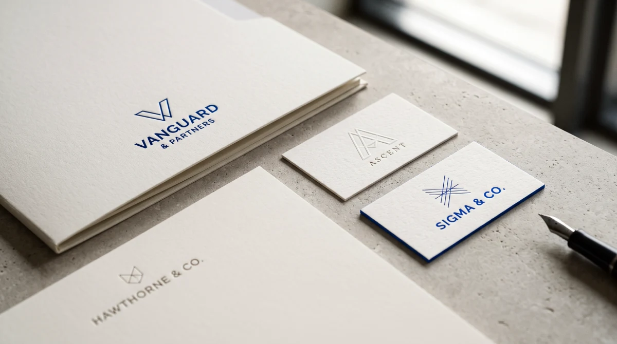
A brand identity package should leave your team able to produce the materials your business needs. This guide separates visual assets from strategy, messaging and rollout, then shows professional services leaders how to specify usable templates, test the handover and compare proposals without mistaking a long file list for value.


7 min read

Brand Strategy

Colour Psychology in B2B Branding: Looking Credible Without Blending In

Colour psychology can inform a B2B rebrand, but colour associations cannot tell you which palette will win business. Professional services leaders need a different test: whether the identity fits their positioning, identifies their business and works in practice. Start by deciding what to retain, refine and validate before approving change.

9 min read

Brand Identity & Design

Brand Identity Examples: 12 B2B Systems Dissected

B2B identity decisions should be tested in proposals, presentations and everyday client materials. These twelve examples show different ways to organise visual assets, language and practical rules. The useful lesson is choosing what your business needs to communicate, retaining recognisable assets where justified, and approving a system employees can use.

11 min read

Specialist Branding

Consulting Firm Branding: What to Approve Before the Redesign

Consultancy branding deserves investment when a specific commercial problem warrants it. Start by deciding whom to serve, what to promise and which evidence supports that promise. Then scope identity, website and rollout around those choices. This guide provides decision gates, budgeting questions and a practical framework for measuring progress.

9 min read

Specialist Branding

Accounting Firm Logo Design That Builds Authority

A strong accounting firm logo design is a visual asset that communicates competence, differentiates a practice from competitors, and functions reliably across digital and print formats. It replaces generic financial symbols with a distinct visual identity that builds brand equity and justifies premium fees.

9 min read

Rebranding

Controversial Rebrands of 2026 and How Not to Join Them

Controversial rebrands are rarely rejected because audiences dislike change. They fail when a business removes, dilutes or never explains something that customers, staff or communities believed was theirs. Cracker Barrel, Galway City Council, McLaren, Amazon and Spotify show where that line sits, and what professional services firms should protect first.

10 min read

Brand Identity & Design

Wordmark vs Monogram vs Symbol: Pick a Sequence, Not a Winner

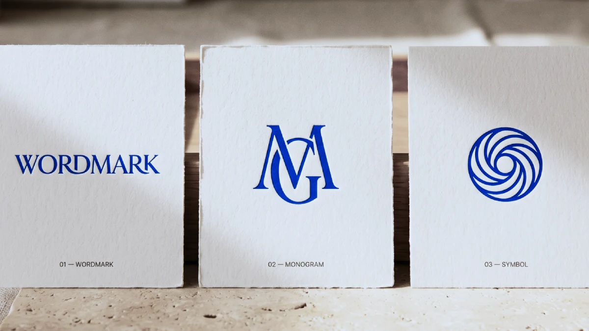
Wordmark, monogram and symbol are three recognition strategies dressed as visual styles. Professional services firms should lead with the full name, because clients cannot decode a mark they have never been taught. Build the monogram and symbol as supporting assets, letting them stand alone only once exposure has earned it.

9 min read

Brand Identity & Design

100 Famous Logos with Names (And What Makes Them Iconic)

100 famous logos with names and pictures, organised across ten industries from finance to logistics, show that recognition is not a matter of clever drawing. It is built through repeated exposure within a distinctive asset system. This guide breaks down what genuinely applies to a professional services firm weighing a rebrand — and what does not.

56 min read