10 Law Firm Branding Examples Worth Studying
Law firm branding is about the idea people remember when they encounter your practice. These ten examples demonstrate different ways to communicate personality, specialisation and client value. From Morgan & Morgan's recognisable promise to Harbottle & Lewis's heritage-led identity, each offers a practical lesson for your next branding decision.



On this page8 min left
- Which Law Firm Branding Examples Are Worth Studying?
- What Makes a Law Firm Brand Worth Remembering?
- 10 Law Firm Branding Examples and What Each Teaches Us
- Which Branding Direction Should Your Law Firm Choose?
- How Do You Turn Branding Inspiration Into a Commercial Brief?
- A Distinctive Law Firm Brand Starts With a Clear Commercial Idea
- Questions people ask
A law firm can have excellent solicitors, decades of experience and a strong reputation among existing clients, yet still look remarkably similar to the practice down the road.
That is a branding problem worth fixing.
The best law firm branding examples demonstrate how a clear market position becomes recognisable through messaging, visual identity and the experience clients receive.
Morgan & Morgan, YLaw and Harbottle & Lewis show three very different ways to achieve that.
For Managing Partners considering a rebrand, the useful question is not which logo looks best. It is which commercial idea the identity communicates.
Which Law Firm Branding Examples Are Worth Studying?
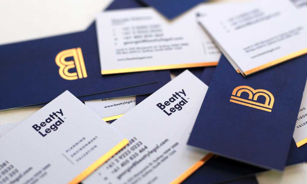
Law firm branding examples worth studying include Morgan & Morgan, YLaw, Bick Law, Harbottle & Lewis, Bend Law Group, Charles Russell Speechlys, Cameron & Kane, Berger Montague, Counsel for Creators and Rendigs.
Each illustrates a different branding decision, from audience-specific positioning and distinctive visual identity to consistent communication across client touchpoints.
Three principles are particularly useful:
- Positioning: Morgan & Morgan demonstrates how a repeatable promise can organise an extensive advertising presence.
- Personality: YLaw and Bick Law illustrate alternatives to conventional legal presentation.
- Consistency: Charles Russell Speechlys and Berger Montague demonstrate the importance of maintaining a consistent identity across multiple applications.
Law firm branding should communicate why a particular client should consider a particular practice. The logo, typography, website and messaging should reinforce that proposition.
Law firm branding strategy therefore needs to precede creative execution. The broader principles are covered in Inkbot Design's law firm branding services and its law firm brand strategy guide.
What Makes a Law Firm Brand Worth Remembering?
A memorable legal brand gives prospective clients a reason to recognise and remember the practice. Five criteria help distinguish a strategically useful identity from an attractive collection of design elements.
Assessment criterion | What to examine |
|---|---|
Positioning | Can a prospective client identify what the firm specialises in? |
Audience clarity | Does the messaging speak to a recognisable type of client? |
Personality | Does the firm sound and look like a distinctive organisation? |
Visual recognition | Are there identifiable visual elements beyond the logo? |
Experience consistency | Does the website support the promise made in the advertising and other communications? |
These criteria matter because a Managing Partner is not choosing artwork for its own sake. The decision affects how the practice presents its expertise before a prospective client has spoken to a solicitor.
A 20-partner commercial litigation practice targeting company directors has different requirements from a boutique family law practice serving individuals. Both need professional credibility. Their identities do not need to look alike.
Visual differentiation must also remain appropriate to the firm's clients. An unusual identity that attracts attention but confuses the intended audience is not doing its job.
10 Law Firm Branding Examples and What Each Teaches Us
These ten practices make different branding decisions. Some lead with a promise. Others use personality, specialist imagery or a distinctive visual system.
The useful part is understanding why each decision suits the organisation behind it.
1. Morgan & Morgan: Turning 'For the People' Into a Recognisable Brand

Morgan & Morgan uses the phrase For the People as the organising idea behind its personal injury brand.
The promise is straightforward. It communicates whose interests the practice represents and gives its advertising a consistent message.
The identity extends across billboards, broadcast advertising, social media and creative collaborations.
Rather than relying on individual campaigns to explain the business, Morgan & Morgan has a recognisable central proposition.
A UK employment law practice, for example, might communicate its commitment to protecting employees through a consistent message across its website, advertising and educational content.
The wording must reflect the actual service and client experience.
A slogan cannot compensate for an unclear proposition.
2. YLaw: Bringing Personality Into Legal Branding
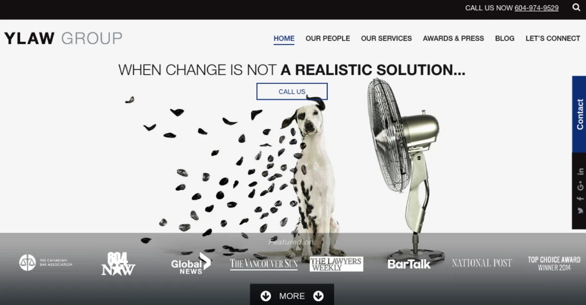
YLaw combines expressive website imagery with practical client information.
They use straightforward navigation and online payment facilities.
That combination matters because a prospective client can encounter YLaw's personality without having to work harder to understand the service or make contact.
A more expressive legal identity needs that balance.
Keep the practical information visible.
3. Bick Law LLP: Making Environmental Law Visually Memorable
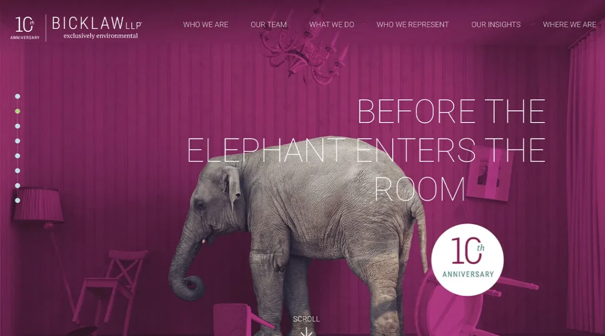
Bick Law LLP focuses on environmental law and uses unexpected imagery to communicate its specialist identity.
They use a rhinoceros on a tightrope and a giraffe in a library as examples of the firm's distinctive visual presentation.
The creative decision gives Bick Law LLP a recognisable personality while providing an opportunity to connect imagery with the firm's environmental specialism.
This is more interesting than selecting an attractive stock photograph of a courthouse.
A specialist planning law practice might use architectural and landscape imagery that reflects the developments and projects its clients work on.
4. Harbottle & Lewis: Updating a Heritage Brand Without Losing Its Character

Harbottle & Lewis provides an example of modernising an established legal identity.
They use a refined monogram, Domaine typography and a refreshed digital presence as elements of the rebrand.
The intended balance was to preserve Harbottle & Lewis's heritage while communicating authority, warmth and a contemporary character.
A 30-partner firm with a recognised name and established referral relationships may not need to discard its identity.
It may need to reconsider how that identity is expressed.
A rebrand should not destroy existing brand equity simply because the design team wants a blank canvas.
5. Bend Law Group: Speaking Like a Partner, Not a Legal Textbook
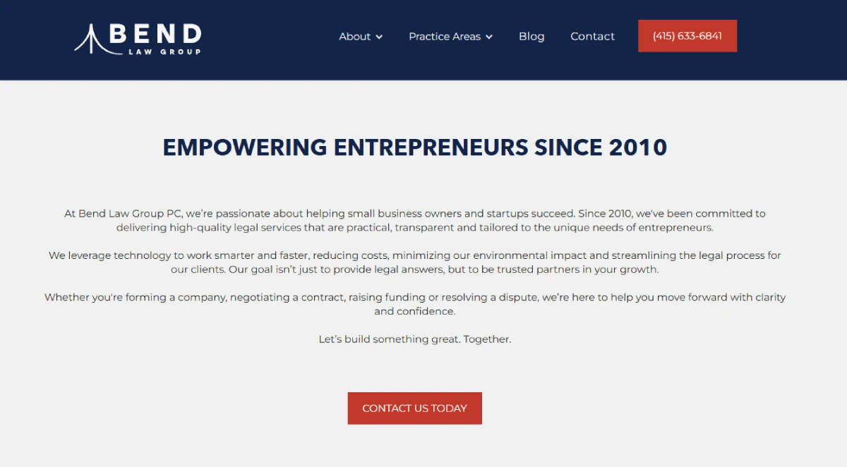
Bend Law Group addresses small-business owners through approachable messaging, including the phrase "Dream Big." We got your back.
The example also identifies introductory videos and testimonials as part of Bend Law Group's website presentation.
The interesting decision is the language.
Bend Law Group communicates in a way that relates to the ambitions of its intended audience rather than relying exclusively on legal terminology and lists of professional credentials.
That style suits an audience looking for an accessible relationship with its legal adviser.
It would not necessarily suit a firm communicating with institutional lenders or corporate boards.
6. Charles Russell Speechlys: Turning Relationship-Led Positioning Into a Brand System
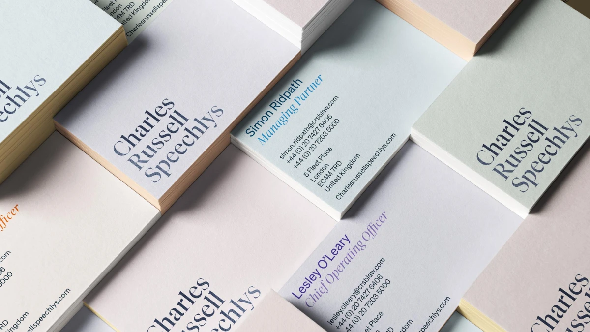
Charles Russell Speechlys offers one of the more useful strategy-led examples in this collection.
The brand refresh began with stakeholder interviews and qualitative research.
The resulting proposition centred on meaningful relationships that create impact.
The identity was subsequently applied across the website, video, brochures, stationery and templates.
Research informed the positioning. The positioning informed the verbal and visual identity.
The identity was then carried into the firm's communications.
For a multi-office practice, this is particularly relevant. Partner opinions may differ, but the resulting brand needs to communicate one coherent proposition.
7. Cameron & Kane: Standing Out With Colour and Character
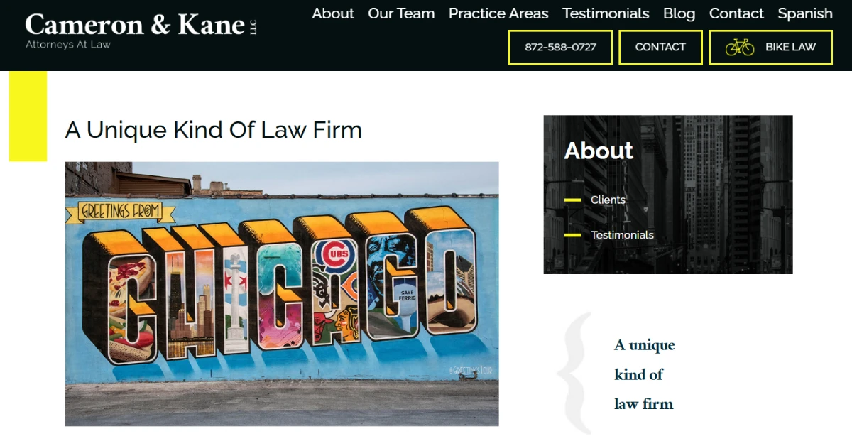
Cameron & Kane uses yellow accents and grayscale photography to give its identity a recognisable visual direction.
The colour choice is only part of the decision.
They connect the visual presentation to a boutique, community-oriented personality.
A UK regional practice could adopt a similarly distinctive direction, provided that the choice reflects its actual positioning and its clients' expectations.
8. Berger Montague: Making Every Touchpoint Look Like the Same Firm

Berger Montague illustrates the importance of carrying a recognisable identity across different environments.
They highlight the use of its logo, bold statements and custom photography across the website, office environment and social channels.
A new website can look excellent while the firm's pitch presentations, recruitment materials and correspondence still carry an older identity.
The result is a consistent presentation of the same organisation.
9. Counsel for Creators LLP: Building the Brand Around a Clearly Defined Client

Counsel for Creators LLP focuses on creative business owners.
There’s audience-specific imagery, accessible presentation and a legal subscription offering.
The interesting point is the relationship between the intended client and the service itself.
Counsel for Creators LLP aligns its audience positioning with how its legal services are packaged.
A practice serving independent designers, production companies and creative agencies should make that specialism obvious before the prospective client reaches the contact page.
10. Rendigs: Making One Simple Design Element Work Across the Brand
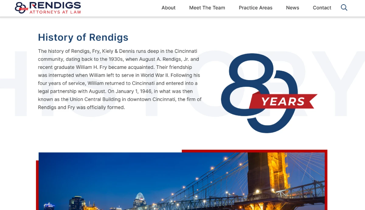
Rendigs provides a more restrained approach to legal identity design.
The supplied PaperStreet description identifies a simple brandmark and recurring red-line graphic element used across the website, corporate identity and social media.
The recurring device provides a visual connection between applications without requiring complicated artwork.
A recognisable identity does not need an elaborate symbol, unusual photography or an extensive colour palette.
A simple graphic device, used with discipline, can do the job.
Which Branding Direction Should Your Law Firm Choose?
The most appropriate branding direction depends on the commercial problem the practice needs to solve.
A Managing Partner should not choose a rebrand because another firm has an attractive website. The underlying issue might be positioning, messaging, visual identity or the experience clients receive.
Your firm's situation | Relevant example | Recommended direction |
|---|---|---|
Clients struggle to understand what makes your practice different | Morgan & Morgan | Define a clear, repeatable brand promise |
The practice appears formal and unapproachable | YLaw | Develop a more recognisable personality |
Your specialist expertise is difficult to communicate | Bick Law | Build imagery and messaging around the specialism |
The firm has heritage but an outdated presentation | Harbottle & Lewis | Refresh the identity while retaining recognition |
Your language focuses too heavily on credentials | Bend Law Group | Rewrite messaging around client needs |
Different partners describe the firm differently | Charles Russell Speechlys | Establish shared positioning before design |
Your brand looks inconsistent across communications | Berger Montague | Create and implement a consistent identity system |
These are directional recommendations, not claims that the named firms achieved particular financial results.
Two objections deserve attention.
"Our clients come through referrals. We do not need an expressive brand."
A referral can introduce a law firm, but the prospective client may still investigate its credentials, specialisms and website before making contact.
"We have been established for 30 years. Changing our identity could damage recognition."
That is a legitimate concern. An established name, recognisable monogram or familiar visual device can carry value. A refresh may be more appropriate than a complete rebrand if the underlying positioning remains relevant.
The recommendation changes when the firm's commercial proposition has changed substantially, perhaps following a merger, a shift in specialisation or a move towards a different client market.
How Do You Turn Branding Inspiration Into a Commercial Brief?
Before asking a designer for a new logo, write down what the firm needs prospective clients to understand.
A 15-partner practice with three different descriptions of its specialism has a positioning problem to resolve before choosing typography.
A practice whose positioning is already clear but whose website, proposals and stationery carry different identities has an implementation problem.
Those are different projects. They should not receive the same brief.
A useful branding brief should establish five things:
- The intended client: Which organisations or individuals should recognise themselves in the firm's communications?
- The commercial proposition: What does the practice provide that the intended client should understand immediately?
- The positioning: What should make the firm recognisable within its chosen legal category?
- The identity requirements: Which visual and verbal elements need to change?
- The implementation: Where must the identity appear, from the website and pitch documents to recruitment materials and correspondence?
The distinction between a visual refresh and a complete rebrand is particularly important.
If the firm's name, specialism and commercial proposition remain relevant, a visual refresh and better messaging may be sufficient. If the practice has moved into a different market, merged with another organisation, or fundamentally changed its offering, the positioning may need to be reconsidered before any design work begins.
A Distinctive Law Firm Brand Starts With a Clear Commercial Idea
Morgan & Morgan, YLaw, Bick Law and Charles Russell Speechlys demonstrate different ways to make a legal practice recognisable. None provides a universal identity template.
The most useful lesson is that the commercial idea should lead the creative work.
A recognisable promise, a defined audience and a clear reason for choosing the practice give the visual identity something meaningful to communicate.
A firm with strong positioning but outdated graphics may need a refresh. A firm whose partners cannot agree on what makes the practice different needs strategic work first.
Do not commission another logo until you know which problem you are trying to solve.
If your firm's identity no longer reflects its expertise or commercial ambitions, request a free Inkbot Design Brand Equity Audit™. The diagnostic identifies where your brand may be losing commercial ground and what needs attention.
Questions people ask
What makes a law firm brand distinctive?
A distinctive law firm brand communicates a recognisable proposition through its positioning, messaging, visual identity and client experience. The intended audience should understand what the practice specialises in and why its services are relevant. A memorable logo alone cannot establish that distinction.
Should a law firm use traditional or modern branding?
Neither style is automatically right. A traditional identity may suit a heritage practice whose clients value established reputation and continuity. A more contemporary identity may suit a practice whose intended clients expect a different presentation. The decision should follow the firm's positioning and client expectations.
Can a small law firm have a distinctive brand without a large marketing budget?
Yes. A smaller practice can establish a distinctive identity through clear positioning, consistent messaging, a professionally designed logo and a useful website. The priority should be a coherent identity that communicates the firm's specialism, rather than an expensive collection of marketing materials.
How often should a law firm rebrand?
A law firm should review its brand when its positioning, target clients, services or market circumstances change. There is no universally correct rebranding interval. A practice with an effective identity may need only minor updates, while a post-merger firm may require a more substantial repositioning exercise.
What is the difference between a law firm logo and a law firm brand?
A logo is a visual identifier. A law firm brand is the wider set of associations created by its positioning, messaging, identity and client experience. The logo helps people recognise the practice, while the wider brand communicates what the practice represents and why its services matter.