Brand Iconography That Makes Complex Firms Easier to Understand
Brand iconography works when it makes a complex firm easier to understand without making its identity feel simpler or less credible.


On this page8 min left
Brand iconography is more than a collection of small graphics.
For firms that explain complex work, it is a visual operating system: a controlled set of symbols that helps people understand services, processes, proof points, and actions before they read every word.
This matters especially in professional services. A legal, accountancy, advisory, or consultancy firm may offer sophisticated expertise, but prospects rarely arrive with the patience to decode dense language.
Clear iconography can reduce cognitive load without reducing the seriousness of the work.
Poor iconography does the opposite. It creates ambiguity, makes materials feel assembled rather than designed, and quietly weakens consumer perception of authority.
I recommend treating brand iconography as a governed identity asset, not a decorative afterthought in professional services branding.
The aim is not to put an icon beside every heading. The aim is to build a visual language that makes complex information more navigable while reinforcing the brand's values and character.
What Brand Iconography Is and Is Not
A coordinated visual language, not isolated artwork
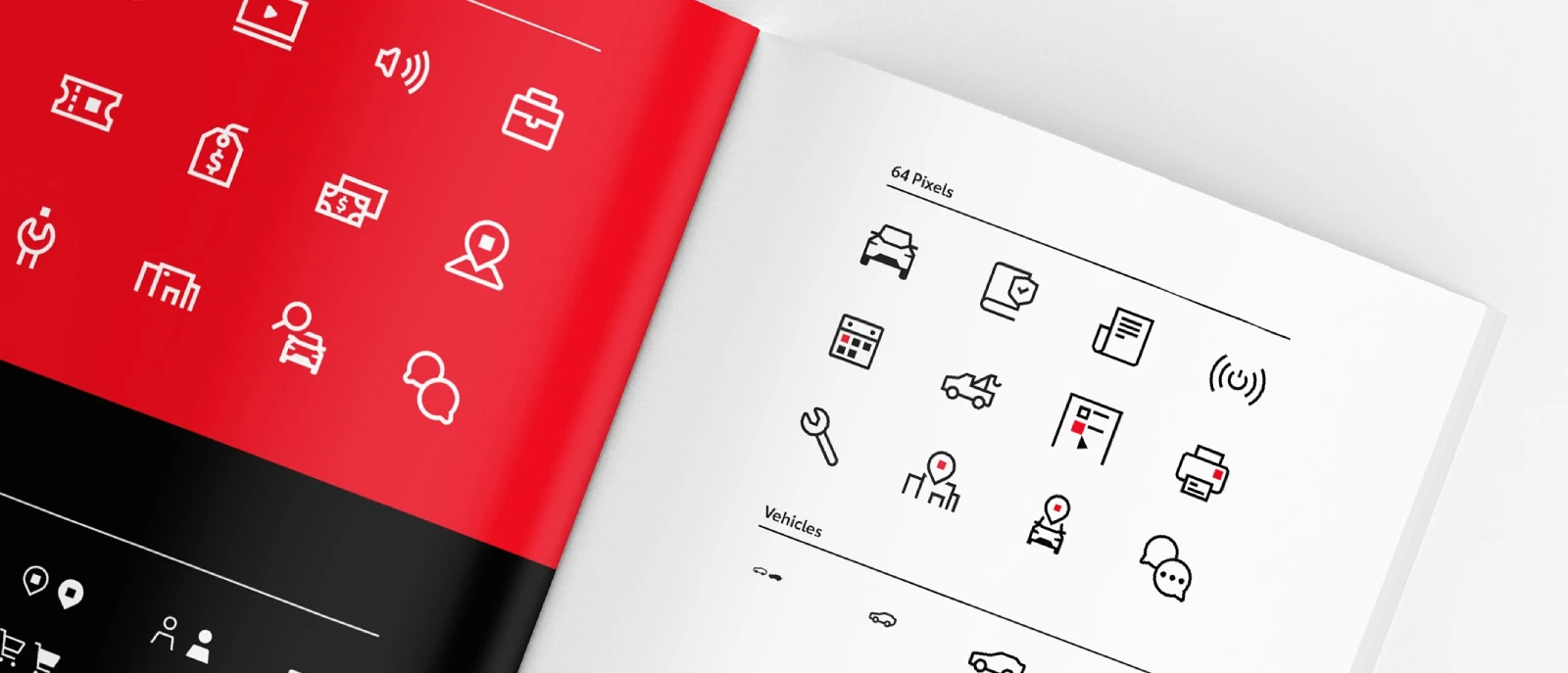
Brand iconography is a coordinated system of visual symbols used across a brand’s product, marketing, editorial, and service communications. It includes the rules that make those symbols feel related: geometry, proportions, corner treatment, stroke weight, colour behaviour, spacing, and level of detail.
The distinction matters because a single icon can look polished while still damaging the broader identity.
A rounded, friendly line icon placed beside a sharp, dense, highly technical icon creates visual friction. The audience may not describe the problem in design terms, but they can register that the business feels inconsistent.
For decision-makers, the practical question is simple: does each icon reinforce the same visual language as the logo design, typography, and other brand assets?
If the answer is uncertain, the icon is not yet ready for broad use.
A well-designed brand identity package should therefore define iconography as part of the overall identity system, rather than leaving teams to source graphics independently for every presentation, campaign, or product update.
Logo, symbol, illustration, and icon: different jobs
These terms are often used interchangeably. They should not be. Each visual asset has a different role, scale, and expectation of recognition.
Asset | Primary role | Best use | Main risk when misused |
|---|---|---|---|
Logo | Identifies the organisation | Formal recognition, ownership, signatures | Overuse can make every page feel branded rather than useful |
Brand symbol | Provides distinctive shorthand | Social profiles, applications, campaigns, compact spaces | Assuming it explains an action or service when it does not |
Functional icon | Signals action, status, navigation, or feature | Interfaces, forms, dashboards, digital tools | Ambiguity when shown without labels |
Expressive brand icon | Conveys themes, values, or narrative character | Editorial content, service overviews, social posts | Decorative use without a clear communication purpose |
Illustration | Explains a scene, relationship, or concept | Complex stories, campaigns, reports | Becoming too detailed to work at small sizes |
A brand symbol can become powerful shorthand, but shorthand is earned through repeated, consistent use. Reddit’s description of its Snoo icon identifies it as brand shorthand used across the company’s marketing and communications. That is a useful distinction: Snoo identifies Reddit, while a reply, search, or voting icon communicates a specific action.
Functional versus expressive icons
I suggest separating iconography into two related but distinct families.
Functional icons help people operate something. Examples include download, account, close, filter, save, warning, or document status. Their first duty is comprehension. In a client portal, an icon that is visually clever but unclear is a usability failure.
Expressive brand icons carry a firm’s themes and visual character. A consultancy might use a structured pathway icon to represent transformation, a faceted shape to signal analytical rigour, or a connected-node motif to depict collaboration. These are not necessarily controls. They are editorial devices that make abstract propositions more tangible.
The mistake is asking a single icon to do both jobs without acknowledging the trade-off. A detailed “strategic growth” illustration may work on a capabilities page but fail as a 16-pixel navigation control. Conversely, a generic arrow may function perfectly in an interface but contribute nothing distinctive to a high-value proposal.
Use functional icons when a person must act, choose, or recognize status. Use expressive icons when the goal is to frame an idea, organize a narrative, or reinforce brand character.
How to Build a Coherent Icon System
Start with construction tokens, not a mood board
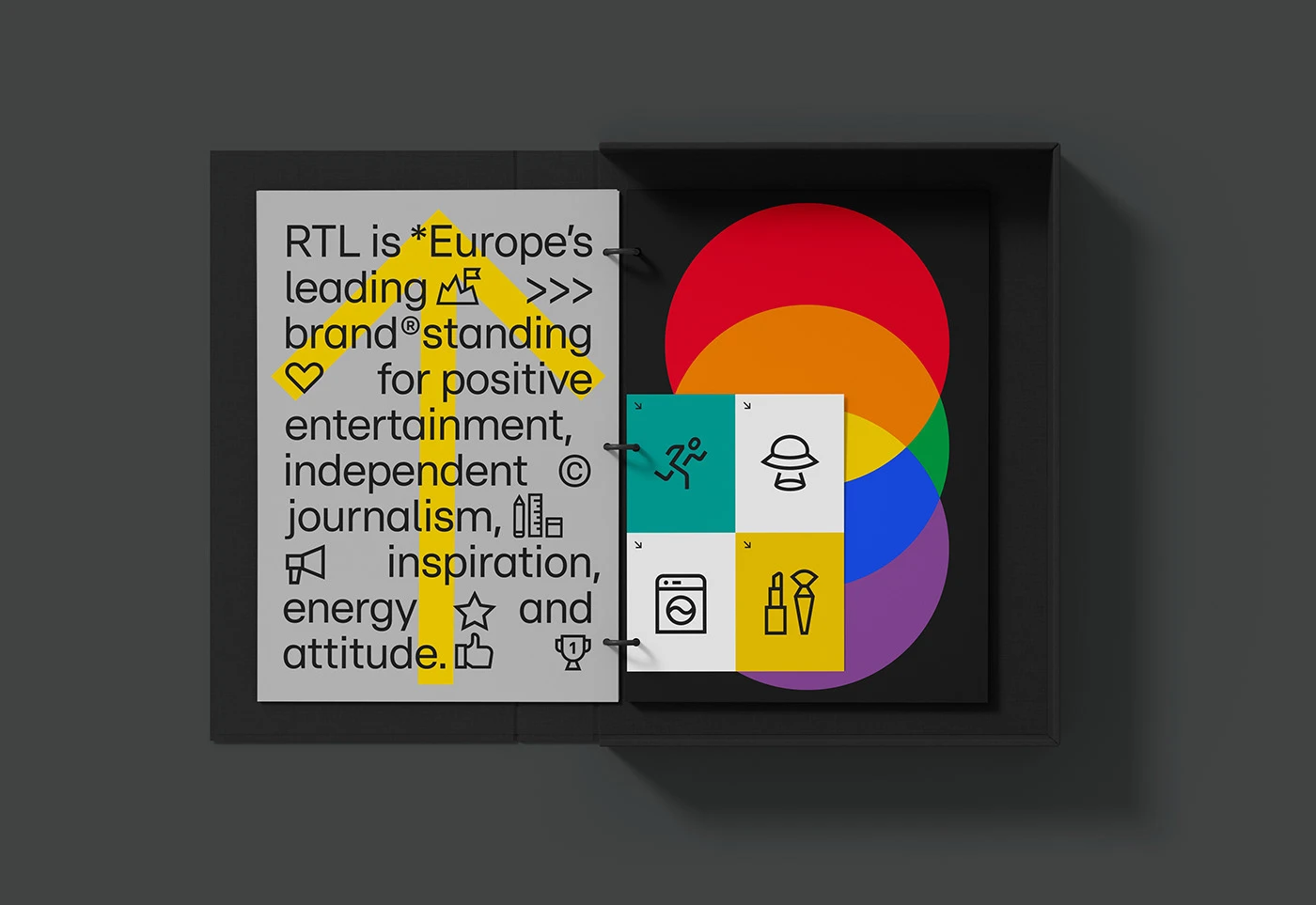
Consistency is produced by repeatable rules. A mood board can establish visual direction, but it cannot govern hundreds of icons across years of use. The more durable method is to define construction tokens: named rules that designers and developers can apply repeatedly.
A practical icon system normally specifies the following:
- Grid and artboard dimensions for each intended size
- Stroke weight and rules for scaling it
- Corner radius and line-cap treatment
- Base geometric shapes and permitted angles
- Internal spacing and safe-area margins
- Detail limits at small, medium, and large sizes
- Colour rules, including monochrome use
- State rules for default, hover, selected, disabled, and alert conditions
The UK Office for National Statistics offers a useful example of this discipline. Its icon design guidance instructs designers to follow established shapes, detail levels, and recurring elements when creating new icons. That is the core principle of an icon family: new additions should feel constructed from the same grammar, not merely drawn in a similar style.
For a professional services firm, this often means choosing restraint. Complex metaphors, subtle internal details, and ornamental effects may look attractive in a presentation mockup but may become unstable across a website, a proposal template, a webinar slide, and a printed report.
Choose outline, filled, or dual-state logic deliberately
There is no universal rule that outlines are more premium, or that filled icons are more visible. The right choice depends on context, density, and interaction states.
Approach | Choose it when | Avoid it when |
|---|---|---|
Outlined icons | You need a light visual tone, many icons in one view, or a system aligned to line-based typography | Strokes become too fine at the intended size |
Filled icons | You need strong visual emphasis, compact recognition, or clear status differentiation | Dense pages start to feel heavy or repetitive |
Outline plus filled state | You need a consistent interaction model for selected or active items | The distinction is not tested in the actual interface context |
Reddit’s brand guidelines provide a clear state model: its icons are primarily outlined, while solid variants indicate an active state. The same guidance documents a grid-based icon language, product-oriented icon use, and single-colour legibility requirements.
The lesson is not to copy Reddit’s style. It is to define what visual change means. If a solid icon means “selected,” do not also use solid treatment merely because it looks more attractive in a social graphic. State conventions lose value when they are inconsistently applied.
Design for the smallest real use case first
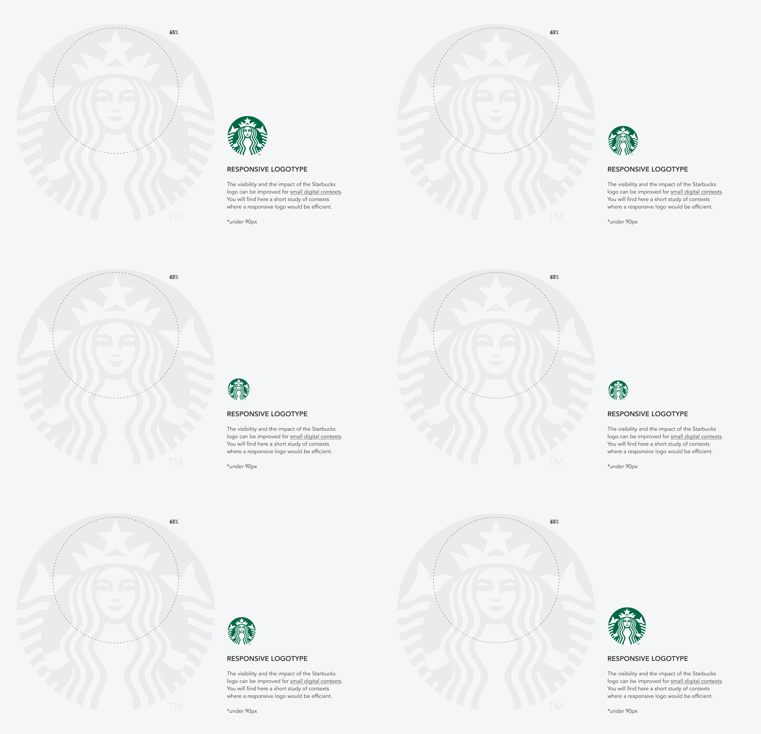
An icon system should be built around actual use sizes, not a single polished master file. Detail density, viewing distance, output medium, and reproduction method all change what will survive.
The Office for National Statistics sets practical scale tiers in its iconography guidance: small web-interface icons use a 16 × 16 pixel artboard and are intended for roughly 5 to 9 mm in print; medium icons use 32 × 32 pixels for approximately 10 to 19 mm; large icons use 64 × 64 pixels for around 20 to 35 mm. It also recommends SVG for digital use because the format scales without becoming blurry, and emphasises that icons should support rather than replace content.
These dimensions are not universal standards. They are a useful reminder that an icon intended for a mobile interface should not simply be a reduced version of a detailed report graphic. At 16 pixels, a scale, a handshake, a bar chart, and a shield can quickly become indistinguishable if each relies on intricate internal lines.
I recommend maintaining size-specific variants when the meaning would otherwise collapse. For example, a large “cross-border advisory” icon might include a globe and directional routes. At small sizes, a simpler globe or location marker may be more usable, with text providing the precise meaning.
Make monochrome testing a formal approval gate
Colour can attract attention, group content, and signal status. It should not be the only reason an icon works.
The single-colour test is straightforward: render the icon in one approved colour on a plain background, then inspect it at the smallest intended size. Can a user still distinguish the basic form?
Does the icon retain appropriate contrast? Does it reproduce cleanly in a one-colour print job, document export, browser state, or low-quality photocopy?
This test exposes common problems quickly:
• Thin strokes that disappear
• Interior gaps that fill in visually
• Multiple shapes that merge into a single blot
• Meaning that depends entirely on colour coding
• Excess detail that creates visual noise
Colour may still carry useful secondary meaning. A red alert icon can, for example, reinforce a sense of urgency. But the warning shape, adjacent wording, and placement should still communicate the state when colour is unavailable.
How to Apply Icons Across Channels
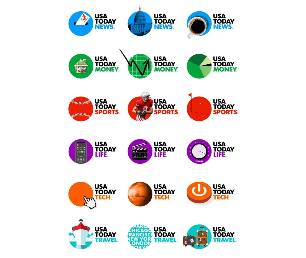
Pair meaning with language when ambiguity is costly
An icon is not a universal language. Some symbols are widely familiar in narrow contexts, such as a magnifying glass for search. Others are culturally variable or too abstract to stand alone. A lightbulb might suggest insight, ideas, energy, innovation, or simply utility, depending on the setting.
For high-stakes content, pair the symbol with supporting language. Use visible labels in navigation, concise captions in reports, tooltips for unfamiliar controls, and adjacent headings for expressive icons. This is especially important when users are comparing services or making decisions with financial, legal, or operational consequences.
A practical rule is this: if choosing the wrong interpretation would lead to the wrong action, include text. A “document” icon beside a button may be unclear. “Download engagement terms” is not.
This is also where brand psychology becomes relevant. Visual cues affect what people notice and infer, but they do not remove the need for precise language. A credible brand uses both: icons to reduce friction and words to eliminate uncertainty.
Set cross-medium rules before teams improvise
The same icon can appear in very different environments: a website interface, pitch deck, social post, print brochure, dashboard, email signature, event signage, or proposal document. Treating every channel as identical creates predictable failures.
Channel | Primary consideration | Recommended rule |
|---|---|---|
Product UI | Immediate recognition and accessible interaction | Use functional icons with labels where meaning is not obvious |
Website editorial | Scanning and hierarchy | Use expressive icons to organise ideas, not replace substantive copy |
Presentation decks | Viewing distance and pace | Increase scale, simplify detail, and avoid decorative repetition |
Print documents | Physical size and reproduction quality | Test at final millimetre size and in grayscale |
Social media | Fast recognition in a crowded frame | Use bold, simple forms with safe margins and limited text dependence |
Large-format applications | Distance and production constraints | Use simplified marks, strong contrast, and generous spacing |
A single icon may need related variants rather than one unchanged asset. This is not inconsistency. It is responsive design. The visual DNA remains stable while detail adapts to the conditions of use.
Govern assets like any other strategic system
Icon drift usually begins with good intentions. A marketing team needs an icon quickly. A product designer uses a library symbol.
An external supplier redraws an asset for print. Soon, three versions of “security” appear across the same organisation, each with a different corner radius, weight, and metaphor.
The recovery is governance, not another visual refresh. Your brand style guide should define ownership, approval, sourcing, naming, storage, and retirement of icon assets.
At minimum, maintain an approved library with metadata for each icon:
- Name and intended meaning
- Category, such as navigation, service, status, or editorial
- Permitted contexts and size variants
- Accessibility label or accompanying text requirement
- Version number and date of approval
- Source and licensing status for externally adapted assets
- Replacement or deprecation notes when an icon changes
The Office for National Statistics’ icon set guidance distinguishes website UI icons from other icon assets and provides them in SVG and PNG formats.
That distinction is operationally useful.
SVG may be the preferred master for digital implementation, while PNG exports can serve specific legacy or document workflows. Teams should not assume that one format or file is appropriate everywhere.
External icon libraries deserve particular scrutiny. They can be efficient for common interface controls, but assess license terms, modification rights, long-term availability, visual mismatch, and ownership before embedding a library deeply into a brand system.
A low-cost shortcut can become expensive when a product redesign reveals that the original library cannot be modified or redistributed as intended.
Conclusion
Brand iconography works when it makes a complex firm easier to understand without making its identity feel simpler or less credible.
The strongest systems separate functional needs from expressive ones, define repeatable construction rules, adapt responsibly by size and channel, and give teams a clear governance model.
The decision is not whether to use more icons. It is whether every icon has a defined job, a consistent visual language, and a controlled place within the brand.
Questions people ask
What should a brand icon system include?
It should include a defined grid, artboard sizes, stroke and corner rules, colour behaviour, optical-balance guidance, approved icon categories, file formats, naming conventions, accessibility requirements, and governance rules. The aim is to make future decisions repeatable rather than subjective.
How do I make icons readable at small sizes?
Remove nonessential detail, enlarge critical gaps, use fewer internal lines, and test at the final display size rather than only in a design file. If the icon loses meaning when reduced in size, create a smaller variant or add a text label. Do not rely on SVG scalability alone; vector files remain sharp, but they do not make a dense design easier to understand.
Should brand icons be outlined, filled, or both?
Choose one primary logic based on the brand’s visual language and the interface context. Use both only when the difference carries a consistent meaning, such as outline for default and filled for selected. Avoid mixing treatments randomly across teams and channels.
When should an icon include a text label?
Include a label when the icon is unfamiliar, abstract, culturally variable, legally significant, or attached to an important action. Standalone icons are most defensible for highly familiar controls in established contexts. A tooltip can help, but it should not be the only explanation for a critical choice.
Should the same icon work in product UI and marketing materials?
Sometimes, but not automatically. Product UI prioritises rapid comprehension and state clarity. Marketing materials can accommodate more expressive and narrative elements. Use the same underlying geometry where possible, then adapt detail, scale, and surrounding language to the context.
What file formats are best for brand iconography?
SVG is generally the strongest format for digital iconography because it scales cleanly and supports modern interface workflows. Keep controlled exports for other needs, such as PNG files for constrained platforms or document production. Store master files centrally and document which format belongs in each workflow.
Can I adapt icons from an existing library?
Yes, if the license permits the intended use and modification, and if the icons can be aligned with your system without creating a patchwork result. Generic interface actions may be suitable candidates. Distinctive service or editorial icons usually need more deliberate customisation to support brand identity.