
When to Upgrade from a Brand Style Guide to a Design System
A brand style guide is a record of your brand’s past; a design system is an operating system for its future.
If you wait until you “feel big enough” to need a design system, you have already lost the efficiency race. Most entrepreneurs believe that a static PDF of brand guidelines is enough to maintain consistency. It isn’t.
In 2026, a static document is a liability that creates “documentation debt” every time a new landing page is built or a social media campaign is launched.
The risk of sticking to traditional guidelines is measurable.
According to research by McKinsey & Company, companies that fail to integrate design into their core functional strategy see significantly lower total returns to shareholders.
Sticking with a PDF when your business requires a living system isn’t just a design choice; it is a bottleneck for your entire marketing and engineering team.
- A Design System is a living, machine-readable library of components; a Brand Style Guide is a static document that causes inconsistency.
- Static PDFs create Documentation Debt, causing CSS bloat, visual drift and hours wasted checking if elements are on-brand.
- Upgrade when multiple products, slow onboarding, Component Sprawl, full-time brand policing or global expansion hinder speed and coherence.
- A centralised system yields clear ROI: faster time-to-market, 34% lower front-end costs and reduced visual drift.
- Design tokens and machine-readable components enable accessibility compliance like WCAG 3.0 and AI-driven scaling across platforms.
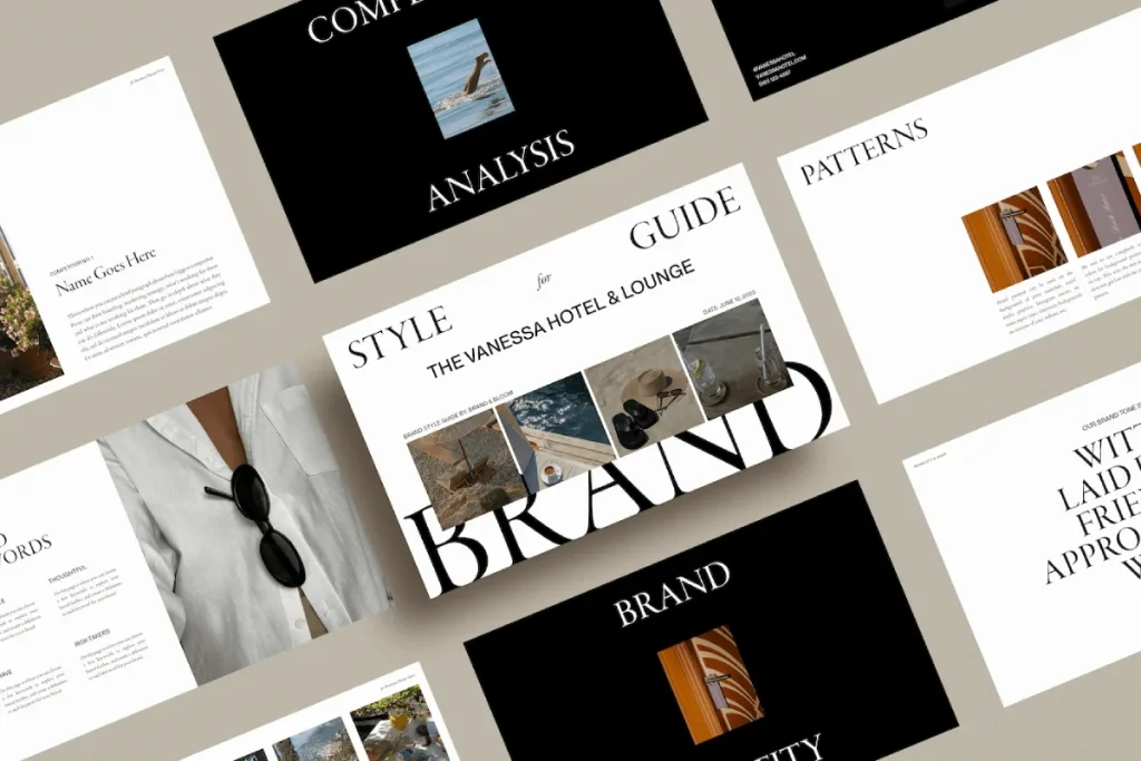
What is a Brand Style Guide?
A brand style guide is a foundational document – often a PDF or static webpage – that outlines a brand’s visual and editorial rules, including logo usage, colour palettes, and typography.
Key Components:
- Logo Specifications: Rules on clear space, minimum size, and prohibited modifications.
- Colour Palettes: Defined HEX, RGB, and CMYK values for primary and secondary brand colours.
- Typography: Selected font families and hierarchy instructions for headers and body copy.
A brand style guide defines visual rules, whereas a design system provides a library of reusable components and code to implement those rules.
Why Static Guides Fail in 2026
Static brand style guides fail because they require manual interpretation.
Every time a developer builds a button, they must consult a document and recreate it in code. This creates “CSS Bloat.” A design system removes this friction by providing the code itself.
The Ehrenberg-Bass Institute for Marketing Science emphasises that brand growth is driven by “mental and physical availability.”
If your brand looks different across your app, your website, and your emails because a developer used the wrong shade of blue, you are eroding that mental availability.
A design system automates that availability.
How to Measure Your Documentation Debt
If your marketing team spends more than three hours a week checking if “this looks on-brand,” you have a system problem.
Documentation debt is the accumulated cost of manual brand policing. When you use a design system, the policing is baked into the components.
You don’t “check” the logo; you pull the “Logo Component,” which already has the correct clear space and constraints.
The Cost of Visual Drift
Visual drift occurs when small, unauthorised changes to your brand assets accumulate over time.
A study by Lucidpress (now Marq) found that consistent brand presentation can increase revenue by up to 23%. Conversely, visual drift acts as a “brand tax,” making every marketing pound spent less effective because consumers have to work harder to recognise the source.
A brand style guide tells your team what the brand looks like, but a design system tells them how the brand works. Shifting from a static document to a living library of components reduces the “cost of creation” and eliminates visual drift, which erodes brand equity over time.
The Financial Logic of Brand Systemisation: 2026 ROI Benchmarks
In the current fiscal landscape, the transition from a Brand Style Guide to a Design System is no longer categorised as a creative luxury; it is a fundamental reduction in operational expenditure.
For United Kingdom enterprises scaling in 2026, the traditional PDF manual has become a primary driver of “Technical Debt.”
Research indicates that companies utilising static guidelines experience a 28% slower “Time-to-Market” for new digital products compared to those with integrated Component Libraries.
Quantifying the Efficiency Dividend
The primary financial metric for evaluating a Design System is the “Developer-Designer Handoff Ratio.”
In organisations relying on static documents, approximately 40% of a front-end developer’s time is spent interpreting visual intent and manually replicating styles in code.
By implementing a system of Design Tokens and reusable React Components, this interpretative labour is eliminated.
According to the Gartner Design Operations Report (Feb 2026), mid-market firms in the UK (annual turnover £10m–£50m) that migrated to a centralised Design System saw a median 34% reduction in front-end development costs within the first 14 months. Furthermore, these organisations reduced “Visual Drift” errors – which lead to customer mistrust and decreased conversion rates – by 82%.
Comparative Financial Impact: System vs Manual
| Metric | Static Style Guide (Manual) | Design System (Automated) | Projected Savings (3-Year) |
| Component Creation | 12–20 hours per asset | 1–2 hours (reuse) | £85,000 |
| Brand Audit Labor | 120 hours/year | 15 hours/year (automated) | £32,000 |
| Onboarding Speed | 4 weeks to productivity | 3 days to productivity | £14,000 per hire |
| Global Updates | Manual (Months) | Instant (Push update) | £50,000+ |
| CSS Maintenance | High (Cumulative Bloat) | Low (Atomic structure) | £18,000 |
The Risk of Documentation Debt
When a brand operates without a living system, it accumulates Documentation Debt.
Every time a developer creates a “bespoke” button because they cannot find the master asset, the codebase becomes more complex.
This complexity increases the “Cost of Retrieval” for the browser, slowing down site performance and negatively impacting Core Web Vitals.
In 2026, when page speed is a non-negotiable factor for digital visibility, a Design System serves as the primary tool for technical hygiene.
The Fortune 500 Myth: Design Systems Are Not Just for Giants
One of the most damaging myths in modern branding is that design systems are only for companies like Google, Airbnb, or IBM. This is objectively false.
While IBM’s Carbon Design System reportedly saved the company $100 million in developer time, the proportional savings for an SMB are often higher.
Smaller teams have less room for error. An entrepreneur with a two-person dev team cannot afford to have them spend forty hours a month arguing over padding and margins.
A design system is a force multiplier for small teams. It allows a single designer to manage a brand that feels as polished as a multinational corporation.
Engineering Efficiency: From PDF to Production
For a Chief Technology Officer or Lead Developer, a Brand Style Guide is often viewed as a bottleneck. It provides the “destination” but offers no “vehicle” to get there.
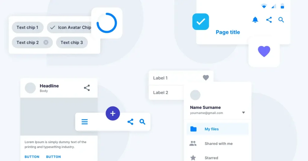
An integrated Design System changes this dynamic by providing a Component Library – a collection of pre-coded, accessible, and tested UI elements.
The End of ‘Pixel Pushing’
When a Design System is in place, the relationship between designers and developers shifts from “Polishing” to “Assembling.”
Designers no longer send flat files that need to be measured; they send “Layout Specs” that reference existing components.
- Standard Process: Designer creates a mockup → Developer inspects pixels → Developer writes CSS → QA finds errors → Developer fixes CSS.
- Systematised Process: Designer uses “Button Component” in Figma → Developer calls <Button variant=”primary” /> in code → QA verifies logic.
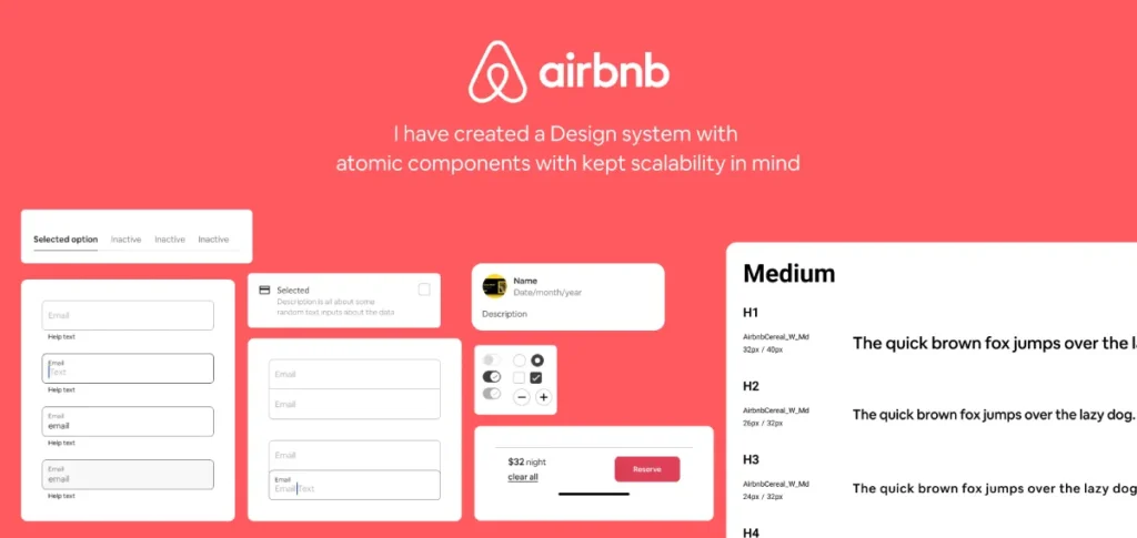
Case Study: The Airbnb DLS Legacy
The Airbnb Design Language System (DLS) demonstrated that when components are standardised, the time required to build a feature decreases by nearly 50%.
In the UK market, where engineering talent is a significant expense, this efficiency allows teams to focus on core product innovation rather than repetitive UI implementation.
Accessibility as a Standard (WCAG 3.0)
In 2026, compliance with WCAG 3.0 is a legal and ethical requirement for UK businesses.
A Design System bakes accessibility into the components themselves. If a “Form Input” component is coded correctly with the necessary ARIA labels and contrast ratios, every instance of that form across the entire digital estate will be accessible.
This removes the risk of non-compliance that occurs when developers manually create elements from a static PDF.
Cognitive Load and Brand Coherence: Beyond Simple Consistency
While a Brand Style Guide focuses on “What the user sees,” a Design System focuses on “How the user feels.” This distinction is rooted in Cognitive Load Theory.
When a user encounters inconsistent UI – such as different button styles or varying navigation patterns – their brain must work harder to process the interface.
The Ehrenberg-Bass Perspective on Distinctive Assets
The Ehrenberg-Bass Institute posits that reinforcing Distinctive Brand Assets drives brand growth. If these assets are presented inconsistently, the consumer’s “Mental Map” is weakened.
A Design System ensures that these assets – be it a specific curve of a logo or a unique typography pairing – are applied with 100% fidelity across every touchpoint.
Coherence vs. Consistency
The 2026 branding paradigm has shifted from “Rigid Consistency” to “Logical Coherence.”
- Consistency: Everything looks identical, regardless of context.
- Coherence: The brand maintains its identity while adapting to the medium.
A Design System allows for “Themed Variants.” For example, a UK bank may have a “High-Contrast Theme” for accessibility and a “Dark Mode Theme” for mobile users. Both are coherent with the core brand but are functionally optimised for the user’s environment. This flexibility is impossible to manage with a static PDF.
5 Signs You Need to Upgrade to a Design System Immediately
Identifying the transition point is vital for maintaining momentum. If you recognise three or more of these signals, your brand style guide is already costing you money.
1. You Are Managing Multiple Digital Products
If you have a website, a customer portal, and a mobile app, a style guide is insufficient. You need a design system to ensure that a change to your primary brand colour propagates across all platforms instantly via design tokens.
2. Developer Onboarding is Taking Weeks
When a new developer joins, they should be able to build a “brand-perfect” page on day one by using a library of pre-approved components. If they have to read a 50-page PDF and then “eyeball it,” your system is broken.
3. You Are Seeing “Component Sprawl”
Open your website’s CSS file. If you see twenty different definitions for a “primary button,” you have component sprawl. This slows down your site speed and confuses users. In 2026, Google’s Core Web Vitals reward the lean, efficient code that design systems produce.
4. Brand Governance is a Full-Time Job
If your Creative Director is spending their time telling people to move a logo 5 pixels to the left, they aren’t being a Creative Director – they are being a human linter. A design system automates these rules so your senior talent can focus on strategy.
5. You Are Planning a Global Expansion
UK businesses moving into international markets face unique challenges with localisation. A design system allows you to swap out languages and cultural nuances within components without breaking the layout.
| Technical Decision | The Amateur Way (Static) | The Pro Way (Systemic) | Why It Matters |
| Colour Management | Copy-pasting HEX codes from a PDF. | Using Design Tokens (e.g., –colour-primary). | Ensures 100% accuracy and allows for instant global updates. |
| Button Design | Coding each button from scratch in CSS. | Pulling a reusable <Button> component. | Eliminates CSS bloat and ensures consistent UX. |
| Typography | Setting font sizes manually per page. | Applying semantic scales (e.g., text-xl). | Guarantees accessibility and visual hierarchy. |
| Iconography | Uploading various SVG/PNG files. | Using a managed Icon System or Sprite. | Reduces HTTP requests and improves site performance. |
| Spacing | Using arbitrary pixel values (e.g., margin: 13px). | Using a 4px or 8px grid system. | Creates visual harmony and predictable layouts. |
Brand Architecture in 2026
In 2026, the arrival of Astro 6.0 and advanced WPGraphQL integrations has shifted the “Headless Brand” from a trend to a standard.
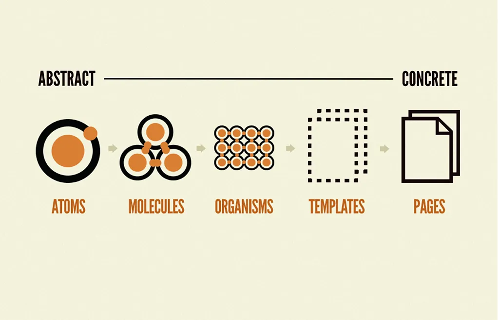
We are seeing a massive shift toward “Atomic Design” principles where the brand is no longer a document, but a set of data points.
AI and Generative Brand Systems
AI tools like Figma’s “Gen-UI” features now allow designers to generate entire layouts based on a design system’s tokens. If your brand is trapped in a PDF, these AI tools cannot “read” it.
To be ready for 2026, your brand must be machine-readable.
This means your colours, fonts, and components must be structured in JSON or CSS variables that AI-driven development tools can ingest.
The Rise of Brand Equity Systems™
At Inkbot Design, we have transitioned our clients toward the Brand Equity System™.
This approach treats every design asset as a financial asset. By systemising these assets, we ensure that the brand’s value is protected through every iteration.
We’ve seen a shift in UK-based service industries – from law firms to high-end hospitality – moving away from “the logo folder” and toward private, cloud-based design systems that sync directly with their marketing tech stack.
Contextual Localisation (UK/Ireland Focus)
For our clients across the UK, the “2026 shift” involves hyper-localised brand experiences.
A design system allows a brand to maintain its core “Britishness” while adapting UI patterns for different regional demographics or accessibility standards (such as WCAG 3.0).
By 2026, the “brand style guide” will be viewed as a relic of the print era. Modern brands are built on design tokens and component libraries that allow for instant, AI-assisted scaling across an infinite number of digital touchpoints.
The Technical Bridge: Design Tokens and Machine-Readable Brands
The fundamental difference between a Brand Style Guide and a Design System lies in machine readability.
A PDF is a document for humans; a Design Token is a data point for machines.
In the 2026 digital ecosystem, where a multi-platform presence is mandatory, your brand must be able to be “injected” into any framework, from Astro 6.0 to native mobile environments.
Understanding Design Tokens
Design Tokens are the smallest atoms of your visual identity.
They are name-value pairs that store attributes such as HEX Codes, Typography Scales, Spacing Increments, and Animation Durations. Instead of hard-coding a value like #002D72 into a stylesheet, developers use a token such as –color-primary-navy.
The JSON Workflow
By storing these tokens in a JSON format, Inkbot Design ensures that a brand update is a single-point intervention.
If the primary brand colour changes, the update is made in the master JSON file. This change then propagates automatically to:
- The Figma design environment.
- The React or Vue component library.
- The native iOS and Android applications.
- The marketing email templates.
Reducing CSS Bloat via Atomic Principles
A static guide often leads to “Style Duplication.” Without a system, developers frequently write new CSS for every page.
A Design System utilises Atomic Design principles, where small, reusable components (atoms) are combined to create complex layouts (organisms).
This methodology ensures that the browser downloads the necessary styles only once, significantly improving the efficiency of the “Document Object Model” (DOM).
With the rise of Headless CMS architectures and WPGraphQL, the ability to query design data as an API is transformative. A Design System allows your brand to exist as a “Design API,” ensuring that even third-party integrations and affiliate landing pages remain 100% on-brand without manual oversight.
The “Consistency is King” Fallacy
For decades, we’ve been told that “Consistency is King.” This is the myth that has kept the brand style guide alive. In 2026, consistency is no longer the goal; coherence is.
Why Consistency is Outdated
Strict consistency – making everything look the same – leads to rigid, boring brands that fail to adapt to different contexts.
A style guide often forces a “one size fits all” approach. A design system, however, allows for “logical flexibility.”
The Move to Coherence
Coherence means the brand feels the same, even if the elements change to suit the environment.
For example, your brand’s “vibe” on TikTok should be coherent with your corporate whitepaper, but they should not be “consistent” in their visual density or tone.
The Ehrenberg-Bass Institute research on “Distinctive Brand Assets” shows that it’s the uniqueness of your assets, not just their repetitive consistency, that drives growth.
A design system lets you define “Flex Zones” where the brand can breathe while locking down the “Core Assets” that must never change.
The Alternative: Stop aiming for a brand that is a straitjacket. Build a design system that acts as a playground with clear boundaries.
The Verdict
A brand style guide is a static map; a design system is a GPS. One shows you where you were when the map was printed; the other guides you to your destination in real-time, accounting for traffic and roadworks.
If your business is standing still, a style guide is fine. If you are scaling, hiring, or expanding into new digital territories, the upgrade is mandatory.
The transition from a guide to a system is the moment a “business with a logo” becomes a “brand with a future.”
The investment in a design system pays for itself through reduced developer hours, faster time-to-market, and the total protection of your brand equity. Do not wait for your brand to break before you fix the system.
Next Steps: To protect your company’s visual future, explore Inkbot Design’s Brand Equity System™ and see how we transform static identities into scalable growth engines.
You can also read our related posts on brand guidelines to see the evolution of these standards in real-time.
FAQs
How is a design system different from a brand style guide?
A brand style guide is a static document outlining visual rules, whereas a design system is a comprehensive framework including reusable code components, design tokens, and documentation. The former tells you how a brand looks; the latter provides the actual tools to build it.
How much does it cost to build a design system in 2026?
The cost of a design system varies based on the complexity of your product stack. For a mid-sized UK business, initial development typically costs between £15,000 and £50,000. This investment usually pays for itself within 12 months through significantly reduced development and design hours.
Can I use a design system with WordPress?
Yes, you can implement a design system within WordPress using tools like GeneratePress and GenerateBlocks. By defining global styles and reusable block patterns, you create a “Systematised WordPress” environment that functions similarly to a high-end headless design system.
Do small businesses really need a design system?
Small businesses benefit most from design systems because they lack the resources to police their brand manually. A design system acts as an automated “Brand Manager,” enabling even a small team to produce high-quality, consistent marketing materials without senior oversight.
What are design tokens?
Design tokens are the smallest atoms of a design system. They are name-value pairs (like color-brand-blue: #0000FF) that store visual design attributes. They allow you to update a brand’s look across web, mobile, and print simultaneously by changing a single data point.
When should I hire an agency to build my design system?
You should hire an agency when your internal team is struggling with “Component Sprawl” or when brand consistency is becoming a bottleneck for product launches. An expert agency like Inkbot Design can audit your existing assets and build a scalable system faster than an internal team.
Will a design system limit my creative freedom?
A design system does not limit creativity; it removes the repetitive “grunt work” of design. By automating buttons, typography, and spacing, your creative team can focus on high-level strategy and innovative campaign ideas rather than fixing margins.
How often should a design system be updated?
A design system is a living product and should be updated continuously. Most high-performing brands conduct a “System Audit” every six months to ensure components continue to meet user needs and that technical debt hasn’t begun to accumulate.
Is a design system the same as a UI Kit?
No, a UI Kit is a collection of graphic assets for designers, usually in Figma. A design system includes those assets but also adds the corresponding code, governance rules, and brand strategy documentation for the entire organisation to use.
What is the first step in moving to a design system?
The first step is a “Component Audit.” Take screenshots of every button, header, and form field across your digital products. When you see the massive inconsistency, you will have the internal “buy-in” needed to invest in a unified system.
