Corporate Colour Palette Systems: Building One That Manages Risk
A corporate colour palette system is not a set of swatches chosen to look trustworthy. In regulated and conservative sectors it is a controlled visual system that manages risk, supports accessibility, and stays usable across every high-stakes communication. Here is how to build one that holds up beyond the boardroom.


On this page8 min left
A palette that earns nods in the boardroom can fail on every screen it lands on.
That gap – between colours that look credible in a presentation and colours that work in a live payment journey, a signed engagement letter, or a client portal – is where most regulated-sector rebrands lose ground.
WebAIM's February 2026 analysis of one million home pages found that 83.9% contained low-contrast text below WCAG AA thresholds, with an average of 56.1 detected errors per page.
Most of those brands signed off their colours in a deck. None of them tested where it mattered.
If you lead a professional services firm heading into a rebrand, this is the decision to get right early, because it is expensive to reverse.
Colour sits at the centre of professional services branding, and it is the one identity choice a partner group will argue about for weeks and then never revisit – even when it stops working.
What colour palette systems actually are
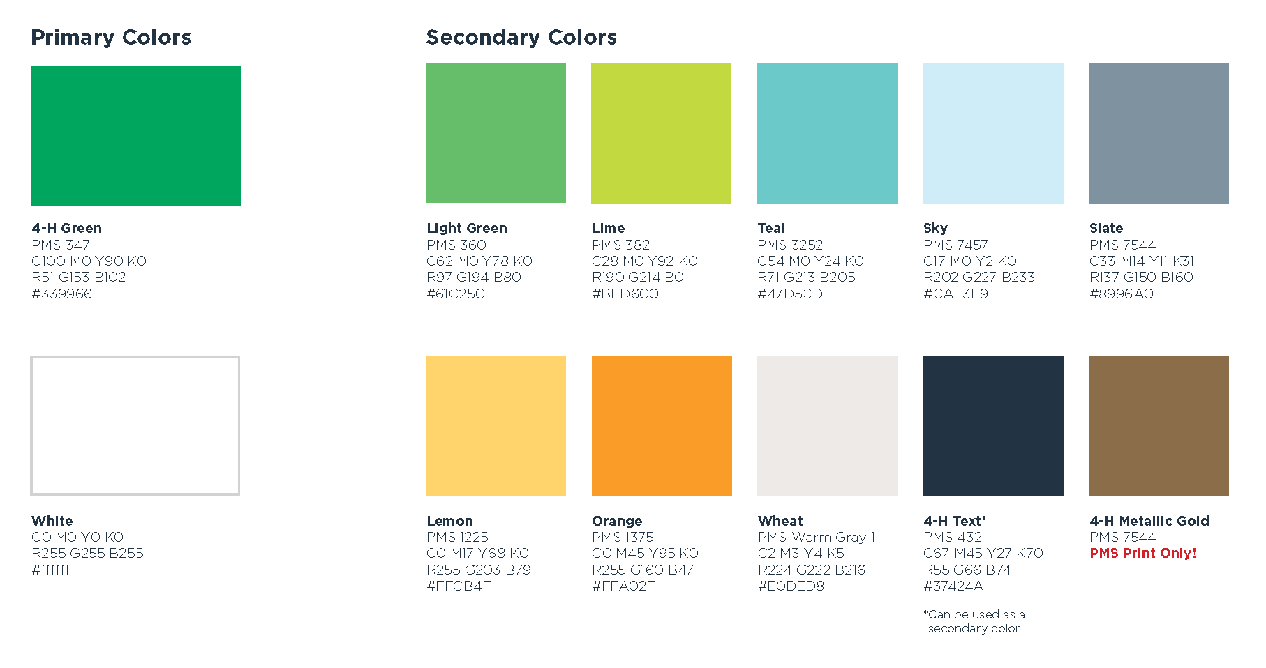
A colour palette system is a defined set of brand colours with assigned roles, contrast rules, and usage constraints that govern where each colour may appear. It is not a mood board. It is not a row of swatches with nice names.
It is the thing that stops your teal ending up as 11px body text on a client portal because someone in marketing thought it looked fresh.
- A palette system defines the permitted role of every colour, not just its HEX value.
- It specifies contrast-tested combinations, so approved pairings stay readable in real use.
- It constrains misuse, which is what keeps a brand consistent once dozens of people start applying it.
A colour palette system is a defined set of brand colours with assigned roles, contrast rules, and usage constraints governing where each colour may appear.
This is a facet of building a coherent brand identity system, and it directly relates to how a firm governs its broader design system as the brand scales across teams.
Why palettes that pass in the boardroom fail on the screen

The failure is rarely the colour itself. It is the absence of a defined role.
A palette is chosen based on how the primary navy and the accent teal look side by side on a foamboard under gallery lighting at A2 size. Then the teal gets used for 11px body text on a white client portal, and it drops below a readable contrast ratio the moment it leaves the deck.
WCAG 2.2 Success Criterion 1.4.3 sets the measurable threshold: a minimum contrast ratio of 4.5:1 for normal text and 3:1 for large text.
The trap for brand teams is treating that as a verdict on the whole palette. It is not. The requirement applies to text and images of text – not to every colour in a logo, background, or decorative element.
A brand colour can fail comprehensively as body text and still work perfectly as a large heading, a background fill, or an accent rule.
So the solution is rarely to delete the colour. It is to define where it is allowed to go.
“A brand colour that fails as body text is not broken. It is a colour whose role has not been defined. The palette does not need fewer colours. It needs each colour assigned to the jobs it can actually do, and barred from the ones it cannot.”
That distinction – role definition over colour deletion – is the single most useful reframe in this entire process, and it is the one competing content skips.
WebAIM found low contrast to be the most common detected failure across those million pages, present on 83.9% of them. This is not a fringe edge case. It is the default outcome when colour is approved for appearance and never assigned a role.
How to build a colour palette system that manages risk
You build it in a defined order, and the order is the value. Most guides list the colours; the working method assigns the roles.
1. Fix the core identity colours first – usually two.
These carry recognition. They are what a client should associate with the firm before reading a word. Keep this set small. A 12-partner tax practice does not need nine brand colours; it needs two that are unmistakably theirs and a disciplined system around them.
2. Define functional roles, not decorative tiers.
Instead of “primary, secondary, accent,” assign each colour to a job: body text colour, heading colour, background colour, interactive/link colour, alert or status colour. A colour can hold more than one role – but every role it holds must be contrast-tested for that specific use.
3. Test every approved combination against WCAG 2.2 thresholds.
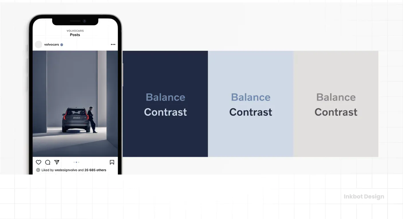
Not the swatches in isolation – the pairings. Navy-on-white, white-on-navy, teal-on-grey: each combination either clears 4.5:1 for body text and 3:1 for large text, or it is restricted to roles where it does. Record the pass/fail per pairing. That record is the system.
4. Remove colour as the sole carrier of meaning.
The National Eye Institute states that about 1 in 12 men have colour vision deficiency. A financial dashboard that signals gains and losses using green and red alone is unreadable to a meaningful slice of its own users. Pair colour with a symbol, a label, a sign, or a position – always.
5. Specify the same colours across RGB and CMYK.
A navy that reads as authoritative on screen can turn muddy or purple in print if the CMYK build is not defined and locked. For a firm whose engagement letters and pitch documents still go out on paper, this is not a technicality.
The judgement – the part no checklist covers – is deciding which roles a borderline colour keeps.
Take a teal that clears 3:1 but misses 4.5:1. Delete it, and you lose the accent the partners chose. Keep it everywhere, and you ship unreadable body text.
The call: teal is approved for large headings, section rules, and chart fills, and barred from any text under 18px. That single ruling saves the colour and the compliance position at once. Which way you rule depends on where the firm actually communicates – and that is what experience buys.
What accessibility law now expects of a regulated brand
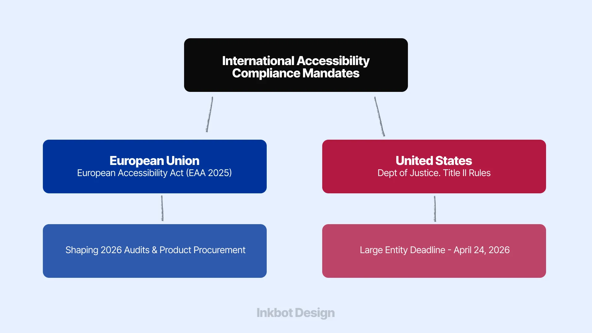
Accessibility has moved from a design courtesy toward a market-access and compliance concern, and two developments in the last year sharpen the point for regulated firms.
In October 2025, WCAG 2.2 was approved as ISO/IEC 40500:2025.
The World Wide Web Consortium (W3C) described the approval as making WCAG 2.2 an international standard that countries and organisations can formally adopt. Be careful how you read that: becoming an ISO standard does not automatically create a new legal obligation for every organisation.
The legal effect depends on jurisdiction, sector, and the legislation that applies to you. What it does is make “our brand colours are just a bit low-contrast” far harder to wave away as an aesthetic preference.
The European Accessibility Act entered into force on 28 June 2025. It covers products and services, including areas directly relevant to regulated sectors – banking, payment services, and digital interfaces.
For a firm serving European clients, a low-contrast accent that once seemed like a minor visual compromise becomes operationally significant the moment it appears in an online banking interface, an authentication flow, or a customer service platform.
The European Accessibility Act increases the commercial importance of accessible digital design for organisations serving European customers. It does not mean every colour decision is automatically a legal breach. It does mean an inaccessible digital experience is harder to dismiss as a cosmetic imperfection.
You will reasonably object that your firm is not a bank and does not run a payment interface. Fair. But WebAIM's 2026 figures – 95.9% of a million home pages carrying at least one automatically detected WCAG failure – show how routinely this gets missed even by organisations with resources.
The second objection: “We'll fix accessibility later, after the visual identity is signed off.”
That sequence is exactly the error. Retrofitting contrast onto an approved palette means either weakening colours that the partners already emotionally own or accepting combinations you know will fail.
Build the constraint first, and the palette that emerges is one you never have to defend against its own users.
The Verdict
A colour palette designed to “look trustworthy” solves the wrong problem.
The regulated-sector brand that holds up is the one built as a controlled system – with colours assigned defined roles, contrast-tested pairings, so it never rests on colour alone, and fidelity across screen and print.
Every figure in this piece points the same way: the 83.9% failure rate, the 4.5:1 threshold, the 1-in-12 who cannot rely on colour, the ISO and EAA shifts. Appearance was never the hard part. Usable under pressure is.
None of this ends the argument over the teal. It relocates it – from “do we like it” to “where is it allowed to work,” which is a question evidence can actually settle.
Do one thing today: take your current or proposed palette and test its most-used text pairing against a 4.5:1 contrast ratio. If it fails, you have found the first role to define.
To find every place your brand is losing commercial ground (colour included), request a free Brand Equity Audit™, a structured diagnostic that shows exactly where the leaks are and what to do about them.
Frequently asked questions
What is a colour palette system?
A colour palette system is a defined set of brand colours with assigned roles, contrast rules, and usage constraints. It specifies which colour is used where – body text, headings, backgrounds, alerts – and where each is forbidden, so a brand stays consistent and readable once many people apply it.
How many colours should a corporate palette have?
Fewer than most firms expect. Two core identity colours carry recognition; a small set of functional and neutral colours handles the rest. What matters is not the count but whether every colour has a defined, contrast-tested role. Nine undefined colours are worse than three governed ones.
What contrast ratio do brand colours need to meet?
WCAG 2.2 requires 4.5:1 for normal text and 3:1 for large text. This applies to text, not every colour in a logo or palette. A colour can fail as body text yet work as a heading, background, or accent – the fix is to define its role, not delete it.
Is it true that colour drives most brand recognition?
That claim circulates widely but is rarely sourced reliably, so treat it with caution. What is measurable: WCAG contrast thresholds, WebAIM's finding that 83.9% of a million home pages had low-contrast text, and that about 1 in 12 men have colour vision deficiency. Build on evidence, not folklore.
Does accessibility law affect our rebrand?
Possibly, depending on your sector and market. The European Accessibility Act entered into force on 28 June 2025, covering banking, payments, and digital interfaces. WCAG 2.2 became ISO/IEC 40500:2025 in October 2025. Neither makes every colour choice a breach, but both make inaccessible design harder to justify as cosmetic.