
WCAG 3.0 Typography Standards for Websites in 2026
Static accessibility is a lie that web designers have told themselves for two decades.
If you think meeting a 4.5:1 contrast ratio makes your site “accessible” in 2026, you are mistaken. The industry is shifting from rigid, binary checks under WCAG 2.1 to fluid, perceptual models under WCAG 3.0.
This shift costs businesses money because they build for “checklists” rather than human eyes.
According to the Nielsen Norman Group (NN/g), the world-renowned UX research consultancy, users with low vision or cognitive impairments represent nearly 20% of the global population.
Ignoring the evolution of Typography basics doesn’t just invite legal risk; it actively erodes your brand equity by making your content a chore to consume.
- APCA replaces 4.5:1; WCAG 3.0 uses Lc scores factoring font size, weight and polarity for perceptual contrast.
- Variable Fonts and the Grade axis enable optical weight adjustments without layout reflow, supporting adaptive legibility across modes.
- Cognitive accessibility demands spacing ratios, left-aligned text, open apertures and large x-height to reduce processing and fatigue.
- WCAG 3.0 compliance affects legal risk, brand equity and search visibility; maintain APCA audits, variable fonts and living accessibility statements.
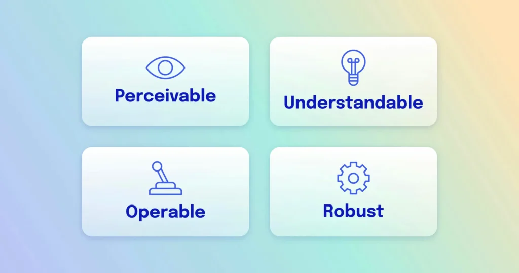
What Are WCAG 3.0 Typography Standards?
WCAG 3.0 Typography Standards, also known as Project “Silver,” are a new set of W3C guidelines designed to make web content more accessible through a points-based system that prioritises the Accessible Perceptual Contrast Algorithm (APCA).
Key Components:
- APCA Integration: A replacement for the old 4.5:1 ratio that accounts for font weight and size.
- Visual Continuity: Standards for how text behaves across different devices and ambient light conditions.
- Cognitive Load Reduction: Guidelines for line length, spacing, and font choice to assist neurodivergent users.
WCAG 3.0 typography uses the APCA (Accessible Perceptual Contrast Algorithm) to determine readability based on spatial frequency, font weight, and context, replacing static contrast ratios.
The Death of the 4.5:1 Contrast Ratio
The old math is broken. For years, designers relied on a simple formula to ensure text was “contrasty” enough against a background.
This formula ignored how modern screens actually work. Statista reports that mobile device usage now accounts for over 58% of global web traffic, where glare and varying brightness levels make static ratios useless.
WCAG 3.0 introduces APCA, which calculates contrast based on how the human eye perceives light rather than just the difference between two hex codes.
This means a thin font needs a higher contrast value than a thick, bold font to be considered accessible. If you aren’t auditing your site against these new perceptual standards, you are likely failing users on high-resolution OLED displays where “perfect” blacks and “blinding” whites create different legibility issues.
The Mathematical Science of Lightness Contrast (Lc)
The transition to WCAG 3.0 is defined by a move from simple linear math to the complex, non-linear perceptions of the human visual system.
The Accessible Perceptual Contrast Algorithm (APCA) does not merely measure the distance between two points of light; it also calculates how the human brain interprets them based on their size and environment.
The Failure of Luminance-Only Models
In previous iterations of web standards, contrast was calculated as a binary function of relative luminance. This method failed because it assumed the human eye is a linear sensor. It is not.
The human eye is significantly more sensitive to contrast in mid-tones than in highlights or shadows. This phenomenon, known as Weber’s Law, suggests that the perceived change in a stimulus is proportional to its initial intensity.
Understanding Lc Scores
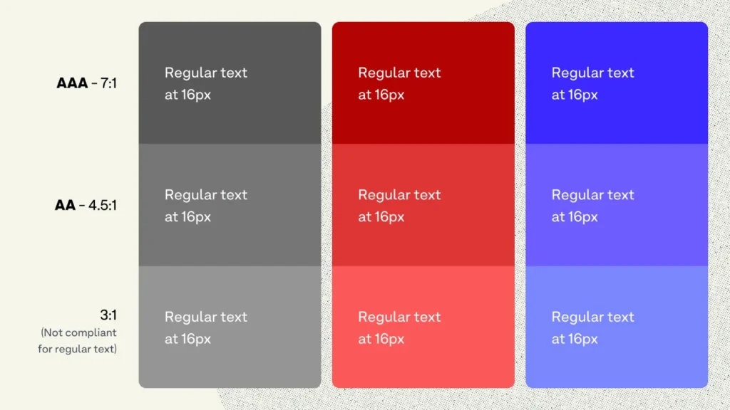
The result of an APCA calculation is an Lc value (Lightness Contrast). Unlike the old 4.5:1 ratio, Lc values are signed (+/-) to indicate whether the text is light-on-dark or dark-on-light.
- Lc 90: The gold standard for body text. This level ensures readability for users with low vision impairments (approx. 20/40 visual acuity).
- Lc 75: The minimum for content text is at least 18px (regular weight) or 14px (bold weight).
- Lc 60: Permissible for large headings (above 24px) or bold sub-headers.
- Lc 45: The absolute floor for decorative text or non-essential UI elements.
Spatial Frequency: Why Size Changes Everything
Spatial frequency refers to how “crowded” the visual information is. In typography, small, thin fonts have high spatial frequency. The brain requires significantly higher contrast to resolve high-frequency information.
APCA addresses this by mandating that, as font size decreases, the required Lc value must increase. This prevents the common “Compliance Rot” where a thin grey font passes a 4.5:1 check but remains physically unreadable for an ageing user.
Why Dark Mode Needs Different Rules

In WCAG 2.1, the 4.5:1 ratio was the same regardless of whether you had white text on black or black text on white. This was a fundamental error in visual physics. The human eye perceives light text on a dark background as larger and “bolder” than it actually is. This is known as the halation effect or irradiation.
APCA’s Polarity Awareness
The Accessible Perceptual Contrast Algorithm is “polarity-aware.” It recognises that the Lc value for white text on a black background must be calculated differently to prevent the text from appearing blurry or overwhelming.
- For Dark Mode: To achieve a comfortable Lc 75, you may actually need a thinner font weight than you would in light mode.
- In Light Mode, the eye requires more “ink” (weight) to resolve letter shapes against a bright background.
By acknowledging the physics of the human eye and how it interacts with backlit displays, WCAG 3.0 provides a more nuanced and comfortable reading experience for the millions of users who now prefer dark mode for its battery-saving and eye-strain-reducing benefits.
Why APCA is the New Technical Requirement
APCA provides a “Lc” (Lightness Contrast) value. Unlike the old system, which gave you a “Pass” or “Fail,” APCA gives you a score indicating which font sizes and weights are safe to use with that specific colour combination.
According to a study by the Baymard Institute, an independent e-commerce research organisation, 27% of users have abandoned a checkout process because the text was too difficult to read on their specific device.
APCA solves this by forcing designers to consider the “spatial frequency” of text – essentially how the size and stroke width interact with the background.
WCAG 3.0 marks the end of the “one-size-fits-all” accessibility model. By adopting the APCA standard, web designers must move beyond static contrast ratios and embrace a dynamic typographic system that accounts for the physical properties of modern screens and the biological reality of human vision.
The Myth of the “Safe” Sans-Serif
For years, the industry “best practice” was to use sans-serif fonts for all digital body text. The argument was that serifs became “muddy” on low-resolution screens. This is a 2012 solution for a 2026 world.
The Sans-Serif Superiority Myth
This advice is now harmful. High-density Retina and 4K displays render serif fonts with incredible precision. In fact, for long-form reading, serifs provide horizontal “paths” for the eye, which can actually reduce cognitive fatigue.
The myth that you must use a sans-serif font for accessibility causes brands to lose their visual distinctiveness without gaining any real legibility benefits.
Modern font combinations in 2026 should focus on “x-height” and “aperture” (the openings in letters like ‘e’ and ‘c’) rather than the presence or absence of serifs. A serif font with a large x-height and open apertures is significantly more accessible than a geometric sans-serif with tight spacing.
Variable Fonts: The Technical Backbone of Adaptive Legibility
Modern web design in 2026 relies on Variable Fonts (W3C OpenType Font Variations) to meet the fluid requirements of WCAG 3.0.
Unlike static font files, variable fonts allow infinite adjustments along specific axes, providing a level of typographic control previously impossible.
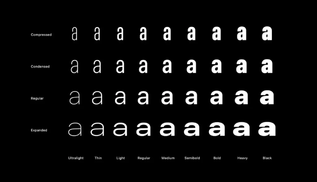
The Power of the Grade (GRAD) Axis
The most critical development for 2026 accessibility is the Grade axis.
Unlike the Weight axis, which increases the thickness of letters and thus changes the horizontal space they occupy (causing “text reflow”), the Grade axis increases the optical weight of the strokes without changing the character width.
- Use Case: When a user switches their device to “Dark Mode,” the light text on a dark background often appears to “glow” or “bleed” (a phenomenon called irradiation).
- The Fix: By using a negative Grade adjustment in your CSS, you can slightly thin the letters to maintain the perceived weight and Lc value without breaking the layout.
Micro-Adjustments via CSS
Implementing WCAG 3.0 requires developers to move beyond static font-weight: 400. In 2026, the standard practice is to use custom properties to tie font weight directly to the viewport and user preferences.
Beyond Vision: Typography for the Neurodivergent Mind
While WCAG 3.0 and APCA focus heavily on visual contrast, the “Silver” project also introduces more robust guidelines for cognitive accessibility.
This acknowledges that for 15-20% of the population, including those with dyslexia, ADHD, and autism, the challenge is not just “seeing” the text, but “processing” it.
Reducing Cognitive Load through Spacing
High cognitive load occurs when the brain has to work too hard to track a line of text.
WCAG 3.0 recommends specific typographic ratios to alleviate this:
- Line Spacing (Leading): Should be at least 1.5 times the font size.
- Paragraph Spacing: Should be at least 2 times the font size.
- Letter Spacing (Tracking): Should be at least 0.12 times the font size.
The Role of Aperture and X-Height
For readers with dyslexia, letters that look similar (like ‘b’ and ‘d’, or ‘p’ and ‘q’) are easily confused. Typography with open apertures – the white space inside letters like ‘c’, ‘e’, and ‘s’ – helps the brain distinguish character shapes more quickly.
Similarly, a large x-height (the height of the lowercase ‘x’ relative to uppercase letters) makes lowercase letters more legible, which is essential as they form the “word shapes” we recognise while reading.
Avoidance of Full Justification
One of the most significant barriers to information clarity is fully justified text. This creates “rivers of white space” running through paragraphs, which can be incredibly distracting for neurodivergent users.
WCAG 3.0 reinforces the requirement for left-aligned text (in LTR languages) to provide a consistent starting point for the eye at the beginning of every line.
Solving the Tension Between Design and Accessibility

A common fear among Creative Directors is that WCAG 3.0 will “kill” brand creativity, forcing every website to look like a government portal. This is a misconception.
In fact, APCA offers more design freedom than the old system.
Flexibility in Colour Choice
Because APCA factors in font weight, you can use lighter, more “on-brand” colours that would have failed the old 4.5:1 ratio, provided you increase the font size or weight.
- Old Way: “We can’t use our brand’s light blue for headings because it fails accessibility.”
- 2026 Way: “We can use our brand’s light blue for headings if we set the size to 32px and use a Semi-Bold variable weight to hit our Lc 60 target.”
This shift allows for a sophisticated visual identity that doesn’t compromise on trustworthiness or user inclusion. Accessibility is the canvas, not the cage.
| Technical Aspect | The Wrong Way (Amateur) | The Right Way (Pro) | Why It Matters |
| Contrast Logic | Static 4.5:1 Ratio | APCA (Lc) Values | Accounts for font weight and screen physics. |
| Font Scaling | Fixed px or em units | Fluid Typography (clamp) | Ensures legibility on 4-inch vs 32-inch screens. |
| Weight Control | Standard Bold/Regular | Variable fonts | Allows micro-adjustments for better readability. |
| Line Length | Random-width containers | Max 70–80 characters | Reduces “eye strain” and tracking errors. |
| Hierarchy | Visual bolding only | Semantic HTML Tags | Essential for LLM extraction and screen readers. |
The State of WCAG 3.0 Typography in 2026
The most significant development in the last 18 months is the widespread adoption of Variable Fonts as an accessibility tool.
In late 2024, Adobe and Google updated their font rendering engines to allow for “Grade” axes. Grading allows a font to become slightly thicker without changing its width or “reflowing” the text.
Why Accessibility is the Key to Search Visibility
In 2026, the way information engines and AI crawlers interpret your content is intrinsically linked to how accessible it is. A site that is built with semantic integrity – using correct HTML tags for headings, lists, and tables – provides a clear map for automated systems to extract “knowledge.”
The Link Between Legibility and Citations
If your typography is clear and your information architecture is logical, users stay on the page longer.
These user signals tell search platforms that your content is high-quality. Furthermore, as AI Overviews become the primary way people find answers, these engines prioritise content that is structured for easy parsing.
- Semantic Tags: Using <h1> through <h6> correctly isn’t just for screen readers; it’s for the LLMs (Large Language Models) that categorise your expertise.
- Alt-Text and Tables: Providing text-based alternatives for visual data ensures that your “Information Gain” is indexed and attributed to your brand.
By building for WCAG 3.0, you aren’t just helping human users; you are optimising your “Cost of Retrieval” for the machines that determine your online success.
Legal Risks and Brand Equity
As of 2026, the legal framework surrounding web accessibility has shifted from “voluntary adoption” to “strict enforcement.”
In the United Kingdom, the Public Sector Bodies (Websites and Mobile Applications) Accessibility Regulations and the Equality Act 2010 have been updated to reflect the transition toward WCAG 3.0 standards.
Global Harmonisation of Standards
The European Accessibility Act (EAA), which came into full force in mid-2025, now mandates that all digital products and services – including e-commerce, banking, and transportation – meet modern legibility standards.
In the United States, the Department of Justice (DOJ) has increasingly cited APCA and perceptual contrast in ADA Title III settlements, viewing the old 4.5:1 ratio as an insufficient measure of true accessibility.
Impact on Brand Equity
For a business, accessibility is no longer just a checkbox for the legal department; it is a pillar of brand equity.
- Market Reach: By ignoring WCAG 3.0, you are effectively blocking 20% of your potential customers from using your services.
- Trustworthiness: A site that is difficult to read is perceived as less professional and less trustworthy.
- Search Visibility: In 2026, major search engines will use user experience signals that directly correlate with legibility. If users “bounce” because of poor contrast or high cognitive load, your online authority will diminish.
The Audit Trail
To protect against litigation, firms must maintain a “living” accessibility statement. This document should detail the use of APCA testing, the implementation of variable fonts, and the schedule for regular human-centric audits.
Relying on automated “overlay” tools is not a valid legal defence; in fact, many 2026 court cases have ruled that overlays are a discriminatory barrier in themselves.
The Verdict
WCAG 3.0 is not a set of suggestions; it is a fundamental redesign of how we communicate on the web. The transition to APCA and the integration of variable fonts represent the move from “static design” to “responsive legibility.”
If you continue to build websites using the 4.5:1 ratio as your only guide, you are intentionally excluding a massive segment of your audience and leaving your brand vulnerable to the next wave of SEO and legal updates.
Accessibility in 2026 is a competitive advantage. Brands that master the nuances of perceptual contrast and adaptive typography will rank higher, convert better, and build stronger equity.
To ensure your brand stays ahead of these shifts, explore Inkbot Design’s Brand Equity System™ and see how we integrate technical SEO with world-class design.
FAQs
What is the main difference between WCAG 2.1 and WCAG 3.0 typography?
WCAG 3.0 replaces the static 4.5:1 contrast ratio with the Accessible Perceptual Contrast Algorithm (APCA). While WCAG 2.1 uses simple luminance calculations, WCAG 3.0 accounts for font size, weight, and how the human eye perceives light on modern screens.
What is APCA in web accessibility?
APCA stands for Accessible Perceptual Contrast Algorithm. It is a new method for calculating text contrast that provides a more accurate representation of how humans perceive readability. It generates an “Lc” score that dictates safe font sizes for specific colour pairings.
Why is the 4.5:1 contrast ratio being replaced?
The 4.5:1 ratio is based on outdated display technology and does not account for font weight. Thin fonts often meet the 4.5:1 requirement while remaining unreadable, a flaw that the new WCAG 3.0 APCA model specifically addresses.
Are variable fonts required for WCAG 3.0 compliance?
Variable fonts are not strictly required, but they are a primary tool for achieving the fluid accessibility standards of 2026. They allow designers to adjust font weight and grade without changing the layout, which is essential for adaptive legibility.
How does font size affect WCAG 3.0 contrast scores?
In WCAG 3.0, font size is a direct variable in the contrast calculation. Under the APCA model, smaller text requires a significantly higher lightness contrast (Lc) value than larger text to be considered accessible.
What is “spatial frequency” in typography?
Spatial frequency refers to how close the strokes of a letter are to each other. High spatial frequency (thin, tightly packed letters) is harder for the eye to process, requiring higher contrast scores under the new WCAG 3.0 guidelines.
Should I stop using sans-serif fonts for accessibility?
No, but you should stop assuming they are inherently better. Modern high-resolution screens render serif fonts perfectly. Accessibility is now determined by x-height, aperture, and stroke weight rather than the presence of serifs.
How do I test my site for WCAG 3.0 typography?
You should use tools that support the APCA algorithm rather than standard hex-ratio checkers. Look for auditors that provide Lc values and test your site across various font weights and screen types.
Does WCAG 3.0 affect SEO ranking?
Yes. Google’s “Helpful Content” and “User Experience” signals increasingly prioritise sites that meet modern accessibility standards. Proper semantic structure and legibility are core components of how AI engines crawl and cite your content.
When should I update my site to WCAG 3.0?
You should begin the transition now. While WCAG 2.1 remains the current legal baseline in many jurisdictions, the “Silver” (3.0) standards represent the best practices for 2026 and are already being adopted by major tech platforms.
