
Serif vs Sans-Serif Fonts: Which is Right for Your Brand?
The serif vs sans-serif debate is the most fundamental and, frankly, most overanalysed choice in branding. Entrepreneurs tie themselves in knots over it, often settling on a choice because “it just looks nice.”
That’s a terrible way to make a six-figure decision.
As someone who has spent over a decade helping business owners avoid choosing a font that could undermine their message, I can tell you this: your font choice is 90% of your brand’s voice. Get it wrong, and you’re screaming “amateur” when you mean “authoritative,” or “clinical” when you mean “caring.
This isn’t just about picking a pretty typeface. It’s the absolute core of your typography in branding. Before we dive in, let’s clear the air.
- “Serifs are for print, sans-serifs are for web.” This is dangerously outdated advice. It was true in 1998 on 800×600 monitors. On today’s 4K and Retina displays, it’s a lazy rule that ignores context.
- Choosing a “trendy” font. Trends die. A brand identity is supposed to last. Choosing a font because it’s popular on Canva this week is like building your office in a field that’s known for flooding.
- Ignoring legibility. The number one job of a font is to be read. If you pick a beautiful script or a wafer-thin sans-serif that vanishes at 12px, you’ve failed.
- The “Ransom Note” Effect. Using too many fonts. You need two, maybe three. A headline, a body text, and an accent. That’s it. Stop.
This guide isn’t a history lesson. It’s a business decision framework. We’ll set aside the academic fluff and focus on what truly matters: psychology, context, and customer perception.
- Your font choice defines ~90% of your brand voice; pick to match intended perception, not personal taste.
- Match type to context: sans-serifs for scalable digital readability, serifs for print long-form and heritage signals.
- Pair fonts with contrast (headline vs body), limit to 2–3 faces, and prioritise legibility at all sizes.
Part 1: The Blunt Definitions
You can’t make a choice if you don’t know the players. The difference is mechanically simple, but the impact is enormous.
Serif Fonts: The Voice of Tradition

A serif is the small line or “foot” attached to the end of a stroke in a letter. Think of them as anchors.
The most classic example is Times New Roman. You’re looking at serifs. They originated from Roman stonemasons, who would paint brush strokes before chiselling, and the flared brush mark became part of the letter.
- Key Examples: Garamond, Bodoni, Caslon, Minion
- The Vibe: Authoritative, traditional, established, formal, reliable, academic, expensive.
- The Psychology: Serifs feel grounded. They imply history and legacy. They are the font equivalent of a stone university building, a leather-bound book, or a tailored wool suit. They command respect.
Sans-Serif Fonts: The Voice of Modernity
“Sans” is French for “without.” A sans-serif font is one without those little feet. The letters have clean, simple endings.
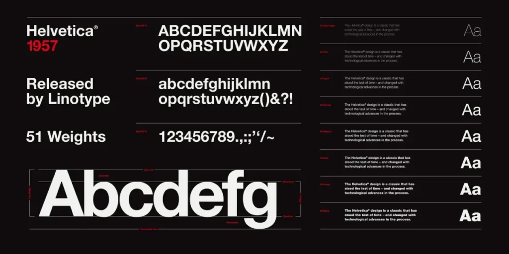
The most famous (and infamous) example is Helvetica. It’s clean, neutral, and was the face of 20th-century modernism.
- Key Examples: Roboto, Open Sans, Montserrat, Lato, Arial
- The Vibe: Modern, clean, minimalist, approachable, direct, informal, tech-forward.
- The Psychology: Sans-serifs fonts feel efficient. They are clean, direct, and unadorned. They are the font equivalent of a glass-and-steel skyscraper, a smartphone interface, or minimalist Scandinavian furniture. They feel current.
Part 2: The Psychological Impact on Your Customer
This is the most critical part of the article. Your font choice is a subconscious signal to your audience. You are telling them who you are before they read a single word.
A client in the finance sector once wanted to use a bubbly, rounded sans-serif font. It felt “friendly” to them. But to a customer, it subconsciously screamed “not serious,” “no experience,” and “I wouldn’t trust them with my money.” We switched to a solid, stable serif, and the entire perception of their brand collateral shifted from “fin-tech startup” to “trusted financial advisor.”
I’ve built this table to help you map font styles to brand personalities.
The Brand Personality Spectrum
| Brand Trait | Serif Leaning | Sans-Serif Leaning |
| Authority | High. (Law firms, universities, broadsheet news) | Low-to-Mid. (Tech startups, friendly blogs, direct-to-consumer) |
| Modernity | Low. (Heritage, timeless, classic) | High. (Digital, forward-thinking, new) |
| Formality | High. (Formal invitations, financial reports, luxury goods) | Low. (Casual, conversational, everyday value) |
| Approachability | Low-to-Mid. (Respected, established, sometimes distant) | High. (Friendly, direct, accessible) |
| Pace | Slow. (Considered, academic, thoughtful) | Fast. (Quick, scannable, efficient) |
| Price Point | Perceived as more expensive or premium. | Perceived as more accessible or mass-market. |
A quick glance at this table shows there is no “better” option. There is only the “right” option for your intended message.
- A law firm using a sans-serif might feel too approachable, undermining their perceived authority.
- A tech startup using a heavy serif might feel old, slow, and out of touch.
Part 3: Legibility vs. Readability (The Great Technical Debate)

Business owners (and too many designers) use these terms interchangeably. They are not the same, and the difference dictates where and how you should use your chosen font.
- Legibility: Can I distinguish one letter from another? This is about the character’s clarity. Is that an ‘l’ or an ‘i’? An ‘e’ or a ‘c’? Legibility is crucial for logos, signage, and any text that is visible at a glance.
- Readability: How easy is it to read blocks of text? This refers to the page’s layout and flow. It’s a combination of font choice, size, line height (also known as leading), and line length. Readability is critical for websites, blogs, books, and reports.
Debunking the “Print vs. Web” Myth
The old rule was: Serifs are for print, sans-serifs are for web.
The logic was that on low-resolution screens, the tiny serifs would “fuzz” together, making the letters harder to read (resulting in poor legibility). The serifs, however, were excellent in print, as they create a “line” for the eye to follow, thereby improving readability in books and newspapers.
This is now false.
With high-PPI (Pixels Per Inch) displays—like your smartphone, modern laptop, and 4K monitor—serifs render perfectly cleanly. Websites like The New York Times, Medium, and countless high-end blogs use serif fonts for their body text, and it’s perfectly readable.
The real rule for the modern era is about context and scalability.
- For Digital Body Text: Sans-serifs are still the safer, more conservative choice. Why? Because your text needs to be readable on a 32-inch 4K monitor and a 5-year-old 7-inch Android tablet with a lower-res screen. A simple, clean sans-serif (like Roboto or Open Sans) is a workhorse that scales beautifully and remains clear under almost any condition.
- For Print Body Text: Serifs still reign supreme for long-form reading. If you’re publishing a 300-page book or a dense annual report, a serif like Garamond will cause significantly less eye fatigue for the reader.
Part 4: Real-World Brand Analysis
Let’s look at who uses what and why it works. This isn’t theoretical; it’s a series of conscious, expensive branding decisions made by global companies.
Real-World Brand Deconstruction
| Brand | Font Type | Analysis (Why it Works) |
| Rolex | Serif (Custom) | Why: It projects heritage, luxury, precision, and timelessness. It feels permanent. A sans-serif would make their watches feel like a disposable tech gadget. |
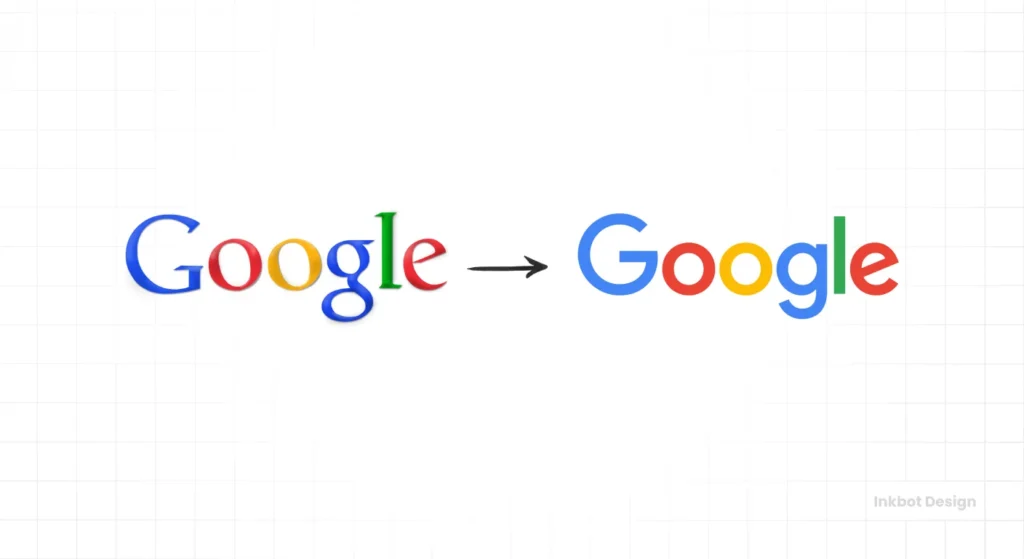
| Sans-Serif (Product Sans) | Why: It signals approachability, simplicity, modernity, and accessibility. It’s clean, scalable, and digital-first. A serif would make them feel like an old library, not the world’s information index. | |
| Vogue | Serif (Didot) | Why: The high-contrast, elegant, “ball-terminal” serif is high fashion. It screams sophistication, luxury, and editorial authority. It would be absurd in any other style. |
| Netflix | Sans-Serif (Netflix Sans) | Why: Bold, direct, scalable, and cinematic. It needs to be instantly readable on a massive TV screen, a tiny phone, and a website preview. It’s about content delivery, and the font gets out of the way. |
| Zara | Serif (Custom) | Why: A fascinating case. They switched to a high-fashion serif to elevate their brand perception, moving them from “cheap fast-fashion” to “accessible luxury.” This was a purely psychological move. |
| Spotify | Sans-Serif (Gotham) | Why: Friendly, modern, and cool. It feels like a contemporary music brand—accessible, user-friendly, and mainstream. A serif would feel stuffy and out of touch. |
Part 5: A Practical Decision Framework (Choosing for Your Brand)
Enough theory. Here is a step-by-step framework to help you make your choice. Stop asking “serif or sans-serif?” and start asking these questions instead.
Step 1: Define Your Brand Personality (In 3 Words)
Are you:
- Authoritative, Trusted, Premium? -> Lean Serif.
- Modern, Friendly, Simple? -> Lean Sans-Serif.
- Elegant, Sophisticated, Artisanal? -> Lean Serif.
- Tech-forward, Fast, Efficient? -> Lean Sans-Serif.
- Bold, Confident, Industrial? -> (Wait for it…) Lean Slab Serif.
Step 2: Consider Your Primary Use Case
Your font needs to work where you live. A brand is built on touchpoints. Where will most people see your font?

Use Case 1: Your Logo
This is about legibility and personality. Your logo must be identifiable when it’s 16px (a “favicon” in a browser tab) and 16 feet wide (a trade show banner).
- Serif Logos: Works well for brands built on personal expertise or heritage. Think tailors, law firms, wealth managers, or artisan bakeries. The risk? They can look fussy or “blurry” when very small.
- Sans-Serif Logos: The modern standard for a reason. They are clean, scalable, and bold. Perfect for tech, retail, and any brand that needs to live on an app icon. The risk? They can be generic.
This choice is the absolute cornerstone of your brand identity. Getting it wrong means starting from scratch in two years. It’s not the place to experiment without expert guidance.
Use Case 2: Your Website (Body Text)
This is about readability and scalability. Someone will be reading this on a phone while walking.
- Serif Body Text: Can feel very editorial and sophisticated (like Medium). It positions your blog as a “publication.” You must choose a font designed for screens (such as Merriweather or Lora) and provide it with generous line spacing.
- Sans-Serif Body Text: The safer, more accessible choice. A workhorse like Open Sans, Lato, or Roboto is designed to be effortlessly readable on any screen, at any size. It’s clean, it’s fast, and it just works.
Use Case 3: Your Print & Packaging
This is about readability (long-form) or impact (at-a-glance).
- Long-Form (Reports, Books): Serif is the clear winner. Decades of research and publishing have proven that serifs reduce eye strain over hundreds of pages.
- Packaging (On a Shelf): Sans-serif often wins. It’s bolder, cleaner, and easier to read from 10 feet away in a crowded supermarket aisle.
- Business Cards/Letterhead: This is your opportunity to utilise your primary brand’s (logo) font. Either works.
Use-Case Decision Matrix
| Use Case | Primary Goal | Serif Option | Sans-Serif Option | My Advice |
| Logo | Uniqueness & Legibility | Heritage, Luxury, Law | Tech, Modern, Minimalist | Test it. Does it work in a tiny favicon and on a van? |
| Website (Headlines) | Personality & Hook | Editorial, Classic Blog | Modern, Clean, Direct | Either works. Pair it in contrast to your body text. |
| Website (Body Text) | Readability & Scalability | Risky, but possible (e.g., Medium) | Winner. Much safer for all screen sizes and resolutions. | |
| Print (Book/Report) | Long-form Readability | Winner. The serifs create a line for the eye to follow. | Tiring for 300 pages. Good for captions or sidebars. | |
| Packaging | Shelf Impact & Clarity | Niche (e.g., artisan goods) | Winner. Bolder, cleaner, and easier to read at a glance. |
Part 6: The “In-Betweeners” (Slab, Semi & More)
The world isn’t just black and white. Showing you the “secret menu” proves you’re not just getting the beginner’s guide.
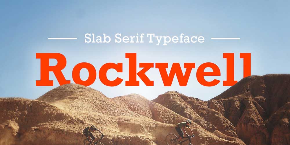
- Slab Serifs: These are the heavyweight cousins. They have thick, blocky, “slab” serifs.
- Vibe: Confident, bold, industrial, sturdy, “old-school cool.”
- Use Case: Ideal for logos and headlines that need to convey a sense of established strength. Think car brands (Volvo), electronics (Sony, in the past), or a modern coffee shop.
- Semi-Serifs (or Flared): A hybrid. The strokes “flare” out but don’t form a full, distinct serif.
- Vibe: Modern but with a touch of humanity or tradition. (e.g., Optima).
- Use Case: A great compromise when a full serif feels too old, but a standard sans-serif feels too cold.
Part 7: The Art of Font Pairing

You will never use just one font. You’ll have a headline font (for personality) and a body font (for readability).
The golden rule of pairing is: Contrast, Don’t Conflict.
If you pair two fonts that are too similar (such as two slightly different sans-serifs), it doesn’t look intentional—it appears to be a mistake.
- The Classic Pair (Safe & Effective):
- Headline: Bold Serif (e.g., Playfair Display)
- Body: Regular Sans-Serif (e.g., Open Sans)
- Why it works: This gives you the personality and authority of a serif, with the clean readability of a sans-serif. It’s the classic “magazine” or “editorial blog” look.
- The Modern Pair (Clean & Minimal):
- Headline: Extra-Bold Sans-Serif (e.g., Montserrat)
- Body: Regular/Light Sans-Serif (e.g., Lato)
- Why it works: The contrast comes from weight, not style. This is the look of tech companies, startups, and minimalist brands. It’s exceptionally clean and professional.
- The “Reverse” Pair (Stylish & Confident):
- Headline: Bold Sans-Serif (e.g., Roboto Condensed)
- Body: Regular Serif (e.g., Merriweather)
- Why it works: This is what sites like Medium do. It’s a confident move that prioritises long-form reading comfort while using the headline for clean, simple navigation.
My Final Take: Stop Thinking “Vs”
Stop thinking “Serif vs Sans-Serif” and start thinking “What is my brand’s core message?“
Your font is a tool. It’s the outfit your words wear. You wouldn’t wear a tuxedo to a beach party, and you wouldn’t wear shorts to a black-tie gala.
- Choose a Serif if your brand is built on trust, heritage, authority, expertise, and a premium feel. (Finance, law, luxury goods, high-end editorial, artisan craft).
- Choose a Sans-Serif font if your brand is built on modernity, simplicity, approachability, speed, and
technology. (Tech, startups, mass-market retail, digital services, minimalist brands).
The worst mistake you can make is choosing a font in a vacuum. The second-worst is letting your personal preference (“I just think it’s neat”) override what your customers need to feel to trust you.
Choosing a font is just the first step. Building a cohesive, powerful visual identity around it—with the right colours, spacing, and logo—is the real work.
If you’re finding that your font choice isn’t aligning with your business goals, it may be time to reassess your brand identity as a whole. We build brands from the ground up, starting with this exact typographic foundation.
If you’re ready to stop guessing and build a brand that speaks the right language, request a quote and let’s talk.
FAQs: Serif vs Sans-Serif
Is a serif or sans-serif font better for a logo?
It depends entirely on your brand’s personality. A serif logo feels traditional and authoritative (like a law firm). A sans-serif logo feels modern and clean (like a tech startup). The most important factor is legibility at all sizes.
What is the best font for a website?
For body text (paragraphs), a sans-serif font like Open Sans, Roboto, or Lato is the safest and most readable choice across all devices. For headlines, you can use a bold sans-serif or a stylish serif for contrast.
Are serifs easier to read?
In long-form print (like a book or report), yes. The serifs are believed to guide the eye along the line, reducing fatigue. On digital screens, this advantage is debatable, and a clean sans-serif is often considered more readable.
Can I use both serif and sans-serif fonts?
Yes! This is called font pairing and is highly recommended. The golden rule is to use one for headlines (personality) and the other for body text (readability). This creates a strong, professional visual hierarchy.
What is a “slab serif”?
A slab serif is a type of serif font with very thick, blocky, “slab-like” serifs. They feel very sturdy, confident, and industrial. Examples include Rockwell, Arvo, and Roboto Slab.
Why do luxury brands use serif fonts?
Serif fonts convey a sense of history, heritage, elegance, and a premium price point. Brands like Rolex, Vogue, and Dior utilise them to subconsciously convey that their products are timeless, sophisticated, and rooted in a long tradition of quality.
Why do tech companies use sans-serif fonts?
Sans-serif fonts communicate modernity, simplicity, efficiency, and approachability. Tech companies like Google, Netflix, and Spotify utilise them to convey a sense of current, clean, and easy-to-use design.
Is Times New Roman a good font for branding?
No. While it’s a classic serif, it has been overused to the point of being generic. It’s the default font for so many applications (like Microsoft Word) that it looks like a lack of a brand decision.
What’s the difference between legibility and readability?
Legibility is about the clarity of individual letters (can you tell ‘e’ from ‘c’?). This is vital for logos. Readability is about the comfort of reading a block of text. This is vital for websites and books.
What is the most popular sans-serif font?
Historically, Helvetica and Arial have been the most widely used. For modern web design, Roboto (Google’s font), Open Sans, and Lato are massively popular due to their excellent readability and free availability on Google Fonts.
