Which of These 7 Typography Trends for 2026 Will Last?
This is a practical guide for entrepreneurs and business owners.
People who don’t have time to waste on design fads that will look dated in 18 months.
The goal here isn’t to chase what’s popular. It’s to understand what’s happening in typography and make a wise, strategic decision that serves your brand for the next five years, not the next five minutes.
Forget fashion. We’re talking about business.
- Prioritise brand strategy: choose typography that communicates your brand’s value and endures for years, not chasing short-lived fads.
- Use AI-generated type sparingly for single, high-impact headlines; avoid for body copy or primary logos due to legibility issues.
- Match trend to purpose: chunky serifs for warmth, hyper-minimal sans for clarity, high-contrast serifs for luxury.
- Variable fonts are a practical web tool—use for responsive functionality, not for distracting animated effects.
- Limit fonts to two or three; typography must work with colour, imagery, and messaging to build a coherent, lasting brand.
The One Rule Before You Pick Any Trend: Strategy First.
Before we get into the fonts, let’s establish the rule that matters more than any trend: your typography must serve your brand strategy. Full stop.
A font isn’t just decoration. It’s the tone of voice for your written communication. It tells customers if you’re serious or playful, luxurious or affordable, modern or traditional. Picking a typeface because it’s “trending” on Pinterest is like hiring a salesperson without checking if they can speak your customers’ language.
Your font is a long-term commitment. It builds recognition and trust over time. Don’t treat it like a t-shirt you can swap out next season.
Here’s a quick litmus test. Look at a font and ask yourself: “Does this feel like my business? Does it communicate the value we promise?”
If the answer is a hesitant “maybe,” then ditch it. No matter how trendy it is.
Trend 1: AI’s Weird, Wonderful, and (Sometimes) Unusable Creations
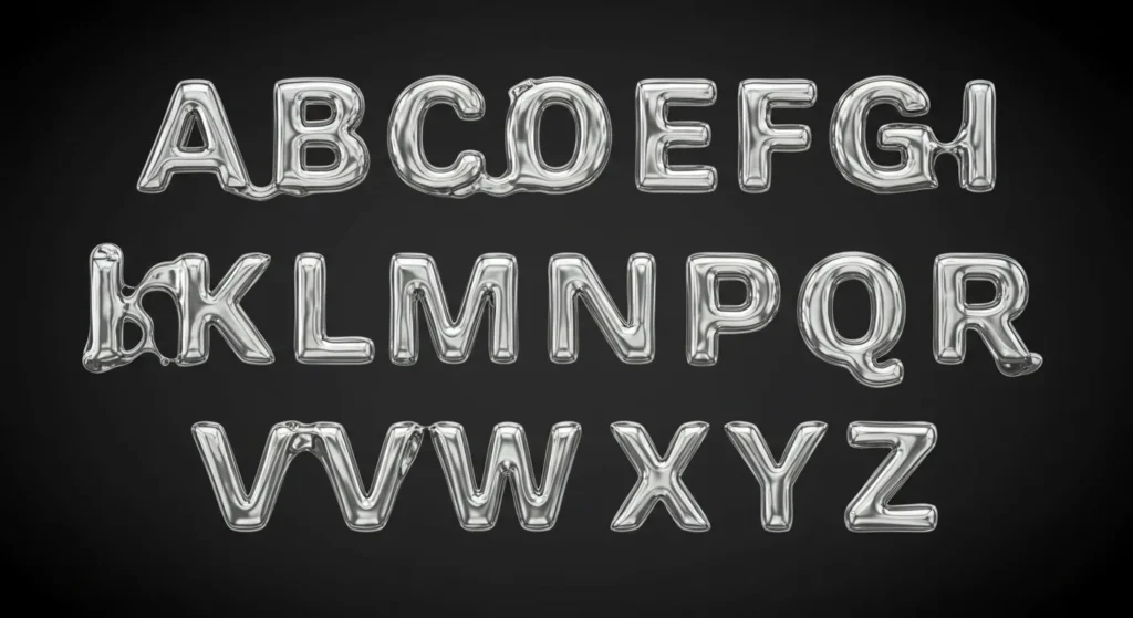
What it is.
This trend involves using AI tools to generate unique, often surreal, unpredictable letterforms. Designers feed prompts into platforms like Adobe Firefly or Midjourney (“create a typeface made of liquid chrome and moss”) and the machine spits out something no human would have conceived.
Why is it happening?
Two reasons. First, the technology is now ridiculously accessible. Anyone can experiment. Second, it directly reacts against years of soulless, geometric perfection in design. We’re craving something with a spark of chaos and unpredictability.
How do you use it (without looking ridiculous)?
The key is to use it for one-off, high-impact pieces, not your primary brand typeface. Think of it as a single-use spice, not the flour for your bread. It’s perfect for a social media campaign, an event poster, or a stunning hero image on your website that only features one or two words.
The Red Flag.
My first pet peeve: legibility. Most AI-generated text is a complete nightmare to read. It’s art, not communication. If you use it for anything more than a single headline word, you’ve failed the most basic typography job. Never use this for body copy or your logo’s primary lockup.
Trend 2: The Return of the Chunky, Friendly Serif
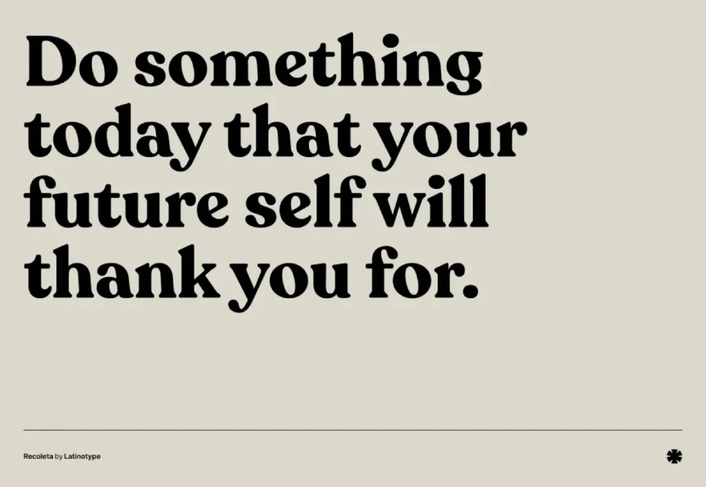
What it is.
We’re seeing a massive resurgence of bold, rounded serifs with a heavy dose of 70s nostalgia. These aren’t your stuffy, academic serifs. They’re warm, approachable, and have soft, almost bubbly edges. Think of Cooper Black’s more sophisticated, modern cousin, like the popular Recoleta typeface.
Why is it happening?
It’s a backlash against the cold, corporate, and often sterile feel of minimalist sans-serif that has dominated the tech world. Brands want to feel more human, trustworthy, and comforting. This style evokes a sense of nostalgia for a simpler time. We saw brands like Chobani and Mailchimp pioneer this friendly, approachable look years ago, and now it’s becoming mainstream.
How to use it.
This style is perfect for consumer-facing brands that want to feel friendly, organic, and established. It works brilliantly for businesses in food and beverage, lifestyle blogs, subscription box services, and wellness products. It signals warmth and quality without being pretentious.
The Red Flag.
This brings me another annoyance: “Retro for Retro’s Sake.” This font style can feel gimmicky and inauthentic if your brand has no connection to that warm, nostalgic vibe. Using a 70s-inspired font for a cutting-edge B2B SaaS company just creates confusion. It has to feel earned.
Trend 3: Deconstruction & The “Polite” Glitch
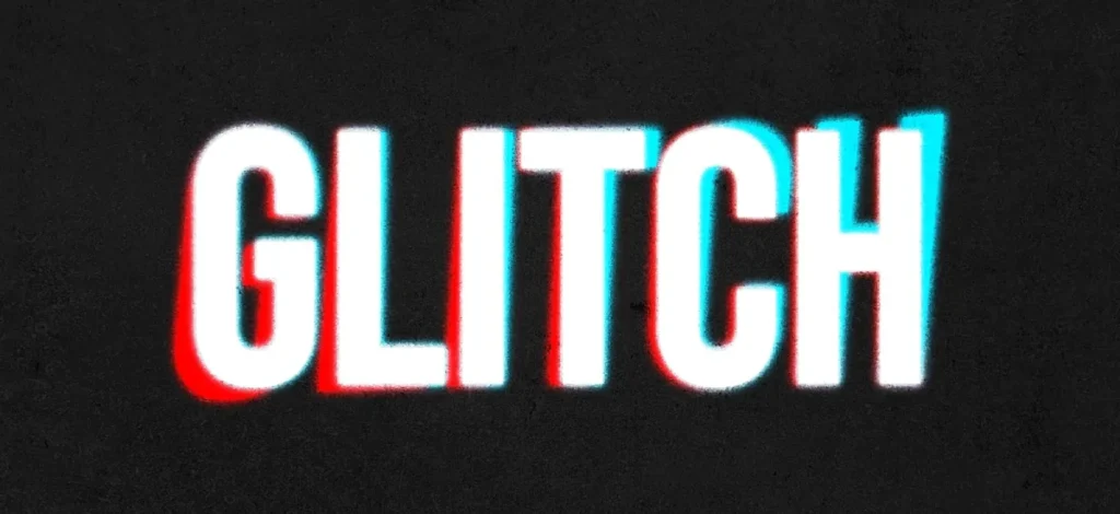
What it is.
This is typography that’s intentionally broken. We’re talking about distorted letterforms, subtle digital glitch effects, cut-up characters, and misaligned baselines. It’s the ghost of the ’90s deconstructionist design pioneered by figures like David Carson, but it was made more refined and palatable for the corporate world.
Why is it happening?
It’s a visual metaphor for our chaotic, digital-first world. It’s a shortcut for brands to signal that they are “edgy,” “innovative,” or “unconventional.” A little bit of controlled chaos can grab attention in a feed full of pristine, boring design.
How to use it.
Use this with extreme caution. It’s best for brands in industries that value disruption: tech startups, electronic music, streetwear fashion, or arts festivals. Apply it sparingly to a single headline on a website or a social media graphic to create a focal point. A little goes a very, very long way.
The Red Flag.
It can easily look like a mistake. Your expensive new website seems broken if it isn’t executed with high skill and intention. This trend also has a very short shelf life. What looks edgy today will look dated and cheesy tomorrow. It’s a high-risk, low-reward choice for most businesses.
Trend 4: Hyper-Minimalism’s Last Stand
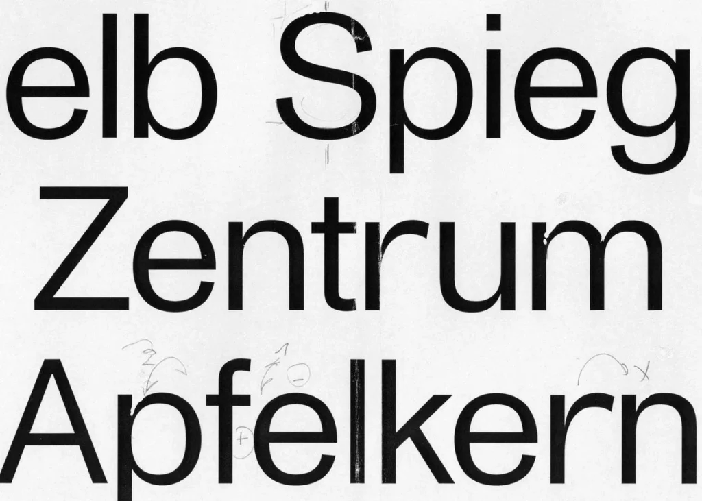
What it is.
Clean, geometric, almost characterless sans serifs. This is the logical evolution of Helvetica, stripped of any personality. Typefaces like Inter, SF Pro, or Monument Grotesk are built for maximum clarity and neutrality. The design is so quiet it’s almost invisible.
Why is it happening?
In a world of constant visual noise, simplicity feels honest and secure. It’s the default aesthetic for tech, finance, and healthcare. A neutral typeface implies efficiency, transparency, and trustworthiness. It doesn’t try to sell you anything but presents the information.
How to use it.
This is a workhorse. It’s ideal for corporate brands, SaaS products, financial services, or any business that must communicate clarity and security. Use it when your message is more important than the personality of your font. It’s a safe, professional, and timeless choice.
The Red Flag.
It can be profoundly boring. A minimalist sans-serif puts all the pressure on the other elements of your brand identity. Without excellent use of colour, spacing, layout, and messaging, your brand will look generic and utterly forgettable. It’s the plain white t-shirt of typography—it only looks good if everything else is on point.
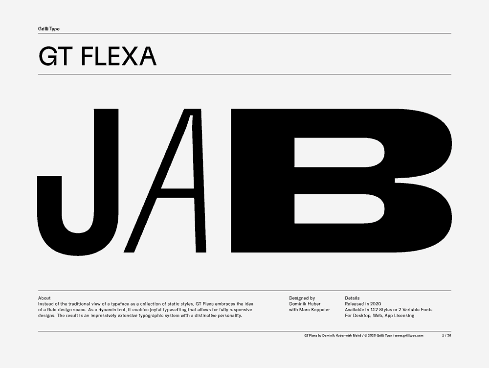
Trend 5: Soft, Organic, and Inky Serifs
What it is.
This trend features serifs and sans serifs that have a distinct human touch. You’ll see slightly irregular edges, soft terminals where strokes end, and a general feeling of warmth, as if drawn with a pen. It’s the antithesis of geometric perfection, with type from foundries like Grilli Type or OH no Type Co. leading the way.
Why is it happening?
It’s part of a larger cultural push for authenticity, sustainability, and craftsmanship. Consumers are tired of mass-produced perfection and are drawn to brands that feel personal, thoughtful, and handmade. This typographic style is a shortcut to conveying that ethos.
How to use it.
This is fantastic for artisanal brands. Think small-batch coffee roasters, independent bakeries, ceramicists, sustainable skincare lines, and personal brands like coaches or authors. It communicates that a real human is behind the product, adding a layer of trust and quality.
The Red Flag.
This style can look unprofessional or “crafty” without a strong, clean layout and high-quality photography. Don’t use a font that looks like it was drawn by hand if your brand promise is precision engineering or high-tech performance. The context has to match the letterforms.
Trend 6: Truly Dynamic & Variable Type
What it is.
This is more of a technological shift than a purely aesthetic one. Variable fonts are single font files that contain a whole range of styles. A designer can fluidly change the text’s weight, width, and slant without needing separate font files. This allows the type to adapt seamlessly to different screens and contexts.
Why is it happening?
The technology, supported by major players like Google and Adobe, is finally mature and widely supported in web browsers. It’s an efficient solution for responsive web design, ensuring that typography is continually optimised for the user’s device. It also opens up new, subtle creative possibilities.
How to use it.
Right now, this is primarily a tool for sophisticated web design. Use a variable font to create more refined and responsive typographic layouts that don’t break on different screen sizes. For example, a headline can be slightly narrower on a mobile phone to fit perfectly. It can also be used for subtle interactive animations, like text that gets bolder on hover.
The Red Flag.
Herein lies my biggest pet peeve. Just because you can make text wiggle, morph, and stretch doesn’t mean you should. Most kinetic typography is distracting, adds no value, and screams “amateur.” Use the power of variable fonts for functional responsiveness first, not for cheap animated tricks. It was a technical tool before it became a creative toy.
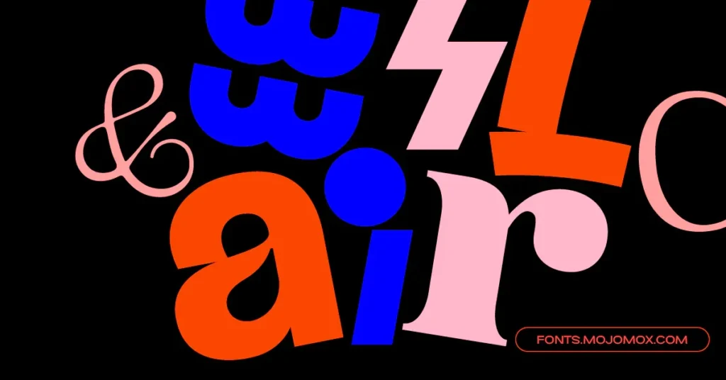
Trend 7: High-Drama Contrast
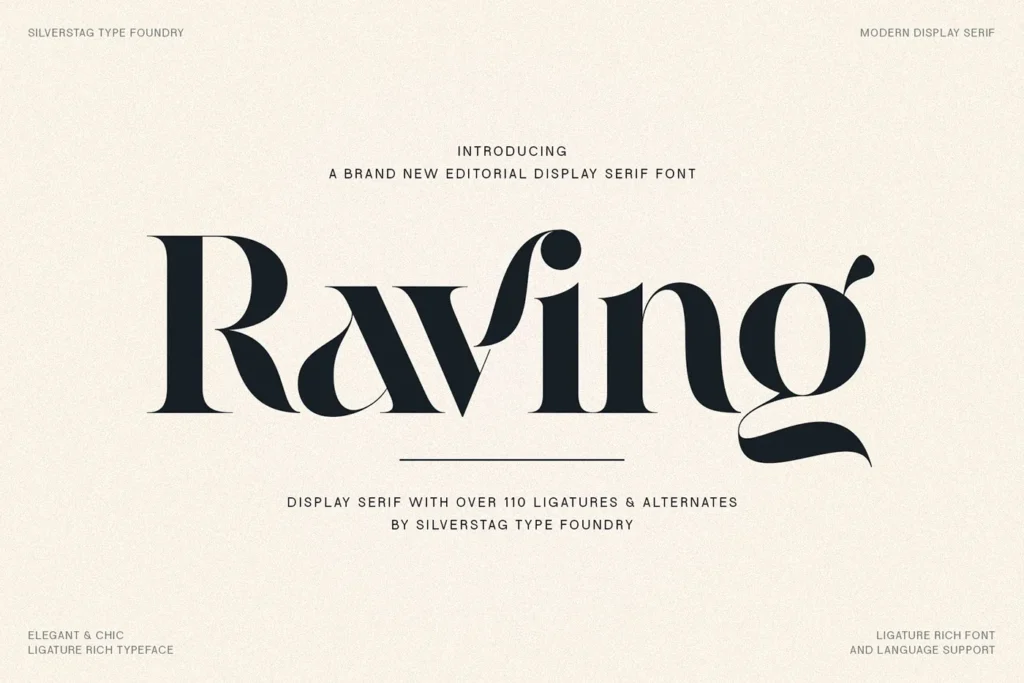
What it is.
This is the return of the elegant, high-fashion serif. These are modern Didone-style typefaces with extreme, razor-sharp contrast between the thick and thin strokes. Think of classics like Bodoni and Didot, or modern web-friendly equivalents like Playfair Display. This style is all about drama, sophistication, and luxury.
Why is it happening?
As many brands lean into friendly, rounded, or minimalist styles, a high-contrast serif’s sharp, dramatic elegance stands out. It’s an immediate and unmistakable signal of a premium or luxury positioning. It cuts through the noise with an air of confidence and exclusivity.
How to use it.
You have to use it big. This style is for headlines, logotypes, and short, impactful statements. It’s perfect for luxury retail, high-end real estate, fashion editorials, perfumeries, and any brand that wants to project an image of elegance and refinement.
The Red Flag.
This style is entirely useless for small text. The ultra-thin horizontal strokes disappear at small sizes, making it illegible. Using a Didone font for a paragraph of text on your website is a cardinal sin of typography. It’s like wearing a ball gown to go for a jog—utterly unfit for purpose.
So, Which Trend Should You Actually Use?
None of them. Or any of them.
The answer depends entirely on your brand strategy. Stop asking “What’s popular?” and ask “What communicates our value?” “What will resonate with our specific customer?” and “What will still look good in 2030?”
Here’s a simple breakdown to help you think:
| If Your Brand Is… | Consider a Trend Like… | Because It Communicates… |
| Friendly, Warm, Nostalgic | #2 Chunky, Friendly Serif | Approachability, Comfort, Honesty |
| Secure, Modern, Trustworthy | #4 Hyper-Minimalist Sans Serif | Clarity, Efficiency, Professionalism |
| Luxurious, Elegant, Exclusive | #7 High-Drama Contrast | Sophistication, Quality, Prestige |
| Artisanal, Human, Authentic | #5 Organic & Inky Serifs | Craftsmanship, Personal Touch |
| Edgy, Innovative, Disruptive | #3 Deconstructed & Glitch | Modernity, Unconventional Thinking |
| Experimental, Attention-Grabbing | #1 AI-Generated Type (Sparingly!) | Creativity, Novelty, Spectacle |
Your Brand Is More Than a Font
Choosing a great typeface is a critical step. But it’s just one piece of a much larger puzzle. The proper font creates a powerful and coherent brand when combined with the right colours, imagery, and messaging. The font alone can’t do all the work.
If you’re trying to figure out how typography fits into your bigger picture, that’s what a solid brand identity strategy is for. It’s the blueprint that ensures every decision you make—from your font to your Instagram posts—is working together to build a brand people trust.
Ready to stop guessing and build a brand that lasts? Request a quote and let’s have a real conversation.
Frequently Asked Questions About Typography Trends
What is the most significant typography trend for 2026?
There isn’t one “biggest” trend, but the overall movement is away from rigid minimalism and towards more character and warmth. Trends like Chunky Serifs (#2) and Organic Letterforms (#5) reflect a broad desire for brands to feel more human and approachable.
How often should I change my brand’s font?
As infrequently as possible. Your primary brand typeface should be a long-term asset. You should only consider changing it during a comprehensive rebrand, which most businesses only need to do every 7-10 years.
Can I use a free font like Google Fonts for my business?
Absolutely. Many free fonts, like Inter, Playfair Display, or Poppins, are high-quality, professional workhorses. The key isn’t the price, but whether the font is a strategic fit for your brand’s personality and is licensed for commercial use (which most Google Fonts are).
What is the difference between a serif and a sans-serif font?
A serif is a small line or stroke attached to the end of a larger stroke in a letter. Times New Roman is a classic serif. A sans-serif font does not have these strokes (“sans” is French for “without”). Helvetica and Arial are familiar sans-serif fonts.
Is kinetic typography a good idea for my website?
Generally, no. While my pet peeve is its overuse, subtle and meaningful text animation can occasionally enhance user experience. However, 95% of the time, bouncing or morphing text is just a distraction that slows down your site and annoys users. Prioritise clarity over novelty.
How many fonts should I use for my brand?
Stick to a maximum of two or three. Typically, you need one distinct font for headlines (a display face) and one highly readable font for body copy. A third can be used for accents like captions or call-to-actions. Using more than that makes your brand look chaotic and unprofessional.
What is a “variable font”?
It’s a single font file that behaves like multiple fonts. It contains a range of weights (light to bold), widths (condensed to extended), and other attributes, allowing for fine-tuned typographic control, especially on the web.
Is it bad if my brand doesn’t follow any trends?
Not at all. It’s often a very good thing. Choosing a classic, timeless typeface that perfectly matches your brand strategy is always smarter than chasing a trend that doesn’t fit. Enduring brands are built on strategy, not fads.
What makes a font “legible”?
Legibility refers to how easily one can distinguish individual letters from each other. Factors include precise letter shapes, generous spacing (kerning and tracking), a tall x-height (the height of a lowercase ‘x’), and uncomplicated designs. A font like Helvetica is highly legible; an elaborate script font is not.
Should my logo font be the same as my website font?
Not necessarily. Your logo can use a custom or highly stylised typeface unique to your brand. However, your website’s body text must prioritise readability above all else. You often use a “logotype” for the logo and a related or complementary “workhorse” font family for everything else.
