Digital Brand Colour Drift: How to Control It Instead of Chasing It
Digital brand colour drift happens because a hex code is not a guaranteed visual outcome across devices. The fix is not the same colour everywhere. It is a tolerance system that locks recognition-critical colours, lets supporting colours flex, and defines what failure looks like before your rebrand ships to production.
 By Stuart Crawford
 Reviewed by Tabitha Ayers
10 min read
On this page10 min left
A £12m accountancy firm signed off on a new brand blue on a calibrated studio monitor.
Six weeks later, the same blue was live: slightly purple on the partners' iPhones, washed-out on the reception display, and a shade too green in the printed report the audit team left on a client's desk.
Nobody had made a mistake. The hex code was identical everywhere. The colour was not.
That gap – between the value you specify and the colour a viewer actually sees – is digital brand colour drift. And most rebrands treat it as a fault to eliminate when it is a variable to govern.
The firms that get colour right during a rebrand do not chase identical output across every screen. They decide, in advance, which colours must stay fixed and which are allowed to breathe.
That decision is the difference between a brand system and a hex code with ambitions. If you want the wider frame for how colour functions as a structural asset, our work on brand colour architecture sets it out.
How Digital Brand Colour Drift Is Controlled
Digital brand colour drift is controlled by classifying each brand colour by how much of your recognition depends on it, then assigning each a tolerance – a defined limit for how far it may shift across devices before it counts as a failure. Recognition-critical colours are locked tightly. Supporting colours are allowed to have managed variation.
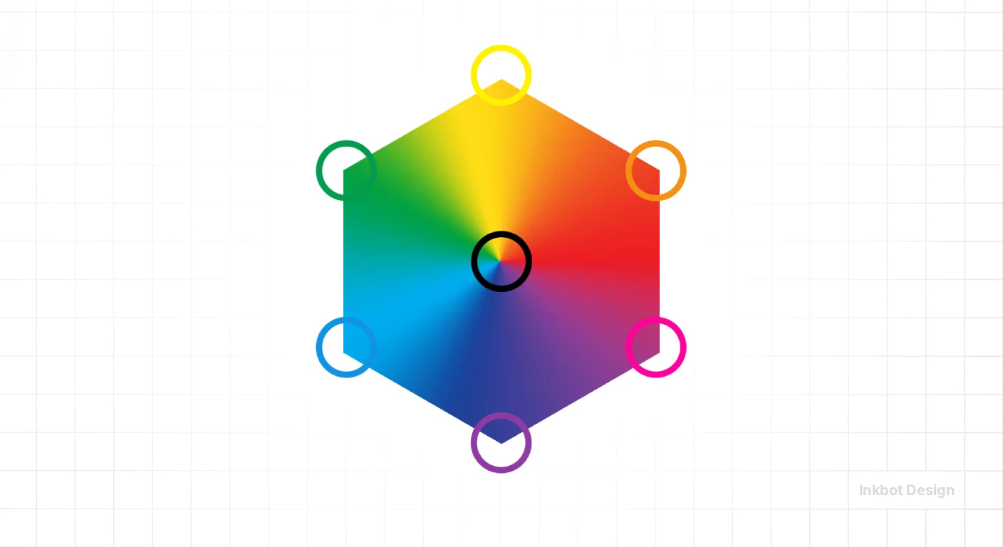
- A hex value is not a guaranteed visual outcome; the device's colour profile, gamut, calibration state and display technology all change how it renders.
- Wide-gamut displays can make the same RGB values appear more saturated than intended – a primary reason brand colours look “off” on newer P3-capable screens.
- Colour drift is partly a hardware-and-viewing problem, not only a brand-guideline problem.
Digital brand colour drift is managed by classifying each brand colour by recognition-criticality, then setting a defined tolerance for how far each may shift across devices.
What You Need in Place First
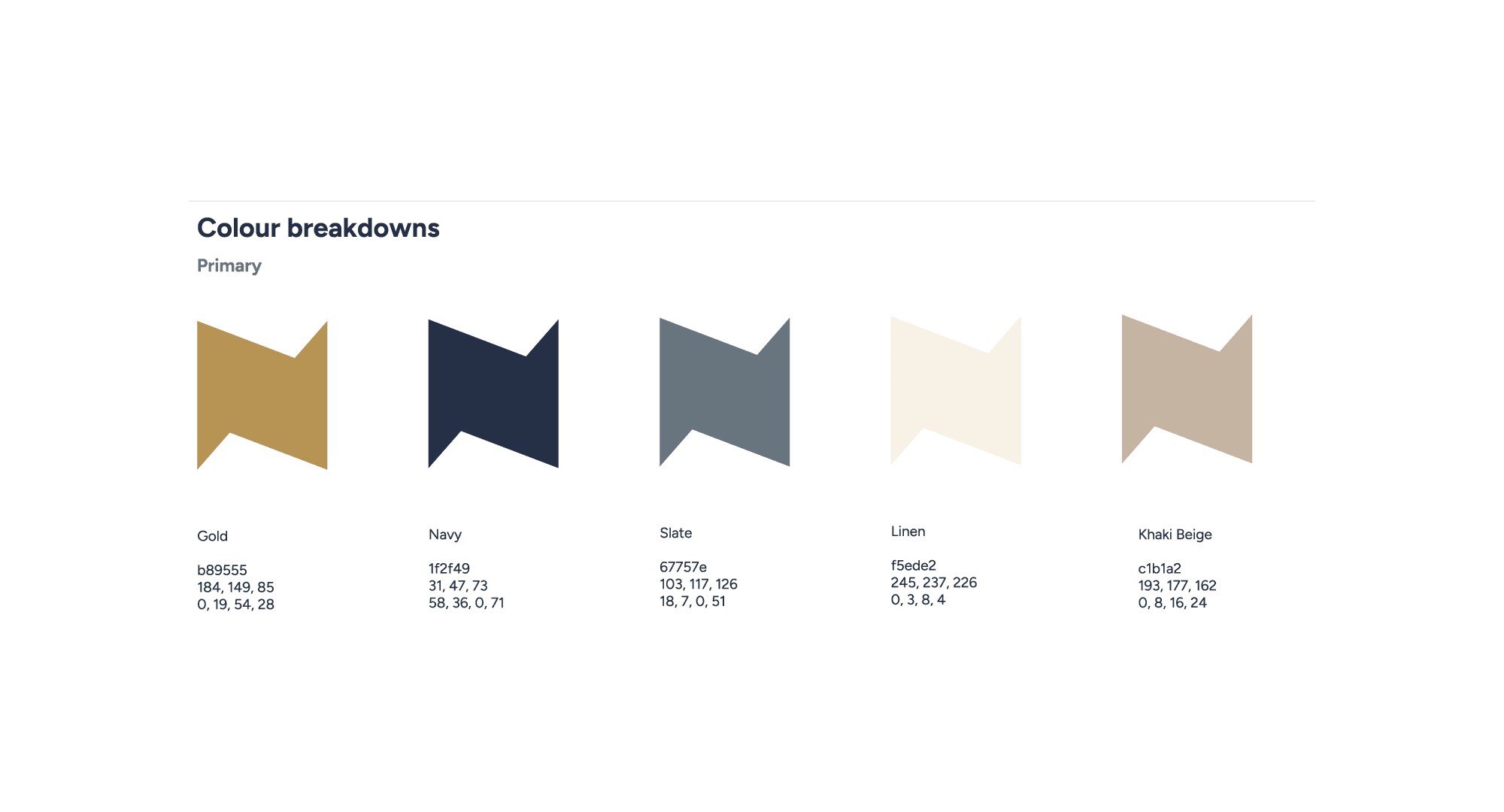
Before you touch a single value, you need three things most rebrands skip: a named owner for colour decisions, a working definition of your primary recognition colour, and agreement on where the brand will actually appear.
A firm whose brand lives 90% on-screen and 10% in print has a different problem from one that ships physical signage across 30 offices. Colour governance without a deployment map is guesswork.
You also need to accept the premise.
The device the viewer holds is not under your control. Screen appearance is affected by colour profile, gamut, calibration and display technology – variables that sit with Apple, Samsung and a thousand unmanaged office monitors, not with you.
Once you accept that identical output is not on the table, the real work begins: deciding what you will hold fixed anyway.
Stage One: Classify Every Colour by Recognition Weight
The first stage is triage, and it is the one nearly every rebrand does last, if at all. Sort your palette into two groups: colours that carry recognition, and colours that merely support.
Tiffany & Co. anchors recognition to a single custom colour, Pantone 1837 C – that blue is the brand, and it tolerates almost no drift.
Coca-Cola does the same with Coke Red. Your firm likely has one, occasionally two, colours doing that job. Everything else is supporting.

You know this stage is done when you can point at one colour and say, “If this shifts, people stop recognising us” – and at the rest and say, “These can move within reason.”
The failure mode here is democratic palettes, where every colour is treated as sacred.
Lock everything, and you will fail everywhere, because tight tolerance on a supporting colour is effort spent defending something recognition does not depend on.
Stage Two: Set a Tolerance for Each Colour
Once classified, each colour gets a tolerance – a stated limit on acceptable variation.
This is the stage competitors ignore entirely, and it is where colour management stops being an aspiration and becomes a spec.
The concept is not invented: the colour-perception difference is sufficiently formalised that measuring it has been codified in industry standards.
The same colour can be perceived differently by viewers even when the screen signal is identical.
Tolerance is the missing number in almost every brand guideline. A hex code tells the printer and the developer what to aim for. It says nothing about how far they are allowed to miss before the result is wrong. Define the miss, and you have a system. Leave it undefined, and every vendor invents their own.
For a recognition colour, tolerance is near zero – you manage it actively across colour spaces. For a supporting colour, you can state a wider acceptable range and stop policing it.
You know this stage is done when a printer or web developer could look at your spec and know not just the target but the boundary.
Stage Three: Manage the Colour Space, Not Just the Hex
The third stage is technical, and where the P3 problem lives.
Design your digital assets in a defined colour space and manage conversions deliberately, because wide-gamut displays render the same RGB values more saturated than standard sRGB screens.
This is why a brand-new blue can look almost neon on a new Apple display. The signal is identical. The screen's gamut is not.
The failure mode is exporting assets with no colour profile attached and letting each device guess. Missing profiles cause software to interpret colour on its own terms, producing subtle, cumulative shifts.
Attach the right profile, decide whether your recognition colour needs a wide-gamut variant, and the drift becomes something you designed rather than something that happened to you.
The Judgement Layer: When to Hold and When to Let Go
This is where 17 years show and where AI-generated guides go thin, because it cannot be reduced to a rule.
The judgement is knowing which colour is genuinely load-bearing for your firm, not in theory.
A litigation practice whose entire recognition rests on one deep navy should defend that navy across every colour space, even at real cost.
A consultancy with a flexible, illustrative palette should not – locking supporting colours there would make the brand feel rigid and dated.
In 17 years of brand work, the pattern I see most often is firms defending the wrong colour with the most effort.
The skill is not technical colour management, which any good production studio can execute. It is deciding, before the rebrand ships, which colour is worth that defence.
The Objections a Sceptical MD Will Raise
Two objections are worth naming directly.
First: “Isn't this just an excuse for sloppy output?” No – tolerance is stricter than the usual approach, not looser, because it forces you to state a boundary where most guidelines state nothing.
Second: “Our audience won't notice a slight shift.” Sometimes true for supporting colours, which is the point.
For your recognition colour it is not, because colour consistency is a determinant of brand recognition, trust and consumer preference – a finding recent research on dark-mode logo adjustment restates.
The trick is knowing which of your colours the finding applies to.
The Step Everyone Does in the Wrong Order
Here is the sequence correction that separates a working colour system from a cosmetic one.
Almost every rebrand picks the hex values first, then discovers how they behave across devices afterwards – usually when a partner complains. That is backwards.
Classification and tolerance come first; the specific values come last, chosen to survive the tolerance you have already set.
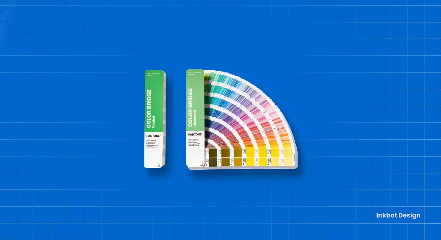
The prevailing view – anchor to Pantone, standardise on sRGB, calibrate screens – is not wrong. Intelligent practitioners hold it because those steps genuinely reduce drift, and DesignMantic and Siteimprove are right to recommend them.
But they treat consistency as the goal and matching as the method, which quietly assumes every colour deserves equal defence.
Recent display-standards work judges professional screens on luminance stability, contrast and colour rendering – proof that output conditions vary by design, not by fault.
Decide recognition-criticality and tolerance before you lock a single value. Do it in that order, and the technical fixes finally have something to serve.
The Verdict
Digital brand colour drift is not a calibration problem you can solve once and forget. It is a system-design decision your rebrand will make, either deliberately or by accident.
The firms that make it deliberately do not waste effort chasing identical colour across screens they do not control.
They decide which one or two colours carry their recognition, defend those across every colour space and device, and let the rest flex within a stated tolerance.
That reframing changes the whole project. “Make the blue match everywhere” is an impossible brief that generates endless complaints and no system in place.
“Lock this navy to near-zero tolerance, allow these three supporting colours a defined range, and export everything with managed profiles” is a spec a production team can actually deliver against.
The hex code was never the asset. The tolerance around it is.
The single action to take today: before your rebrand signs off on a palette, name the one colour your recognition genuinely depends on.
Everything else in your colour system follows from that decision. If you want an outside read on where your current brand is losing commercial ground – colour drift included – request a free Brand Equity Audit™. It's a structured diagnostic, written and delivered in 48 hours, with no sales call.
Frequently asked questions
What is digital brand colour drift?
Digital brand colour drift is the gap between the colour value you specify and the colour a viewer actually sees. A hex code is not a guaranteed visual outcome, because the device's colour profile, gamut, calibration and display technology all change how that value renders on screen.
Why does our brand colour look different on different screens?
Screen appearance is affected by colour profile, gamut, calibration state and display technology. The same brand colour can render differently across devices, even when the underlying hex value is identical, because each screen interprets and displays that signal on its own hardware terms.
Why does our logo look too bright on new iPhones?
Wide-gamut, P3-capable displays like newer Apple screens can make the same RGB values appear more saturated than intended. The signal has not changed; the screen's colour range has. Managing assets in the correct colour space prevents a recognition colour from looking neon on wide-gamut devices.
Is it true that all brand colours should be locked to exact values?
No – locking every colour equally wastes effort defending colours your recognition does not depend on. Recognition-critical colours should be held to near-zero tolerance. Supporting colours can be given a defined, wider range and allowed managed variation across platforms.
How much colour variation is acceptable?
It depends on the colour's recognition weight, so set tolerance per colour, not per brand. A recognition-critical colour gets near-zero tolerance and active management. A supporting colour can be assigned a wider stated range, freeing you from policing shifts that do not affect recognition.
What's the difference between a recognition colour and a supporting colour?
A recognition colour carries brand identification – if it shifts noticeably, people stop recognising you, as with Tiffany's custom Pantone 1837 C. A supporting colour rounds out the palette but does not anchor recognition, so it tolerates wider variation without commercial cost.
Why is colour drift a hardware problem and not just a design one?
Colour drift is partly a hardware-and-viewing issue because display performance depends on luminance stability, contrast, resolution and colour rendering, which vary by device. The viewer's screen is outside your control, so colour consistency depends on hardware and viewing conditions, not just a brand guideline.
How do I keep brand colours consistent during a rebrand?
Classify each colour by recognition weight, assign each a tolerance, then manage the colour space during export. Choose specific hex values last, so they survive the tolerance you have already set, rather than dictating a spec you discover problems with afterwards.
When should I involve colour management in a rebrand?
Involve it before you lock any values. Classification and tolerance decisions come first; specific colour values come last. Deciding recognition-criticality early means the technical fixes – profiles, colour spaces, Pantone anchoring – have a clear standard to serve rather than being applied blindly.
Why does Pantone anchoring not fully solve colour drift?
Pantone anchoring gives a physical reference and genuinely reduces drift, but it does not define how much on-screen variation is acceptable. Without a stated tolerance per colour, vendors still guess at the boundary. Anchoring is a method; tolerance governance is the system it should serve.
What happens if we ignore colour tolerance entirely?
Every vendor invents their own acceptable miss. Your printer, web team and signage supplier each interpret the target differently, producing cumulative drift across touchpoints. Undefined tolerance is why a single signed-off brand colour can ship in several visibly different versions.
Does colour consistency actually affect brand recognition?
Yes – colour consistency is a determinant of brand recognition, trust and consumer preference, a finding recent research on dark-mode logo adjustment restates. That applies most to your recognition-critical colour; supporting colours carry far less recognition weight and need less strict governance.