Brand Identity & Design
Brand Iconography That Makes Complex Firms Easier to Understand
Brand iconography works when it makes a complex firm easier to understand without making its identity feel simpler or less credible.
Tagged
Asset libraries, templates, photography, illustration and collateral. 10 Inkbot Design articles on brand assets for professional services firms.
Brand iconography works when it makes a complex firm easier to understand without making its identity feel simpler or less credible.
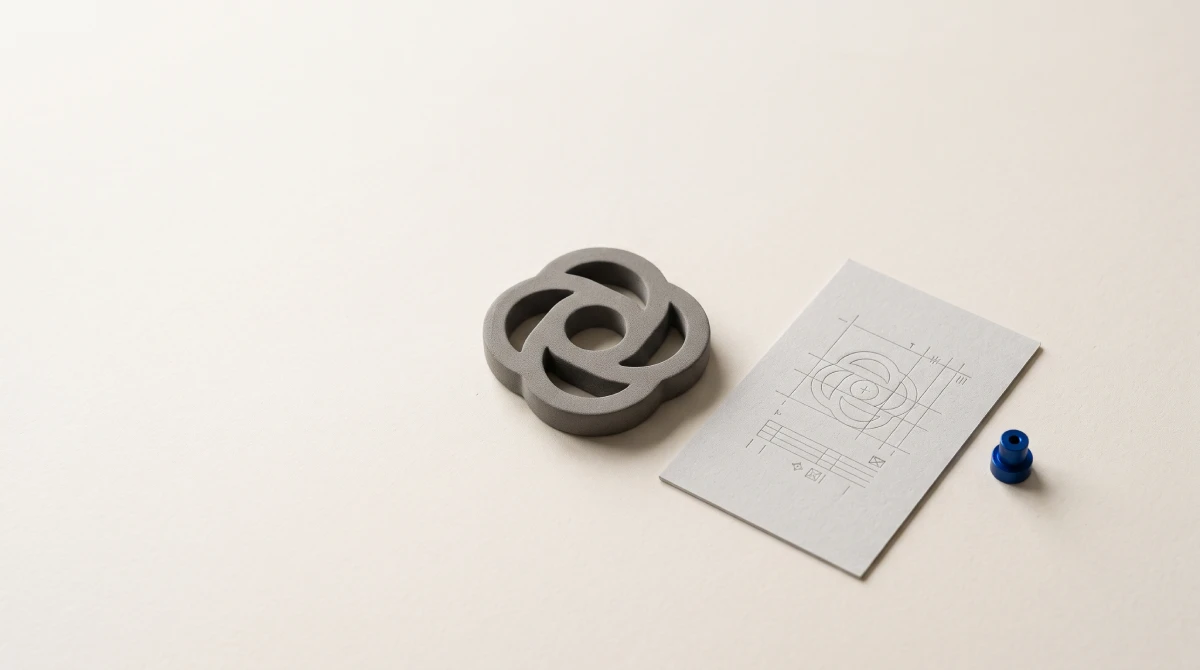
Digital Asset Management Tools are worth considering when your organisation has a repeatable problem with finding, approving, protecting, or distributing valuable digital content. The best platform is the one that supports the way your teams publish and collaborate while imposing only the governance needed to protect the business.

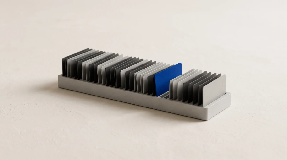
B2B identity decisions should be tested in proposals, presentations and everyday client materials. These twelve examples show different ways to organise visual assets, language and practical rules. The useful lesson is choosing what your business needs to communicate, retaining recognisable assets where justified, and approving a system employees can use.

Sonic branding is the deliberate use of proprietary sound to build recognisable commercial brand assets. Beautiful composition offers zero commercial value if listeners cannot attribute the sound to your company. Strategic audio requires evaluating customer touchpoints, securing absolute copyright ownership, and measuring distinctive recall across digital channels using proven brand equity principles.
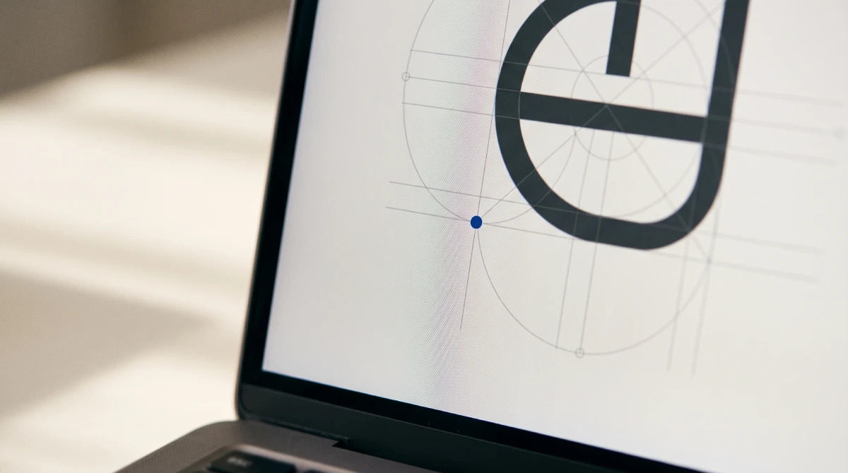
A logo grid system establishes proportions and spacing, but mathematical alignment cannot settle every visual decision. This guide explains how to assess optical corrections, resolve disagreements about balance, and document approved artwork so website developers and suppliers preserve the finished identity rather than rebuilding the logo from a construction diagram.
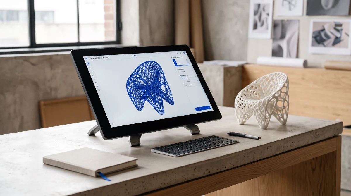
Artificial intelligence can produce brand assets without earning the authority to speak for your business. Professional services leaders need explicit decisions about confidential inputs, approved claims, creative changes and release. This guide separates production permission from commercial authorisation, with a practical framework for assigning owners before AI-assisted work reaches clients.
International trademarking decides where your new name can actually be owned, so it belongs before identity design, not after launch. This guide shows UK professional services leaders which markets to clear first, how the Madrid System and regional routes compare, and where trademark checks sit in a rebrand timeline.
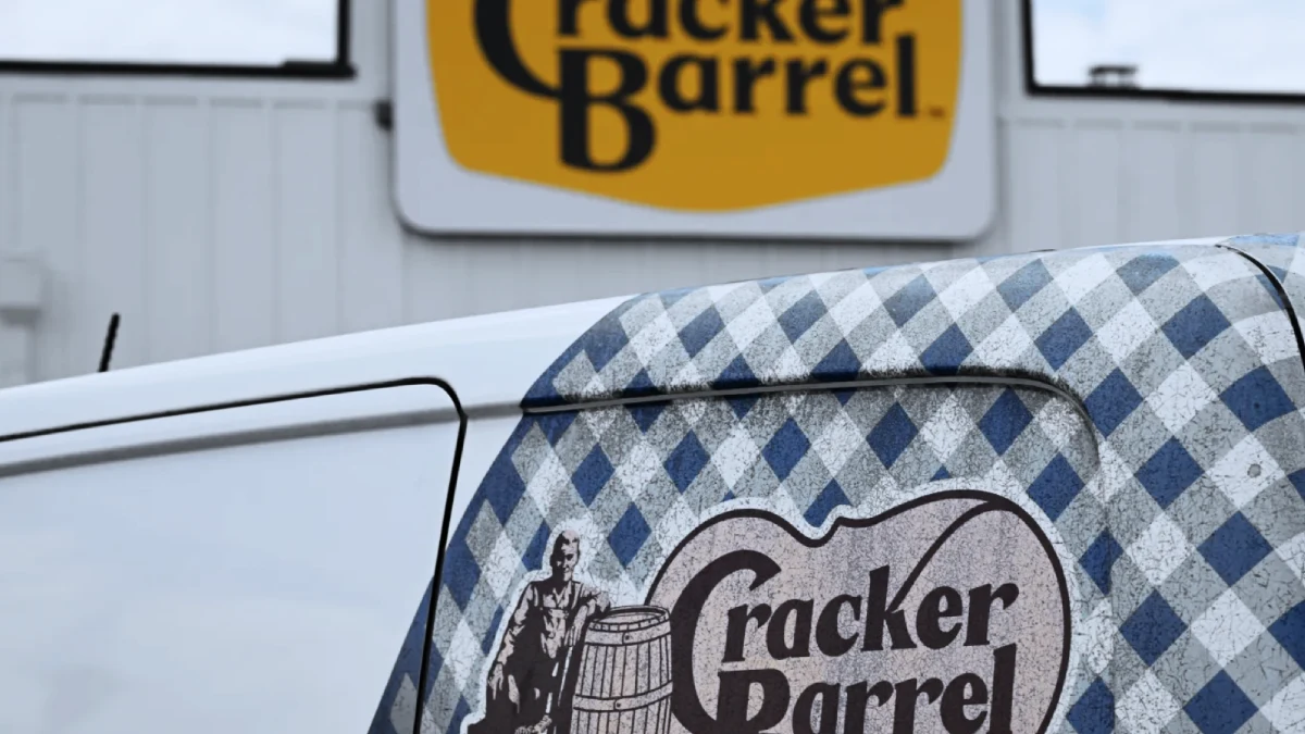
Controversial rebrands are rarely rejected because audiences dislike change. They fail when a business removes, dilutes or never explains something that customers, staff or communities believed was theirs. Cracker Barrel, Galway City Council, McLaren, Amazon and Spotify show where that line sits, and what professional services firms should protect first.

100 famous logos with names and pictures, organised across ten industries from finance to logistics, show that recognition is not a matter of clever drawing. It is built through repeated exposure within a distinctive asset system. This guide breaks down what genuinely applies to a professional services firm weighing a rebrand — and what does not.

Famous slogans don’t work because they’re catchy. They work because they refuse to explain everything. The 25 most effective taglines in history share one mechanism: category ownership through restraint. This analysis breaks down what each slogan actually does — and why most B2B firms are copying the wrong lesson from them.