Brand Identity Examples: 12 B2B Systems Dissected
B2B identity decisions should be tested in proposals, presentations and everyday client materials. These twelve examples show different ways to organise visual assets, language and practical rules. The useful lesson is choosing what your business needs to communicate, retaining recognisable assets where justified, and approving a system employees can use.
 By Stuart Crawford
 Reviewed by Tabitha Ayers
11 min read

On this page11 min left
- Which brand identity examples should B2B leaders study?
- 12 B2B Brand Identity Systems and Their Strategic Lessons
- How Can Leadership Evaluate a Brand Identity Beyond Personal Taste?
- What Needs Changing, and What Should Remain?
- Practical Case Study: Launching an Independent Wealth-Management Practice
- How to Sign Off Your New Brand Identity Before Public Launch
- Questions people ask
If your business is targeting larger clients, useful brand identity examples should show more than a better-looking logo.
Slack, Boomi, Deltek and the other B2B systems below offer practical lessons in partner materials, employee templates, messaging and everyday application.
The question is what your own business needs to change.
That distinction matters. In research involving more than 26,000 respondents globally, Ipsos and Jones Knowles Ritchie found that only 15% of tested brand assets achieved their Gold standard of distinctiveness.
The 2023 study assessed assets, not entire brands, and was not B2B-specific. Attractive work and recognisable work are different judgements.
A useful brand identity brief therefore needs to connect appearance with application. Your website might introduce the business. A proposal, partner biography or presentation may have to explain the business without you in the room.
Which brand identity examples should B2B leaders study?
Study Mailchimp for asset pairing, Slack and Asana for co-branding, Boomi for employee materials, Sovos and Motive for verbal guidance, and Deltek for hierarchy. Dropbox, HERE Technologies, Varonis, Cisco Duo and Payroc provide further examples of how identity rules extend into practical applications.
These are learning references, not a ranking of commercial effectiveness.
- Start with the example that addresses your problem: fragmented proposals require different work from unclear positioning.
- Separate documented design rules from claims about what the design achieved.
- Ask for equivalent applications in your own materials before approving a direction.
B2B brand identity examples include Mailchimp, Slack and Asana, whose documented guidelines cover recognisable assets and practical application rules.
When commissioning strategic brand identity design, leadership teams should assess agencies on practical operational deliverables (such as editable pitch decks and partner templates) rather than the volume of conceptual logos shown in a pitch presentation.
12 B2B Brand Identity Systems and Their Strategic Lessons
HubSpot’s published brand-guidelines examples document the features discussed below.
The observations establish what the systems contain; the recommendations explain how I would apply those lessons to a professional-services rebrand.
The source does not demonstrate that any individual rule increased revenue or improved pitch conversion.
1. Mailchimp: How Should You Regulate Brand Asset Pairing?
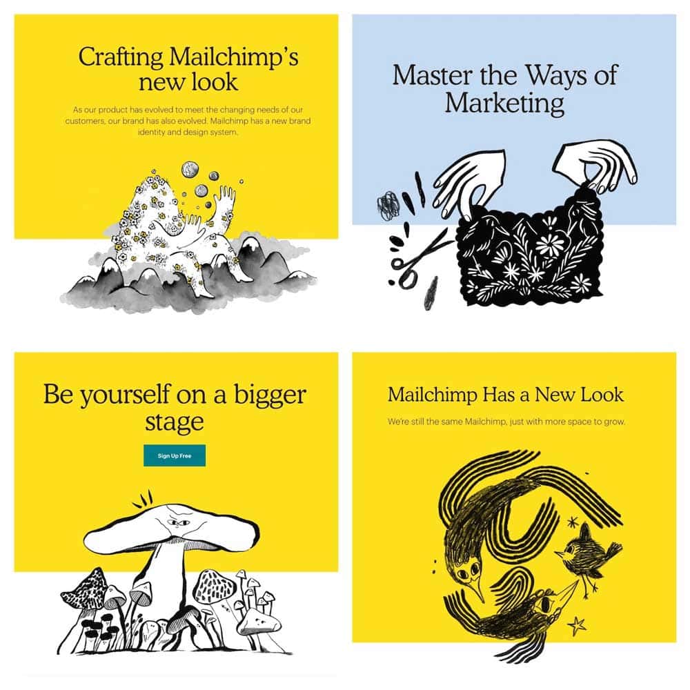
The Core Lesson: Document strict pairing rules to prevent staff from separating recognisable symbols from the corporate wordmark.
Mailchimp pairs a distinct primary colour palette (Cavendish Yellow anchored by Peppercorn black) with rigid asset-coupling mandates: the "Freddie" icon must never float in isolation in external marketing without explicit approval, and must remain in direct proximity to the typographic wordmark.
Professional Services Application: In a law firm or accountancy practice, individual partners frequently isolate a graphic symbol on seminar slides or email signatures. Your brand specification must define the approved lockups for proposal covers, digital letterheads, and event banners to remove ambiguity for administrative staff.
2. Slack: How Do You Protect Your Logo in Co-Branded Partnerships?
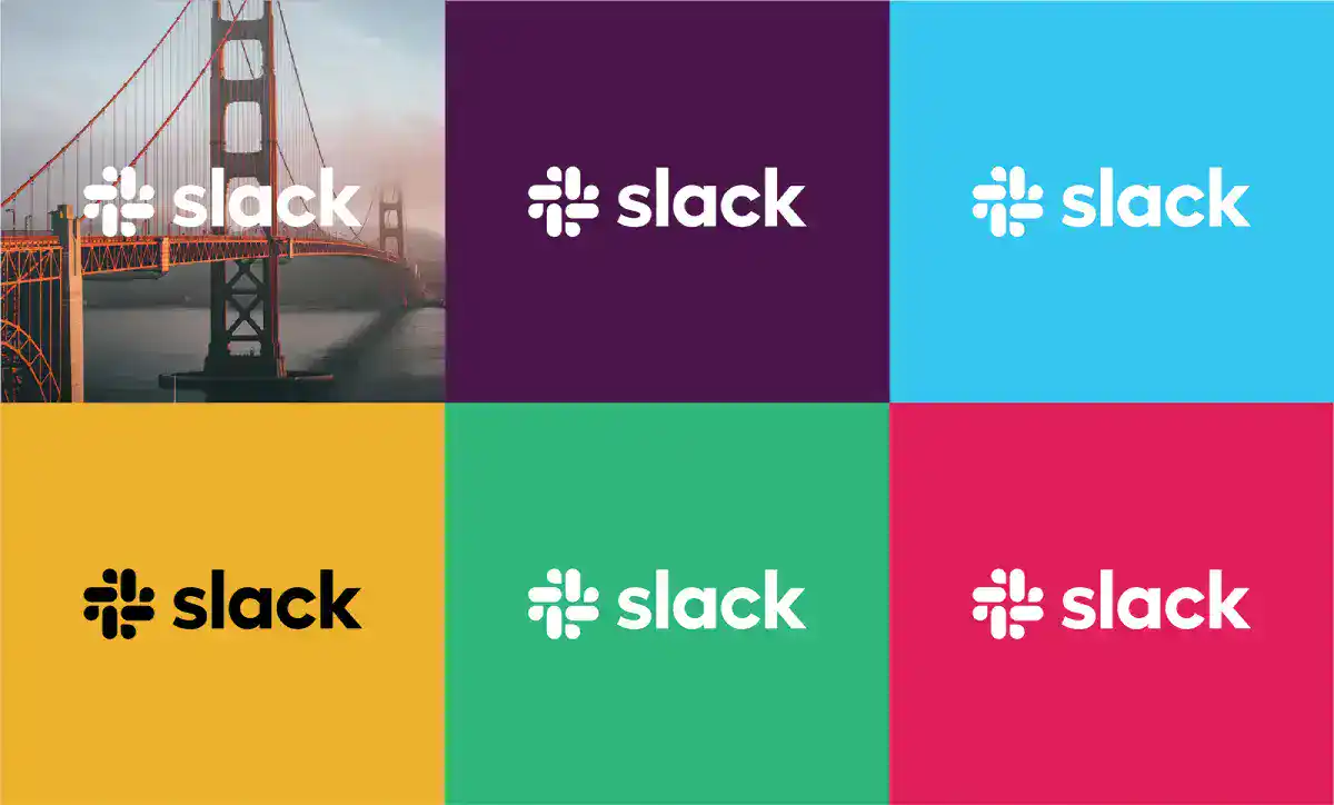
The Core Lesson: Design explicit clear-space and co-branding guidelines to ensure your firm’s logo retains visual authority alongside commercial partners.
Slack’s design guidelines specify precise clear-space boundaries, monochrome alternatives, and side-by-side co-branding formulas for integration partners, event organisers, and software vendors.
Professional Services Application: Advisory firms routinely co-host webinars or publish joint research with software vendors, chambers of commerce, or academic bodies. Specifying vertical dividing lines, proportional scaling, and neutral background rules prevents your firm from appearing secondary or cluttered on joint collateral.
3. Boomi: Why Must Employee Templates Form Part of the Core Identity Scope?
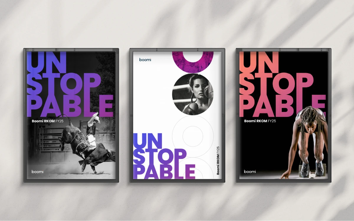
The Core Lesson: A brand identity is only as consistent as the working software templates supplied to fee-earners.
Boomi’s identity manual extends visual and verbal standards into everyday operational assets: editable PowerPoint decks, Word templates, email signatures, and business cards.
Professional Services Application: In a 50-partner consultancy, client proposals are assembled under tight deadlines by fee-earners, not graphic designers. If an agency delivers only a PDF brand manual and static vector files, your team will improvise poorly formatted slides. Insist that custom, locked PowerPoint and Word templates are delivered as core assets.
4. Sovos: How Does a Verbal Identity System Support Technical Specialists?
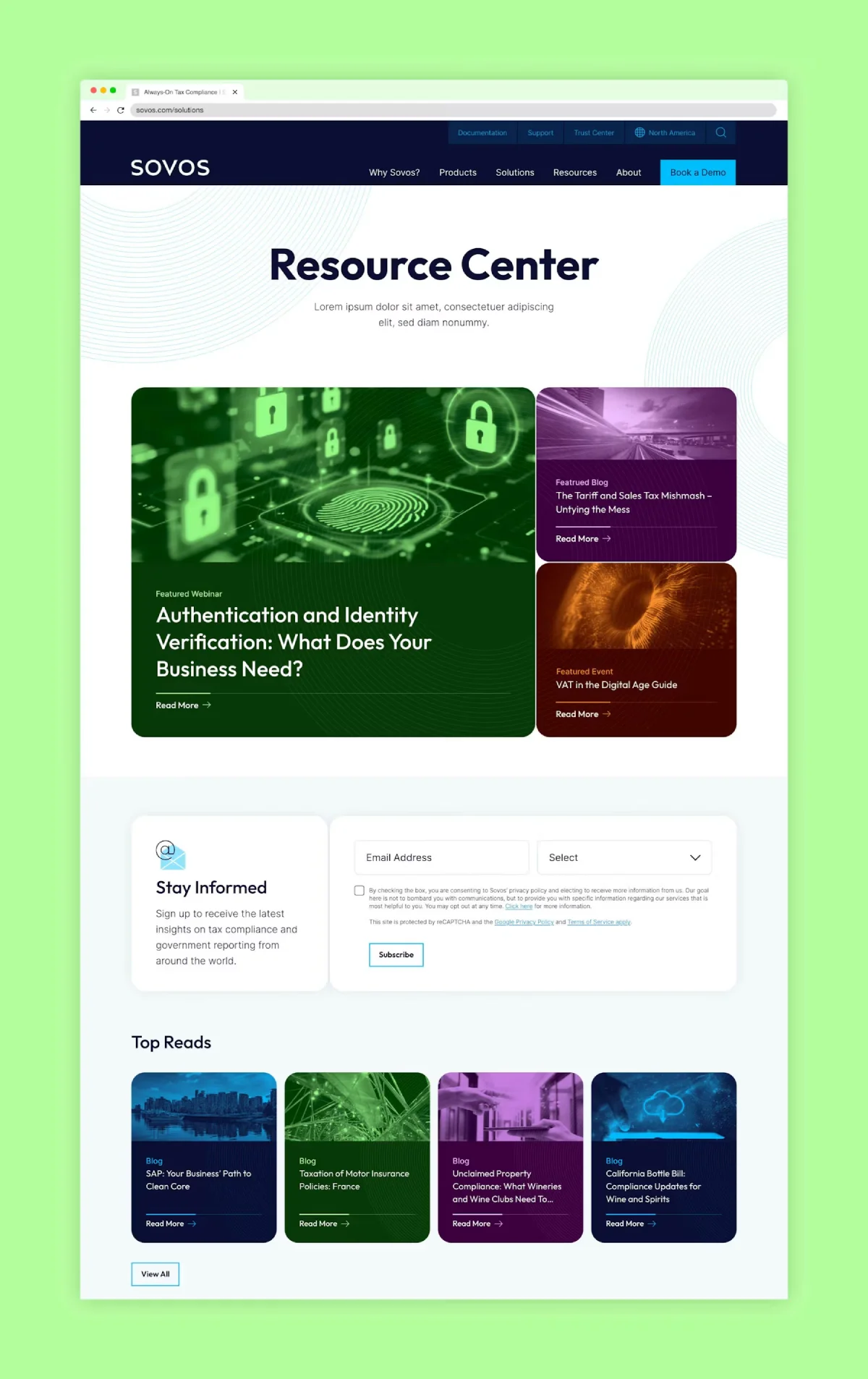
The Core Lesson: Codify positioning pillars and tone of voice so technical experts write with unified market positioning.
Sovos integrates positioning statements, value pillars, and boilerplates into its unified design system, providing staff with clear parameters for describing complex regulatory compliance software.
Professional Services Application: In specialised sectors such as tax advisory or corporate law, partners often explain services in dense, jargon-laden language. A verbal identity framework gives specialists pre-approved elevator pitches, service summaries, and biography structures, ensuring technical precision without sacrificing commercial clarity.
5. Deltek: How Do You Structure Brand Architecture After Mergers and Acquisitions?
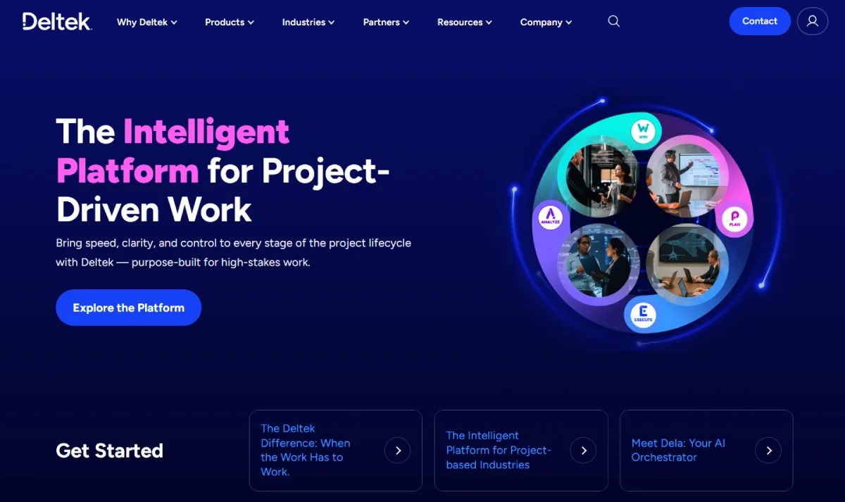
The Core Lesson: Establish brand hierarchy rules before acquired entities or newly launched service lines invent divergent visual identities.
Deltek’s brand architecture guidelines clearly differentiate Deltek-led offerings from product sub-brands, acquisition marques, and certified partner tiers, preventing visual fragmentation across its enterprise software portfolio.
Professional Services Application: When an accountancy practice acquires a boutique payroll firm or financial planning practice, leadership must immediately clarify the brand hierarchy: does the acquired business adopt the master brand (monolithic), operate as an endorsed brand ("A Division of..."), or remain separate? Resolving this in the brand specification prevents costly disputes over stationery and signage.
6. Asana: How Should You Handle Inverted and Single-Colour Logo Applications?
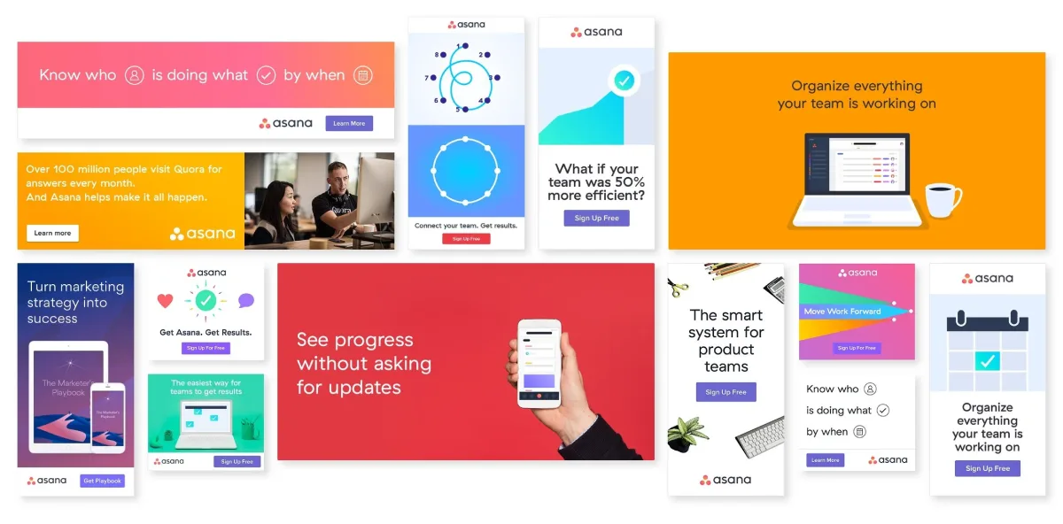
The Core Lesson: Pre-approve single-colour and whiteout logo assets to maintain legibility across non-standard partner backgrounds.
Asana provides strict guidance for horizontal, vertical, and icon-only configurations, including an approved pure-white asset specifically engineered for dark or clashing partner backgrounds.
Professional Services Application: Sponsoring an industry gala or legal conference often means your logo will be printed on dark backgrounds, metal signage, or lanyards. Without pre-engineered single-colour and reversed assets, event printers will place an unsightly white rectangle behind your full-colour logo, undermining your firm’s visual credibility.
7. Dropbox: When Does an Interactive Brand Guidelines Portal Justify Its Cost?
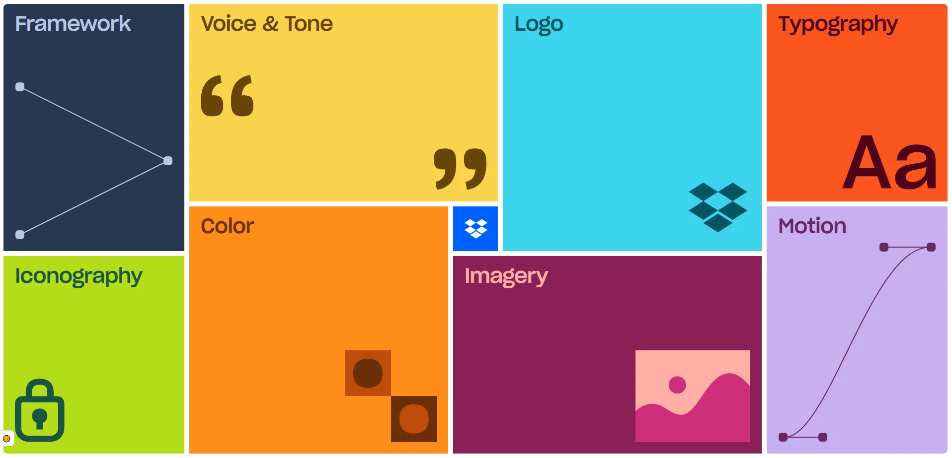
The Core Lesson: Demonstrate motion, UI behaviour, and digital responsiveness through dynamic examples rather than static PDFs.
Dropbox utilises an interactive online brand portal to showcase motion graphics, dynamic typography scaling, and audio-visual cues alongside traditional layout grids.
Professional Services Application: While global software brands require complex digital guideline portals, mid-tier advisory firms are better served by accessible, indexed digital asset hubs. Prioritise downloadable, pre-formatted pitch kits and template packs over expensive interactive portals that fee-earners rarely consult.
8. HERE Technologies: How Do You Balance Core Identity Consistency with Divisional Flexibility?
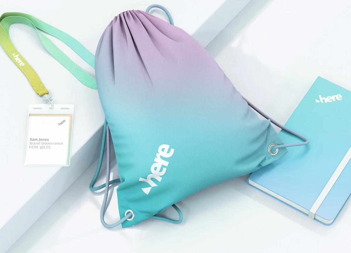
The Core Lesson: Establish immutable foundation elements while allowing departmental layouts to adapt to diverse client sectors.
HERE Technologies maintains fixed standards for core typography, logo placement, and primary colours, but allows generative flexibility across digital interfaces, mapping displays, and vehicle wraps.
Professional Services Application: A full-service commercial law firm needs visual continuity between its corporate M&A group and its family law or private client department. Keep typography, primary colours, and document layouts consistent, but allow practice areas to use tailored imagery and case-study formatting to connect with their respective audiences.
9. Varonis: Why Is an Explicit "What NOT to Do" Section Vital in Brand Guidelines?

The Core Lesson: Document concrete examples of common formatting errors to prevent staff from distorting core assets.
Varonis features comprehensive "misuse" pages illustrating real mistakes: rotating logos, applying unauthorised drop shadows, squeezing wordmarks into cramped footer margins, and placing marks over busy photography.
Professional Services Application: Vague instructions like "ensure adequate clear space" do not prevent administrative staff from stretching a logo to fit a Word document header. Documenting actual mistakes made in past firm presentations provides a clear, unmistakable visual warning for non-designers.
10. Cisco Duo: Why Must Corporate Typography Be Tested in Standard Enterprise Software?
The Core Lesson: Ensure chosen typefaces function flawlessly across standard Microsoft 365 environments without causing font substitution errors.
Cisco Duo specifies primary typography (Neue Haas Grotesk) for marketing collateral, but designates CiscoSansTT and system-safe fallbacks for presentation slides and internal spreadsheets.
Professional Services Application: Design agencies often specify exotic, expensive web fonts that look stunning in design mockups but fail in client proposals. When fee-earners open the file on a machine lacking the font licence, PowerPoint substitutes Arial or Times New Roman, breaking line lengths and slide layouts. Always test and specify standard system font alternatives.
11. Payroc: How Do You Design Identity Assets for Referral Intermediaries?

The Core Lesson: Build self-contained, co-brandable marketing one-pagers that external referral partners can distribute without altering your brand narrative.
Payroc provides turnkey partner toolkits featuring pre-formatted flyer templates, icon packs, and dedicated branding zones for third-party distributors and ISO partners.
Professional Services Application: Wealth managers and tax consultancies rely heavily on referrals from solicitors, accountants, and mortgage brokers. Providing clean, co-branded PDF service summaries with an allotted panel for the introducer's contact details allows partners to recommend your firm professionally without redrafting your materials.
12. Motive: How Can Before-and-After Copywriting Examples Upgrade Firm Communications?
The Core Lesson: Train non-marketing staff through direct before-and-after paragraph comparisons rather than abstract adjectives.
Motive’s verbal identity guidelines illustrate corporate tone by comparing weak, passive sentences with direct, authoritative revisions across emails, case studies, and web pages.
Professional Services Application: Telling partners to "sound approachable yet authoritative" produces inconsistent writing. Providing an annotated before-and-after example of an introductory email or partner biography demonstrates exactly how to trim unnecessary legal jargon while preserving technical expertise.
How Can Leadership Evaluate a Brand Identity Beyond Personal Taste?
Brand identity projects frequently derail during partner reviews when conversations descend into subjective aesthetic debates. To evaluate a proposed identity system objectively, leadership teams should apply five practical operational stress tests:
Test 1: Distinctive Asset Recall (The Isolation Test)
Question: Can prospective clients identify your firm if the company name is removed?
The 2023 Ipsos/JKR study found that only 19% of tested brand logos and 4% of tested colour palettes achieved "Gold" standard standalone recognition. Test your primary symbol, typography, or layout style in isolation with client-facing staff. If an asset is indistinguishable from three direct competitors, it is failing to build distinctive memory structures.
Test 2: Standalone Proposition Clarity (The Silent Pitch Test)
Question: Can an executive summary or credentials slide explain your core service without a partner in the room?
Hand a draft proposal cover and service introduction to a professional outside that specific discipline. If they cannot explain who the service is for and the commercial problem solved. Why your firm is qualified within 60 seconds, your messaging hierarchy requires structural revision—not a fresh colour palette.
Test 3: The Forwarded Document Test
Question: When your proposal is forwarded to an internal CFO or procurement panel, does your commercial case survive?
High-value professional-services purchases involve risk-averse buying committees. Ensure the identity system includes clear typographical styling for fee tables, case studies, methodology diagrams, and risk disclosures so that non-attendees grasp the value proposition immediately.
Test 4: The Handover Stress Test (The Non-Designer Trial)
Question: Can an associate or administrator assemble a bespoke pitch deck without agency intervention?
Before signing off an identity programme, ask a non-designer in your office to build a 5-page pitch document using the delivered templates. If elements break, fonts fail, or formatting requires constant rescue by a graphic designer, the handover is incomplete.
Test 5: Equity Continuity Audit
Question: Does the new visual system preserve your existing commercial goodwill?
Review current and proposed materials side by side. Ensure the rebrand retains established visual cues that existing clients trust while shedding outmoded elements that cap your fee positioning.
What Needs Changing, and What Should Remain?
A successful rebranding brief begins with an identifiable commercial bottleneck rather than a vague sensation that "our logo feels dated". The table below maps common operational problems in professional-services firms to the appropriate scope of work:
Operational Symptom | Recommended Starting Scope | Strategic Rationale |
|---|---|---|
Partners describe the firm's core proposition inconsistently across offices. | Positioning & Verbal Identity Review | Visual updates cannot resolve a strategic disagreement regarding your core market offer. Agree on the message before adjusting pixels. |
The logo is well-known, but client proposals vary wildly by department. | Template Engineering & Application Guidelines | The issue is internal operational governance, not brand equity. Provide locked, editable templates rather than replacing established assets. |
Recent firm acquisitions have created competing marques and confusing sub-brands. | Brand Architecture & Hierarchy Framework | Establish parent-subsidiary governance before commissioning individual stationery or signage suites. |
A specialist boutique practice is frequently mistaken for a low-cost generalist provider. | Strategic Positioning Review followed by Identity System | Cosmetic adjustments alone cannot explain technical depth; repositioning must lead visual elevation. |
The website looks modern, but staff cannot assemble clean pitch decks internally. | Operational Asset Production & Staff Training | Focus resources on day-to-day production files rather than redesigning functional public assets. |
A legacy brand identity no longer reflects the firm's scale, fee tier, or international reach. | Full Strategic Rebrand (Brand Equity Blueprint™) | Substantial evolution in market capability justifies a complete realignment of positioning, identity, and assets. |
Practical Case Study: Launching an Independent Wealth-Management Practice
At Inkbot Design, we were commissioned by three former private-banking directors establishing an independent wealth-management firm.
The founding partners needed a unified identity that synthesised three distinguished personal reputations into one institutional entity - capable of competing with established private banks while conveying the agile, personal counsel that corporate institutions lack.
The industry default would have been to mimic institutional finance tropes: navy-blue serif typography, generic architectural photography, and conservative heraldry.
Instead, we developed a restrained, contemporary visual identity supported by executive pitch decks, stationery, and comprehensive guidelines.
The Operational Outcome: Rather than claiming unverified revenue windfalls, the documented result was complete operational readiness. The full identity system and pitch collateral were delivered ahead of schedule, enabling the partners to conduct high-stakes introductory presentations with regional legal and accountancy referrers weeks before their public website launched.
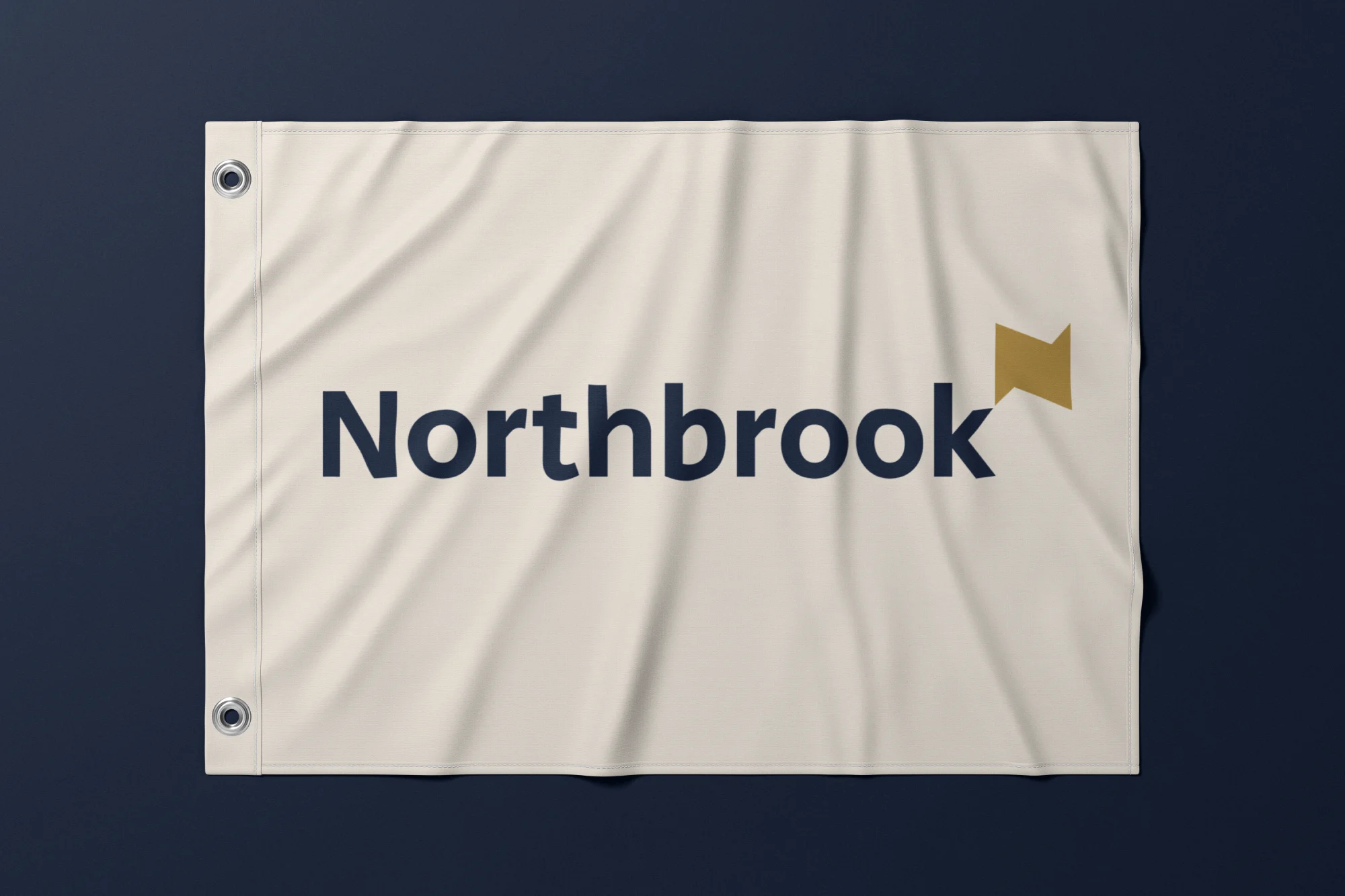
(For a comparable published identity system, explore our work on the Northbrook financial identity case study).
Having directed brand identity systems for professional services firms across 21 countries since 2009, my guiding criterion remains operational: which specific materials must be ready for your next client conversation?
Two Common Objections to Resolve Before Commissioning a Rebrand
Objection 1: "Are we being sold a £50k rebrand when we simply need functional templates?"
The Strategic Reality: Demand that your agency clearly separates strategic diagnosis from asset production. Request an explicit "retained assets register" alongside their design proposal. If your firm’s market positioning is robust and your logo is well recognised, commissioning a targeted overhaul of the template and application is the right commercial decision.
Objection 2: "Will simplifying our visual presentation make our specialist expertise look shallow?"
The Strategic Reality: Visual and verbal clarity does not dilute technical depth; it structures it. An effective identity system establishes a clean visual hierarchy where executive summaries communicate immediate value, while supporting pages provide the methodology, legal precedents, and technical specifications required by institutional evaluators.
How to Sign Off Your New Brand Identity Before Public Launch
To avoid approving a brand system that looks impressive on a designer's monitor but fails in daily practice, bring three live documents to your final sign-off meeting:
- One live client proposal deck
- One senior partner biography and service sheet
- One co-branded referral document
Require the agency to apply the proposed identity system to those exact files. Then, ask an administrative colleague to edit text, swap an image, and export a PDF without the designer present.
This exercise will tell you more about the viability of the identity than fifty concept mockups.
If the problem remains unclear, request Inkbot Design’s free Brand Equity Audit™. The written diagnostic reviews positioning, messaging, visual consistency and visibility, with a prioritised set of recommendations.
The audit is a commercial service from Inkbot Design, not independent market research.
Before approving a new identity, require evidence that the working materials can carry the business into its next conversation.
Questions people ask
How should a partnership or board justify a rebrand internally?
Internal justification should centre on documented commercial inefficiencies rather than subjective aesthetics. Gather evidence of lost proposals, inconsistent cross-office collateral, or acquired practices operating under conflicting names. Frame the rebrand as an operational risk-reduction exercise that protects fee positioning and shortens pitch cycles.
Can a complex professional-services firm simplify its identity without losing technical depth?
Yes. Simplification applies to information architecture, not technical rigour. A disciplined identity system presents a concise, jargon-free executive summary up front, followed by organised sections detailing methodology, credentials, and regulatory compliance. Shorter introductions make technical expertise more accessible to senior decision-makers.
What specific deliverables should be required in an identity agency's proposal?
Insist that the proposal explicitly itemises: (1) core strategic positioning, (2) complete logo and lockup suites, (3) typography and colour systems with digital accessibility ratings, (4) locked, editable PowerPoint and Word templates, (5) co-branding governance rules, and (6) an operational brand manual demonstrating concrete misuse cases.
Can we commission comprehensive brand guidelines without redesigning our logo?
Yes. If your current marque carries significant goodwill and high client recognition, a "guidelines and template overhaul" is often the most cost-effective path. This project standardises typography, colours, layout hierarchies, and proposal templates across offices while preserving your core visual equity.