- Client
- Northbrook & Co.
- Industry
- Location
- Leeds, United Kingdom
- Services
- Brand positioning & strategy
- Visual identity
- Wordmark & logomark
- Brand guidelines
- Stationery & digital collateral
Northbrook & Co.
Private-bank authority with boutique warmth
Background
Northbrook & Co. is an independent wealth practice in Leeds, founded by three senior private banking directors to serve high-net-worth individuals, retirees and business owners.
The brief
Launch a new firm that could stand beside the private banks its founders had left, without inheriting their coldness. The brand had to carry multi-million-pound family estates’ trust from day one, and unite three established personal reputations under one name.
The solution
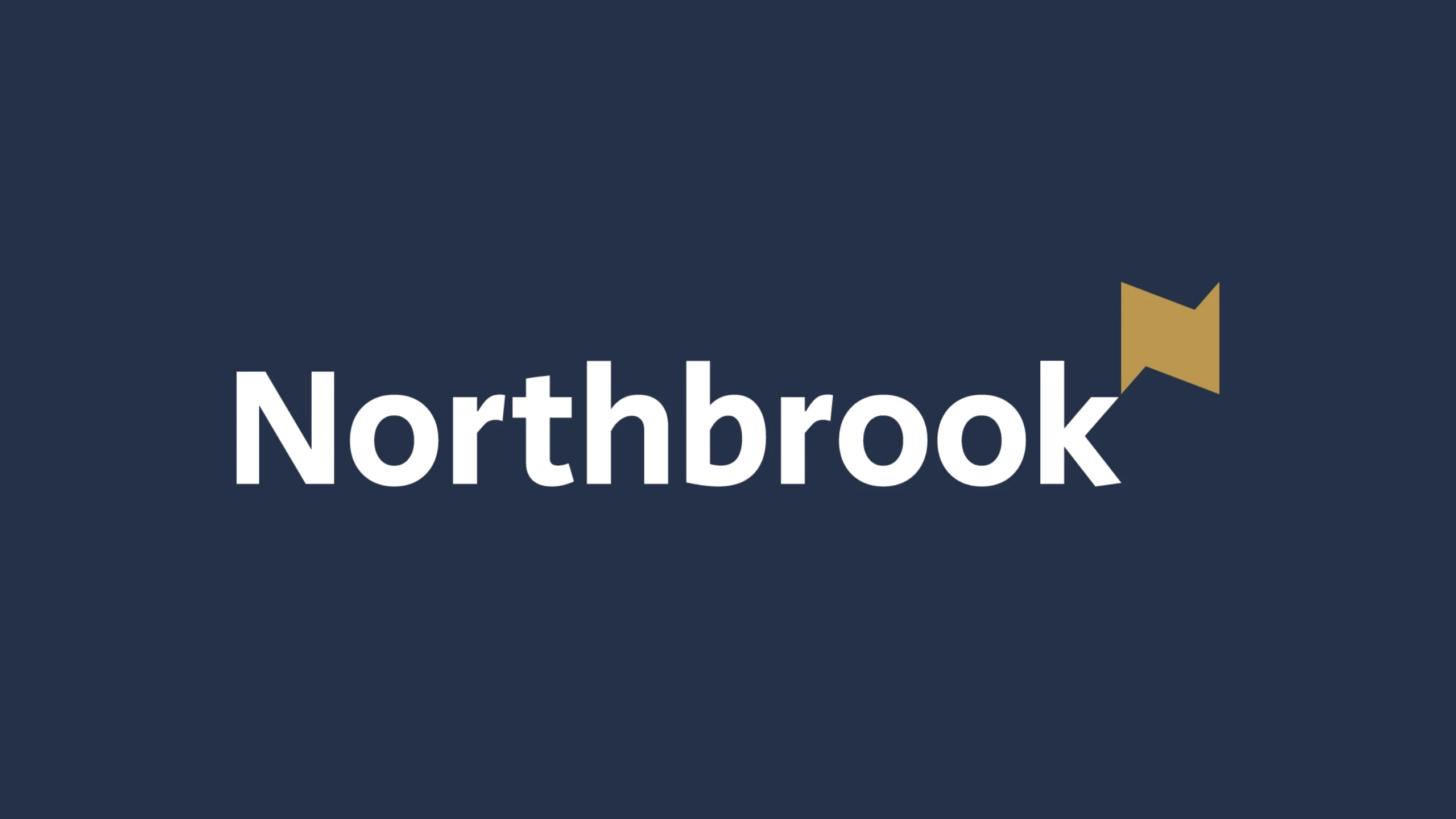
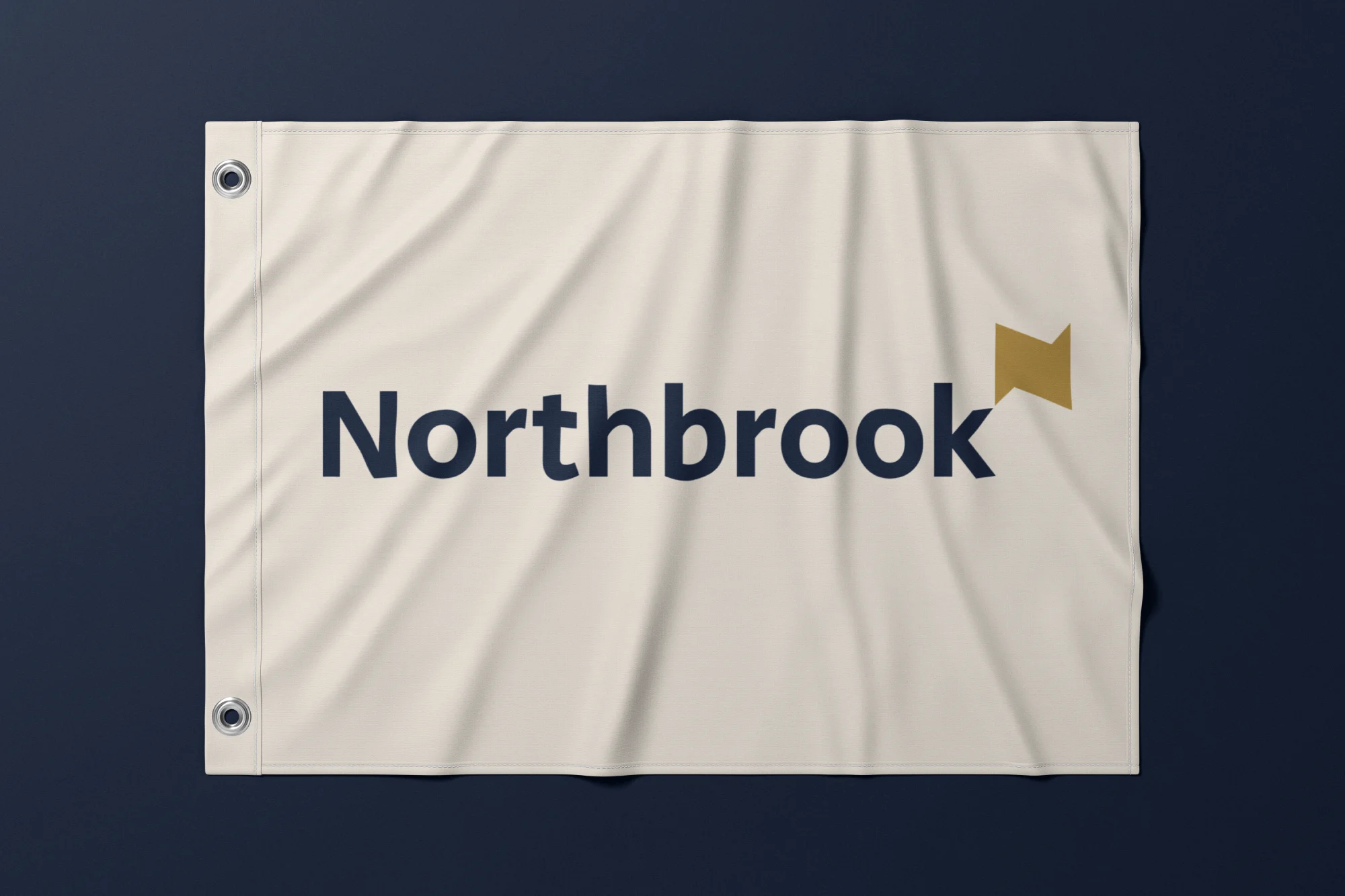
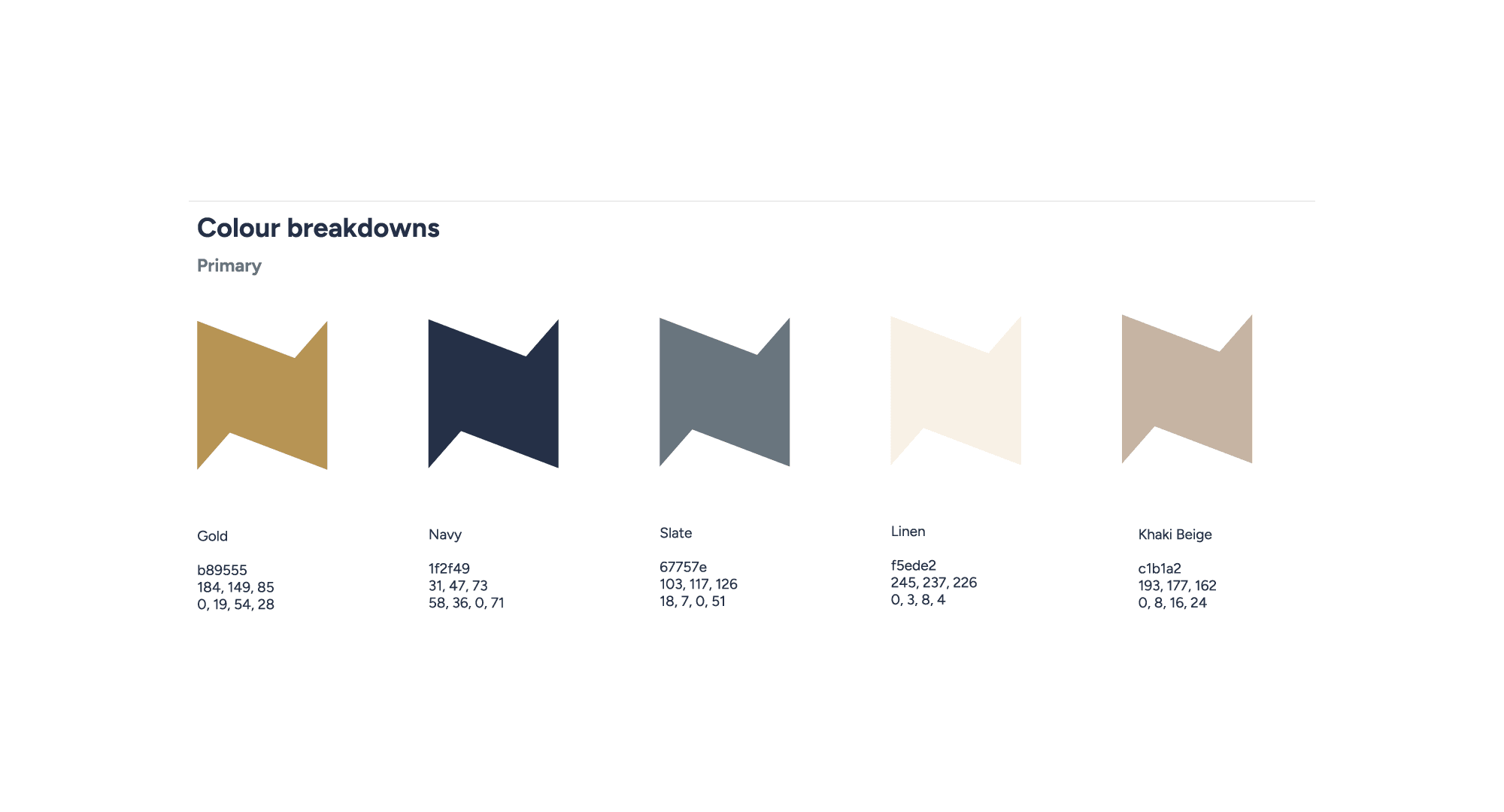
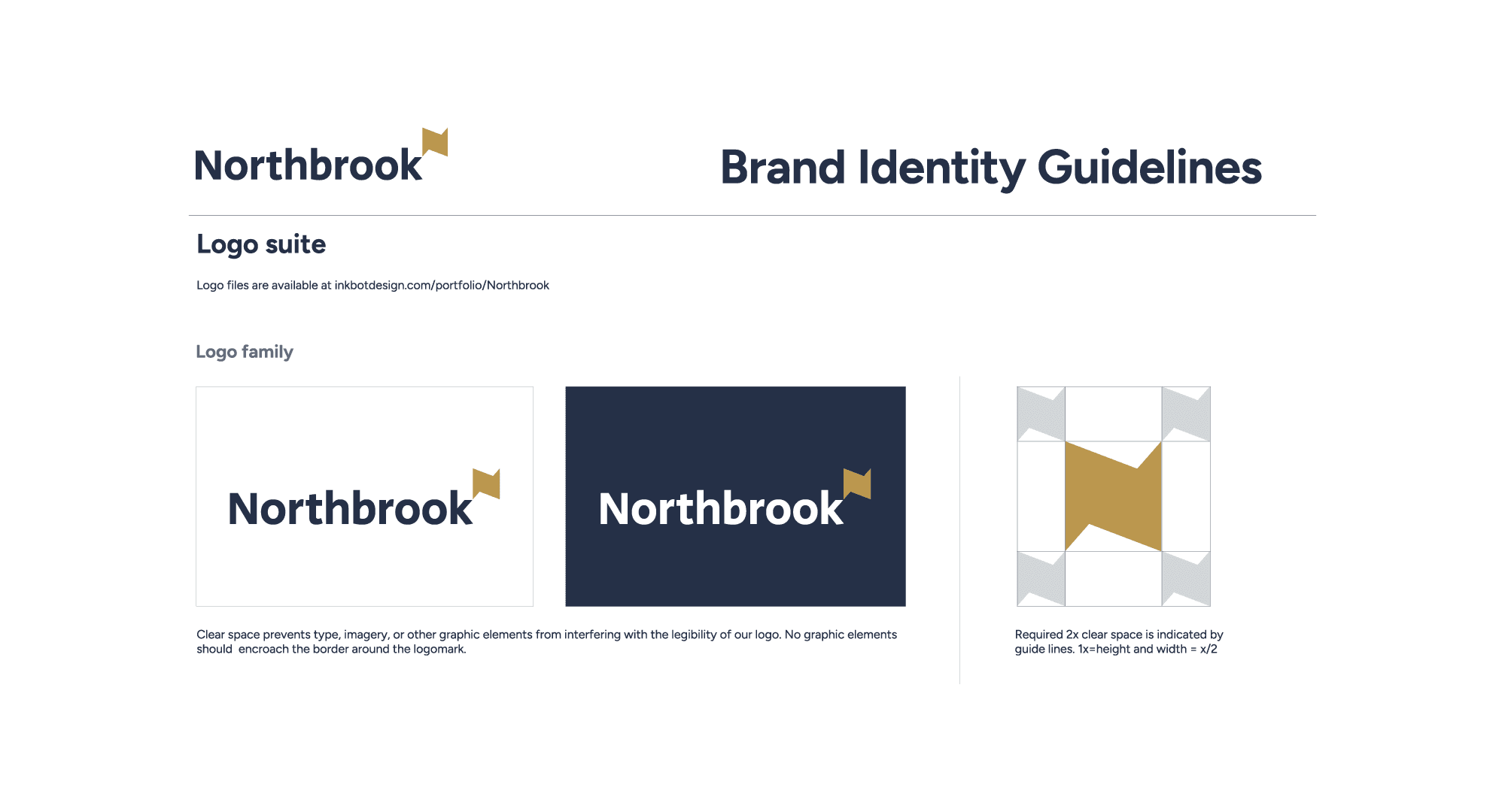
We positioned Northbrook as the Personal Powerhouse: private-banking acumen with boutique attentiveness. The identity borrows from architecture and law rather than retail finance: a tailored serif wordmark, a restrained palette of Deep Navy, Slate Gold and Warm White, and a Brand Clarity Guide that keeps every report, letter and post consistent.
The challenge
Escaping institutional coldness without losing trust
Private banks offer balance-sheet authority but relationships that feel transactional. Independent advisers offer attention but can struggle to look stable enough for multi-million-pound estates.
Northbrook needed both: the permanence clients expect from a bank, and the warmth they left the banks to find.

The identity
A modern classic
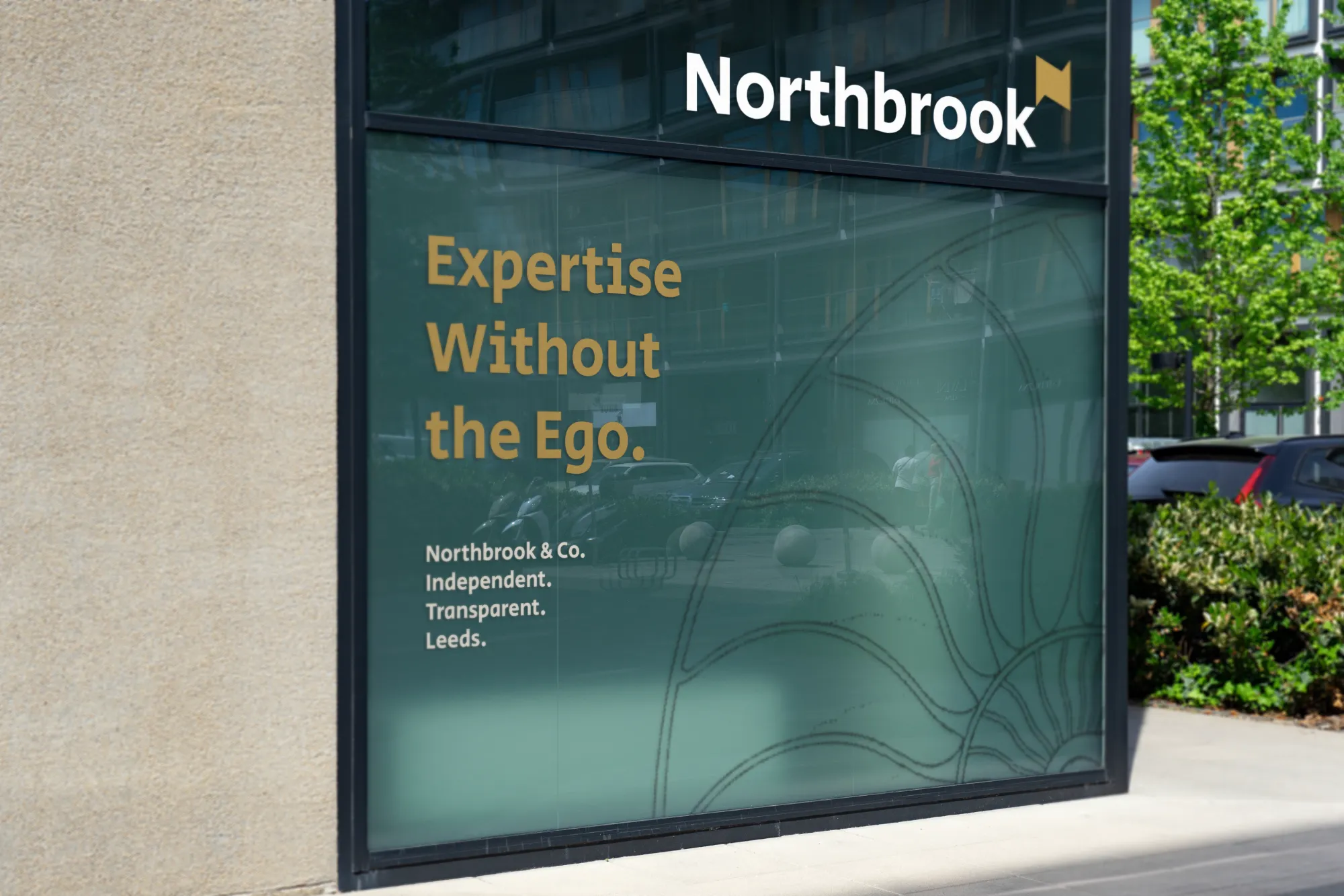
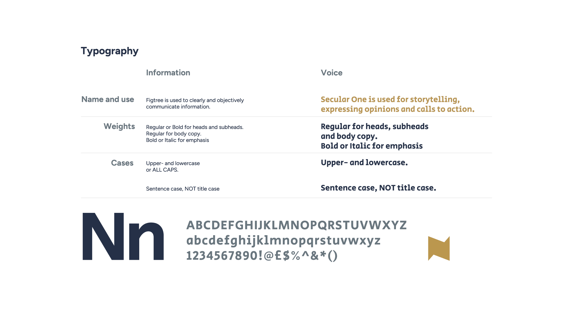
We rejected the clichés of retail finance (rising arrows, globes, currency symbols) for an identity grounded in architectural balance, typographic restraint and tactile print. The wordmark pairs a tailored serif structure with humanist proportions, so the firm reads as established rather than new.
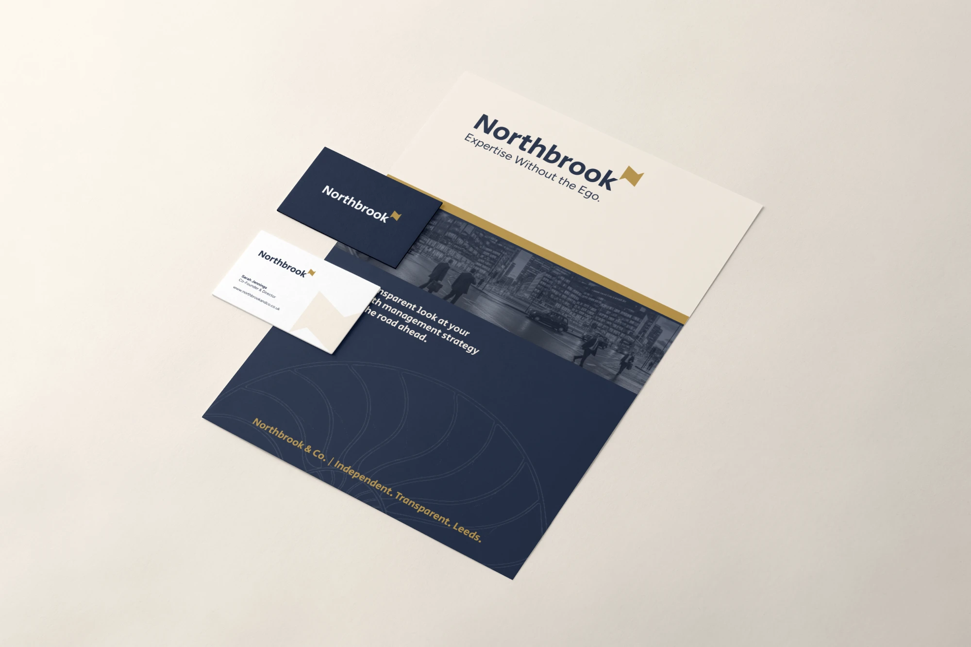
We knew what we didn’t want: the stuffy, corporate look of our past lives. Stuart and the Inkbot team listened to our vision for a ‘modern classic’ and delivered an identity that feels exactly like us: professional, reliable, but completely approachable.

What changed
Ready to launch, as one firm
- 01
Launch-ready early
The identity, stationery suite and Brand Clarity Guide were finished ahead of schedule, so signage and client onboarding went ahead without delay.
- 02
Three founders, one brand
Three senior bankers with different backgrounds now present a single visual and verbal identity.
- 03
Credible before launch
The firm used its stationery and pitch materials to open conversations with Leeds law and accountancy firms before the website went live.