Controversial Rebrands of 2026 and How Not to Join Them
Controversial rebrands are rarely rejected because audiences dislike change. They fail when a business removes, dilutes or never explains something that customers, staff or communities believed was theirs. Cracker Barrel, Galway City Council, McLaren, Amazon and Spotify show where that line sits, and what professional services firms should protect first.
 By Stuart Crawford
 Reviewed by Tabitha Ayers
10 min read
On this page10 min left
- What Makes a Rebrand Controversial?
- The Controversial Rebrands of 2025–26, Case by Case
- Is Backlash Always a Sign the Rebrand Failed?
- Why Rebrand Reactions Are Bigger in 2026
- What Controversial Rebrands Mean for a Professional Services Firm
- Find What Your Audience Thinks It Owns
- Frequently asked questions
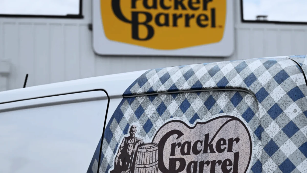
In August 2025, Cracker Barrel took the old man off its sign. The US restaurant chain replaced the “Old Timer” figure leaning on a barrel with a plain wordmark.
Within about a week, after a backlash that ran from regular diners to national political commentary, the old logo was back.
According to YouGov, a research and polling firm, 76% of respondents who were aware of the Cracker Barrel change preferred the old logo.
Nobody had studied that logo. Most could not have drawn it. They defended it anyway, because it stood for something they felt was theirs.
That pattern runs through every case below, and it applies to a 90-person accountancy practice just as much as a restaurant chain.
It is also why a sound rebranding process starts by identifying the equity before anyone opens a design file, and why the risk of controversy belongs within any strategic rebranding programme for professional services firms.
What Makes a Rebrand Controversial?
A rebrand becomes controversial when the audience believes something it owns has been taken without explanation. The trigger is rarely the new design itself. It is the removal of a recognisable asset, a heritage reference or a cultural signal that customers, staff or communities have treated as theirs.
- Removal: deleting a high-recognition asset, such as a character, colour or symbol, provokes the fastest reaction, as Cracker Barrel found in 2025.
- Dilution: simplifying towards a generic look reads as a loss of character, which was the complaint some McLaren fans raised in September 2026.
- Silence: an unexplained change lets critics write the story. Edelman's 2026 research found that 41% of consumers are most influenced by unpaid voices, compared with 20% by what the brand says about itself.
Controversial rebrands provoke backlash when a business removes, dilutes, or fails to explain away brand equity that customers, employees, or communities believed belonged to them.
The Controversial Rebrands of 2025–26, Case by Case
Each entry below names what changed, how the audience reacted, and the specific piece of equity the reaction was defending.
Cracker Barrel (August 2025): The Removed Character
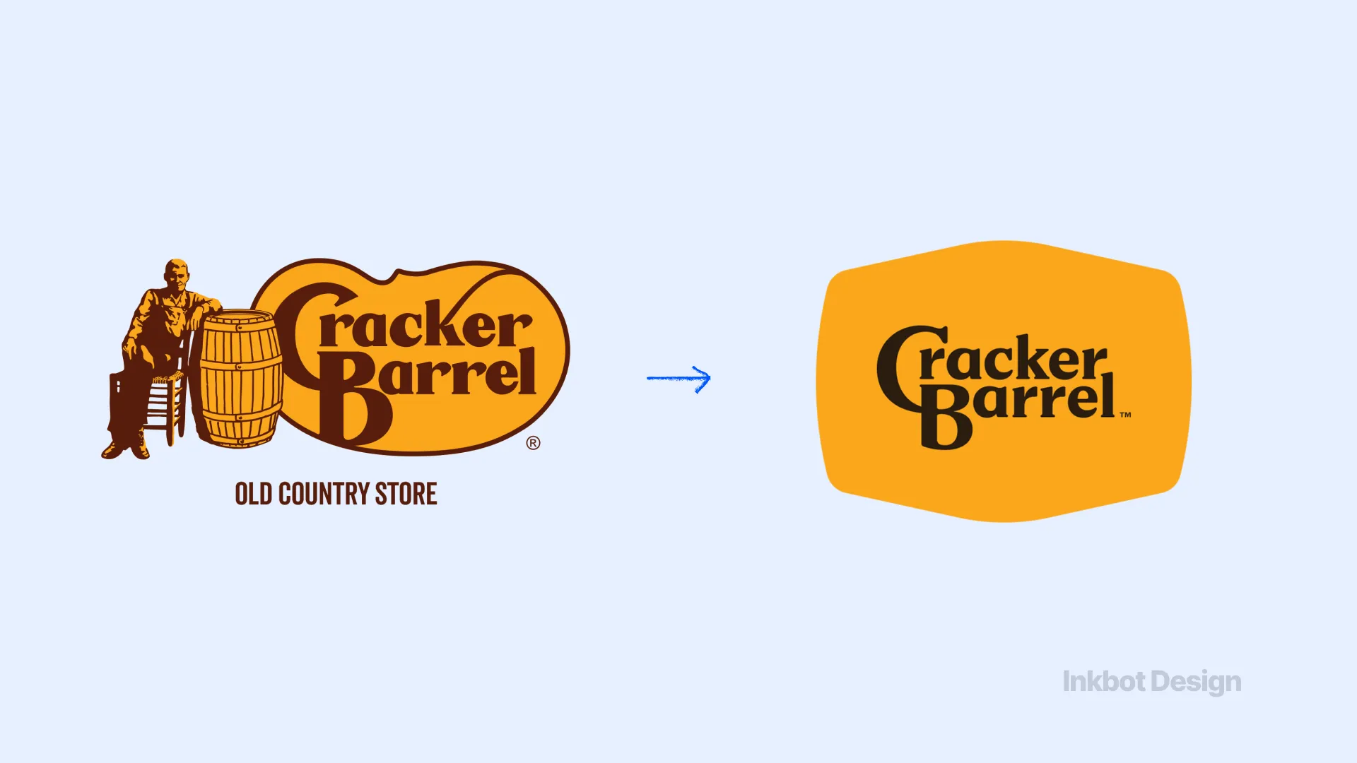
Cracker Barrel Old Country Store replaced its long-standing logo, including the Old Timer figure and barrel, with a text-only wordmark in August 2025, then reinstated the original within about a week.
YouGov found that 76% of respondents aware of the Cracker Barrel change preferred the old logo. In the same poll, 29% said the change made them less likely to dine at Cracker Barrel, against 9% more likely.
Treat that second figure carefully. It is self-reported intent, not measured sales.
Equity breached: a character that customers read as Cracker Barrel's heritage and, more importantly, their own nostalgia.
Galway City Council (September 2026): The Civic “G”
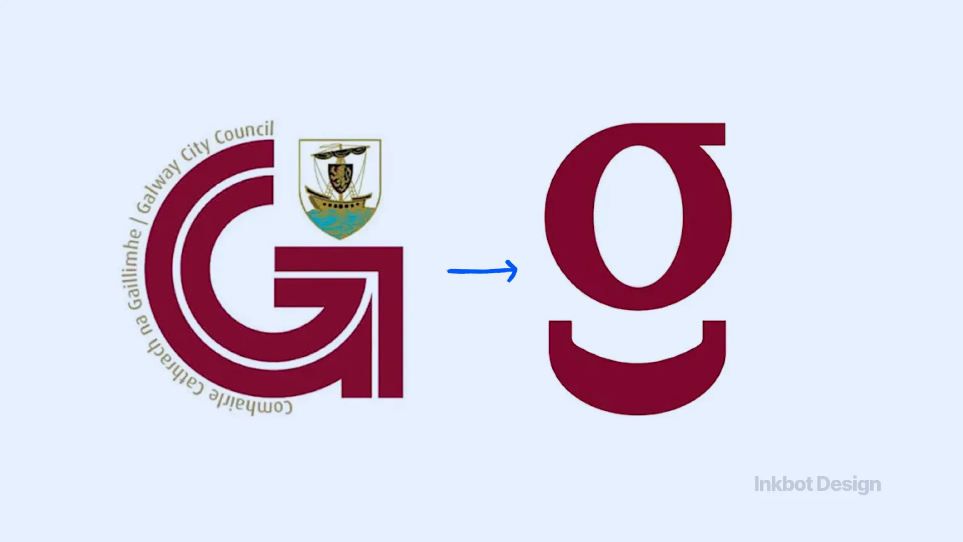
Galway City Council launched a new visual identity in September 2026.
The new identity keeps maroon as the principal colour, gives more prominence to the Irish-language name Comhairle Cathrach na Gaillimhe, and retains the City's Coat of Arms.
Residents and local business figures objected to the loss of the familiar “G” associated with Galway's quincentennial identity.
The reported €28,000 cost drew scrutiny for value for money.
Media reports also pointed to visual similarities with existing commercial marks, including a Belgian shopfitting company's logo and the Gousto emblem. Galway City Council says the rollout will be phased, replacing assets only as they come up for renewal.
Equity breached: civic ownership. Residents did not see a council logo. They saw their city's mark, paid for with their money, and possibly resembling someone else's.
McLaren (22/09/2026): Criticised, Not Broken
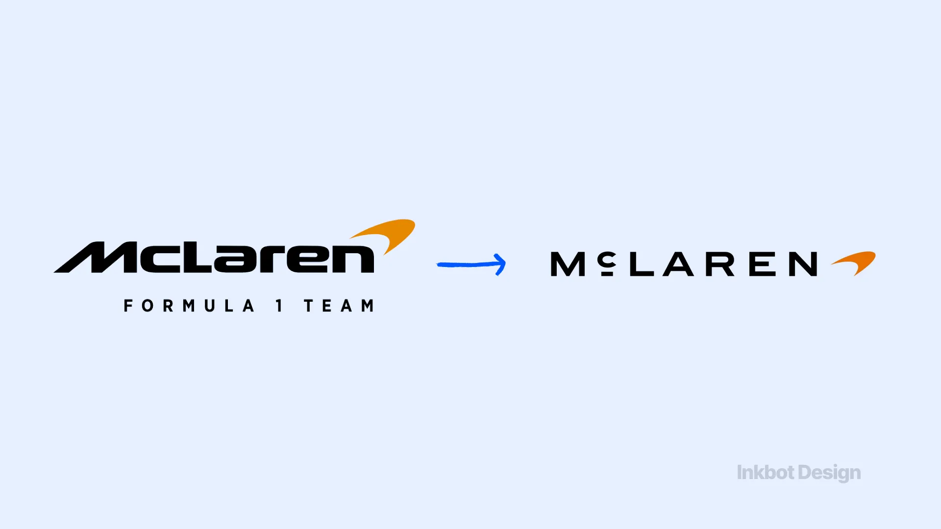
McLaren unveiled an “evolved identity” uniting McLaren Automotive and McLaren Racing under a new wordmark and typeface.
Some fans read the quieter wordmark as a loss of character, and Yahoo Sports framed it as part of a broader complaint about sports “blandardisation”.
McLaren kept the Speedmark, the papaya colour and the Speedy Kiwi emblem. It also rooted the new wordmark in the founding McLaren family's service station in Remuera, Auckland.
Equity breached: arguably, none of the core assets. The criticism targeted a wordmark, not the things fans actually recognise McLaren by. That distinction matters later.
Amazon (2026): A Refresh Judged on Behaviour
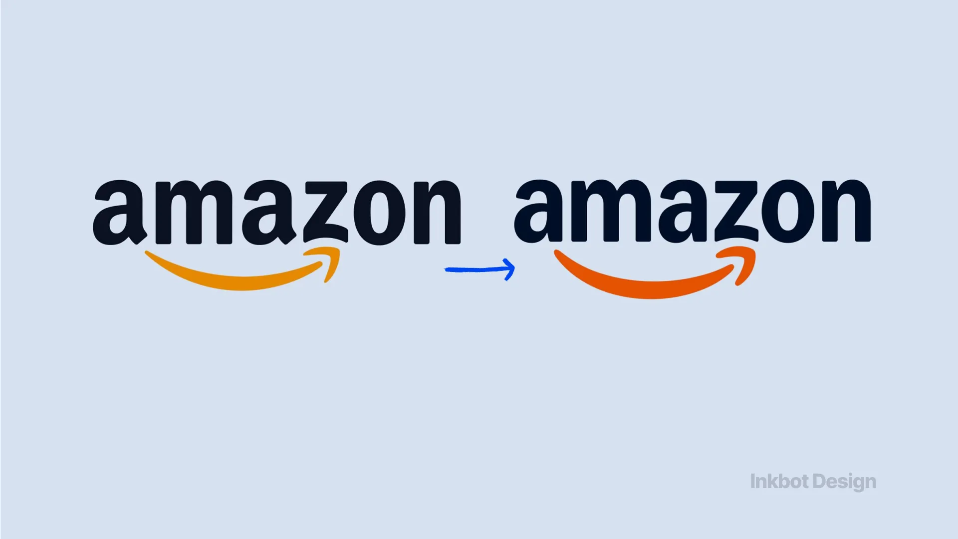
The Branx, a design agency blog, reported that Amazon refined its smile-arrow logo in 2026. The changes removed the serif on the “a” and moved to a brighter orange to unify more than 50 Amazon sub-brands.
Criticism centred less on the design than on the contrast between a cheerful identity and continuing public scrutiny of Amazon's labour practices and environmental footprint.
Equity breached: credibility. An identity cannot outrun a reputation, and a brighter orange invites people to say so.
Spotify (2026): The Icon as Infrastructure

Spotify's temporary disco-ball app icon caused annoyance and confusion in 2026. It was a limited-time campaign treatment, not a replacement for Spotify's core identity.
On a phone, the Spotify icon is a navigation cue that thumbs find without looking. Move it, and people get irritated, not heartbroken.
The professional services version is the client portal login page, the invoice template or the email footer, the places clients touch on autopilot.
Change them without warning, and you'll field “Is this a phishing email?” before you get a single compliment.
Equity breached: habit, not affection.
The Benchmarks: Gap (2010) and Tropicana (2009)
Gap Inc. replaced its blue-box logo in October 2010 and reverted within about a week. Tropicana, then owned by PepsiCo, replaced its orange-with-a-straw carton in 2009 and reinstated it within about two months. Both removed the single asset customers used to recognise the product.
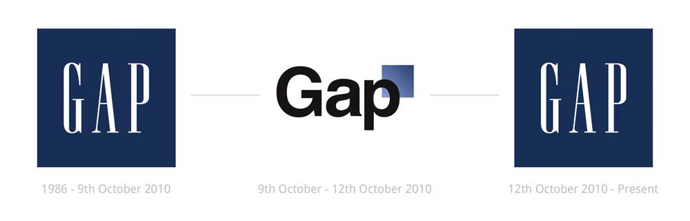
Equity breached: the recognition cue itself.
Is Backlash Always a Sign the Rebrand Failed?
No. Backlash measures disruption, not strategic error.
The Toimi analysis of rebranding failures argues that brands that recovered quickly were those that reversed course. That is true for Gap, Tropicana and Cracker Barrel, because in each case the removed element was the equity.
Reversal would be the wrong answer for McLaren, which kept all high-recognition assets and changed only the wordmark.
Type of change | Example | What the backlash measures | Right response |
|---|---|---|---|
Removal of a core asset | Cracker Barrel, Tropicana | Lost recognition and meaning | Restore the asset |
Evolution with assets retained | McLaren | Taste and nostalgia | Explain the continuity, hold |
Public-sector identity | Galway City Council | Ownership, cost, distinctiveness | Consult, justify cost, phase the rollout |
Refresh against a reputation gap | Amazon | Credibility | Fix the behaviour, not the logo |
Campaign or interface change | Spotify | Disrupted habit | Wait it out; it is temporary |
The test is simple. Did the change remove something the audience used to recognise the brand, trust it, or feel it belonged to them? If yes, restore it. If no, explain the change and hold your nerve.
Why Rebrand Reactions Are Bigger in 2026
Edelman's 2026 Brand Growth in an Insular World study surveyed 17,688 people across 15 markets. Two-thirds (66%) said they are hesitant or unwilling to trust people who differ from them in values, information sources, cultural background or problem-solving approach.
That changes how identities get read. A logo is now treated as a statement about who a business is for, and professional services firms aren't exempt. Drop a regional firm's heritage crest for a flat sans-serif and some clients will read it as “they've gone corporate”, or worse, “they're being bought”. Nobody briefed them to think that. They got there on their own.
Trust sits right alongside quality and price. According to Edelman, 88% of consumers consider trust in a brand critical when buying, nearly equal to quality at 89% and value at 88%. In a sector that sells judgement, that probably understates it.
The most useful figure for anyone planning a rebrand is this one. Among consumers who both trust a brand and find it relevant, 71% would keep using it if it began serving people different from themselves.
Among those who neither trust it nor find it relevant, that drops to 36%. Permission to change is earned in advance. Brands with thin trust have very little of it to spend.
What Controversial Rebrands Mean for a Professional Services Firm
A 120-person law firm will never trend on social media over its logo. The equity at stake is identical, though, and it has more owners than most leadership teams account for.
In a partnership, the brand is co-owned in a literal sense. Partners' names sit on the door. Long-standing clients remember the letterhead on their first engagement letter. Senior staff joined that firm.
Drop a founding partner's name after a merger and three things happen at once: the partner loses visible status, the partner's clients lose the name they asked for at reception, and everyone else starts wondering whose firm this is now.
Some mergers absorb that fine. The ones that don't… rarely find out from a survey.
The Galway case is the closest parallel. A civic identity belongs to residents in a way no trademark register records, and a partnership identity belongs to its partners in the same way.
Both demand consultation, a reasoned case for cost, and a distinctiveness check before launch, not after a journalist finds the lookalike.
“Nobody will complain publicly about our rebrand.”
Probably true. Professional services backlash is quiet. A partner keeps the old email signature for six months. A client of 15 years asks during a renewal meeting whether the firm has been sold. A senior associate cites “not the firm I joined” in an exit interview. None of it makes the news. All of it shows up in retention.
Tracking is part of measuring whether a rebrand has succeeded.
“If we protect everything, we'll never modernise.”
Also true, and McLaren answers it. Identify the two or three brand assets that actually carry recognition, keep them visible, and change the rest. That is the core of a rebranding equity strategy: migrating value rather than replacing it.
“A rebrand does not need unanimous approval. It needs the people who believe they own the brand to recognise themselves in what comes next. Partners, long-standing clients and senior staff will forgive a new typeface. They will not forgive the feeling that the firm they built, chose or joined has been quietly swapped for someone else's.”
Explanation is the other lever. Edelman's 41%/20% split means your announcement will lose to whatever partners and clients say to each other, unless they hear the reasoning first. That is why communicating a rebrand internally comes before the public launch.
Find What Your Audience Thinks It Owns
Every case here tells the same story from a different angle.
- Cracker Barrel took away a character.
- Galway City Council touched civic memory.
- Amazon's refresh ran into its own reputation.
- McLaren changed a wordmark, kept what fans recognise, and will be fine.
The logo is simply where a breach of equity becomes visible.
For a professional services firm, the owners are partners, clients and staff. They won't post about it. They'll just behave differently.
Before approving any new identity, list what each of those groups believes belongs to them, and decide deliberately what stays. A free Brand Equity Audit™ does exactly that: a structured diagnostic showing where your brand holds commercial value, where it is losing ground, and what a rebrand must protect.
Frequently asked questions
Why do some rebrands cause so much public backlash?
Rebrands cause backlash when audiences feel something they owned has been taken away. The loss might be a familiar character, a colour or a heritage reference. Cracker Barrel's 2025 logo change removed its Old Timer figure, and YouGov found 76% of aware respondents preferred the old version. The reaction defended meaning rather than design.
Should a company reverse a rebrand if customers hate it?
Only if the rebrand removed the asset customers use to recognise or trust the brand. Gap, Inc. in 2010 and Cracker Barrel in 2025 reversed because the removed element was equity. McLaren's 2026 identity kept its Speedmark, papaya colour and Speedy Kiwi, so explaining the continuity is a better response than reversal.
Does a negative reaction to a rebrand hurt sales?
Not necessarily, and survey data rarely proves it. YouGov found that 29% of respondents said Cracker Barrel's 2025 logo change made them less likely to dine there, compared with 9% who said it made them more likely. Those measures stated intent, not purchasing behaviour. The measurable risk lies in lost trust, which Edelman found to be a key purchase criterion for 88% of consumers.
Is it risky to drop a partner's name from a firm's brand after a merger?
Yes. A partner's name is status equity for that partner and a recognition cue for the clients who hired them. Removing it without consultation creates quiet resistance: old email signatures, uncomfortable questions from clients, senior departures. Agree the change with named partners first, and explain the reasoning to long-standing clients before any public launch.
What is the difference between a controversial rebrand and a bad rebrand?
A controversial rebrand provokes reaction; a bad rebrand destroys equity. McLaren's 2026 evolution drew criticism but retained all high-recognition assets, so it is controversial rather than bad. Tropicana's 2009 carton redesign removed the orange-and-straw cue that shoppers relied on, and the change was reversed within about two months.