25 Rebranding Failures That Wiped Out Millions in Brand Equity
Around 38–40% of rebranding campaigns fail to deliver a positive return on investment. This forensic breakdown examines 25 famous rebranding failures, the specific strategic errors that caused them, and how professional services firms can avoid destroying their own brand equity.
 By Stuart Crawford
 Reviewed by Tabitha Ayers
Updated 14 min read
On this page14 min left
Around 38-40% of rebranding campaigns fail to deliver a positive return on investment, leaving businesses to fund multimillion-pound recovery efforts for an identity no one asked for.
The failure is rarely the fault of the typography or the colour palette.
In 17 years of brand work, the pattern I see most often is a leadership team confusing boredom with irrelevance.
Knowing when to consider rebranding is the first defence against a costly mistake.
When iconic visual cues are removed abruptly, immediate loss of recognition is the most common proximate cause of sales decline.
B2B and professional services firms are not immune to this consumer mechanism; when a 100-person accounting firm radically changes its name and visual identity post-merger without transitioning its authority, it resets its digital footprint and market trust to zero.
We are going to dissect 25 distinct times this happened at scale.
What Are Rebranding Failures?
Rebranding failures occur when a company attempts to update its corporate identity but inadvertently destroys established brand equity, leading to financial loss, market confusion, or public backlash.
- They typically result from the abrupt removal of visual heuristics, causing immediate loss of recognition.
- Roughly 60% of these failures stem from internal procurement or vendor-led processes rather than audience-tested strategy.
- The average corrective spend to fix a poorly received rebrand typically reaches £2.5M to £4M.
Rebranding failures occur when companies abruptly remove established visual heuristics, resulting in immediate loss of recognition, diminished sales, and degraded digital indexability.
The Commercial Reality for Professional Services MDs
A failed rebrand is not a design critique. It is a commercial shock event.
When a consumer goods company changes a logo and sales drop, the mechanism is usually shelf confusion. When a £15m UK accountancy practice or legal firm changes its name and visual identity, the mechanism is referred to as referral friction.
Professional services rely entirely on trust and memory. If a referring partner cannot instantly recall your new name, or if your new visual identity mimics a low-tier competitor, you drop off the shortlist.
According to proxy studies by groups such as PwC and Pivitt, around 38–40% of rebranding campaigns fail to deliver a positive return on investment.
This post acts as a supporting asset within our broader rebranding agency methodology. To protect your firm's equity, you must first study exactly how other organisations set theirs on fire.
The Anatomy: 25 Famous Rebranding Failures
We have categorised these 25 rebranding failures into five distinct failure mechanisms. Each represents a repeatable error in strategy, execution, or audience alignment.
1: The Erasure of Heritage
Heritage erasure occurs when a brand discards decades of accumulated trust in favour of a generic, modernised aesthetic. These failures usually replace character with typography that lacks cognitive ease.
1. Gap (2010) Estimated Cost: £78,000,000 ($100M)
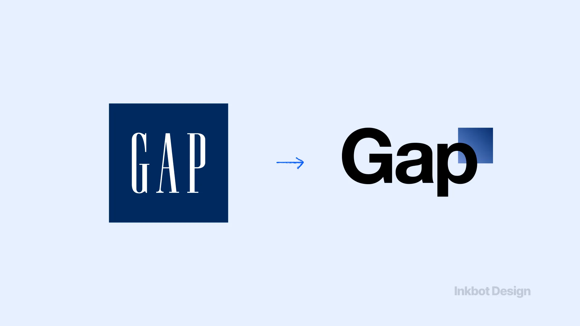
Gap abruptly replaced its iconic 20-year-old blue square logo with a heavy Helvetica font and a small gradient box. The design ignored fundamental typographic principles, abandoning high-contrast visibility in favour of an AI-smooth, corporate neutrality that meant nothing to its audience. The public backlash was immediate and vicious. Gap reverted to its original logo just six days later, squandering an estimated $100M in design and rollout costs.
2. Tropicana (2009) Estimated Cost: £107,000,000 ($137M in lost sales)
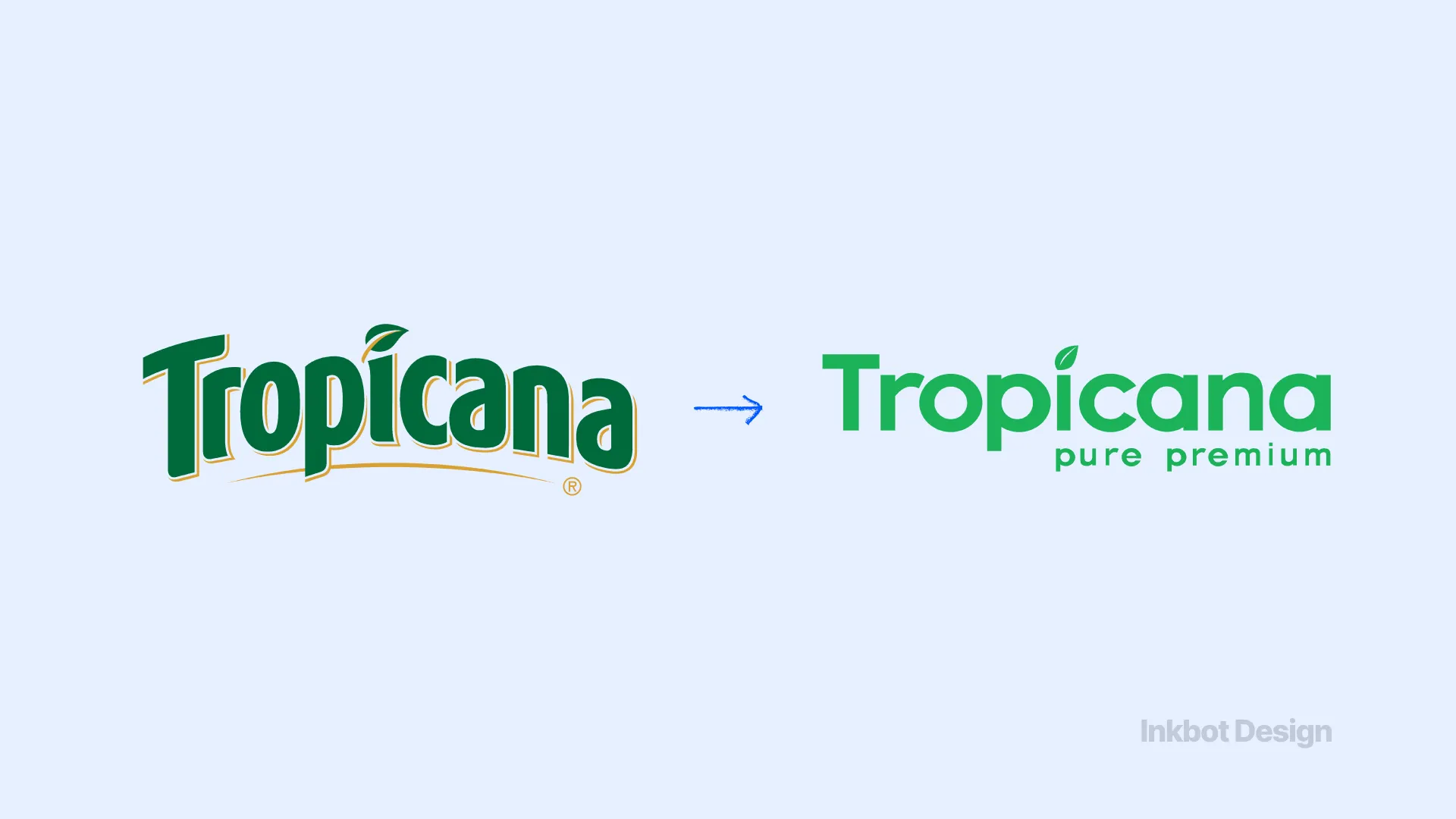
PepsiCo removed the familiar orange-with-a-straw image from Tropicana cartons, replacing it with a minimalist glass of juice and a clean, sans-serif font. When iconic visual cues are removed abruptly, immediate loss of recognition is the most common proximate cause of sales decline; Nielsen scan data confirm that shelf confusion in FMCG is a documented mechanism. Sales plummeted by 20% in two months, costing the company $137M before they abandoned the redesign.
“A brand is essentially a heuristic-a mental shortcut that saves a buyer from having to think. When you change the packaging so drastically that the buyer has to pause and verify they are holding the right product, you have broken the heuristic. That fraction of a second of doubt costs millions.”
3. Royal Mail to Consignia (2001) Estimated Cost: £2,500,000 launch and recovery
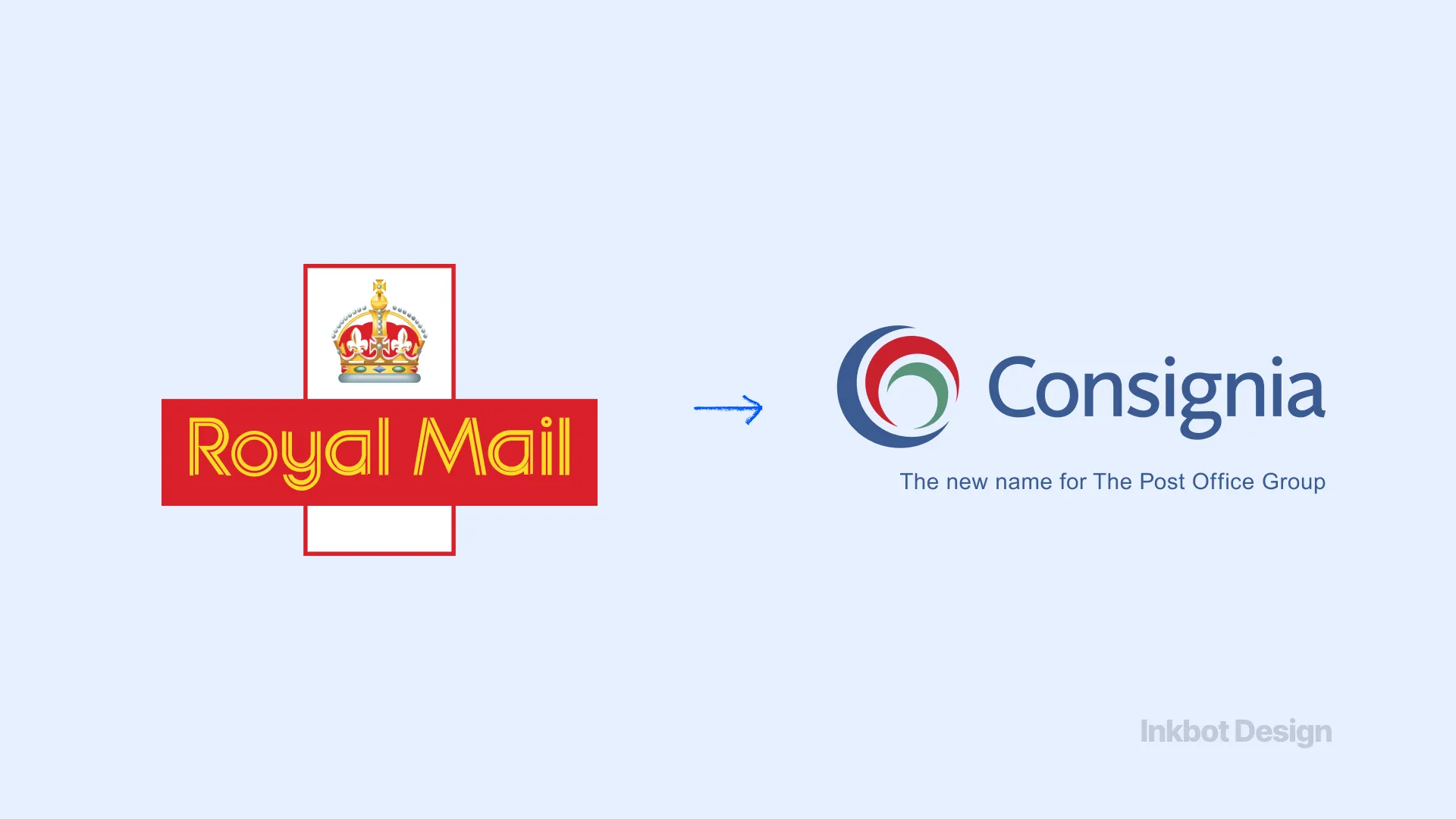
The 500-year-old British institution, Royal Mail, rebranded as “Consignia” to sound like a modern, international logistics business. The name was universally mocked as a meaningless corporate invention that stripped away centuries of civic trust. After 16 months of sustained ridicule and union pressure, the organisation paid £1M to revert to Royal Mail.
4. Leeds United (2018) Estimated Cost: Immeasurable reputational damage, blocked £100M+ rollout
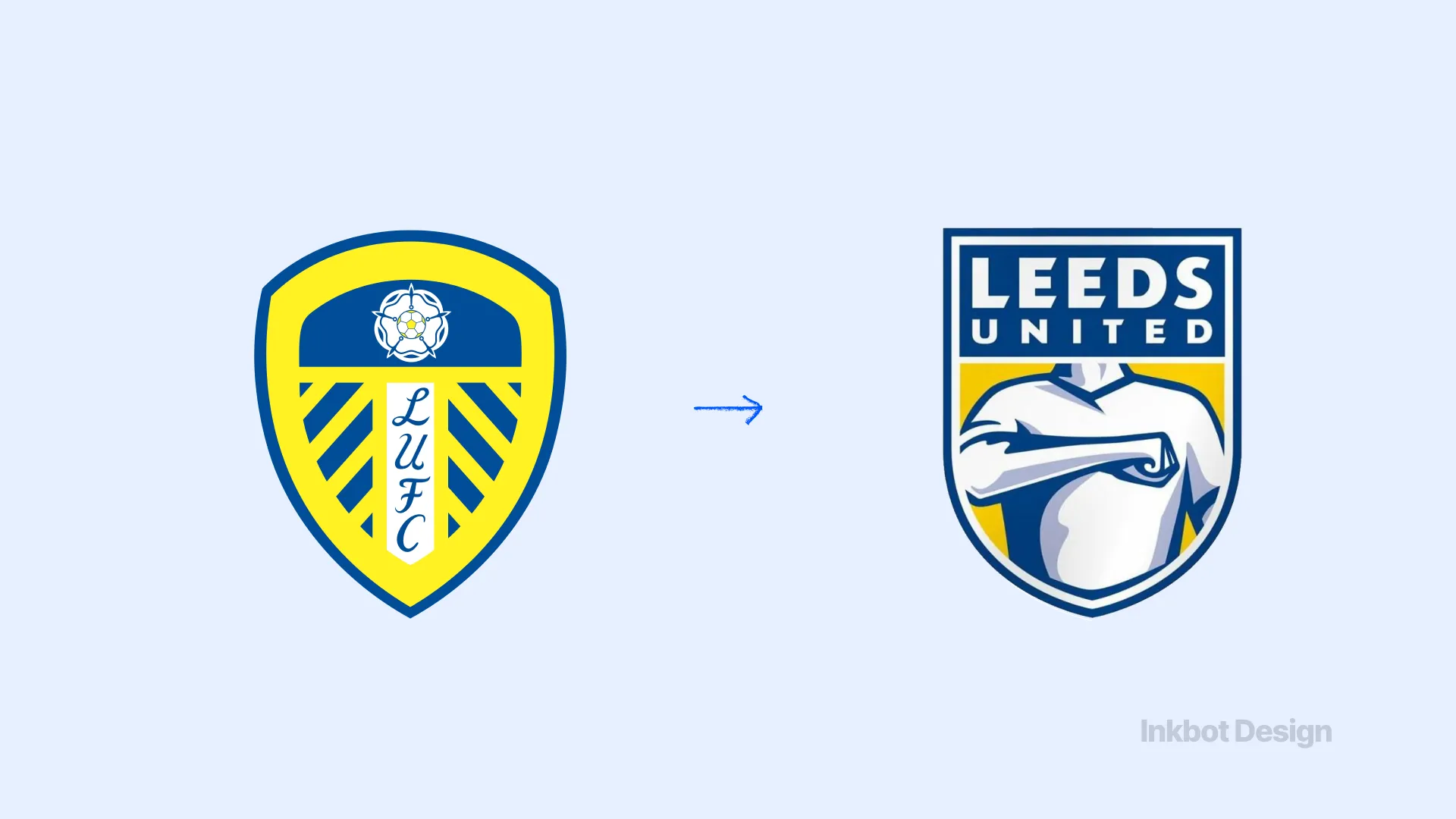
Leeds United attempted to modernise its crest, introducing a design featuring a torso performing the “Leeds salute.” Fans immediately likened it to a cheap pharmacy brand or a video game default graphic. The club ignored the human-centric, analogue history of football heraldry. Over 77,000 fans signed a petition within hours, forcing the club to scrap the design entirely.
5. Twitter to X (2023) Estimated Cost: Billions in lost brand equity
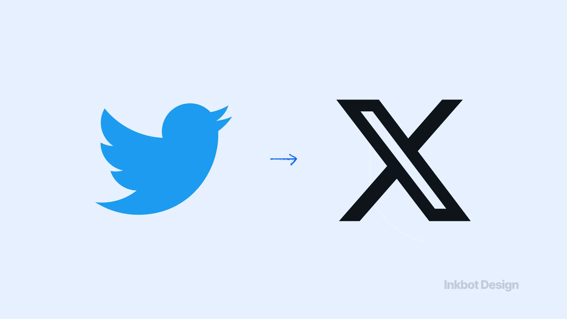
Elon Musk discarded the globally recognised bluebird and the proprietary verb “to tweet,” replacing them with a stark, generic “X”. The letter X lacks a variable font and offers no distinct trademark protection. By destroying one of the most recognisable digital entities on the planet, the platform fractured its user base and alienated advertisers who relied on the brand's established safety signals.
2: Strategy Misalignment & Audience Friction
These rebrands failed because the company's internal strategy violently collided with what the public was willing to accept.
6. Weight Watchers to WW (2018) Estimated Cost: Multi-million-pound subscriber loss
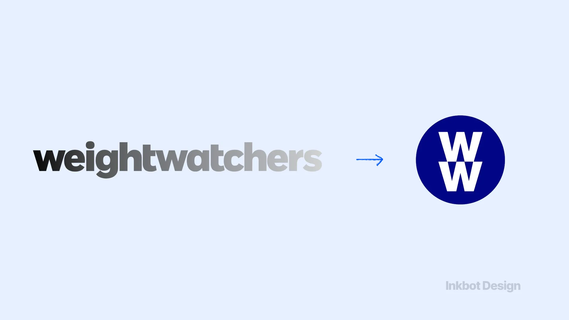
Attempting to pivot from diet culture to “Wellness and Wellbeing,” Weight Watchers rebranded to WW. However, “WW” is functionally difficult to say aloud (it has twice as many syllables as Weight Watchers). The core audience felt abandoned, and the company lost over 600,000 members globally in the months following the shift.
7. BP (2000) Estimated Cost: £165,000,000 ($211M+)
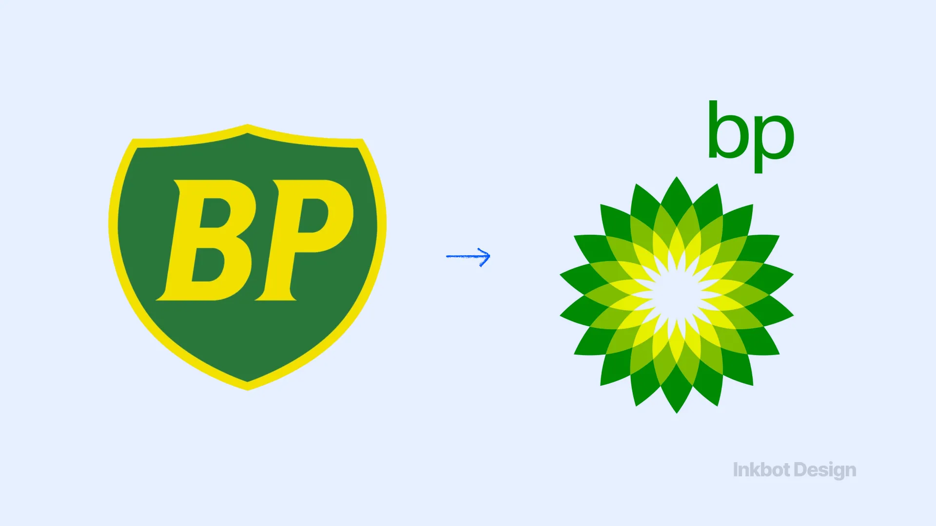
BP replaced its shield with the “Helios” sunburst, positioning itself as a green, environmentally friendly energy company (“Beyond Petroleum”). The public saw through the greenwashing instantly. When the Deepwater Horizon disaster occurred, the eco-friendly logo became a global target for satire, permanently associating the design with corporate hypocrisy.
8. TGI Fridays (2020) Estimated Cost: Unknown rollout waste
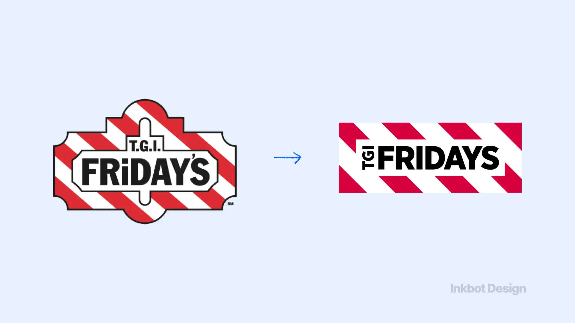
The restaurant chain attempted a minimalist refresh, dropping “TGI” to become simply “Fridays.” The simplified logo removed the ornamental borders and character that defined the brand's casual-dining history. Customers found the abbreviation confusing and disconnected from the brand's promise. The company eventually had to reintroduce the clashing legacy elements to restore recognition.
9. Syfy (2009) Estimated Cost: Unknown
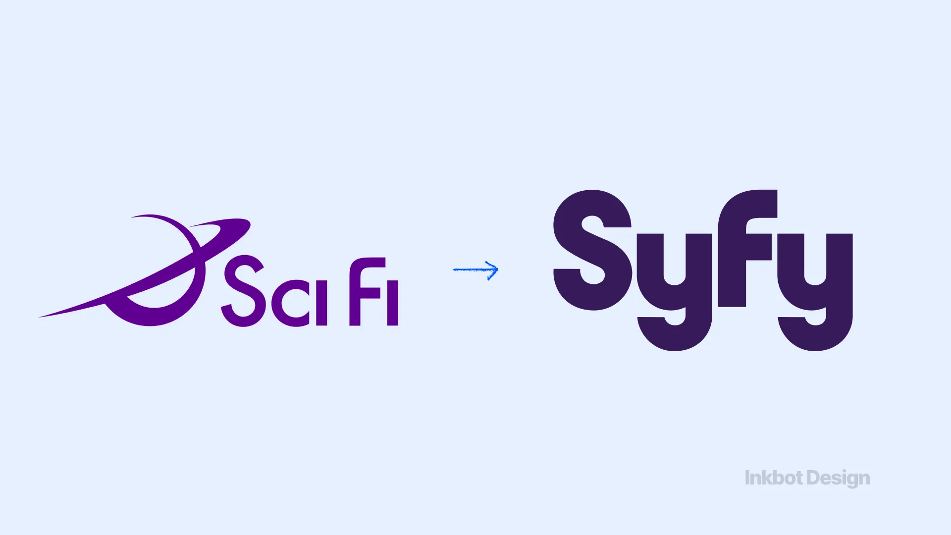
The Sci-Fi Channel rebranded as “Syfy” to trademark the name and broaden its programming beyond strict science fiction. While the sound remained the same, the spelling alienated its core demographic of genre enthusiasts. In several languages, “Syfy” also translated poorly, creating a persistent low-grade friction that took years for the network to overcome.
10. Facebook to FACEBOOK (2019) Estimated Cost: Unknown
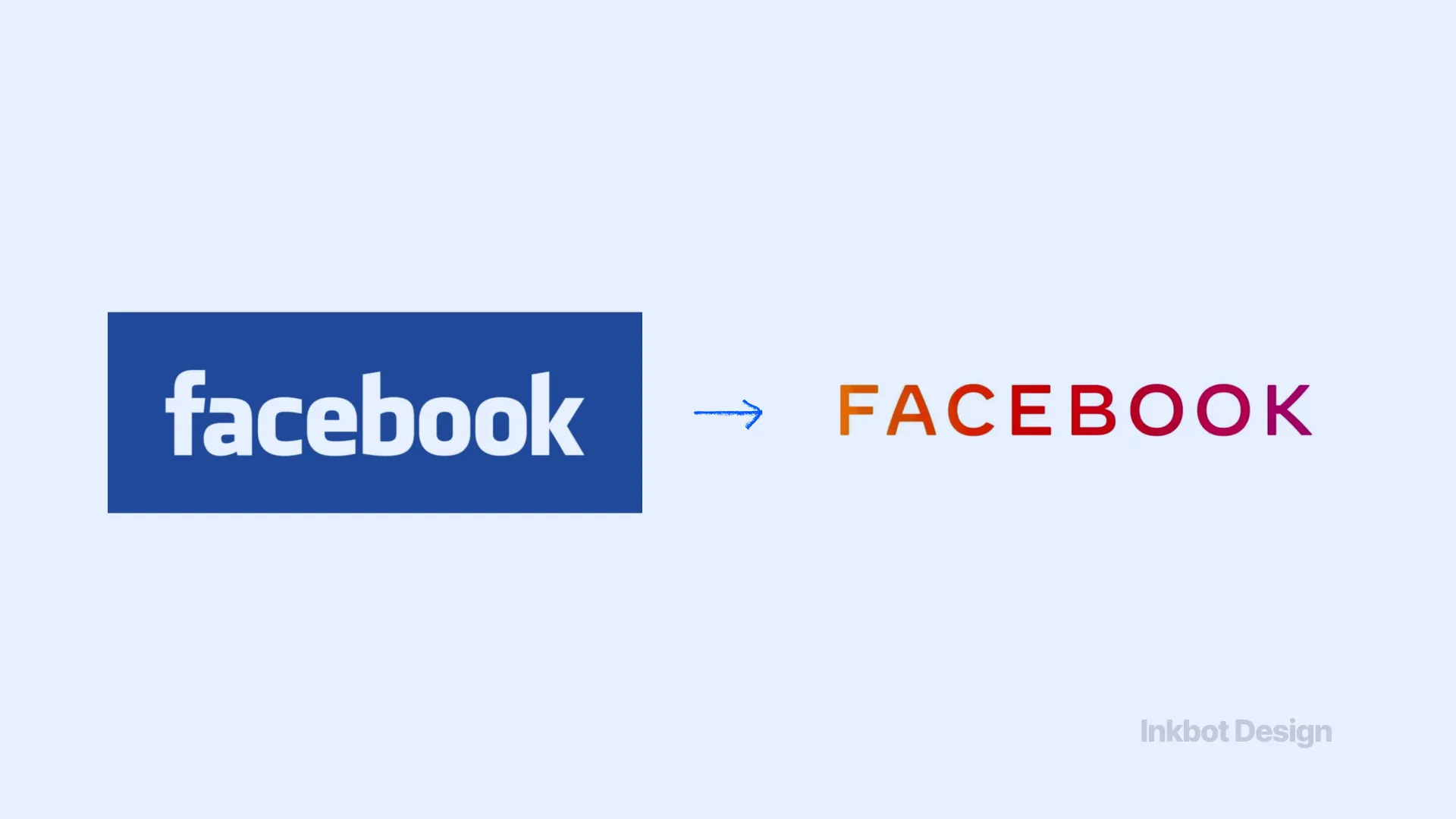
In an attempt to distinguish the parent company from its apps, Facebook introduced a new all-caps logo that shifted colours based on the product (e.g., Instagram, WhatsApp). Instead of clarifying the corporate structure, it drew mockery for feeling like a “Boomer” shouting on the internet. It was a superficial typographic fix to a deep structural trust problem. They eventually abandoned it in favour of the “Meta” rebrand.
3: Overcomplication & Clutter
While many modern rebrands fail by becoming too minimal, this group failed by adding unnecessary noise, proving that poor aesthetic judgment carries a hard commercial cost.
11. Mastercard (2006) Estimated Cost: £7,800,000 ($10M)
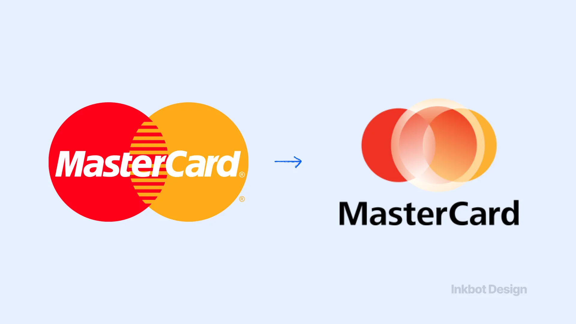
Mastercard attempted to update its globally recognised interlocking red and yellow circles by adding a third, off-centre element filled with gradients and complex line work. It violated every rule of cognitive ease. The result was a cluttered, muddy disaster that failed to translate to small screens or print. It was swiftly and quietly buried until Pentagram correctly fixed the brand in 2016.
12. Capital One (2008) Estimated Cost: Unknown
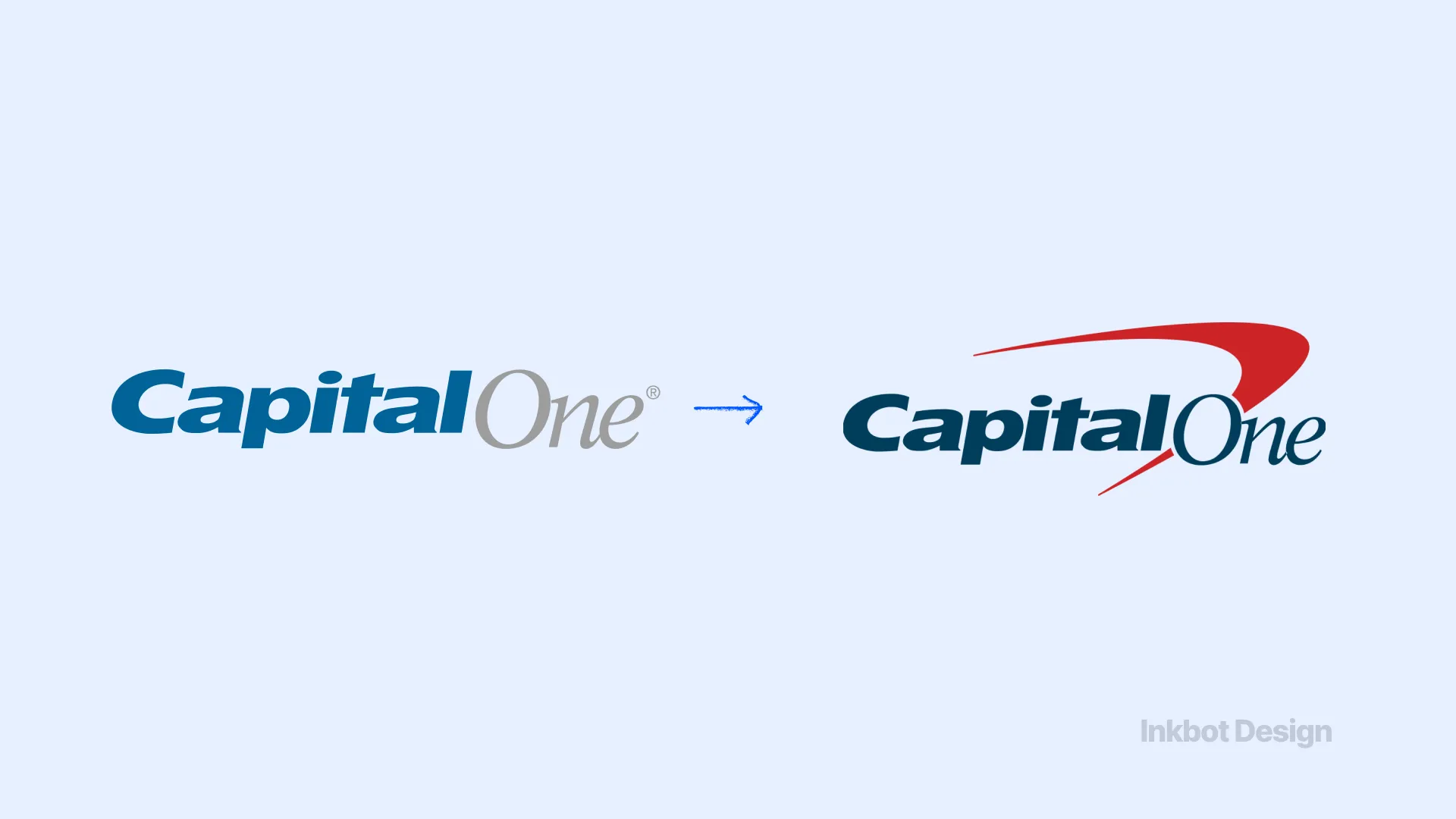
Capital One added a red swoosh to its logo. The swoosh felt dated immediately, resembling late-90s tech-boom graphics rather than those of a stable, modern financial institution. It added zero semantic meaning, complicated the visual footprint, and failed to project the necessary authority.
13. Hershey's (2009) Estimated Cost: Unknown reputational damage
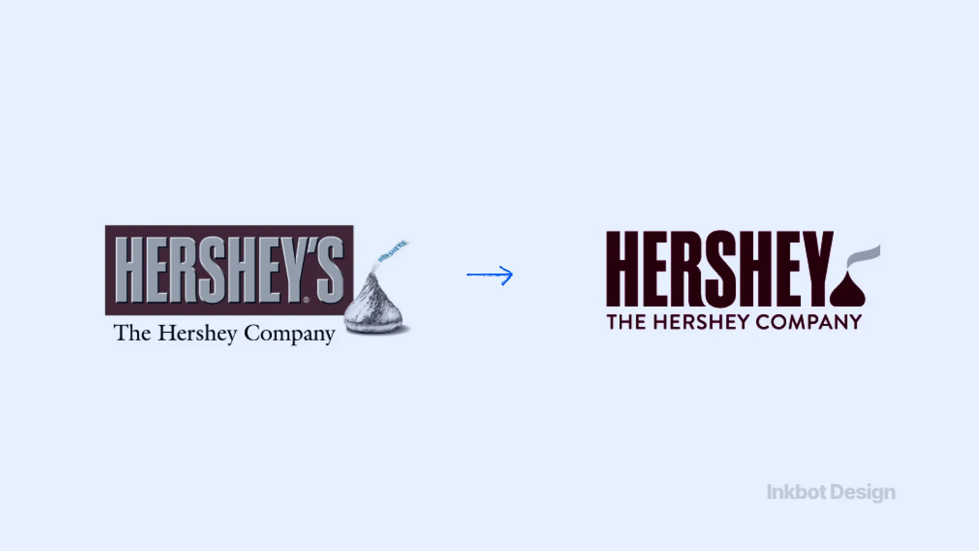
Hershey's attempted a flat-design refresh of its corporate logo, including a stylised illustration of a Hershey's Kiss. Unfortunately, the flat, vector-art rendering stripped the product of human-centric depth, resulting in a shape that the internet universally agreed looked like a steaming pile of poop. It was a catastrophic failure of basic visual testing.
14. Mozilla (2006) Estimated Cost: Unknown
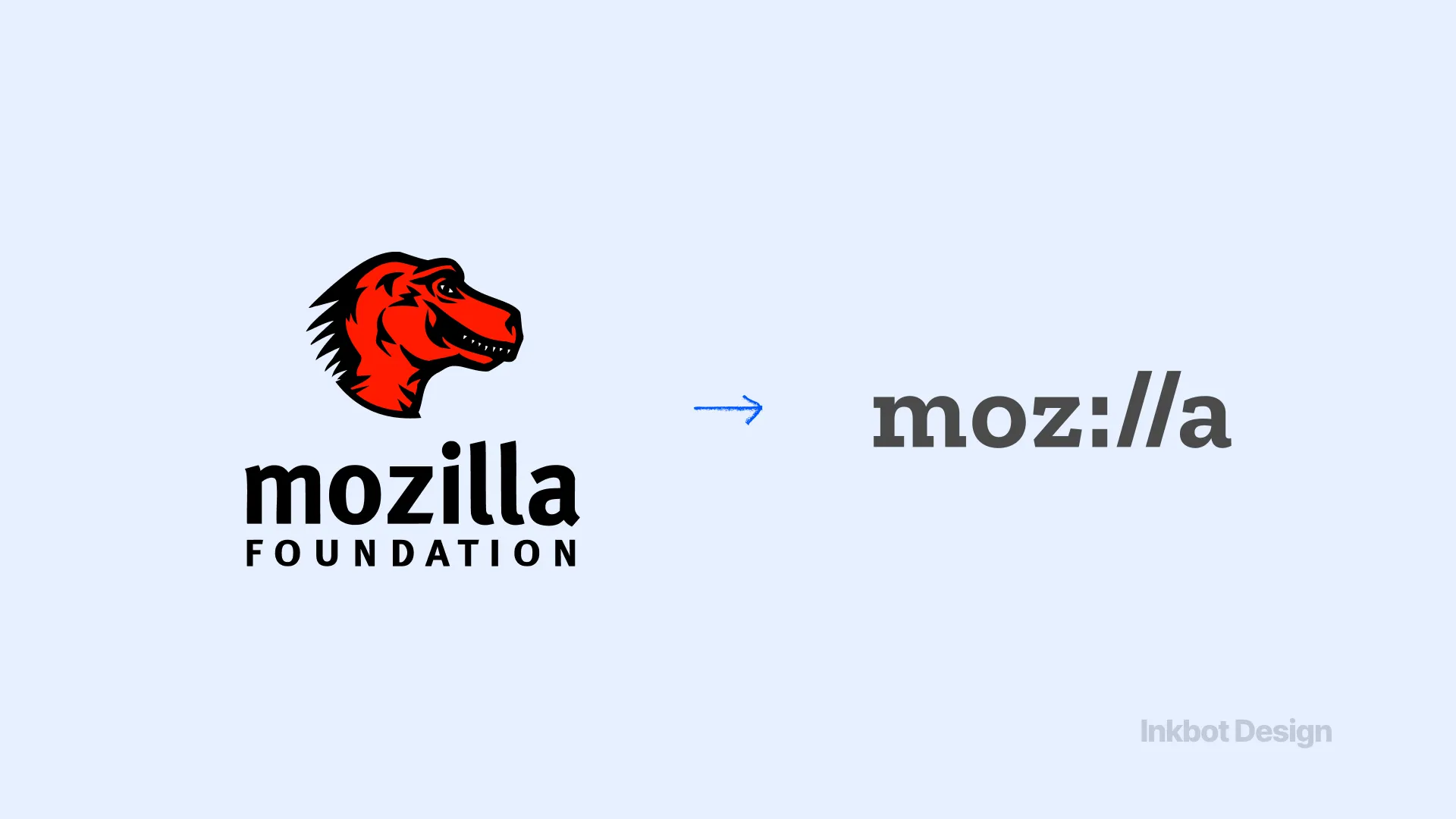
Mozilla rebranded to “Moz://” to highlight its internet roots. It created a URL-like logo that confused non-technical users and failed to establish a strong, standalone identity in a browser market dominated by visually distinct icons like Chrome and Safari. The typography was clever to developers but illegible to the public.
15. Microsoft Windows 8 (2012) Estimated Cost: Billions in lost OS adoption
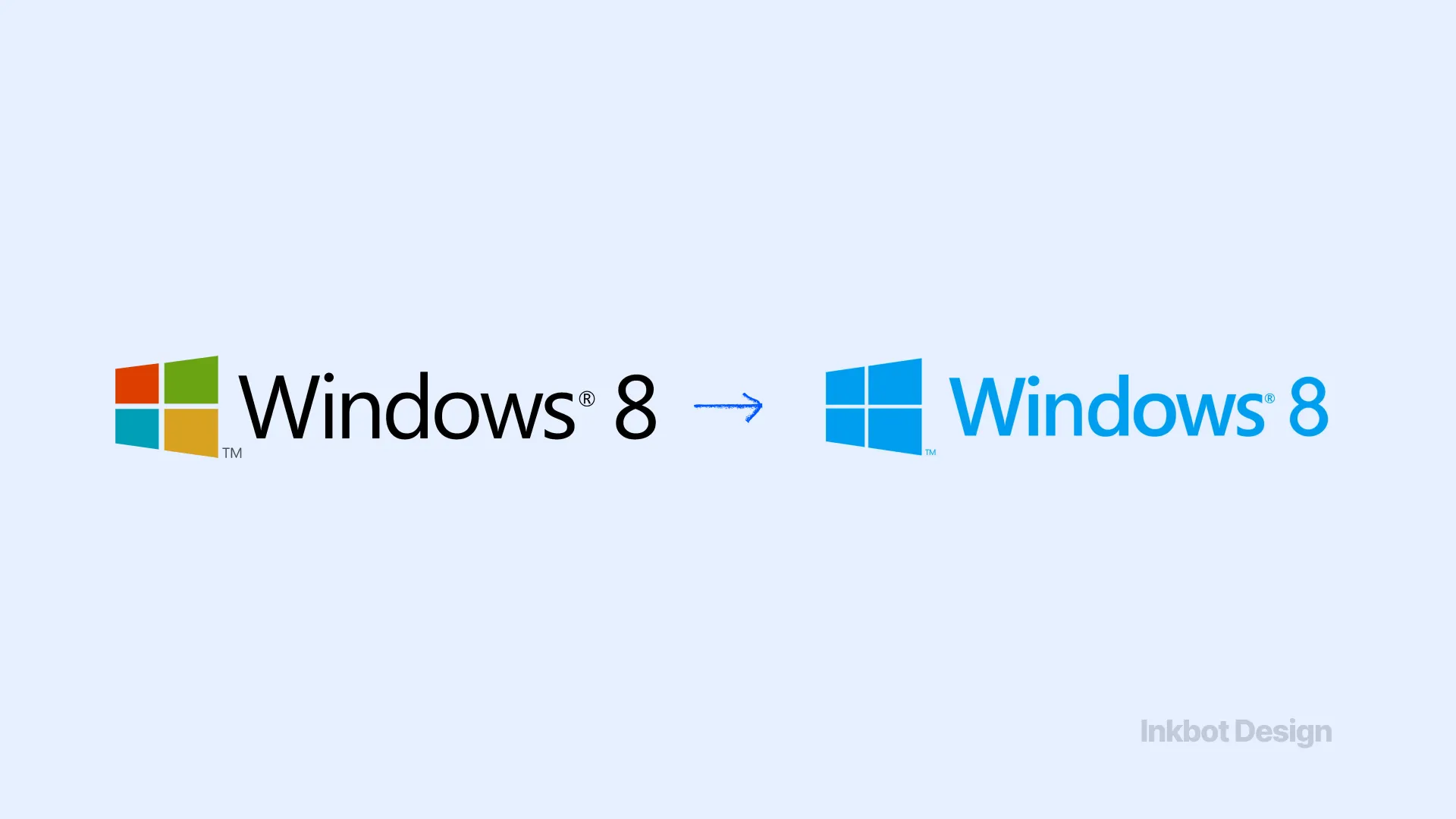
Microsoft forced a radical, tile-based “Metro” UI onto desktop users who relied on the traditional Start menu. The visual rebrand was tied to a functional overhaul that completely ignored user behaviour. The cognitive friction was so severe that adoption stalled completely, forcing Microsoft to rapidly pivot back to familiar visual heuristics in Windows 10.
4: Modern Identity Collisions
These recent failures highlight a modern reality: brand changes now trigger instant, coordinated digital reactions that destroy market capitalisation in days.
16. Cracker Barrel (2024) Estimated Cost: £110,000,000 ($140M market value drop)
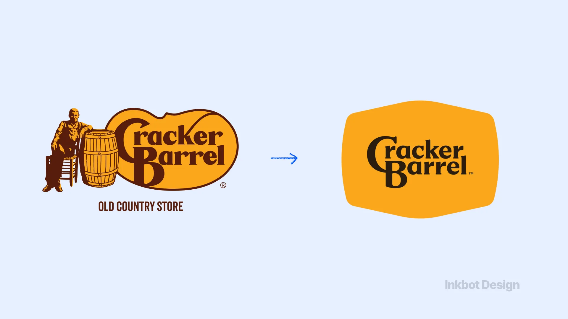
The American restaurant chain attempted a wide-scale modernisation, tweaking its typography and brand presentation. The core audience viewed the modernisation as an attack on the brand's rustic, traditional identity. The immediate backlash wiped out more than $140M in market value at the height of the controversy, proving that heritage brands cannot simply adopt modern design trends without permission.
17. Jaguar (2025) Estimated Cost: 97.5% plunge in European registrations
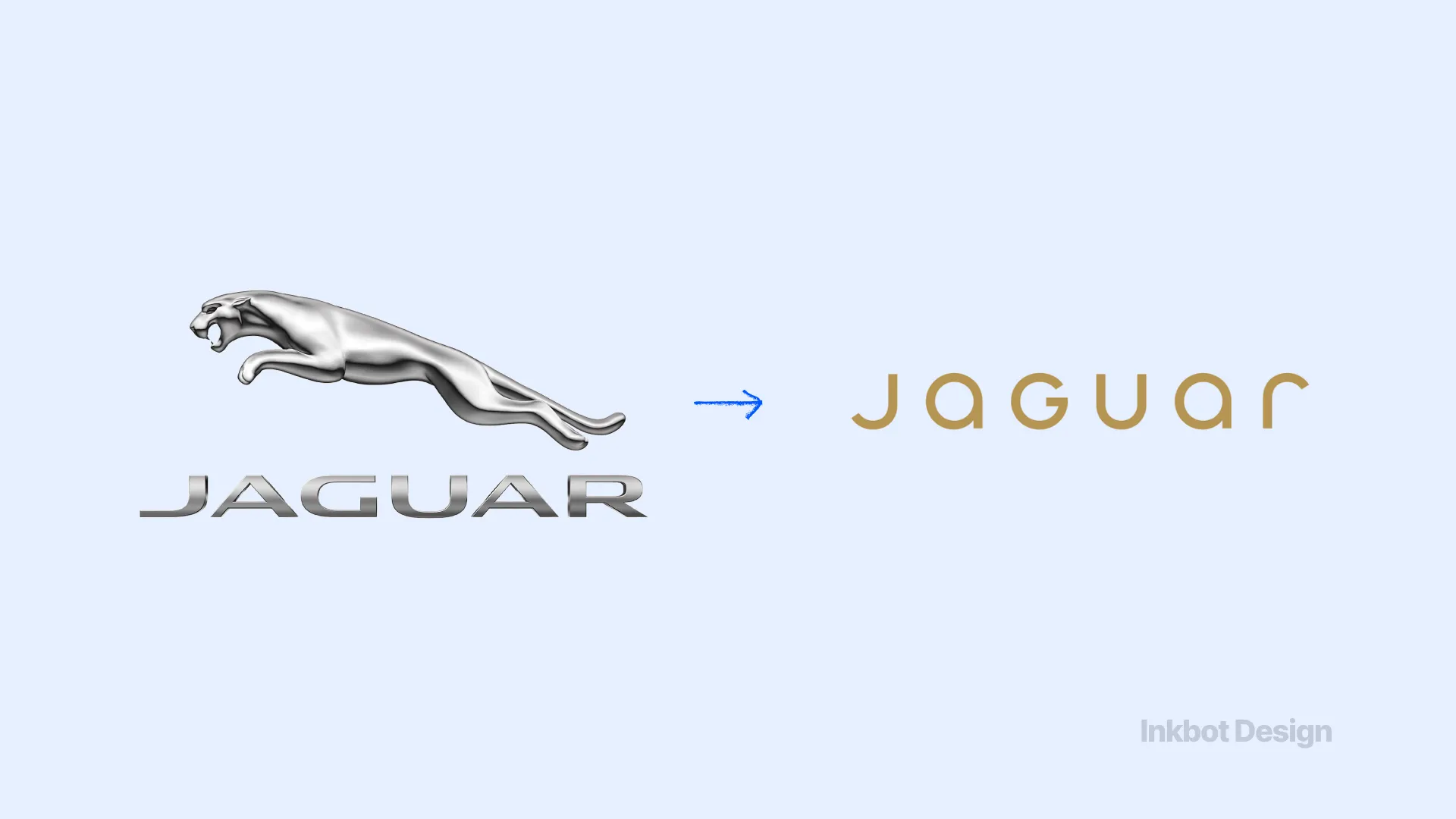
Jaguar executed a radical, electric-first repositioning, abandoning its traditional leaping cat and heritage styling in favour of an avant-garde, fashion-forward aesthetic. The shift was so jarring that it alienated the existing buyer base entirely. Industry commentary noted a dramatic 97.5% plunge in European registrations immediately following the brand shift.
18. Bud Light (2023) Estimated Cost: £21,000,000,000 ($27B market value wiped)
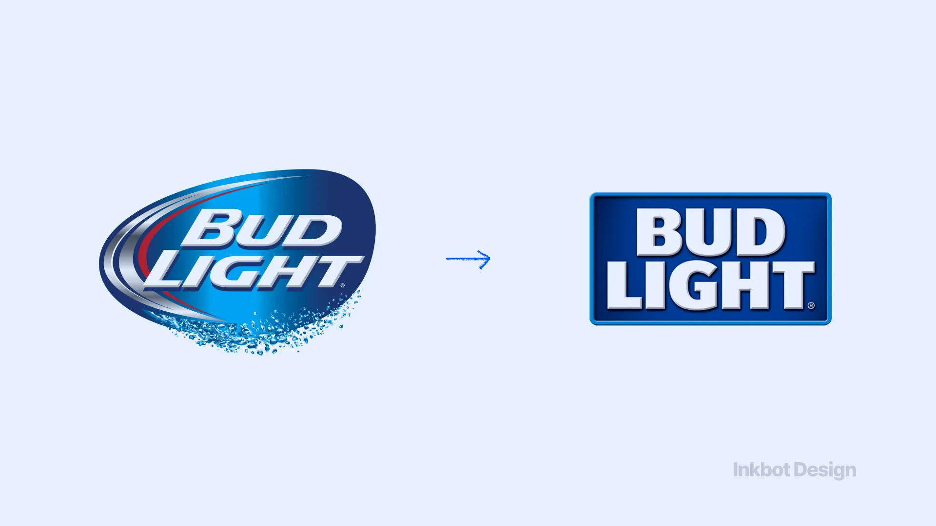
While technically a campaign rather than a full corporate rebrand, Bud Light's shift in visual positioning and influencer alignment collided violently with its core audience's identity. The resulting boycott is the clearest modern example of a brand move causing catastrophic financial damage. It wiped out an estimated $27 billion in market value at the parent-company level.
“A rebrand is not a canvas for a marketing department’s self-actualisation. It is a highly sensitive adjustment to a commercial engine. If the changes you make violate the identity of the people who actually buy the product, the market will correct your mistake with brutal financial efficiency.”
19. Cardiff City (2012) Estimated Cost: £100M+ in owner investment friction
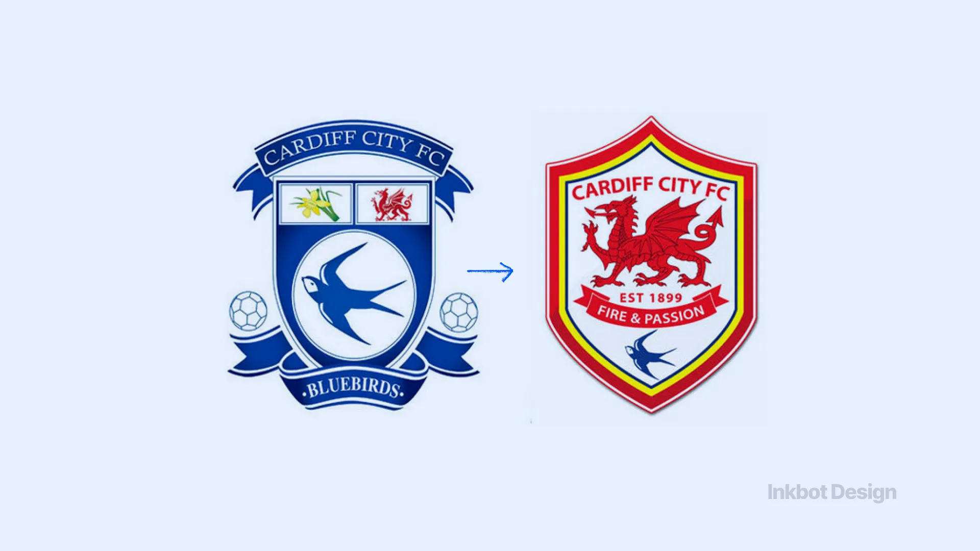
The club's ownership changed the traditional blue kits to red and replaced the bluebird crest with a red dragon, attempting to appeal to international markets. They ignored a century of tribal loyalty. The resulting fan hostility fractured the club's culture, eventually forcing the owners to capitulate and return to the blue identity in 2015.
20. Pepsi (2008) Estimated Cost: £940,000,000 ($1.2B over 3 years)
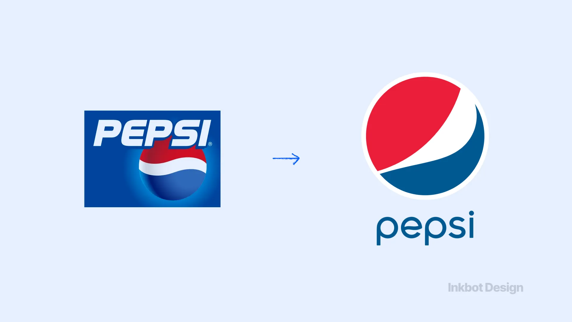
Pepsi spent millions on a redesign that tilted its iconic globe to create a “cheeky smile” and introduced a thin, lightweight font. The accompanying 27-page design document, which referenced the golden ratio, Earth's magnetic field, and planetary dynamics, leaked online. It became a permanent industry joke regarding agency overreach and pseudo-intellectual design padding.
5: The “Name Change” Delusion
Companies frequently attempt to solve structural business problems by inventing meaningless corporate portmanteaus. It never works.
21. Tribune Publishing to Tronc (2016 ) Estimated Cost: Unrecoverable industry credibility
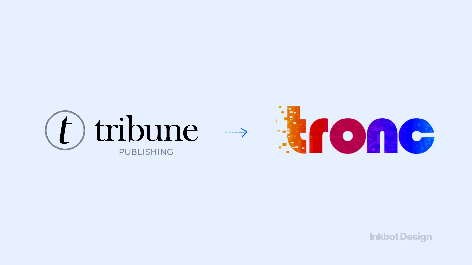
A historic newspaper publisher rebranded to “Tronc” (Tribune online content) in a bid to sound like a digital-first tech platform. It sounded like a bodily function. The media industry ridiculed the change mercilessly, and the company quietly reverted to Tribune Publishing two years later.
22. RadioShack to The Shack (2009) Estimated Cost: Preceded complete bankruptcy
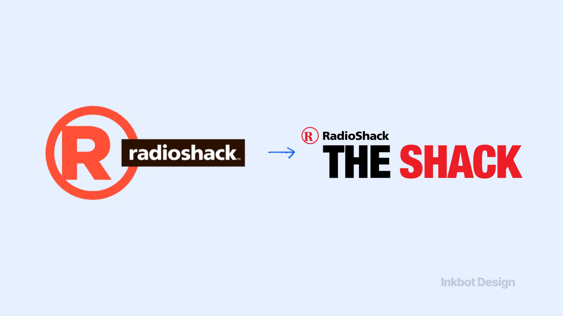
Attempting to shed its outdated image, the electronics retailer tried to rebrand as “The Shack.” It failed to recognise that its only remaining brand equity was its authority in niche electronic components, not lifestyle appeal. The informal name felt desperate and did nothing to fix the failing retail model.
23. Overstock to Bed Bath & Beyond (and back) (2023) Estimated Cost: Massive digital traffic loss
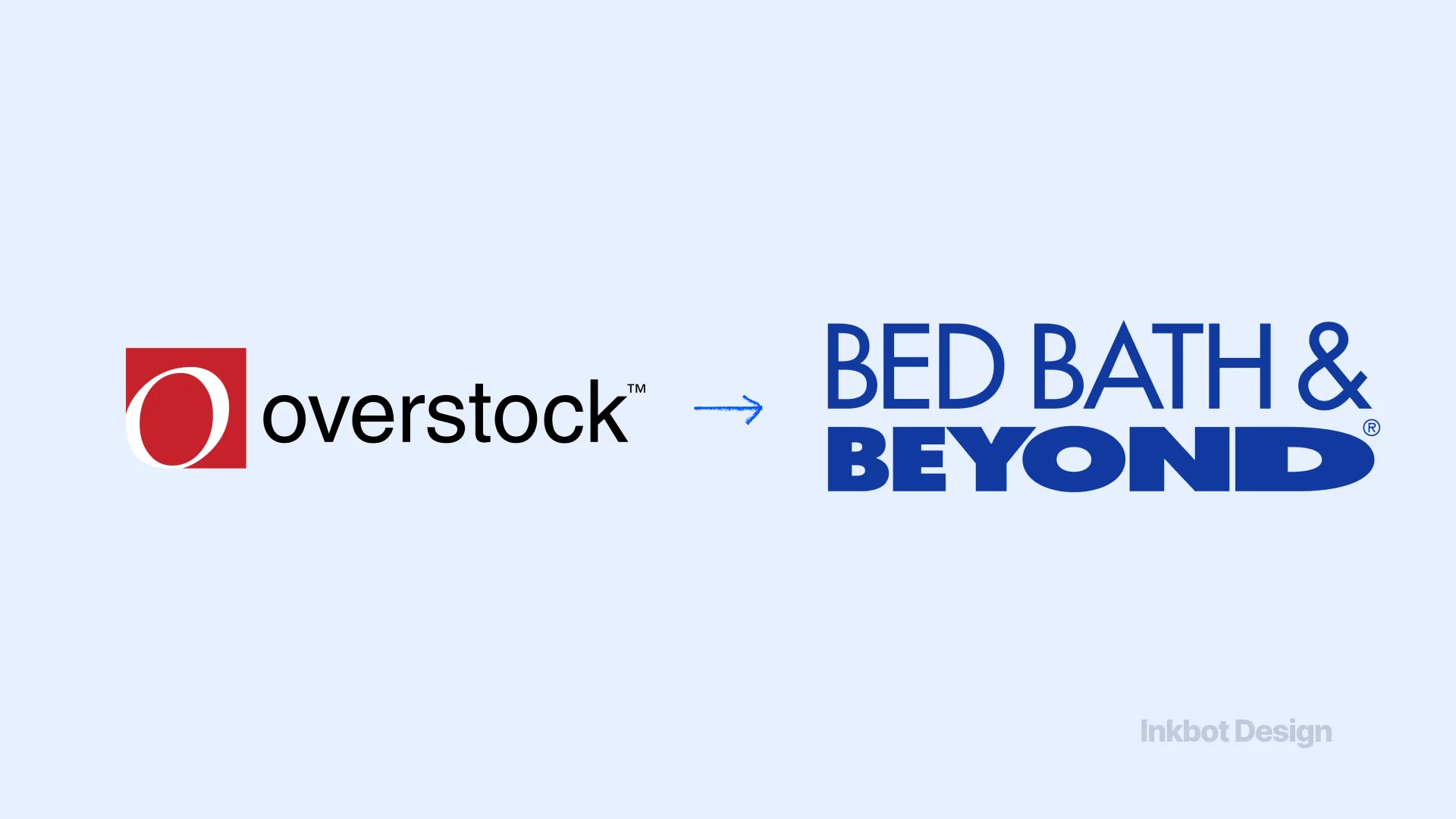
Overstock bought the bankrupt Bed Bath & Beyond IP and changed its own name to match. They assumed the legacy name carried more weight. Instead, they confused their own loyal customer base and failed to retain the new one. They have since had to execute a complicated pivot to “Beyond,” bleeding digital visibility at every step.
24. JCPenney to JCP (2012) Estimated Cost: 25% sales drop in one year
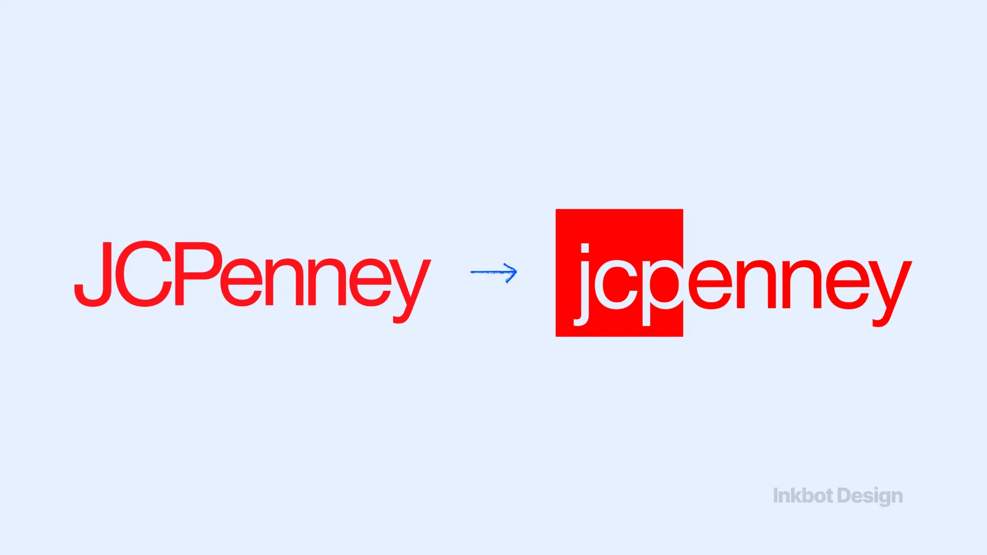
Under new leadership, the retailer changed its logo to a simple “jcp” in a square and eliminated constant sales promotions in favour of “everyday low prices.” The strategy fundamentally misunderstood consumer psychology. Shoppers liked the thrill of the hunt and the visual cue of the old logo. Sales cratered, and the CEO was ousted within 17 months.
25. PricewaterhouseCoopers Consulting to Monday (2002) Estimated Cost: £85,000,000 ($110M)
Before being acquired by IBM, PwC's consulting arm attempted to rebrand as “Monday” to differentiate itself. The corporate world universally rejected the name as childish and disconnected from the serious business of enterprise consulting. The $110M branding exercise was scrapped immediately upon acquisition.
Where People Get It Wrong: The Indexability Problem
The prevailing view in marketing is that these rebrands failed because people naturally resist change. If you just weather the storm, the theory goes, the audience will eventually adapt.
This is fundamentally incorrect. The current conversation around rebranding is no longer just about logos; it is about brand memory, audience fit, and AI visibility.
When you execute a major name change or visual overhaul, you do not just confuse a human on the street. You break the digital entity connections that search engines and AI models use to surface your firm.
Recent industry commentary frames failed rebrands as a mix of strategic mismatch and digital discoverability problems. If a buyer searches for the legacy name and finds a radically different visual presentation, the cognitive friction causes them to bounce.
That bounce signals to Google that your new domain is irrelevant.
Average recovery timelines after a failed rebrand typically run 12–18 months. Most professional services firms cannot survive 18 months of degraded referral traffic and broken digital indexability.
A Worked Example in Professional Services
Imagine a 12-partner tax practice in Manchester named “Smith & Harrison.” They decide to modernise and rebrand to “Aura Financial.”
They launch the new site. The partners are thrilled with the minimal, AI-smooth logo. However, an external solicitor referring a £50k corporate tax job tells her client to “call Smith & Harrison.” The client Googles it.
Google, confused by the sudden shift in entity, surfaces a mix of old directory listings and a link to “Aura Financial.”
The client clicks through, sees a generic corporate identity that lacks the established gravity of the partners they were promised, assumes they have the wrong firm, and hires a competitor.
The mechanism of failure was not bad graphic design. It was the destruction of a trusted heuristic.
The Designer’s Tactical Checklist
Many rebrands fail because they are procurement-led rather than strategy-led. The decision to change the logo is made in a vacuum, divorced from the commercial realities of how buyers actually interact with the firm.
If your board is pushing for a rebrand, use this tactical checklist to either justify the expense or block a pending disaster:
- The Heuristic Test: What specific visual cues do our best clients use to recognise us? (If the proposed design removes them, stop).
- The Syllable Test: Is the new name harder or easier to speak aloud in a noisy room? (If harder, stop!)
- The Digital Entity Check: How long will it take for search engines to resolve our old name to our new domain? Can we afford that traffic dip?
- The Contrast Check: Does the new typography prioritise aesthetic minimalism over high-contrast legibility? (Never sacrifice cognitive ease for style).
- The Governance Rule: Is this rebrand driven by a shift in our business model, or just a new marketing director wanting to make their mark?
If you cannot confidently answer these, you are not ready to change your identity.
Reviewing examples of successful rebrands will show you that the best updates are evolutionary rather than revolutionary.
The Verdict
Rebranding failures are rarely subjective accidents.
They are the predictable outcome of stripping away the visual and verbal shortcuts your market relies on to trust you. We have seen how £100m errors unfold: from Gap's typographic vandalism to Tropicana's destruction of shelf memory.
The lesson is not that you should never rebrand. The lesson is that brand equity is a measurable financial asset, and altering it requires a forensic understanding of exactly what your buyers value.
If you modernise too quickly and remove recognisable cues, you will pay for it in confusion, backlash, and unrecoverable rollback costs.
Before you touch your logo, you must diagnose exactly what is currently working and what is fundamentally broken.
Request a free Brand Equity Audit™ to identify exactly where your brand is losing commercial ground, and what to do about it.
Frequently asked questions
Why do most corporate rebrands fail?
Most corporate rebrands fail because they abruptly remove established visual heuristics. When a company changes the specific visual cues buyers use to recognise them, it creates immediate confusion, breaks digital indexability, and destroys market memory.
How much does a failed rebrand cost a company?
The average corrective spend after a poorly received rebrand sits in the low millions, typically cited around £2.5M to £4M. However, indirect costs from lost sales and diminished brand equity often push total losses into the hundreds of millions.
Is it true that Tropicana lost millions from changing its logo?
Yes – Tropicana lost an estimated $137 million in sales over two months. They removed the iconic orange-and-straw packaging, resulting in immediate shelf confusion for consumers who could no longer recognise the product.
When should I consider a complete rebrand?
You should consider a complete rebrand only when your current identity fundamentally misrepresents your business model, or when entering a new market where the legacy brand carries negative equity. Never rebrand simply out of internal boredom.
What is the difference between a brand refresh and a rebrand?
A brand refresh updates visual elements like typography and colour contrast while retaining core heuristics and market recognition. A rebrand fundamentally alters the organisation's name, strategic positioning, and primary visual identity.