Your Consulting Firm Logo Doesn’t Need to Look Clever
A consulting firm’s logo should help buyers recognise whose thinking they are reading. Choosing between a wordmark, monogram or symbol starts with the firm’s name, existing recognition and working documents. Test attribution on forwarded slides and reports before replacing a mark that may only need a better system around it.


On this page6 min left
A consulting firm logo should identify whose thinking buyers are reading.
Start by making the name readable and the identity recognisable across reports, proposals and individual slides. A diagram of intelligence is optional.
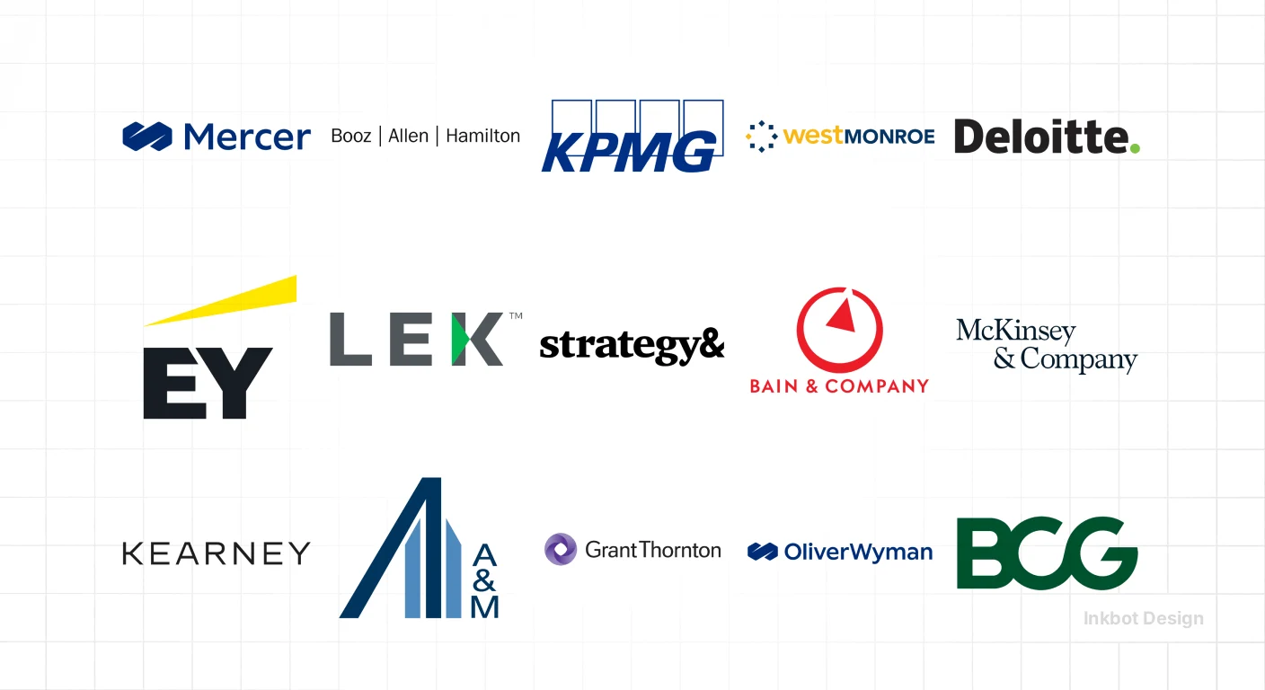
McKinsey & Company treated its 2019 identity refresh as a wider communication system: fonts, colour, photography and data visualisation changed alongside the graphic identity.
That is a more useful reference point than copying a famous wordmark.
Consulting logo design belongs within that broader logo design and identity work. The mark needs to work where your expertise appears, including documents you cannot personally explain.
Which logo direction should a consulting firm choose?
Choose a full-name wordmark when buyers still need to learn the consultancy’s name. Consider initials when buyers already use them, or a supporting symbol when a specific application requires one. Retain an existing mark when buyers recognise it, and the problem lies in inconsistent documents.
- Keep the full name visible wherever unfamiliar buyers encounter the firm.
- Compare proposed designs on working documents, not presentation mock-ups alone.
- Check existing recognition before discarding an established identity.
A consulting firm logo should make the firm identifiable across reports, proposals and presentations without relying on generic symbols of intelligence.
Will buyers recognise whose thinking they are reading?
Looking appropriate for consulting is a starting condition. Looking like a particular consultancy is the harder task.
A restrained wordmark can be a sensible choice. Enterprise buyers need to read the name, and your identity must sit comfortably beside client branding. Nobody needs a pitch deck that resembles a festival poster.
But appropriateness cannot answer the question of attribution.
Put a research chart beside a competitor’s chart. Remove the report covers. Can the reader still identify the publisher from a visible name and a recognisable treatment?
The Ehrenberg-Bass Institute for Marketing Science, a marketing research institute, describes distinctive assets through two characteristics: fame, meaning recognition, and uniqueness, meaning association with one brand.
The distinction matters because a familiar visual convention can suggest a category without identifying your business.
That framework is useful for assessing B2B logos, although applying it to a consultancy’s documents is a design recommendation here, not a measured, consultancy-specific finding.
For your firm’s visual identity, separate two questions:
- Does the material look suitable for the work we sell?
- Does the material clearly identify our consultancy rather than resemble several possible publishers?
The second question changes the brief. “Make us look like a major strategy consultancy” becomes “make our name and publishing system identifiable without imitating a major strategy consultancy”.
“Our clients buy the partners, not the logo”
Fair objection. A new mark cannot replace a partner’s relationships, evidence or judgement.
Consider a hypothetical situation: a finance director receives a useful operating-model chart from a colleague, without meeting the partner who wrote the report. The chart needs a visible firm name or source line because the relationship cannot identify the author on its own.
That does not mean stamping a huge logo across client work. Agree on what can carry your identity, what must follow the client’s rules and what needs explicit source attribution.
Treat a recognisable consultancy identity as support for the thinking. The thinking still has to earn its place.
Should a consultancy use a wordmark, monogram or symbol?
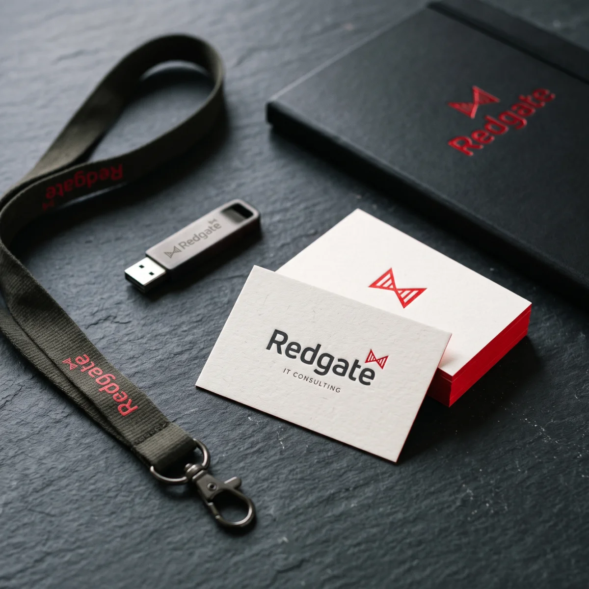
Begin with the name buyers must learn. Choose the structure around that requirement.
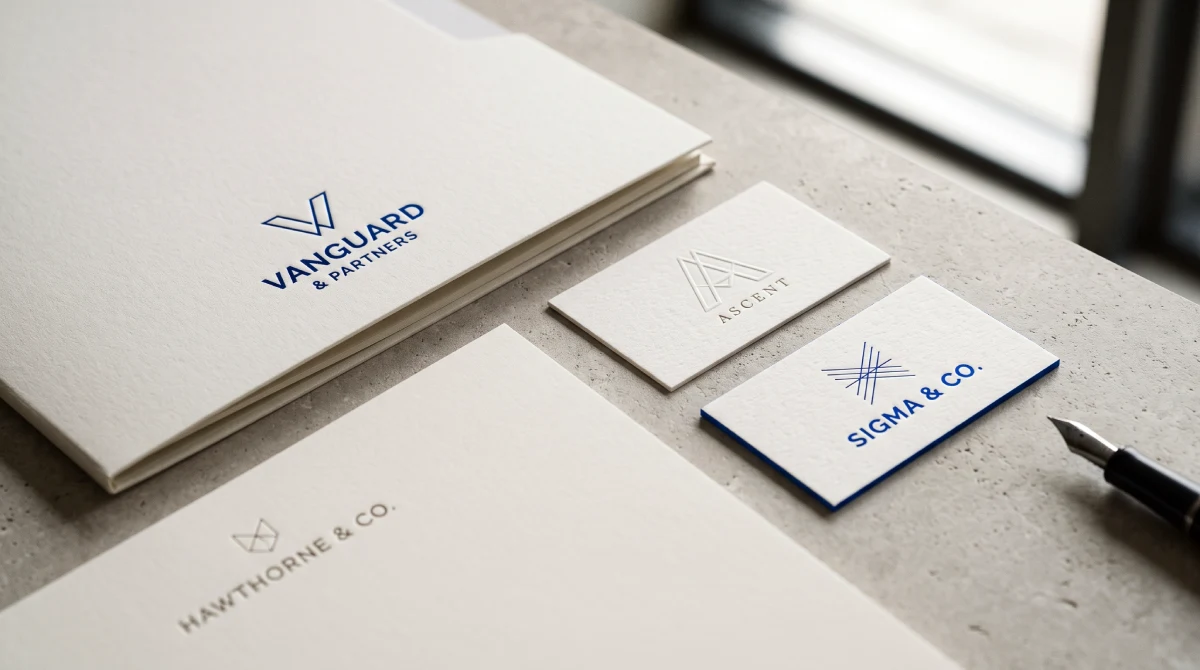
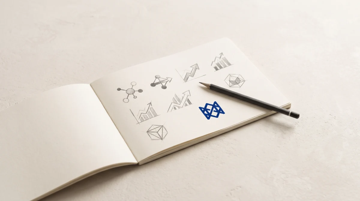
A wordmark renders the firm’s name as the logo. A monogram uses initials. A combination mark pairs the name with a symbol.
None is automatically more sophisticated.
The Ehrenberg-Bass Institute identifies several possible brand assets, including logos, colour and distinctive lettering. The principle gives no reason to assume that a separate symbol is inherently superior to a name-led identity.
Use the following scenarios as starting recommendations, not universal rules.
Your situation | Recommended direction | Why, and what would change the recommendation |
|---|---|---|
A new consultancy has a short name that buyers do not know | Full-name wordmark | Prioritises learning the name. Add a compact version only for applications that require one. |
An established consultancy is routinely called by its initials | Monogram supported by the full name | Matches existing usage. Keep the name prominent in cold acquisition materials. |
A founder-name consultancy has a long name | Primary wordmark with a compact secondary lockup | Preserves attribution while accommodating tight spaces. Review naming separately if the name itself is changing. |
Buyers recognise the current mark, but documents vary between partners | Retain the mark; repair the application system | A new identity does not resolve uncontrolled templates. Replace the mark only if a separate problem remains. |
Two consultancies are combining under a new name | Resolve the naming hierarchy before drawing the mark | The design depends on which name buyers should learn. Do not settle that question through typography. |
A consultancy also sells a named software product | Define the relationship between firm and product identities | The product may need its own identifier. The consultancy does not automatically need to resemble a software company. |
For the final scenario, tech company logos provide an adjacent comparison. Keep the distinction clear: the advisory firm identity and the software product may have different jobs.
A new symbol needs an introduction.
A new symbol starts without an established association. Keep the consultancy’s name next to the symbol as buyers learn the connection.
The Ehrenberg-Bass Institute distinguishes identity elements that are uniquely associated with a brand but not yet widely recognised from established assets strong enough to identify the brand without its name. That is a reason to build recognition, not assume recognition arrives with the artwork.
A consultancy monogram needs the same discipline. Two elegant letters may please the partners while leaving an unfamiliar buyer unable to name the business.
Test the actual combination. Do not approve the initials in isolation and promise to solve the name later.
Approve the logo on working documents.
Ask every designer to show the same materials. Otherwise, the partners are comparing the quality of the mock-ups rather than the suitability of the identity.
McKinsey & Company’s 2019 programme included data visualisation and photography as well as the graphic identity. McKinsey & Company later reported a Red Dot Award for the programme. The award documents design recognition; the award does not establish a sales uplift or prove that another consultancy should use the same visual language.mckinsey+1
For your approval meeting, request a proof sheet containing:
- A proposal cover with the actual legal or trading name.
- A crowded analytical slide with the mark in its intended position.
- A report page containing a chart and a source line.
- A social profile image beside the full account name.
- A co-branded page following a real client’s presentation requirements.
Use realistic content. A short invented name above three lines of placeholder text tells you very little about a long consultancy name sitting beside a procurement reference.
Judge each consulting brand mark against four questions.
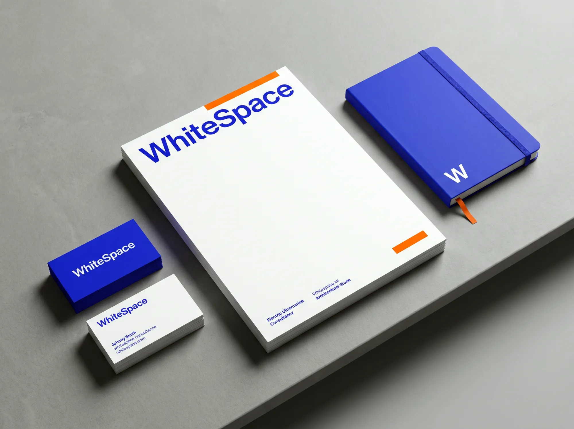
Can an unfamiliar reader identify the publisher?
Read the full name at the intended output size. Check the actual PDF and slide export, rather than relying on the designer’s enlarged screen.
Where a document may be separated into individual pages, agree how each page identifies its source. The answer might be a text line rather than another logo.
Does the identity survive ordinary production?
Print in monochrome. Place the mark on light and dark backgrounds. Check the supplied compact version for tight spaces.
If the name disappears, ask for a better lockup or application rule. Shrinking an unsuitable layout is not a solution.
Can the team reproduce the result?
Give the proposed template to someone who did not design it. Ask that person to create a normal client slide.
If the result requires manual reconstruction of the logo, the delivery is incomplete. Supply usable files and fixed template elements.
What existing recognition would be lost?
Before replacing an established identity, examine which elements clients actually associate with the firm. Do not assume the oldest element is the weakest.
The Ehrenberg-Bass Institute illustrates the risk through Australian retailer David Jones, which replaced a longstanding slogan in 2011. The Institute questions leaving an existing asset unused. The lesson is to assess retained value before making a change; the example does not prove that every old consultancy logo deserves preservation.
“We need enterprise credibility, not a design experiment”
Agreed. Use an orderly document, readable typography and evidence appropriate to the assignment.
Then distinguish those requirements from imitation. A familiar navy wordmark cannot demonstrate delivery capability. A recognisable identity cannot compensate for a weak case study either.
If your pitch competitors include accountancy-led advisers, accounting firm logo design is a relevant comparison. Assess where your consultancy needs category familiarity and where clearer separation would help readers identify the publisher.
Start with qualitative checks involving people resembling your intended buyers. Ask what name they can read, what they remember and which business they think produced the material. Treat a small exercise as diagnostic feedback, not statistically reliable market research.
Fix attribution before commissioning another mark.
If buyers recognise the existing name and mark, but each partner publishes a different-looking deck, begin with the templates.
If the name becomes unreadable at normal sizes, commission a logo refresh. If the name or business structure is changing, settle that decision before approving artwork.
A professional-looking consultancy identity is useful only within its actual job. Your mark should help identify the source of a report, chart or proposal. The evidence and argument must demonstrate the quality of the thinking.
Inkbot Design offers a free Brand Equity Audit™: a written diagnostic covering positioning, messaging, visual consistency and visibility, with priority corrections. The service does not require you to commission a redesign.
Today, assemble one proposal, one report and one individual slide. Check whether all three clearly identify the same consultancy.
Questions people ask
Can a consulting business use the founder’s name as its logo?
Yes — a consulting business can use the founder’s name as a wordmark. Keep the name if the name still represents the business you intend to build. If succession, additional partners or a change of ownership makes the name unsuitable, resolve the naming decision separately from the logo’s appearance.
How should a consultancy handle a very long name?
A consultancy with a long name should request primary and compact layouts using the actual wording. Check both the layouts on the proposals and the slides before shortening the name to initials. Where space permits, retain a readable full-name version for buyers who have not encountered the consultancy before.
Should every consulting practice have its own logo?
No — separate practice logos should require a clear reason, such as a genuinely separate buyer-facing business. If strategy, operations and transformation are services sold by one consultancy, begin with one firm identity and clear service labels. Add complexity only when the commercial structure requires the distinction.
What should go into a consultancy logo design brief?
A consultancy logo design brief should name the intended buyers, the name they must learn, the materials they encounter and the identity elements worth retaining. Include actual documents and relevant competitors. State who approves the work, which applications matter most and whether naming or positioning remains unresolved.