Accounting Firm Logo Design That Builds Authority
A strong accounting firm logo design is a visual asset that communicates competence, differentiates a practice from competitors, and functions reliably across digital and print formats. It replaces generic financial symbols with a distinct visual identity that builds brand equity and justifies premium fees.


On this page9 min left
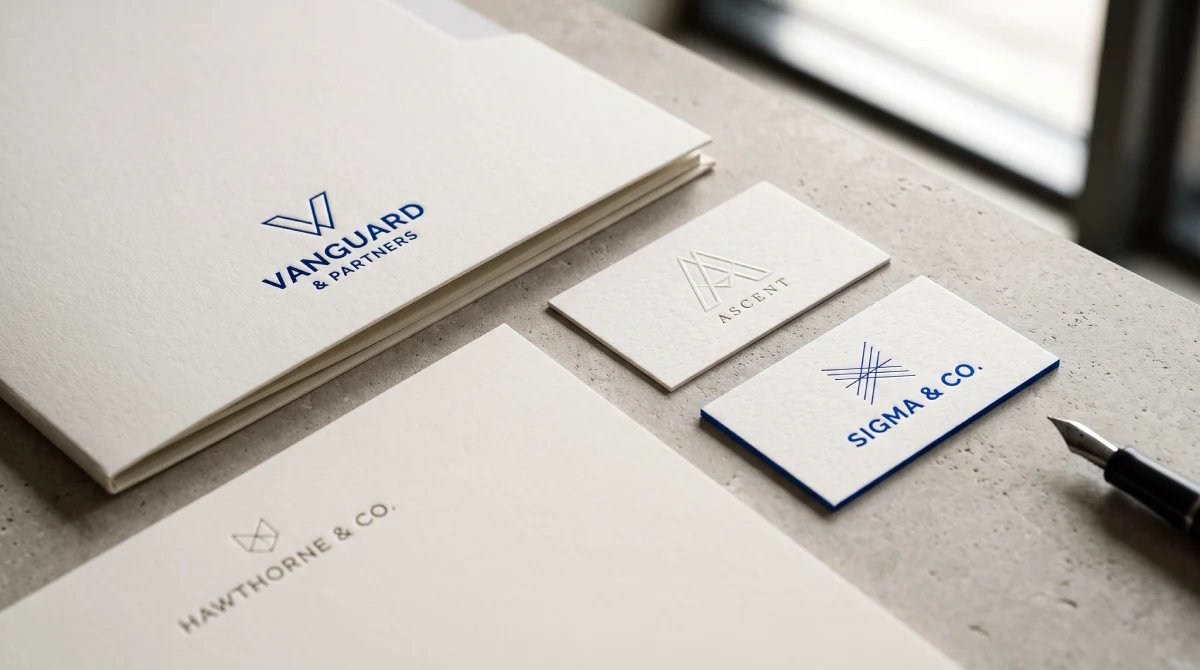
A strong accounting firm logo design does more than identify a business. It sets expectations before a prospect reads a proposal, reviews a service page, or speaks with a partner.
On an invoice, tax return cover sheet, website header, or presentation slide, the logo should make the firm appear clear, capable, and established.
I recommend treating the logo as one part of a broader brand identity system rather than an isolated graphic.
The mark must communicate the right level of authority. Still, it also needs to work in small spaces, withstand monochrome printing, and remain distinct from the many firms that use calculators, currency symbols, charts, shields, and initials.
The best approach is not to ask, “What looks like accounting?” The more useful question is, “What visual identity helps the right clients recognise this firm as credible and relevant?”
A specialist tax advisory firm, a regional CPA practice, and a modern bookkeeping platform may all require trust, but they should not look interchangeable.
A good accounting logo balances three things: category recognition, brand distinction, and operational usability.
What an Accounting Firm Logo Must Communicate
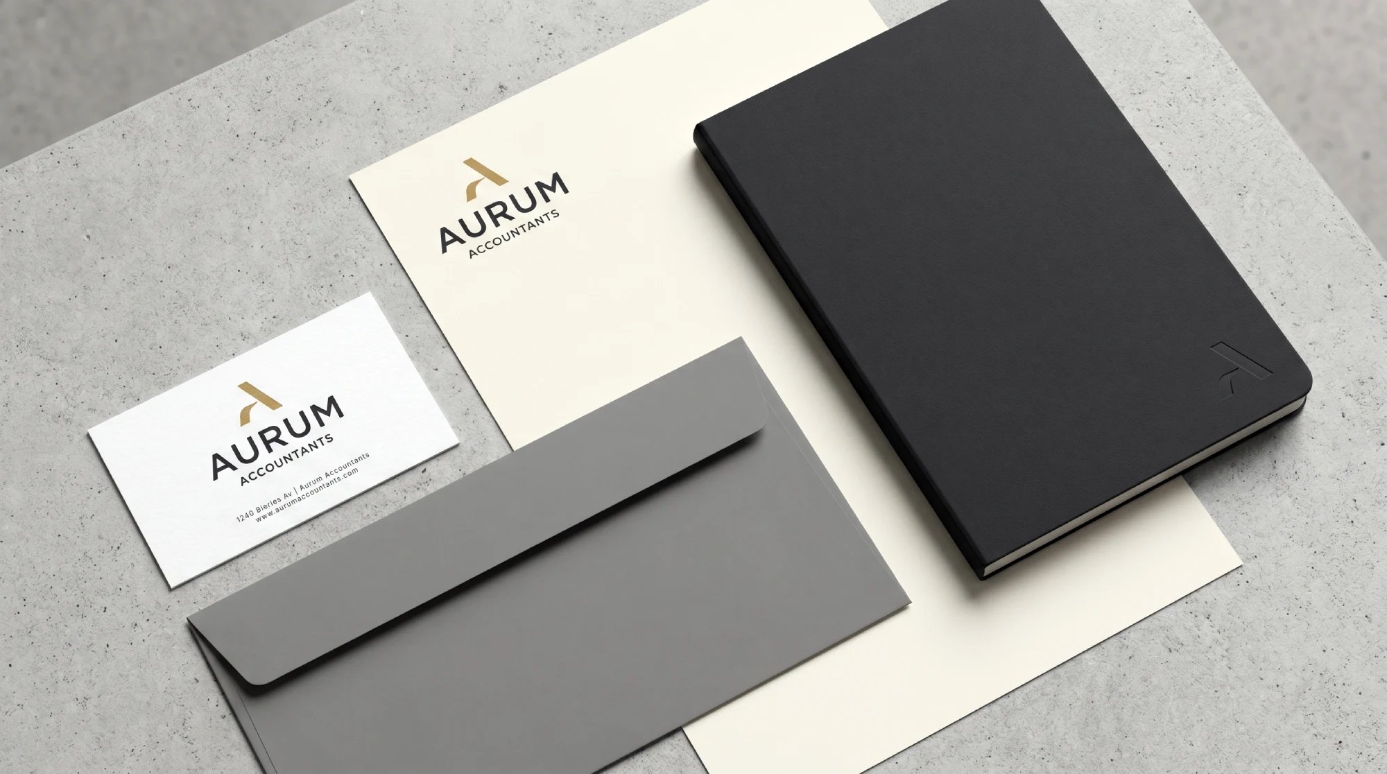
An accounting logo should make the firm feel organised and dependable without becoming visually cold or generic.
This is particularly important for decision-makers choosing advisers for tax planning, compliance, payroll, audit, bookkeeping, or financial reporting.
The purchase is often high-trust and long-term. A logo will not prove technical competence, but it can either support or undermine the firm’s positioning.
Trust is created through consistency, not colour alone
Navy, charcoal, black, deep green, and restrained blue palettes are common in accounting branding because they can appear formal and stable.
That does not mean a specific colour automatically creates trust. A weak wordmark remains weak in navy. A clear, well-spaced mark may look credible in a wider range of colours.
Colour works as part of a system.
Consider a firm that serves owner-managed businesses and growth-stage companies. A dark blue base may establish seriousness, while a muted green or warm accent can make the identity feel less institutional.
By contrast, a large audit or corporate tax practice may prefer a more restrained palette to reinforce formality.
For a structured method of selecting and applying colours across the full identity, review Colour Palette Systems. The goal is not to select a fashionable colour.
It is to build a colour palette that remains legible, recognisable, and appropriate in everyday communications.
Category signals need a distinctive execution.
Accounting logos often use initials, upward movement, charts, ledgers, calculators, coins, and currency symbols.
Accounting logo inspiration galleries repeatedly show these financial symbols, initials, charts, and professional visual styles.
These visual cues can help a new practice explain its category quickly. The risk is that the firm becomes difficult to remember.
A dollar sign may say “finance,” but it says little about why one adviser should be chosen over another.
I recommend separating category signalling from distinctiveness:
Design Question | Category Signalling | Distinctiveness |
|---|---|---|
What does it do? | Indicates accounting, tax, reporting, or financial order | Makes the firm recognisable among competitors |
Common tools | Ledger lines, initials, structured grids, measured geometry | Custom letterforms, unique proportions, unexpected negative space |
Main risk | Being too abstract to understand | Looking like every other finance firm |
Better decision | Use a subtle cue when category explanation is needed | Build the memorable element into typography or geometry |
For example, a bookkeeping firm could use a book-like shape. Still, a stronger solution might be a monogram in which the letterforms imply an open ledger rather than adding a literal book icon beside the name.
A Reddit discussion of an accounting identity showed this approach through initials, a book-inspired form, typography, and colour to create a bookkeeping-oriented impression.
That accountant identity example is useful because it demonstrates how a familiar service cue can be integrated rather than simply attached.
Positioning should determine the visual personality.
A logo for a premium advisory firm should not necessarily resemble one for a friendly local bookkeeping service. Neither direction is inherently better.
The right choice depends on the audience, fee level, service model, and growth ambition.
- Established CPA and audit firms often benefit from disciplined typography, darker colours, and minimal imagery.
- Technology-enabled accounting practices can use cleaner sans-serif typography, simplified geometry, and a sharper digital-first icon system.
- Bookkeeping practices serving small businesses may use softer forms or a warmer accent colour, provided the identity still feels orderly.
- Specialist tax advisers may need a more authoritative, focused mark that communicates discretion rather than friendly informality.
The visual direction should reflect the firm’s market position. If the business sells senior-level advisory work, a playful icon may create a mismatch.
If it targets creative freelancers, an overly formal mark may imply that the firm is inaccessible.
Choosing the Right Logo Structure and Visual Direction
The first practical decision is the logo architecture. Most accounting firms use a wordmark, a monogram, a symbol, or a combination of these.
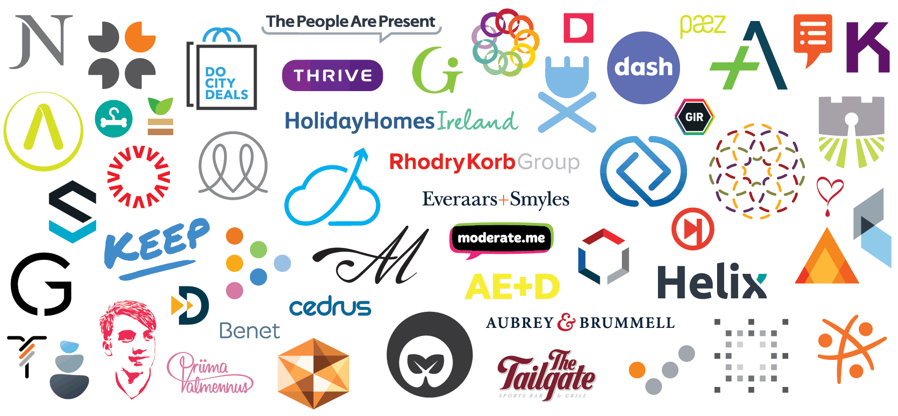
Wordmark, monogram, or symbol?
Logo type | Best when | Avoid when | Operational value |
|---|---|---|---|
Wordmark | The firm name is short, distinctive, or strategically important | The name is very long or difficult to fit into compact spaces | Clear name recognition on websites, proposals, and letterhead |
Monogram | The firm has multiple partners, a long name, or strong initials | The initials are generic and resemble many local competitors | Compact mark for avatars, favicons, and document covers |
Symbolic mark | The firm has strong name recognition or needs a highly compact visual asset | The symbol requires explanation or closely resembles financial clichés | Useful for social profiles, app icons, signage, and small placements |
Combination mark | The firm needs both a clear name and a repeatable visual asset | The icon and wordmark compete for attention | Flexible for most professional-services applications |
For many firms, a combination mark is the safest starting point. It gives the organisation a recognisable compact element while keeping the full name visible.
Over time, the symbol may be used independently where recognition is established.
Typography carries more weight than most firms expect
Accounting logos are often judged first by their name, not their symbol.
Poor spacing, awkward capitalisation, narrow letterforms, or an unsuitable typeface can make an otherwise competent logo look temporary.
Serif typefaces can suggest continuity and an established professional character.
Sans-serif typefaces may better support a contemporary, technology-oriented, or streamlined proposition. The distinction is not absolute.
A serif can feel modern, and a sans-serif can feel formal. What matters is proportion, weight, spacing, and how the name performs at practical sizes.
A community critique of an accounting logo focused on font pairing, tracking, point size, and typographic relationships rather than only the icon.
The accounting-logo typography critique illustrates a useful truth: small spacing decisions can materially change whether a mark appears deliberate.
Before approving typography, test the firm name at realistic sizes. If “Chartered Accountants” becomes unreadable under the name, consider removing it from compact variants rather than shrinking it until it fails.
For a broader framework for evaluating type families, weights, and logo suitability, see Best Fonts for Logos. Use licensed fonts and record the license terms in the final handoff materials.

Avoid literal symbols unless they add meaning.
A calculator or dollar sign can work if it reflects a genuine brand idea. It should not be added merely because the firm is in the finance sector.
Literal symbols often fail in two ways:
- They make the mark look interchangeable with competitors.
- They become hard to reproduce when reduced, embroidered, stamped, or displayed as a favicon.
A more durable approach is to use visual logic rather than illustration.
A precise grid, a modular letterform, an implied balance, or a carefully structured monogram can communicate order without relying on a stock finance icon.
Building a Scalable Accounting Logo System
A single logo file is not a logo system.
Accounting firms use many materials with competing layout constraints: reports, invoices, browser tabs, email signatures, social profiles, reception signage, presentation templates, branded folders, and embroidered garments.
I recommend approving a system of variants before final sign-off. This prevents staff from stretching, recolouring, cropping, or recreating the logo whenever a new format appears.
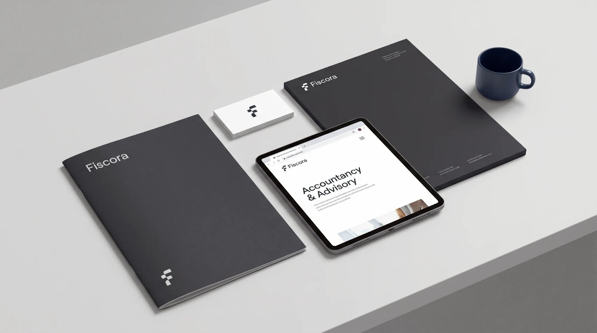
The essential logo variants
Variant | Primary use | Design requirement |
|---|---|---|
Primary horizontal lockup | Website headers, letterhead, email signatures | Icon and name remain balanced in wide spaces |
Stacked lockup | Square documents, social graphics, compact signage | Name stays readable without excessive vertical height |
Compact mark | Favicons, avatars, app icons, document tabs | Recognisable without the full firm name |
Monochrome version | Invoices, stamps, photocopies, single-colour print | Works without relying on colour contrast |
Reversed version | Dark website sections, presentations, signage | Light mark remains clear against dark backgrounds |
The horizontal version usually handles formal business materials best because it aligns naturally with page headers and email signatures.
The stacked version should not simply be a squeezed horizontal mark. It needs its own spacing and proportion.
Use a reduction protocol, not guesswork.
A logo does not scale down indefinitely. Fine lines, small gaps, secondary descriptors, and detailed chart elements disappear first.
Instead of asking whether the primary logo “looks okay” at every size, define a reduction path.
- Start with the full logo. Use it where there is enough room for the icon, firm name, and any approved descriptor.
- Remove secondary wording first. Terms such as “Tax and Advisory” may be useful on a website header but are usually too small for an invoice footer or social profile.
- Simplify the symbol next. If the icon contains multiple ledger lines, small chart points, or interior detail, create a compact version with fewer elements.
- Use the monogram or icon alone only when recognition is possible. A favicon has very little space. The goal is recognition, not explanation.
There is no universal minimum pixel size for every logo because letterforms and symbol complexity vary.
A reasonable practical test is to reduce each approved variant until counters close, strokes merge, or the name can no longer be read at normal viewing distance.
The version immediately before that failure point becomes the minimum size for that use case.
Plan for real production conditions
Vector artwork matters because it can be resized without the pixelation associated with raster files. For example, vector artwork should consider restrained colour palettes, typography, and applications such as invoices, websites, business cards, and office signs.
However, vector files alone do not solve reproduction problems. A logo with extremely thin lines may be technically scalable but still print poorly on low-quality office printers or disappear in embroidery.
A complete handoff package should include:
- SVG for websites and digital interfaces
- EPS or AI for commercial print suppliers and future editing
- PDF for reliable print sharing
- PNG files with transparent backgrounds for everyday office use
- RGB colour values for screens and CMYK or spot-colour references for print where required
- Monochrome and reversed versions
- Font names, licensing details, and approved fallback fonts
- A short brand-style guide covering clear space, minimum sizes, colour use, and prohibited alterations
For more complete thinking on how logo choices connect with positioning, messaging, and implementation, review Logo Design and Branding.
Testing, Accessibility, and Trademark Checks
A logo should be reviewed in the context where it will actually be used.
A polished presentation slide can conceal problems that become obvious on a crowded invoice or a 16-pixel browser tab.
Use a practical application test matrix
Application | What to test | Pass condition | Common failure |
|---|---|---|---|
Invoice and financial report | Monochrome printing, small header use | Firm name remains legible and identifiable | Tagline becomes unreadable or light elements disappear |
Spreadsheet template | Dense gridlines and repeated use | Logo does not compete with financial data | Icon looks noisy beside rows and columns |
Browser favicon | Extreme reduction | Compact mark is distinguishable at a glance | Complex symbol becomes an indistinct square |
Social avatar | Circular cropping and mobile display | Icon remains centred and recognisable | Full wordmark is too small to read |
Exterior sign | Distance, lighting, material limits | Contrast and letterform weight remain clear | Thin strokes or low-contrast colours vanish |
Embroidery | Thread thickness and simplified shapes | Mark can be produced without lost details | Fine lines merge into a dark patch |
This matrix is especially useful during approval meetings.
Rather than debating personal taste, decision-makers can ask whether the mark performs in the specific environments that generate trust and revenue.
Accessibility is a design requirement.
Do not rely on colour alone to distinguish parts of the logo. A green accent should not be the only feature separating a symbol from its background.
Check contrast against white, dark, colored, and grayscale backgrounds. Review the mark in black and white. Print it on a standard office printer.
This matters for clarity as much as inclusion. A client viewing a low-quality PDF, a photocopied engagement letter, or a washed-out screen should still recognise the firm.
Check distinctiveness before committing.
Trademark clearance is not the same as an informal online search, and a design review is not legal advice.
Still, firms should treat similarity as a commercial risk before investing in signage, templates, domain names, and campaign materials.
Start with a practical review:
- Search the firm name and close spelling variations in relevant markets.
- Compare the proposed initials, symbol shape, and category language with competitors in accounting, financial advice, software, and tax services.
- Identify whether the mark could be mistaken for another firm when viewed quickly in a document or search result.
- Obtain appropriate legal advice before filing or relying on trademark rights.
A generic monogram can be visually elegant but legally difficult to protect.
For example, a three-letter set of partner initials may look refined yet closely resemble those of other professional firms. In that situation, custom geometry or a more distinctive wordmark may reduce confusion.
Conclusion
Accounting firm logo design is a strategic exercise in clarity, distinction, and consistency.
The strongest marks do not depend on generic financial symbols or a single “trustworthy” colour. They translate the firm’s position into visual elements that work on formal documents, digital platforms, compact icons, and real-world signage.
Before approving a design, test it at small sizes, in monochrome, beside financial data, and against competing firms. Then document the system well enough that every future invoice, proposal, presentation, and social profile reinforces the same brand authority.
Questions people ask
What makes a good accounting firm logo?
A good accounting firm logo is clear, distinctive, professionally proportioned, and practical across documents and digital channels. It should reflect the firm’s intended position, whether that is established authority, modern efficiency, specialist expertise, or approachable service. The logo also needs approved small-size, monochrome, and reversed versions.
Should an accounting firm use a calculator, dollar sign, or chart?
Only if the symbol adds a specific brand idea; these motifs communicate the category quickly but are widely used, so they can make a firm look generic. A monogram, typographic feature, or abstract structure often creates stronger recognition while retaining a subtle reference to order, precision, or financial clarity.
Are blue and navy the best colours for an accounting logo?
They are common choices, not universal requirements. Dark blue and navy can support a formal, stable appearance, but the full palette, typography, contrast, and composition determine the final impression. A firm should choose colours that suit its positioning and remain effective in monochrome and low-quality reproduction.
Should a CPA firm choose a serif or sans-serif font?
Choose based on positioning and legibility. Serif typography can support an established or traditional tone, while sans-serif typography can feel cleaner and more contemporary. Test the actual firm name at small sizes before deciding. A typeface that looks elegant in a large mockup may fail in an email signature or document header.
Is a monogram better than a symbol for an accounting firm?
A monogram is often useful when the firm name is long, or the initials have equity. A symbol is better when it can be recognised independently and remains clear at small sizes. Many firms benefit from both: a primary name-and-icon lockup plus a compact monogram or symbol for restricted spaces.
How should an accounting logo be tested on invoices and reports?
Place the logo in a realistic invoice header, financial report cover, spreadsheet template, and PDF. Print it in black and white, view it at normal zoom, and test it beside dense financial data. If the name becomes unreadable, the icon distracts from the report, or fine detail breaks down, use a simplified approved variant.
What logo files should an accounting firm receive from a designer?
At a minimum, the firm should receive editable vector files such as AI or EPS files, web-ready SVG files, print PDFs, transparent PNGs, colour specifications, monochrome and reversed versions, font information, and a concise usage guide. The organisation should also know where editable source files are stored and who has permission to use them.