Tagged

Logo Design

Logo development, formats, recognition and application. 6 Inkbot Design articles on logo design for professional services firms.

Brand Identity & Design

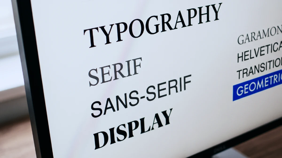
Logo Grid Systems: Why Perfect Alignment Looks Wrong (and How to Fix It)

A logo grid system establishes proportions and spacing, but mathematical alignment cannot settle every visual decision. This guide explains how to assess optical corrections, resolve disagreements about balance, and document approved artwork so website developers and suppliers preserve the finished identity rather than rebuilding the logo from a construction diagram.
9 min read

Specialist Branding

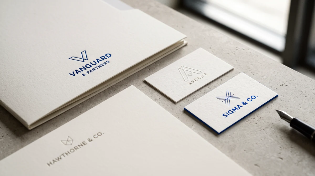
Accounting Firm Logo Design That Builds Authority

A strong accounting firm logo design is a visual asset that communicates competence, differentiates a practice from competitors, and functions reliably across digital and print formats. It replaces generic financial symbols with a distinct visual identity that builds brand equity and justifies premium fees.

9 min read

Brand Identity & Design

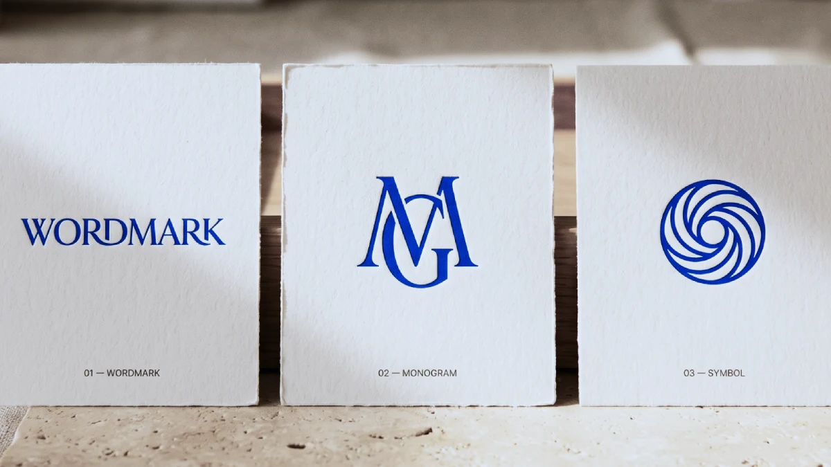
Wordmark vs Monogram vs Symbol: Pick a Sequence, Not a Winner

Wordmark, monogram and symbol are three recognition strategies dressed as visual styles. Professional services firms should lead with the full name, because clients cannot decode a mark they have never been taught. Build the monogram and symbol as supporting assets, letting them stand alone only once exposure has earned it.

9 min read

Brand Identity & Design

100 Famous Logos with Names (And What Makes Them Iconic)

100 famous logos with names and pictures, organised across ten industries from finance to logistics, show that recognition is not a matter of clever drawing. It is built through repeated exposure within a distinctive asset system. This guide breaks down what genuinely applies to a professional services firm weighing a rebrand — and what does not.

56 min read