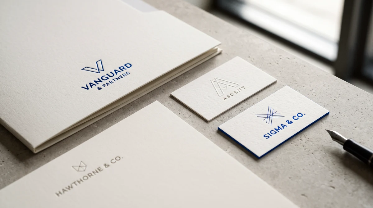
Financial Advisor Logo Design: Recognisable or Just Respectable?
A financial advisory logo should help clients recognise the practice, rather than simply identify the sector. Familiar colours and symbols are starting points, not proof of success. Evaluate proposals against existing recognition, positioning and everyday applications before deciding whether the practice needs a restrained refresh or a more substantial rebrand.



On this page9 min left
Effective financial advisor logo design makes an advisory practice unmistakably identifiable across client reports, digital portals, and pitch materials while reflecting the firm’s commercial proposition.
Rather than relying on generic shields or dark-blue monograms that blend into the market, a well-specified advisory identity combines a legible wordmark, disciplined typography, and consistent application rules.
Your partners can agree that a logo looks respectable and still approve an identity that a prospective client could confuse with another local practice.
Appearance still deserves careful attention: Nielsen Norman Group explains that aesthetically pleasing interfaces are often perceived as more usable, even when underlying performance does not improve.
In wealth management, that is a warning against mistaking visual polish for commercial differentiation—not proof that a new logo alone wins client trust.
The same identification question belongs in the broader discussion of B2B logos, although a private-client advisory practice needs to assess identity through its own clients’ experiences.
What makes a good financial advisor logo?
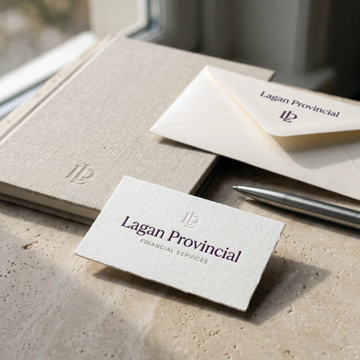
Choose a financial advisory logo that makes your practice identifiable through a legible name, distinct typographic or graphic features, and consistent application across client documents.
Retain existing visual cues when clients already recognise them; commission a wider redesign only when the current identity conflicts with a changed commercial proposition—not simply because partners have grown tired of seeing it.
- Test the name and descriptor in real client documents: Check readability on quarterly valuation headers, suitability reports, and mobile client portals, alongside mandatory UK Financial Conduct Authority (FCA) trading-name or Appointed Representative disclosures.
- Benchmark against genuine peers: Place proposed concepts alongside the three to five advisory or wealth-management firms your prospects actually shortlist.
- Judge the mark inside a system: Evaluate the logo inside your website header, pitch deck, and reporting templates rather than as an isolated symbol on a white slide.
Treat those as commissioning criteria, not a promise of enquiries. Broader professional logo design services may include strategy and applications; establish the scope before comparing proposals.
How can an advisory logo stand out without looking inappropriate?
An advisory logo does not need to reject familiar financial-services conventions; it simply needs enough distinctive visual detail for a prospect to recognise your specific practice rather than the category as a whole.
A restrained colour palette and traditional serif or humanist sans-serif lettering can be entirely appropriate.
Partners are right to resist eccentric styling that clashes with fiduciary seriousness. The mistake is treating category familiarity as the finished brief.
The Institute of Practitioners in Advertising (IPA), the UK advertising industry body, defines distinctive brand assets as non-brand-name identifiers (such as specific typography, colour combinations, or visual devices) that link communications back to a brand in memory.
Their job is immediate recognition, not explaining every reason a client should appoint your firm.
Put that distinction to work. Place a proposed identity beside the practices your prospects genuinely compare.
If the same shield, monogram, and navy-blue palette could be swapped onto a rival’s name without looking out of place, ask the designer which element is actually doing the work of identifying your practice.
“Looks financial” is a baseline, not a strategy.
Does a wealth management logo need to be blue?
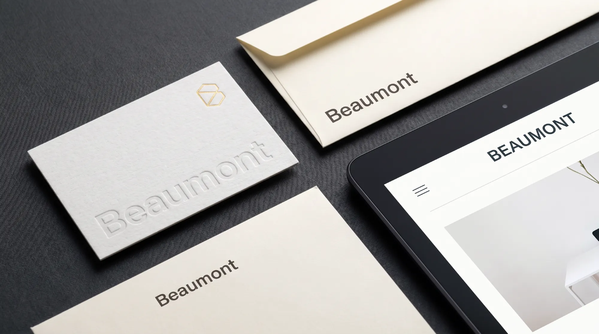
No—a wealth management logo does not need blue as a commissioning rule.
Assess colour against three practical factors: whether existing clients already associate a colour with your practice, how nearby competitors present themselves, and how the palette reproduces across screen and office print.
If clients already recognise a particular shade of blue as yours, retaining that equity is often sensible.
Conversely, if every firm on a prospect’s shortlist uses near-identical navy, examine your typography, spacing, and supporting layout before assuming a colour swap alone will create differentiation.
Consider a hypothetical advisory practice that has used navy for fifteen years. Clients know the name, but the condensed lettering blurs in a digital report header.
Refining the typography and proportions solves the real operational weakness without discarding familiar brand equity.
That is a practical design decision, not a “colour-personality” diagnosis.
Can a conservative financial logo still be distinctive?
Yes—a conservative presentation and a recognisable identity are fully compatible objectives.
Partners often say, “Our clients expect something conservative,” and use that expectation to justify an indistinct template.
Keep the restraint your proposition requires, then decide where visual recognition comes from: distinctive lettering, disciplined layout proportions, or a consistently applied graphic device.
The IPA’s Madrí Excepcional effectiveness case describes growth from launch to £1bn in UK sales within five years, crediting an integrated programme of distinctive brand assets and consistent communications.
That case concerns brewing rather than wealth management.
It does not isolate the effect of a logo on its own—which is precisely the lesson for advisory partners: commercial results come from the whole positioning and communication system, never from a mark in isolation.
Avoid inferring high-net-worth clients' preferences solely from partners' tastes.
Show realistic document mock-ups to a small group of trusted clients or introducers, ask what feels unclear or out of character, and record their observations without overstating informal feedback as statistical proof.
What should determine a financial advisory logo’s visual direction?
Your commercial proposition should set the design brief before partners choose between a wordmark, a monogram, or a symbol.
Document three things first: who the practice advises, what problem you solve for those clients, and what your current visual presentation gets wrong.
Those answers will not mechanically select a typeface, but they give a branding specialist a concrete commercial brief rather than vague adjectives such as “premium, yet approachable.”
Case example: positioning before the mark at The Technical Traders
At Inkbot Design, the strategic branding agency I lead, our branding engagement with The Technical Traders—a trading-methodology business—began with a positioning problem rather than a request for a prettier logo.
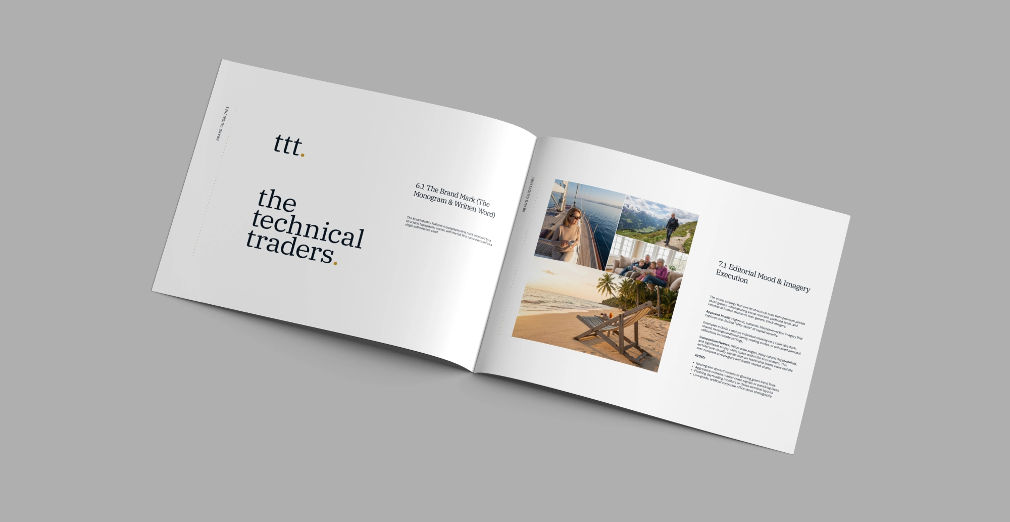
The business needed to distance itself from speculative retail-trading clichés and establish a calmer wealth-stewardship positioning for private investors.
We anchored the strategy around Asset Revesting (the firm’s investment methodology) and shifted the verbal narrative from short-term trading mechanics to the client’s underlying priorities—protecting a lifestyle and seeking greater peace of mind.
Those were communication objectives, not claims that the methodology guaranteed either outcome.
The visual identity followed directly from that brief:
- Logo architecture: A typography-first wordmark anchored by a structural baseline rather than an ornate financial icon.
- Typography system: IBM Plex Serif for editorial authority in headings, paired with IBM Plex Sans for clarity across body copy and data-heavy tables.
- Colour palette: Midnight Navy and Antique Cream as primary tones, with Metallic Gold reserved for restrained accents.
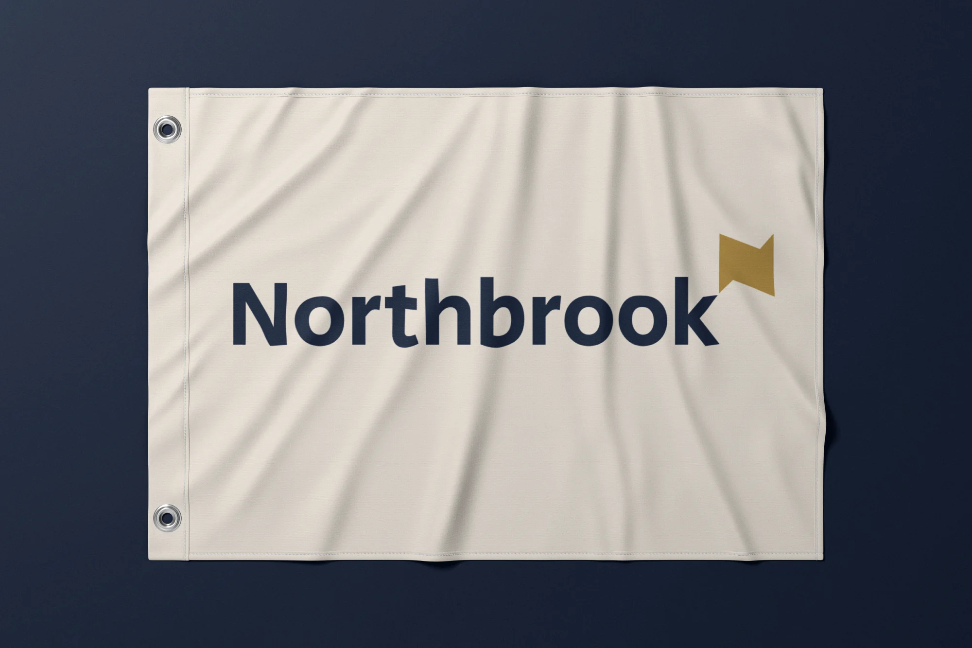
Internally, we termed this direction “Warm Institutionalism”—balancing institutional credibility with an accessible human register—and carried it across the website, brand guidelines, book design, and marketing collateral (similar to the discipline required in our corporate identity and stationery work for financial-sector client Northbrook).
The sequence is the lesson: settle the proposition first, then build the mark around it.
Should a financial practice choose a wordmark, monogram, or symbol?
Start with a wordmark when your practice name is the primary identifier and a separate icon has no clear functional job.
Add a compact brand mark only when specific real-world applications—such as a client-portal favicon, mobile app tile, or social avatar—genuinely require a square shorthand.
- Wordmark (logotype): A typographic logo built exclusively from the styled name of the practice, prioritising immediate name recognition and legibility.
- Monogram: A typographic device formed by interlocking or combining the practice’s initials (for example, partner surnames).
- Symbol or brand mark: A standalone graphic icon paired with, or used as a compact derivative of, the primary practice name.
A long partnership name may need a stacked lockup or compact mark for tight digital spaces, but the primary logo should not bury an unfamiliar firm behind cryptic initials.
Challenge any monogram on three counts: can a prospect read the letters at 24 pixels high, does it resemble a nearby wealth manager, and is the full trading name legible beside it?
Require your agency to justify each element rather than selling complexity as completeness.
Readers comparing adjacent professional sectors can examine logo design for law firms and accounting firm logo design.
Borrow the evaluation questions, not another profession’s visual identity.
How should partners test and approve a financial planning logo?
Test a financial planning logo inside routine client documents before signing off large-screen agency presentation boards.
A PDF valuation header or printed suitability report reveals an unreadable descriptor far faster than a mock-up on a boardroom wall.
- Name and descriptor readability: Inspect the mark at the actual website header and report footer sizes. Ask someone outside the practice to read the full name and regulatory descriptor aloud.
- Competitive identification: Place the shortlisted concept alongside three to five direct competitors and note any shared shields, initials, or colour schemes that could confuse.
- Print and monochrome reproduction: Test a single-colour black version, a reversed white-on-dark version, and a standard office laser print.
- Cross-application consistency: Review a live-scale website header, client report cover, and pitch-deck title slide governed by the same typography and spacing rules.
- Existing client recognition: Where continuity matters, show current clients the proposed treatment without explanation and ask which firm it brings to mind.
Record specific diagnostic observations rather than personal votes: “The ‘Wealth Management’ descriptor breaks up on an office printer” gives a designer a problem to fix; “I prefer option two” merely states a preference.
Agree on evaluation criteria before concepts arrive, and ask partners to score independently before the review meeting so discussion focuses on commercial clarity rather than seniority.
Does a referral-led advisory practice still need a distinct logo?
Yes—because a personal referral supplies the introduction, not the due diligence.
When a referred prospect searches for your practice name, visits your website, or reads an initial fee proposal, your visual identity confirms they have found the right firm and reinforces your professional credibility.
That is an identification and verification task, not proof that a logo alone wins the mandate. If existing clients recognise your current identity and it reproduces cleanly across documents, referral dependence is no reason to manufacture a rebrand.
Nielsen Norman Group’s 2024 overview of the aesthetic-usability effect revisits 1995 usability research in which 252 participants rated 26 ATM interfaces, finding that visually appealing designs were judged easier to use even when task performance was identical.
That study examined interface usability rather than private-client advisory behaviour, so treat it as a practical caution: partners liking a logo presentation does not establish that the identity works for clients.
When should an advisory firm keep, refresh, or replace its logo?
Keep your existing identity unless you have documented evidence of an identification, legibility, or positioning failure.
Match the scale of the design intervention to the scale of the commercial problem—the scenarios below are illustrative decision guidance, not reported client cases.
Practice situation | Recommended choice | Commercial rationale |
|---|---|---|
Clients recognise the identity; reports and portals remain legible | Retain | No demonstrated identity failure justifies the cost and disruption of change. |
A familiar practice name looks cramped in digital headers or mobile portals. | Refresh typography and lockups. | Solves the operational legibility weakness while preserving accumulated recognition. |
The firm has shifted its target client tier or advisory proposition | Review positioning before redesign | The visual brief must reflect the specialist practice clients are now being asked to appoint. |
Merged practices need a single public-facing identity | Resolve naming and brand architecture first | Logo concepts alone cannot settle the commercial relationship between legacy firms. |
Partners like the logo, but prospects confuse the firm with a competitor | Commission a more distinctive visual system | Internal partner approval has not resolved the issue of external market recognition. |
The logo works, but client reports and pitch decks look inconsistent | Repair the application system and guidelines | Redrawing the logo mark will not fix fragmented document production. |
What is the difference between a standalone logo and strategic brand architecture?
A standalone logo package delivers a mark and basic file formats, whereas strategic brand architecture aligns market positioning, verbal messaging, visual identity, and client-facing templates into one coherent system.
For established UK financial advisory and wealth-management practices (typically firms generating £2M–£20M in annual revenue with 10–100 staff), a new symbol rarely solves a perception gap if the underlying proposition and pitch collateral remain generic.
At Inkbot Design, we do not offer quick, logo-only refreshes or hourly billing.
Our core engagement, the Brand Equity Blueprint™ (£7,500 one-time fixed fee for one brand, typically delivered in 4–6 weeks), builds the full strategic positioning framework, verbal messaging guide, visual identity system, comprehensive brand guidelines, and master pitch-deck architecture—with full intellectual property ownership transferring on completion.
Not sure whether your practice needs a typographic tidy-up or a wider positioning reset?
Request Inkbot Design’s free Brand Equity Audit™.
Answer five short diagnostic questions by email and receive a 2-to-3-page written forensic review covering identity gaps, visual trust, messaging logic, and how AI search tools currently describe your firm—delivered within a two-working-day (48-hour) target, with no sales call and no obligation.
Before commissioning any design concepts, write a single sentence naming the specific commercial or legibility failure the change must correct.
Questions people ask
Does a financial adviser need a separate logo icon?
No—a separate icon is not a requirement. A legible, name-led wordmark is often sufficient for an advisory practice. Commission a compact brand mark only when a defined application, such as a client-portal favicon or profile image, requires a smaller square identifier, and require the designer to demonstrate that exact use case.
Should “financial planning” appear inside the logo?
Include a descriptor such as “Financial Planning” or “Wealth Management” when the practice name alone does not make your regulatory service clear. Test the descriptor at the smallest intended screen and print size; if the secondary text becomes illegible, use a cleaner primary lockup and let supporting page or document headings explain the service.
Is digital gold the same as metallic foil?
No—a flat gold or ochre RGB/CMYK colour on screen does not replicate a metallic foil print finish. If a designer proposes foil blocking for stationery or presentation folders, request a physical print proof alongside a standard CMYK/office-print alternative so routine client reports still look crisp.
What should a financial advisor logo design brief ask the agency to deliver?
A thorough brief defines your target client profile, commercial proposition, existing visual assets to retain, and real-world applications to test. Require the agency to specify primary and secondary logo lockups, colour variants (full-colour, single-colour, reversed), editable master and web file formats, and usage guidelines—and confirm explicitly whether client report and pitch-deck templates are included.