Logo Design For Law Firms Is Risk Architecture, Not Branding
Law firms treat logo design as a style decision. It isn’t. For a stranger scanning a shortlist, your mark is the fastest available signal of whether you are a credible risk. Coherence and legibility reduce that perceived risk. Colour theory and symmetry rules do not. Here is the difference, commercially.
 By Stuart Crawford
 Reviewed by Tabitha Ayers
Updated 14 min read
On this page14 min left
- Your Law Firm's Logo Is A Risk Signal, Not A Style Choice
- Why Intelligent Partners Believe The Logo Is A Style Question
- The Turn: Coherence Is Doing The Work, Not Attributes
- What Risk Architecture Looks Like In Practice
- What I Watched This Cost A 12-Partner Firm
- What This Means For Your Firm
- The Objection You Are Already Making
- The Reframe: Stop Buying Design, Start Buying Risk Reduction
- The Verdict
- Frequently asked questions
Your logo is not a design asset. It is a risk instrument, and a prospective client uses it to price you before a single partner opens their mouth.
That sounds like agency talk until you look at what actually happens in a shortlist decision. A General Counsel with eleven capability statements open in browser tabs is not evaluating your typography. They are making a fast, mostly unconscious judgement about whether instructing your firm carries career risk for them personally.
Google and the University of Basel found that people form an impression of a web page in 50 milliseconds, with visual design the dominant factor. Fifty milliseconds is not enough time to read your practice-area list. It is enough time to decide you look like a high-street practice.
That decision is expensive. Ian Stephens, writing in 2023, modelled the professional services business-development funnel conservatively — assuming brand contributes roughly a quarter of the outcome at each of three stages: getting invited to the RFP, converting the pitch, and holding your fee rate.
Combined, that puts brand at more than 50% of a successful firm's profitability. Most of that influence is exercised visually, before anyone has assessed your competence.
This is why serious logo design and branding work for law firms starts with the risk the buyer is carrying, not with the mood board.
Your Law Firm's Logo Is A Risk Signal, Not A Style Choice
In high-stakes professional services, the first job of a logo is to reduce perceived risk for a stranger within two to three seconds. It is not to look good. A buyer instructing a law firm is exposed personally if the choice goes badly, and they use the fastest available signal — the visual system — to decide whether your firm operates at their level.
- Google and the University of Basel found web-page impressions form in 50 milliseconds, driven primarily by visual design — faster than any reading of credentials.
- Lucidpress found that presenting a brand consistently across channels can increase revenue by up to 23%, because coherence is what a stranger reads as reliability.
- Hinge Marketing (2025), a research and advisory firm specialising in professional services, found that firms conducting formal brand research grow faster and are more profitable than those that do not.
Logo design for law firms functions primarily as risk reduction, signalling credibility to prospective clients within the first seconds of contact.
Why Intelligent Partners Believe The Logo Is A Style Question
The prevailing view is that a law firm's logo is a matter of taste, and taste is subordinate to substance. Partners hold this position for good reasons.
The best of them run on evidence. In a market where the actual product is judgement, it is rational to conclude that clients instruct on track record, referrals and relationships — not on a mark.
Every senior lawyer can name a firm with an ugly logo and a magnificent client list. The “work speaks for itself” position is not stupidity; it is a reasonable inference from a career of watching mandates arrive through networks rather than through design.
The design industry has also earned this scepticism. Firesign Marketing's guidance to law firms is representative of the genre: 95% of logos are perceived as symmetrical; symmetrical marks score 4.9 out of 7 for consumer preference versus 3.9 for asymmetric; 45% of law firms use blue; 16% use gold.
All of it is true. None of it tells a Managing Partner what to do on Monday. When the available advice is a colour lookup table, “it's just taste” is the correct conclusion from the evidence presented.
“The “work speaks for itself” position was never wrong about substance. It was wrong about sequence. The work speaks for itself once you are in the room. The logo decides whether you get in the room. A firm that wins on merit after the shortlist and loses on appearance before it has not been beaten on quality — it has been filtered out before quality was assessed.”
The Turn: Coherence Is Doing The Work, Not Attributes
The consensus fails on a mechanism, not on a fact. Attribute-selection advice assumes the buyer evaluates your logo. They do not. They evaluate whether your firm's signals agree with each other.
Lucidpress's finding — up to 23% revenue lift from consistent presentation of logo, colour, typography and tone — is not a statement about how attractive those elements are. It is a statement about friction.
When a firm's website is a clean modern layout, its logo is an ornate crest with a Latin motto, and its partner bios are written in dense legalese, the buyer receives three incompatible claims about what kind of firm this is. They cannot resolve the contradiction, so they resolve the decision instead: this firm doesn't know what it is. Next tab.
This also explains why Firesign Marketing's own descriptiveness research contains a caveat it cannot account for: descriptive logos generate more favourable impressions and drive more sales, except in law, where firms handling litigation, divorce or criminal matters are advised against them.
That exception is not a quirk. It is the risk mechanism showing through. A descriptive mark on a divorce practice increases the buyer's felt exposure by making the unpleasant thing explicit. Descriptiveness was never the variable. Perceived risk was.
The market has noticed. In March 2026, the Economic Times reported that Indian law firms — a famously conservative market — are revamping logos, colour systems, websites and full identity programmes as competition intensifies and foreign entry becomes realistic.
Lakshmikumaran & Sridharan and Juris Corp were named among firms explicitly moving away from the “work speaks for itself” mindset. When the most tradition-bound legal market on earth starts rebuilding its visual systems under competitive pressure, the “logos don't matter” position is being abandoned by the people best placed to test it.
What Risk Architecture Looks Like In Practice
Risk architecture means designing the mark for the conditions where it is actually consumed. Most law firm logos are designed for a letterhead and then fail everywhere that matters.
Count the real exposure surfaces. A 32-pixel favicon in a browser tab. A LinkedIn avatar the size of a fingernail. A slide footer in a pitch deck projected badly in someone else's boardroom. An email signature rendering in Outlook's dark mode.
A partner's speaker badge at a conference. A press quote carrying the firm's name into earned media. Senior brand leaders in professional services, writing in PSM (December 2025), now describe media relations and re-humanised client experience as the two brand battlegrounds of 2026 — which means the mark's job is to make a press quote, a speaker deck, an event invite and an onboarding pack read as one firm rather than a patchwork.
An ornate crest survives none of that. At 32 pixels it is a grey smudge. TopRight's 2026 visual identity analysis describes the direction of travel plainly: clarity, flexibility and character — marks that are legible small, applicable across digital and physical touchpoints, and distinctive enough to escape the sea of corporate blue without tipping into gimmickry.
Given 45% of law firms use some shade of blue, per Firesign Marketing, the sea is real.
The practical test is unglamorous. Print the mark at 15mm. Put it on a LinkedIn avatar. Drop it into a slide footer next to your three most likely competitors. If a stranger cannot tell which one is yours, the logo has failed at its only job — and no amount of symmetry scoring fixes it.
What I Watched This Cost A 12-Partner Firm
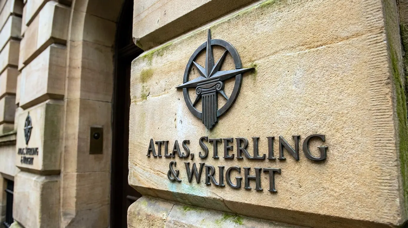
A UK commercial law firm came to Inkbot Design with roughly £8M in revenue, twelve partners, and genuine strength in corporate/M&A and employment.
Their problem arrived in feedback form after feedback form: “You seem very capable, but you feel more like a high-street practice than a strategic partner.”
Their logo was a detailed crest with a Latin motto, drawn in the early 2000s. Their navy-and-gold palette matched a dozen local competitors. Their website was clean and modern. The mismatch was doing the damage — not the crest itself.
Nothing in the visual system had ever been connected to the business development goal, which was £500k corporate mandates, not £5k one-off consultations. The brand had been treated as a look.
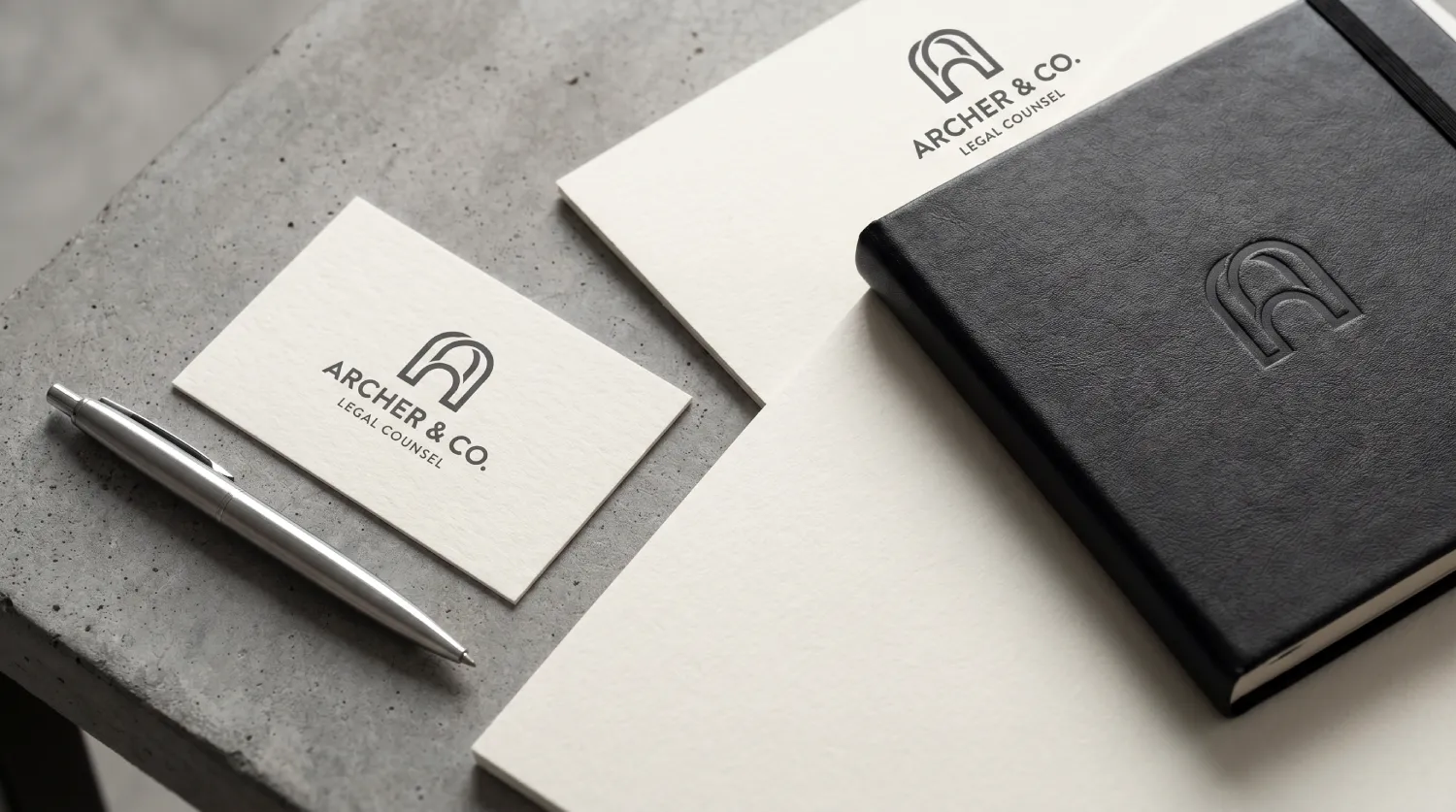
We replaced the crest with a refined wordmark carrying a subtle structural element — no scales, no columns. It had to hold up at favicon size, so that was the constraint we designed against first. The palette went to deep charcoal, off-black, and a single accent.
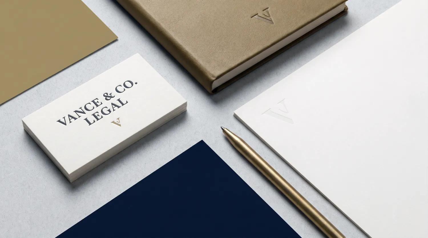
Typography moved to a contemporary serif/sans pairing that reads as boardroom rather than high street. Then we implemented it at the risk points: proposal covers, pitch decks, partner slide templates, email signatures, LinkedIn banners, office signage.
Within 12 months, shortlist rate in comparable RFPs moved from roughly 28% to 46%. Average new corporate matter value moved from around £18k to around £27k. Inbound enquiries self-identifying as CFO, General Counsel or founder went from about 35% to 58%.
What This Means For Your Firm
If the logo is risk architecture, then the fee ceiling you are hitting is partly a design fault, and it is one you are paying for every quarter you leave it.
Work the mechanism through. Ian Stephens' model puts brand at roughly a quarter of the outcome at each of three BD stages.
If your mark and visual system are filtering you out at the shortlist, you are not losing that mandate — you are losing the chance to compete for it, which never appears in your pipeline data because it never entered the pipeline.
A firm losing 18 percentage points of shortlist rate, as the firm above was, does not experience it as a brand problem. It experiences it as a slow quarter.
The cost of inaction is not “our logo is a bit dated”. It is a compounding price ceiling. You are quoting against firms with equivalent expertise and sharper signals, and the buyer resolves the ambiguity in favour of the firm that looks like less of a personal risk to instruct. You then discount to close. Every discount is your logo billing you.
The Default Approach | What It Costs | The Better Approach | Why |
|---|---|---|---|
Choose colours from a psychology chart (45% pick blue) | Invisibility in a shortlist of blue logos | Choose the palette that separates you from your three named pitch rivals | Differentiation is relative to competitors, not to a chart |
Keep the crest for heritage reasons | Illegible at 32px; reads as high street on screen | Design for the smallest real exposure surface first | Buyers meet the mark on LinkedIn, not letterhead |
Judge the logo in isolation at full size | Dissonance with website and copy goes undetected | Judge the mark alongside your homepage, proposal cover and partner bios | Buyers read coherence, not components |
Use a crowdsourced platform or Canva | Copyright exposure; Canva retains IP rights | Commission with work-for-hire terms transferring IP on payment | A firm that cannot own its own mark has an obvious credibility problem |
Treat the rebrand as a marketing project | No connection to matter value or shortlist rate | Tie the identity to a named BD goal before design starts | Untethered design is decoration and gets cut in the next budget round |
Refresh the logo, leave everything else | Mismatch persists; the friction is unchanged | Implement across proposals, decks, signatures, signage together | Consistency is the variable Lucidpress measured, not the mark |
The Objection You Are Already Making
“Our clients instruct us on relationships and results, not on a logo.”
Correct — and irrelevant to the problem.
Existing clients instruct on relationships. The logo is not addressed to them. It is addressed to the stranger on the RFP panel who has never met you, the referred prospect checking your site before returning the call, and the General Counsel scanning eleven capability statements.
Your relationship-led work is evidence of what happens after the signal has done its job. It says nothing about the mandates that never reached you.
The second objection is sharper.
“This is unfalsifiable — you'll credit any improvement to the rebrand.”
Fair. So measure it the way you would measure anything else: shortlist rate in competitive RFPs, average matter value, and inbound lead seniority, tracked before and after, over 12 months. Those are the three numbers in the engagement above, and they are the three a Managing Partner can defend to a partnership.
Hinge Marketing (2025) found professional services firms conducting formal brand research grow faster and are more profitable — the mechanism being that they measure the thing rather than assert it. If a branding firm will not agree to those metrics up front, that tells you what you need to know.
The Reframe: Stop Buying Design, Start Buying Risk Reduction

Every question in the standard law firm logo brief is the wrong question. Symmetrical or asymmetric? Descriptive or abstract? Blue or something braver?
Those are style questions, and they only become answerable after the real one: what does a stranger have to believe about this firm in three seconds for instructing us to feel safe?
Answer that and the attributes resolve themselves. If the belief you need is “these people handle complexity at board level”, the crest is gone before you have discussed colour, because heritage is not the risk being managed.
If the belief is “this firm will not embarrass me in front of my board”, legibility at 32 pixels stops being a technical footnote and becomes the primary specification.
“Design the mark for the moment of maximum doubt, not the moment of maximum attention. The buyer is never looking at your logo. They are glancing at it while deciding whether you are a safe person to be seen instructing. Everything decorative you add competes with the only thing it needs to do — and in a shortlist, competing with yourself is how capable firms lose to lesser ones.”
The 2026 context makes this less optional than it was. Industry analyses describe professional services marketing shifting from visibility toward relevance, reputation and results — trust and transparency over polish, insight over volume.
A generic mark actively undermines that positioning, because it is the first and fastest evidence a buyer receives that your firm's operations and your firm's self-presentation are not aligned.
If you are running AI-enabled workflows, value-based pricing and data-driven BD behind a crest from 2003, the gap is not subtle. Prospects notice it before you do.
The Verdict
The belief to leave with: your logo is not competing on taste, it is competing on perceived risk, and it is doing that job whether or not you designed it to.
A crest that reads as heritage in the partners' meeting reads as high street on a General Counsel's phone. The mark is not neutral. It is either reducing the buyer's felt exposure or adding to it, and firms are ranked accordingly before the pitch begins.
The evidence carries the position rather than decorating it. Fifty milliseconds to an impression, per Google and the University of Basel.
Up to 23% revenue lift from consistency, per Lucidpress. More than half of profitability attributable to brand across the BD funnel, per Ian Stephens' model. Faster growth and higher profits for firms that research their brand rather than assume it, per Hinge Marketing.
The most conservative legal market on the planet rebuilding its identity systems under competitive pressure, per the Economic Times. None of that is a design argument. All of it is a risk argument.
So stop asking whether the logo looks right. Ask what a stranger must believe in three seconds, then check whether every surface they will encounter — favicon, avatar, proposal cover, slide footer, signature — says the same thing. Most firms fail that test and have never run it.
Run it this week. If you would rather have someone run it for you, request a free Brand Equity Audit™ — a written diagnostic, delivered in 48 hours, no sales call, identifying exactly where your firm's brand is losing commercial ground and what to do about it.
Frequently asked questions
Does a law firm's logo actually affect winning work?
Yes — because it operates before evaluation, not during it. Google and the University of Basel found impressions of a web page form in 50 milliseconds, driven by visual design. A logo influences whether a firm reaches the shortlist, at which point competence assessment begins.
Why do capable law firms get told they “feel like a high-street practice”?
Because the visual signals contradict the capability. A modern website carrying an ornate crest and dense legalese bios sends three incompatible claims. Buyers cannot resolve the contradiction, so they resolve the decision instead — usually against the firm.
What's the difference between a logo and a brand for a law firm?
A logo is a single mark. A brand is the coherent system — mark, palette, typography, tone, and their consistent application. Lucidpress found consistent presentation across channels can lift revenue by up to 23%, which is a measure of the system, not the mark.
Is it true that most law firms use blue logos?
Yes — Firesign Marketing reports 45% of law firms use some shade of blue, and 16% use gold tones. That concentration is why colour-psychology charts produce invisibility rather than differentiation. Palette decisions should be made relative to named competitors.
When should a law firm redesign its logo?
When the mark fails at its real exposure surfaces or contradicts the firm's positioning. Practical trigger: illegibility at 32 pixels, mismatch with the website, or repeated pitch feedback describing the firm as smaller or more traditional than it is. Timing considerations are covered in when to redesign your logo.
Should a law firm avoid scales, columns and gavels?
Yes — but not because they are clichés. Literal legal symbols add nothing to the risk calculation a buyer is making, while consuming the legibility budget the mark needs at small sizes. Distinctiveness relative to competitors matters more than symbolic accuracy.
How much does logo design for a law firm cost?
Cost tracks scope, not the mark itself. A wordmark alone differs from a full identity system implemented across proposals, decks, signatures and signage. The variables are set out in detail at logo design cost.
Is a descriptive logo a good idea for a law firm?
No — not for firms handling distressing matters. Firesign Marketing reports descriptive logos generally drive more favourable impressions and more sales, but advises against them for litigation, divorce and criminal practices, where making the unpleasant matter explicit increases the buyer's felt exposure.
Why does symmetry get recommended for law firm logos?
Because symmetrical marks score higher on stability perception — Firesign Marketing cites 4.9 out of 7 for symmetrical versus 3.9 for asymmetric, with 95% of logos perceived as symmetrical. Symmetry is a downstream attribute, useful only once positioning and legibility are settled.
Can a law firm use Canva or a crowdsourced platform for its logo?
No — the ownership risk is disqualifying. Firesign Marketing notes Canva users cede intellectual property rights, and crowdsourced platform clients bear responsibility for copyright infringement. A law firm that cannot demonstrate ownership of its own mark has a visible credibility problem.
How do you measure whether a law firm rebrand worked?
Track three numbers over 12 months: shortlist rate in competitive RFPs, average new matter value, and seniority of inbound enquiries. Hinge Marketing (2025) found firms conducting formal brand research grow faster and are more profitable than firms that assume.
What makes a good law firm logo in 2026?
Legibility at 32 pixels, coherence with the website and copy, and distinctiveness relative to named competitors. TopRight's 2026 analysis identifies clarity, flexibility and character as the direction of travel. Broader criteria are covered at what makes a good logo.