When to Redesign Your Logo Without Destroying What You’ve Built
A logo redesign is a signal decision, not a style one. Redesign when the business, audience, offer, or channels have genuinely changed — not because the mark feels tired. This framework helps professional services leaders tell strategic mismatch from cosmetic boredom, and protect the recognition they have already paid to build. Precisely.
 By Stuart Crawford
 Reviewed by Tabitha Ayers
11 min read
On this page11 min left
- What Does “Redesign Your Logo” Actually Mean?
- Why This Matters for a Firm Heading Into a Growth Phase
- The Four Signals That Tell You When To Redesign Your Logo
- Where People Get It Wrong: Mistaking Boredom for Obsolescence
- Evolution or Reset: Choosing How Far to Go
- The Sharper Way to Think About This
- The Verdict
- Frequently asked questions
A £30m accountancy practice came to us convinced its logo was the problem.
Enquiries had softened, the mark was fifteen years old, and three partners had independently decided it “looked tired.” It didn't. The logo was fine.
What had actually changed was the firm – it now led with advisory work, not compliance, and sold to founders rather than finance directors. The logo still said, Ledger. That is a redesign trigger. “Tired” is not.
This distinction is where most redesign decisions go wrong, and where a lot of money gets spent solving a problem that isn't there.
A logo redesign is a signal decision, not a style decision. You commission a logo design agency when the mark has stopped telling the truth about the business, not when the team has simply looked at it for too long.
What Does “Redesign Your Logo” Actually Mean?
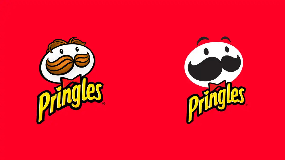
Redesigning a logo means changing the visual identity so it represents a real shift in the business, its audience, its offer, or the channels it competes in. It is a strategic correction, not a decorative update. Done for the right reason, it realigns perception with reality.
- A refresh modernises an existing mark while keeping its recognisable core.
- A redesign replaces the mark because the thing it represents has changed.
- A trigger is a material change in business reality, never the passage of time.
A logo needs redesigning when the business, audience, offer, or channels have materially changed – not simply because the design looks dated or the team is bored.
For the broader picture of how identity and positioning fit together, our guide to logo design and branding provides the wider context in which this decision sits.
Why This Matters for a Firm Heading Into a Growth Phase
Get this decision wrong in either direction, and it costs you.
Redesign unnecessarily, and you throw away recognition you spent years and considerable fees building. Fail to redesign when the business has genuinely moved on, and every proposal you send arrives with a visual identity that contradicts the story you're telling in the room.
A 2025 thesis comparing Nokia and Ericsson found that rebranding serves as a market-realignment tool when the outward messaging aligns with internal capabilities.
The mechanism is straightforward: a buyer reads the identity as a promise. When the promise and the delivered reality align, the identity reduces perceived risk and supports the fee.
When they diverge, the prospect senses the gap before anyone names it – and starts discounting.
“A logo does not create trust. It stores it. Redesign the mark, and you reset the store to zero, then spend the next two years rebuilding what you had. That trade is worth making only when the old identity has started actively working against the business.”
The Four Signals That Tell You When To Redesign Your Logo
The decision comes down to four questions. If a material change has occurred in one or more, redesign. If none has changed, you have a cosmetic itch, not a strategic case.
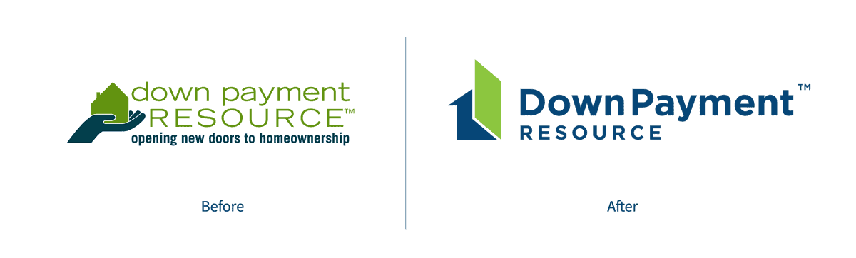
Has the Brand Promise Changed?
Redesign when the firm now promises something materially different from what the original mark was built to signal.
The £30m accountancy practice above had shifted from compliance to advisory – a change in what the firm fundamentally sells.
A logo built to signal reliability and process cannot carry a promise of insight and judgment. When the promise moves, the signal must move with it. If the promise is unchanged, the logo is not the problem.
Has the Audience Changed?
Redesign when the firm now sells to a different buyer than the one the identity was designed to reach.
A litigation practice that built its mark to reassure corporate general counsel speaks to a different reader when it starts targeting founder-led scale-ups.
Visual codes that read as “safe and established” to one audience read as “slow and expensive” to another.
A changed audience is a legitimate redesign trigger; a stable audience that you have simply grown bored of presenting to is not.
Has the Offer or Structure Changed?
Redesign when a merger, acquisition, new service line, or restructure has changed what the firm actually is.
Two mid-sized firms merging cannot credibly run two legacy logos, and bolting one onto the other signals acquisition rather than integration.
A genuinely new entity needs a mark that represents the combined business, not the louder of its predecessors.
Have the Channels Changed?
Redesign when the mark can no longer perform in the environments where the firm now competes. A logo designed for letterhead in 2009 may collapse into an unreadable smudge as a 32-pixel favicon or a LinkedIn avatar.
This is the one trigger where “it looks dated” and “it fails strategically” overlap – because a mark that cannot function digitally is failing a real operating requirement, not an aesthetic preference.
Before assuming this applies, weigh it honestly against the true cost of professional logo design; channel failure justifies the spend, mild dislike does not.
Where People Get It Wrong: Mistaking Boredom for Obsolescence
The most common error is treating internal fatigue as market obsolescence. You and your partners see the logo every day for a decade; of course, it feels stale to you.
Your clients see it a few times a year, and to them it reads as familiar and stable – which, in professional services, is an asset, not a liability.
A January 2026 industry post argued the point directly: logos should change when the underlying business reality changes, not because time has passed or the team has grown tired of the look.
The people most bored with a logo are almost always the people least representative of the market. Your fatigue is not data.
Here is the objection a sharp reader raises: “But our logo genuinely does look dated compared to competitors.”
Fair – and worth separating into two cases. If “dated” means the mark fails digitally or misrepresents a changed business, that is a real trigger.
If “dated” means the typeface belongs to a previous decade but still legibly represents an unchanged firm, a targeted refresh preserves recognition while updating execution. You rarely need to redraw the whole identity to fix a typeface.
Evolution or Reset: Choosing How Far to Go
Once a redesign is justified, the second decision is how much to keep. This is where recognition is either protected or squandered.
Scenario | Recommended Choice | Why |
|---|---|---|
Business promise unchanged, mark fails digitally | Refresh (retain core) | Preserves recognition; fixes the real fault |
New service line added, core firm intact | Evolution | Signals growth without erasing equity |
Merger of two established firms | Full redesign | New entity needs a mark of its own |
Repositioning to a new audience segment | Evolution to full redesign | Depends on how far the audience has shifted |
Post-acquisition integration | Full redesign | Two legacy marks cannot both survive credibly |
Recognised mark, leadership simply bored | No change | Protect the equity; fix the system, not the logo |
Commentary on 2025 redesigns reinforced this: the strongest examples were not radical reinventions but careful updates that kept core recognition while improving clarity and flexibility.
The instinct to “start fresh” is usually the expensive instinct.
The Sharper Way to Think About This
The prevailing advice – redesign when your logo looks outdated, hard to read, or in need of a refresh – is not wrong so much as it is vague, and vagueness is why so many firms redesign the wrong thing at the wrong time.
Intelligent practitioners hold this view for a reasonable reason: an outdated-looking mark genuinely can cost credibility, and “does it look current?” is an easy question to ask.
The problem is that “outdated” describes a feeling, not a fault. It cannot distinguish the firm that has genuinely outgrown its identity from the leadership team that has simply grown tired of it. The fix is to replace the feeling with a test.
If the brand promise, audience, offer, or channels have materially changed, redesign the identity to reflect reality.
If none has changed, the logo is doing its job, and the discomfort belongs elsewhere: in the messaging, the website, the proposal design, or the sales conversation.
This matters because redesigning an otherwise accurate logo has real downsides. A 2019 academic study found that people with a strong self-brand connection react more negatively to changes that reduce the associations they already value.
In professional services, your most valuable clients are precisely the ones with the strongest connection to your identity. Reset the mark they trust, and you risk unsettling the exact relationships you most need to protect.
“Preserve recognition ruthlessly and redesign only on evidence of real change. A logo that still tells the truth about the business is not a problem to be solved – it is equity to be defended. The firms that treat their identity as disposable are the ones that never accumulate any.”
And when a redesign is warranted, execution decides the outcome.
A 2025 telecom case study found meaningful differences in stakeholder engagement and communication timing across two major rebrands, reinforcing that rollout quality matters as much as the new identity itself. A right decision, badly rolled out, still fails.
In 17 years of brand work, the pattern I see most often is a leadership team convinced the logo is the problem when the logo is merely the most visible thing to point at.
For the mechanics of how a disciplined redesign actually runs once the decision is made, our logo design process walks through it stage by stage.
The Verdict
The redesign decision is not aesthetic, and it is not a matter of taste. It is a test of whether your identity still tells the truth about your business.
Run the four signals honestly. Has the promise changed? The audience? The offer or structure? The channels you compete in?
If one or more have genuinely moved, redesign and roll it out with the care that the 2025 telecom evidence shows is required for the outcome to be dependent on it. If none has, you do not have a logo problem.
You have a recognisable asset and a restless leadership team, and the answer is to leave the mark alone and fix the system around it: the messaging, the website, the proposal design, the story you tell in the room.
The firms that get this wrong in the expensive direction redesign a mark that was still working, reset a decade of recognition to zero, and unsettle the very clients whose loyalty they most needed.
The firms that get it wrong in the other direction let a genuinely outgrown identity quietly contradict every proposal they send. Both errors come from the same root: mistaking a feeling for a fault.
Before you commission anyone to redraw anything, find out precisely where your brand is actually losing commercial ground – the logo may be the least of it.
Request a free Brand Equity Audit™: a structured, written diagnostic that identifies exactly where your brand is costing you enquiries and what to do about it, delivered in 48 hours with no sales call.
Frequently asked questions
How do I know when to redesign my logo?
Redesign when the business, audience, offer, or channels have materially changed, and the logo no longer represents that reality. A mark that still tells the truth about the firm needs no redesign, however dated it feels to the people who see it every day.
Is a logo looking outdated a good enough reason to redesign it?
No – “outdated” describes a feeling, not a fault. It cannot distinguish a firm that has genuinely outgrown its identity from a leadership team bored with looking at it—redesign based on evidence of real business change, not on aesthetic fatigue.
What's the difference between a logo refresh and a logo redesign?
A refresh modernises an existing mark while keeping its recognisable core intact. A redesign replaces the mark because the business it represents has fundamentally changed. A refresh preserves recognition; a redesign resets it, which is why the reason for change matters so much.
Should we redesign our logo before an acquisition or merger?
Yes – a genuinely new combined entity needs a mark that represents it, and running two legacy logos signals acquisition rather than integration. A merger changes what the firm fundamentally is, which is one of the clearest legitimate triggers for a full redesign.
Does redesigning a logo lose brand recognition?
Yes, it can. A 2019 academic study found that people with a strong self-brand connection react more negatively to changes that reduce associations they value. In professional services, your most loyal clients hold that connection, so an unnecessary redesign risks unsettling your most valuable relationships.
How often should a company redesign its logo?
There is no fixed schedule. A January 2026 industry post argued that logos should change when business realities change, not because time has passed. Calendar-based rules like “every five years” ignore whether the mark still accurately represents the firm, which is the only question that matters.
Why do most logo redesigns solve the wrong problem?
Because leadership mistakes internal boredom for market obsolescence. The people who are most tired of a logo see it daily and are the least representative of the market. Clients see it occasionally and read it as familiar and stable – an asset in professional services, not a liability.
When is a logo refresh better than a full redesign?
A refresh is better when the business promise is unchanged, but execution has dated – a tired typeface on an otherwise accurate mark. Commentary on 2025 redesigns found the strongest examples kept core recognition while improving clarity, rather than starting from scratch.
Is it true that a modern logo justifies premium pricing?
Only indirectly. A logo does not command a premium for looking modern; it does so when it accurately signals a promise the firm delivers. A 2025 thesis by Nokia and Ericsson found that rebranding realigns the market only when outward messaging matches internal capabilities.
What should we do if our logo still works but leadership wants a change?
Leave the mark alone and fix the system around it. If the promise, audience, offer, and channels are unchanged, the discomfort belongs in the messaging, website, or proposal design – not the logo. Redesigning a working mark discards recognition for no strategic gain.
Does how we roll out a redesign really matter?
Yes – a 2025 telecom case study found stakeholder engagement and communication timing drove meaningful differences across two major rebrands. An appropriate redesign decision, poorly communicated, still fails. Rollout quality matters as much as the new identity itself.
What's the single test for whether to redesign?
Ask whether the brand promise, audience, offer, or channels have materially changed. If one or more have, redesign to realign perception with reality. If none has, preserve recognition and address the real problem elsewhere. Change in business reality is the only reliable trigger.