What Makes a Good Logo: The Test That Matters More Than Taste
A good logo is not the prettiest option in the room. It is the mark that identifies your firm faster, and more separably, than every competitor it sits beside — under the worst real-world constraint it will ever face. Distinctiveness under constraint, not aesthetic polish, is the standard that actually predicts commercial performance.
 By Stuart Crawford
 Reviewed by Tabitha Ayers
Updated 12 min read
On this page12 min left
- What Makes a Good Logo?
- Why This Matters for a Firm in the Middle of a Rebrand
- The Anatomy of a Logo That Works
- Where Firms Get It Wrong: Mistaking Simplicity for Distinctiveness
- A Worked Example: Approving a Rebrand Logo Without Guessing
- The Sharper Test: Does It Out-Identify the Alternatives?
- The Verdict: Distinctiveness Under Constraint Beats Taste Every Time
- Frequently asked questions
Sit ten UK accountancy firms' logos side by side and most dissolve into the same wash of navy blue, a clean sans-serif, and an abstract swoosh that could belong to any of them.
That is the real failure state, and it is not ugliness. It is invisibility.
A good logo is not the one that wins the boardroom's approval on taste; it is the one that identifies your firm faster, and more separably, than the competitors it sits beside – under every constraint it will actually face.
The prettiest mark in your pitch deck can still be the weakest performing one on a phone screen at a networking event.
If you are commissioning identity work as part of a rebrand, the question worth arguing over is not whether the logo is elegant.
It is about whether it does a better job of identifying than the alternatives already in your category.
That is a question of logo design and branding strategy, not aesthetics, and it is the one most approval processes never ask.
What Makes a Good Logo?
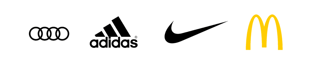
A good logo is a visual cue that lets a specific audience quickly recognise and distinguish one brand from its competitors, and that continues to do so across every size, format, and context in which the brand appears. It is judged by identification performance under real-world constraints, not by aesthetic preference.
- It is distinctive within its category – separable from the specific competitors it sits beside, not merely attractive in isolation.
- It is processing-easy – the eye and memory encode it with minimal effort, which a consumer-brand perception study links to a more positive brand experience.
- It is constraint-proof – it holds up at 16 pixels, in one colour, in dark mode, and embroidered on a polo shirt.
A good logo identifies a brand faster and more distinctly than its category competitors do while remaining legible across all sizes and formats.
Why This Matters for a Firm in the Middle of a Rebrand
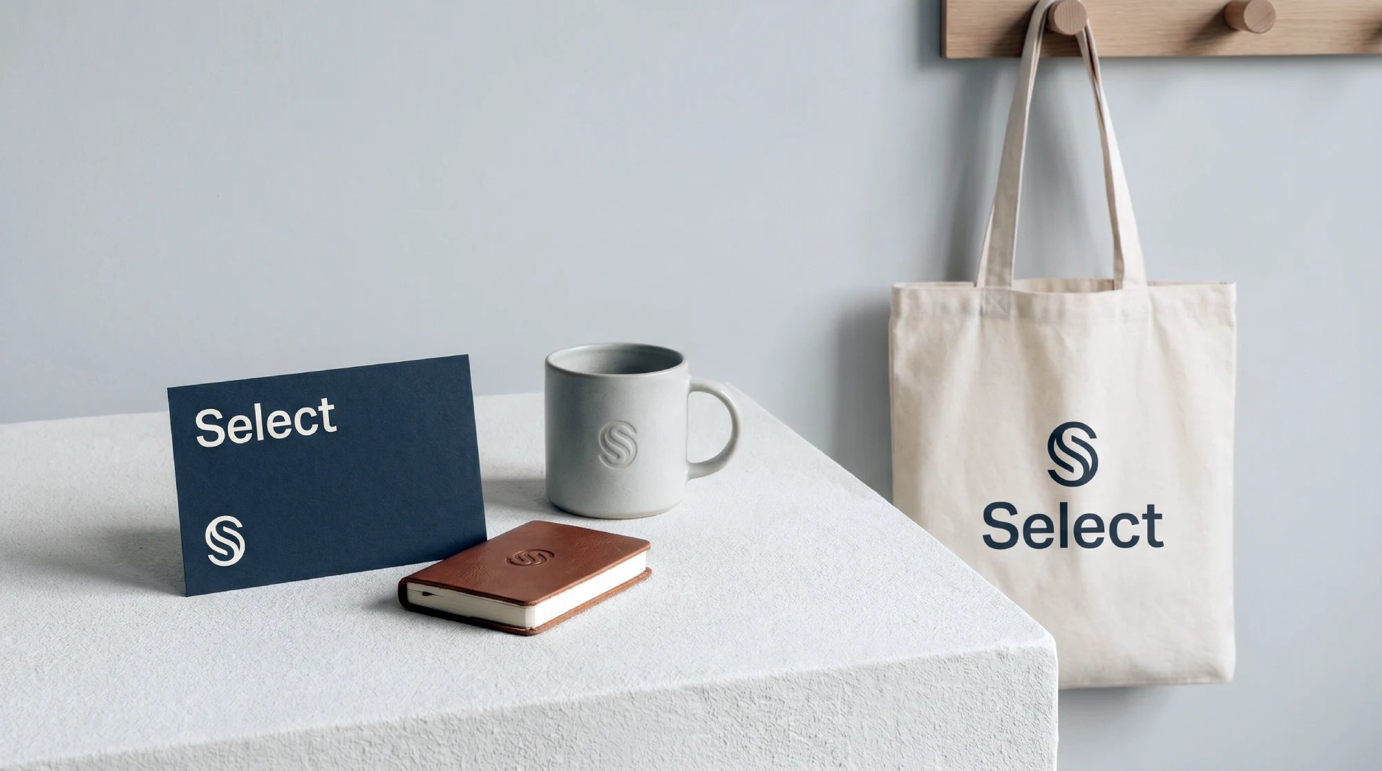
The commercial stakes are highest precisely when you are rebranding, because that is the moment you either buy distinctiveness or pay for a mark that quietly blends in for the next decade.
A 2019 review of logo literature frames logos as visual cues for identity and attention – but the same review notes the academic field is fragmented, which is exactly why so much “logo best practice” content states its rules with false certainty.
For a 120-partner professional services firm, the cost of a logo that fails the identification test is not a design complaint.
It is a slower path to recognition in a market where three rivals look interchangeable to a prospect who spends four seconds scanning a shortlist.
Distinctiveness is not a nicety here. It is the mechanism by which a prospect who has met you once retrieves you later, unaided, from a category of near-identical firms.
Consider the litigation practice that repositions upmarket, commissions a “sophisticated” wordmark in a refined serif, and launches – only to discover its three closest competitors did the same thing eighteen months earlier. The logo tested beautifully in the room. In the market, it identified nobody.
“A logo does not compete against good taste. It competes against the other logos in its category for a few seconds of a distracted prospect's recognition. Elegance that arrives at the same visual conclusion as every rival is not an asset – it is camouflage the firm paid a premium to wear.”
The Anatomy of a Logo That Works
A good logo is built from four working parts, and the sequence matters: distinctiveness sets the target, processing ease and constraint-fitness make it achievable, and meaning makes it stick.
Distinctiveness Within the Category, Not in Isolation
The first test of a logo is whether it separates the brand from its direct competitors, not whether it looks good on a white background.
Most approval processes judge a logo in isolation – projected large, alone, in ideal conditions – which is the one context in which it will never actually be seen.
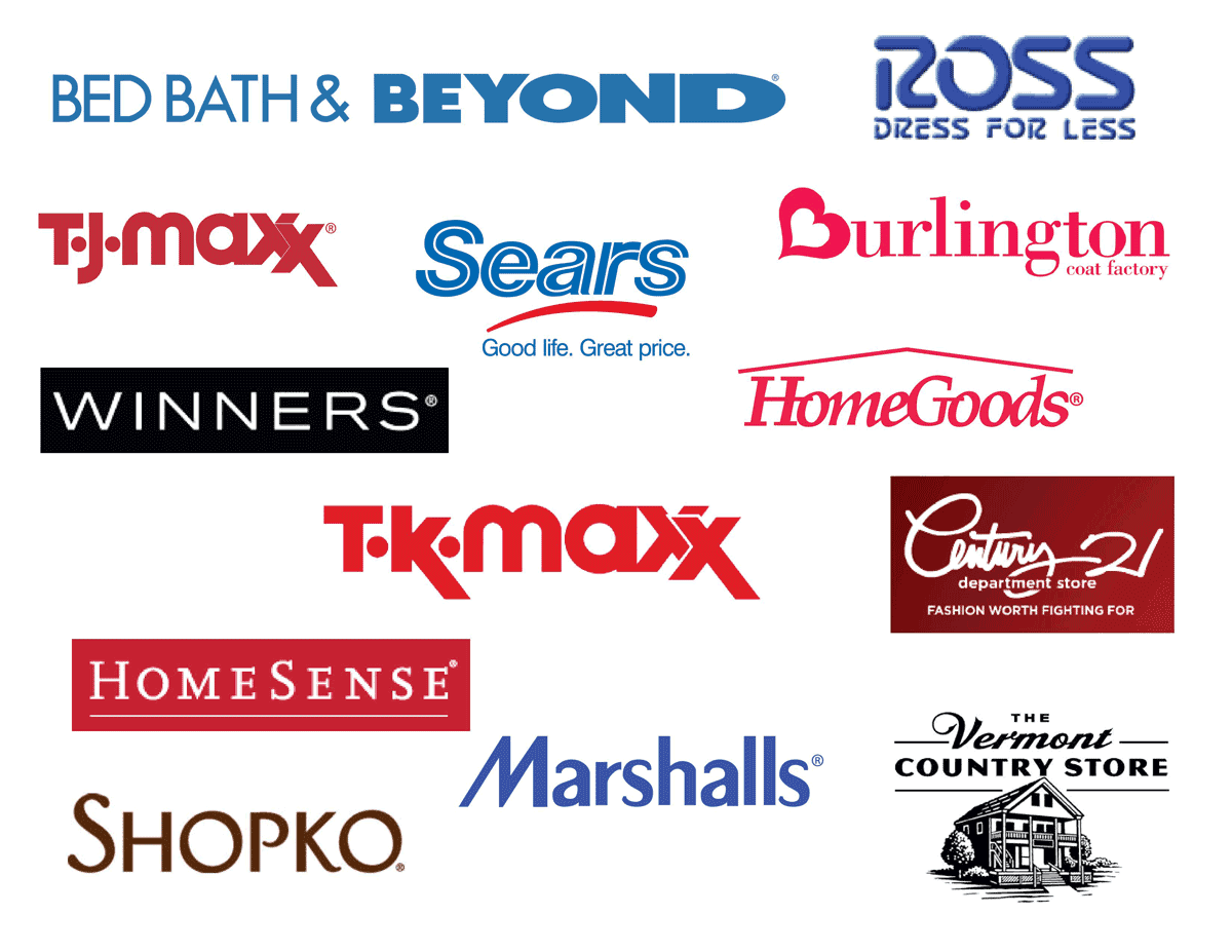
The Ehrenberg-Bass Institute's body of work on distinctive brand assets treats separability from competitors as the property that drives unaided recognition.
A logo that scores highly on polish but shares its entire visual vocabulary with the sector – same palette, same mark type, same typographic register – has failed the only test that predicts commercial recall.
Processing Ease: How Fast the Eye and Memory Encode It
A good logo is one that the brain reads with minimal effort, because ease of processing is associated with a more positive brand experience.
A consumer-brand perception study on logo impact reports that smoother logo information processing correlates with how positively people experience the associated brand.
The mechanism is straightforward: when recognition requires less cognitive effort, that fluency transfers to the brand as a feeling of familiarity and confidence.
This is why cluttered, over-detailed marks underperform – not because detail is inelegant, but because it raises the processing cost of every single exposure.
Meaning That Aids Memory: Why Figurative Often Beats Abstract
A logo that carries associative meaning is often more memorable than a purely abstract one.
A study on the influence of brand logos reports that figurative logos with associative meaning can be encoded and retrieved more reliably than abstract marks.
For a professional services firm, this is a direct argument against the default abstract swoosh: a mark that means something relevant gives the brain a second retrieval route beyond raw shape.
Abstract can still work – but it is working with one hand tied, relying on frequency and spend to do what meaning could have done for free.

Constraint-Fitness: The Worst Format Is the Real Brief
A good logo is designed for the smallest, harshest context it will face, not the largest and most flattering.
The real brief is the 16-pixel favicon, the single-colour invoice footer, the dark-mode email signature, and the embroidered polo – because those are where the logo lives daily, and where fine detail collapses into mush.
Designing for the pitch-deck hero shot and hoping the mark survives shrinking is the wrong order.
Treating the worst constraint as the starting input is what separates a logo that works everywhere from one that only works in the presentation that sold it.
Where Firms Get It Wrong: Mistaking Simplicity for Distinctiveness
The most common misunderstanding is that “simpler is always better” – and it is a misunderstanding, not a rule.
Simplification helps when it sharpens a distinctive cue and hurts when it strips one away.
A 2024 study on minimalist and adaptive logos found that logo simplification can influence brand memory, and a 2024 study on minimalist redesign found that it affected Generation Z's brand awareness and perception, which in turn influenced purchase intention.
So minimalism can pay.
But the current “debranding” critique – the wave of brands flattening their marks into near-identical geometric sans-serif wordmarks – has drawn warnings that many of these reductions weaken distinctiveness rather than improve it.
When Jaguar and others reduced richly specific marks to generic typographic treatments, the debate that followed was precisely about lost distinctiveness.
The correct rule is not “simplify.” It is: simplify only what does not carry your recognition, and protect the cue that does.
A sceptical reader will object here: “Isn't distinctiveness just a fancy word for being different for its own sake?”
No. Distinctiveness is not novelty – it is separability paired with retrievability.
A logo can be wildly novel and still unmemorable. The test is not “is it unusual?” but “does a prospect who saw it once pull the right firm out of a lineup of competitors?”
A Worked Example: Approving a Rebrand Logo Without Guessing

Here is the concept applied end-to-end for a mid-sized firm approving new identity work.
First, assemble the actual competitive set – pull the logos of your eight closest competing firms and place your candidate mark among them at thumbnail size.
If it does not jump out, no amount of boardroom affection fixes that.
Second, run the constraint gauntlet before the taste conversation: render the mark at favicon size, in one colour, in dark mode, and at the size it appears in an email signature.
Anything that dies at 16 pixels is disqualified, regardless of how large it appears. Third, test retrieval, not recognition – show it briefly to someone outside the firm, then ask them to describe it an hour later.
A logo they can redraw from memory is doing the encoding job; one they can only vaguely gesture at is not.
In 17 years of brand work, the pattern I see most often is a firm falling in love with the mark that photographed best in the pitch, only to discover it is indistinguishable from a competitor at the exact scale clients actually encounter it.
The Default Approach | What It Costs | The Better Approach | Why |
|---|---|---|---|
Judge the logo alone on a white slide | Blends into the category unnoticed | Judge it inside your competitor lineup | Recognition happens against rivals, not in isolation |
Design the hero version first, shrink later | Detail collapses at real sizes | Design the 16px version first | The worst format is where it actually lives |
Default to an abstract mark | Relies on spending to build memory | Use meaning where the sector allows | Figurative-with-meaning encodes more reliably |
Simplify because minimalism is trendy | Strips the distinctive cue | Simplify only the non-identifying detail | Simplification helps memory only when it preserves the cue |
Approve of partners' taste | Optimises for insiders, not prospects | Test retrieval with outsiders | The buyer, not the boardroom, has to remember it |
The Sharper Test: Does It Out-Identify the Alternatives?

Intelligent practitioners hold the “simple, memorable, timeless, relevant, versatile” checklist for a good reason. Each item points to something real, and the list is a reasonable summary of what designers have observed for decades.
The problem is not that the checklist is wrong. It is that it judges a logo against abstract virtues rather than against its actual competitors, and a mark can satisfy every item on the list while remaining commercially invisible in its category.
The stronger standard is a single question: does this logo do a better job of identification than the alternatives in its category, under the constraints it will actually face?
This reframes logo quality from a matter of polish to a matter of performance.
It is supported, not asserted: the 2019 literature review establishes logos as cues for identity and attention; the processing-fluency research explains why separable, easy-to-read marks win; the figurative-memory research explains how to make them stick; and the debranding critique shows the failure mode when distinctiveness is sacrificed to style.
Taste tells you whether you like it. The identification test tells you whether it will work.
“Stop asking whether the logo is beautiful. Ask whether a prospect who glimpsed it once, beside four competitors, on a phone, could pull your firm's name back out an hour later. If the answer is no, it does not matter how refined the mark is – it is failing at the only job a logo exists to do.”
Where does this stand now? The market trend is still toward simplification and responsive logo systems built for mobile-first, app-driven touchpoints, and a 2025 NIH-indexed paper reports that animated logos can improve engagement and purchase intention – useful for firms whose brand increasingly lives on screens.
But the same period's debranding debate is the counterweight: simplicity is an asset when it preserves a distinctive cue and a liability when it removes one.
The defensible current position is neither “go minimal” nor “stay ornate.”
It is: build a responsive system that flexes across formats while protecting the one cue that makes you separable from your category.
The Verdict: Distinctiveness Under Constraint Beats Taste Every Time
A good logo is not the prettiest mark in the room, and the firms that treat it as such are the ones who launch identities that quietly underperform for a decade.
Across every section here, the same standard holds: a logo earns its keep by identifying your firm more quickly and distinctly than your competitors do, and by maintaining that performance across every size and format in which it appears.
Research on processing fluency explains why ease of recognition translates into brand experience.
Figurative-memory research explains why meaning outperforms empty abstraction. The debranding critique explains why simplification is only ever conditionally good.
None of that is about taste, and all of it is about whether the mark does its one job under pressure.
For a firm mid-rebrand, the practical consequence is a change in how you approve. Stop judging the candidate logo based on a single flattering slide.
Put it inside your real competitor lineup, shrink it to the sizes clients actually see, and test whether an outsider can remember it.
The surviving mark is worth commissioning. The one that only wins on elegance is a liability you will pay to maintain.
The single most useful thing you can do today is stop treating logo approval as an aesthetic decision and start treating it as a distinctiveness diagnosis.
If you want that done rigorously against your actual market, request a free Brand Equity Audit™. This structured diagnostic identifies exactly where your brand is losing commercial ground and what to do about it.
Frequently asked questions
What makes a good logo?
A good logo identifies a brand faster and more separably than its category competitors, and holds that performance across every size and format. It is judged by identification under real-world constraints, not by aesthetic taste. Distinctiveness, processing ease, meaningful memory cues, and constraint-fitness are its four working parts.
Why is distinctiveness more important than looking good?
Recognition happens against competitors, not in isolation. A logo can be elegant yet reveal its entire visual vocabulary to rival firms, making it invisible at the exact moment a prospect scans a shortlist. Distinctiveness is what lets someone retrieve your firm unaided from a category of near-identical marks.
How do I judge our new logo before approving it?
Place it inside your real competitor lineup at thumbnail size, render it at 16 pixels and in one colour, and test whether an outsider can describe it an hour later. A logo that survives its worst format and stays memorable outside the boardroom passes; one that only wins on taste does not.
Is it true that simpler logos are always better?
No – simplification helps only when it preserves a distinctive cue and harms when it strips one away. Research shows simplification can influence brand memory, but the debranding critique warns that many modern reductions weaken distinctiveness. Simplify non-identifying detail; protect the cue that makes you recognisable.
What's the difference between a distinctive logo and a different one?
Distinctiveness is separability paired with retrievability – a prospect can both tell you apart from rivals and remember you later. Mere difference is novelty for its own sake and can be entirely unmemorable. The test is not “is it unusual?” but “does it pull the right firm out of a lineup?”
Should our rebrand use an abstract mark or a figurative one?
Figurative logos with associative meaning are often more memorable than abstract ones because meaning provides the brain with a second retrieval route beyond raw shape. Abstract can still work, but relies more heavily on spend and frequency. Where your sector allows meaning, use it.
Why do professional services logos all look the same?
Firms judge logos in isolation rather than against competitors, and default to the sector's shared visual vocabulary – navy palettes, clean sans-serifs, abstract swooshes. The result is a category of interchangeable marks. Escaping it requires designing against the competitive set rather than toward the sector's conventions.
How small should a logo still work?
A good logo remains legible at favicon size (around 16 pixels), in a single colour, in dark mode, and when embroidered or printed at a small size. The smallest, harshest context is the real design brief. Any mark whose detail collapses at those sizes is failing where it lives most.
Does colour matter as much as logo advice suggests?
Less than most articles claim. Colour-psychology tables (“blue means trust”) are contested and sector-generic, and relying on them often produces the same palette as every competitor. Colour matters most as a distinctiveness lever – choosing what separates you from rivals – not as a fixed emotional code.
When should we consider an animated logo?
Consider animation when your brand increasingly lives on screens and apps. A 2025 NIH-indexed paper reports that animated logos can improve engagement and purchase intention. It suits mobile-first, digital-heavy touchpoints – but the static, small-scale version must still pass the distinctiveness and constraint tests first.
How does a logo affect commercial performance?
A logo drives unaided recognition, which is how prospects retrieve your firm from a crowded category. Processing-fluency research links smoother recognition to a more positive brand experience. It does not sell alone, but a distinctive, easily encoded mark lowers the effort a prospect spends remembering you.
What's the single biggest logo mistake firms make in a rebrand?
Approving the version that photographs best in the pitch, then launching a mark indistinguishable from a competitor's at the scale clients actually see. The fix is to judge the logo inside the competitive lineup and at real sizes before the taste conversation ever begins.