Best Fonts for Logos: The 5 Tests a Professional Wordmark Must Pass
A logo font is not a brand personality selector; it is the most constrained piece of typography in the identity system. Discover why professional wordmarks require strategic spacing, distinctive customisation, and legal clearance... not just a £30 typeface download.


On this page8 min left
- Which Font Should a Professional Services Firm Choose?
- The Strategic Role: Why "Personality" Is Not Enough
- Name Behaviour: How Your Firm’s Name Dictates Typography
- Functional Constraints: Where Typography Actually Fails
- 5 Benchmark Typefaces That Pass the Constraint Tests
- Distinctive Customisation: Why a Font Is Not a Wordmark
- Legal and Production Viability: The Trademark Problem
- Wordmark Scenarios for Professional Services
- The Verdict: Building a Typographic System
- Frequently asked questions
The total value of the world’s 100 most valuable brands reached an all-time high of over $10 trillion in 2025 (Statista, 2025).
The typography that carries your firm's name holds immense commercial equity.
Yet when UK professional services firms prepare for a strategic rebrand, they often treat typeface selection as a subjective mood board exercise.
They search for ideal typefaces for brand identities, download a file that reflects their personality, and assume the job is done. That is a costly mistake.
There are many different types of logos, but a professional wordmark is the most technically and legally constrained piece of typography in your entire identity system.
Which Font Should a Professional Services Firm Choose?
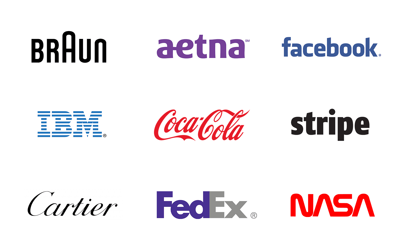
There is no single best font for a logo. The correct choice is a defensible typographic system that passes five strict functional constraints: strategic role, name behaviour, technical scaling, distinctive customisation, and legal viability.
- Select a typeface based on structural legibility at small sizes, not just aesthetic preference.
- Commission distinctive customisation to separate the wordmark from the raw commercial font file.
- Clear the underlying typeface licence for commercial trademark registration before finalising the design.
The best fonts for logos are determined by a rigorous sequence: evaluating the strategic role, testing name behaviour at small scales, assessing functional constraints, applying distinctive customisation, and clearing the typeface for trademark registration.
The Strategic Role: Why "Personality" Is Not Enough
Most corporate typography selection advice reduces the decision to basic psychology: serif fonts communicate tradition, while sans-serif fonts indicate modern innovation.
That is true, but incomplete. Personality is only one filter, and rarely the decisive one.
A 50-person financial consultancy does not need a font to prove it is serious; its track record does that. The wordmark's strategic role is to establish immediate recognition, facilitate trust, and separate the firm from its direct competitors.
You cannot rely on a typeface alone to do the heavy lifting of brand positioning.
Before deciding between a logotype vs logomark, you must recognise that the font functions as the anchor for a wider type system.
If you select a highly decorative display font for your logo, you immediately constrain the secondary typography you can use across your website and pitch documents without causing visual chaos.
Name Behaviour: How Your Firm’s Name Dictates Typography
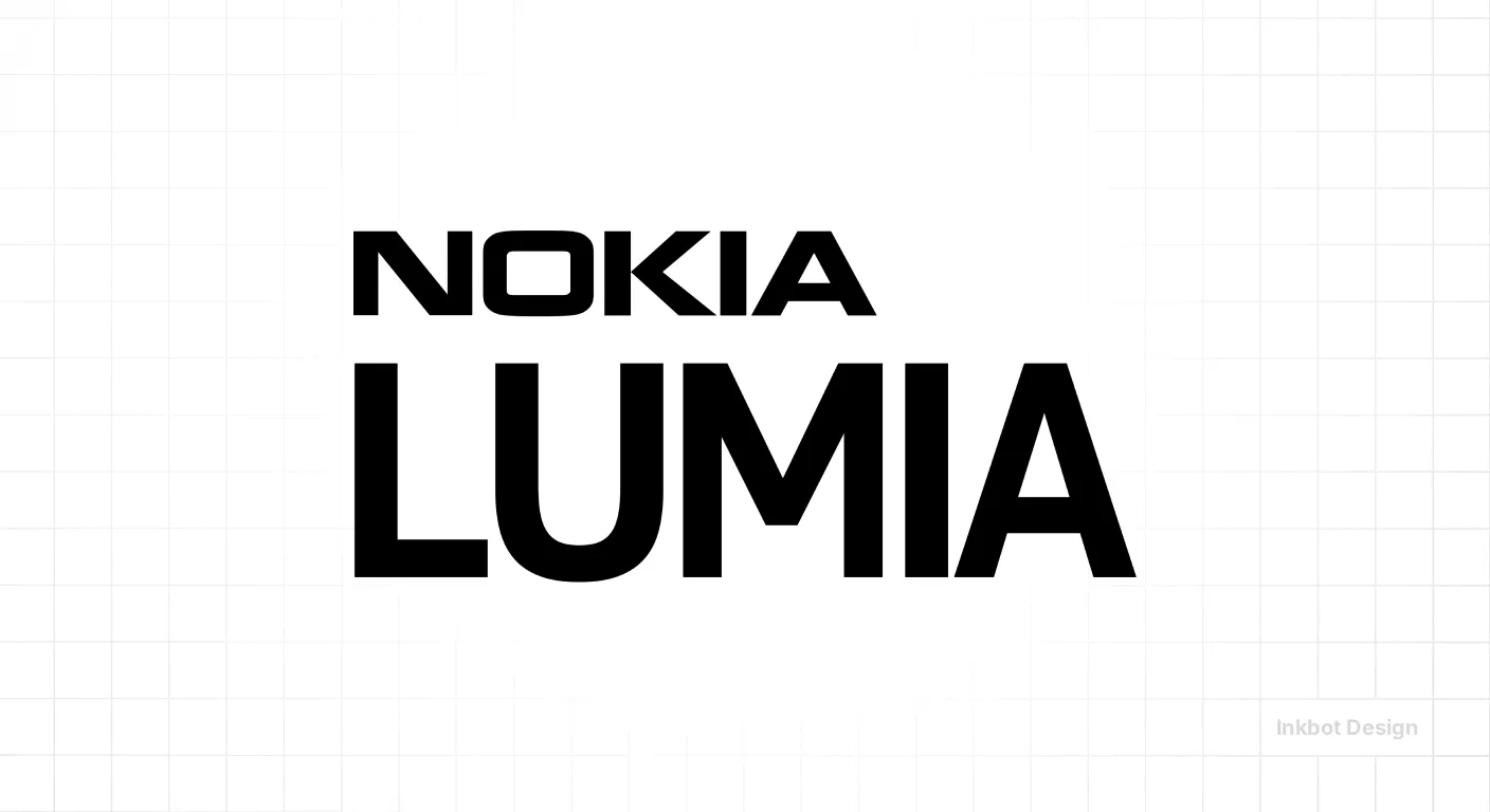
You cannot separate logo font choices from the specific characters in your firm's name.
A geometric sans-serif might look flawless in a foundry's type specimen displaying the word "AVANT", but fail if your firm is named "Miller, Harrison & Associates".
Research reviewed by the Nielsen Norman Group found that, for very short isolated text, larger type sizes, uppercase settings and regular-width type improved the speed of recognition. In contrast, condensed type was slower to identify (Nielsen Norman Group, 2025).
If your firm has a long, multi-partner name, a standard-width font will make the logo shrink to illegibility on mobile screens or in LinkedIn profile pictures.
Conversely, a short, three-letter acronym demands heavier weights and wider tracking to command the necessary physical space. The name itself sets the parameters for the typography.
Functional Constraints: Where Typography Actually Fails
A commercial wordmark must survive tiny app icons, digital embroidery, and monochrome reproduction.
Variable fonts are now mainstream, allowing a single typeface file to contain multiple weights, widths and other axes (Google Fonts, 2026).
For wordmarks, this matters immensely. A brand can now retain strict typographic consistency while adapting weight or width across digital and print contexts.
Furthermore, multilingual typography is becoming a practical brand requirement. In September 2026, Canva and Monotype expanded their partnership to add styles for Arabic, Bengali, Hindi, Khmer, Lao, Thai and Vietnamese.
For UK professional services firms operating internationally, professional wordmark fonts must be assessed for language coverage, diacritics, and script support.
If your chosen font cannot maintain legibility when reversed out in white over a complex photograph, or lacks the glyphs required for a European expansion, it fails the functional test.
5 Benchmark Typefaces That Pass the Constraint Tests
If you are looking for the raw materials to build a professional wordmark, you must start with typefaces engineered for scale, variable weights, and commercial licensing.
The following five fonts are not finished logos, but they serve as exceptional base layers because they survive the functional constraints that break lesser typefaces.
1. Inter: The Functional Workhorse
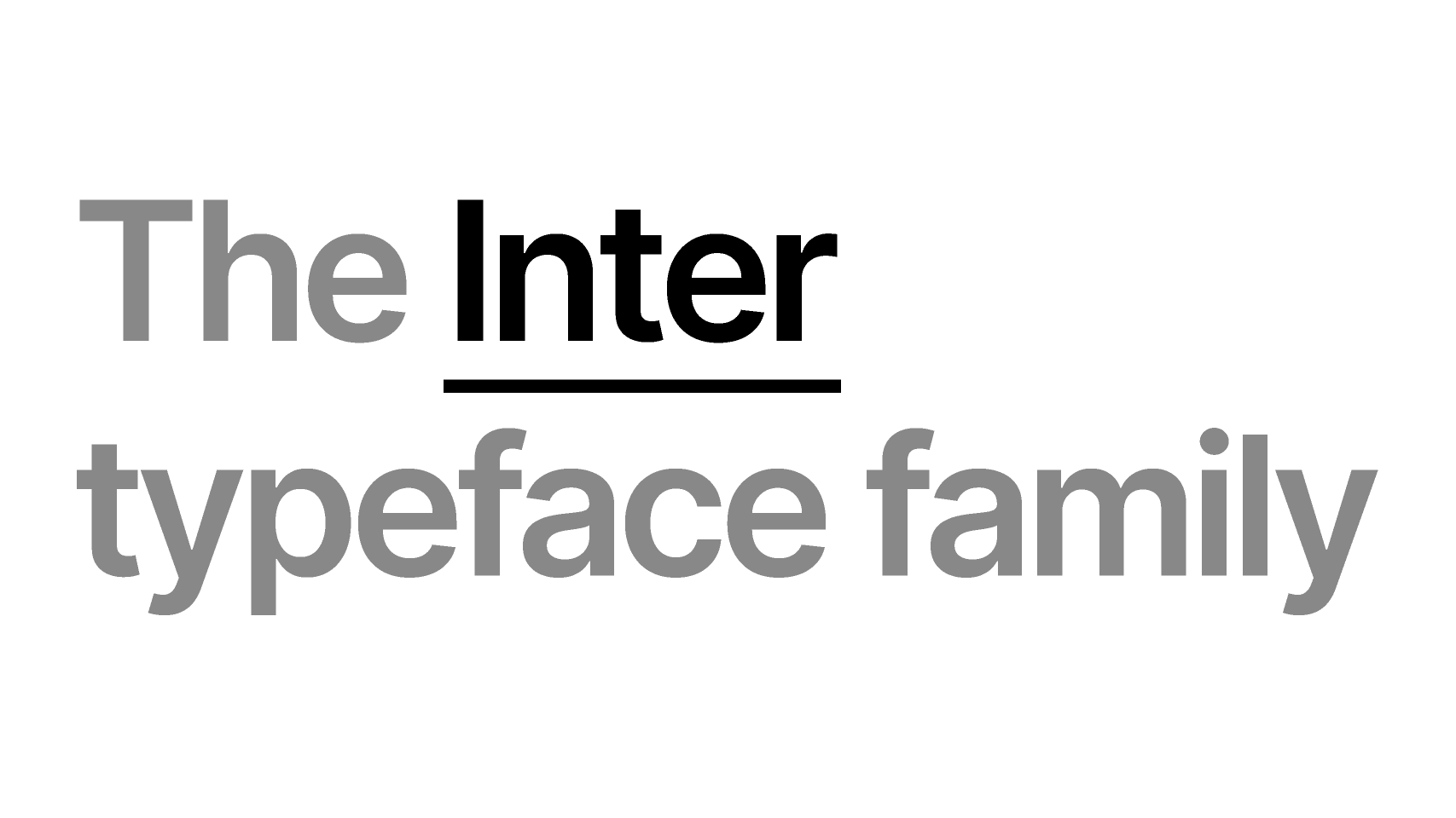
Inter was purpose-built for computer screens. It features a tall x-height, which greatly improves legibility of short text at small sizes (crucial for app icons and mobile headers).
Because it is a variable font, a designer can dial in the exact weight needed to balance the negative space in your firm's name.
Where it excels: High-growth tech consultancies and digital-first B2B platforms.
2. Montserrat: The Geometric Baseline
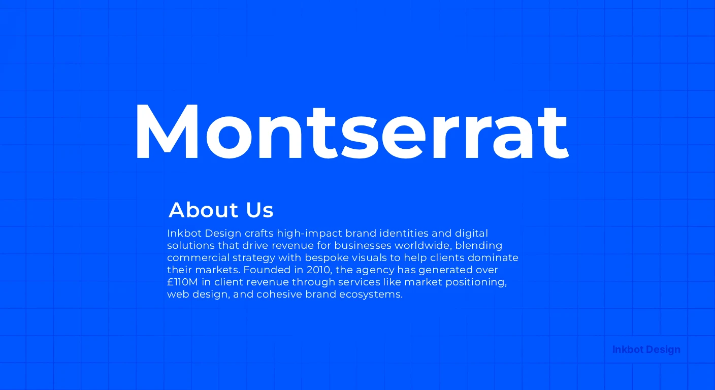
Often cited in design communities as a modern standard, Montserrat offers clean, inoffensive geometry.
Its value lies in its extensive weight range and wide language support.
However, its capital letters (particularly the 'G' and 'C') are highly distinctive; if your firm name relies heavily on these characters, they will require manual optical kerning to stop the wordmark from looking disjointed.
Where it excels: Corporate advisory and modern real estate firms.
3. Garamond (Premier Pro): The Heritage Standard
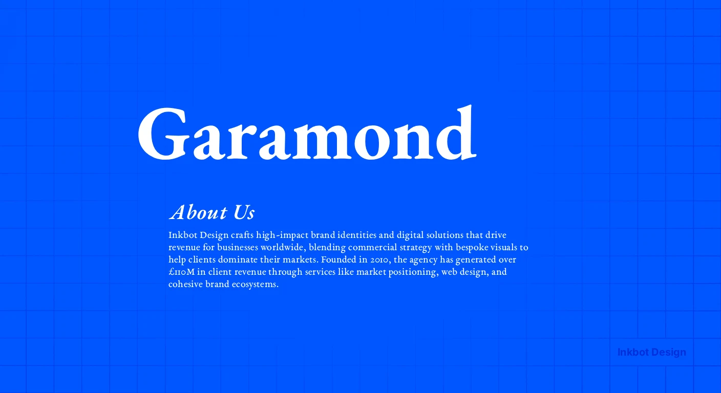
When a professional services firm wants to project authority, they default to serifs.
Garamond is the historical standard, but you must select a professional cut like Adobe’s Premier Pro rather than a free web clone.
The professional cuts include "Display" and "Subhead" optical sizes, ensuring the delicate serif strokes do not vanish when the logo is printed on a textured business card.
Where it excels: Wealth management, litigation practices, and established consulting partnerships.
4. Poppins: The Approachable Standard
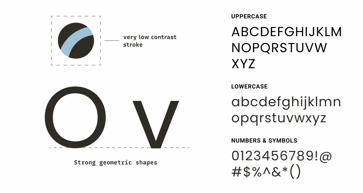
Poppins is a geometric sans-serif that relies on near-perfect circles for its letterforms.
It passes the multilingual test effortlessly, supporting both Latin and Devanagari systems.
It softens a corporate identity without slipping into novelty, making it highly functional for firms trying to humanise their market position.
Where it excels: Healthcare consultancies, HR advisory, and progressive SaaS firms.
5. Bebas Neue: The Display Constraint
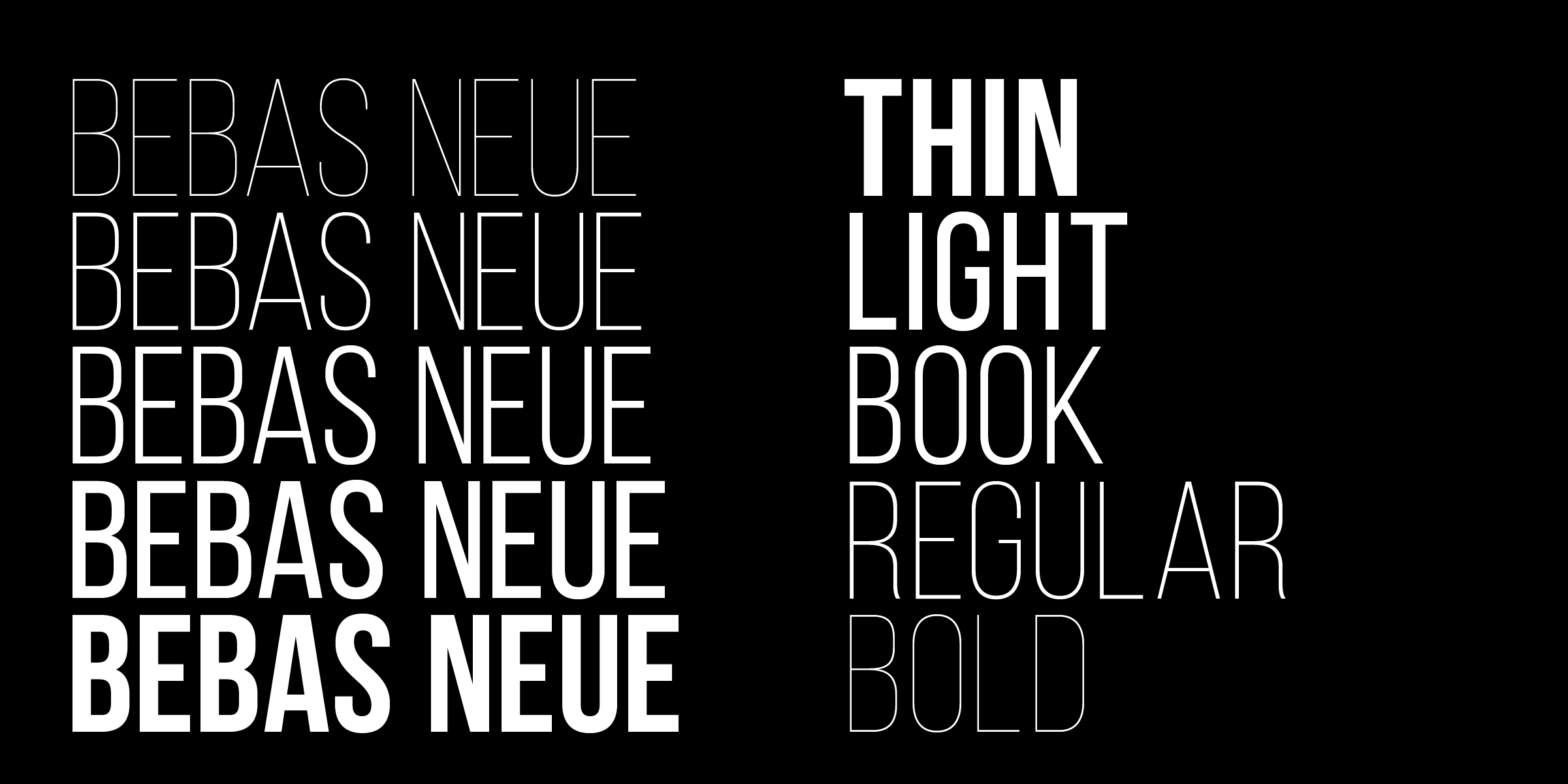
Bebas Neue is a bold, all-caps display font that commands immediate attention.
It performs brilliantly for short, three-letter acronyms (e.g., "KBR" or "SMC") because its condensed vertical structure creates a solid, unified block of typography.
Where it fails: Do not use it for a five-partner firm name; a long string of condensed capital letters fails the Nielsen Norman Group legibility test immediately.
Distinctive Customisation: Why a Font Is Not a Wordmark

This is where DIY branding collapses. Typing your firm's name into a £30 font file is not logo design.
It might serve a startup looking for a fast minimum viable product, but it is entirely inadequate for a £10M professional services firm seeking market authority.
A professional wordmark requires optical kerning, weight balancing, and often structural modification of individual letterforms.
A raw font relies on metric kerning—mathematical spacing that works well enough for body copy but creates jarring visual gaps when blown up to the size of a building or a billboard.
If a law firm named "WAVERLEY" uses a raw font, the physical space between the 'W', 'A', and 'V' will look structurally weak. A branding agency manually re-engineers that negative space.
Monotype’s 2025 Re:Vision report explicitly examines the relationship between creativity and AI, noting that while technology can generate endless options, strategic selection, customisation and systems thinking remain human-led brand decisions (Monotype, 2025).
If you close your eyes to the technical craft of customisation, you end up with a generic asset that looks exactly like the raw font anyone else in your sector can buy.
Legal and Production Viability: The Trademark Problem
Choosing a typeface without clearing commercial font licensing is a liability trap if you want to use a free font you found on a design forum to brand a firm heading toward an acquisition, good luck.
"Free" fonts routinely mean free for personal use only.
Commercial, logo, web, and embedding rights differ wildly. If you plan to register your wordmark as a trademark, the underlying typeface licence must explicitly permit that commercial use.
Many foundries prohibit the use of their desktop fonts as standalone, unmodified logos for registered trademarks precisely to protect their own intellectual property.
The scale of the trademark system is vast. In FY 2025, applicants filed more than 824,000 new trademark classes with the USPTO (USPTO, 2025).
The USPTO’s average time to first action was 5.6 months in FY 2025, while average total processing time was 11.7 months.
When your legal counsel discovers you do not own the commercial rights to your logo font eleven months into a trademark application, the bill to unpick and rebuild that logo file architecture will dwarf whatever you initially saved on licensing.
Wordmark Scenarios for Professional Services
Firm Scenario | The Default Approach | What It Costs | The Better Typographic Approach |
Legacy Firm Refresh | Adopting a trendy geometric sans-serif to look "modern". | Alienates existing high-net-worth clients who value continuity and stability. | Updating the heritage serif with careful customisation for digital screens and variable weights. |
Post-Merger Rebrand | Cramming all legacy partner names into a highly condensed font. | Fails the Nielsen Norman Group legibility test at small sizes; becomes unreadable on mobile. | Transitioning to a sharper acronym or abstract wordmark using a highly legible, standard-width variable font. |
Tech Spin-Out | Using a free, open-source technology font downloaded from the web. | Zero visual differentiation in the market; creates severe trademark registration friction. | Commissioning a heavily customised wordmark built on a commercially licensed base to ensure legal ownership. |
The Verdict: Building a Typographic System
A logo font is not a brand personality selector; it is the most constrained piece of typography in the identity system.
The defensible position is clear: there are no universally best fonts for logos. There is only the best typographic system for a specific brand, name, and set of real-world constraints.
Monotype’s report frames type as a participant in issues including accessibility and public discourse—not merely as decoration (Monotype, 2025).
Treat your wordmark as a strategic asset, clear the licensing early, and insist on optical customisation.
Before you select a typeface for your upcoming rebrand, you need to know exactly where your current visual identity is failing to convert in the market.
Request a free Brand Equity Audit™ at https://inkbotdesign.com/services/brand-audits/ — a structured diagnostic that identifies exactly where the brand is losing commercial ground and what to do about it.
Frequently asked questions
Can I just use a standard font for my business logo?
Yes — for a temporary, low-stakes project, typing your name into a standard font works. However, for a professional services firm, a raw font lacks the distinctive customisation and optical kerning required to stand out, and its licence may prohibit trademark registration.
What is the difference between a font and a wordmark?
A font is a piece of software containing a set of typographic characters designed to work together in paragraphs. A wordmark is a custom-engineered logo made of text, where the spacing, weight, and letterforms have been manually adjusted to serve as a singular, standalone graphic asset.
Do I have to buy the font used in my logo?
It depends on how the typeface is used. If your agency outlines the font and delivers a vector logo, you generally own the logo asset. However, if you plan to install that specific font on your company computers to type documents, you must purchase the appropriate desktop licences.
Can I legally trademark a wordmark made from a font?
Yes — provided the wordmark is distinctive enough to function as a trademark, it is available for registration, and the underlying typeface licence explicitly permits you to use it in a commercial logo. Always verify foundry licensing terms before filing.
Why are sans-serif fonts so popular for logos?
Sans-serif fonts are popular because their clean, unadorned letterforms scale down exceptionally well on digital screens and mobile applications. They meet the functional constraints of modern digital environments more easily than highly detailed serif typefaces do.