Consulting Website Design: What Buyers Need Before a Call
A consulting website should help enterprise buyers assess fit, examine evidence and explain the choice internally. Start with the assignment you want to win, then build service pages around delivery, proof and practical constraints. Choose the visual system and platform to support those decisions, rather than deciding the message afterwards.
 By Stuart Crawford
 Reviewed by Tabitha Ayers
10 min read
On this page10 min left
- How consulting website design supports a buying decision
- What partners must agree before design starts
- Build service pages around the assignment and its evidence
- What should a consulting service page explain?
- Design the digital presence for readers who arrive indirectly
- Choose the build around publishing and buyer tasks
- Approve the evidence before the visual concept.
- Questions people ask
Consulting website design should help a prospective client work out whether your firm fits the assignment, examine the evidence and explain the choice to colleagues before making contact.
Start there. A new visual concept comes later.
Nielsen Norman Group advises B2B websites to explain relevant services before requiring contact with sales. That guidance matters when a referred prospect knows one partner’s reputation but still needs to assess the wider consultancy.
The website is one application of your consultancy branding. The practical question is whether the website expresses the same position, expertise and scope that your partners describe in a proposal.
How consulting website design supports a buying decision
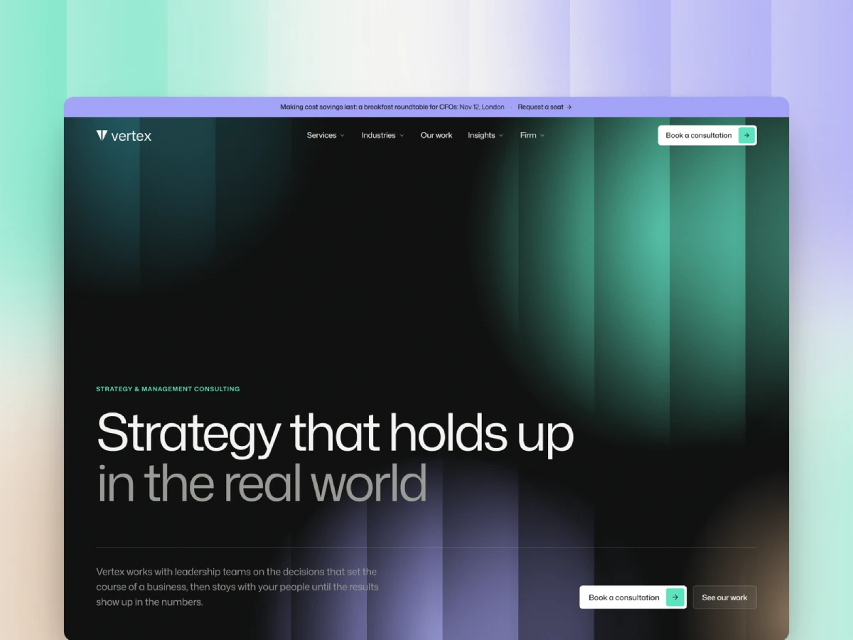
Consulting website design brings services, people and supporting evidence into a structure that prospective clients can evaluate. Begin with the assignment the consultancy wants to win, identify the questions a buyer must answer, and build pages that explain suitability before requesting a meeting.
- State the client situation each service addresses.
- Connect service claims to relevant evidence.
- Explain the next step and its practical commitment.
Consulting website design organises a consultancy’s services, evidence and expertise so prospective clients can assess suitability before making contact.
Visual quality still has a job. Nielsen Norman Group’s 2019 corporate-website research identified clear layouts, authentic imagery and consistent navigation among the factors associated with user satisfaction. The same research identified hard-to-find company information and cluttered interfaces as problems.
That gives the design brief a purpose. Typography should make a case study easy to read. Navigation should help a buyer distinguish an operating-model assignment from implementation support. Photography should show the people a prospect may actually work with.
A homepage can introduce those choices, but should not carry every detail. Put the firm-level proposition on the homepage and the assignment-level explanation on the relevant service page. Let the reader choose the depth.
The acceptance question is straightforward: can someone establish a reason to continue evaluating the consultancy without asking a partner to translate the website?
What partners must agree before design starts
Before commissioning a consultancy website redesign, agree which assignments deserve priority and what evidence the firm can publish.
Use a one-page decision brief:
- Priority assignment: what work should the website help buyers recognise?
- Client situation: what has happened inside the client organisation?
- Relevant buyer: who owns the problem, and who else needs reassurance?
- Evidence: what approved work, methods, or named expertise supports the claim?
- Boundaries: which assignments should the consultancy decline or refer elsewhere?
- Approval owner: who resolves disagreements about the final message?
Write answers that can guide an actual page.
“Operations consulting for ambitious businesses” leaves the design team guessing. A hypothetical brief such as “post-acquisition operating-model work for multi-site industrial groups” gives the team a client situation to explain. That wording is an illustration, not a recommended niche for every consultancy.
A multi-practice management consultancy may need a broad corporate proposition with separate practice pages. A specialist boutique may need one central service narrative. Do not compress genuinely different assignments into one message merely to make the homepage shorter.
Partner disagreement is a reason to pause copy approval. If one partner wants restructuring work and another wants long-term transformation programmes, a designer cannot settle that commercial choice through layout.
Where the existing position is sound, keep the intervention smaller. Correct service copy, missing evidence and inconsistent templates before commissioning a full rebrand. The distinction between a website problem and a wider consulting firm branding decision belongs in the brief.
The exit condition is agreement on the priority assignment, the claims supporting it and the person authorised to approve them. “Everyone likes the mood board” answers a different question.
Build service pages around the assignment and its evidence
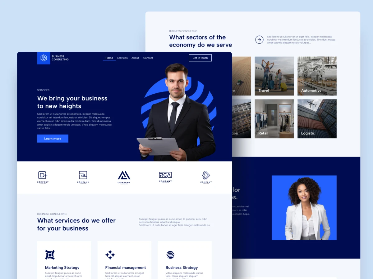
A consulting service page should explain the client situation, the work involved, the evidence supporting suitability and the responsibilities on both sides.
Nielsen Norman Group’s 2016 B2B guidance recommends content for both end users and purchasing decision-makers, recognising that those audiences need different information. That is a useful design principle for consulting service pages, although the research is cross-sector rather than consultancy-specific.
Before a sponsor contacts the consultancy, the sponsor should be able to identify the assignment, the relevant experience and the likely demands on the client team. Put those answers on the service page. A contact form cannot substitute for them.
What should a consulting service page explain?
A consulting service page should make the assignment concrete enough for a prospective client to assess relevance without confusing an illustration with a fixed commitment.
Start with the trigger. Has an acquisition created overlapping responsibilities? Is a reporting process delaying decisions? Is the organisation preparing to introduce a different operating model?
Then describe the work:
Page element | What to explain |
|---|---|
Client situation | The problem and the circumstances in which the service applies |
Scope | Activities and deliverables, with exclusions where useful |
Delivery | Who leads, who contributes and how the client participates |
Evidence | Relevant experience, approved results and limitations |
Commercial basis | How scope, dependencies and fees are established |
Next step | What the buyer sends or books, and what happens afterwards |
These elements need not become six identical boxes on every page. A short diagnostic assignment and a multi-country implementation programme require different explanations.
Take a hypothetical operating-model review. A useful description might explain that the work examines decision rights, reporting relationships and handovers between functions. The page could identify interviews and existing documentation as inputs, then describe the recommendations the client receives.
That is more useful than “we unlock organisational potential”. The buyer can inspect the proposed work.
Do not invent a fixed programme length to make the page look complete. If timing depends on access to executives or the number of operating units, name those dependencies. A conditional explanation is more honest than a tidy promise.
How can confidential consulting work provide credible evidence?
Confidential consulting work can support a website when the client has approved the disclosure and the description preserves enough context to explain what the consultancy contributed.
Begin by separating what is restricted. The client name, operational detail and financial result may have different permission requirements. Obtain approval for the actual material intended for publication rather than assuming an anonymous description is acceptable.
A named case study is useful when permission exists. Where permission does not exist, consider an approved anonymous account covering:
- The client context at a level that does not reveal the organisation.
- The assignment and the consultancy’s specific contribution.
- The evidence supporting any stated outcome.
- The limits of what can be disclosed.
Avoid anonymity that removes all substance. “A leading business achieved major improvements” gives a reader no basis for assessing relevance.
An anonymous case may still be too sensitive to publish. In that situation, explain the method, introduce the relevant professionals and state that further references are subject to client permission. Do not imply that confidential proof is guaranteed to become available.
NNg’s corporate-website research identifies authentic presentation and reputable external endorsements as useful credibility factors. That supports taking evidence seriously; it does not establish that an anonymous case study performs as well as a named one.
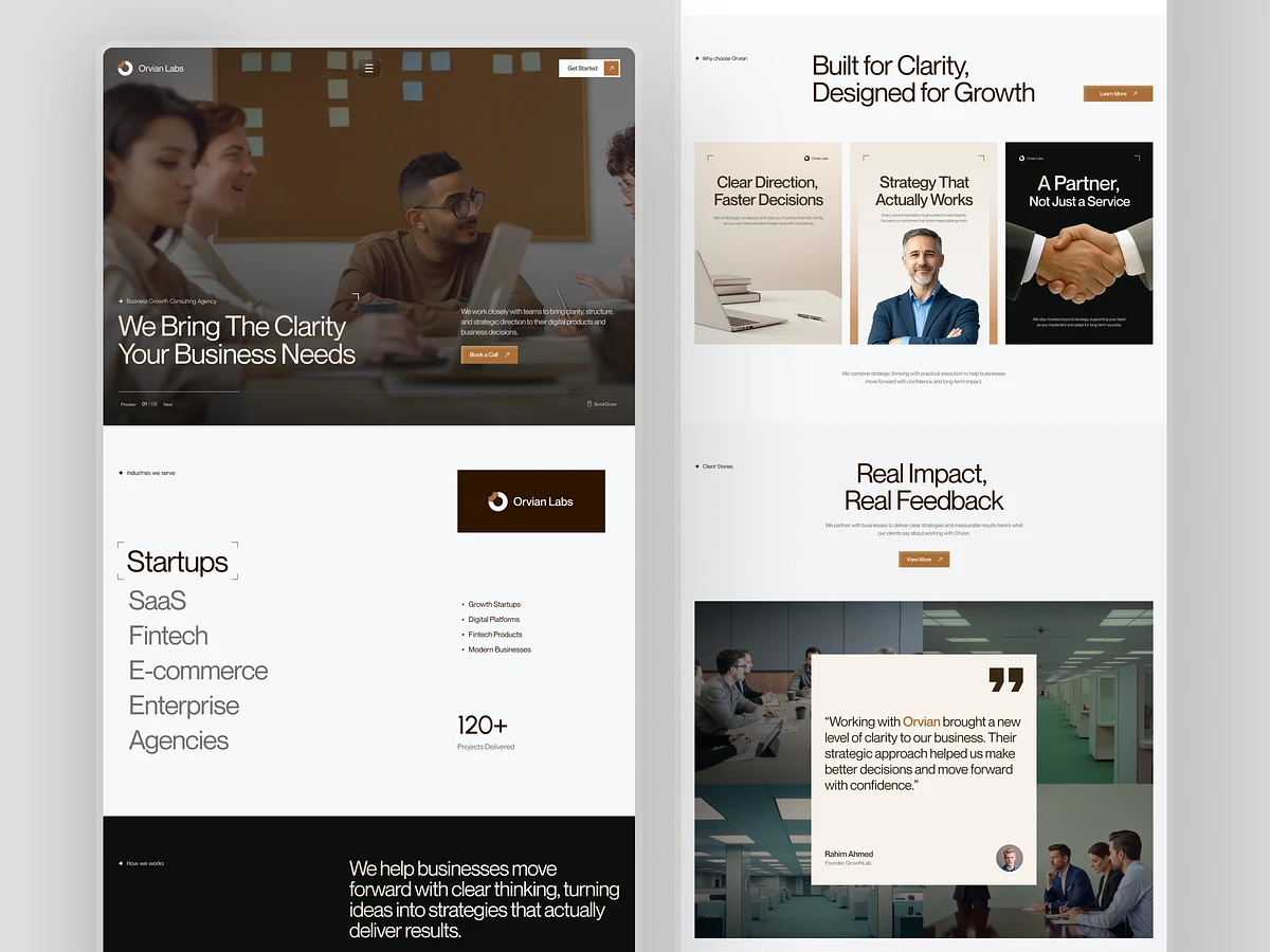
Put evidence beside the claim it supports
If a service page claims experience in complex integrations, place the relevant assignment evidence near that statement. A row of logos at the bottom of the page does not explain which work the consultancy performed.
Check the unit of attribution. Did the consultancy deliver the engagement, or did a newly appointed partner do the work at a previous employer? Both may be relevant, but the wording must distinguish them.
Apply the same discipline to results. If a client’s margin improved after an engagement, do not attribute the whole improvement to consulting advice without supporting evidence. Explain the intervention and the basis for the reported result.
The aim is an inspectable account: a reader can see what happened, who contributed and what remains uncertain. The wider visual system should make that evidence easy to read and consistent with the firm’s management consultancy brand identity.
Make the consultancy easier to recommend internally
A website should provide an interested buyer with material that can withstand being forwarded to someone who has never met the partners.
B2B guidance explicitly recommends supporting internal advocates with material they can use in meetings, memos and presentations.
The practical implication is to design for the second reader.
The first reader may understand the assignment from a conversation. The second reader may receive only a link and the sentence, “Could these people help?” A service page that depends on the earlier conversation leaves that colleague having to start from scratch.
What should an internal sponsor be able to forward?
An internal sponsor should be able to forward a service page and relevant evidence that explain the consultancy’s suitability without requiring an accompanying sales presentation.
Provide a stable page address. Give the page a title that describes the assignment. Include enough context for a finance director, procurement colleague or practice sponsor to recognise what is being proposed.
A compact downloadable summary can help where buyers need an attachment. Keep the substantive explanation available on the website as well, and assign an owner to maintain both versions. Otherwise, the PDF becomes a second, quietly ageing website.
A proposed acceptance test is to ask a reviewer to write a recommendation email using only the published pages:
“Consider this consultancy for [assignment], because [evidence]. The proposed work involves [scope] and includes [client responsibilities]. We still need to confirm [open questions].”
Any statement the reviewer has to invent identifies missing information.
This test does not prove that the consultancy will win. It tests whether the website supplies the ingredients for a reasoned recommendation.
“Most of our work comes through referrals”
Then test the website after the referral.
Give a reviewer the kind of introduction a prospect would receive: the consultancy’s name, the relevant partner and the broad problem. Ask the reviewer to use the website to identify the relevant service, delivery team and evidence.
The referral may explain why someone visits. The website still needs to explain what the firm can do.
If the firm has no ambition to expand beyond a small, established relationship network, a compact site may be sufficient. Do not commission a large publishing operation without someone to run it. A precise set of service pages can be a more sensible investment than a neglected library.
Design the digital presence for readers who arrive indirectly
Pew Research Centre’s 2025 analysis found that users clicked a traditional search result in 8% of Google visits that included an AI summary, compared with 15% of visits without one.
The analysis used browsing data from 900 US adults during March 2025; the search-result pages were collected in April.
Those findings describe an association in that study. They do not show that AI summaries caused a specific loss of UK consultancy enquiries, or that every consulting search behaves the same way.
The design implication is narrower: do not treat a search impression as a website visit, and do not assume the homepage will introduce every reader to the firm.
A colleague may forward a service page. A search result may send a prospect directly to an article. Each destination should identify the subject, explain the relevant expertise and provide a route to inspect the supporting material.
For published analysis, use descriptive headings, identify the author and put sources beside factual claims. State the limits of a recommendation where the limits matter. A reader encountering one section should not have to reconstruct the argument from a slogan on another page.
That connects website content with consulting business development: the material helps a conversation continue when the partner is no longer in the room.
Choose the build around publishing and buyer tasks
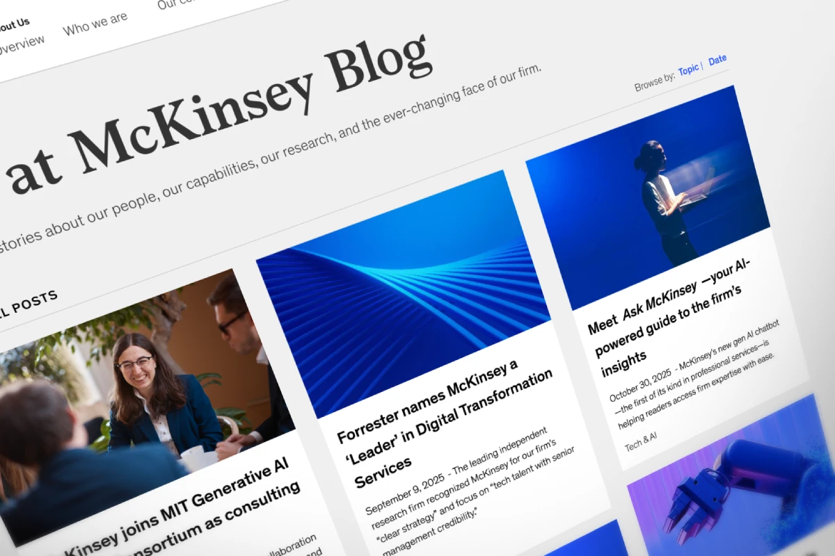
Select the website platform after defining what the team must publish and maintain.
Ask the proposed publisher to update a partner biography, replace a case-study chart and correct a service-page claim in the proposed system if routine edits require developer intervention, price that dependency before choosing the platform.
A small firm with a stable service set may be well served by a template-based build. A multi-practice consultancy publishing regular research may need more structured content and approval controls. The platform decision follows those requirements.
Before launch, run website acceptance testing against buyer tasks:
- Find the service relevant to a defined client situation.
- Identify the person or team associated with the work.
- Locate evidence supporting the service claim.
- Explain likely client responsibilities.
- Forward the relevant material.
- Complete the appropriate enquiry route on a phone.
Record where the reviewer hesitates and what information is missing. Fix those issues before debating minor visual preferences.
2019 B2B trust guidance recommends providing service information before requiring contact with sales. Apply that principle to forms: ask for the information needed to route an enquiry, rather than making a buyer complete your qualification exercise before learning whether the service fits.
Technical quality remains part of acceptance. Ask the implementation team to demonstrate mobile layouts, keyboard operation and readable charts, and agree how performance and accessibility will be assessed. A fast homepage does not excuse an unreadable case study.
Approve the evidence before the visual concept.
The useful output of a consultancy website project is a set of pages a buyer can use to assess an assignment, inspect the evidence and brief a colleague.
That standard gives partners something firmer than personal preference to approve.
The decision-confidence brief and recommendation-email test proposed here still require a documented consultancy application before either can be considered a proven method.
If the position is clear and the evidence exists, a copy specialist and a capable website team may be enough; if partners disagree about the assignments the firm should pursue, resolve that question first.
Inkbot Design offers a free Brand Equity Audit™, a written assessment of positioning, messaging, visual consistency and relevant digital visibility. It is a diagnostic starting point, not a promise of additional revenue.
Start today by choosing one priority service page and listing the statements a buyer would need to justify recommending your consultancy. Mark which statements the current page actually supports.
Questions people ask
Can a consultancy use a website template?
Yes — a consultancy can use a template when the template accommodates the required service explanations, evidence and publishing tasks. Assess the template using real content before purchase. A constrained layout becomes a problem when important information is removed or distorted to make the demonstration design look tidy.
How much should a consulting website cost?
A consulting website budget should follow an agreed scope: research, copywriting, design, development, content migration and ongoing support are separate requirements. No verified market-rate dataset is supplied here. Compare proposals against the same deliverables, and ask which costs remain after launch rather than comparing headline design fees alone.
Should every practice area have a separate website?
No — separate practice areas do not automatically require separate websites. Begin with a shared site when the practices serve a coherent firm-level proposition and can be distinguished through navigation and service pages. Consider separate sites only when the audiences, brands or operational requirements justify the additional publishing burden.
Do we need a new logo before redesigning the website?
No — a website redesign does not automatically require a new logo. Retain an identity that remains appropriate and usable. If the problem is unclear service copy, missing proof or poor navigation, address those issues directly. Revisit the identity if the current system prevents the website from accurately representing the firm.