The Instagram Logo: A Necessary Betrayal of Nostalgia
The collective meltdown when Instagram changed its logo in 2016 was entirely predictable. It was also one of the best things the social media company ever did for its brand.
People screamed. They called it a travesty, an abomination, the death of a beloved icon. They missed the point entirely.
This isn’t just a history of the Instagram logo. It’s a series of brutal, real-world lessons for any entrepreneur who thinks their logo is precious.
It’s not. It’s a tool. And sometimes, tools need replacing.
- Instagram's logo change in 2016 prompted public outrage but ultimately benefited the brand's strategic evolution.
- Initial logos were placeholders; prioritising a functional identity over perfection allowed Instagram to launch effectively.
- Rebranding was necessary as Instagram evolved from a photo-sharing app to a comprehensive media platform.
- Public backlash against changes indicates brand value; however, enduring criticism mustn't deter strategic decisions.
- Successful branding requires simplicity and adaptability, ensuring logos can represent broader brand identities over time.
It All Started with a Bottle of Whisky: The Pre-Launch Logo
Before Instagram, there was a social media app called Burbn. It was a location-based check-in app with gaming elements and, yes, photo sharing. It was a mess.
Its logo was… well, it was a logo. A retro-style script font, a glass of whisky. It screamed “speakeasy” and “boys’ club”.
The First “Logo”: A Lesson in Getting Something—Anything—Out the Door
Founder Kevin Systrom wasn’t trying to build a timeless brand mark. He was trying to get a product, any product, in front of users. The Burbn logo did its job: it gave the app a name and a face. It was a placeholder. And for an early-stage venture, a placeholder is often all you need.
But when Systrom and Mike Krieger decided to strip Burbn down to its most popular feature—photo sharing—the entire concept changed. The whisky-soaked identity had to go.
The lesson here is simple: your first idea is rarely your best. The same goes for your first logo. Don’t spend months perfecting a visual identity for a business model that might not exist in six weeks.
The Icon That Fooled Everyone (2010-2011): Systrom’s Polaroid
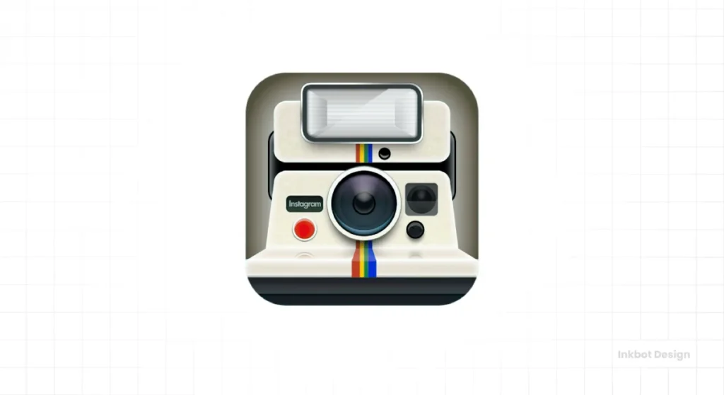
With the pivot to a photo-centric app, renamed Instagram, Systrom needed a new icon. Fast.
So he did what any founder under pressure does. He cobbled something together himself.
The first official Instagram logo, the one that launched with the app in October 2010, was a direct visual reference to a Polaroid OneStep camera. Systrom designed it in a few hours.
It screamed, “This is a retro camera app.” And for 2010, that was an obvious message. It told users exactly what the product did: take photos on your phone and make them look old-timey.
But let’s be honest. It was a barely-modified image of a real-world product. It wasn’t particularly original and wasn’t a long-term solution. It was another, slightly better, placeholder.
Polishing a Placeholder (2011-2016): The Age of Skeuomorphism
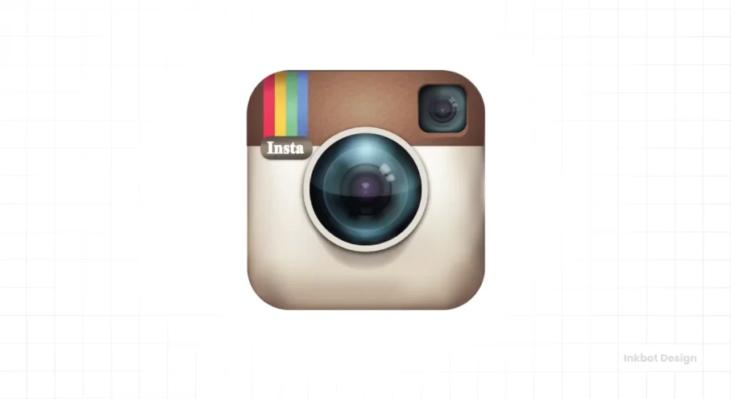
By 2011, Instagram was taking off. The placeholder logo felt amateurish. Systrom knew it needed a professional touch but feared alienating his new, loyal user base.
The brief was essentially, “Make it better, but don’t you dare change it.”
Enter professional designer and photographer Cole Rise. He took on the challenge of refining the social media icon without losing its soul. Rise created the version of the logo that people now remember with such misplaced nostalgia.
Deconstructing the Beloved Logo
This logo was a masterpiece of a design trend called skeuomorphism.
- The lens was more detailed, with a glassy reflection.
- The body had a textured, leathery feel.
- The classic rainbow stripe was given a place of honour, a nod to the Polaroid brand.
- It even had a subtle shadow, making it feel like a physical object on your phone’s screen.
What is Skeuomorphism? And Why Did We Love It?
Put simply, skeuomorphism is designing digital things to look like their real-world counterparts. The “Notes” app looked like a yellow legal pad—the bookshelf in the iBooks app.
We loved it because, in the early days of smartphones, it helped us understand what to do. It created a sense of familiarity and tangibility in a new, unfamiliar digital world. The Instagram logo looked like a camera, so you knew to tap it to take a picture. Simple.
Rise apparently based his final render on a Bell & Howell camera from the 1950s, a detail that adds a nice touch of design lore. But the core idea remained: it represented a physical object.
The Strategic Problem
For its time, the Cole Rise logo was perfect. It was beautifully rendered, instantly recognisable, and communicated the app’s core function.
But it was also a beautiful dead end.
By 2015-2016, Instagram was no longer just a retro filter app. It was a video platform. A messaging service. A discovery engine for culture and commerce. Facebook had bought it for a billion dollars. The business had grown up, but its logo was still stuck in 2011, representing only a fraction of its function.
Clinging to that logo would have been like a multinational bank continuing to use a logo of a single gold coin. It was hopelessly outdated and strategically limiting.
The Great Upheaval (2016): Why Instagram Had to “Kill” Its Logo
The business had fundamentally changed. The brand had to follow.
This is the non-negotiable rule of branding that so many entrepreneurs forget. Your brand identity must serve your business strategy. Not the other way around.
Instagram’s strategy was to become the visual hub of the internet, a parent brand to a growing family of apps like Layout, Boomerang, and Hyperlapse. The detailed, skeuomorphic camera couldn’t be the parent. It was too specific. It needed a symbol that could represent the entire ecosystem.
The Design Brief: Simpler, Flatter, More Scalable
The design team, led by Ian Spalter, spent months on the redesign. They needed something simpler, flatter, and more scalable. Something that worked as a tiny favicon, a notification icon, and a corporate letterhead.
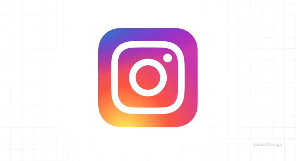
The result was the glyph we know today.
Deconstructing the “Sunset Gradient” Glyph
They didn’t just throw the old logo away. They boiled it down to its core elements.
- The Ghost of the Camera: The new logo is a minimalist camera outline. The viewfinder and the lens are still there, just reduced to their simplest forms.
- The Rainbow Lives On: The iconic rainbow stripe wasn’t ditched; it was exploded into a vibrant “sunset” gradient that forms the background.
It was a brilliant solution. It honoured the past without being trapped by it.
The Public Reaction: A Masterclass in Predictable, Pointless Outrage
Of course, the internet hated it.
“My 5-year-old could have made that!” “It looks like a washing machine setting!” “They destroyed the one thing we loved!”
It was a textbook case of change aversion. People don’t like change, especially to familiar digital touchpoints. This outrage is noisy, but it’s almost always shallow and temporary. A 2019 study showed that negative sentiment towards a major rebrand, like Instagram’s, typically peaks immediately and dissipates within a week as people get used to it.
Straight Talk: The backlash wasn’t a sign of failure. It was a sign that people cared. It proved the brand had equity. The team’s job wasn’t to placate the mob but to make the right strategic move for the next decade of the business. And they did.
The lesson for every business owner is critical: when you rebrand for the right reasons, you must have the courage to see it through the initial storm of criticism. Public opinion is a data point, not a directive.
Subtle Tweaks and Building a System (2022-Present)
The 2016 redesign wasn’t the end of the story. A great brand identity is never truly “finished.
The 2022 Refresh: Why Go Brighter?
In 2022, Instagram refreshed the gradient again, making it brighter and more vibrant. The goal, they said, was to feel more “illuminated and alive.” This wasn’t a random aesthetic choice. It was a move to stand out in an increasingly crowded digital space. In a sea of apps, vibrancy catches the eye. The updated colour palette was designed to feel more tangible using an innovative 3D modelling process.
Beyond the Icon: Instagram Sans and a True Visual Identity
More importantly, the company introduced its bespoke typeface, “Instagram Sans.” This is the mark of a mature brand.
Your logo isn’t your entire visual identity. It’s the front door. The typeface, colour palette, and photography style are the rooms inside the house. By creating a custom font, Instagram built a cohesive system that could be applied everywhere, from advertising billboards to in-app text.
This is the ultimate evolution: from a single, detailed illustration to a flexible, comprehensive brand system.
Brutal Lessons from the Instagram Logo Graveyard
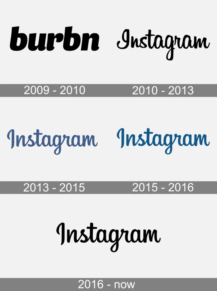
The journey of the Instagram logo offers a free masterclass in branding. Here are the key takeaways.
Lesson 1: Your First Logo Is Rubbish. And That’s Fine. Systrom’s first two logos were placeholders. They did their job and were discarded when they were no longer helpful. Don’t agonise over getting your first logo perfect. Get it done, launch your business, and earn the right to afford a better one later.
Lesson 2: Clinging to a “Beloved” Logo Can Strangle Your Growth. The Cole Rise logo was beautiful. But it represented a business that no longer existed. Holding onto it for sentimental reasons would have been a strategic blunder. Nostalgia doesn’t pay the bills.
Lesson 3: Rebrand for Strategic Reasons, Not Aesthetic Ones. Instagram didn’t change its logo because it was bored. It changed because the business had outgrown its clothes. A rebrand should always solve a business problem: entering a new market, broadening your services, or unifying a product family.
Lesson 4: If You Change, Be Prepared for the Shouting. Then Get On With It. Backlash is inevitable. It means people are paying attention. Have a plan to manage the communication, listen for any valid constructive criticism (it will be rare), and then hold your nerve.
Lesson 5: Simplicity Scales. Complexity Crumbles. The skeuomorphic logo was a complex illustration. It looked terrible when shrunk down. It was hard to adapt. The new glyph is the opposite. It’s a simple, bold shape that works everywhere, at any size. That’s the test of a truly modern logo—end of story.
So, What’s the Real Takeaway?
The history of the Instagram logo is a history of letting go. It’s about having the courage to kill something good to make way for something necessary.
Instagram chose to build a brand for its future, not one that paid homage to its past. Every single entrepreneur and small business owner will face a version of this choice. You’ll look at your logo, which you sketched on a napkin or paid a friend £50 to design, and feel that pang of sentimental attachment.
Your job is to ignore it. Your job is to ask a straightforward question: Does this logo serve the business I want to be in five years?
If the answer is no, you know what to do.
We analyse this stuff because it matters. These visual decisions are business decisions. If you’re tired of staring at a logo that no longer fits the ambition of your business, you know where to find us.
We are for businesses ready to look forward.
Frequently Asked Questions about the Instagram Logo
Who designed the original Instagram logo?
The first Instagram logo, a literal depiction of a Polaroid camera, was created by Instagram co-founder Kevin Systrom in 2010. The more famous, polished skeuomorphic version was designed by Cole Rise in 2011.
Why did Instagram change its logo in 2016?
Instagram changed its logo to reflect a significant strategic shift. The company had evolved from a simple photo-filtering app into a diverse “family of apps” and a considerable media platform. The new, simpler logo was designed to be a scalable symbol for the entire ecosystem, not just one function.
What is the current Instagram logo called?
The current logo is referred to as the “glyph.” It’s a minimalist outline of a camera set against a vibrant gradient background, which is sometimes called the “sunset gradient.”
What is skeuomorphism?
Skeuomorphism is a design principle where digital objects are made to resemble their real-world counterparts. The old Instagram logo, with its leather texture and glass lens, is a classic example. This trend was popular in early smartphone UI design to make new technology feel familiar.
Was the 2016 Instagram logo redesign successful?
Despite initial public backlash, the 2016 redesign is considered a major strategic success. It created a modern, scalable, and adaptable brand identity that has allowed Instagram to grow and maintain a cohesive visual system across all its platforms and services.
What font does Instagram use?
In 2022, Instagram introduced its custom typeface called “Instagram Sans.” It was designed to be used across the brand’s marketing and within the app, creating a more consistent and ownable brand identity.
Did the rainbow disappear from the Instagram logo?
No, the rainbow didn’t disappear; it evolved. The small rainbow stripe from the old logo was expanded to become the full-colour gradient that serves as the background for the modern glyph.
Who led the 2016 Instagram rebrand?
The 2016 rebrand was led by Instagram’s then-head of design, Ian Spalter.
Why did the Instagram logo get brighter in 2022?
The gradient was updated in 2022 to be more vibrant and “illuminated.” This was a strategic choice to help the brand stand out in a visually crowded digital environment and to reflect the platform’s focus on discovery and creativity.
What’s the main lesson from the Instagram logo’s history?
The primary lesson is that a brand’s visual identity must evolve with its business strategy. Clinging to a nostalgic but outdated logo can limit growth, while a strategic rebrand, even if controversial, can position a company for future success.
What was the Burbn app?
Burbn was the original app created by Kevin Systrom before Instagram. It was a location-based social network. Its most popular feature was photo sharing, which led the founders to pivot and make the simpler, photo-focused app we now know as Instagram.
Is the Instagram logo related to the Polaroid camera logo?
The first two Instagram logos were heavily inspired by and visually referenced Polaroid instant cameras. This was an intentional choice to communicate the app’s function of creating “instant,” retro-style photos. The modern logo retains only abstract elements of this history.

