The 7 Essential UI Elements of Engaging User Interfaces
To be fair, we all have been at the point of using a poorly designed app or website. You know, the one where you cannot even complete a simple task because the user interface (UI) is such a disaster. Well, my friends, this is precisely why mastering essential UI elements is vital for anyone in design or development.
Look at it this way – UI is like the face of your product; it’s what users see first. It’s just like having a doorman at an exclusive club: if he does not meet expectations, no matter how great the party may be. And let’s face it, with this being the digital era that we live in now, having bad UI could make or break the success of your product.
So grab yourself some coffee (or maybe something a little more substantial if it’s after hours), and let us take a deep dive into essential UI elements together. I promise you won’t be disappointed – things are about to get weird, but you will walk away knowing how to create visually stunning user interfaces that are also intuitive.
- Master essential UI elements to create engaging user interfaces that enhance user experience and promote product success.
- Implement clear navigation, interactive buttons, and user-friendly forms to facilitate seamless user interactions.
- Prioritise accessibility and visual consistency to cater to diverse user needs and enhance overall usability.
What exactly is a UI Element?
Let's cover some ground rules before we start getting too technical here. A UI element constitutes any part of an interface that users can interact with on their screens while using digital products, including mobile phone applications, etc.
These components range from being obvious, such as buttons or menus, to subtle features, like tooltips and progress bars. Each element has its function and needs to work together well enough so that people can easily understand what is expected of them as they use these systems.
The Building Blocks: Essential UI Elements
Now, let us dive into the key players of this show – the essential UI elements that every designer and developer should have in their toolkit.
1. Buttons
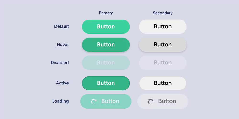
Ah, buttons. Simple as they seem, these make a good user interface. They serve as gateways and catalysts for action; without them, your users would only be able to stare at your beautiful visualisations — which aren’t enough to captivate them.
Here’s what you need to know about buttons:
Designing Buttons
- Size & Placement: Make sure buttons are big enough to be easily tapped or clicked on, and position them logically according to their function within the interface.
- Labels: Keep button labels clear, concise, and action-oriented; don’t use ambiguous or cutesy language that might confuse the user.
- Visual Styling: Use consistent styling (colours, shapes, shadows, etc.) throughout all your buttons so users can recognise different types of buttons at a glance.
Types of Buttons
- Primary Buttons: These are what I like to call ‘the big guns’ — they trigger an app’s primary actions, such as submitting forms or purchasing products.
- Secondary Buttons: Supporting acts; these perform secondary actions like cancelling edits or filtering lists/results.
- Floating Action Button (FAB): This round-shaped button is attention-seeking and usually placed at a fixed location on mobile interfaces where it performs a meaningful/ frequently used action(s).
- Icon Buttons: Sometimes all you need is a simple icon instead of text on a button, e.g., search input fields can have a button with a magnifying glass icon, while delete/ remove operations may use trashcan icons.
Button States
- Default State: The normal resting state that most buttons will be in when nothing special has happened.
- Hover/Focus State: When the user hovers the mouse pointer over a button or navigates/jumps to it using the keyboard tab key, give some visual cues like slightly changing colour.
- Active/Pressed State: When the button has been clicked or tapped but hasn’t been released yet.
- Disabled State: Inactive/muted state for buttons that are currently unavailable.
2. Menus for Navigating
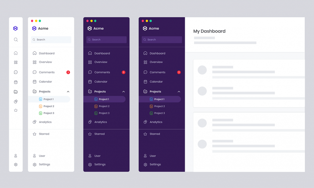
If buttons are guards, then navigation menus can be said to be guides in your UI. This is so because they enable users to know where they are going and avoid being lost in the digital wilderness.
Navigation menus come in different types, such as the traditional horizontal top bar and others, like the hamburger menu, which is named after its three-line icon (affectionately, though). Here are some things you should consider when creating an effective navigation system:
Different Types of Menus
- Horizontal Top Bar: This classic design runs across the screen’s width and is best suited for displaying primary navigation options.
- Vertical Sidebar: This is used when there are many nested sections in a complex application, and this menu hides neatly on one side.
- Hamburger Menu: The menu remains hidden until it is called up by clicking on its iconic three-line icon; this saves space, especially on mobile devices.
- Breadcrumb Trail: This shows users their location within the hierarchy, just like digital breadcrumbs.
- Tabs: A good way of organising content into various views or categories within one screen.
Designing the Menu
- Hierarchy and Organization: Make your menu options easy to navigate by arranging them into logical hierarchies that follow a natural use order.
- Labelling and Icons: Help users identify items quickly by using simple words or phrases accompanied by familiar symbols that can be recognised easily.
- Visual Styling: Consistency should be observed when styling these elements, such as colours used, fonts employed, spacing between links, etc., since it makes them appear as part of a whole rather than individual parts thrown together randomly, thus making scanning more manageable for visitors eyeing site at a glance.
- Responsive Design: Let your menus adjust gracefully based on different sizes or orientations screens may have.
3. Forms and Input Fields

When making an e-commerce checkout or a simple contact form, it’s crucial to have input fields and form elements to gather user data. Nobody likes dealing with a chunky form – especially if it’s confusing, too – because this will make users leave and never return.
Creating user-friendly forms and input fields: here are some things you should consider:
Form Design
- Layout and Grouping: Arrange form fields logically so they can be scanned easily. Also, put related fields close together for better understanding.
- Field Labels: Use descriptive labels that clarify what kind of information belongs in each field.
- Inline Validation: Let users know about their mistakes immediately by giving them real-time feedback like error messages or success indicators.
- Progress Indicators: If your form is long enough to fill several screens with scrolling space, include progress bars or step indicators to show people how far along they are as they complete each part of the process.
Input Field Types
- Text Input: This is the primary text field where you can type in short strings such as names and email addresses.
- Textarea: A bigger version of the text input field, allowing users to type longer strings like comments or descriptions.
- Checkboxes & Radio Buttons: When there are multiple options from which only one (radio) or more (checkboxes) can be chosen, then use these controls with predefined lists for simplicity.
- Dropdown/Select Menus: These menus take up less space than radio buttons but provide more options at once since they can hold much longer lists inside them, too, if necessary.
- Date & Time Pickers: Instead of asking someone to enter dates/times manually, provide them with user-friendly widgets that help with picking these values quickly so there are no mistakes made due to typos or similar errors happening during the inputting process itself either caused by confusion about required format etcetera.
Input Styling & Behaviour
- Field Sizing & Spacing: Ensure your input fields are wide enough for people to type comfortably. Give them plenty of room by having space between each one, too – this will also make it easier for users to touch specific fields accurately on smaller screens with less space available.
- Default Values & Placeholders: Offer hints about what should go into specific fields or pre-fill them with values that match the most common inputs. This way, anyone filling out the form will have an easier time completing it quickly and correctly since they won’t need as much thought process in decision-making regarding what exactly needs to be entered into which specific field, etcetera.
- Input Masks & Formatters: Automatically format user input so that phone numbers, credit card numbers, etc., appear in their proper formats without people having to remember those formats themselves and enter everything ideally.
- Focus & Cursor Behaviour: As people navigate through your form, let it respond smoothly when they click on inputs or try moving around using the tab key (or equivalent) – this adds a nice touch of polish while also making things feel more responsive overall since there’s no delay between someone interacting with an input element and seeing the visual feedback related to that action appearing on screen.
4. Modalities and Overlays
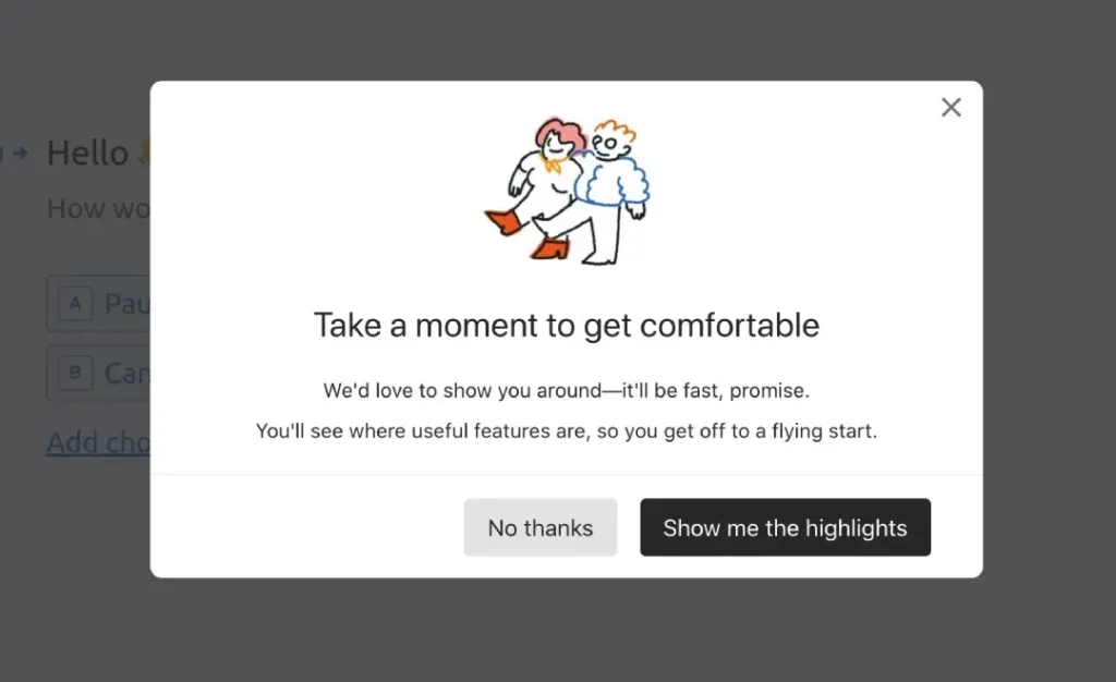
Occasionally, you must attract your users' attention to convey essential information or ask them to perform a specific task. In this case, modals and overlays act as spotlights on stage in UI design.
These components temporarily obscure the remainder of the interface, so the user must concentrate on what they should do. However, it is good to note that great power comes with great responsibility; if misused, it can quickly become intrusive and annoying.
Below are tips for implementing modals and overlays properly:
Modal Design
- Trigger and Context: Only use modals or overlays when there is a clear user action or within suitable contexts like error messages and confirmations.
- Content and Focus: Keep modal content succinct by addressing one task or message; refrain from bombarding users with excessive information.
- Visual Styling: Utilise different visual styles, such as backgrounds or animations, which make it apparent where the primary interface ends & modal starts.
- Dismissal & Escape: Always allow users to close modals quickly through a close button or backdrop click.
5. Notifications and Feedback
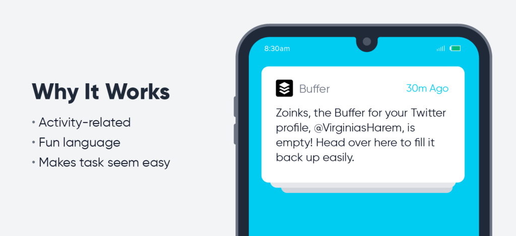
Have you ever done something on a website or app and thought, “Did that work? What’s going on?” Yeah, we’ve all been there—and it’s an all too effective method of alienating and confusing users.
That’s why clear, timely notifications and feedback are essential for user engagement. These UI components act as a two-way communication channel, letting the user know their action was received and informing them about what is happening with the system.
Types of Notifications
- Toast Messages: These small, unobtrusive pop-ups are perfect for quick, transient messages (“File uploaded successfully”).
- Banners & Alerts: More prominent than toast messages, banners can deliver persistent notifications without completely interrupting a user’s workflow.
- Modal Notifications: Modal dialogues can take over the whole screen when critical information or immediate action is required.
- In-App Messaging: Chatbot-style messaging components can give real-time updates, guidance, and support directly within an app.
Feedback Mechanisms
- Progress Indicators: Whether a spinning wheel or a progress bar, these elements provide feedback on ongoing processes to inform users that the app hasn’t crashed.
- Status Messages: Simple text-based messages can give feedback on system actions taking place in real-time—such as saving or deleting data—or notify users of errors or pending tasks that require their attention.
- Animations & Transitions: Delicate animations or transitions can provide visual feedback about what happens when a user interacts with something (like pressing a button) or moves from one page/state to another within your app.
Design Considerations
- Positioning & Hierarchy: Place notifications carefully so they don’t cover up important content or get in the way of user tasks elsewhere onscreen.
- Timing & Duration: Display notifications for an appropriate amount of time—not too short that they’re missed entirely; not too long to become annoying if there are many appearing one after another.
- Visual Styling: Use similar styling (colours, typography, iconography) across different types of notifications to help users quickly recognise and differentiate them.
- Accessibility: Ensure that notifications are perceivable and understandable to people with various abilities (e.g., provide adequate colour contrast or alternative text).
6. Icons and Visual Indications

In the world of UI or user interface design, a picture is worth a thousand words, but in this case, a well-designed icon can represent complex ideas and actions through a simple graphic alone. However, icons are not merely decorative images; they can improve usability, facilitate navigation, and offer helpful visual clues to users when used appropriately.
Designing an Icon
- Simplicity and clarity: The most effective icons are simple, recognisable and self-explanatory. Avoid those that are too detailed or vague.
- Consistency and style: Ensure you maintain an even visual style along with design language throughout all your icons so that they have a unified look and feel within your UI or user interface.
- Size & scale: Make sure icons remain legible at different sizes or resolutions without losing clarity.
- Accessibility: Use adequate colour contrast and provide alternative text descriptions for individuals with visual impairments using screen readers or similar assistive technologies to access your app’s content.
Types of Icons & Their Usage
- Navigation Icons: These are basic symbols (e.g., arrows, hamburger menus) to help users quickly move around your UI.
- Action Icons: Symbols representing everyday actions (e.g., pencil for edit, trash can for delete).
- Status Icons: Visual signals showing system states or conditions (e.g., check mark for success, warning triangle for errors).
- Category Icons: Pictorial representations denoting various content categories or types (e.g., work, briefcase, health, heart shape).
- Branding Icons: Your company’s logo or mascot should be used sparingly to reinforce brand recognition without overwhelming other elements onscreen.
Visual Indications
Apart from icons, there are other cues which could be visualised to guide people through the interface:
- Highlighting & Emphasis: Use contrasting colours, borders, backgrounds, etc., to draw attention towards essential elements or actions.
- Tooltips & Hotspots: Display text descriptions or icons when hovering/clicking to provide contextual information and instructions to users.
- Microinteractions: Small animations/effects that subtly respond to user interactions (e.g., button presses, form validation) and create delightful moments within the app.
7. Facts Presentation
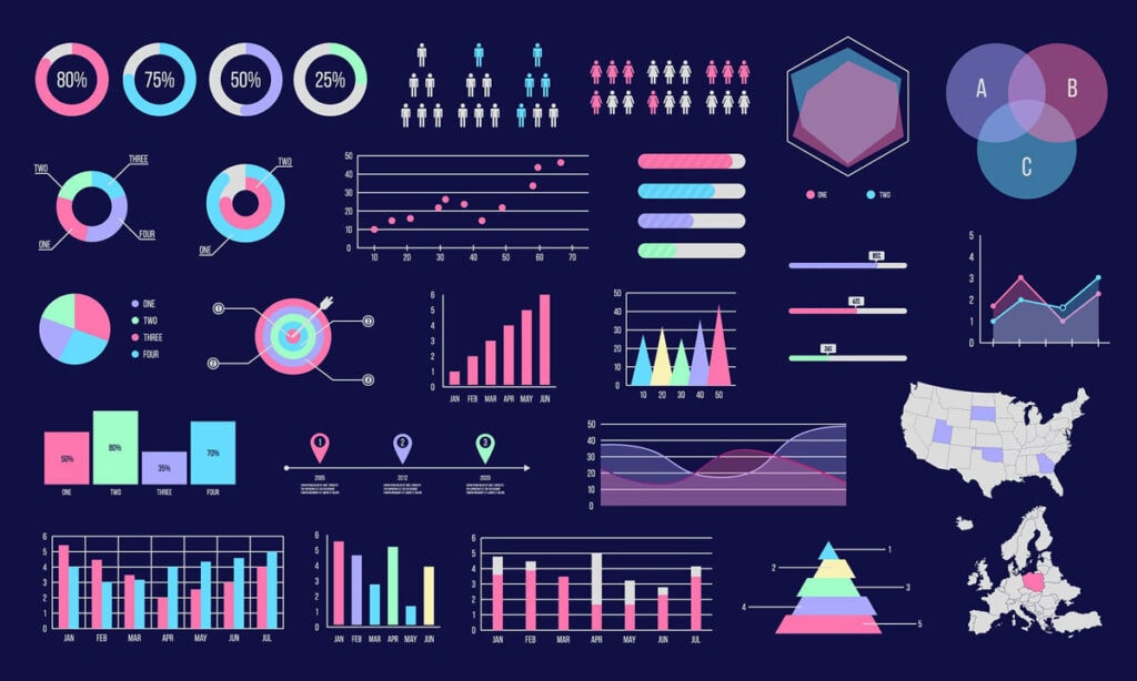
In today’s world, where everything revolves around data, individuals must understand and digest complex information. This is why the effective representation of data is handy as it transforms raw numbers or statistics into visually appealing, easily understood formats.
These UI elements, ranging from simple charts and graphs to interactive data exploration tools, can breathe life into your numbers and allow users to gain insights at a glance.
Types of Charts & Graphs
- Line Charts: These are used to represent trends or continuous data over time.
- Bar Charts: Best for comparing different categories or groups against one another.
- Pie Charts: Classic choice when showing proportions or percentages of a whole.
- Scatter Plots: They come in handy when showing relationships between two or more variables.
- Heat Maps: A colourful way of representing density/ intensity across a matrix/grid, etc.
Designing Data Visualisations
- Clarity & Readability: Use clear labels, appropriate scales, and meaningful colour schemes to ensure the reader understands.
- Interactivity & Exploration: Allow users to zoom in/out, filter by category/date range, etc. Click on points for more information, and let them play with the data!
- Responsiveness & Adaptability: Ensure your visualisations look good on all devices (desktops/laptops/tablets/phones) regardless of screen size/resolution, etc.
- Accessibility: Provide alt text descriptions, high contrast colour schemes, and keyboard navigation support… cater for people with disabilities who may be accessing your content using assistive technologies like screen readers!
Tools & Libraries for Data Visualisation
While it is possible to build custom components from scratch, there are many powerful tools and libraries available which can save you time:
- Chart.js – popular open-source JavaScript library that allows the creation of responsive, animated charts/graphs;
- D3.js – versatile JavaScript library for creating highly customisable interactive data visualisations;
- Google Charts – suite of free lightweight charting tools/libraries powered by Google;
- Plotly is a comprehensive data visualisation platform offering advanced charting capabilities and integrations with popular programming languages/environments.
The Art of Layout and Spacing
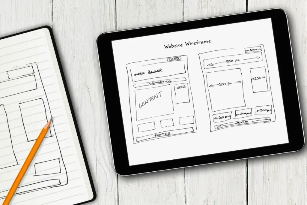
Even though individual UI elements are essential, their positioning and spacing can make or break the overall user experience. A good layout should have a logical flow of information, a clear hierarchy, and a balance of proportions, which will help quickly guide users through the interface.
Grid Systems and Responsive Design
The grid system is one of the fundamental concepts behind effective UI design. This involves dividing your canvas into rows and columns to create visually appealing layouts with consistent structure across devices such as phones, tablets or desktops with varying screen sizes and resolutions.
Bootstrap and Foundation are among the most widely used grid systems that offer ready-made classes for creating responsive, friendly designs without much hassle.
Spacing and Typography
Typography and proper spacing often go unnoticed but can significantly affect how usable and readable an interface is. Keeping equal spaces between components and using ample line heights throughout your project, coupled with a well-thought-out typographic scale, could turn what seems like a chaotic jumble into a neat organisation.
Visual Hierarchy and Emphasis
The success of any UI lies in its ability to direct users’ attention where needed through visual hierarchy and emphasis. By strategically using contrasting colours, sizes, and padding/margin values, among other properties, you can make specific actions or information stand out more while downplaying less essential features.
The Finishing Touches: Branding, Accessibility, and Delight

While the fundamentals are vital, excellent UI design is more than just about this. Good UI design means creating a consistent on-brand experience for everyone, with some fun points that will stick in users’ minds.
Brand Identity and Consistency
Consistency is crucial in reinforcing the connection between the user interface (UI) and your brand’s identity. All aspects of the design — from colour schemes to typography, iconography or even micro-interactions – must be aligned with what you stand for visually.
Inclusivity and Accessibility
Accessibility should not be treated as a checklist; it should result in designs catering to people with different capabilities, ensuring that all users feel included. To achieve this, designers must pay attention to colour contrast ratios, alternative text descriptions for screen readers or Braille displays, keyboard navigation compatibility across various devices, and other requirements outlined by WCAG 2.0 AA guidelines.
Microinteractions & Delightful Moments
However useful it may be functionally speaking, adding little surprises here and there could make an interface more engaging than just usable! So think small animations when buttons are clicked/toggled on/off, etc.; playful transitions between states (e.g., hover →, active); unexpected visual or motion effects still do not compromise usability.
Frequently Asked Questions
What’s the discrepancy between UI and UX design?
UI or user interface design concerns the visuals and interactive elements that users see and engage with directly while using a product, whereas UX (user experience) design is more comprehensive in scope. It deals with every step a user takes when using a product, from finding out about it to getting started with it up to continued use and even afterthoughts. However, UX can only be effective with UI because these two work together hand in glove. Good UX also considers information architecture, among other things, such as user research, usability testing, and overall strategy.
How do I know what UI elements to include in my design?
Knowing the appropriate UI elements for your design largely depends on the needs and goals of your users and the tasks they are supposed to perform within your product. You must conduct user research first, then establish clear user personas and scenarios. After that, you should identify the best user flows and interactions required to support those scenarios before finally settling on suitable UI elements to realise such experiences.
How much does consistency matter in UI design?
Consistency is highly significant in UI design since it creates a connected, predictable user experience. This means that if you want people to understand and navigate easily through your interface, you have no choice but to keep visual styles, interaction patterns, and design principles consistent throughout the product. Otherwise, their cognitive load may increase, making it difficult to comprehend what they should do or where they can go next.
What should I do to make sure my UI is accessible?
To ensure that all individuals can use your application regardless of their abilities or disabilities, you must consider accessibility from the inception stage until the completion phase of the development process itself. Therefore, follow recognised accessibility guidelines like WCAG (Web Content Accessibility Guidelines) plus Section 508, and consider colour contrast, alternative text, and keyboard navigation, among other things that might affect people with impairments. In addition to this, perform tests on different devices, such as screen readers, so that it becomes possible for you to identify any areas that could be problematic.
How should I prototype and test UI designs?
Creating prototypes when designing UI design is essential to validate usability before investing heavily into the complete development cycle. At the beginning of testing, you can use low-fidelity prototypes, including wireframes or clickable mockups. Later on, during more advanced rounds, high-fidelity ones like interactive prototypes or coded demos will be more appropriate as they allow greater penetration into the evaluated system.
Where can I keep myself updated about UI design trends and best practices?
The field of UI design keeps changing constantly; hence, new patterns, trends and best practices are continually emerging. If you want to remain up-to-date, follow relevant industry leaders or publications, attend conferences/meetups within your area or even outside it, and keep trying out different tools/techniques continuously since this will help expose you to various possibilities available. Additionally, research may reveal areas where improvements must be made or potential breakthroughs could occur, mainly when applied to products.
What can I do to enhance my skills in UI design?
Improving user interface design skills requires continuous learning and regular practice sessions. Understand design principles plus methodologies better by studying them extensively; look at what other designers have done so far, thereby gaining inspiration from such works; participate actively within various online/offline communities that revolve around creative contests related directly towards enhancing these abilities. Nevertheless, I apply acquired knowledge practically whenever given a chance while striving to become an excellent designer who always delivers beyond expectations. Thus, do not hesitate to seek feedback/critique from colleagues and users alike…
Conclusion
Creating user interfaces that are truly efficient and interesting is a mix of art and science. It involves knowing people’s behaviour deeply, having a good sense of visual design, and continuously trying new things while looking for better ways.
You must understand the basics – buttons, menus, forms, notifications, icons, data visualisation and layout principles. This way, you can create great digital experiences on top because these are just foundations.
Remember that the UI design should look good and allow users to achieve their goals quickly and efficiently with fun. So, don’t stop researching or experimenting because there can never be enough knowledge in this field, where everything changes rapidly due to technological advancements.

