Homepage Design: Boost Conversions Without Breaking the Bank
Have you ever landed on a website and felt like you'd stumbled into a digital maze?
Yeah, me too.
And let me tell you, it's not a great feeling. 🙄
I remember when I first started in the online business world. My homepage looked like a toddler with a crayon and a sugar high had designed it. It was a hot mess of competing colours, fonts that made your eyes bleed, and more buttons than a lift in a skyscraper.
Unsurprisingly, my conversion rate was about as impressive as a wet firework.
But here's the thing:
Your homepage isn't just another page on your website. It's your digital storefront, your first impression, your chance to grab your visitor by the eyeballs and say, “Hey you! Yeah, you with the itchy mouse finger! Stick around; I've got something you need!”
Get it right; you'll be swimming in leads, sales, and happy customers.
Get it wrong, and… well, let's say you'll have plenty of time to perfect your juggling skills while you wait for those non-existent customers to roll in.
So, buckle up, buttercup. We're about to embark on a journey through the wild and wonderful world of homepage design. When we're done, you'll be armed with the knowledge, tools, and confidence to create a homepage that looks and does the business.
And the best part? You won't need to remortgage your house to pay for a fancy designer or lose sleep trying to decipher complex coding languages.
Sound good? Then let's get cracking!
🔰 TL;DR: Your homepage is the digital front door to your business. It must grab attention, communicate value, and guide visitors to act in seconds. This post will show you how to craft a homepage that looks great and converts like crazy without breaking the bank on designers or fancy tech. We'll cover essential elements, common pitfalls, and actionable tips to transform your homepage into a lean, mean converting machine. Let's dive in!
- Your homepage acts as a digital storefront, crucial for first impressions and conversions.
- Implement a clear hero section with an impactful headline, visuals, and a strong call-to-action.
- Use social proof like testimonials and trust badges to build credibility with visitors.
- Focus on simple navigation and mobile optimisation to enhance user experience.
- Regularly test and update your homepage based on data and feedback to improve performance.
- The Anatomy of a High-Converting Homepage
- The Psychology of Homepage Design: What Makes People Click
- Common Homepage Design Mistakes (And How to Avoid Them)
- Case Study: From Flop to Fabulous
- DIY Homepage Design: Tools of the Trade
- The Future of Homepage Design: Trends to Watch
- Putting It All Together: Your Homepage Makeover Action Plan
- The Secret Sauce: Injecting Personality into Your Homepage
- Conclusion: Your Homepage, Your Rules
- FAQs: Your Burning Homepage Questions, Answered
The Anatomy of a High-Converting Homepage
Before we dive into the nitty-gritty, let's break down what makes a homepage tick. Think of your homepage as a well-oiled machine, with each component crucial in turning casual browsers into eager buyers.
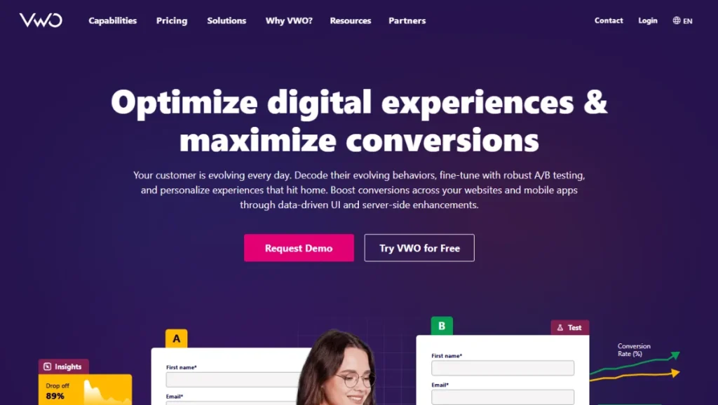
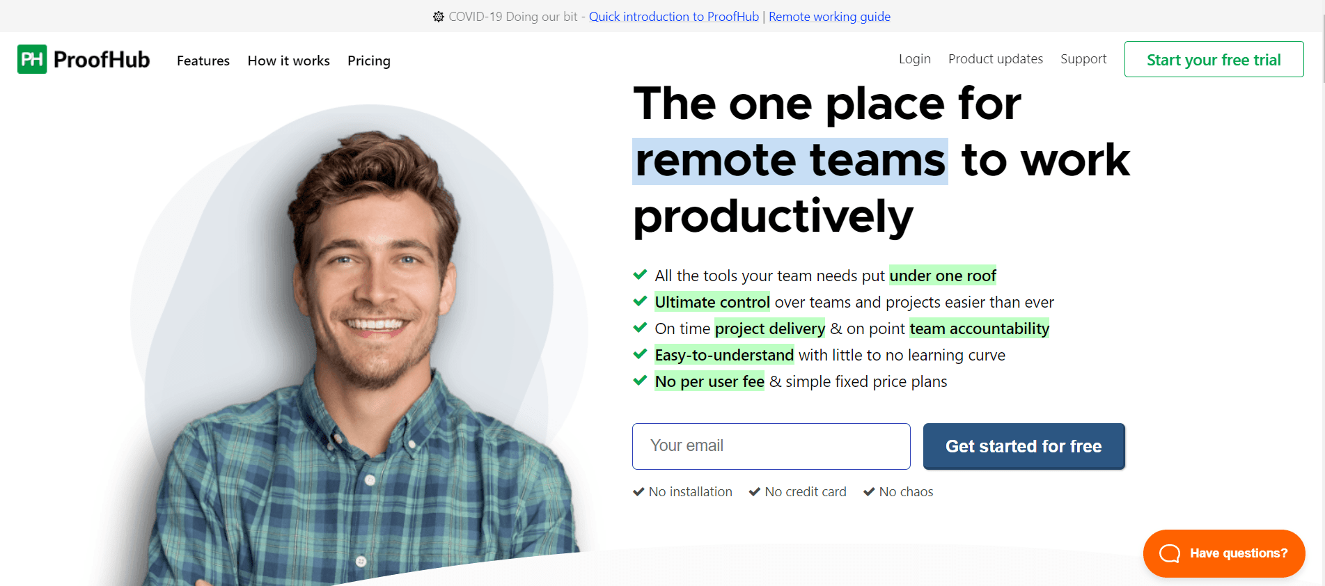
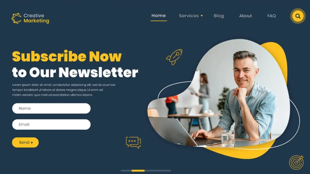
🎯 The Hero Section: Your Digital Handshake
Your hero section is like the digital world's firm handshake and winning smile. It's the first thing visitors see and needs to pack a punch.
Here's what you need:
- A Knockout Headline: This is your “Hello, world!” moment. Make it count.
- Compelling Subheadline: Expand on your headline. What's in it for them?
- Eye-Catching Visuals: A relevant image or video that supports your message.
- Clear Call-to-Action (CTA): Tell them what to do next. Make it impossible to miss.
Pro Tip: Your headline should address a pain point or desire. Something like, “Tired of websites that look like they were designed in the dark ages?” grabs attention and relates to your audience's frustrations.
💪 The Benefits Section: Show ‘Em What You've Got
Next, explain why your product or service is the bee's knees. This is where you answer the all-important question: “What's in it for me?”
- Use bullet points or icons to highlight key benefits
- Keep it scannable – remember, people skim online
- Focus on outcomes, not features
🏆 Social Proof: Let Others Sing Your Praises
Nothing sells quite like satisfied customers. Sprinkle social proof throughout your homepage like fairy dust.
Include:
- Customer testimonials (with photos for extra credibility)
- Trust badges or certifications
- Case studies or success stories
- Logos of well-known clients or media features
🧠 The How It Works Section: Simplify the Complex
Break down your process into easy-to-understand steps. This helps visitors visualise working with you and reduces perceived complexity.
- Use icons or illustrations to represent each step
- Keep descriptions short and sweet
- End with a CTA to get started
💰 Pricing: Be Transparent (But Strategic)
Consider including pricing information if you sell products or services directly on your site. But be smart about it.
- Highlight your most favoured option
- Use comparison tables to showcase the value
- Include a FAQ section to address common objections
🚀 Final CTA: The Grand Finale
End your homepage with a bang. Reiterate your main value proposition and give visitors one last chance to take action.
- Make it big, bold, and impossible to miss
- Use action-oriented language: “Start Your Free Trial” beats “Sign Up” any day of the week.
- Create a sense of urgency or scarcity if appropriate
The Psychology of Homepage Design: What Makes People Click
Now that we've covered the building blocks let's dive into your visitor's mind. Understanding what makes people tick (or click, in this case) is crucial for designing a homepage that converts.
The F-Pattern: Reading in the Digital Age
Did you know that most people read web pages in an F-shaped pattern?
It's true.
Eye-tracking studies have shown that users typically scan a webpage in a pattern that looks like the letter F:
- They start by reading across the top
- Then move down the page a bit and read across again
- Finally, they scan the left side of the page from top to bottom
What does this mean for your homepage design?
Simple. Put your most important information along the top and left side of the page. That's prime real estate, baby. Don't waste it!
The Power of White Space: Less is More
Have you ever walked into a cluttered room and felt instantly overwhelmed?
Your homepage can have the same effect if you cram too much.
White space (or negative space) is your friend. It gives your content room to breathe and helps guide the visitor's eye to what's essential.
Pro Tip: Don't be afraid of space. It's not wasted space – it's breathing room for your design.
Colour Psychology: Painting with Purpose
Colours aren't just pretty – they're powerful psychological triggers. Use them wisely:
- Blue: Trust, stability, professionalism
- Green: Growth, health, tranquillity
- Red: Excitement, urgency, passion
- Yellow: Optimism, clarity, warmth
- Purple: Luxury, creativity, wisdom
Choose a colour scheme that aligns with your brand personality and the emotions you want to evoke.
The Rule of Thirds: Balance in Design
Imagine your homepage divided into a 3×3 grid. The rule of thirds suggests that placing key elements along these lines or at their intersections creates a more balanced, aesthetically pleasing design.
It's not a hard and fast rule but a good starting point for creating a visually appealing layout.
The Paradox of Choice: Fewer Options, More Action
Here's a fun fact:
The more choices you give people, the less likely they are to decide.
It's called the paradox of choice and a natural psychological phenomenon.
What does this mean for your homepage?
Keep it simple.
Limit the number of options you present. Focus on one primary call to action. Guide your visitors down a clear path instead of overwhelming them with choices.
Common Homepage Design Mistakes (And How to Avoid Them)

Now that we've covered the good stuff let's talk about the bad and the ugly. Here are some common homepage design mistakes that could be tanking your conversions:
1. The “Kitchen Sink” Approach
Do you know that friend who tries to tell you their entire life story in the first five minutes of meeting them?
Don't let your homepage be that friend.
The Problem: Trying to cram everything about your business onto your homepage.
The Solution: Focus on the essentials. What does your visitor need to know to take the next step? Everything else can go on other pages.
2. The Slow-Mo Show
In today's world, patience is as common as a unicorn riding a dinosaur.
The Problem: Slow loading times due to large images, complex animations, or bloated code.
The Solution: Optimise your images, minimise HTTP requests, and use a content delivery network (CDN) to speed things up.
Pro Tip: Aim for a loading time of 3 seconds or less. Any longer, you're losing visitors faster than you can say “bounce rate”.
3. The Hidden Treasure Hunt
Your homepage isn't an escape room. Don't make visitors solve puzzles to find what they need.
The Problem: Important information or CTAs are buried beneath layers of navigation or hidden in unexpected places.
The Solution: Make navigation clear and intuitive. Use heat mapping tools to see where users are clicking and adjust accordingly.
4. The Mobile Afterthought
It's 2024, folks. Mobile isn't the future – it's the now.
The Problem: A homepage that looks great on desktop but falls apart on mobile devices.
The Solution: Embrace responsive design. Start with a mobile-first approach and scale up to larger screens.
5. The Generic Snooze-fest
Your business is unique. Your homepage should be, too.
The Problem: Using generic stock photos and cookie-cutter templates that blend your site with every other business in your niche.
The Solution: Invest in high-quality, original imagery that reflects your brand. If you must use stock photos, choose ones that look authentic and align with your brand personality.
6. The Jargon Jungle
Unless you're selling exclusively to robots, ditch the technical jargon.
The Problem: Using industry-specific language that your average visitor won't understand.
The Solution: Write as you talk. Imagine explaining your business to a friend over coffee. That's the tone you're aiming for.
Case Study: From Flop to Fabulous
Let me tell you a story about a client of mine. We'll call him Bob. (It's not his real name, but who doesn't like the name Bob?)
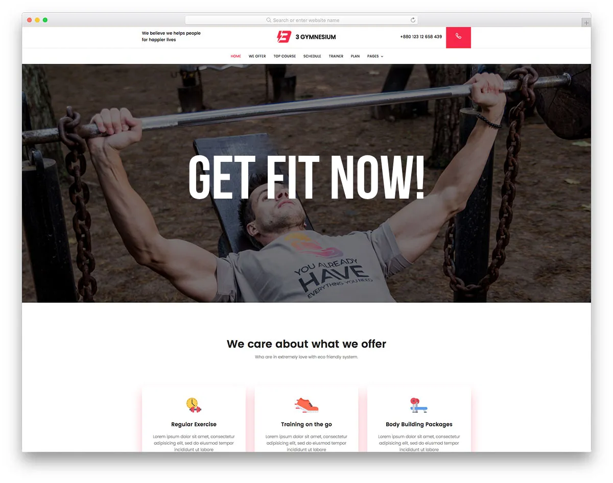
Bob ran an online fitness coaching business. When he came to me, his homepage was… well, let's just say it was about as inspiring as a wet sock.
Here's what we were dealing with:
- A headline that read: “Get Fit Now!” (Groundbreaking stuff, right?)
- A giant picture of Bob flexing his muscles (because nothing says “relatable” like a guy who looks like he bench presses cars for fun)
- A wall of text explaining every detail of his 12-week program
- A sad little “Sign Up” button hiding at the bottom of the page
Unsurprisingly, Bob's conversion rate was lower than the Mariana Trench.
So, we rolled up our sleeves and got to work. Here's what we did:
- Nailed the headline: We changed it to “Transform Your Dad Bod into a Rad Bod (Without Living at the Gym)”. Specific, benefit-driven, and a touch of humour.
- Revamped the hero image: Out went Flex-a-lot Bob, and a split image of a regular guy transforming into a fitter version of himself came in.
- Simplified the message: We boiled down his program to three key benefits, each with a punchy icon and a short description.
- Added social proof: We scattered before-and-after photos and testimonials throughout the page.
- Clear CTAs: We added a prominent “Start Your Transformation” button in the hero section and at the end of each significant section.
- Showed the process: We broke down Bob's program into four simple steps, making it easy for visitors to understand what they signed up for.
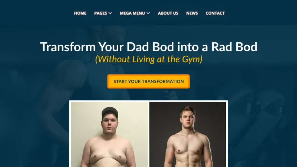
The result?
Bob's conversion rate shot up by 327% in the first month.
He went from struggling to fill his roster to having a waiting list.
It's all from tweaking his homepage.
The lesson?
Your homepage is more than just a pretty face for your website. It's a powerful tool that can make or break your online business. Treat it with the respect it deserves!
DIY Homepage Design: Tools of the Trade

Now, I know what you're thinking. “This sounds great, but I'm about as tech-savvy as my gran after her third sherry.”
Fear not, my friend. You don't need to be a coding wizard or a design guru to create a homepage that converts. Here are some tools that'll make you look like a pro (even if you still use “hunt and peck” typing):
1. Wix
What it is: A drag-and-drop website builder with many customisable templates.
You'll love it: It's intuitive flexible, and you can create a good-looking site without touching a line of code.
Potential drawback: The free plan includes Wix branding, which isn't ideal for a professional site.
2. Canva
What it is: A graphic design platform that's ridiculously easy to use.
Why you'll love it: You can create stunning visuals for your homepage, even if your artistic skills are limited to stick figures.
Pro tip: Use Canva to create custom icons or infographics to make your homepage unique.
3. Hotjar
What it is: A behaviour analytics tool showing how visitors interact with your site.
Why you'll love it: It gives you visual heatmaps and recordings of user sessions, so you can see exactly where people are clicking (or not clicking).
Potential drawback: The free plan is limited, but it is a good starting point.
4. Google Analytics
What it is: A free web analytics service that tracks and reports website traffic.
Why you'll love it: It gives you a wealth of data about your visitors, including where they're coming from and how they're behaving on your site.
Pro tip: Set goal tracking to measure how well your homepage converts visitors.
5. Grammarly
What it is: An AI-powered writing assistant.
Why you'll love it: It'll catch those pesky typos and grammar mistakes that could make your homepage look unprofessional.
Potential drawback: The free version is limited but valuable for basic proofreading.
Remember, these tools are meant to make your life easier, not replace your brain. Use them as a starting point, but feel free to trust your gut and inject your personality into your homepage.
The Future of Homepage Design: Trends to Watch
It's time to get our crystal ball out and peer into the future. What's coming down the pike in the world of homepage design? Let's take a look:
1. AI-Powered Personalisation
Imagine a homepage that adapts in real-time based on who's visiting. That's where we're headed.
What to expect: Homepages that change their content, imagery, and CTAs based on the visitor's location, browsing history, or even the weather in their area.
How to prepare: Start collecting and analysing user data now. The more you know about your visitors, the better you can personalise their experience in the future.
2. Voice User Interface (VUI)
With the rise of smart speakers and voice assistants, voice interaction is becoming more common.
What to expect: Homepages optimised for voice search and navigation.
How to prepare: Consider how users might interact with your site using voice commands. What questions might they ask?
3. Micro-interactions
These are small, subtle animations that provide visual feedback to users.
What to expect: More homepages using micro-interactions to guide users and make the experience more engaging.
How to prepare: Find opportunities to add small, meaningful animations to your homepage. But remember, less is more!
4. Dark Mode
Dark mode isn't just more accessible to the eyes – it's becoming a popular design choice.
What to expect: More sites offering a dark mode option or even defaulting to dark designs.
How to prepare: Consider creating a dark version of your homepage. Test it with users to see how it affects engagement and conversions.
5. 3D Elements and AR
As technology advances, we see more 3D elements and even augmented reality (AR) on home pages.
What to expect: More interactive 3D elements and AR experiences built into homepages, especially for product-based businesses.
How to prepare: Explore how 3D or AR could enhance your homepage experience. But remember, it needs to add value, not just look cool.
The key takeaway?
Stay curious and keep experimenting. The digital world moves fast, and what works today might be outdated tomorrow. But don't worry – if you focus on providing value and creating a great user experience, you'll always be on the right track.
Putting It All Together: Your Homepage Makeover Action Plan
Right, we've covered a lot of ground. Your head's probably spinning faster than a politician's moral compass. Let's break this down into actionable steps you can take right now to transform your homepage from meh to marvellous.
Step 1: Audit Your Current Homepage
Before you start changing things willy-nilly, take a good, hard look at what you've got.
- Use heat mapping tools like Hotjar to see where people are clicking (and where they're not)
- Check your analytics to see how long people stay on your page and where they go next.
- Ask for feedback from customers, friends, or even your gran (after her third sherry, of course)
Step 2: Craft Your Message
Your homepage needs to communicate your value proposition clearly and quickly.
- Write a compelling headline addressing your target audience's most significant pain point or desire.
- Create a subheadline that expands on your headline and clarifies your offer.
- Develop your unique selling proposition (USP) – what makes you different from every other Tom, Dick, and Harry in your industry?
Step 3: Design Your Layout
Remember the F-pattern we talked about? Use it to your advantage.
- Sketch out your layout on paper first (stick figures are perfectly acceptable)
- Place your most important elements along the top and left side of the page
- Use white space to guide the eye and prevent overwhelming users
Step 4: Create Compelling Visuals
A picture's worth a thousand words, right? Make sure your visuals are telling the right story.
- Choose images that reflect your brand personality and resonate with your target audience.
- Create custom graphics or icons to illustrate your key points (remember, Canva is your friend)
- Optimise your images for fast loading times (nobody likes watching a spinning wheel)
Step 5: Craft Your CTAs
Your calls to action are the signposts guiding your visitors to the promised land. Make them count!
- Use action-oriented language that creates a sense of urgency or excitement
- Make your CTAs stand out visually – contrasting colours work wonders
- Place CTAs strategically throughout your page, not just at the bottom
Step 6: Add Social Proof
Let your happy customers do the talking for you.
- Gather testimonials from satisfied clients (bonus points for video testimonials)
- Display logos of companies you've worked with or publications you've been featured in
- Include case studies or success stories that showcase actual results
Step 7: Optimise for Mobile
Remember, it's 2024. If your site doesn't work on mobile, you might as well be using carrier pigeons.
- Test your homepage on various devices and screen sizes
- Ensure all elements are easily clickable on smaller screens
- Consider a “mobile-first” approach if most of your traffic comes from mobile devices
Step 8: Test, Measure, Repeat
Your homepage is never “finished”. It's a living, breathing entity that needs constant care and attention.
- Run A/B tests on different elements to see what performs best
- Keep an eye on your analytics to track how changes affect your metrics
- Stay open to feedback and be willing to make changes based on user behaviour
Remember, Rome wasn't built in a day, and neither is a high-converting homepage. Take it one step at a time, and before you know it, you'll have a homepage working harder than a caffeinated squirrel on a hamster wheel.
The Secret Sauce: Injecting Personality into Your Homepage
Here's the thing about most homepages: they're about as exciting as watching paint dry in slow motion.
But it doesn't have to be that way.
Your homepage is your chance to make a first impression, to show the world who you are and what you're all about. So why settle for bland?
Here are a few ways to inject some personality into your homepage:
1. Find Your Voice
Are you sassy? Professional? Quirky? Whatever your brand personality is, let it shine through in your copy.
Example: Instead of “Contact Us”, how about “Let's Chat (No Small Talk Required)”?
2. Use Humour (Wisely)
A well-placed joke can make your brand more relatable and memorable. Just make sure it aligns with your brand and audience.
Example: A loading screen that says, “Hang on, we're making the internet hamsters run faster…”
3. Get Creative with Imagery
Stock photos are fine, but original, on-brand visuals can set you apart.
Example: Instead of a generic “team” photo, how about a cartoon illustration of your team as superheroes?
4. Tell a Story
Humans are hardwired for stories. Use your homepage to tell yours.
Example: Instead of listing your company history, create an interactive timeline that shows your journey (warts and all).
5. Surprise and Delight
Add unexpected elements that make visitors smile.
Example: A “secret” button that, when clicked, makes a unicorn dance across the screen. (Okay, that's a bit much, but you get the idea.)
Remember, your homepage shouldn't just inform – it should entertain, engage, and maybe even make people chuckle because people do business with people, not faceless corporations.
Conclusion: Your Homepage, Your Rules
We've covered a lot of ground, from the nitty-gritty of layout to the lofty heights of future trends. But here's the most important thing to remember:
Your homepage is uniquely yours.
Yes, there are best practices. Yes, there are rules of thumb. But at the end of the day, the best homepage is the one that resonates with your audience and drives results for your business.
So, take these tips, tools, and techniques and make them your own. Experiment. Have fun. And most importantly, never stop iterating.
Your perfect homepage isn't a destination – it's a journey. And it starts right now.
So what are you waiting for? Go forth and conquer the digital world, one homepage at a time!
If all else fails, just remember: At least your homepage isn't using Comic Sans. (Right? RIGHT??)
FAQs: Your Burning Homepage Questions, Answered
How long should my homepage be?
As long as it needs to be to convey your message effectively, but no longer. Generally, aim for a length that allows users to get the gist without scrolling more than 2-3 times on a desktop.
Should I include pricing on my homepage?
It depends on your business model. For straightforward products or services, yes. It might be better to have a separate pricing page for complex offerings.
How many CTAs should I have on my homepage?
Less is more. Aim for one primary CTA and 2-3 secondary CTAs max.
Is it necessary to have a slider or carousel on my homepage?
Not necessarily. While they can look flashy, studies show they're often ignored. A static hero image with a clear message is often more effective.
How often should I update my homepage?
Regularly review your homepage every 3-6 months, but make updates whenever you have significant changes to your offerings or branding.
Should I use pop-ups on my homepage?
Use them sparingly, if at all. They can be effective for lead generation but annoy visitors if overused.
Is it essential to have social media icons on my homepage?
Yes, but don't make them too prominent. You want to keep visitors on your site, not send them to social media.
How many fonts should I use on my homepage?
Stick to 2-3 fonts max. Too many fonts can make your design look cluttered and unprofessional.
Should I include a search bar on my homepage?
Yes, if you have a content-rich site or an e-commerce store. For more straightforward sites, it may not be necessary.
Is it okay to use stock photos on my homepage?
While custom photography is ideal, high-quality stock photos can work if they align with your brand and don't look too generic.

