Best Homepage Design Practices For Building Your Website
Most business owners spend thousands on ads to drive traffic to their website… only to watch 95% of visitors leave within 15 seconds, never to return.
Your homepage isn’t a digital brochure – it’s a sales machine that either multiplies your marketing dollars or wastes them completely.
I’ve personally analysed over 1,000 homepages across dozens of industries. The difference between winners and losers isn’t subjective design preferences or fancy animations. It’s a scientific formula that psychologically compels visitors to take action.
Businesses implementing these proven homepage design principles see conversion rates 3-5X higher than industry averages. That means triple the leads, sales, and revenue from the same traffic.
In this article, I’ll share the blueprint for creating a homepage that turns cold traffic into hot customers – the same system that’s generated millions for my clients and portfolio companies.
- Homepage design significantly influences user retention and conversion rates, making it essential for businesses to prioritise.
- Clear communication of your site's purpose on the homepage is crucial for capturing user interest and guiding actions.
- Applying simplicity and effective visual hierarchy ensures that users can easily navigate and understand your offerings.
- Incorporating trust signals and security features enhances credibility, encouraging users to engage and convert on your site.
Why Homepage Design Best Practices Are So Important
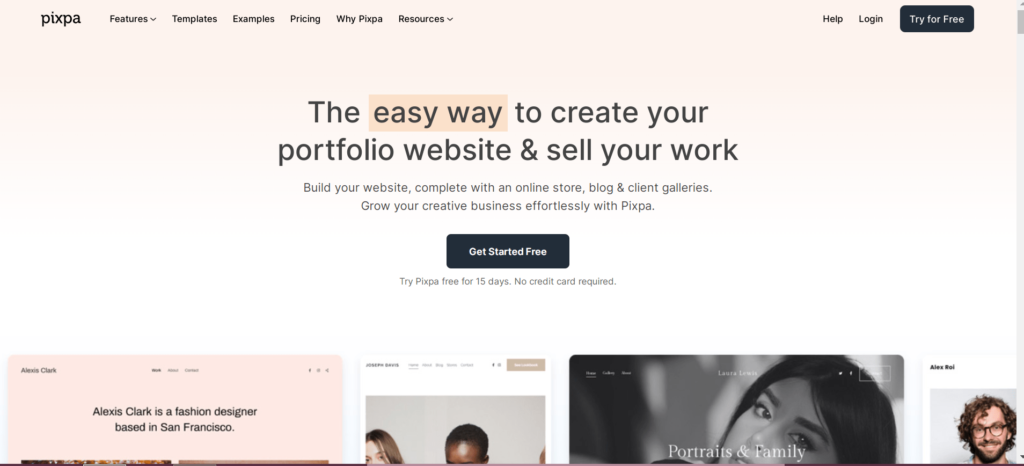
According to Google Analytics, the homepage receives roughly 65% of your traffic (that’s right — just one page) and 20% of your total time on site. Yet, your homepage design can have a significant impact on conversion.
The homepage is the most influential page on your site because visitors typically land there, see the top-performing elements of your site and what you’re offering, and decide whether they want to stay. It’s an excellent opportunity to influence that initial decision.
When you start working on a website or any online project, you should start with a clear understanding of your overall goals and strategy. After that, it’s crucial to understand what you should focus on first.
One of the most common mistakes that beginners and even experienced web designers make is focusing too much on the aesthetics or design of the site while ignoring the other two factors. They make a beautiful website without a plan and waste lots of time and money on a project that doesn’t deliver.
The homepage should grab attention, keep users engaged, and lead them into the desired action (e.g. purchasing or signing up for an email newsletter). There is no such thing as a typical home page in the digital age anymore.
Most websites have many more components than just a simple headline, but they are typically not organised optimally. A recent study by Google’s PageRank revealed that only 1% of websites receive more than 50% of traffic from organic search results.
This shows that most people use only the first page to land on a website and then bounce off before purchasing.
Make the Site’s Purpose Clear
As soon as a visitor enters the site, it’s essential to communicate the purpose and goals of the site in a single message. The first impression that a visitor gets should be clear, concise, and focused on accomplishing one task – getting the visitor to convert.
Your visitors may or may not know what your site is about in the first place, so you need to give them something to click on and then make sure that clicking the link takes them to the page where they will find precisely what they were looking for.
While you should always ensure your site is intuitive and easy to navigate, it’s also essential to make it obvious why people should visit it.
Ensure that something on the homepage conveys the site’s purpose, whether it’s the homepage’s headline, logo, or tagline. You’ll struggle to make a compelling homepage if you don’t know what makes your site unique.
Explain Who You Are and What You Do
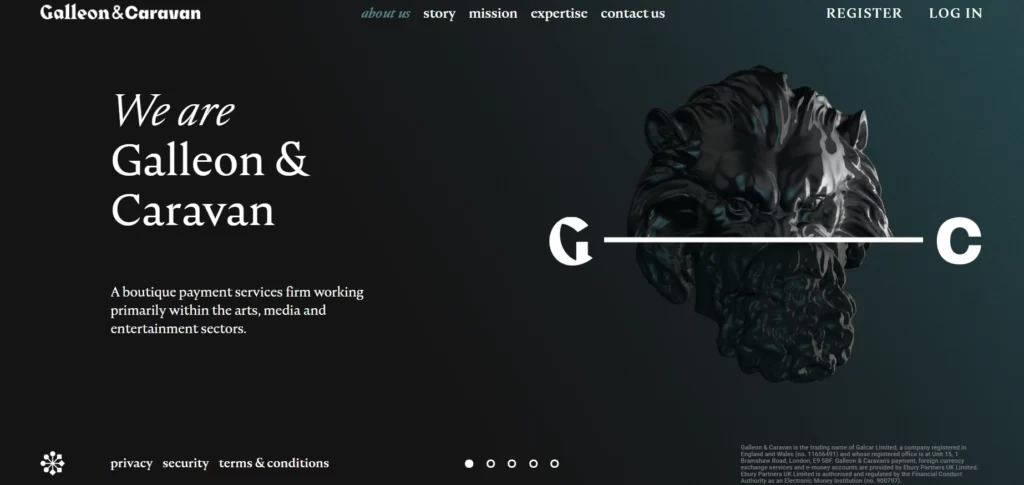
When building trust in your brand, the first thing your visitor sees should be the logo. In addition, you should include a tagline and a description of the type of company you are in.
If you’re a food blogger, you might tell your reader you’re a foodie or a gourmet chef. All this is to let your customers know who you are and what kind of company you are.
There’s much talk about content and what people should read in eCommerce. But at the end of the day, it comes down to what people need.
You can tell a lot about a business’s success by the first thing they show you on their site. Does it grab your attention, or do you immediately get bored and move on? When someone visits your site, they will do one thing: decide if they will stay or leave.
- Why is your product unique?
- How do you differentiate yourself from competitors? What makes you stand out?
These are some of the questions that should guide the homepage. The homepage must communicate who you are, what you do, and why you are different. The more clearly and succinctly you explain this, the better.
15 Tips for Amazing Homepage Design
Simplicity
There is no single formula for the ideal homepage design, but some traits should make the cut. The biggest mistake is to think that a homepage needs to include everything in a user’s life.
Your homepage is not a place to tell people about you and your business; it is a place to tell people what you can do for them. So, ensuring that your presentation isn’t too complicated and overwhelming is essential. People don’t want to read through long blocks of text, so your content should be concise.
If a website looks simple and easy to use, there’s a chance that people will stay on the page longer and keep looking around. The page must include all the information necessary to give potential customers all the answers to their questions and ensure that it’s organised so the reader doesn’t get lost.
Simplicity is an essential element in any successful website or blog. Whether you’re trying to get people to sign up for something or have already signed up, the goal should always be to give visitors the quickest, most straightforward method to accomplish what they’re looking for.
Importance of White Space in Design
White space, or negative space, is the area between elements in a design without content or imagery. It might seem minor, but using white space effectively can drastically improve the user experience.
It helps reduce clutter, making the content more digestible and attractive and allowing users to move through the site more efficiently. Giving elements room to breathe enhances the focus on key areas and improves comprehension.
White space also contributes to the overall elegance of a design, creating a more straightforward and sophisticated interface.
While often overlooked, white space contributes significantly to a cleaner, more focused design. Using white space to highlight key elements on your homepage, such as images or calls to action, is important. It’s just as essential to avoid cluttering the page with excessive visuals or text, which can overwhelm visitors and detract from your message.
By prioritizing white space, you’re amplifying readability and creating a more inviting space where users feel at ease exploring and interacting with content.
Visual Hierarchy

For many years, the visual hierarchy has been considered one of the most critical elements of the homepage design.
There are many theories behind its importance. Some argue that the most important thing is to have a large headline, while others maintain that the eye is drawn to images more readily than text.
The visual hierarchy is crucial when designing a website or landing page. It gives a visitor the first impression of what the site is about.
You don’t want them to decipher through a mess of text, images, and other content to understand your site or landing page. Visual hierarchy is used to establish a structure and organisation within a design.
According to Google, a good landing page should “draw people into the action it wants them to take.” So, if you’re looking for an opportunity to connect with your potential customers, paying attention to how the page is laid out is essential. Getting your visitors to convert will be easier with a clear, well-designed landing page.
The Role of Typography in Homepage Design
Typography plays an integral role in defining the overall feel of your homepage. The choice of fonts can significantly impact readability and user engagement. Opt for fonts that are not only visually appealing but also align with your brand’s identity.
Typography should balance aesthetics with functionality, ensuring content is easy for the eyes. For instance, a clean, sans-serif typeface can enhance readability, especially on digital screens.
Consider the font size and line spacing to maintain clarity and legibility across different devices.
In addition to font selection, consider the hierarchy of typography to guide users smoothly through your content. Headlines should be distinct and more prominent than the body text, naturally drawing attention to key messages or offers.
Subheadings can further break content into manageable sections, enhancing readability. Pair compatible fonts to maintain consistency, improve visual appeal, and ensure that text is scalable for different devices to optimise the user experience.
Consistent typography helps convey professionalism and enhances the site’s overall aesthetic.
Navigability
Regarding usability, the most important thing you can do is ensure your home page is navigable. No one wants to get lost or have to hunt for something.
When you test for usability, you’ll find that people are likelier to stay on your site if it’s easy to navigate. So, make sure that you’re keeping in mind that it’s essential to make your content easy to read and access.
A website is like a map; it should be easy for anyone to navigate and find what they need. A map must be simple to understand, intuitive, and include all the information needed to reach any destination.
For example, a map with no scale or reference points will make it difficult for people to read directions or even figure out where they are. It’s the same with a website.
Ensure your homepage design is user-friendly and includes all the information your potential customers need to find what they want.
Consistency
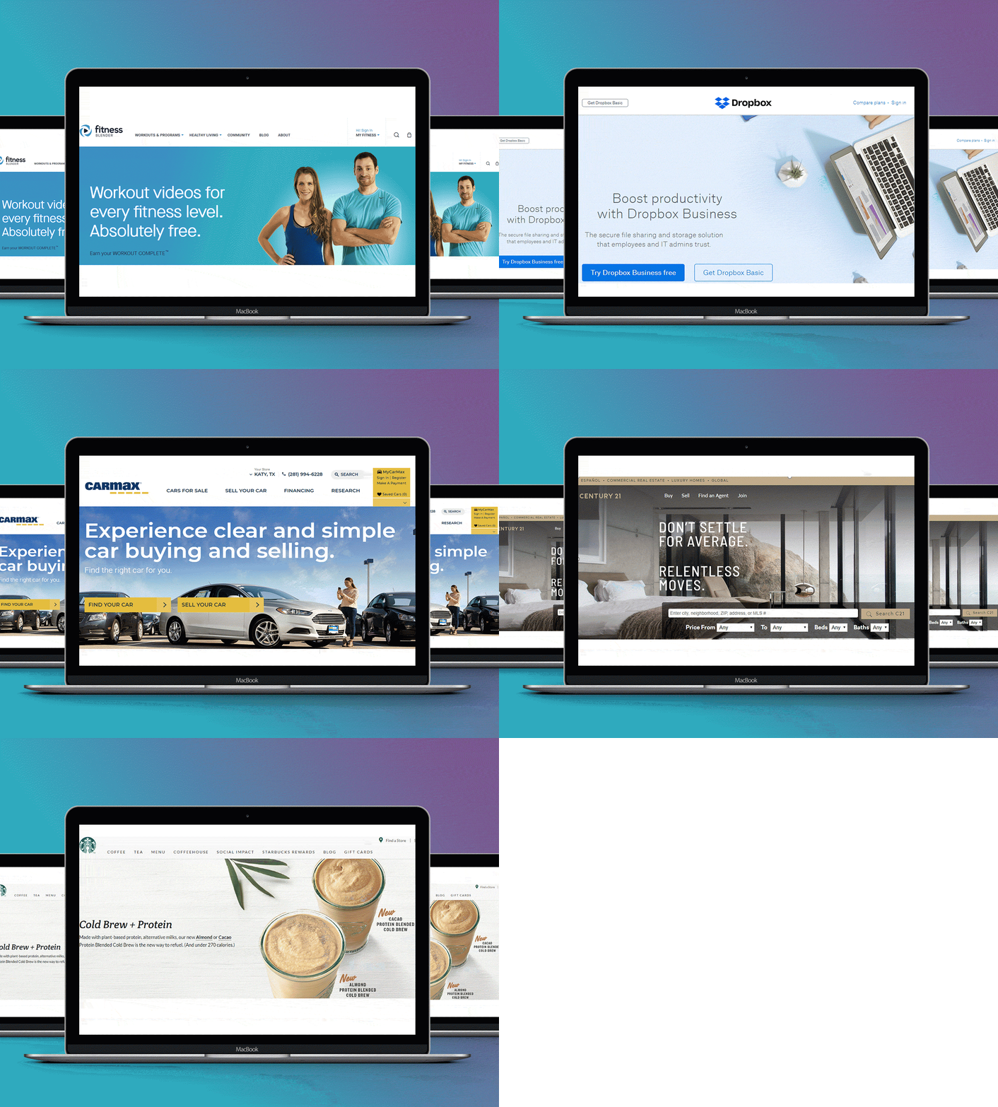
We all know that consistency is crucial in creating a strong brand identity. However, while consistency is always an advantage for your business, the best homepage design is achieved when it matches your company’s values.
You are trying to create trust and credibility in your clients and potential customers. When they feel that you care about what they are looking at, that you care about their needs, and that you care about delivering a high level of service to them, they will feel comfortable with you.
An excellent homepage design doesn’t mean you can do it in just one day. It takes time and patience to build a great design. Here are some tips that can help you get started:
- Focus on your overall website theme (for example, the colour palette, layout, font, etc.).
- Add some depth, variety, and contrast to keep the design interesting.
- Don’t forget to optimise your design.
Include keywords throughout your content and navigation that help search engines find and index your site.
In a recent study, researchers from Columbia University’s Mailman School of Public Health analysed the effects of different home pages on visitors.
They found that sites with three or fewer call-to-action buttons on the homepage performed better than those with many more buttons. So, what can you take away from this?
Ensure you only use three calls-to-action (CTAs) on your homepage. This includes buttons to sign up for updates, subscribe to a newsletter, and fill out a form for more information.
The Impact of Colour Psychology on User Behaviour
Colour psychology is a powerful tool for influencing user emotions and actions on your homepage. Different colours evoke different responses; for instance, blue is often associated with trust and calmness, while red can evoke urgency and excitement.
Applying this insight, businesses can strategically use colour to guide users’ actions.
You can enhance engagement and conversion rates by selecting a colour scheme that aligns with your brand message and appeals to your target audience. It’s crucial to maintain a balanced colour palette that complements the visual hierarchy of your design.
Beyond individual colours, consider how colours interact with one another. A harmonious colour scheme can make your homepage more inviting and aesthetically pleasing. Contrast is another tool that effectively draws attention to specific elements, such as call-to-action buttons.
Ensure these critical features stand out using contrasting colours that naturally draw the eye. This visual tactic improves engagement and can guide users intuitively towards desired actions, enhancing the site’s functionality and user experience.
Responsivity
The website’s homepage is often one of the most important places to put responsive web design (RWD) because it’s the first thing visitors see and can either make or break a sale.
A website’s homepage should communicate what it does and why people should use it. It can be the foundation for a successful online experience that builds trust and credibility, which is essential for getting new customers to sign up and purchase from you.
Your homepage’s responsiveness to the user’s device — and how fast it loads — directly affects its conversion rate.
“Mobile sites have become an increasingly important part of the shopping funnel,” says Dan Zarrella, CEO of web analytics firm Enigma. “When users are on a mobile device, they visit websites briefly before they convert,” he explains.
So, if a site isn’t responsive and looks like an ugly mess when viewed on a mobile device, it can harm conversions.
Accessibility
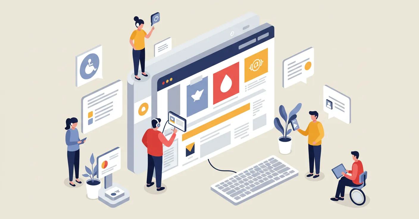
The best web designers take accessibility very seriously. They consider how a webpage will appear to people using assistive technologies such as screen readers and braille displays. They also consider how users who have mobility issues may navigate the page.
The most important thing to note is that your website should be accessible from various devices, including tablets, smartphones, laptops, and desktops. It should also be easy for the user to navigate. Remember, people access websites through different devices; your homepage should make that possible.
While a good website can look beautiful, the best websites work. They work for the user. That means a great home page can be beautiful, but that’s not great if it doesn’t work. That’s why accessibility is crucial to the best homepages—so all the information is easily accessible.
It’s best practice to ensure that all the text is large enough to read and that any images are big enough to see clearly without zooming in. This is especially important for people with visual impairments.
Credibility
People have to trust you for you to persuade them to buy from you, but first, they have to trust you in general. Credibility is your initial opportunity to establish trust between you and your audience.
Your design doesn’t matter so much if you don’t present yourself well in the first place. A poorly designed website can easily be bypassed, so you need to make sure you’re presenting yourself in a way that people feel confident in doing business with you.
Your homepage is the most critical page on your website, and it’s responsible for telling your story and building trust with visitors. So, what makes a homepage powerful and persuasive? How can you make it more trustworthy, engaging, and compelling? And what elements should it include?
Social proof is instrumental in building credibility and trust on your homepage. Showcasing customer testimonials, reviews, and industry accolades reassures new visitors of your quality and service. Including client logos or case studies demonstrates your experience and reliability within your field.
By highlighting user-generated content, such as reviews or social media mentions, you provide visitors with a sense of community and shared experience. This approach bolsters your brand’s image and can influence potential customers’ decisions.
Building Trust with Security Features
Trust is a prerequisite for conversion, and one way to establish it is through visible security features. Displaying SSL certificates and trust badges on your homepage assures visitors that their data is secure.
These indicators are critical in e-commerce, where customers need assurance when entering personal information. Ensure your security certifications are prominently displayed, ideally near points of data input or call-to-action buttons.
Demonstrating a commitment to safeguarding user data will enhance security perception and increase the likelihood of conversion and return visits.
User Centricity
One of the easiest ways to lose customers is to force them to figure out the product themselves. Users don’t want to work to solve problems, and if you’re unwilling to give them tools that make that process as easy as possible, you’ll lose them.
User-centricity is designing and developing websites that focus on the user experience. Instead of using content for the sake of content, the website focuses on the needs and interests of its users.
Designing and developing a website results in a more satisfying user experience and can improve conversion rates and the likelihood of users returning to a site. The first thing we can all do to improve our user experience is to make sure that the homepage of our website is user-centric, says Brian Dean.
Clear CTAs
The key is to avoid being overwhelmed with too many calls to action (CTAs) on the home page. The typical home page has a couple of prominent, bold CTAs for products and services and a couple of smaller, subtle CTAs for contact information.
The more CTAs, the worse the conversion rate. It would help if you kept it under three, maybe even fewer. The optimal home page has no more than 2 CTAs. You can still add a couple more if you’re trying to sell an additional product or service, but be careful not to overload the user with too many.
Storytelling
If you’re a web designer or developer, storytelling is key to designing the best landing page. We believe a story is a collection of words on a page and a visual narrative in which your visitor engages through various senses. Doing so gives your visitor a reason to stay engaged and complete your sales process.
According to HubSpot, the best homepage designs tell a story. The website’s purpose is defined and communicated through straightforward navigation, visual hierarchy, and clear calls to action.
These elements work together to guide visitors through the website and help them achieve their goals. The homepage is the gateway to the rest of the site and should be designed to keep visitors engaged and encourage them to explore other pages.
Mobile-first design

As the mobile web continues to grow, it’s becoming more and more important to start with mobile-first design. Mobile-first design is an approach to designing a website that begins with the assumption that mobile is the future of digital.
Mobile-first design isn’t just about building a site optimised for small screens but about creating a unique user experience that considers the smaller form factors of smartphones and tablets.
Prioritise SEO
Search engine optimisation (SEO) is a practice designed to ensure your site appears high on the search results page for any keyword.
SEO is precise, so it can be tricky to understand. For example, a website with the same content as another will often appear higher in the SERPs for a search term than the other site because the site with the better SEO design will rank better.
Optimising your homepage for search engines takes time. But suppose you’re serious about optimising your homepage. In that case, you should expect to spend at least a few hours (probably more) making sure your home page is optimised for search engines and designed to maximise conversions.
Monitor site speed
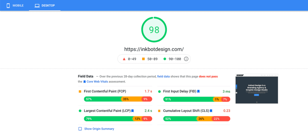
There is much value in having a fantastic homepage design on page speed alone. As a result, a simple, clean, and attractive homepage will convert visitors into subscribers at a higher rate than other designs.
A study by Kissmetrics found that the conversion rate for a simple, clean, and attractive design on a landing page was five times greater than one with a cluttered, cluttered, and boring design.
However, to ensure your website homepage is optimised for performance, check out how fast it loads and the bounce rate on your homepage.
To optimise your homepage for conversions, you need to track what happens when people arrive on your site.
For example, if someone clicks on your navigation menu, that could be an opportunity to add new content to your homepage. If someone lands on your homepage and sees no call to action, they have no reason to stay on your site.
Heatmaps
A heatmap (or heat map) helps us understand where people click. You can see any page’s clicks by hovering over a specific part of the screen and watching the colours light up.
You must look at heatmaps to understand where people clicked on your site. Google Analytics lets you see which links on a page have been clicked the most often. But heatmaps go beyond the data they provide. They’re visualisations of clicks. You can see where people click on your site and why using colour and shape.
A heatmap is just a bar graph showing visitors’ traffic to a page. One of the first ways webmasters looked at heatmaps was to determine whether a page was “sticky” or not, meaning if visitors kept returning to that page or left quickly.
However, it is also helpful to determine what links get people to your site. A link with a green or yellow colour (not red) means a connection between the two pages.
AB Testing
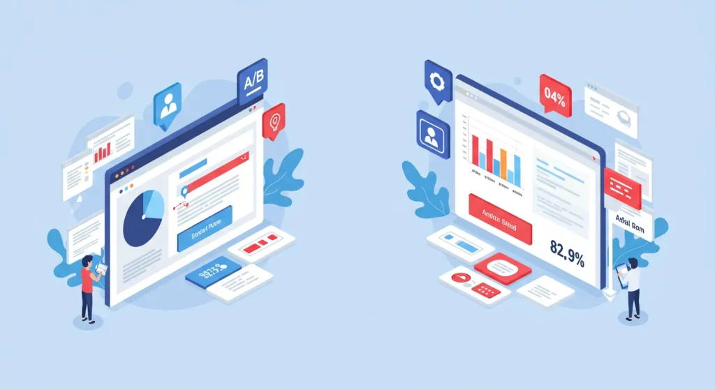
You can test multiple versions of your homepage using A/B testing to see which performs best. It’s an experimental marketing tool, which means that instead of having one home page that works perfectly, you try out different home page designs, and the one that performs best becomes the one that will stay.
One key point is that you should go back to the drawing board and start over if the two versions don’t have enough data to tell the difference between them.
Once you’ve determined the content that resonates with your audience, it’s time to decide how it will look. A handy tool for accomplishing this is A/B testing.
A/B testing lets you run multiple versions of your website simultaneously. For example, you could show a visitor a page with content that appeals to them, compare the results with a page that offers the same content but is written differently, and then choose the winning version.
The same principle applies to the rest of your marketing channels.
Conclusion
When developing a website, it’s essential to consider what you’re building for yourself and what you’re building for the person who will see it and use it daily.
Think about the person who will visit your site.
- Will they be a new or returning customer?
- Do you want to convert them into customers or encourage them to shop with you?
- Is it necessary to provide your readers with information or make them buy?
- Do you want readers to sign up for your email list or subscribe to your blog?
When designing a website, going overboard with features and functionality is easy. Ensure you consider your readers’ needs and provide them with the right experience.
The homepage is often considered the most crucial page on a website but can also be the most frustrating.
Users are typically faced with many choices when they arrive at a homepage. How does your homepage stand out among the rest? This guide looked at the best homepage design practices that will lead you to success.
Homepage Design FAQs
What’s the #1 mistake people make with their homepage?
They try to say too much. Your homepage isn’t a novel—it’s a movie trailer. One clear value proposition, one clear call to action. That’s it. When you try to tell them everything, they hear nothing. Simplicity sells; confusion costs.
How long should someone scroll to understand what I do?
No more than 5 seconds. If they can’t figure out who you are and what problem you solve on the first screen they see, you’ve already lost them. Here’s the brutal truth: nobody cares about your website enough to play detective.
What’s more important: design or copy?
Copy wins every time. Beautiful websites with mediocre messaging lose to ugly websites with killer copy. Look at Berkshire Hathaway’s site—it looks like it was built in 1997, yet they’re worth $700+ billion. Your words make the sale, not your fancy animations.
How many CTAs should I include on my homepage?
One primary CTA repeated strategically. When you give people too many options, they choose none. Every additional button reduces the effectiveness of your primary conversion goal by about 30%. So pick your one most valuable action and hammer it home.
Should I include pricing on my homepage?
Suppose your price is to your advantage, and you sell premium services. In that case, pricing will be more profound in your funnel after establishing value. Remember: price is only an issue in the absence of value. Build value first, then reveal price.
What about testimonials—how many should I include?
Include 3-5 power testimonials that directly address objections. Don’t just throw up 20 generic “they’re great!” quotes. One specific testimonial that speaks to your prospect’s biggest fear is worth 50 vague ones. Quality over quantity every time.
How do I know if my homepage is working?
One metric: conversion rate. Nothing else matters. There is no bounce rate, time on the page, or how pretty it looks. Track how many visitors take your desired action, then test relentlessly to improve it. A 1% increase in conversion often means 10%+ more revenue.
Mobile or desktop—which should I optimise for first?
Mobile. 60-70% of your traffic comes from mobile, yet most people design on desktop and treat mobile as an afterthought. That’s backwards. Design for thumbs first, then scale up to desktop. Your prospects are scrolling Instagram and clicking your ad—the experience should be seamless.
What should my navigation menu include?
As little as possible. Every menu item is a potential exit point. The most effective homepages I’ve tested have just 3-4 navigation items: Home, About, Services, and Contact. That’s it. Your navigation isn’t a table of contents—it’s a tool to drive conversions.
How vital are load times?
For every second your site takes to load, you lose 7% of potential customers. That beautiful video background might look nice, but if it adds 2 seconds to your load time, it’s costing you 14% of your business. Speed equals revenue—optimise ruthlessly.
Should I use a template or a custom design?
Templates are fine if you’re starting. What’s not okay is looking like everyone else. The riches are in the niches—and that includes visual differentiation. As you grow, invest in custom elements that make you instantly recognisable. Your brand is your moat.
