10 Tips for Website Designing and Development
If you think about it, what is a website? It’s just a bunch of files that are working together. It's fascinating when you break it down like that.
And with all these files working together, many challenges will be tackled daily. Whether it's a task at work or home, our brain has to put in some OT and figure out the best way to tackle any given thing. You know this already: practice makes perfect, but there are also other ways to help increase efficiency and creativity. We’ve gathered up our favourite methods for doing so. Pass them on if you can!
Several elements are involved when designing your website, and they should always be the top priority. Having these will guarantee online success.
- A functional and responsive design is essential for optimal user experience across various devices and improves SEO ranking.
- Prioritize website performance to ensure fast loading times, reducing visitor frustration while maintaining aesthetic appeal.
- Implement a clear visual hierarchy to enhance user navigation and ensure important information stands out effectively.
- Choose a user-friendly navigation structure, making it easy for visitors to find desired information without confusion.
- 1 - Create a website that is functional and responsive
- 2 - Don't sacrifice design for performance
- 3 - Use visual hierarchy
- 4 - Choose the proper navigation structure
- 5 - Make it easy to find what users are looking for
- 6 - Make sure your content is readable
- 7 - Focus on usability when website designing
- 8 - Add some personality to your website
- 9 - Be accessible to search engines
- 10 - Test, test, test
- Conclusion
- Website Designing FAQs
1 – Create a website that is functional and responsive

Designing a website that works well is already hard enough. However, if you care for these few things, your experience will improve.
A responsive website can fit any screen size. It’s become necessary to make websites compatible with multiple devices now that people are constantly browsing the web on their phones or tablets.
We’ll go over what it means for a website to be responsive and how you can make one.
What is Responsive Design?
Responsive design is a new trend in web design. You probably haven’t heard of it yet. It allows people to view your website on screens other than desktops and laptops like smartphones and tablets. Sometimes, it's called fluid or adaptive layout, making the site automatically resize based on the screen size.
Having a responsive website has many benefits. One of them is SEO, which stands for search engine optimisation. This helps search engines like Google read and understand your site when it appears on larger screens so that they know what it's about and rank you higher in searches.
Once you learn how it’s done, implementing responsive design isn't too difficult either. You don’t have to create multiple versions of your website from scratch; all you need to do once your site is ready to go live is upload it to your server, do some theme edits, and voila!
So, no matter what screen someone views your site on, whether on their smartphone or computer, they’ll see something good. It’s easier for you because there aren’t different versions of one site running around online — just one! Plus, being more SEO-friendly never hurt anyone’s chances of getting seen by others who wouldn't typically come across their thing!
2 – Don't sacrifice design for performance
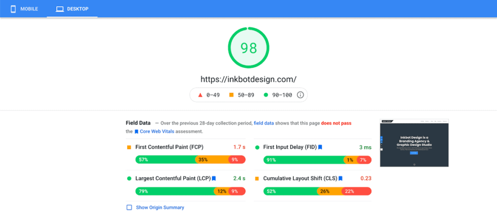
Performance and Design are usually considered two different things. Performance is the site's speed, functionality, and responsiveness, while design is the look and feel of the site that makes up the user experience. However, in this rare instance, the terms can be used interchangeably.
Performance is what matters.
Performance is how a site functions and looks to users. It should always be your top priority, especially on mobile devices, as it can affect user experience by taking too long to load.
The design does matter, too.
Design refers to how your website looks and feels to users. You may have a beautiful design, but if it’s not optimised for performance, it will run slow and frustrate visitors. You can improve performance by:
- Reducing HTTP requests
- Using CDNs
- Minifying and combining CSS files
- Optimising images and removing unused code.
So, which one should you focus on?
There's no exact answer to this question, but focusing on performance in web design is crucial because this is the only aspect of design that users will see. Although you can adjust a website's aesthetics through proper design, these edits won't be visible, so they don't impact user experience.
3 – Use visual hierarchy
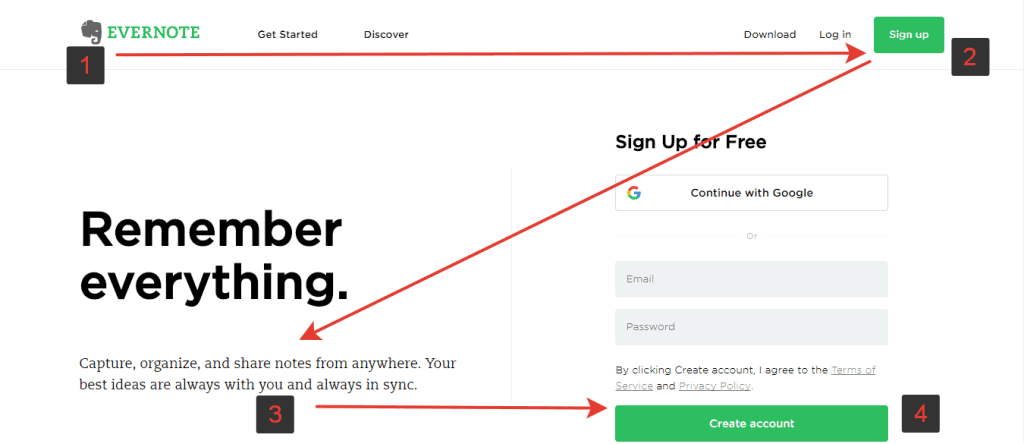
A web page comprises text, images, icons, graphics, and backgrounds. These items help create a website's design. But they don't tell us anything about a website’s structure. That's where visual hierarchy comes in.
Visual hierarchy is how you present the different elements of a website or webpage. For example, most websites have a navigation bar, main menu, header and footer. But how are these parts related to each other?
Here’s how it works:
When planning to build a new website, understand what you're trying to achieve. Then, think about what parts of the site you want people to pay attention to most. Finally, rearrange your site’s elements based on their importance.
That’s all there is to it!
So, how does it work in practice?
Imagine you’re creating a website for a tech company.
On the homepage is a picture of a man holding a tablet device.
Below that is the headline “About Us.”
Then, there's an image with the company logo and name.
Next comes one sentence explaining what the business does.
Finally, at the bottom is “Contact Us.”
The picture at the top of this list shares something in common with all other websites created: It's always essential. And because it's so important, we need everything else on our site to be smaller than it.
This includes the text “About Us” below that photo…and everything else listed above!
You may wonder why we wouldn’t just put “About Us” at the top and arrange things as we see fit.
That might look nice! But visual hierarchies aren’t written for looks – they're built for clarity.
4 – Choose the proper navigation structure
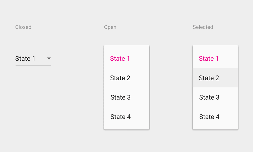
There are several ways to create navigation menus, and it’s essential to consider your options. But how do you know which navigation structure is best for your website design? What should be your main focus?
Choosing the navigation structure is one of the first decisions you must make when creating a website. For example, if you’re making a food website, you might use a three-column navigation menu. It’s easy to make, and it fits well with the content that will be on the site. Another option could be a five-column menu, which would look nice and clean on a business website.
Regardless of what type of site you’re working on, the most important thing is: what will get people interested in visiting your site? You want something that isn’t complicated or confusing for users so they can easily navigate it. The navigation structure should be clear, organised, and appealing.
1: Icons
If you have a food website, use different icons to represent various food categories. For example, a burger icon could represent fast food.
2: Colours
If your website is sports-themed, consider using colours to differentiate between different types of sports! For example, red and blue could represent football and cricket, respectively!
3: Subcategories
Sometimes, if your website has many pages, it could be helpful to use subcategories so everything can be organised easier! A ‘Home’ category can be used as a parent category, whilst ‘Food' can serve as one of its child categories.
4: Individual Pages
Create a separate page for each category if your site has many categories. For example, if you have a sports website, make an individual page for each sport, like football, basketball, etc…
5: Drop Down Menu
Use a dropdown menu if there are too many categories on your site that would clutter the page(findlinks).
5 – Make it easy to find what users are looking for
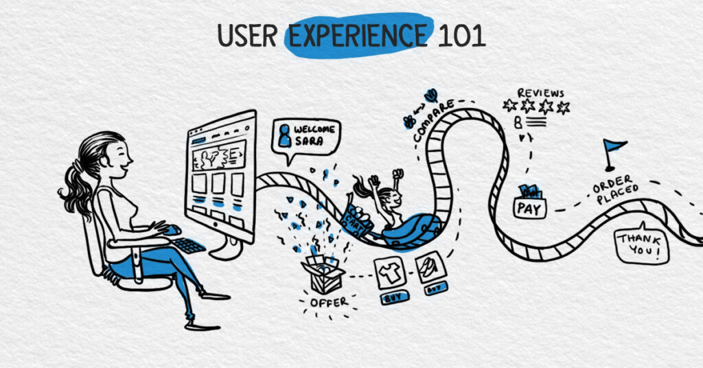
You can make your website simple and easy to navigate in several ways. Here, we will discuss some of the most important ones.
Design for users first, then the rest
If you design navigation after the fact, there may be time. When you create your homepage, make navigation an integral part of it. Sure, there are other aspects to consider when building a simple and informative landing page – but keeping interest is paramount.
Go mobile-friendly
We live in a world where everyone has a tablet or smartphone for work and entertainment. Your site must look good and be responsive on small and large devices. If it doesn't, you may lose out on potential visitors.
Avoid clutter at all costs.
Make sure your site looks clean and clear by eliminating unnecessary elements that don't serve any purpose for the average visitor. It’s also good to avoid using big font sizes and bold text because they can make words difficult to read.
Brighten up the colours.
The colour palette that you apply should be vibrant and eye-grabbing. Dark colours are great when displaying images, but they won’t pop on already dark backgrounds, so keep that in mind! Try incorporating light blue, green, yellow or pink instead – just something bright!
Fonts matter too
Fonts are essential in maintaining appeal to readers’ eyes: Find one that compliments your overall design scheme. If there's lots of white space, you can afford to use larger fonts with thick letters; however, if there are many images throughout the page, opt for smaller fonts.
Keep things user-friendly
Throughout this process, remember that simplicity is vital when building an easily navigable website! The user experience is critical here, so ensure every element is tailored to them.
Now that you know different ways to make your site more user-friendly, get designing! Be aware of these tips and tricks before you start your next site-building project.
6 – Make sure your content is readable

Making sure your content is visible on screen and read by people can be difficult. The problem with web designers is that they don't know much about reading text on the screen and reading for long periods. Here are some tips to make sure that your content is readable:
Know your audience
Understanding who will be viewing your website before you start designing is essential. What kind of information do you want to communicate? Is it informational text, for example, or are there interactive elements like buttons and links? Do you like simple text, or is your site meant for people who might not be familiar with coding? All these things can affect how your website is designed.
A good designer should anticipate what content the viewer needs to read before reaching the website.
Keep the font size consistent.
When designing a website, font sizes are often too small. It can be frustrating for people trying to read your content. You can always increase the font size if you struggle to read something on a website because the font is too small.
Here are a few tips to help you adjust the font size:
- Increase the font size of the text elements within your website, such as your header.
- Include a @font-face rule at the top of your stylesheet.
- Use a browser plug-in like Web Zoom to zoom in on a webpage and view the text at any size.
- Make sure that the font size you choose is a good balance between legibility and readability. A good rule of thumb is that a font size of 10pt should work for most websites.
Use contrast
Contrast is essential for reading. Using two different colours on a webpage makes reading and understanding the text more manageable for your eyes. The text on a website will not appear well if the background colour is the same as the text.
You can use a contrast-testing tool such as Contrast Checker to ensure that your content has enough contrast. This tool can determine whether your website design is formatted correctly.
7 – Focus on usability when website designing

Focusing on the site's design, including the layout and colours, is critical to getting visitors to stay on the site, but it can make it hard to keep your visitors engaged and returning. This article covers some ways to ensure you focus on what's important to your users.
Usability is one of the main aspects of a good user experience. A website that's easy to navigate and understand keeps users on the site. It's also essential to think about how you can encourage people to share and use your content.
The two main elements of usability are discoverability and accessibility. Discoverability means making it easy for users to find the information they need, while accessibility means making it easy for users to use the site.
For example, if you're creating a site for people who love reading, you might want to focus on the readability of the content on the site. You might also think about how people can interact with the site – perhaps they can choose the best articles they like.
Another thing to think about The less likely a visitor is to come back to your site, the more critical it is that you get their attention. A great example is a site with a straightforward design but many videos. The captivating video draws people in, but they may never return if they don't find the videos helpful.
The most important thing is to ask yourself how your audience uses your site. What types of users do you have, and what are they trying to accomplish? For example, a site for teachers may have different needs than one for a family.
One of the most important things to consider is how easy it is for new users to learn the basics of your site. Do they need to sign up to access everything? Do they have to look up how to use a feature? Is there anything they need to learn before they start using it?
8 – Add some personality to your website
Website design is an excellent way to boost your company's personality, giving it the image and voice it needs. It can be an advantage for a business to look unique and fun, not to mention enjoyable. Why not spend some money making your site more attractive?
People who are into designing things will know that they have to be creative but still hit the brief. There are requirements from the people who own the site that need to be met to get what they want from their website. Any web developer or designer worth their salt should know how to make a good-looking website that is easy enough to use. You'll want users to stay on your site for as long as possible, so make sure you give them every reason.
A more personal touch can be added through fonts, colours and other small features like pictures that enhance what is being said by words and images on the page. The design of a website comes not only down to layout but also style.
A user-friendly website will attract more visitors, eventually leading to sales. Those who don't understand websites will know when something is confusing or bad. You should always try to ensure it’s easy for whoever visits it.
When it comes down to stylising a website, there isn’t much someone else can do if you’re unhappy with it (unless you pay them extra). The client usually designs their brand around themselves, so they’ll likely have a keen eye for particular colours, etc.
You should be able to easily update your website to change its design whenever new content is added. A vital feature of any successful business is being up-to-date with everything, so updating your site frequently will probably prove beneficial in the long run.
People often see Your online appearance when they visit your company's site, so you'll want it to look as good as possible. You could spend a lot of money on getting someone else to design your website, and you may feel like you're not getting the most out of it. If that's how you think, creating it yourself may be the way to fix it.
When searching for resources online, see if your business associates can suggest anyone. While many freelancers and small businesses offer these services, some aren’t worth their time, let alone yours.
9 – Be accessible to search engines
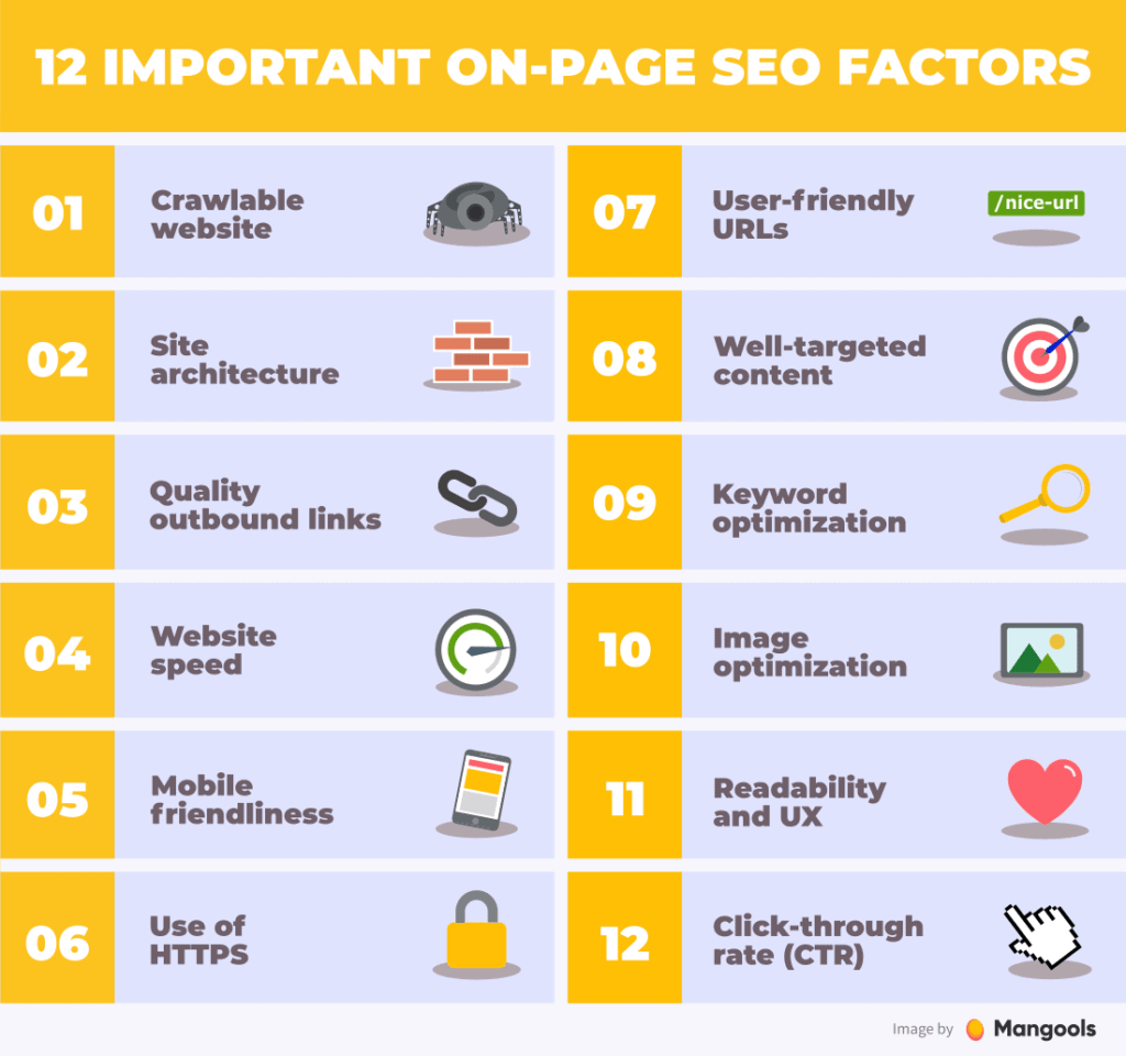
Making your website accessible to search engines is a general question everyone wants to know about. We'll present you with the best guide on how you can optimise your website for search engines.
Most people searching for something online don't even read the results list. They scroll down to the first few pages. This is what makes SEO so important. Search engines are the only way to ensure your website appears at the top of its list.
To make your website accessible to search engines, follow the steps below:
1: Optimise your title tag
A reasonable title tag makes your website accessible to search engines. Search engines like Google use titles to give information about the page they're searching. For example, if you search for “car insurance”, Google will display the page title in the search results.
The title should be concise and relevant. It should include keywords and describe the page content clearly. Make sure that your title is no longer than 60 characters.
2: Optimise your meta description tag
Your meta description tag is another important element of optimising your website for search engines. The meta description tag is a short description under the title tag. This description is displayed to visitors after a search is performed.
For example, if someone searches for “car insurance” in Google, this description will appear in the search results. It will appear under the title tag but shouldn't exceed 150 characters.
Include key phrases that can help the searcher identify your content type.
3: Add alt tags
Alt tags are used to describe the images on your website. They can also be helpful for blind users who use screen readers, which read out the text from web pages. An alt tag is usually a short phrase that describes the image. It should not contain any links or other text. The alt tag may include the alt attribute, making it a required part of the HTML tag.
4: Use H1 and H2 tags
Headers (H1 and H2) are used to categorise content on a page. Search engines will use these headers to give information about a page.
5: Add keywords
Ensure you add keywords to the title, description, and meta description tags. They should be the words that describe your website. If it is a local business, you want them to be specific to your city or town.
6: Create a sitemap
Sitemaps ensure that search engines can access all the pages on your website. A sitemap helps search engines know which pages to crawl.
7: Make sure that your site's URL is optimised
Your website's URL should be user-friendly. It should be easy to remember and include keywords. If your site's URL is complex to remember or doesn't include keywords, then your site will be ignored by search engines.
10 – Test, test, test
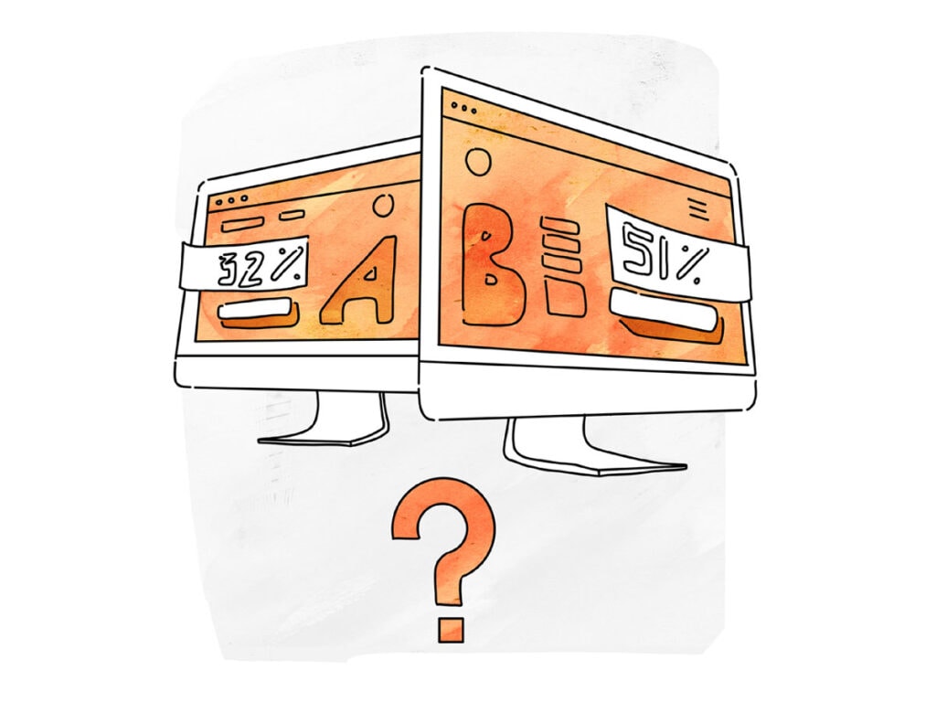
What does it take to test website speed? You probably found yourself on this page because your website takes forever to load. This means the site you created isn’t optimised correctly, which can hinder your website's SEO and even your content’s quality! So, you better make sure your slow site is fast!
Here are a few tips to get you started.
Testing Your Website Speed
First, you need to test the speed of your website. Because if you don't know its speed, how will you even know if there's anything wrong with it? There are plenty of ways to measure how fast or slow it is.
You can use Google’s PageSpeed Insights tool, which provides a detailed report on the speed of your website. Another one would be the Pingdom Web Performance Test Tool, which also gives a detailed report about the speed of your website. The only difference between these tools is that Google’s tool tells you about the speed of your website in a detailed way. The Pingdom tool also details the speed of your website.
Another thing to keep in mind is that if you don’t have a powerful internet connection, then it might take longer for the site to load. And if this doesn't cut it, another thing to consider is what web hosting service you’re using, e.g., a virtual private server or shared hosting package.
If You’re Using A Shared Hosting Package, Sorry But…
You won’t be able to monitor the performance of your website at all! However, If You’re Using A VPS (Virtual Private Server) Then…
You can access its control panel and check on some statistics on how well (or not) it's doing!
Monitoring Your Website
Start by monitoring your site as soon as possible so that when traffic starts flowing through, it will be easier to notice any drops or increases in visitors. Also, it'll be easier to see if the page could be faster. If there's something wrong with it, you can fix it immediately! In Addition, You can also start planning your future website design and functionality!
Website Monitoring Tools
Not all monitoring tools are reliable and efficient. So, you'll have to spend a lot of time researching for one that is. However, here are some examples to get you started on searching.
- Google Analytics
- Piwik
- Yandex Metrica
- Uptime Robot
- Pingdom
- Cloudflare
- PageSpeed insights
- GTMetrix
- WebPageTest
These are just a few ways you can test your website’s speed. Now that you know how to test your site’s speed, make any necessary adjustments.
Conclusion
A good website should be user-friendly and easy to navigate so that users have no problems accessing all your business's offerings. Also, it should be a site that visitors can spend time on. That's why good design is essential.
Good design is about creating a site that looks good and is easy for users to navigate. Good design is about making sites user-friendly. User-friendliness means that users will have no problems accessing all the business's offerings and have no trouble finding the pages they are looking for. This guide will show you how to design and build a good-looking and functional site for your business.
Let me help you achieve a beautiful website design! Contact me for more details.
Website Designing FAQs
When designing a website, what should be considered the most?
User experience (UX) is the most significant. It should be user-friendly and easy to navigate, and visitors must have a seamless experience on the site. This involves logical information architecture, clear calls-to-action, and responsive design that functions well across various devices.
How can I make my website load faster?
Compress images, leverage browser caching, reduce HTTP requests, use content delivery networks (CDNs), and minimise CSS, JavaScript and HTML files. Further, we are still considering implementing lazy loading for images and other resource-intensive assets.
What are some critical aspects of a good website design?
A neat layout with good visual appeal, consistent branding and design elements, and simple navigation, including clear menus.
How can I improve my website's search engine optimisation (SEO)?
Carry out keyword research; optimise title tags, meta-descriptions, headers, and contents with relevant keywords; create high-quality backlinks; use alt tags for images; generate an XML sitemap; ensure mobile-friendly design.
Should I use a website builder or hire a professional web developer?
Small enterprises or individuals needing basic websites may find website builders suitable since they are inexpensive. However, hiring a professional web developer for more complex or custom sites to have a more robust, scalable and tailored platform would be better.
What are some best practices for website security?
Use HTTPS instead of HTTP for secure data transmission, keep software/plugins updated, consistently implement strong password policies, and use web application firewalls such as WAFs; regular backups should also be made. Finally, sensitive data should be handled appropriately at all times.
How can I make my website more accessible for users with disabilities?
Ensure proper colour contrast, provide image alt text descriptive link texts logical heading structure keyboard navigation WCAG compliant.
What are some practical ways to engage website visitors?
Integrate interactive features such as quizzes, calculators, and surveys; offer informative materials like blog posts, guides, and whitepapers; use multimedia/ videos; incorporate user-generated content such as reviews, testimonials, and social media integration.
How often should I update my website's content?
Depending on your industry and goals, there is a different frequency of updating content. However, it’s generally recommended always to add fresh and relevant information to improve your SEO ranking and keep visitors engaged. Never forget to change something on your site at least once a month.
What are some common website design mistakes to avoid?
Untidy and disorderly layouts, excessive animations or pop-ups, small text size or illegible text, broken links, outdated information, long loading time, unresponsive mobile versions, and lousy navigation structure.

