Landing Page Design Basics: The Keys to Conversion
You’ve likely heard the talk about creating landing pages for your marketing campaigns. But what’s the big deal with these little web pages? Why not just send people to your homepage or product pages?
Landing pages, my friend, are meant to do one thing — convert casual visitors into solid conversions (sales, email list sign-ups, etc.).
By removing distracting navigation, extras and fluff – a well-designed landing page focuses your visitors’ attention like a laser beam on one goal. And when you combine that with persuasive copywriting, visuals and Call-to-Action elements… It’s like pouring gasoline on a fire, which ignites more fans, sign-ups, and buyers.
Sound good? Then, let’s dive into how to create killer landing pages…
- Landing pages specifically convert visitors into customers by removing distractions and focusing on a single goal.
- Key elements include a captivating headline, persuasive subheadings, compelling copy, striking visuals, and clear calls-to-action.
- The design should be clean and responsive, utilising visual cues and a strategic colour palette to enhance user experience.
- Continuous testing and optimisation of landing pages through A/B testing and feedback are essential for improving conversion rates.
- Offers should be irresistible and eliminate perceived risks, maximising the likelihood of visitor engagement and conversion.
- Core Elements of Killer Landing Pages
- Types of Landing Pages & Examples
- Landing Page Copywriting Tips
- Focus on an Irresistible Offer
- Optimising Landing Page Design
- Landing Page Conversion Rate Optimisation (CRO) Tactics
- Putting It All Together: Landing Page Examples
- Final Thoughts + FAQs
- Final Landing Page Checklist
Core Elements of Killer Landing Pages
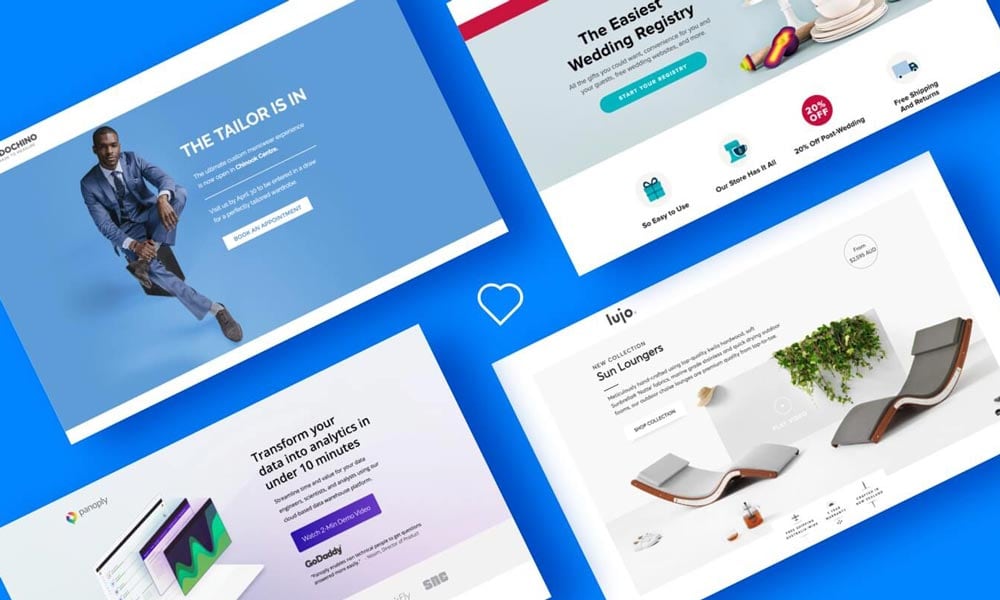
Like a spicy recipe, effective landing pages combine the perfect blend of essential ingredients. Here are the core components you'll want to nail:
1. The Headline Hooks ‘Em
Your headline is the first thing visitors see, so it better grab their interest FAST. Use powerful words, spark curiosity, or immediately convey the main benefit and value proposition.
For example, which headline would make you want to read on:
"Welcome to Our Landing Page About Our Services"Or…
"Attention Entrepreneurs: Are You Sick of Lackluster Sales? Read This..."See the difference? That second one just oozes curiosity and benefit-focused magic.
2. Sub-Headings Guide the Experience
Subheadings act like street signs for your readers, breaking up content and guiding them continually deeper. Use persuasive, benefit-driven subheads every few paragraphs to:
- Keep visitors engaged and focused
- Subtly reiterate key selling points
- Facilitate effortless, targeted content skimming
3. Copy Does the Selling
Once you've hooked them with the headline, your carefully crafted body copy needs to seal the deal. Don't just list features—sell your product/service's transformative benefits.
Remember to break your copy into short, digestible paragraphs or bullet points, add plenty of persuasive power words, and back claims with social proof like stats, testimonials, and guarantees.
4. Visuals Cement the Message
Crisp, high-quality images, videos, graphics, charts or illustrations supporting your narrative do wonders for clarity, credibility, and engagement.
An explainer video summarising the top benefits can boost conversions like crazy. Photos of people using and loving your offerings build trust. Icons and graphics illustrate critical points in a snap.
5. Calls-to-Action Compel Action
Every landing page needs one prominent, unmissable Call-to-Action driving visitors to the conversion goal—clicking the “Buy Now” button, signing up for a free trial, downloading something, etc.
Make your CTAs clear and visually striking, and use persuasive phrasing that conveys value and urgency. And don't just stick one CTA at the bottom. Sprinkle relevant CTAs throughout to capitalise when visitors are feeling the heat.
Types of Landing Pages & Examples
Landing pages come in all shapes and sizes based on their conversion goals. Let's look at some common landing page examples:
1. Lead/List Building Landing Pages
These pages aim to capture visitor information like email addresses in exchange for a free incentive like an ebook, webinar, contest entry, etc. Once on the list, you can nurture those leads down the funnel.
For example, this landing page from Wistia offers a free ebook on video production in exchange for an email address:

2. Click-through Landing Pages
These simple pages merely “warm up” visitors before clicking through to the main website. For example, educational sites might use them to gauge topic interest. Companies running video ads might use them to filter traffic before hitting the leading site.
3. Long-Form Sales Pages
Longer, in-depth sales pages are designed to sell more complicated, expensive products or services. They extensively detail features, benefits, credibility builders, testimonials, bonuses, pricing, guarantees and more to convince visitors to pull the trigger.
4. Lead Gen for Service Businesses
These landing pages aim to have visitors fill out a more detailed lead form to get a customised service quote/consultation from the business. You'll see lots of form fields and plenty of compelling copy and visuals to convince them it's worthwhile.
For example, this lead gen page from Formstack covers the basics and offers a free quote in exchange for a detailed lead form:

5. Unboxing/Demo Landing Pages
Some companies create dedicated landing pages or micro-sites to showcase inventors or excited customers unboxing their products for the first time. They're primed to go viral when done right.
Like this fun unboxing page from Cards Against Humanity:

6. Targeted Campaign Landing Pages
For extra conversion oomph, many companies create dedicated, targeted landing pages for paid campaigns like Google Ads, Facebook Ads, guest blogging in their niche, etc. That way, visitors see an ultra-relevant, tailored experience based on the ad messaging, targeting data, etc.
Landing Page Copywriting Tips
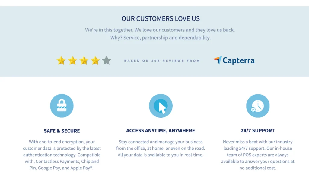
Now that we've covered some of the essential parts let's talk about crafting landing page copy that converts like crazy…
Benefits Over Features: Always!
Listing out drab product features falls flat. Instead, speak directly to your visitors' pains, struggles, and deepest desires. Hammer home how your solution provides proven benefits, advantages, and transformative results.
For example:
- Boring feature: “Our software includes an analytics suite…”
- Benefit-focused: “Finally, get valuable data-driven insights to grow your business and blow your competitors out of the water…”
Boom—much more engaging and persuasive, correct? Always focus on the WIIFM (What's In It For Me?) from the visitor's perspective.
Speak in a Natural, Conversational Tone
Stilted, overly formal tones are a major turn-off. Enjoy and engage visitors like you'd chat with a good friend. Use contractions like “you'll” instead of “you will,” drop in some personality with pop-culture references, turn questions into conversations, and connect using relatable stories and examples.
Harness Psychological Persuasion Tactics
Introductory human psychology plays a massive role in compelling visitors to take action. Sprinkle in techniques like:
- Anchoring: Setting the context for deals, such as “Instead of our usual $99, today, only get it for $29!”
- Urgency/Scarcity: Saying, “Only 123 spots remaining!” or “This deal ends in 24 hours!”
- Social Proof: Displaying reviews, testimonials, media mentions, trust signals, “joined by X other people,” etc.
- Risk Reversal: Offering a solid guarantee or free trial to help overcome fear.
Strategically Guide Them
Use visual signposts, targeted subheadings, and bucket brigades to nudge visitors into your sales funnel. The journey should flow logically while preemptively addressing potential objections at every step.
Focus on an Irresistible Offer
Your unique offer is THE crucial element that will make or break your conversion rates. You must give visitors a blazing, undeniably valuable offer that turns them into rabidly eager buyers.
Exactly how you craft that offer depends on your product/service and goals. Some common compelling offers include:
- Free Trial Periods
- Free Samples/Products
- Free Consultations
- Time-Sensitive Discounts
- Risk-Free Guarantees
- Exclusive Waitlists
- Freemium Software
- Content Upgrades
- Free Tools/Widgets
- Contests or Giveaways
Whatever you choose, the offer should eliminate perceived risk as much as possible. Something precious that's hard to pass up. Remember that the better and more irresistible your offer, the better your landing page will convert.
Optimising Landing Page Design
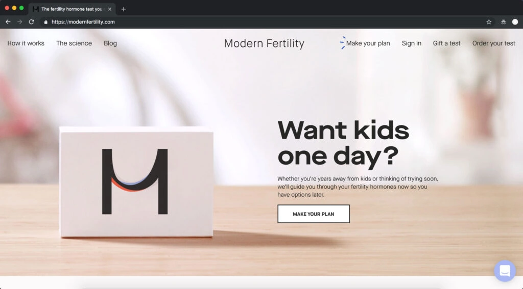
Of course, for a landing page to succeed, it also needs to follow clever design and User Experience (UX) principles. Here are some tips for nailing the visual elements:
Keep the Design Clean & Clutter-Free
Resist the urge to cram tons of information, visuals, CTAs, and navigational extras above the fold. You want a clean, distraction-free design that creates a clear visual hierarchy and path for visitors.
Too many bells, whistles, and sidebars look amateurish and confusing. Keep your layout simple with ample white space to let key elements breathe and catch the eye.
Use Directional Cues & Visual Metaphors
Subtle directional cues like arrows or contrasting coloured sections can instinctively guide visitors' eyes through the page in the ideal flow. Leverage visual metaphors or illustrations creatively to reinforce your core message.
Make Strategic Use of Colour
Your brand's colour palette should be used strategically on landing pages. Bright accent colours can highlight crucial elements like your main CTA button. Just don't go overboard with jarring or clashing shades.
Choose Your Images & Video Wisely
High-resolution imagery, graphics, and video appropriately used are compelling for making connections and demonstrating the benefits of your offer. But lowbrow visuals disjointed from your message can damage credibility.
For maximum persuasion, aim to show your actual product/service in use through accurate product shots, data visualisations, or explainer videos whenever possible.
Prioritise Mobile Responsiveness
With our mobile-first world, every landing page you publish must be optimised for perfect viewing across all device sizes and screen resolutions.
Elements should dynamically resize and reorder themselves for easy thumb interaction. Pay attention to tap targets, font sizes, and load speeds. Test relentlessly.
Landing Page Conversion Rate Optimisation (CRO) Tactics

Speaking of testing, continual Conversion Rate Optimisation through meticulous testing and refinement is a huge part of succeeding with landing pages.
CRO helps squeeze the most bankable results out of every campaign by tweaking individual elements until you've created the highest-converting experience possible. Here are some CRO techniques to try:
A/B Test Relentlessly
Create variation versions of your landing pages by adjusting headlines, body copy, visuals, layouts, CTAs, offers and more.
Then, split traffic evenly between the different versions to see which one statistically resonates best—that's your new control version to beat. Rinse and repeat continually to achieve incremental conversion lifts.
Leverage Targeted Overlays/Pop-ups
Well-timed overlay elements like pop-ups, slide-ins or sticky bars can give that last motivating nudge. They're powerful for resurfacing CTAs or promotions without disrupting the main content.
Try Different Offer/Lead Magnets
Sometimes, all it takes to spike conversions massively is tweaking your incentive or main offer. If your existing offers are falling flat, try:
- New content upgrades
- Time-sensitive deals
- Contests/prize draws
- Bonuses and free tools
- Free trials/samples
- Premium resources
- Coupons and discounts
Bonus CRO Tips:
- Test new headlines, copy styles, button colours
- Adjust form lengths and form field asks
- Add inline videos or GIF product demos
- Employ new urgency and scarcity tactics
- Tweak visual styles (fonts, colours, images)
- Experiment with different layout structures
- Improve page load speeds
- Gather user feedback via polls/surveys
Keep an open mind, track your data, and stay committed to incremental improvements through constant optimisation.
Putting It All Together: Landing Page Examples
Hopefully, by now, you have a solid grasp of all the critical landing page components and best practices to deploy. But what does excellent execution look like? Let's check out a few inspiring examples:
Crazy Egg's Clear Value Proposition
The team at Crazy Egg uses a flawless combination of on-brand illustrations, instantly graspable taglines, smooth animation, and intuitive structure on their main landing page:
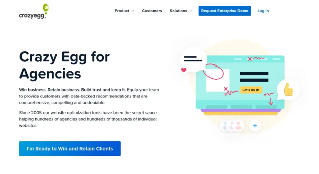
Everything about this page effortlessly communicates its core value proposition while naturally guiding visitors toward the central “Win and Retain Clients” CTA to proceed further into the funnel.
Airbnb's Beautiful Booking Experience
On the other end of the spectrum, check out how clean and immersive this landing experience for booking Airbnb is:

The combination of ample negative space, oversized imagery, and strategic pops of colour does an incredible job highlighting the core search functionality—which is all many visitors need to start browsing unforgettable vacation stays. Bravo.
HubSpot's Smart Lead Capture
Finally, here's a prime example of a nicely executed lead generation landing page from HubSpot:
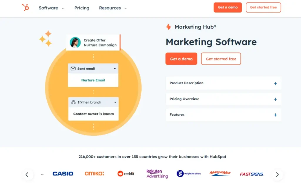
While dense with copy, the intelligent use of section headers, visuals, form positioning, and social proof makes digesting all the information feel effortless. All paths ultimately drive visitors toward the core “Get a Demo” conversion goal cohesively.
Final Thoughts + FAQs
Phew, that was a ton of landing page insights and examples to absorb! I hope you feel fired up and equipped with a solid understanding of what separates lacklustre landing pages from ultra-high-converting ones.
As a quick refresher, some of the essential keys we covered include:
- Incorporating all the critical components like a magnetic headline, persuasive copy, multimedia, social proof, and CTAs
- Optimising the visual/UX design aspects like layout, colours, directional cues, and responsiveness
- Following best practices around conversational copywriting, benefit-focused selling, proven psychological principles, and defining your offer
- Leveraging continual Conversion Rate Optimisation through relentless testing and refinement of different variables
Of course, there's always more to learn as you dive into the nitty-gritty of your landing page campaigns. So, let's wrap up by quickly addressing some frequently asked questions:
How many landing pages should I have?
As many as needed to align with your key marketing campaigns' traffic sources and offer variations. Trying to stuff too many messages into one page dilutes effectiveness. Most businesses need at least a few dedicated landing pages. HubSpot found that companies see a 55% lead boost when total landing pages are increased from 10 to 15.
Can you share any tips on designing signup/lead capture forms?
Keep forms “clean” by only including essential fields visitors need to complete your offer's lead capture requirements. Use in-line form labels or placeholder text rather than separate field titles. Visually break up long forms into multiple steps. Always have a relevant lead captured on the “Thanks!” page upon submission.
What landing page builders or tools do you recommend?
Top landing page tools with visual editors and built-in templates include Unbounce, Instapage, Leadpages, SeedProd, Landingi, Pagewiz, Systeme.io, and Hubspot. But depending on your specific needs, I'd suggest prioritising user-friendliness, mobile responsiveness, form builder features, and integration capabilities.
How long should landing pages be?
There's no one-size-fits-all answer, but effective lengths often align with the offer's complexity. A short lead capture page may only need 200-400 words. At the same time, a long-form sales page could require 2,000+ words of hyper-detailed copy to make a convincing case.
What should conversion rates be for landing pages?
On average, most marketing campaigns see landing page conversion rates of just 2-5%. However, the top 25% of performers typically achieve 5-15% rates. And it's not abnormal for well-optimised lead magnets or product offers to reach 30%+ conversions for savvy landing pages.
How important is organic SEO for landing pages?
Landing pages are primarily direct response assets designed to convert paid traffic sources. So, optimising them heavily for organic search isn't necessarily crucial unless you're investing significant inbound marketing efforts. However, following basic on-page SEO best practices doesn't hurt.
Do you have any last tips on improving landing page copy?
Focus on providing a flawless, conversational experience tailored directly to your target audience's wants and pain points.
Tell real-world stories they can relate to. Ask rhetorical questions that get them nodding along. Speak using the exact words and phrases they'd use—not fancy corporate jargon. And above all else, concentrate on clearly communicating your unique value proposition and irresistible offering.
Final Landing Page Checklist
Before hitting publish on any new landing page, quickly run through this checklist of must-have elements:
[✓] Clear Unique Value Proposition Does the page instantly convey what's being offered and why it's irresistibly valuable?
[✓] Captivating Headline Does the main headline grab attention and compel visitors to keep reading?
[✓] Persuasive Supporting Subheads Do subheads throughout reiterate key benefits and nudge visitors in a logical flow?
[✓] Conversational, Benefit-Rich Body Copy Does the body copy paint a vivid, compelling picture of how this solves visitors' struggles and improves their lives?
[✓] Eye-Catching Visuals/Media Do visuals and multimedia accurately reinforce the offer's core message and benefits?
[✓] Credible Social Proof: Are customer logos, testimonials, stats, guarantees, and other trust indicators leveraged?
[✓] Clear, Standout Call-to-Action
Is there a prominent, unmissable CTA button or element to drive the desired conversion?
[✓] Intuitive UX/Layout: Does the page structure and visual flow feel clean, polished, and effortless to navigate?
[✓] Mobile Optimised: Do all elements resize perfectly and deliver a thumb-friendly experience on all devices?
[✓] Fast Page Speeds Are page load times blindingly fast for an excellent user experience?
Keep this checklist handy when designing landing pages, and you'll be well on your way to crafting a high-converting masterpiece tailored for your business.
Now, get out there and start iterating! Landing page optimisation is both an art and a science—it takes creativity and continual refining to get it right. However, the rewards for businesses that make it a priority are immense.
So, have fun putting these landing page design basics into practice. I wish you the best in creating captivating, revenue-driving experiences that WOW visitors from when they arrive!

This information was eye opening, and clearly outlines the need for thorough planning and detail design aspects for a successful website. Thanks