10 Steps to Creating Landing Pages that Convert
Your landing page has 3 seconds to convince someone to stay or leave forever.
Think about that—three seconds to turn a stranger into your next customer. Three seconds could mean the difference between scaling to 7-figures or watching your business flatline.
I've spent a good amount of time testing landing pages across dozens of industries. I've seen the catastrophic mistakes that kill conversions. But more importantly, I've uncovered the proven elements that turn casual visitors into obsessed buyers.
The harsh truth? Most landing pages are leaving mountains of cash on the table. Your competitors are probably making the same deadly mistakes right now.
But that's good news for you – I'm about to hand you the 10-step framework we use to creating landing pages that consistently convert at 2-3x the industry average.
This isn't a theory. These aren't “best practices” regurgitated from some marketing blog. These are battle-tested principles that have generated hundreds of millions in revenue. And today, I'm giving you the complete playbook.
Ready to turn your landing page into a conversion machine? Let's dive in.
- First Impressions Matter: Your landing page must engage visitors within 3 seconds to convert them into customers.
- Define Your Objective: Clearly outline your conversion goal and align it with your overall business objectives.
- Know Your Audience: Create detailed buyer personas to tailor your messaging and address their pain points effectively.
- Test and Optimise: Use A/B testing to refine your landing page continually and improve conversion rates based on data insights.
- The Importance of High-Converting Landing Pages
- Step 1: Define Your Objective
- Step 2: Know Your Target Audience
- Step 3: Craft a Compelling Headline
- Step 4: Write Persuasive Copy
- Step 5: Design an Effective Call-to-Action (CTA)
- Step 6: Optimise for User Experience (UX)
- Step 7: Use Engaging Visuals
- Step 8: Build Trust with Social Proof
- Step 9: A/B Test and Optimise
- Step 10: Measure Success and Iterate
- Conclusion
The Importance of High-Converting Landing Pages
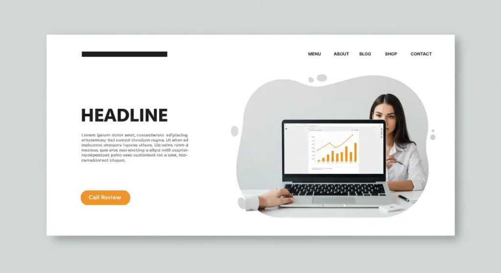
If you're running a business online, you know how essential first impressions are. Think of your landing page as your storefront—it's the first thing potential customers see, and like a shop window, it needs to draw them in. A high-converting landing page isn't just a nice-to-have; it's a must-have.
Let's break it down. Consider this: a minor tweak to your landing page could lead to a remarkable increase in conversions. Just imagine if a 1% increase in conversion rates could translate to thousands of extra sales. That's the power a landing page has.
- Capture Attention: Your landing page should grab attention immediately. You have mere seconds to engage a visitor.
- Clarify Value: You must communicate clearly and concisely what you offer and why it's beneficial.
- Drive Action: Ultimately, the goal is to turn visitors into customers. A compelling call to action can make all the difference.
Remember, every successful business starts with a remarkable landing page. It's where potential customers decide whether to stay or leave.
What to Expect from This Guide
In this guide, we'll ditch the fluff and get straight to the point. You'll discover practical steps to create landing pages that convert visitors into customers.
Here's a sneak peek of what we'll cover:
- Defining your objectives: Understand what you want and how to align it with business goals.
- Target Audience: Learn how to identify and connect with your audience.
- Compelling headlines and persuasive copy: Master writing text that captures attention and builds interest.
- Effective calls-to-action: Create prompts that encourage users to engage.
- Optimising user experience: Ensure your landing page is quick and user-friendly.
Are you ready to turn your landing page from another webpage into a powerhouse of conversions? Let's dive in!
Step 1: Define Your Objective
Understanding Your Conversion Goal
Before you start designing your landing page, let's hit the brakes momentarily. You need to determine your conversion goal. Without a clear objective, your landing page will be like a ship without a rudder—aimless and likely to drift away.
Ask yourself:
- What do you want visitors to do? Do you want them to sign up for a newsletter, download an e-book, or make a purchase? This is your primary conversion goal.
- What does success look like? Define what conversion means for your business. Is it a certain number of signups or sales within a month?
I once worked with a client who thought getting many visitors was the key. Instead, we focused on quality leads. By zeroing in on their conversion goal—growing their email list—they saw a 50% increase in subscriptions in just a month!
Aligning the Page Purpose with Business Goals
Now that you've got a solid grip on your conversion goal, it's time to ensure that the page's purpose aligns with your overall business objectives. This step is crucial!
Imagine you're a fitness coach selling personalised training plans. Your landing page's purpose should be to inform and compel potential clients to take action, like signing up for a consultation.
Here's how to align everything:
- List Your Business Goals: Identify your larger objectives (e.g., increase revenue, grow your brand presence, or improve customer retention).
- Match Landing Page Goals: Ensure your landing page has a singular focus that supports these business goals. For instance, if your goal is to boost revenue, your landing page should highlight a limited-time offer that encourages immediate action.
- Consistent Messaging: Your page should reflect your brand's values and voice. If your brand is about fun and expertise, your landing page should radiate those qualities.
By aligning your landing page purpose with your business goals, you create a focused direction that guides potential customers right where you want them—taking action! Ready to move on to the next step? Let's keep this momentum going!
Step 2: Know Your Target Audience

Creating Detailed Buyer Personas
Now that you've defined your objective let's talk about your audience. You wouldn't try to sell ice to an Eskimo, would you? Understanding your target audience is where the magic begins. The best way to do this is through detailed buyer personas.
Here's how to create them:
- Demographics: Start with the basics. Gather information about age, gender, location, and education level.
- Psychographics: Dig deeper into their interests, behaviours, and values. What are their hobbies? What keeps them up at night?
- Pain Points: Identify their challenges. What problems can your product or service solve?
- Buying Behaviour: Understand how they make purchase decisions. Do they prefer online shopping or brick-and-mortar stores?
I once designed a landing page for an e-commerce client. After creating detailed buyer personas, we discovered that many of their audience were young parents facing time constraints. We tailored the landing page messaging to emphasise convenience and quick solutions.
Tailoring Messages to Audience Needs
With your buyer personas in hand, it's time to tailor your messages to meet their needs. The key here is relatability. When your audience feels you understand them, they're more likely to engage.
Here's how to craft messages that resonate:
- Speak Their Language: Use terminology and expressions familiar to your audience. You want to sound like a friend, not a robot.
- Address Pain Points: Clearly articulate how your offering solves their problems. If they're time-poor, highlight features that save them time.
- Benefits Over Features: Focus on what's in it for them. Instead of just listing features, show how these features improve their lives.
For example, don't just describe the fabric if you're selling workout gear. Instead, talk about how it helps users stay comfortable while crushing their fitness goals!
By knowing your target audience and tailoring your messages, you're setting the stage for an engaging landing page that speaks directly to your potential customers. Ready to pull them in with compelling headlines? Let's rock the next step!
Step 3: Craft a Compelling Headline
Grabbing Attention Instantly
You've done the groundwork—defined your objectives and got to know your audience. Now, it's time to create a headline. A compelling headline is like a baited hook, drawing your audience in and making them eager to discover more.
Let's get into how to grab attention instantly:
- Be Bold: Use strong, impactful words. “Transform Your Fitness Routine” is much more inviting than “Fitness Tips.”
- Pose a Question: Asking questions creates engagement. “Ready to Take Control of Your Health?” makes people reflect and relate.
- Use Numbers: Headlines that include numbers grab attention quickly. “5 Secrets to Boost Your Productivity” is more enticing because it promises specific, digestible information.
I remember crafting a landing page for an online course. The initial headline was too generic. After a creative brainstorming session, we shifted to “Unlock Your Potential: Master Time Management in Just 4 Weeks!” and saw a significant uptick in click-through rates.
Communicating Value Clearly and Concisely
Once you've caught their eye, deliver value with clarity. Your headline must communicate what's in it for them while being brief. Make sure every word counts:
- Highlight Benefits: Focus on what the reader gains. “Double Your Sales in 30 Days!” gives a clear, attractive promise.
- Clarity is Key: Avoid jargon and complicated phrases. A simple, straightforward headline, like “Get Fit Without the Gym,” speaks directly to the point.
- Create Urgency: Incorporate time-sensitive phrases like “Limited Time Offer” or “Act Fast!” to encourage immediate action.
Take a tip from successful businesses: they often A/B test different headlines to see what resonates best with their audience. Try it! Your audience may respond better to one phrase than another.
A well-crafted headline is your landing page's first impression—make it a good one! With your attention-grabbing headline in place, you're one step closer to drawing visitors deeper into your message. Ready to write persuasive copy that seals the deal? Let's move on to the next step!
Step 4: Write Persuasive Copy
Addressing Pain Points and Solutions
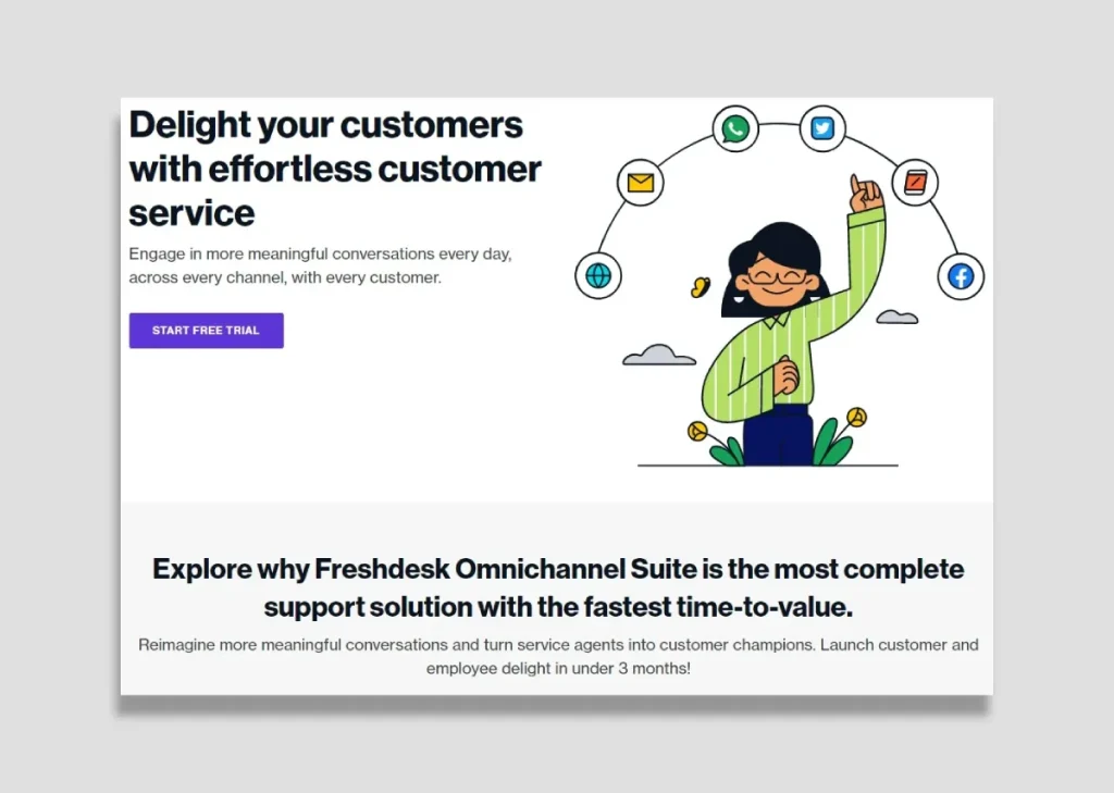
With your compelling headline ready to roll, it's time to dive into your landing page copy. This is where you truly connect with your readers by addressing their pain points and providing valuable solutions.
The first step is to empathise with your audience. Identify their struggles and show that you understand them. Here's how:
- Identify Common Pain Points: Use buyer personas to pinpoint your audience's issues.
- Speak Directly to Them: Phrases like “Are you tired of feeling overwhelmed by your workload?” instantly resonate and draw readers in.
- Present Your Solution: Once you've highlighted their challenges, swiftly transition to how your product or service provides the remedy. With our innovative time management tools, you can easily conquer your tasks!
I've had clients who initially focused too much on features rather than the benefits. We noticed engagement levels soared by shifting our approach to first acknowledge their pain points. Readers felt seen and were eager to learn more about our solutions.
Using Persuasive Language and Social Proof
Now that you've captured their pain points and laid out your solutions, it's time to enhance your copy with persuasive language. This isn't about flashy words; it's about genuine connection and motivation.
- Create Visual Imagery: Use descriptive and relatable language. Instead of saying, “Our software is useful,” try “Imagine breezing through tasks, feeling accomplished as you check off each item on your to-do list.”
- Incorporate Social Proof: Include satisfied customer testimonials, ratings, or case studies. For instance, “Join the 1,000+ users who've transformed their productivity with us!” This builds trust.
- Call to Action: End your persuasive copy with a strong call to action. “Start your free trial today and experience the change yourself!”
Your landing page becomes a powerful tool by addressing your audience's pain points, offering straightforward solutions, and utilising persuasive language alongside social proof. It compels readers to take the next step without hesitation.
The groundwork is laid! You've created the right messaging. Next, design a compelling call-to-action that seals the deal and leads your audience confidently to convert!
Step 5: Design an Effective Call-to-Action (CTA)
Creating a Clear and Actionable CTA
Having crafted compelling copy, you're now at the crucial stage of guiding your audience towards action. The call-to-action (CTA) is your final push to transform interest into conversion. All your hard work could go to waste if unclear or weak.
Here's how to create a clear and actionable CTA:
- Be Direct: Use concise and strong language. Instead of “Learn More,” say “Start Your Free Trial Today!”
- Focus on Benefits: Paint a picture of what they'll get. “Get Instant Access to Exclusive Content” communicates value and urgency.
- Keep It Short: A few well-chosen words should suffice. Your CTA should be easy to digest in seconds.
The initial CTA was long and generic when I worked on a SaaS product launch. After testing multiple options, “Book a Demo” proved far more effective. It spoke directly to the audience's desire for personal engagement and clarity.
Using Colour and Placement Strategically
Design isn't just about pretty visuals; it's about functionality, too. The strategic use of colour and placement can significantly influence how compelling your CTA is.
- Choose Contrasting Colours: Make your CTA stand out against the rest of the page. If your landing page uses muted tones, a bright button like bright green or orange can draw the eye. Just ensure it fits your overall branding.
- Optimal Placement: Position your CTA where it naturally follows the flow of the content. Placing it near persuasive statements or before crucial information helps capture attention before they leave. Consider a sticky CTA that stays in view as users scroll.
- Whitespace Matters: Surround your CTA with enough whitespace so it doesn't feel cluttered. This provides visual breathing space, allowing the CTA to grab attention without distractions.
With a clear and actionable CTA that's visually appealing and strategically placed, you're well on your way to converting visitors into customers. Next up is the need for a seamless user experience. Let's optimise for UX to ensure they convert effortlessly!
Step 6: Optimise for User Experience (UX)
Ensuring Fast Loading Times
Now that you've established a compelling CTA let's talk about user experience (UX). A fantastic landing page with great content can fall flat if it isn't user-friendly. First and foremost, you need to ensure fast loading times. If your page takes too long to load, you could lose potential customers before they even see your brilliance!
Here's how to optimise load times:
- Compress Images: Large images can slow down your page significantly. Use tools to compress images without losing quality; this will speed things up.
- Minimise HTTP Requests: The more elements on your page, the longer it takes to load. Streamline what's essential—fewer scripts, stylesheets, and images can make a big difference.
- Use a Content Delivery Network (CDN): CDNs distribute your content across various servers globally, making it faster for users to access. It's like having your content available at multiple kiosks across the world!
I once helped a client whose landing page was slow. After streamlining their images and content, we watched their bounce rate drop dramatically, leading to increased conversions.
Designing for Mobile Responsiveness
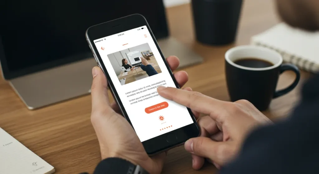
Next, let's ensure your landing page design is mobile responsive. With over half of web traffic from mobile devices, your page must look and function beautifully on smartphones and tablets.
Here are some tips for mobile optimisation:
- Responsive Design: Use a responsive design framework that adjusts your layout for different screen sizes. This creates a cohesive experience no matter the device.
- Simplify Navigation: Mobile users appreciate straightforward navigation. Make buttons more prominent and easier to tap and simplify your menu structure.
- Test for User Experience: Constantly test the mobile version of your landing page. Check elements on varying devices to ensure there are no glitches.
We saw a significant drop in mobile conversions when I initially overlooked mobile responsiveness for a recent project. Upon revising the layout for mobile users, we witnessed a sharp uptick in engagement!
You'll provide your audience an enjoyable user experience by prioritising fast loading times and ensuring mobile responsiveness. This sets the stage for higher conversions. Next, let's add some visual flair that engages visitors even more!
Step 7: Use Engaging Visuals
High-Quality Images and Videos
Now that your landing page is optimised for an excellent user experience let's dive into a crucial aspect of capturing attention: visuals. Engaging visuals plays a vital role in your landing page's effectiveness. They can often convey messages faster than words, making a lasting impression on your visitors.
Here's how to incorporate high-quality images and videos:
- Use Professional Imagery: Invest in high-quality images that reflect your brand. Avoid cheesy stock photos that feel out of place. Authentic visuals connect better with your audience.
- Incorporate Videos: Short, engaging videos can explain complex ideas quickly. A well-placed video can increase conversions significantly. A landing page I worked on featured a brief explainer video showcasing how the product works, instantly boosting engagement and significantly improving conversion rates.
- Showcase Products: If you're selling a product, use multiple images from different angles. Include lifestyle images that show the product in action, helping users envision themselves using it.
Visual Hierarchy and White Space Usage
Equally important is how you present these visuals. Implementing a clear visual hierarchy guides visitors' eyes naturally throughout the page.
Here's how to do it effectively:
- Prioritise Information: Make the most critical elements stand out. Use larger fonts or bold texts for headings and essential info. Your CTA should always be prominently placed to draw attention.
- Utilise White Space: Don't be afraid of using white space. Clutter can overwhelm users, making them feel lost. Sufficient white space around visuals and text allows for better focus and clarity.
- Stay Consistent: Ensure your visuals fit your brand's colour palette and style. Consistency helps build trust and recognisability.
In one of my projects, we introduced more white space around CTAs and key messages. The result was astonishing—conversion rates climbed simply because users felt less overwhelmed and more at ease while browsing.
By utilising engaging visuals, leveraging high-quality images and videos, and applying effective visual hierarchy with white space, you're creating a landing page that captivates and compels visitors to convert. With this foundation set, it's time to build trust with social proof and testimonials! Let's get into that next!
Step 8: Build Trust with Social Proof
Customer Testimonials and Reviews
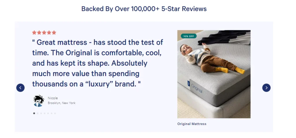
With your visually engaging landing page ready, it's vital to instil trust into your potential customers. One of the most potent ways to do this is through social proof. When visitors see that others have had positive experiences, they're more likely to feel confident taking the plunge.
Start with customer testimonials:
- Feature Authentic Stories: Collect genuine feedback from satisfied customers. Short snippets can be powerful. Instead of lengthy essays, opt for concise, impactful quotes like, “This product changed my life!” followed by the customer's name and photo (if possible).
- Diversify Testimonials: Display testimonials from different types of users to appeal to various audience segments. One happy teacher using your educational software and another satisfied parent will resonate with other visitors.
- Promote User-Generated Content: Encourage customers to share their experiences on social media. You can showcase this content on your landing page, adding authenticity and relatability.
I once worked with a startup that integrated testimonials into their landing page design. After moving quotes higher up and adding images, they experienced a 30% increase in conversions. It's clear evidence that trust matters!
Trust Badges and Case Studies
Beyond testimonials, trust badges and case studies are essential social proof elements. This gives visitors more confidence that they are making the right decision.
Here's how to leverage them:
- Add Trust Badges: Include logos from secure payment providers, industry associations, or awards your company has received. These badges show that you're a credible player in your field.
- Showcase Case Studies: Select a few standout customer stories demonstrating how your product or service has impacted significantly. Highlight specific results or benefits that users have experienced. This gives potential customers clear evidence of what they can expect.
By effectively incorporating customer testimonials, reviews, trust badges, and detailed case studies into your landing page, you'll help eliminate hesitation and encourage visitors to convert.
With trust established, your landing page is truly ready for success! Next up is all about optimisation through A/B testing. Let's explore how to refine your page further!
Step 9: A/B Test and Optimise
Identifying Key Elements to Test
Now that you've built a trusted landing page, it's time to put it to the test. A/B or split testing is one of the best ways to understand what works best for your audience. It's about making data-driven decisions to improve your conversion rates.
Start by identifying key elements to test:
- Headlines: Small changes in your headline can lead to significant results. Experiment with wording, phrasing, or length to see what resonates best.
- Calls to Action (CTAs): Test colour, text, and placement variations. For example, changing “Start Your Free Trial” to “Try It Free Today” may work wonders.
- Images vs. Videos: Does your audience engage more with pictures or prefer a short, captivating video? Test both to see which format drives better results.
- Content Layout: Try altering the layout—such as moving the testimonials section up or down the page. Sometimes, how information is presented can make a considerable difference.
When I worked on a product launch, we tested two versions of a landing page—one focusing on a bold headline and another on social proof. The one with social proof significantly outperformed the other, leading us to adjust our strategy accordingly.
Analysing Results and Implementing Changes
Once you've conducted your A/B tests, it's time to analyse the results and make informed decisions:
- Use Analytics Tools: Tools like Google Analytics or dedicated A/B testing platforms provide in-depth insights. Look at metrics like conversion rates, bounce rates, and time on the page.
- Statistical Significance: Ensure that your results are statistically significant. Waiting for a substantial sample size can prevent you from jumping to conclusions based on minimal data.
- Implement the Winner: Once you determine which version performed better, update your landing page accordingly. But the analysis doesn't end here—continue to test and iterate.
By embracing A/B testing and following a systematic approach to analysing results, you create a chamber for continuous improvement. This ensures your landing page evolves alongside your audience, responding to their preferences and leading to even higher conversion rates.
With testing and optimisation on your side, it's time to measure success and keep refining your approach! Let's dive into the final step!
Step 10: Measure Success and Iterate
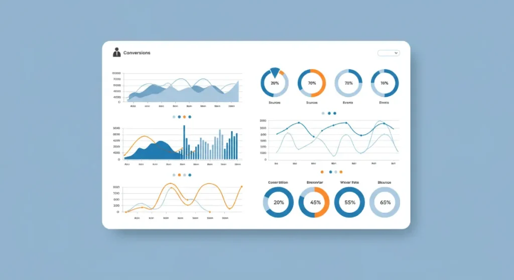
Setting Up Conversion Tracking
Congratulations! You've built and optimised an impressive landing page. Now, it's time to measure its success. Understanding how well your page performs is crucial for continued growth and refinement.
First up, you need to set up conversion tracking:
- Choose Your Goals: Identify what conversions mean for you. Is it signing up for a newsletter, purchasing, or filling out a contact form? Clearly define these goals in your analytics tools.
- Use Analytics Tools: Google Analytics is a fantastic resource for tracking conversions. Set up Goals in Google Analytics to monitor these key actions. For example, if a goal is to increase signups, you can track how many visitors complete that signup form.
- Add Tracking Codes: If you use paid advertising or social media, implement UTM parameters in your links. This allows you to see which sources and campaigns drive the most conversions.
In a past project, I introduced conversion tracking for an email signup page. We tracked user interactions and discovered many visitors dropped off before submitting the form. With this insight, we optimised the form layout and increased conversions by 40%!
Using Analytics to Improve Continuously
Once you have conversion tracking in place, the real magic happens when you start analysing the data and iterating on your strategy:
- Monitor Key Metrics: Monitor conversion rates, bounce rates, and content engagement metrics. These numbers tell a story about how your audience interacts with your page.
- Identify Areas for Improvement: Look for patterns or red flags in your data. If you see a high bounce rate, investigate which elements might be causing visitors to leave. Is your message clear? Is navigation intuitive?
- Iterate Based on Data: Take action based on your insights. Adjust headlines, tweak CTAs, or even redesign sections that are underperforming. Continuous testing and applying your learning will keep your landing page fresh and compelling.
By setting up conversion tracking and leveraging analytics, you're not just looking at numbers; you're gaining a roadmap for ongoing improvement.
Remember, the digital landscape changes rapidly. Regularly measuring success and iterating your approach ensures your landing page remains relevant and continues to deliver results. You're now fully equipped to create high-converting landing pages and leave a lasting impact. Happy converting!
Conclusion
You've learned how to define objectives, understand your target audience, create compelling headlines, and more. Each step builds upon the last, setting a firm foundation for driving conversions.
Your Roadmap to Success
Think of your landing page as a living entity. It's not just a static webpage; it's a powerful tool that requires continuous refinement and attention to detail.
- Start with Clear Objectives: Establish what success looks like for you from the outset. What actions do you want your visitors to take?
- Know Your Audience: The more you understand your visitors, the better you can tailor your messaging to meet their needs.
- Engage with Visuals and Social Proof: Compelling visuals, honest testimonials, and user-generated content create a connection and build trust.
These principles set you up to creating landing pages that attract visitors and convert them into customers.
Keep the Momentum Going
Remember, the digital landscape is continuously evolving. A successful landing page today may need adjustments to stay relevant tomorrow. Embrace A/B testing and analytics as your guiding stars. Measure your results regularly and iterate based on what the data tells you.
For example, I once had a client see a drastic improvement in conversion rates after introducing changes based on user feedback gathered through surveys on their landing page. Listening to your audience can ultimately point you in the right direction.
As you create high-converting landing pages, remember that every small change can lead to significant results. Stay curious, be bold with your experiments, and listen to your audience.
With these strategies, you're well on delivering a seamless experience that resonates and converts. Let's put this knowledge into action and watch your conversions soar! Now, get on creating landing pages that convert today!

