
User Experience Design (UX): What It Is, and Why Corporate UX Fails
A prospect vetting your firm forms a judgement about your competence in roughly the time it takes a page to load and one link to be clicked.
Not from your case studies. From whether the experience felt considered or improvised.
Nielsen Norman Group has spent decades documenting that users decide whether to trust or abandon a digital experience in seconds, long before they read a word of your positioning.
For a firm charging premium fees on the promise of good judgement, that is the whole game — which is exactly why web design is important to how much a buyer is willing to pay you.
Most guides to user experience design are written for people who want to become UX designers.
This one is written for the person deciding whether the UX being built for their firm is any good, and what it is quietly costing them if it isn’t.
That is a different problem, and it has a different answer.
- User experience design manages ambiguity across the whole journey, creating certainty prospects read as competence and protecting the fee a buyer will pay.
- A component library standardises appearance; a decision system standardises how choices are made and prevents inconsistent answers that signal risk.
- Research and measurable metrics must drive decisions; design without user evidence is guesswork that leaves enquiry leaks and reduces conversion and fees.
What Is User Experience Design?

User experience design is the practice of shaping every interaction a person has with a product, service, or brand so that acting on it is clear, usable, and low-risk.
It covers the entire journey — from the first search result to the enquiry form and beyond — not only the visual surface.
Its purpose is to remove friction and ambiguity between what a person wants to do and their ability to do it.
- User experience design governs the whole path a person takes, not a single screen or the appearance of buttons.
- User experience design is evidence-led: decisions are meant to follow from observed behaviour, not internal preference.
- User experience design is measured by whether people can act without confusion, not by whether the interface is admired.
User experience design is the practice of shaping every interaction a person has with a product or service so it is clear, usable, and low-risk to act on.
Why User Experience Design Matters for Firm Leaders Mid-Rebrand
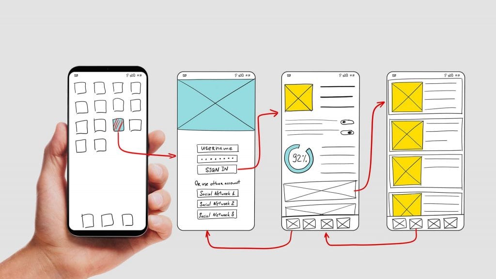
For a professional-services firm, the website is not a brochure — it is the first working demonstration of how the firm thinks.
A prospect who finds the fee structure ambiguous, the navigation guess-work, or the enquiry path uncertain does not conclude “poor website.”
They conclude “unclear firm,” and unclear reads as risk.
In a high-consideration purchase, perceived risk is the single biggest suppressor of the fee a buyer will accept.
This is where the commercial stakes become concrete.
According to the UXCam research roundup, only 55% of companies currently conduct user experience research at all — meaning nearly half are designing the most-scrutinised asset of their brand on assumption.
For a firm charging £300 an hour on the strength of its judgement, shipping a website built on guesswork is a positioning contradiction the buyer feels even if they can’t name it.
A rebrand is the one moment you get to correct that deliberately.
Waste it on a repaint, and you’ve spent the budget without moving the number that matters — the fee a client will pay without flinching.
“A professional-services firm does not sell websites, and its buyers do not evaluate websites. They evaluate whether the experience of dealing with your firm feels certain. User experience design is the discipline that manufactures that certainty — or, done badly, manufactures the doubt that makes a prospect choose the cheaper, clearer competitor instead.”
The Anatomy of User Experience Design
User experience design breaks into working parts that build on each other in sequence.
Each part answers a question the previous one raised, and the order is load-bearing: skip research and every later decision is a guess wearing the costume of a decision.
Research: Deciding on Evidence Instead of Opinion
Research is the part that establishes what real users actually do, rather than what the firm assumes they do.
It replaces the highest-paid person’s opinion with observed behaviour — interviews, usability testing, and analysis of how people move through the current experience.
The UXCam roundup reports that 43% of organisations have no process for making UX decisions based on user feedback, which means the research, even where it happens, often changes nothing.
Research without a decision process attached is theatre.
The output of good research is not a report; it is a set of decisions the firm is now committed to.
Information Architecture: Removing Ambiguity From Structure
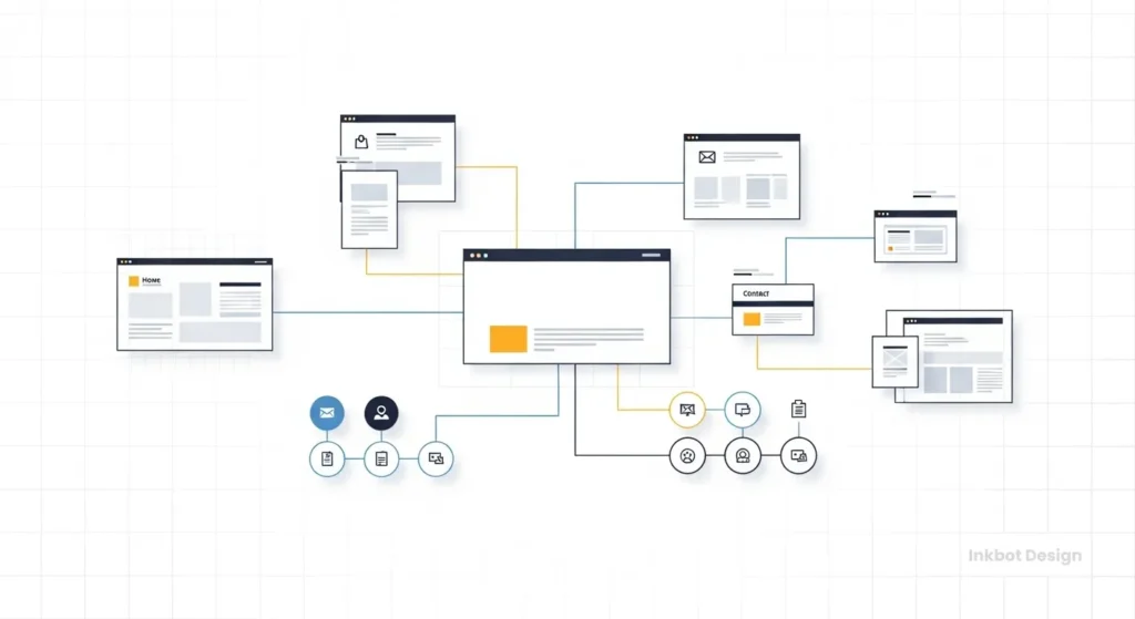
Information architecture is how content and pathways are organised so a person always knows where they are and where to go next.
For a firm with multiple service lines — say a practice offering tax, audit, and advisory — the architecture decides whether a prospect for advisory can find the advisory proof in one move or three.
Every extra move is a point where ambiguity enters and confidence leaks.
The measure of good information architecture is not tidiness; it is that a stranger with a specific need reaches the relevant proof without having to think about the structure at all.
Interaction and Interface: Where Psychology Does the Work
Interaction design governs what happens when a person acts — what a click does, how the system responds, whether the next step is obvious.
This is where interface psychology operates: reducing the cognitive load a person must spend to make progress.
A prospect deciding whether to enquire is already carrying the risk of a high-value decision; an interface that adds even small uncertainties — an unclear form, an unlabelled next step — stacks doubt onto a decision that was already effortful.
The interface’s job is to make the low-risk read of your firm the easy one.
This is closely tied to the broader principles behind effective website design, where clarity and predictability are the working currency.
Measurement: Proving the Experience Works
Measurement is how the firm knows whether any of the above is succeeding, using behaviour rather than approval.
According to the UXCam roundup, organisations gauge UX success mainly through customer satisfaction (63%), sales retention (60%), and product or site analytics (50%) — which tells you what to watch, but not whether you are acting on it.
For a firm, the honest measure is narrower: are qualified prospects reaching the enquiry point and completing it, or are they leaving at an identifiable step?
A measurement layer that names the leak is worth more than one that produces a satisfied dashboard.
Where Firm Leaders Get User Experience Design Wrong
The most common misunderstanding is treating user experience design as a visual upgrade — a nicer-looking version of the same thing.
Under that belief, a rebrand becomes a repaint: new colours, new type, the same underlying confusion.
The prospect still can’t tell your three service lines apart and still can’t find the fee logic. Nothing that suppressed the fee has moved.
The correction is to see user experience design as the management of ambiguity, not the management of appearance.
In 17 years of brand work, the pattern I see most often is a firm that has invested heavily in how the site looks and not at all in whether a stranger can act on it without help.
A second, quieter error belongs to larger firms: assuming that hiring good designers guarantees good UX. It doesn’t, and the reason is the subject of the next section.
A Worked Example: Diagnosing a Three-Service Firm’s Enquiry Leak
Take a 90-person firm running tax, audit, and advisory, mid-rebrand, wanting the new site to lift advisory enquiries specifically.
The instinct is to commission a visually stronger site.
The user-experience-led approach starts elsewhere: with the question of where advisory prospects currently drop out.
Research first establishes that advisory prospects arrive via specific search terms but land on a generic services page that forces them to self-sort — the first point of ambiguity.
Information architecture is then redrawn so advisory has its own clear pathway with its own proof, removing the self-sort.
Interaction design makes the advisory enquiry a single obvious next step rather than a shared contact form that treats a £50k advisory prospect identically to a general query.
Measurement is set to watch one number: advisory enquiries reaching completion.
At no point does “make it look better” appear as a step. The visual work still happens — but it happens in service of removing ambiguity, not in place of it.
That is the difference between design as decoration and design as a decision system, and it is why understanding the full website design process matters more than choosing a colour palette.
A firm approaching a website redesign as a strategic exercise rather than a cosmetic one is already asking the right question.
The Sharper Way to Think About This: A Decision System, Not a Component Library

Here is the reframe that separates firms that get a return from their rebrand and those that don’t.
The prevailing view — held by intelligent, experienced people for good reasons — is that mature UX means a robust design system: a library of consistent components so everything looks unified and ships faster.
That belief is sensible.
Consistency genuinely matters, and component reuse genuinely speeds delivery.
But it stops one level too early.
Figma’s 2026 material on design systems describes organisations now using systems to scale offerings, improve customer retention and loyalty, expand globally, and even measure revenue growth — which is to say, the strongest teams have moved the design system from a hygiene tool to a business instrument.
Nielsen Norman Group’s 2025 “UX Reset” pushes the same direction from the other side, arguing that teams should build deeper UX capability and use tools to deliver genuine user value rather than lean on toolkits as if the toolkit were the strategy.
Read together, these point at one conclusion.
A component library standardises what things look like. A decision system standardises how choices get made — what evidence a decision requires, who resolves a disagreement, how a proposed change is judged against user behaviour.
The reason corporate UX fails is rarely a shortage of talented designers; the UXCam data shows most organisations lack the decision infrastructure, not the design skill — only 13% have a UX leader in the C-suite, and 43% have no process to decide on user feedback.
Talent without a decision system produces beautiful inconsistency at scale.
For a professional-services firm, this lands with unusual force. Interface psychology in a corporate environment is, at bottom, about reducing ambiguity at scale — and ambiguity is exactly what a component library cannot fix, because inconsistency of decision survives perfect consistency of component.
Three partners can each approve a different answer to the same question using the identical button.
The buyer meets the contradiction, reads it as risk, and adjusts your fee down accordingly.
“Stop asking whether your design system looks consistent. Ask whether it decides consistently. A component library guarantees your buttons match; a decision system guarantees your firm gives a stranger one clear answer instead of three plausible ones. In a high-trust purchase, the second thing is what protects your fee — and it is the thing almost no one is actually building.”
Brief your rebrand not around a component library but around the decisions the system must make consistently — what a prospect should always be able to find, in how many moves, with what proof, resolved by whom. Judge the resulting UX on whether a stranger reaches the right answer without help, not on whether the components match.
Where User Experience Design Stands Now
User experience design in 2026 has moved decisively from a craft discussion into a business one.
Figma’s 2026 design-systems position frames mature systems as instruments for scaling offerings, improving retention and loyalty, expanding into new markets, and measuring revenue growth — a marked shift from the older framing of systems as component reuse for its own sake.
The centre of gravity has moved to adoption, governance, and business outcomes rather than the library itself.
The market data reinforces that the discipline is not contracting but reorganising under pressure. One 2025–2026 market projection has the global UX services market growing from USD 8.80 billion in 2026 to USD 77.18 billion by 2034 — a forecast, and to be read as one, but a clear signal that organisations are still increasing UX spend rather than retreating from it.
At the same time, MeasuringU’s 2025 UX job-market report found 70% of respondents planned to hire at least one UX role in 2025 while 35% reported staff losses — a market still hiring, but restructuring as it does.
The through-line for a firm leader is this: the strongest voices in the field have stopped treating UX as a toolkit problem.
Nielsen Norman Group’s 2025 “UX Reset” is explicit that leaning on toolkits is not a strategy and that the real work is deeper capability aimed at genuine user value.
For a firm commissioning a rebrand in 2026, the practical read is that buying a good-looking system is no longer the frontier — building one that decides well is.
That reframing is the difference between UX as expense and UX as an asset that holds its value the way a well-run website’s cost is judged against what it returns, not what it costs.
Two Objections a Firm Leader Will Raise

“This sounds like a large-company problem. We’re 90 people.”
It is more acute at 90 people, not less. A large company can absorb inconsistency behind sheer volume and brand recognition. A mid-sized firm competing on judgement cannot — every ambiguity is a larger share of the total impression a prospect forms.
The decision-system discipline scales down cleanly: for a smaller firm it may be a one-page set of rules about what a prospect must always find and who resolves disputes, not a governance department.
“We already spent on a redesign two years ago. Why would this be different?”
Because a redesign optimised for appearance leaves the decision layer untouched, which is why the enquiry problem usually survives it. If qualified prospects are still leaving at an identifiable step, the previous spend bought a better-looking version of the same ambiguity.
The test is simple and worth running before spending again: can a stranger with a specific need reach the right proof and act on it without having to think about your structure? If not, no amount of visual polish has fixed the thing that suppresses your fee.
The Verdict
The firms that get a commercial return from a rebrand are not the ones that hired the best-looking design.
They are the ones that treated user experience design as the management of ambiguity — building a system that decides consistently, not merely one that looks consistent.
That is the claim this guide has substantiated: a component library standardises appearance, a decision system standardises judgement, and only the second one moves the number a firm leader actually cares about, which is the fee a buyer will pay without hesitation.
The evidence points one way. Nielsen Norman Group’s 2025 position that toolkits are not a strategy, Figma’s 2026 framing of systems as business instruments, and the UXCam finding that 43% of organisations have no process for deciding on user feedback all describe the same gap: the problem is decision infrastructure, not design talent.
For a professional-services firm mid-rebrand, that gap is also the opportunity, because closing it is what removes the ambiguity a prospect reads as risk.
So do this before you approve a single visual: identify the one enquiry path that matters most, and find the exact step where a qualified prospect currently has to guess.
That step is where your fee is leaking.
If you want that step named precisely — where your brand is losing commercial ground and what to do about it — request a free Brand Equity Audit™.
It is a written diagnostic, delivered in 48 hours, no sales call. The rest of the rebrand is easier once you know exactly where the ambiguity lives.
This topic is one facet of the broader discipline of web design services for professional-services firms.
FAQs
What is user experience design in simple terms?
User experience design is the practice of shaping every interaction a person has with a product, service, or brand so acting on it is clear and low-risk. It covers the whole journey — from first search result to enquiry — not only the visual appearance of a screen.
How is user experience design different from UI design?
User experience design governs the entire journey and whether a person can act without confusion. UI design governs the visual surface — the buttons, type, and layout of individual screens. UI is one input to UX; strong visuals cannot rescue an experience built on unclear structure.
Why does user experience design matter for a professional services firm?
Because the website is the first working demonstration of how the firm thinks. A prospect who finds the experience ambiguous reads that ambiguity as risk, and in a high-value purchase, perceived risk directly suppresses the fee a buyer will accept without hesitation.
What’s the difference between a design system and a component library?
A component library standardises what things look like — reusable buttons, colours, and layouts. A design system, done properly, standardises how decisions get made: what evidence a change requires and who resolves disagreements. The second is what actually reduces ambiguity at scale.
Is it true that most companies design without research?
Yes — the UXCam research roundup reports only 55% of companies currently conduct user experience research, meaning nearly half design on assumption. For a firm selling judgement, shipping its most-scrutinised asset on guesswork is a positioning contradiction that buyers feel even when they can’t name it.
Why do enterprise UX projects fail?
Enterprise UX usually fails from a missing decision system, not a talent shortage. The UXCam data shows 43% of organisations have no process for deciding on user feedback and only 13% have a UX leader in the C-suite. Talented designers without decision infrastructure produce consistent-looking, inconsistent-deciding experiences.
How do I know if my agency’s UX work is any good?
Test whether a stranger with a specific need can reach the relevant proof and act on it without having to think about your site’s structure. Good user experience design is invisible in exactly that way. If people leave at an identifiable step, the work has not done its job.
When should a firm invest in user experience design?
When commissioning a rebrand, when qualified enquiries are leaking at an identifiable step, or when service lines have grown and prospects can no longer self-sort easily. A rebrand is the highest-leverage moment, because the decision layer can be rebuilt deliberately rather than patched.
Does a better-looking website improve user experience?
No — appearance and experience are different layers. A better-looking site with the same unclear structure leaves every source of ambiguity in place. Visual improvement helps only when it serves the removal of confusion; on its own it repaints the problem without moving it.
How is user experience design measured?
User experience design is measured by behaviour, not approval. The UXCam roundup finds organisations use customer satisfaction (63%), sales retention (60%), and site analytics (50%). For a firm, the sharpest measure is narrower: whether qualified prospects reach the enquiry point and complete it, or leave at a nameable step.
What is interface psychology in a corporate context?
Interface psychology in a corporate context is the practice of reducing the mental effort and uncertainty a person spends to make progress. At scale, its core job is reducing ambiguity — because every unclear step adds cognitive load to a decision that, for a high-value buyer, was already effortful and risk-laden.
Is user experience design a growing field in 2026?
Yes — one 2025–2026 market projection has the global UX services market growing from USD 8.80 billion in 2026 to USD 77.18 billion by 2034, and MeasuringU’s 2025 report found 70% of respondents planned to hire at least one UX role. The field is expanding while reorganising under pressure.
