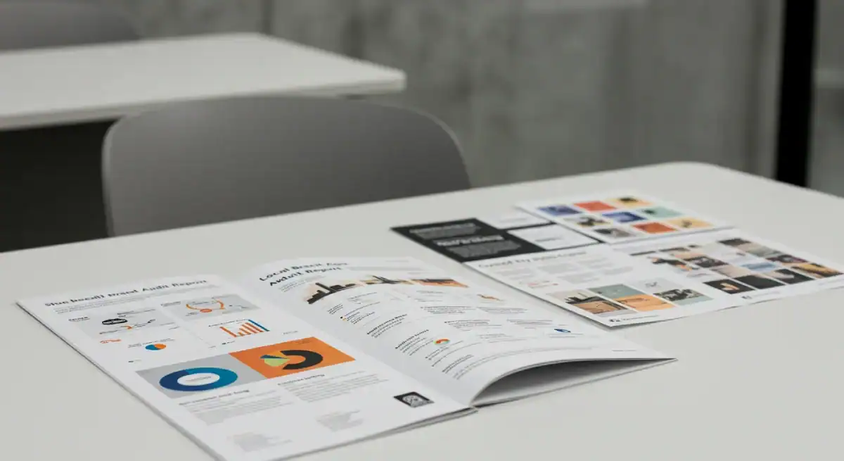
Brand Equity Audit™
Your Brand is Leaking Revenue. We’ll Show You Exactly Where the Holes Are.
94% of B2B brands are becoming invisible to the AI-driven algorithms because of “Strategic Drift.” If your brand feels like a relic of 2023, you aren't just losing clicks—you’re losing authority. Inkbot Design provides the High-Stakes Brand Equity Audit™: a surgical, deep-tissue analysis of your visual, verbal, and semantic DNA designed to turn “invisible” into “indispensable” and drive 3x qualified leads in 90 days.

THE SILENT ROT
Is Your Brand Dying in the “Sea of Sameness”?
The average B2B buyer is bombarded with 4,000+ AI-generated touchpoints a day. Most of it is junk. If your brand doesn’t “snap” into focus within 0.05 seconds, you haven't just lost a lead—you've funded your competitor's growth.
The Risk of “Brand Myopia”: Most Managing Partners and CEOs are too close to the product to see the friction. You’re paying for high-intent traffic that your outdated messaging is actively repelling. You think you have a lead-gen problem; we’re here to tell you that you have a trust problem.
“A Brand Equity Audit™ is the mirror most leaders are afraid to look into. It’s the uncomfortable silence between what you think you’re saying and what the market actually hears. Most agencies give you a ‘report card' to make you feel good. We give you a Correction to make you profitable. If the truth doesn't sting a little, it isn't the truth.”
Stuart Crawford

+247% Lead Growth | 500+ Brands Diagnosed | 20+ Years of Human Strategy in an AI World.
Get a Brand Equity Audit™ →Why Partner With Us?
Stop Guessing. Start Dominating. Choose Your Path to Clarity.
We don't believe in “one size fits all.” Whether you need a quick diagnostic or a complete strategic overhaul, we have a path to clarity.
The Diagnostic
The Focus: Triage. We locate the single biggest leak in your current funnel.
The Output: A two-page written diagnostic identifying your three most critical Brand Leaks, delivered via email within 48 hours.
The Outcome: You stop the bleeding and know exactly why you're losing high-intent leads to inferior competitors.
Best For: Sceptical Managing Partners and CEOs who want to test our thinking before committing.
The Reconstruction – £7,500
The Focus: Strategic Architecture. We build the definitive competitive moat required for market dominance.
The Output: The Brand Equity Blueprint™—a comprehensive technical specification covering your firm’s new positioning, verbal identity, and high-performance visual system.
The Outcome: You command the Authority Premium. You move from being a “choice among many” to the only logical option, justifying premium margins and eliminating the Obscurity Tax.
Best For: Established firms ready to scale, secure higher-value contracts, or position the business as a sellable asset.
Apply for a Forensic Brand Equity Audit™

Areas of Expertise
We Don't Just Look—We Dissect.
The 5 Pillars of Dissection for Professional Brand Audits.
The Semantic SEO Health Check
Are you just a “Keyword” or a recognised “Entity”? We analyse your content clusters to see if Generative Search Agents (SearchGPT, Perplexity, and Gemini) actually understand your value proposition.
The Fix: Aligning your brand with high-intent semantic search so the AI recommends you first.
The Visual Pulse Audit
Does your design system look like “Generic AI” or “Premium Human”? We audit your typography, colour psychology, and UI/UX for Visual Trust Triggers.
The Fix: Aggressively stripping away visual debt and 2021-era design relics that signal “outdated.”
The Verbal “Cut-Through” Test
We apply a high-pressure filter to your copy. We strip away the “Game-changer” and “Synergy” nonsense. We check if your messaging triggers Loss Aversion or Aspirational Desire.
The Fix: A verbal identity that drives DMs and demos, not eye-rolls.
The Conversion Friction Analysis
We simulate the lead’s journey from a LinkedIn post to your written audit request. We find the “Dead Zones” where 40% of your potential revenue is falling through the cracks due to cognitive overload.
The Fix: A streamlined, frictionless 90-day lead-gen funnel.
Competitive Gap Intelligence
We don't just audit you; we audit your top 3 rivals, too. We find the “Meaning Gap”—the one vital thing they are too scared to say that you can own.
The Fix: Your “Unfair Positioning” roadmap to becoming the Category King.
Your Competitors Are Counting On Your Continued Invisibility.
Don’t give them the advantage. Every day you wait is another day your brand “Strategic Drift” pulls you further from your revenue goals. Whether it’s a written ‘Hard Truth' diagnostic or a 4-week Strategic Reconstruction, it’s time to stop the rot.
Note: Due to the high-touch nature of our audits, I personally only review 3 brands per week. Secure your slot and let’s build your revenue engine.
Stuart didn’t just design for us; he provided the honest, expert diagnosis we needed to stop guessing and start growing.
He challenged our existing assumptions and uncovered the ‘meaning gaps' we were too close to see. If you want a ‘yes man,' go elsewhere. If you want the strategic truth that fuels a market-leading brand, get an Inkbot Audit.
Director, Azenby UK
Why Choose Us?
Strategy Built on 20+ Years of ROI, Not 15 Minutes of Prompts.
Inkbot Design is the UK’s strategic branding engine because we understand that Design is a secondary function of Business Strategy.
The 247% Factor
We don't settle for “nice.” We optimise for Growth. Our audits have directly led to a 247% increase in qualified leads for professional service firms and consultancies.
Human Intuition + Data
While others rely on AI to tell them what’s “trending,” we use 15 years of pattern recognition to tell you what’s timeless and profitable.
Zero Generic Advice
You won't get a templated PDF. You get a personalised, high-context audit of why your specific brand is being ignored by your specific audience.
Our Strategy
We Don’t Give “Opinions.” We Install Strategic Truth.
A brand audit isn’t a “report card”—it’s a tactical extraction of everything holding your business back. Using our proprietary Inkbot Protocol™, we identify the friction points and “meaning gaps” where your revenue is leaking. We don’t just find the problems; we provide the blueprint to make it impossible to ignore.

Where We Stand
By the Numbers
- 20+ Years of Industry Expertise
A quarter-century of navigating brand evolution, from traditional print to the age of Agentic AI.
- 4.9/5 Aggregated Sentiment Score
Based on 160+ verified reviews, our reputation is built on strategic depth and high-precision delivery.
- 2,500+ Strategic Resources
We don't just practice branding; we lead the conversation with one of the industry's largest libraries of strategic insights.
- Top-Ranked Strategic Partner
Vetted and ranked as a Top 30 Agency in the UK and the top branding firm in Belfast, Northern Ireland.

Insight
Our Rules for the Modern Founder:
The “So What?” Test: If a prospect reads your ‘About' page and says “So what?”, you don't have a brand; you have a brochure. You need an Inkbot Design intervention.
Audit the Algorithm: If you aren't ranking for your “Category Truth,” you are invisible to the AI agents your buyers use to make decisions.
Authenticity is Currency: In an age of synthetic content, “perfect” is boring. “Real” is expensive. If your audit reveals you're faking your authority, your customers will sense the “synthetic” vibe and flee.
Frequently Asked Questions (FAQ)
The Brand Audits Intelligence
Great partnerships start with great questions. If you are on the fence about whether the Brand Equity Audit™ is worth the investment, read this first.
Why is the Brand Equity Audit™ free?
Because most firms don't realise they have an Authority Gap until they see the data. This audit is our way of proving we understand your specific commercial leaks. If we're a fit, we'll discuss the Brand Equity Blueprint™ (£7,500) to install the fix
Is the Brand Equity Audit™ just a big PDF report?
Absolutely not. Most agencies give you a “report card” to make you feel good about yourself. We give you a commercial correction. While you do receive a comprehensive 25+ page strategic roadmap, the real deliverable is clarity. We hand you the exact visual and verbal blueprint required to stop competing on price and start dominating your category.
My brand was professionally designed two years ago. Is it already outdated?
Two years ago, your buyers weren't using AI agents to vet your business. The market has shifted. 94% of B2B brands are currently becoming invisible to AI-driven algorithms because of “Strategic Drift”. If your messaging still relies on 2023-era buzzwords, you aren't just losing clicks—you are losing authority. We don't audit for aesthetics; we audit for relevance.
We're a B2B company—does “Brand” really matter for our lead gen?
Your buyers are bombarded with 4,000+ AI-generated touchpoints a day. Most of it is junk. If your brand doesn't instantly snap into focus within 0.05 seconds, you haven't just lost a lead—you have funded your competitor's growth. In B2B, a strong brand system is your hardest-working sales asset. It does the heavy lifting of building trust before you even walk into the room.
How soon will I see an ROI from the audit findings?
Immediately. The moment you implement our “meaning gap” corrections, you change how the market perceives your value. Our strategic positioning has historically increased client margins by an average of 35%. You will walk away from this audit knowing exactly what to fix to start commanding the premium prices you actually deserve.
Will you tell me things I don't want to hear?
Yes. If the truth doesn't sting a little, it isn't the truth. If your brand is actively repelling high-intent traffic, we will tell you exactly where and why. We don't do “yes men”. We install strategic truth.


