The 25 Most Expensive Logos Ever Designed
Someone once paid over a billion dollars for a logo. At least, that’s what the internet headlines would have you believe. The Symantec logo, a simple yellow circle with a checkmark, carries a price tag of $1,280,000,000.
But hold on.
No one pays a billion dollars for a JPEG. No board of directors signs off on a nine-figure invoice for a pretty picture. To believe that is to misunderstand what a brand is fundamentally.
This isn’t just a list of expensive logos. This is a breakdown of what that money actually bought. We’re going to look at the astronomical figures, but more importantly, we’re going to dissect the business decisions, strategic pivots, and colossal logistical challenges that hide behind them.
The lesson here isn’t about the price for any entrepreneur or business owner. It’s about the purpose.
- High logo costs reflect comprehensive branding efforts, not just design fees.
- Successful rebranding necessitates deep strategic thinking and market understanding.
- Logos derive value from sustained brand equity and company actions over time.
- Scalability of design is crucial for effective implementation across various mediums.
The List: The World’s Most Expensive Logos Ranked
To make a fair comparison, all costs are shown in their original US dollar value at the time and, where significant, are noted with their approximate value in 2026 US dollars.
1. Symantec – $1,280,000,000
- Year: 2010
- $1.95 billion in 2026
- Context: Brand Asset Acquisition
Let’s get this one out of the way. Symantec did not pay a design agency a billion dollars.
This figure comes from their acquisition of Verisign. Much of what they bought was Verisign’s brand recognition, infrastructure, and widely trusted “check mark” logo, which signalled security to millions of online shoppers. The price tag was for brand equity, trust, and market position—not a design brief. Calling this a logo design cost is fundamentally dishonest.
2. BP (British Petroleum) – $211,000,000
- Year: 2000
- $400 million in 2026
- Agency: Landor Associates
This is a textbook example of a colossal rebranding effort. BP wanted to shift its image from a simple oil and gas giant to a more environmentally conscious energy company.
The result was the “Helios” mark. The $211 million covered the agency fee, extensive market research, and the staggering logistical cost of rolling out the new identity across more than 25,000 service stations, 100,000 employees, and an entire global infrastructure. The irony, of course, is that the 2010 Deepwater Horizon oil spill made the green-focused logo a target of public ridicule.
3. EE (Everything Everywhere) – $150m – $250m+ (Estimated)
- Year: 2012
- $211 million to $352 million in 2026
- Context: Post-Merger Brand Creation
In the UK, mobile networks Orange and T-Mobile merged. The result was a new brand called EE, designed from the ground up to be the UK’s leading 4G network. The cost of creating and launching a new national brand—including massive advertising campaigns, rebranding thousands of retail stores, and communicating the change to tens of millions of customers—was undoubtedly in the hundreds of millions of pounds.
4. Accenture – $100,000,000
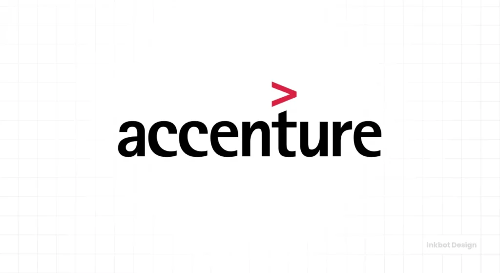
- Year: 2000
- $188 million in 2026
- Agency: Landor Associates
This rebrand was born out of a bitter divorce. Andersen Consulting had to separate from its parent accounting firm, Arthur Andersen, thoroughly, and was forced to change its name.
The company held an internal competition, and an employee suggested “Accenture” (a portmanteau of “accent on the future”). The $100 million was spent in a massive hurry to build a new global brand from absolutely nothing, running ad campaigns and rolling out the new identity across 47 countries to erase the old name and establish the new one.
5. Posten Norge (The Norwegian Post) – $55,000,000
- Year: 2008
- $82 million in 2026
- Context: National Rebrand
How much does it cost to rebrand a nation’s postal service? A lot. Posten Norge undertook this massive project to modernise its image and unify its various service divisions. The price tag reflects the enormous physical task of rebranding every single postbox, truck, uniform, and office in an entire country.
6. Comcast (Xfinity) – $50,000,000 – $100,000,000 (Estimated)
- Year: 2010
- $75 million to $150 million in 2026
- Context: Reputation Management
Comcast consistently ranked as one of America’s most hated companies. So, what did they do? They rebranded their consumer services (internet, TV, phone) under a new name: Xfinity. This is a classic brand architecture play. By creating a new sub-brand, they hoped to create distance from the toxic reputation of the parent company. The logo is simple, but its strategy is a multi-million-dollar attempt to wash away years of bad press.
7. ANZ Bank – $15,000,000
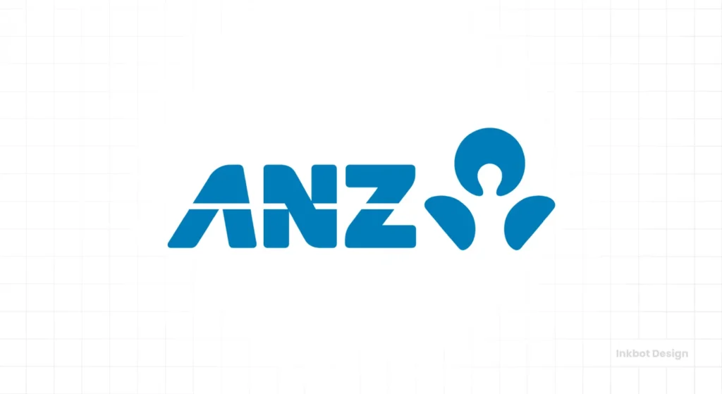
- Year: 2010
- $22 million in 2026
- Context: Post-Merger Rebrand
The Australia and New Zealand Banking Group (ANZ) spent two years and $15 million on a rebranding campaign. This wasn’t just about a new logo but about creating a unified brand identity and culture after a series of mergers and acquisitions. The cost was driven by consolidating multiple brands into one cohesive system across the Asia-Pacific region.
8. AOL. – $10,000,000 – $20,000,000 (Estimated)
- Year: 2009
- $15 million to $30 million in 2026
- Context: Strategic Pivot
After spinning off Time Warner, AOL was a brand desperate to escape its past as a dated dial-up provider. They rebranded as “Aol,” with a simple wordmark designed as a window for constantly changing background imagery. The strategy was positioning AOL as a modern, content-focused media company. The rebrand was unsuccessful, proving that a new logo can’t fix a flawed business model.
9. Ogilvy & Mather – $5,000,000 – $15,000,000 (Estimated)
- Year: 2018
- $6 million to $19 million in 2026
- Context: Self-Rebrand
What happens when one of the world’s most legendary advertising agencies rebrands itself? They simplified their name to “Ogilvy” and unified their sprawling, siloed structure into one entity. The new logo connected the modern wordmark with the founder David Ogilvy’s signature. While the cost is undisclosed, the investment was in redefining their business strategy for a new era—a classic case of “physician, heal thyself.”
10. BBC (British Broadcasting Corporation) – $1,800,000
- Year: 1997
- $3.5 million in 2026
- Context: Digital Simplification
The BBC’s move to the simple, block-letter logo was a strategic decision to create a unified and consistent identity for the dawning digital age. The previous logo, with its slanted boxes and coloured stripes, was difficult to render on screen and expensive to print. The $1.8 million investment created a timeless, flexible mark that works seamlessly across TV, radio, and web, saving the corporation millions in the long run.
11. Citibank – $1,500,000
- Year: 1998
- $3 million in 2026
- Agency: Pentagram (Paula Scher)
The story behind this one is legendary in design circles. During her first client meeting, Paula Scher of Pentagram famously sketched the concept on a napkin. It perfectly merged the Citicorp identity with the Travellers Group’s red umbrella to create a new, unified mark. So why $1.5 million for a napkin sketch? You’re not paying for the five seconds it took to draw; you’re paying for the 30 years of experience that enabled the insight. The rest of the fee covered developing a complete global identity system to support the massive merger.
12. Mastercard – $1,500,000
- Year: 2016
- $2 million in 2026
- Agency: Pentagram
How do you update one of the most recognisable marks in the world? Very carefully. Pentagram was tasked with modernising the Mastercard brand for the digital age. They didn’t reinvent it; they refined it. They simplified the overlapping circles, created a new, lowercase wordmark, and developed a comprehensive visual system for everything from a mobile app icon to a stadium banner. This was a masterclass in brand evolution, not revolution.
13. Slack – $1,000,000 – $3,000,000 (Estimated)
- Year: 2019
- Agency: Pentagram
Slack’s original hashtag logo was beloved but technically flawed. It used 11 different colours, was difficult to reproduce consistently, and looked terrible when placed on any background that wasn’t white. The new “pinwheel” logo solved these practical problems. It’s built from simpler shapes and uses fewer colours, making it more scalable and versatile. This rebrand was driven by technical necessity and the need for a more robust identity system as the company grew.
14. Warner Bros. – $1,000,000 – $2,000,000 (Estimated)
- Year: 2019
- Agency: Pentagram
For its 100th anniversary, the classic film studio wanted to modernise its iconic “WB” shield. Pentagram streamlined and simplified the mark, optimising it for the digital-first world while retaining its core equity. This project wasn’t about fixing something broken; it was about future-proofing a legendary brand, ensuring the shield works as well as a tiny app icon as it does on the silver screen.
15. Pepsi – $1,000,000
- Year: 2008
- $1.5 million in 2026
- Agency: Arnell Group
While the design fee was $1 million, the total estimated cost of the complete rebrand rollout was hundreds of millions. This logo is famous, or rather infamous, for the leaked 27-page design document titled “Breathtaking,” which attempted to link the new design to the golden ratio, the earth’s magnetic fields, and other bizarre concepts. It’s a prime example of brand strategy tipping over into self-parody.
16. Animal Planet – $1,000,000
- Year: 2008
- $1.5 million in 2026
- Context: Strategic Repositioning
This rebrand was a strategic pivot. Animal Planet wanted to move away from its reputation as a channel for gentle family documentaries and capture a more dramatic, visceral, and adult audience. With its aggressive typography and sideways “M,” the new logo signalled that change. The cost was part of a much larger marketing campaign to reposition the channel in the viewers’ minds completely. It was a business decision first, a design decision second.
17. City of Melbourne – $625,000
- Year: 2009
- $950,000 in 2026
- Agency: Landor Associates
Civic branding is notoriously complex, with countless stakeholders. Melbourne’s edgy, crystalline “M” was designed to position the city as a modern, dynamic hub. The cost covered extensive research, stakeholder engagement, and creating a flexible identity system that could be adapted for everything from business cards to public transport.
18. London 2012 Olympics – $625,000
- Year: 2007
- $975,000 in 2026
- Agency: Wolff Olins
Arguably one of the most controversial logos of all time, the jagged, abstract mark for the London Olympics cost around £400,000. It was widely mocked upon release, but it was designed to be energetic, youthful, and unlike any Olympic logo that had come before. The cost reflects the high stakes and global visibility of Olympic branding.
19. City of Belfast – $280,000
- Year: 2008
- $400,000 in 2026
- Context: Civic Identity
Like the Melbourne logo, this project aimed to create a new, vibrant identity for a city looking toward the future. The heart-shaped “B” was designed to be warm and welcoming, helping to shift perceptions of Belfast. The £180,000 fee accounted for the extensive consultation with city councils, community groups, and local businesses—a notoriously complex and political process standard to all public sector branding projects.
20. Capital One – $200,000 (estimated)
- Year: 2008
- $300,000 in 2026
- Context: Brand Refresh
The addition of the “swoosh” to the Capital One logo was widely criticised when it launched. Many saw it as a generic, unnecessary appendage. However, it was part of a larger strategy to position Capital One as a mainstream consumer bank, not just a credit card company. The cost reflects the work of a major agency and the research involved, but it serves as a good reminder that a high price tag doesn’t guarantee public approval.
21. NeXT – $100,000
- Year: 1986
- $295,000 in 2026
- Designer: Paul Rand
When Steve Jobs was forced out of Apple, he hired legendary designer Paul Rand to create the identity for his new venture, NeXT Computer. Jobs paid Rand $100,000 (around $280,000 in 2025 dollars) for a single option. Rand famously delivered a 100-page brochure detailing the entire brand identity, presenting the logo as a final, non-negotiable solution.
22. Enron – $33,000
- Year: 1996
- $67,000 in 2026
- Designer: Paul Rand
This entry is here for one simple reason: to prove that a great logo can’t save a bad company. The legendary Paul Rand was paid $33,000 for this mark shortly before his death. It was a clean, professional, and well-designed logo. It also became the symbol for one of the biggest corporate frauds in history. This is the ultimate proof that a brand’s meaning is defined by its actions, not aesthetics.
23. Google – $0 (in-house)
- Year: 2015
- Context: In-house Design
As its internal creative team developed it, Google’s shift from a serif to a sans-serif logo cost nothing in agency fees. But think about the implementation cost. Changing the logo on every single one of their trillions of indexed pages, app, every login screen, and corporate hardware represents one of the most significant and most expensive rollouts in history. It highlights that the design fee is often trivial compared to the execution cost.
24. Microsoft – $0 (in-house)
- Year: 2012
- Context: In-house Design
Like Google, Microsoft’s move to the four-coloured square “window” logo was handled internally. It was a massive strategic shift, designed to unify the company’s diverse product portfolio (Windows, Office, Xbox) under one consistent visual identity for the first time. The design cost was zero, but the strategic value and implementation effort were immense.
25. X (formerly Twitter) – $0
- Year: 2023
- Context: Ownership Whim
This is the ultimate cautionary tale. The rebranding of Twitter to X had a design cost of effectively zero—the logo was sourced from a Creative Commons font. However, brand valuation experts estimate that the move instantly vaporised between $4 billion and $20 billion in brand equity. Twitter’s name and bluebird logo were globally recognised cultural icons. Throwing them away overnight for a generic letter “X” demonstrates that the most expensive branding decision you can make ignores strategy entirely. It’s the perfect inverse of every other lesson on this list.
Let’s Be Clear: You’re Not Paying for a Picture
The first mistake people make is thinking the logo is the brand. It isn’t. The logo is just the symbol for the brand.
When a multinational corporation spends millions on a “logo,” the mark’s design is a tiny fraction of the cost. The real investment goes into four key areas:
- Brand Strategy & Research: This is the foundation. It involves months of market analysis, competitor reviews, focus groups, and internal stakeholder interviews. It’s about defining the company’s position in the market before a single pixel is placed.
- Brand Architecture: For huge companies, this is a nightmare of complexity. How do sub-brands and product lines fit together? Does the parent company endorse them, or do they stand alone? Untangling this is a massive strategic project.
- Design & Identity System: This is more than a logo. It’s a comprehensive visual language. It includes typography, colour palettes, photography styles, tone of voice, and hundreds of other elements. It’s a toolkit that ensures the brand looks and feels consistent everywhere.
- Global Implementation & Rollout: This is the behemoth. It’s the physical and digital cost of changing everything. Think thousands of storefronts, hundreds of thousands of uniforms, millions of pieces of packaging, a global vehicle fleet, and countless digital assets. This is where the real money goes.
So when you see these numbers, don’t think about the “design fee.” Think “cost of a global business transformation.”
The Billion-Dollar Logo That Cost Just $35
Now, for the most crucial story. In 1971, a graphic design student named Carolyn Davidson was paid $35 (about $270 in 2025) by a small startup to design a stripe for a shoe. She created the Nike “Swoosh.”
This is the ultimate counterpoint to the entire list. It proves that a logo’s initial cost has zero correlation with its eventual value.
But the story doesn’t end there. The real investment wasn’t the $35. The real investment was the subsequent 50 years and the tens of billions of dollars in marketing, athlete endorsements, and product innovation. Nike pumped meaning into that empty shape until it became one of the most recognised symbols on Earth.
The value wasn’t bought up front. It was built. A solid foundation is crucial, so professional logo design is a strategic investment, not just an expense.
What a Small Business Owner Should Actually Learn From This
Forget the million-dollar figures. They are irrelevant to you. Instead, absorb the strategy behind them.
- Lesson 1: Pay for the Thinking, Not Just the Drawing. The value from a good designer or agency comes from the questions they ask before they start designing. They should challenge your assumptions about your business, customers, and market. If they ask “what colours do you like?”, you’re hiring a decorator, not a strategist.
- Lesson 2: A Rebrand is a Business Decision, Not a Marketing One. Don’t change your logo because you’re bored with it. Do it because your business has fundamentally changed. You’re targeting a new audience, you’ve merged with another company, or your core mission has evolved. The rebrand is the signal of that change, not the change itself.
- Lesson 3: Your Logo’s Value is Built, Not Bought. A great logo won’t make a bad company successful. Your logo is a vessel. You fill it with meaning through your actions, customer service, and reputation. The logo just becomes the shortcut for customers to remember those experiences.
- Lesson 4: Scalability is Key. The corporate logos on this list had to work on everything from a pen to the side of a skyscraper. While you may not have that scale, think ahead. Will your logo work as a tiny favicon? Will it be clear on a trade show banner? A robust design system saves you headaches down the line.
The first step for businesses ready to make a wise, strategic investment in their brand is understanding the project’s scope. A good starting point is to request a quote, which forces you to think through your goals.
So, is an Expensive Logo Worth It?
It’s the wrong question.
The right question is, “Was the strategic business transformation successful?” Sometimes it is, as with Accenture. Sometimes it’s a PR disaster, as with BP. The logo is just the uniform the company wears to the battle. Its success depends entirely on the strategy of the army inside it.
Frequently Asked Questions About Logo Costs
How much should a small business expect to pay for a logo?
Prices vary wildly, from a few hundred pounds for a freelance designer to several thousand for an agency. The cost depends on the scope. A simple logo mark is cheaper than a complete brand identity system with guidelines. The key is to pay for strategy, not just the final files.
What’s the difference between a logo and a brand identity?
A logo is a single mark. A brand identity is the entire visual and verbal system of your company. It includes your logo, colour palette, typography, photography style, and tone of voice, all compiled in brand guidelines.
Why can’t I just use a cheap online logo maker?
You can, but you get what you pay for. A logo maker provides a generic graphic. It doesn’t offer strategy, market research, or a unique identity tailored to your business goals. It’s a template, not a solution.
What did the new Pepsi logo actually cost?
The design fee from Arnell Group was reportedly $1 million. However, the total cost of implementing the rebrand across all packaging, trucks, vending machines, and marketing materials worldwide was estimated to be several hundred million dollars.
Is a more complex logo more expensive to design?
Not necessarily. The cost is based on the strategic thinking, research, and development process, not the visual complexity of the final mark. Some of the simplest logos (like Nike’s) are valuable because of the brand built around them.
Was the Symantec logo really the most expensive?
No. The $1.28 billion price was for acquiring Verisign’s security business, which included its highly trusted brand and the checkmark logo as a key asset. It was a business acquisition, not a design project.
How long does a professional logo design process take?
Expect a proper brand identity project to take several weeks to a few months. This allows for research, strategy sessions, concept development, revisions, and finalisation of the entire identity system.
What is a “brand rollout”?
A rollout is the implementation of a new brand identity across all company touchpoints. This includes changing websites, social media profiles, business cards, letterheads, vehicle wraps, employee uniforms, product packaging, and physical signage.
Do I own the copyright to my logo?
If you hire a professional designer or agency, the contract should explicitly state that upon final payment, all intellectual property rights and copyrights for the final logo are transferred to you. This is a critical detail to confirm.
What’s the most critical factor in a successful logo?
Appropriateness. A great logo feels right for the industry it’s in. A law firm shouldn’t have a playful, cartoonish logo, and a toy company shouldn’t have a stern, corporate one. Beyond that, a logo should be simple, memorable, and versatile.
Let’s Build a Brand That Lasts
The stories behind these expensive logos reveal a simple truth: a strong brand is one of a business’s most valuable assets. It’s not about spending millions; it’s about thinking strategically. When you’re ready to build a brand identity that works as hard as you do, the conversation starts with strategy.
Explore more insights on the Inkbot Design blog or contact us to begin building your brand’s future.
