15 Best Brand Guidelines Examples: Clarity Over Size
Most brand guidelines roundups rank famous rulebooks by how beautiful they look. That measures the wrong thing. These 15 brand guidelines examples are judged by a harder standard: whether a non-designer can make the right brand choice unaided. For a professional services firm, that standard decides everything about adoption.
 By Stuart Crawford
 Reviewed by Tabitha Ayers
Updated 14 min read
On this page14 min left
- What Makes Brand Guidelines Examples Actually Good?
- Why This Matters for a Professional Services Firm Preparing to Rebrand
- The Anatomy of a Guideline That Gets Used
- Where People Get Brand Guidelines Wrong
- What This Looks Like In Practice
- Where This Stands Now: Governance Has Become The Discipline
- The Sharper Way To Judge Brand Guidelines Examples
- 15 Brand Guidelines Examples Buyers Benchmark Against
- The Verdict
- Frequently asked questions
A partner at a 120-person accountancy firm forwards the new brand guidelines to a senior associate drafting a proposal, and within ten minutes the associate is on Slack asking marketing which shade of blue is “the real one.”
That is the failure. Not the design.
The document existed, it was thorough, it had a colour section, and it still couldn't answer the one question someone actually had at the moment of use.
Most brand guidelines examples you'll find celebrated online would fail that same test.
What Makes Brand Guidelines Examples Actually Good?
Effective brand guidelines are a decision system, not a rulebook. They reduce ambiguity at the point of use, show real-world application rather than abstract rules, and let non-designers make correct brand choices without diluting the brand. Comprehensiveness is not the measure. A guide can document every rule and still fail if the people executing the brand daily cannot self-serve from it.
Three components separate a working guide from a beautiful one:
- Ambiguity reduction — the guide answers the specific question at the moment it is asked, not in principle but in practice.
- Applied examples — it shows the brand in a real proposal, a real email signature, a real pitch deck, not floating logos on a grid.
- Self-serve architecture — a marketing coordinator or a fee-earner can act correctly without escalating to a designer.
Effective brand guidelines examples reduce ambiguity, show real-world application, and let non-designers make correct brand choices without diluting the brand.
You can see this standard applied across our own brand guidelines resources, where the test is always whether the person using the document can act, not just admire.
Why This Matters for a Professional Services Firm Preparing to Rebrand
For a professional services firm, the brand is executed daily by people who are not marketers and never will be.
A 40-partner litigation practice has 40 people writing proposals, sending client emails, and standing up in pitches — each one making brand decisions in real time, usually at 6pm the night before a deadline.
The guideline's real job is to let that senior associate produce something that sounds and looks like the firm without asking permission.
The commercial stakes are measurable. According to the Lucidpress/Marq State of Brand Consistency report (2019), 68% of companies say brand consistency contributed directly to revenue growth, and consistent brand presentation across channels can lift revenue by between 10% and 33%.
For a firm mid-rebrand ahead of an acquisition or a growth push, inconsistency is not an aesthetic problem. It reads to a prospective buyer or client as an organisation that does not have its act together.
Consider Mailchimp's public content and voice guidelines. They are not the prettiest document on the internet. What they do is tell a writer, with worked examples, exactly how the brand handles an error message versus a celebration message.
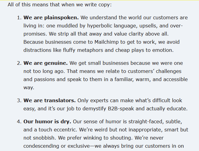
A non-writer can copy the pattern. That is the entire point — and it is the thing a professional services firm should be studying, not the logo grid.
The Anatomy of a Guideline That Gets Used
The working parts of a guideline are not the sections themselves — every guide has a colour page. The parts that matter are the decisions each section enables.
Sequence matters here: a guide that documents rules before it establishes why the brand exists produces compliance without judgement, and judgement is what fee-earners need when a situation isn't covered.
The Foundational Layer Sets the Rules Everything Else Inherits
The foundational layer is the brand's strategy, positioning, and personality, and it exists so that every downstream decision has a reason behind it.
Dropbox structures its public guidance into four areas — strategy, foundational elements, design system, and writing — deliberately leading with strategy.
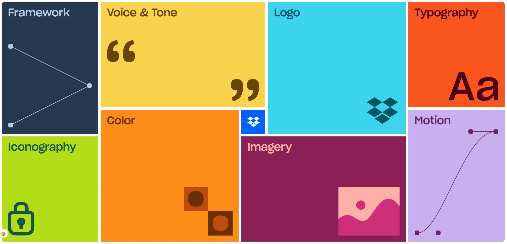
A designer choosing between two layouts, or an associate choosing between two phrasings, resolves the choice by asking which one serves the positioning.
Without that layer, a guideline is a list of preferences with no logic, and the first unusual situation breaks it. The foundational layer is what lets a team make a correct decision the document never explicitly anticipated.
The Visual System Must Resolve Real Ambiguity, Not List Assets
A visual system earns its place by answering the questions people actually hit, not by cataloguing every asset.
IBM's design language is admired for its depth, but the useful part for a professional services firm is how it specifies behaviour — what the logo does at small sizes, how it sits against a busy background, what happens when there isn't room for the full lockup.
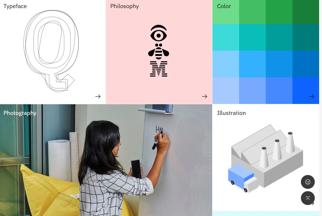
Most guidelines show the logo in ideal conditions and go silent on the messy ones. The messy ones are where fee-earners go wrong.
A visual system that only shows the brand at its best has documented the easy 80% and abandoned users at the exact moment they needed a rule.
The Voice And Tone Section Is Where Professional Services Firms Live Or Die
Voice and tone is the section that governs the majority of what a professional services firm actually produces, because the firm's output is overwhelmingly words — proposals, reports, letters, pitches.
Slack's guidelines are known for a voice section precise enough that a new writer can match the brand on day one.
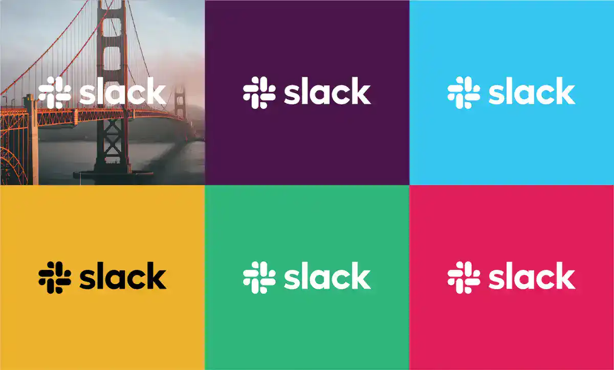
For a law or accountancy firm, this is the highest-leverage page in the entire document. A partner cannot personally review every associate's client email.
The voice section is the only mechanism that scales the firm's tone across dozens of people writing independently. A guide that spends thirty pages on logo geometry and two paragraphs on voice has misread what its own organisation produces.
Where People Get Brand Guidelines Wrong
The common mistake is treating the guideline as a documentation exercise — get everything written down, publish it, done.
This is why 95% of companies have brand guidelines yet only 25% to 30% actively use them across the organisation, according to Capital One Shopping Research. The document is complete and ignored at the same time.
The deeper error is measuring a guide by its coverage. A firm sees IBM's exhaustive system, concludes that thorough equals good, and commissions a 90-page PDF that no fee-earner will ever open.
The Lucidpress/Marq State of Brand Consistency report (2019) found that 81% of organisations still deal with off-brand content despite having guidelines in place. Guidelines are not the constraint. Adoption is. And adoption is a function of clarity and usability, not thoroughness.
“A brand guideline that documents every rule but cannot be used by a non-designer under deadline pressure has failed at the only job that matters. Completeness is what you can measure on the page. Usefulness is what happens the moment someone tries to act on it without asking for help. The two are not the same, and confusing them is the single most expensive mistake in brand governance.”
There is a live objection here that a sharp Managing Partner will raise immediately: “Surely a more detailed guide is safer — it removes more ambiguity, not less.” It sounds right.
It is wrong in practice, because detail and clarity trade off past a certain point. A 90-page guide is not searched under deadline; it is abandoned. The associate makes a guess.
The guess goes off-brand. Detail that isn't accessible at the point of use is detail that doesn't exist.
The second objection: “We're a serious firm — won't a stripped-down guide look unserious to a buyer during due diligence?” No. A buyer conducting brand due diligence is assessing whether the brand is governed, not whether the PDF is long.
A tight, enforced 20-page system signals control. A sprawling, ignored 90-page one signals the opposite the moment someone checks the live website against it.
What This Looks Like In Practice
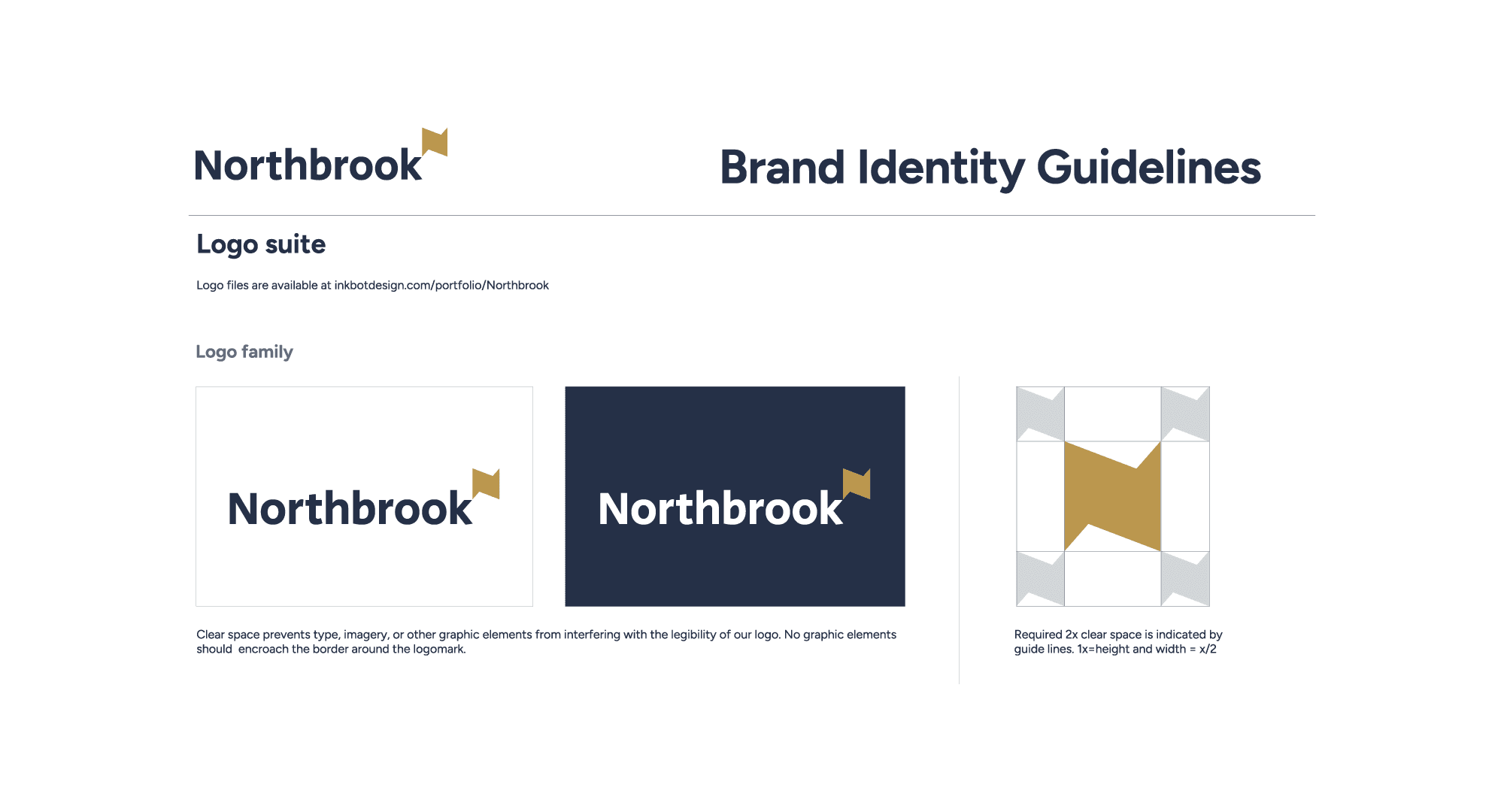
When we worked with Northbrook, the problem was not a shortage of brand assets. It was a shortage of digital clarity. The brand had quality, but its digital presence underplayed the value of what was on offer.
The specific mistake was a common one among firms with a strong offline reputation: the website was being treated as a brochure — a place to display information — rather than as a conversion tool that had to do commercial work.
The fix was not more design. It was a strategy-led redesign and build where every brand decision was tied back to what the digital experience needed to achieve, rather than to how the brand looked in isolation.
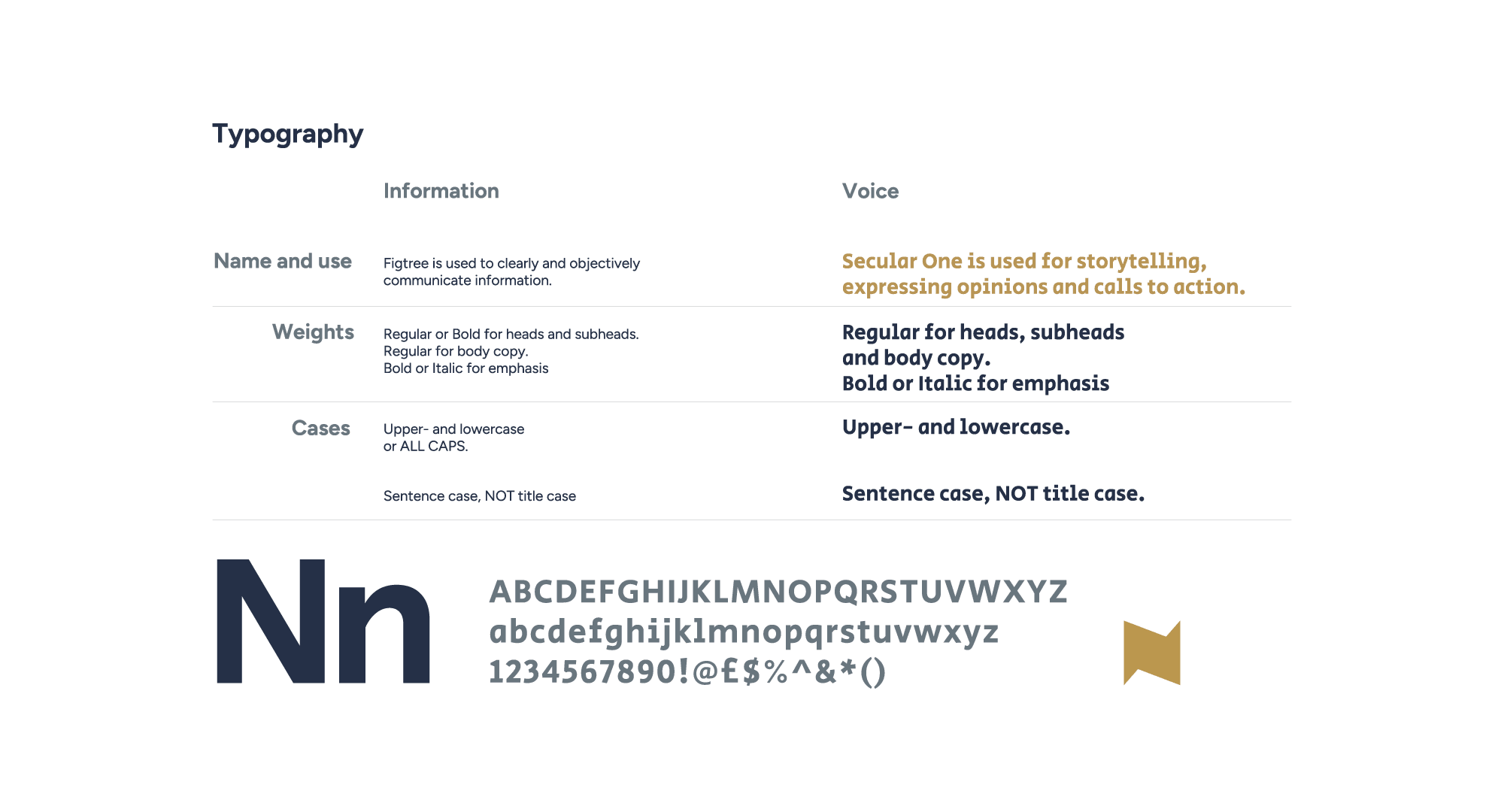
When the brand system was built to serve the actual job — converting attention into commercial outcomes — the results followed, including +186% and +63% uplifts tied to the digital expansion.
Here is the directive that generalises from that: build your guideline backwards from the decisions your people have to make, not forwards from the assets you happen to own.
A firm rebranding for a growth phase should start by listing the twenty brand decisions a fee-earner makes every week, then check whether the guide answers each one at the point of need. If it doesn't, page count won't save you.
Where This Stands Now: Governance Has Become The Discipline
Brand guidelines are being reclassified, in 2026, from a one-off deliverable into operational infrastructure.
A 2026 Marq article frames digital brand governance as the mechanism by which teams scale content creation without losing consistency or speed — which is a useful signal that the industry has stopped treating the brand book as a document and started treating it as a system that has to be run.
The tooling is following.
Figma is actively promoting an AI brand guidelines generator aimed at modern designers, which means automated creation and maintenance of brand rules is now a live product category rather than a concept.
For a professional services firm, the implication is not that AI will write your guidelines. It is that the bottleneck has shifted decisively from producing rules to governing their use.
The commercial case has hardened alongside it. Funnel cites System1 research indicating that consistent brands can see roughly double the profit gains compared with brands that keep changing direction.
That reframes the whole conversation.
Consistency is not a tidiness preference; it is a compounding commercial advantage, and it is available only to firms whose people can actually apply the brand without constant supervision.
The stubborn part hasn't moved. Recent brand-consistency coverage keeps returning to the same gap — organisations have guidelines and still cannot enforce them across channels.
Salesforce's State of the Connected Customer (2024) found that 8 in 10 consumers expect consistent experiences across a brand's channels, and the persistent failure to deliver that is a governance failure, not a documentation one.
Meanwhile, the aesthetic direction of 2024 onwards has favoured simplicity, expressive typography, and clarity over decorative complexity — which is the same lesson arriving from the design side. Clearer systems are winning.
The Sharper Way To Judge Brand Guidelines Examples
The prevailing view is that the best brand guidelines are the most comprehensive, and intelligent people hold it for a defensible reason: a thorough guide genuinely does anticipate more situations, and anticipation feels like safety.
IBM's celebrated system, NASA's revered 1976 manual, the exhaustive rulebooks designers screenshot and admire — they are impressive precisely because they cover so much. The instinct to equate coverage with quality is not stupid. It is just measuring the wrong variable.
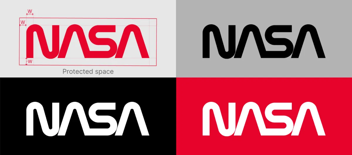
Here is the replacement standard. Judge a guideline by whether a non-designer can make a correct brand decision from it, unaided, under deadline. That single test reorders every famous example.
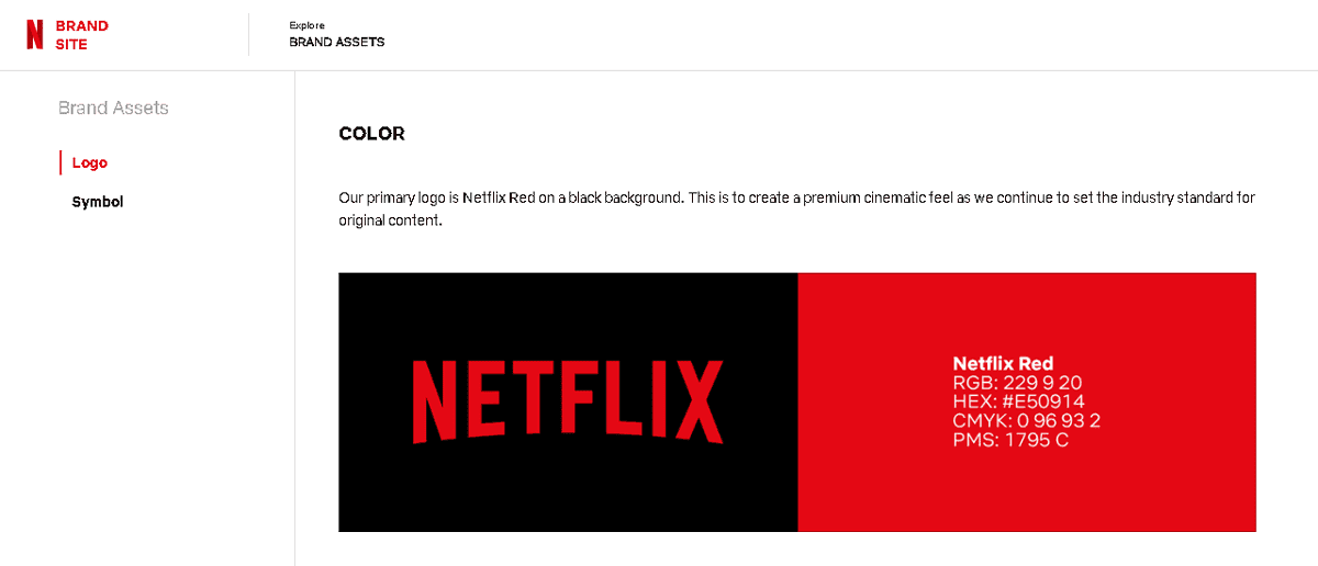
Netflix publishes tight, accessible logo guidelines that a partner can use in five minutes; the rest is gated, and that restraint is a feature, not a gap.
Mailchimp's voice guidance works because a non-writer can copy the pattern. These guides win not because they cover the most, but because they resolve the most ambiguity per page for the people who have to act.
“The best brand guidelines are not the biggest rulebooks. They are the clearest decision systems. A famous brand's guide is worth studying only to the extent that a non-designer in your own firm could open it, find the answer to the question in front of them, and act correctly without asking anyone. Everything else is decoration you paid for.”
The evidence carries this directly. If 95% of firms have guidelines and only a quarter to a third use them, comprehensiveness has demonstrably not solved the problem — because the widely-owned guides are comprehensive and still unused.
The variable that predicts adoption is usability. For a firm whose brand is executed by fee-earners rather than a design team, that is not a nuance. It is the whole game.
The actionable replacement directive: stop benchmarking your guideline against the size of famous ones, and start benchmarking it against a single test — hand it to your newest associate, give them a real proposal to write, and see whether they can do it correctly without asking marketing a single question.
That test tells you more than any page count. If you want a structured version of that diagnostic run against your actual brand, that is exactly what a brand operating system is designed to establish.
15 Brand Guidelines Examples Buyers Benchmark Against
Before commissioning brand work, decision-makers tend to benchmark against the same reference set. Here is that set, evaluated on the standard that matters — decision-enablement — rather than on visual polish.
Brand | What It's Known For | Decision-System Verdict |
|---|---|---|
The revered 1975 Graphics Standards Manual | Historic clarity; a masterclass in unambiguous logo behaviour rules | |
Minimal public identity guidance, tightly controlled | Extreme restraint — resolves ambiguity by limiting choices | |
Material design system with applied examples | Strong self-serve; shows the system in real interfaces | |
Bold, flexible visual system with clear boundaries | Good — flexibility with guardrails, non-designers stay on-brand | |
Publicly accessible logo rules, rest gated | Excellent restraint; usable in minutes, not hours | |
Design language built around a defined concept | Strong foundational layer driving downstream decisions | |
Precise content and voice guidance | Best-in-class for voice — non-writers can copy the pattern | |
Voice section precise enough for day-one writers | Excellent for word-heavy organisations | |
Formerly comprehensive, now minimalist | The shift itself is the lesson: less can enforce better | |
Exhaustive historical design system | Deep, but coverage risks outrunning usability | |
Tightly protected core visual assets | Strong on protecting the few things that must never change | |
Broad system across a vast product range | Governance-led; built to scale across many teams | |
Functional, application-focused system | Practical over pretty — closer to the right instinct | |
Multi-brand governance at scale | A governance case study more than a design one | |
Consistent global visual language | Strong consistency enforcement across markets |
The Verdict
Every famous guide in that table earns its reputation for coverage. That is the wrong reason to study any of them.
The 15 brand guidelines examples buyers benchmark against are useful to a professional services firm only as evidence of one principle: the guides that actually work are the ones a non-designer can act on without asking permission.
NASA's manual and Mailchimp's voice guidance are admired for opposite reasons — one for exhaustive precision, one for copyable simplicity — but they share the trait that matters. Both resolve real ambiguity for the person using them.
The data settles the argument. Ninety-five percent of firms own guidelines; a quarter to a third use them. Comprehensiveness is not the missing ingredient, because the unused guides already have it. Usability is.
For a firm where the brand is delivered every day by fee-earners rather than marketers, a guideline is only as good as the worst-case decision it lets your newest associate make correctly and alone.
So do this today, before you commission or approve a single page of new guidelines: take your current brand document, hand it to someone who has never seen it, give them a real client proposal to produce, and watch where they get stuck. Every point of friction is a decision your guide failed to resolve.
That friction map is worth more than any competitor benchmark — and if you'd like it done rigorously against your whole brand, request a free Brand Equity Audit™, a structured written diagnostic that identifies exactly where your brand is losing commercial ground and what to do about it.
Frequently asked questions
What are brand guidelines examples?
Brand guidelines examples are published or referenced rulebooks from known brands — such as NASA, Mailchimp, Netflix, and IBM — that show how an organisation defines and controls its identity. The useful ones function as decision systems, letting non-designers apply logo, colour, typography, imagery, and voice correctly without help.
What makes brand guidelines effective rather than just comprehensive?
Effective brand guidelines reduce ambiguity at the point of use, show the brand applied in real situations, and let non-designers self-serve without diluting the identity. Comprehensiveness only proves a guide covers a lot. According to Capital One Shopping Research, 95% of firms have guidelines but only 25–30% actively use them — coverage clearly does not equal adoption.
Why don't people follow our brand guidelines?
Usually because the guide was built as documentation rather than a usable decision tool. The Lucidpress/Marq report (2019) found 81% of organisations still produce off-brand content despite having guidelines. If a fee-earner cannot find the answer to a real question under deadline, they guess, and the guess goes off-brand.
How detailed should brand guidelines be?
Detailed enough to resolve the decisions people actually make, and no more. Past a certain point, detail and usability trade off: a 90-page guide is abandoned under deadline, so its extra detail effectively does not exist. Build backwards from the real decisions your team faces weekly.
What's the difference between a brand guideline and a brand operating system?
A brand guideline documents rules. A brand operating system governs their use — covering strategy, application, and the mechanism by which non-designers stay on-brand at scale. The distinction matters most for firms whose brand is executed daily by staff who are not marketers.
Is it true that consistent branding increases revenue?
Yes — the Lucidpress/Marq State of Brand Consistency report (2019) found 68% of companies say brand consistency contributed directly to revenue growth, with consistent presentation lifting revenue by 10–33%. Funnel cites System1 research indicating consistent brands can see roughly double the profit gains of brands that keep changing direction.
When should a professional services firm invest in brand guidelines?
When the brand is being executed by more people than any partner can personally supervise — typically ahead of a growth phase, acquisition, or repositioning. At that point inconsistency becomes a commercial signal to clients and buyers, and a decision system is needed to scale the firm's tone and identity across fee-earners.
Which brand guidelines example is best for a law or accountancy firm to study?
Mailchimp and Slack, for their voice and tone sections. A professional services firm's output is overwhelmingly words — proposals, reports, letters — so the voice section is the highest-leverage page. Both examples are precise enough that a new writer can match the brand on day one.
How does AI change brand guideline creation in 2026?
AI shifts the bottleneck from producing rules to governing their use. Figma is actively promoting an AI brand guidelines generator, making automated creation a live product category. The consequence for firms is that writing the rules gets cheaper while enforcing them across channels remains the real challenge.
Why do most famous brand guidelines fail as a model for a small firm?
Because they are built for large in-house design and marketing teams, not for fee-earners producing brand material between billable work. IBM's exhaustive system suits IBM's resources. A 120-person firm needs a guide its associates can use unaided, which usually means far tighter and more applied than the celebrated examples.
What is the single best test of a brand guideline's quality?
Hand it to someone who has never seen it, give them a real client proposal to produce, and see whether they can do it correctly without asking anyone. Every point of friction is a decision the guide failed to resolve. That test predicts adoption better than any page count or benchmark.
Do brand guidelines need to be publicly accessible like Netflix's?
No — public access is a governance choice, not a quality marker. Netflix publishes logo rules and gates the rest, and that restraint works. What matters is that the people who must use the guide, internal or external, can reach the answer they need at the moment they need it.