Symbolism in Logos: Striking a Balance for Global Appeal
Logos are powerful branding tools that can leave an indelible impression in our minds.
But what explains why some iconic logos, like the Nike swoosh or McDonald's golden arches, stick in our memory while others are forgettable? The secret lies in the strategic use of symbolism.
Symbols allow logos to communicate ideas and values efficiently. As a visual shorthand, they tap into our collective unconscious and leverage associations we already hold. Clever use of symbolism distils the brand identity into a memorable image. This is why exploring symbolism is essential to mastering the art of logo design.
In this comprehensive guide, we will unpack the nuances of symbolic thinking and survey seminal theories from psychology and semiotics. You will learn to decode cultural contexts and choose symbols that resonate with your target audience. We will also review examples of impactful logos and analyse why they succeeded.
By the end, you will understand the principles behind symbolic logos. You will be able to craft distinctive brand marks that capture the essence of organisations. Join me on this journey to reveal the psychology and power of strategic symbolism in logo design.
- Logos are powerful branding tools that can communicate complex ideas and emotions through effective symbolism.
- Cultural context is vital; symbols must align with both local and global perceptions to ensure effective branding.
- Colour choices in logos evoke specific emotions and can have diverse meanings across different cultures.
- Neuroscience studies reveal that symbols activate emotional responses, significantly influencing consumer behaviour and brand loyalty.
- Successful logos, like Nike and McDonald’s, use symbolism to create instant recognition and deep emotional connections.
The Power of Symbols

Symbols have a remarkable power over our minds. They can convey complex ideas and emotions with astonishing efficiency. But why is this the case? It all comes down to the psychology and neuroscience behind how our brains process symbols.
Research has shown that humans are genetically predisposed to recognise visual symbols and logos. When we see a familiar character, our brain quickly activates the visual cortex, which sets off a cascade of neural activity to interpret the meaning behind the symbol.
This rapid processing speed allows symbols to trigger strong emotional responses and associations ingrained in us through culture and personal experience. A heart symbolises love. A national flag arouses a sense of pride and belonging. A cross evokes religiosity. A smiley face conveys happiness and friendliness.
Moreover, symbols and logos activate the brain's reward circuitry. fMRI scans show increased activity in the nucleus accumbens, a region that processes pleasure when people view mighty symbols like religious icons or branding logos. This explains why symbols can motivate behaviour and build brand loyalty.
The ability of symbols to tap into emotions gives them unparalleled efficiency and power to communicate complex ideas. Consider how flags unite citizens or how religious symbols propagate entire belief systems. Brand logos also leverage this psychological mechanism. Just a simple swoosh ignites the ideals and emotions associated with Nike.
In short, modern neuroscience reveals that symbols speak directly to the emotional centres of the human brain. When designed effectively, a compact visual mark or logo can convey a whole narrative, identity, and ethos – activating our neural reward circuitry. This explains why symbols have such a remarkable power over human psychology.
The Role of Colour in Symbolism
Colour plays a significant role in logo design, impacting consumer perception and emotional response.
Each colour has a psychological meaning that can attract or repel potential customers.
For instance, blue conveys trust, professionalism, and calm, making it popular in the financial and tech industries. Conversely, red is associated with energy, urgency, and passion, frequently used in food and drink logos to stimulate appetite and excitement.
Companies carefully select colours to align with their brand identity and evoke desired emotions.
Different cultures can have varied interpretations of colour, adding complexity to global brand positioning. For example, while white symbolises purity and peace in Western cultures, it is often associated with mourning in some Eastern societies.
In other cultural contexts, Green, usually linked with growth and stability, can also symbolise luck and fertility. Such subtleties make it essential for brands to tailor logo colour selection to the cultural landscape where they operate to ensure alignment and avoid miscommunication.
The Language of Symbolism in Logos
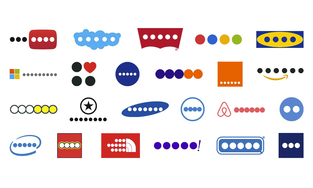
Symbols are an assertive, primal communication that transcends cultural boundaries and taps into our collective unconscious. Their universality enables them to speak to everyone regardless of language or nationality. This makes them a precious tool in logo design for brands looking to connect with a global audience.
Symbols bypass rational thought and words at their core, resonating with our instincts and emotions instead. A heart, for example, conjures up feelings of love and connection worldwide.
Similarly, religious icons like the cross and crescent moon evoke spirituality across cultures. This universal meaning allows logos containing symbols to build instant recognition and understanding across geographic and linguistic divides.
Symbols also distil complex ideas into concise, non-verbal messages. In our fast-paced, distraction-filled world, logos must communicate quickly and effectively.
Signs are ideal for this, conveying layers of meaning in a single glance. Consider Apple's iconic logo – an apple with a bite taken out. This deceptively simple symbol speaks to notions of innovation, profiting from the status quo and striving for progress.
By tapping into timeless symbolic meaning, logos create impactful first impressions. They spark an emotional connection that builds brand recognition and loyalty across global markets.
For companies seeking to make their mark worldwide, incorporating universally understood symbols is an intelligent way to transcend cultural barriers and connect with consumers on a fundamental human level.
The Art of Symbolism
Creating a compelling logo is both an art and a science. It's about distilling the essence of a brand into a visual symbol that encapsulates its identity and values.
A well-designed logo is the cornerstone of a strong brand identity. It should be instantly recognisable and leave a lasting impression. Symbols play a crucial role in achieving these goals.
The power of symbolism in logo design lies in its ability to convey meaning and emotion. A symbol can tell a story, spark curiosity, or evoke nostalgia. It can also differentiate a brand in a crowded marketplace.
For instance, the McDonald's golden arches are not just abstract shapes; they symbolise convenience, familiarity, and the joy of a delicious meal. This symbolism has made McDonald's one of the most recognisable brands globally.
Consumer Psychology and Symbolism
Symbolism in logos taps directly into consumer psychology, influencing perception and brand loyalty.
Humans are wired to recognise and store symbols as shortcuts to complex ideas, simplifying decision-making.
Research indicates familiar symbols inspire trust and comfort, urging consumers to favour recognisable brands over unknown ones. This familiarity leverages brand loyalty, reinforcing consumer retention through repeated positive associations.
Companies craft narratives that resonate emotionally by embedding meanings into simple visuals, creating lasting connections.
The strategic deployment of symbolism influences customer purchase decisions and brand advocacy. When logos effectively communicate core brand values and resonate with personal experiences, they form a part of the consumer's self-concept.
This emotional connection not only aids initial purchase decisions but also strengthens brand loyalty over time, making consumers not just buyers but brand evangelists. As a result, logos become symbolic capsules containing the essence of a consumer's interaction with the brand.
Types of Symbols in Logos
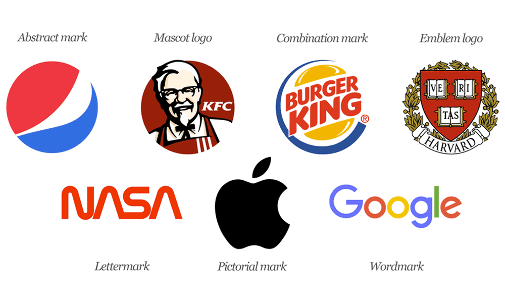
Symbols are vital to logos, allowing brands to communicate core values and build recognition through visual shorthand. Logo symbols come in various forms, each with unique stylistic qualities and strategic advantages.
- Abstract Symbols: Abstract symbols use simplified, geometric shapes rather than literal representations. They convey concepts and ideas in a versatile, open-ended manner. For example, the iconic Nike “Swoosh” symbolises motion and speed with its fluid, curved form. Abstract symbols work well when a brand wants room for interpretation or has diversified product offerings. The simplicity and flexibility of abstract symbols allow them to work across many contexts.
- Iconic Symbols: Iconic logo symbols directly depict a recognisable object or element. They are straightforward and literal in their messaging. For instance, the Starbucks mermaid is an iconic symbol that ties back to the brand's marine and coffee trading history. Iconic symbols quickly telegraph a brand's central theme or industry. They work best when a company wants an easily understandable, specific association.
- Illustrative Symbols: Illustrative symbols use more stylised, detailed graphics and illustrations. They can depict characters, scenes or settings that help visualise the brand's narrative. The Lacoste crocodile is an illustrative symbol that references the nickname of founder Rene Lacoste. Illustrative symbols allow for storytelling and personality. They excel at creating a cohesive world for the brand.
The type of symbol ultimately depends on a company's personality, story and target audience. Abstract symbols offer wide adaptability, iconic characters are clear and straightforward, and illustrative symbols spin an engaging visual tale.
When chosen strategically, each type of logo symbol can become a powerful asset in building brand familiarity and loyalty.
Common Pitfalls in Symbolism
Despite the power of symbolism, common pitfalls can undermine logo effectiveness.
Overcomplicated designs clutter the visual message, leading to confusion and a diluted brand impact.
Similarly, cultural insensitivity in symbol choice can alienate or offend audiences, damaging a brand's reputation. Marks that fail to convey a clear message or misconstrue cultural contexts often result in alienation rather than connection.
Simplicity, clarity, and cultural awareness are essential to avoid these mistakes, ensuring logos communicate the intended brand essence to global and local audiences.
The Process of Symbol Selection

Selecting the correct symbol for a logo is a critical decision in the design process. It requires a deep understanding of the brand's identity and the emotions it wants to evoke.
The process typically involves several steps:
- Brand Assessment: Start by assessing the brand's core values, mission, and personality. What does the brand stand for, and what emotions should the logo convey?
- Market Research: Understand the target audience and their preferences. What symbols resonate with them, and what are their cultural backgrounds?
- Concept Development: Brainstorm ideas for symbols that align with the brand's identity and appeal to the target audience. Consider multiple options before narrowing down the choices.
- Feedback and Testing: Seek input from focus groups or surveys to gauge the emotional impact of potential symbols. Testing different characters with the target audience can provide valuable insights.
- Final Selection: Choose the symbol that best encapsulates the brand's essence and connects with the audience emotionally.
Remember that a logo is a long-term investment. Changing it frequently can confuse consumers and dilute brand recognition. Therefore, the symbol selection process should be thorough and thoughtful.
Symbolism in Logo Design: A Cultural Perspective

The importance of culture in logo design must be considered. Symbols and colours often carry vastly different connotations across cultures, so understanding these nuances is imperative for effective global branding. A logo that resonates in one region may completely miss the mark in another.
For instance, in Western cultures, red is often associated with passion, excitement, and love. However, in Chinese culture, red symbolises luck, joy, and prosperity. Incorporating culturally significant colours like red into a logo can enhance its appeal to specific demographics.
Similarly, numbers and shapes have varying meanings worldwide. The number 8 is considered auspicious in Chinese culture, while the triangle is a sacred symbol in Christianity. Clever usage of such numerals and forms in logos can convey different virtues depending on the cultural context.
However, marketing teams must exercise caution when incorporating cultural symbols into logos. Seemingly innocuous choices can sometimes come across as insensitive or inappropriate. For instance, green hats symbolise infidelity in China, while owls represent death in certain Native American tribes. Using these motifs without understanding their implications can backfire.
The key is thoroughly researching the symbolism behind shapes, colours, numbers, animals, gestures, and other elements that are candidates for logo design. When in doubt, it is advisable to consult experts from the relevant cultures to gain deeper insight and avoid blunders. This due diligence is crucial for crafting logos that click with target audiences worldwide.
In summary, culture significantly influences how people interpret and respond to logos. Paying attention to cross-cultural connotations and tailoring logos accordingly can lead to more effective branding across geographies and demographics.
However, marketers must be careful not to apply cultural symbols in ignorance or risk damaging the brand image.
Global Appeal vs. Local Relevance

Designing an effective logo that appeals globally while resonating locally is a delicate balancing act. On the one hand, a logo aims to be universally recognisable, conjuring up a consistent brand image across international markets.
On the other hand, consumers respond more positively when a brand acknowledges its cultural context and incorporates locally relevant symbols or design elements.
Mastering this global-local dynamic has become imperative as brands expand into new regions. Companies that appear ignorant or indifferent to local values often make embarrassing cultural blunders. Meanwhile, brands that thoughtfully embrace local heritage can gain an edge over global competitors.
Coca-Cola's enduring, globally iconic script logo exemplifies this balance. While the flowing Spencerian font evokes timeless Americana, Coca-Cola brilliantly adapts its branding for regional markets.
In Japan, Coca-Cola aligns itself with traditional Japanese calligraphy styles. During Christmas, it depicts Santa Claus wearing a traditional Japanese dress. For the FIFA World Cup in South Africa, Coca-Cola incorporated tribal African patterns into its marketing.
Another brand that is succeeding locally is McDonald's, which has a “glocal” strategy. While maintaining brand consistency worldwide, McDonald's allows localised flexibility, whether a McAloo Tikki burger in India or a McCroissant in France.
With menu innovations, localised design aesthetics, and community engagement, McDonald's has strengthened its positioning as an international powerhouse and a locally relevant brand.
Effectively blending global recognition and local relevance remains an ongoing challenge. But brands that embrace this nuance authentically can gain goodwill and market share across borders.
With cultural intelligence and strategic design choices, globally iconic brands can send the dual message: “We understand you locally while also representing excellence worldwide.”
The Impact of Symbolism on Brand Perception
Trust and recognition are two pillars of brand success; symbolism is pivotal in building them.
Consider the McDonald's logo once again. When you see those golden arches, you immediately associate them with a familiar and consistent dining experience. This recognition fosters trust in the brand, as consumers know what to expect.
Logo recognition is not just a matter of aesthetics; it has financial implications. Research has shown that consumers are likelier to choose products or services from brands with logos they recognise and trust.
In fact, according to a study by Nielsen, 59% of consumers prefer to buy products from brands they are familiar with. This preference demonstrates the power of logo recognition in influencing consumer behaviour.
Neuroscience of Symbol Recognition
Neuroscience offers insights into symbol recognition and its impact on brand perception. The human brain processes symbols faster than text, directly engaging the emotional cortex.
This triggers instantaneous emotional reactions, enhancing memory retention and recall.
Studies using fMRI technology show increased neural activity in regions associated with pleasure and reward when individuals are exposed to well-designed logos.
This neurological response highlights the potency of symbols in creating lasting and positive brand associations, which is crucial for impactful and effective brand communication.
Case Studies: Iconic Logos
To understand the impact of symbolism in logos, let's delve into some case studies of iconic symbols that have stood the test of time.
Apple
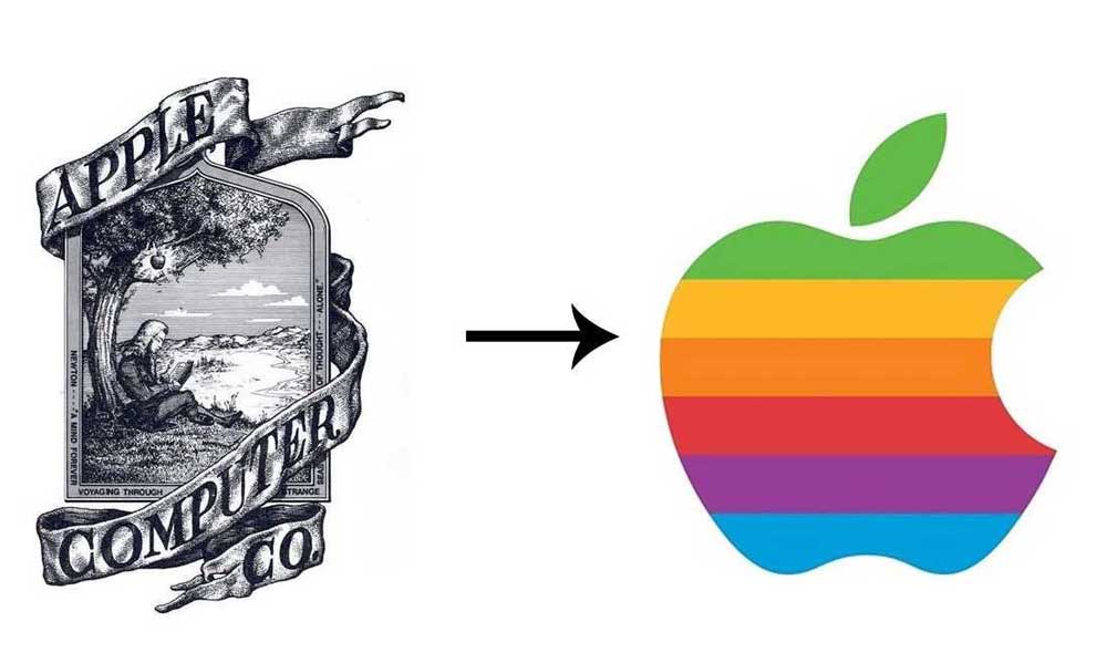
The ubiquitous Apple logo, featuring a partially eaten apple with a bite taken out of its right side, has become one of the most recognisable symbols in the world. Designed in 1977 by Rob Janoff, the rainbow-coloured logo was initially inspired by Alan Turing, the mathematician who pioneered early computer science and artificial intelligence.
The bite in the apple is meant to represent taking a bite out of the fruit from the Tree of Knowledge, symbolising Apple's desire to use technology and innovation to further human progress.
Over the years, the Apple logo has undergone some revisions, losing its colourful stripes and gradients and taking on a more minimalist, monochromatic look.
The basic design featuring the bitten apple has remained consistent for over four decades. This longevity speaks to the logo's simple, memorable, and evocative nature.
The bitten apple encapsulates some of Apple's core branding themes – creativity, innovation, and thinking differently. The bite represents a daring first step into uncharted territory, much like how Apple constantly pushes the boundaries of technology.
It suggests a curious, rebellious spirit of questioning the status quo and forging new paths. At the same time, the minimalistic nature of the logo aligns with Apple's design philosophy, emphasising simplicity and usability.
Indeed, the Apple logo has become synonymous with the company's identity. When people see the bitten apple, they instantly recognise Apple and its reputation for cutting-edge consumer technology.
For Apple fans, the logo represents more than just a brand; rather, it represents a culture and community bonded by shared values of creativity, innovation, and thinking differently.
The longevity and universality of the Apple logo have helped make Apple one of the most valuable brands in the world, with the bitten apple becoming an iconic emblem of tech culture as a whole.
Nike
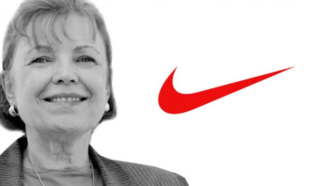
The iconic Nike swoosh has become a globally recognised symbol of athletic prowess, determination, and excellence. The simple yet dynamic curved line evokes a sense of movement and speed, encapsulating the competitive drive of athletes across all sports.
When Nike founder Phil Knight first met with graphic design student Carolyn Davidson in 1971 to create a logo, he envisioned a mark that would convey the spirit of a wing in motion. The resulting Swoosh, which Davidson initially charged only $35 for, has become one of the most brilliant and impactful design elements in brand history.
Over the decades, Nike has built the Swoosh into an emblem synonymous with elite performance. It serves as a stamp of innovative technology and cutting-edge design innovation worn with pride by some of the world's greatest champions. The distinct curve affirms the mantra “Just Do It,” inspiring athletes of all abilities to push past their limits.
As Nike has grown on its mission to bring inspiration and innovation to every athlete, the Swoosh has evolved beyond a logo into a cultural symbol. Its meaning extends beyond the track or court, signifying the pursuit of excellence in any endeavour. For millions worldwide, the Swoosh embodies perseverance, commitment, and empowerment. It has helped fuel Nike's rise as the undisputed global sports and fitness leader.
The minimalist brilliance of Carolyn Davidson's original design remains at the core of Nike's identity and success. The Swoosh's embedded association with achievement continues to drive the company forward as technology progresses. By sticking to its values of grit and greatness, Nike ensures that its iconic emblem retains its timeless meaning and motivational message to strive for the extraordinary.
Mercedes-Benz

The iconic Mercedes-Benz logo, featuring a three-pointed star inside a circle, has a long and meaningful history behind its simple yet striking design. The three-pointed star represents the company's ambition to excel in land, sea, and air transportation. It symbolises Mercedes-Benz's pioneering spirit and desire to innovate across multiple mobility domains.
The origins of the three-pointed star can be traced back to 1909 when Daimler-Motoren-Gesellschaft established the Mercedes brand. The three points represented the brand's land, sea, and air dominance. Mercedes was venturing into marine and aviation engines and its luxury automobiles then. The star enclosed within a circle represents the brand's aim for universal motorisation across all terrain.
Over the decades, the Mercedes three-pointed star has come to embody core values like luxury, prestige, performance and safety. It represents the brand's meticulous engineering, cutting-edge innovation and uncompromising quality. For Mercedes-Benz, the tri-star logo symbolises aspiration, signifying the heights the brand aims to reach with its products and services.
The simple, elegant design of the Mercedes-Benz logo reflects the sophistication and refinement the brand is renowned for. The star's metallic silver or chrome colouring evokes notions of modernity and precision technology. Over the years, the basic form has remained unchanged, consistent with the brand's commitment to excellence.
Today, over a century after its inception, the three-pointed star is an immediately recognisable global emblem representing engineering mastery, luxury experiences and a premium ownership proposition. It serves as a promise from Mercedes-Benz to its customers to strive for the highest quality and performance. The iconic tri-star remains a proud symbol of ambition, innovation and accomplishment.
These case studies highlight how symbolism can elevate a brand and create a deep emotional connection with consumers. These logos are not just visuals but powerful symbols that resonate with people profoundly.
Successful Case Studies of Symbolic Logo Redesigns
Logo redesigns often reflect changing brand narratives and market positions. As a notable example, Instagram is transitioning from an old-fashioned camera icon to a vibrant, gradient representation.
This shift aligned with its evolution from a niche photo app to a more extensive social network, broadening its appeal.
Mastercard’s redesign in 2016 focused on simplicity and digital adaptability while retaining its iconic interlocking circles. These redesigns balance innovation and heritage, maintaining brand recognition while highlighting relevance.
In 2017, YouTube rolled out a significant redesign for its logo, maintaining its familiar play button while emphasizing simplicity and adaptability across platforms. The update signalled a shift towards a more engaging content ecosystem, adapting to changes in how audiences consume media.
Similarly, Burberry's rebranding in 2018 with a new logo design emerged as a blend of heritage and contemporary fashion, retaining classic elements while appealing to a younger, more digital-savvy audience.
These examples illustrate how strategic logo redesigns can align with brand evolution and marketplace trends, ensuring continued relevance in rapidly changing landscapes.
Frequently Asked Questions (FAQs)
How do I choose the correct symbol for my logo?
Choosing the correct symbol for your logo involves thoroughly understanding your brand's identity and the emotions you want to evoke. It's essential to align the mark with your brand's values and mission.
Can a logo with cultural symbolism appeal to a global audience?
A logo with cultural symbolism can appeal to a global audience if done thoughtfully. The key is to strike a balance between cultural relevance and universal understanding.
What makes a logo memorable?
A memorable logo connects with people on an emotional level. It often involves using symbols that evoke strong feelings or associations. Simplicity and uniqueness also contribute to memorability.
Do symbols in logos have a direct impact on consumer behaviour?
Yes, symbols in logos can influence consumer behaviour. Recognised and trusted logos attract more consumers, increasing sales and brand loyalty.
Can I change my logo's symbol without losing brand recognition?
Changing a logo's symbol can be risky, as it may disrupt brand recognition. However, if done strategically and accompanied by a solid rebranding campaign, it is possible to transition to a new symbol while retaining brand recognition over time.
Conclusion
Symbolism in logos is far more than just an artistic flourish – it is a nuanced science grounded in psychology, culture, and strategic brand communication. As designers work to develop impactful logos, they would be aware of the immense power and potential of thoughtful symbol selection.
A logo's symbols speak volumes through their subtle visual cues. They quietly tap into the collective unconscious of consumers, eliciting emotions and associations that words alone cannot achieve. The apple of Apple, the siren of Starbucks – these symbols have become indelibly etched in our minds, building an instant familiarity and connection with these brands.
But choosing the correct symbol is no simple task. Designers must consider the psychology behind shapes, colours, and images. They must understand conventions and cultural contexts, which give symbols meaning. Abstract shapes imply specific characteristics, while iconic images tap into shared experiences. Characters are imbued with so much implicit meaning that one curve or line can make or break a logo's ability to resonate.
This meticulous understanding of symbolism allows great logos to communicate a brand's core values on a primal, emotional level. They bypass rational thought to imprint a feeling that feels right. Such is the power behind Nike's swoosh or McDonald's golden arches. While they say nothing explicitly, we instinctively understand what these brands represent.
So, as designers craft the next great logo, they would do well to remember that a symbol's magic stems from its broad impact on the subconscious. There is both art and science behind this process. Only with masterful understanding and application of symbolism's nuances can one create a logo that truly stands out, ingrains itself in the mind, and builds an enduring brand identity.


Informative read! I appreciate the straightforward explanations. Keep up the good work!