7 Decades of Design: The Complete Sony Logo History
What if I told you the most valuable asset Sony owns isn’t their PlayStation technology, their music catalogue, or even their camera sensors…
It’s four simple letters.
The Sony logo—worth billions—has been the silent architect behind one of the greatest business empires ever built. While products evolved, failed, and were reinvented, these four letters remained the constant consumers trusted with their hard-earned money.
Most business owners obsess over product features when they should be obsessing over what I call “visual equity”—the instant credibility and trust transferred when someone sees your mark.
Sony mastered this game decades ago.
From humble post-war beginnings to global domination, Sony’s logo evolution isn’t just design history—it’s a masterclass in building unshakeable brand power that prints money while you sleep.
The question isn’t whether you should care about Sony’s logo evolution…
The question is: can you afford not to learn from it?
- The Sony logo is a powerful symbol, representing decades of trust and brand equity in the tech industry.
- Simplicity and consistency in design have defined the logo's evolution, making it a lasting icon for Sony.
- In 1955, Sony adopted its current name, enhancing global recognition and establishing a strong brand identity.
- The 1973 logo introduced a bold, timeless design, reinforcing reliability and quality in a competitive market.
- Lessons from Sony include valuing visual identity as a business asset, recognising its impact on consumer perception and trust.
The Birth of a Giant (1946-1955)

It’s 1946. World War II had just ended, and Japan’s economy was in shambles. Two scrappy entrepreneurs, Masaru Ibuka and Akio Morita, decided to start Tokyo Tsushin Kogyo (Tokyo Telecommunications Engineering Corporation). Catchy, right? Yeah, it’s as catchy as a fish hook in your cheek.
Their first logo? It was a circular emblem with some geometric shapes that looked like it belonged on a luxury car, not an electronics company. It was trying too hard to be fancy when the company was two dudes in a bombed-out department store.
However, this seemingly random design set the stage for Sony’s future. It was bold, simple, and stood out in a sea of traditional Japanese company logos. It was like showing up to a tea ceremony in a leather jacket. People noticed.
The Name Change That Changed Everything (1955-1957)

Fast forward to 1955. Ibuka and Morita realise their company name is about as memorable as the terms and conditions on a software update. They need something snappy, something global. They land on “Sony” – a mix of the Latin word “sonus” (sound) and “sonny” (young boy). It’s like they threw a dart at a dictionary and somehow hit marketing gold.
The new logo? A simple, stylised “SONY” in a rectangle. It was handwritten, giving it a personal touch. This wasn’t some faceless corporation; your cool friend knew about the latest tech.
Strategically, this was genius. They ditched the Japanese name, positioning themselves as a global player right out of the gate. It was like attending a local poker game with a World Series of Poker bracelet—instant credibility.
The Serif Era Begins (1957-1961)

In 1957, Sony decided to get fancy. They introduced a new logo in bold, serif font. It was like their logo hit puberty and grew some facial hair. This wasn’t just a company anymore; this was a BRAND.
The serifs weren’t just for show. They added a sense of authority and tradition to a company that was anything but traditional. It was like wearing a suit to a rock concert – unexpected, but somehow it worked.
This logo coincided with Sony’s expansion into the American market. They needed to look established and trustworthy. The serif font said, “We might be new here, but we know what we’re doing.” And boy, did they.
The Refinement Years (1961-1973)
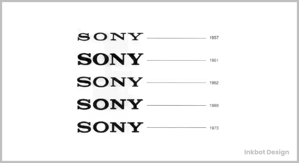
Over the next decade, Sony tweaked their logo like a perfectionist adjusting a crooked painting. The changes were subtle – a little stretching here, some serif adjustment there. To the average Joe, it probably looked the same. But these micro-adjustments were like fine-tuning a race car in the branding world.
Each tiny change aligned with Sony’s evolving identity. Their logo became sleeker and more confident as they introduced groundbreaking products like the Trinitron TV and the Walkman. It was like watching a scrawny kid hit the gym and slowly transform into a bodybuilder.
The Logo That Stood the Test of Time (1973-Present)

In 1973, Sony unveiled the logo we all know today. Clean, bold, timeless. It’s like the little black dress of corporate logos – always in style, never trying too hard.
This logo wasn’t just a pretty face. It was a strategic masterpiece:
- Simplicity: In a world of increasingly complex tech, Sony’s logo says, “We make the complicated simple.”
- Boldness: The thick letters screamed confidence. Sony wasn’t asking for attention; it was demanding it.
- Versatility: This logo looked good on everything from tiny earbuds to giant billboards. Try doing that with a complicated logo. Go ahead, I’ll wait.
The genius of this logo? It hasn’t needed to change in 50 years. While other tech companies change logos like underwear, Sony’s been rocking the same look since bell bottoms were cool. That’s not just good design; that’s branding voodoo.
The Logo That Almost Was (1981)
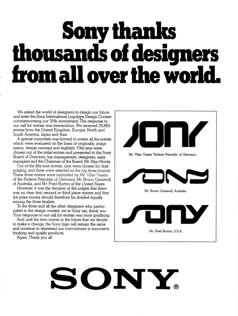
Here’s where things get spicy. In 1981, Sony, riding high on the success of the Walkman, decided to have a midlife crisis. They launched an international competition to redesign their logo.
Spoiler alert: It was a disaster.
They received 30,000 entries, narrowed it down to three finalists, and then… chose none. It was like hosting a massive party and then deciding to eat alone.
The rejected designs were a mix of ’80s futurism and fever dreams. One looked like it belonged on a heavy metal album cover, and the other looked like a rejected Star Trek logo.
Sony’s co-founder, Masaru Ibuka, took one look at these trendy monstrosities and said, “Nah, we’re good.” He stuck with the 1973 logo, proving that sometimes, the best design decision is no decision.
This move was a marketing genius disguised as indecision. Sony got massive press coverage, reinforced the value of their logo, and came out looking like design geniuses – without spending a dime on rebranding.
The Psychology Behind the Sony Logo
Let’s break this bad boy down:
- Colour: Black and white. Classic, authoritative, timeless. It’s like the James Bond of colour schemes.
- Font: A custom, bold serif. It says, “We’re established but not your grandpa’s tech company.”
- Simplicity: Sony’s logo is a visual breath of fresh air in a world of information overload. It’s like finding a quiet corner in a noisy party.
The overall effect? A logo that says, “We’re here, we know what we’re doing, and we’re not going anywhere.” It’s confidence without arrogance, quality without pretension.
The Competition: A Visual Arms Race
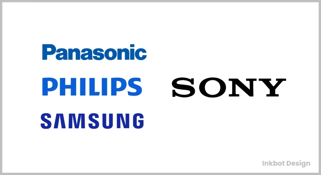
While Sony was perfecting its timeless look, the competition was all over the place:
- Panasonic: I went through more logo changes than a chameleon in a crayon factory.
- Phillips: Stuck with a shield emblem like they were guarding the tech kingdom.
- Samsung: It started as a fancy script and evolved into the oval we know today.
Sony’s consistency made them the visual anchor in changing tech logos. They weren’t following trends; they were setting them.
Lessons from Sony’s Logo Legacy
- Consistency is king. A great logo doesn’t need constant facelifts.
- Simplicity wins. In the tech world, you’ve already lost sight of whether your logo needs an instruction manual.
- Think long-term. Sony’s logo has outlasted disco, hair metal, and boy bands. That’s staying power.
- Sometimes, the best rebrand is no rebrand. Sony’s 1981 non-decision was marketing brilliance.
- Your logo is a promise. Sony’s logo says reliability, quality, and innovation without saying a word.
The Future of Sony’s Visual Identity
Looking ahead, Sony’s challenge will be maintaining relevance without losing its identity. How will that classic logo adapt as we move into AR and VR?
My prediction? There is subtle animation for digital platforms, but the core design will remain. It’s like adding a new spice to a classic recipe – enhance, don’t overpower.
The Bottom Line
Sony’s logo evolution isn’t just a design story; it’s a masterclass in brand management. They turned five letters into a global icon, a feat harder than making a cat follow instructions.
The lesson for brands looking to make their mark is clear: Your logo isn’t just a pretty face for your company. It’s the visual handshake you give to the world. Make it firm, make it memorable, and for the love of all that is holy, make it simple.
In the end, Sony’s logo success comes down to one thing: They designed a logo that works harder than an intern on their first day. It’s been selling TVs, PlayStations, and everything for half a century. And in the fast-paced tech world, that’s not just good design – nothing short of a miracle.
The Complete Sony Logo History – FAQs
When was the first Sony logo created, and what did it look like?
The first Sony logo wasn’t even “Sony” at all. 1946, the company started as “Tokyo Tsushin Kogyo” (Tokyo Telecommunications Engineering Corporation). Their original mark was nothing like today’s clean letterforms. This pre-Sony identity was used until 1958 when they officially adopted the name “Sony”—a blend of “sonus” (Latin for sound) and “sonny” (meaning young boy). That first true Sony wordmark was bolder than what we see today, but it planted the flag for what would become a visual asset worth BILLIONS.
How many significant redesigns has the Sony logo undergone since its inception?
Most people think Sony has changed their logo dozens of times. Dead wrong. There have been only 4 SIGNIFICANT logo evolutions since 1958. What’s the lesson? Once you find something that works, don’t throw it away—you REFINE it. Each subtle change wasn’t about following design trends but optimising a visual asset to transfer maximum trust to consumers across every possible medium. When you own visual real estate in the consumer’s mind, you don’t surrender it through constant redesigns.
What was the most controversial change to Sony’s logo throughout history?
The 1973 redesign was met with internal resistance. Why? The company abandoned the quirky, slightly irregular letterforms for a more standardised, corporate look. Some executives feared losing brand recognition. But they missed something: as Sony expanded globally, they needed a mark that communicated precision and reliability, not quirkiness. The controversy wasn’t about aesthetics—it was about signalling to the market that Sony made products that WORKED, period. That decision to embrace clarity over character accelerated their dominance in consumer electronics.
How did Sony’s logo change to accommodate digital displays and interfaces?
While competitors completely overhauled their identities for digital, Sony made surgical adjustments. In the 1990s, they optimised spacing and letter weight for screen rendering on early digital interfaces. But here’s the million-dollar insight: they never sacrificed recognition for technical accommodation. Instead of creating unique “digital versions,” they ensured their core mark worked across EVERY medium. This single-identity approach meant every marketing dollar they spent reinforced the SAME visual trigger in consumers’ minds, creating compound interest in their brand equity.
Did Sony ever consider adding a symbol or icon to their wordmark?
Yes—and their restraint here is the lesson. Internal documents show that in the 1980s, as Apple and other tech companies embraced iconography, Sony executives debated adding a symbol. They ultimately rejected it. Why? Because they understood something profound about consumer psychology: when you own mindshare with a clean wordmark, adding elements DILUTES rather than strengthens recognition. Their four letters already triggered trust faster than any clever symbol could. Sometimes, the billion-dollar decision is what you choose NOT to do.
How did Sony’s logo influence their product design philosophy?
Most people have the causality backwards. Sony’s product design philosophy—clean, functional, unobtrusive—shaped their logo, not vice versa. However, the logo became the focus for ALL design decisions once established. Their iconic Walkman, Trinitron TV, and later PlayStation all reflected the same principles as their wordmark: essential, nothing wasted, instantly recognisable. The logo became shorthand for their entire design language. When your visual identity drives product decisions rather than marketing ones, you’ve built an actual design-driven organisation.
What’s the estimated financial value of Sony’s logo today?
Brand valuation experts put the Sony logo’s value between $6-8 BILLION as a standalone asset. Think about that—four letters worth more than most Fortune 500 companies. But what most people miss is that value wasn’t built through design innovation but through relentless CONSISTENCY. Each year, Sony refused to chase design trends; they deposited more equity into their visual bank account. The compound interest on those deposits created a valuation most businesses can only imagine. Consistency isn’t sexy, but it prints money.
Has Sony ever created unique logo versions for different markets?
Unlike many multinational companies, Sony has maintained remarkable global consistency. While they’ve permitted minor regional adaptations for legibility in markets like China and the Middle East, they’ve never created fundamentally different versions for different audiences. This global uniformity meant that whether you were in Tokyo, New York, or Moscow, the Sony experience had the same visual foundation. This unified approach created a cumulative impact in a fractured media landscape instead of diluted regional identities.
How did Sony’s logo evolution reflect changes in their business strategy?
Each refinement of Sony’s logo mapped precisely to business pivots. The 1973 standardisation came as they pushed into global markets. The subtle 1990s adjustments coincided with their digital transformation—the space adjustments in the early 2000s aligned with their shift to premium positioning. Rather than random redesigns, each change signalled to the market—and, more importantly, to EMPLOYEES—where the company was headed. When your visual identity evolves in lockstep with your strategy, you create an alignment that competitors can’t match.
What design principles has Sony consistently maintained throughout all logo versions?
Three principles have remained sacred: legibility at any size, perfect balance between letters, and an almost mathematical precision to spacing. While the execution has evolved, these principles never wavered. This reveals Sony’s deeper understanding that a logo isn’t decoration—it’s functional business infrastructure. Each principle serves a business purpose: legibility ensures recognition across all media; balance creates visual stability that implies reliability; precision communicates attention to detail that extends to their products.
What can entrepreneurs learn from Sony’s approach to logo evolution?
The billion-dollar lesson is simple but profound: view your logo as a BUSINESS ASSET, not a design project. Sony never changed their logo because of design trends or because executives got bored. They evolved it only when business requirements demanded it. Most companies waste brand equity with needless redesigns every few years. Sony built its visual empire by treating its logo with the same strategic importance as product development, pricing, or distribution. Your logo isn’t art—it’s the visual infrastructure you should appreciate every year in business.



INTERESTING HOW THERES NO ‘SONY/SUPERSCOPE’ LOGO, BECAUSE THERE WERE FAR MORE SONY/SUPERSCOPE PRODUCTS OF SERIOUS PROFILE, THAN THE CRUMMY LITTLE TRANSISTOR RADIOS OF THE 50’S AND 60’S……………..
SURELY, YOUR EFFORTS DO NOT REFLECT THE COMPLETE LOGOS NOW DO THEY?
Superscope wasn’t Sony’s brand. It was more like their American cousin who hosted the party but didn’t build the house.
Sony kept its brand clean and centralised in Japan, while Superscope was slapping names on stuff for Western markets. So yeah, you saw “Sony/Superscope” a lot—but that was business strategy, not brand design evolution.
This post concerns Sony’s logo—the mark they owned, evolved, and defended. Superscope? That’s another rabbit hole that deserves its spotlight (seriously—a great idea for a follow-up post). I appreciate you pointing it out.