50 Minimal Logos That Master Strategic Subtraction
The phrase “less is more” has been beaten to death. It’s the sort of thing you see on generic motivational posters. But in branding, it’s not a pleasantry; it’s a brutal strategic reality.
Your business is fighting for a sliver of attention in a hurricane of visual noise. The default response is to shout louder and add more gradients, icons, and text explaining what you do. This is the “Cult of More.”
It’s a losing battle.
The alternative is strategic subtraction. This is the disciplined, often painful process of removing every element that doesn’t absolutely serve the core idea of your brand. What you’re left with is a minimal logo.
This isn’t just a gallery of 50 logos that look nice. This is an analysis of 50 brands that won the war against noise by being quiet, clever, and confident.
- The principle of strategic subtraction refines branding down to core elements, promoting minimal logos over cluttered designs.
- A minimal logo must be distinctive, memorable, and scalable to ensure it resonates across various formats.
- Successful minimal logos follow unspoken principles, such as a single concept, precise geometry, purposeful colour, and typographic accuracy.
- Minimalism should align with a brand's core message, not merely follow trends; it conveys confidence and clarity.
What Actually Defines a Minimal Logo? (It’s Not Just ‘Simple’)
People confuse “minimal” with “simplistic.” The two are mortal enemies.
A simplistic logo is lazy. It’s a generic shape from a dropdown menu placed next to a sans-serif font. It’s devoid of thought and personality. It’s forgettable because it was never worth remembering in the first place.
A minimal logo is distilled. It’s the result of immense pressure and refinement, like a diamond. The designer started with a complex idea and stripped away layers until only the most potent, essential form remained.
A truly effective minimal logo must pass three tests:
- Is it Distinctive? In a sea of similar logos, does it stand on its own?
- Is it Memorable? Can a customer accurately recall it after a single glance?
- Is it Scalable? Does it work just as well as a tiny favicon as it does on a massive billboard?
You have a powerful brand asset if the answer to all three is yes. If not, you have a decoration.
The Unspoken Principles of Powerful Minimalism
Before we look at the examples, you need the framework. Every successful minimal logo adheres to these four unspoken principles, whether by instinct or design.

Principle 1: Adhere to a Single, Powerful Concept
A minimal logo does not try to tell a story. It communicates a single feeling or idea. Nike is motion. Apple is sophisticated. Target is precision. It picks one lane and goes all in.
Principle 2: Master Deliberate Geometry and Balance
Nothing is accidental. Every curve, line, and angle is mathematically precise. The relationship between elements creates a sense of visual harmony and stability. It feels right because it is perfectly balanced.
Principle 3: Wield Colour with Purpose (Or Avoid It Entirely)
Minimalist colour palettes are ruthlessly efficient. Often, it’s a single, bold colour or a strict monochrome. Colour isn’t there to decorate; it’s there to evoke a specific emotion or to be so consistent it becomes synonymous with the brand itself (think Tiffany Blue or Cadbury Purple).
Principle 4: Demand Typographic Precision
When a logo is just a word, the typeface does all the heavy lifting. The kerning (space between letters), weight, and form of the letters aren’t just font choices; they are the entire design. Every curve of a letter is as vital as the stroke of a brush.
The Analysis: 50 Minimal Logos That Work
Here are 50 examples, broken down by type. I’m not going to describe what you can see. I will tell you why it works, viewed through the lens of the principles above.
Category 1: Abstract & Geometric Marks
These logos use pure form to convey an idea. They are the most difficult to pull off, but often timeless.
1. Nike
The “Swoosh” is the gold standard. It’s a single vector of pure motion, speed, and positivity. It needs no words.
2. Apple
The bite makes it an apple, not a cherry. It’s perfectly balanced, sophisticated, and speaks to acquiring knowledge.
3. Target
The concept is in the name. It’s a literal target. Its genius is in its unapologetic simplicity. It says, “We are exactly what we claim to be.”
4. Mastercard
Two overlapping circles. It’s one of the simplest ideas imaginable, yet it perfectly represents intersection, connection, and financial partnership. The colour is now the brand.
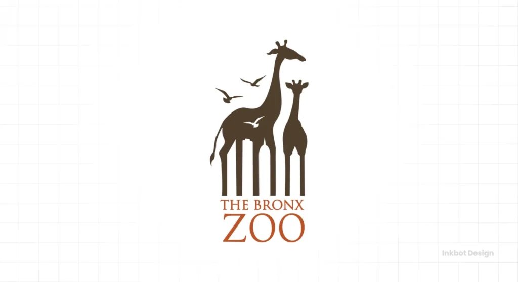
5. Mitsubishi
Three diamonds arranged in a point. It represents reliability and precision, built from a single, repeated geometric shape.
6. Adidas
The three stripes can be configured into multiple logos, but the core concept remains: overcoming challenges. It’s a mountain, a leaf, a simple statement.
7. Chase Bank
A simple geometric octagon, quartered to create a sense of movement and security. It feels solid, like a vault.
8. Pepsi
The current logo is a stripped-back version of the classic “Pepsi Globe.” It’s a simple, smiling form that uses colour and curve to feel optimistic.
9. Olympics
Five interlocking rings represent the five inhabited continents. It’s a globally understood symbol of unity built from the simplest shapes.
10. Mercedes-Benz
The three-pointed star signifies dominance over land, sea, and air. It’s a powerful statement of quality and ambition, enclosed in a perfect circle.
11. Spotify
Three simple curved lines suggesting sound waves or streaming. It’s dynamic, modern, and instantly recognisable as “audio.”
12. HSBC
A stacked hexagon that forms an abstract bowtie shape. It’s meant to look like an open gate, signalling a welcoming, global bank.
13. Shell
The shell shape is representational, but its execution is purely geometric. The bold red and yellow make it unmissable, even from a speeding car.
14. Chanel
Two interlocking “C”s. It’s a simple monogram, but the perfect symmetry and bold, black execution have made it a global icon of luxury.
Category 2: Clever Wordmarks & Letterforms
Here, the typography is the logo. The cleverness is baked directly into the letters.
15. FedEx
The hidden arrow between the ‘E’ and ‘x’ is the masterclass in minimalist execution. It represents speed, direction, and precision without adding an extra element.
16. Amazon
The smile from A to Z. It communicates two things: we sell everything and deliver happiness. It’s a concept and a visual pun in one stroke.
17. Braun
Known for its “less but better” philosophy. The oversized A and tight letter spacing create a confident, engineered feel. It’s pure functionalism.
18. IBM
Paul Rand’s masterpiece. The horizontal lines suggest speed and dynamism, breaking up the heavy, monolithic letters to make them feel more modern and approachable.
19. VAIO
A brilliant piece of engineering. The ‘VA’ forms an analogue wave, and the ‘IO’ represents the binary code of 1 and 0. Analogue and digital in one wordmark.
20. Gillette
A single, sharp diagonal slice through the ‘G’ and ‘i It perfectly represents the clean, precise action of their core product.
21. 3M
The overlapping characters suggest innovation and integration. It’s a simple, bold typographic solution for a company with a vast, complex portfolio.
22. Crate&Barrel
The ampersand is perfectly nested between the two words, creating a cohesive block. It’s a masterclass in spacing and balance.
23. Google
The most straightforward wordmark for the most powerful company. Using primary colours, broken by a secondary green ‘l’, signals a playful rebelliousness within a structured system.
24. Coca-Cola
The Spencerian script is complex, yet the logo functions as a single, minimal mark. It is so distinctive that it is recognised globally, even when the words are in a different language.
25. Uber
A simple, bold, sans-serif wordmark. It communicates utility, efficiency, and modernity. No fuss, just the service.
26. Netflix
The arched wordmark on a red background is cinematic. The single “N” icon is even more minimal—a ribbon folding in on itself, suggesting endless content.
27. Canon
The custom typeface has a unique inward-pointing C. The sharp serifs suggest precision, while the balance is stable and reliable.
28. Panasonic
Another ultra-simple wordmark. Its strength lies in its clean, professional, and unassuming nature. It communicates reliable technology without shouting.
Category 3: Symbolic & Representational Forms
These logos take a real-world object and distil it to its most essential, recognisable form.
29. Twitter (X)
The original bird logo was a perfect representation of a “tweet.” It was upward-facing, optimistic, and constructed from perfect circles.
30. World Wildlife Fund (WWF)
The panda is rendered in stark negative space. It uses the absence of ink to create one of the world’s most beloved and recognised symbols.
31. Beats by Dre
A lowercase ‘b’ enclosed in a circle. Simple enough. But it’s also a perfect representation of a person wearing headphones. It’s the product and the initial in one.
32. Airbnb
The “Bélo.” It’s an abstract mark that combines four symbols: a person, a place, love, and the ‘A’ of Airbnb. It’s a complex idea distilled into a single, simple glyph.
33. Starbucks
The modern version removed the text and zoomed in on the siren. She’s now a symmetrical, mysterious figure—symbolising the brand’s identity.
34. Unilever
It’s a simple, elegant letter ‘U’ from a distance. Look closer, and it comprises two dozen smaller icons, each representing a sub-brand or company value. It’s a masterful execution of a complex idea—”we are made of many things”—distilled into a single, cohesive, and minimal mark.
35. Penguin Books
The simple, charming penguin illustration. It’s friendly, classic, and perfectly captures the brand’s approachable take on literature.
36. NBC
The modern peacock is a masterclass in reduction. The original was a literal illustration; this is its soul. Six simple teardrop shapes represent the original six divisions of the network and the advent of colour television. The negative space creates the peacock’s head and neck, a proud symbol built from nothing.
37. Soundcloud
The cloud shape is obvious, but the vertical lines on the right represent sound bars. It’s “sound” and “cloud” fused into one memorable symbol.
38. Snapchat
The “Ghostface Chillah” is playful, mysterious, and speaks to the ephemeral nature of the app’s content. It’s a personality, not just a mark.
Category 4: Negative Space Genius
These logos use the space between elements to create a second, hidden image. It’s the cleverest trick in the minimalist playbook.
40. USA Network
The ‘S’ is formed by the negative space between the ‘U’ and the ‘A’. It creates a single, unified block that is clever and efficient.
41. The Bronx Zoo
A brilliant example of localised design. Two giraffes stand over the wordmark. Look at the negative space between their legs, and you’ll see the iconic skyline of the Bronx. It roots the zoo in its specific urban environment, creating a sense of place with zero extra elements.
42. Baskin-Robbins
Look at the ‘B’ and ‘R’ pink parts. They form the number ’31’, representing the company’s famous “31 flavours.”
43. Carrefour
The name means “crossroads” in French. The logo features two arrows pointing away each other, creating a hidden ‘C’ in the negative space between them.
44. Northwest Airlines (old logo)
This is a lost masterpiece of minimalist design. The single circular mark contains a clear ‘N’ for Northwest. But the negative space simultaneously forms a ‘W’ for West. To top it off, the mark acts as a compass, with the ‘N’ and the break in the circle creating an arrow pointing directly North-West. Three ideas in a straightforward symbol.
45. MyFonts
The ‘My’ is shaped like a hand, suggesting the user can pick and choose their fonts.
46. Formula 1
The old logo was a masterpiece. The negative space between the black ‘F’ and the red racing stripes formed a perfect number ‘1’.
47. Goodwill
Many people see this logo every day and miss the genius. The lowercase ‘g’ in the wordmark is a stylised smiling face. That same smiling face is then enlarged to become the main logo mark. It’s the brand name and the brand’s emotional benefit—happiness and satisfaction—fused into one.
48. Hartford Whalers (old logo)
An icon of sports branding. The green ‘W’ for “Whalers” is the most prominent element. Below it, the blue whale’s tail gives the team its identity. And in the space between these two core elements, a perfect ‘H’ for “Hartford” emerges. It’s a trifecta of meaning in one of the cleanest logos ever made.
49. London Symphony Orchestra
The letters ‘LSO’ are written in a single, flowing script that also abstractly depicts a conductor with a baton.
50. Hope for African Children Initiative
At first glance, you see the geographic outline of the African continent. But the design’s power is in what’s not there. The negative space on either side of the continent forms the profiles of two people—a child looking up at an adult. Its logo perfectly communicates the organisation’s focus: the human connection and generational hope at the continent’s heart.
A Word of Warning: When Minimalism is the Wrong Move
Minimalism is a tool, not a religion. It is not the right choice for every brand. My biggest pet peeve is seeing businesses adopt a minimal aesthetic because it’s trendy, not because it aligns with their strategy.
A brand built on rich heritage, intricate craftsmanship, or rustic charm—like a small-batch whiskey distiller or a vintage antique shop—would be doing itself a disservice with a sterile, sans-serif logo. Their brand’s value is in the texture, the history, and the complexity. To strip that away is to strip away the soul of the business.
Minimalism works best for modern, forward-thinking brands, tech companies, and businesses that must communicate efficiency and clarity above all else. Choose minimalism because it serves your brand’s core message, not because it’s what everyone else is doing.
How to Apply These Lessons to Your Own Brand Mark
You’ve seen the examples and the principles. Now, turn the lens on yourself. Before you even think about design, you must honestly answer these questions.
- What is the one single idea or feeling people must remember about you? Not three ideas. One. Is it speed? Is it luxury? Is it simplicity?
- Would the core concept still work if you removed one more element from your logo idea? Keep subtracting until it breaks, then take one step back. That’s the sweet spot.
- How does it look at 16×16 pixels? Test your idea as a tiny favicon. If it becomes an unreadable smudge, it’s too complex. The modern logo must be micro-scalable.
Answering these questions honestly is the foundation of a professional logo design process. It’s 90% strategy and 10% execution.
The Final Word: Minimalism is Confidence
Ultimately, a minimal logo is a declaration of confidence.
It’s a brand saying, “This single shape, this one word, this hidden arrow… this is all we need to tell you who we are.” It respects the customer’s intelligence and values their time. It doesn’t shout for attention; it earns it through clarity and cleverness.
In a world full of noise, being simple, direct, and memorable isn’t just an aesthetic choice. It’s a competitive advantage.
Frequently Asked Questions About Minimal Logos
What is a minimal logo?
A minimal logo is a design that has been distilled to its most essential elements. It uses a single concept, deliberate geometry, and a purposeful colour palette to create a distinctive, memorable, and highly scalable mark.
What is the difference between minimal and simple logos?
A simple logo may be uncomplicated or basic. A minimal logo results from a strategic subtraction process—removing every non-essential element until only the core concept remains. Minimalism is purposeful simplicity.
Why are minimal logos so popular?
They are popular because they work well in a cluttered digital environment. They are easy to recognise, memorable, and scale effectively from large billboards to tiny app icons, making them versatile for modern branding.
Are minimal logos suitable for every business?
No. Brands that rely on heritage, intricate detail, or a rustic feel may find minimalism too sterile. The logo style should always match the brand’s core strategy and personality.
What is negative space in a logo?
Negative space is the area around and between the main subjects of a design. Logo design can be cleverly used to form a second, hidden image, as seen in the FedEx or Pittsburgh Zoo logos.
Do minimal logos have to be black and white?
Not at all. While a monochrome palette is standard, minimal logos can effectively use colour. The key is to use the colour purposefully—a single bold colour or a minimal, strategic palette.
How can I make my logo more minimal?
Start by identifying the most critical idea your logo needs to communicate. Then, remove elements—colours, words, shapes—one by one. Ask yourself if the logo still works without it. The goal is to remove as much as possible without losing the core concept.
What fonts are best for minimal logos?
Are minimal logos timeless?
Generally, yes. Because they avoid trendy gradients, shadows, and complex illustrations, well-designed minimal logos tend to age much better than more ornate designs. Focusing on basic geometric forms and classic typography helps them remain relevant for decades.
What famous designer is known for minimal logos?
Paul Rand is one of the most celebrated designers in this field, famous for his iconic and enduring minimal logos for companies like IBM, UPS, and ABC.
You’ve seen the evidence. Minimalism isn’t a style; it’s a strategy.
If you’ve realised your brand needs more strategic clarity and less decoration, that’s our only work. See our approach to logo design or, if you’re ready to get serious, request a no-nonsense quote.

