Land Rover Logo Design: The Brand Breakdown™
Listen up, mate. I've been in the trenches of brand identity for years, and let me tell you, there's nothing quite like the thrill of nailing a logo design. It's like finding the perfect pair of wellies for a muddy adventure – when it fits, you just know.
Now, you might be thinking, “I'm no designer. How can I create something as iconic as the Land Rover logo?” Well, buckle up because we're about to embark on a journey that'll make you rethink everything you thought you knew about logo design.
🔰 TL;DR: Crafting a logo as powerful as Land Rover's isn't just about fancy design skills. It's about understanding your brand's essence, history, and future. This guide will walk you through the process, from research to execution, even if you're working with limited resources. By the end, you'll have the tools to create a logo that's not just pretty but meaningful and effective.
- Land Rover's logo symbolises British engineering, adventure, and resilience, stemming from its rich history since 1948.
- Consistency is vital; the recognition of the green oval evokes feelings of rugged reliability and adventure.
- The logo's simplicity ensures versatility across mediums, making it immediately recognizable on various platforms.
- Understanding your brand's essence is crucial for crafting a meaningful logo that resonates with the audience.
- The Land Rover Legacy: More Than Just a Pretty Face
- The Anatomy of the Land Rover Logo
- Why the Land Rover Logo Works (And What You Can Learn From It)
- Creating Your Iconic Logo: A Step-by-Step Guide
- The Do's and Don'ts of Logo Design
- Common Logo Design Mistakes (And How to Avoid Them)
- The Future of Logo Design: Trends to Watch
- Case Study: The 2020 Land Rover Logo Refresh
- DIY Logo Design: Tools for Non-Designers
- The Psychology Behind Effective Logos
- Measuring Logo Success: More Than Just Aesthetics
- Conclusion: Your Logo, Your Legacy
- FAQs
The Land Rover Legacy: More Than Just a Pretty Face
Let's start with a bit of history, shall we? The Land Rover logo isn't just some fancy graphic slapped onto a posh SUV. It's a symbol of British engineering prowess, adventure, and resilience.
The Birth of an Icon
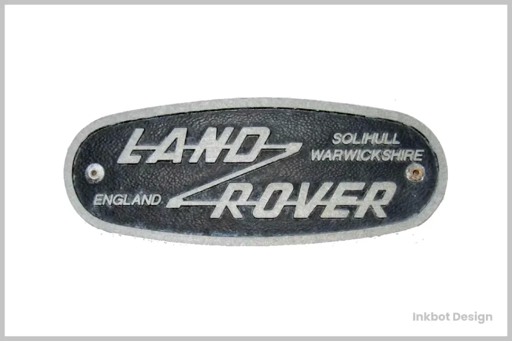
Land Rover's story began in 1948 when Maurice Wilks sketched the outline of the first Land Rover on the sand of a Welsh beach. Talk about humble beginnings!
The original logo was simple:
- The words “Land Rover” in a serif font
- Enclosed in an oval shape
- Green background (because, well, it's British and we love our countryside)
But here's the kicker: that simplicity was its strength. It was easy to recognise and reproduce and stood out on the grille of those early vehicles like a beacon of British ingenuity.
Some thought that the zigzag line featured in the original design of a well-known vehicle logo held more profound significance. This line, which eventually evolved into two separate symbols beside the text, may symbolise the company's adventurous spirit and commitment to going “Above and Beyond.”
This abstract representation captures the pioneering and innovative nature of the brand's vehicles, suggesting a dedication to tackling challenging terrains and pushing the boundaries of exploration.
Evolution, Not Revolution
Over the years, the logo has evolved, but it's always strong in its roots. Why? Because Land Rover understands a fundamental truth about branding:
Consistency builds trust.
Think about it. When you see that green oval, you immediately think of rugged reliability and adventure. That's not by accident. It's the result of decades of consistent branding.
Between 1968 and 1978, several notable changes were made to the Land Rover logo. Initially, the colour scheme of the emblem transitioned to a sleek black background paired with silver text, giving it a more modern look. The logo's overall shape evolved as well, becoming rounder compared to previous designs.
Additionally, the text that once listed “Solihull Warwickshire” and “England” was removed, simplifying the overall design. The font used for “Land Rover” was enhanced, making it bolder and more prominent. Lastly, the zigzag line through the logo was altered, breaking it into two distinct symbols and adding a unique touch to the brand's visual identity.
The Anatomy of the Land Rover Logo
Let's break this beauty down, shall we?
- The Oval: It's not just a random shape. The oval represents the birds-eye view of a Land Rover vehicle. Clever, right?
- The Colour: That deep green isn't just pretty. It represents the British countryside, echoing Land Rover's roots and its vehicles' natural habitat.
- The Typography: The current logo uses a custom sans-serif font. It's bold, straightforward, and no-nonsense – just like the vehicles.
- The Simplicity: Notice what's not there? Fancy gradients, intricate details, or flashy effects. The logo is designed to be instantly recognisable, whether on a billboard or a muddy vehicle badge.
1978 to 1986: Logo Description
The logo featured a striking forest green background during this period, creating a bold yet natural appeal. The text and border were elegantly crafted in gold, providing a luxurious contrast against the deep green. Notably, the overall shape and design within the oval remained unchanged, maintaining the emblem's familiar and iconic look.
Why the Land Rover Logo Works (And What You Can Learn From It)
- It's Versatile. The simple design works everywhere – from digital platforms to vehicle grilles.
- It's Timeless By avoiding trendy design elements, Land Rover created a logo that's as relevant today as it was decades ago.
- It Tells a Story Every logo element ties back to Land Rover's heritage and values.
- It's Distinct In a sea of car logos, the Land Rover emblem stands out.
Here's a personal anecdote: I once met a chap who'd tattooed the Land Rover logo on his arm. I'm not saying you should aim for that level of brand loyalty (please don't), but it speaks volumes about the emotional connection a well-designed logo can create.
Creating Your Iconic Logo: A Step-by-Step Guide
Right, let's get our hands dirty. You don't need a fancy design degree to create a logo that works. You just need to understand your brand and follow these steps:
1. Know Your Brand Inside Out
Before you even think about design, ask yourself:
- What's your brand's personality?
- What are your core values?
- Who's your target audience?
- What sets you apart from competitors?
Pro Tip: Write a brand manifesto. It'll help clarify your thoughts and guide your design decisions.
2. Research, Research, Research
Look at:
- Your competitors' logos
- Logos in other industries you admire
- Historical logos in your field
But remember, the goal isn't to copy. It's to understand what works and why.
3. Sketch Your Ideas
Yes, even if you can't draw to save your life. Trust me, I once tried to sketch a horse, and it looked more like a deformed giraffe. But that's not the point.
The point is to get your ideas out of your head and onto paper. No judgement, no filters. Just pure, unadulterated creativity.
4. Keep It Simple
Remember the KISS principle: Keep It Simple, Stupid (sorry, not sorry).
A complex logo might look impressive, but ask yourself:
- Will it work in small sizes?
- Can it be easily reproduced in different media?
- Will people remember it after a glance?
If the answer is “no,” it's time to simplify.
5. Choose Your Colours Wisely
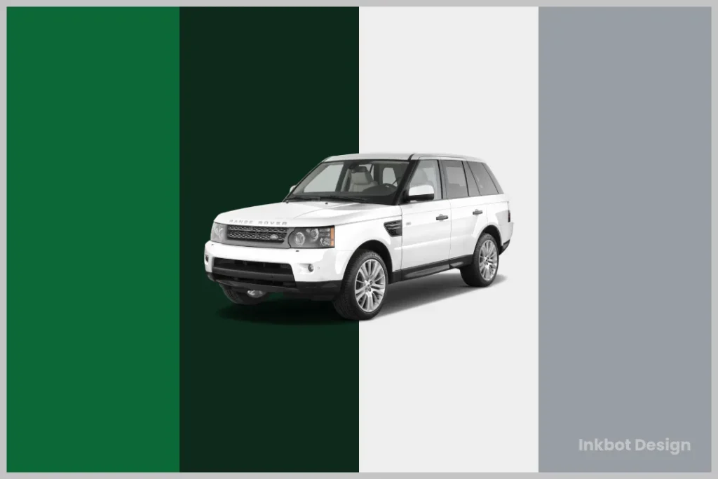
Colours aren't just pretty; they're potent communicators. Did you know that using a signature colour can increase brand recognition by 80%? (Source: Reboot Online, 2023)
For Land Rover, green was the obvious choice. What colour represents your brand's personality and values?
6. Typography Matters
The font you choose says a lot about your brand. Are you classic or modern? Serious or playful?
And for the love of all that's holy, make sure it's legible. A beautiful font that no one can read is about as useful as a chocolate teapot.
7. Make It Versatile
Your logo should look good:
- In colour and black and white
- Large and small
- On different backgrounds
- In different media (print, digital, merchandise)
8. Test, Test, Test
Show your logo to people who match your target audience. Ask them:
- What does this logo make you think of?
- What emotions does it evoke?
- Does it look familiar? (You don't want to copy someone else accidentally)
9. Refine and Polish
Based on feedback, make tweaks. But be careful not to design by committee. Remember, you can't please everyone and shouldn't try to.
10. Protect Your Creation
Once you've got your perfect logo, protect it. Register it as a trademark. Create brand guidelines to ensure they are used consistently across all platforms.
The Do's and Don'ts of Logo Design
Do:
- Keep it simple
- Make it memorable
- Ensure it's scalable
- Think long-term
- Make it relevant to your industry
Don't:
- Follow trends unthinkingly
- Use too many colours or fonts
- Copy others
- Overcomplicate the design
- Forget about its various applications
Common Logo Design Mistakes (And How to Avoid Them)
- Falling for Design Trends Remember the swoosh craze of the 90s? Exactly. Trends come and go, but your logo should stand the test of time.
- Designing for Yourself, Not Your Audience: Your personal preference matters, but your audience's perception matters more.
- Ignoring Cultural Implications: A positive symbol in one culture might be offensive in another. Do your research!
- Using Stock Images or Clip Art Nothing screams “amateur” louder than a logo built from stock elements.
- Overlooking Scalability: Your logo should look good on a business card and a billboard.
The Future of Logo Design: Trends to Watch
While I've stressed the importance of timelessness, knowing where logo design is heading is crucial. Here are some trends to keep an eye on:
- Responsive Logos Logos that adapt to different screen sizes and formats.
- Minimalism 2.0 Taking simplicity to the next level, focusing on the bare essentials.
- Animated Logos With digital platforms dominating, animated logos are gaining traction.
- Gradient Revivals Subtle, modern gradients are making a comeback.
- Variable Fonts Logos that can slightly alter their appearance while maintaining brand recognition.
Case Study: The 2020 Land Rover Logo Refresh
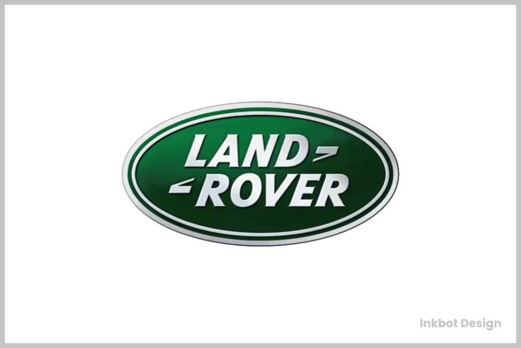
In 2020, Land Rover gave its logo a subtle but significant update. Let's break it down:
Changes:
- Removed the black keyline from the oval
- Switched to a more modern, sans-serif font
- They used a slightly darker shade of green
Why it worked:
- Maintained brand recognition
- Improved digital performance
- Reflected the brand's evolution while respecting its heritage
Lesson: Even established brands need to evolve, but the key is to do so thoughtfully and subtly.
Does Jaguar Land Rover Have Its Own Unified Logo?
The Short Answer: No, Jaguar Land Rover doesn't have a singular, unified logo.
The Details: While Jaguar and Land Rover operate under the same company's umbrella, they have chosen to retain their distinct visual identities. In any representation of the parent company, you'll see the Jaguar logo on the left side, accompanied by the Land Rover logo on the right. This combination showcases both brands under the same corporate entity but needs to form a new, unified logo.
Why This Matters: Preserving separate logos allows brands to maintain their unique heritage and market positioning while benefiting from shared corporate resources and innovation.
DIY Logo Design: Tools for Non-Designers
Not everyone has the budget for a professional designer. Here are some tools to help you create a decent logo on your own:
- Canva: User-friendly with plenty of templates
- Looka: AI-powered logo creator
- Hatchful by Shopify: Free logo maker with customisable templates
- Adobe Express: Offers professional-looking results with minimal effort
- Tailor Brands: Another AI-based option with branding packages
Remember, these tools are starting points. The magic happens when you inject your brand's unique personality into the design.
The Psychology Behind Effective Logos
Understanding the psychological impact of design elements can give your logo an edge:
- Shapes: Circles evoke community and unity, squares suggest stability, and triangles imply power or science.
- Colours: Red excites, blue calms, green represents growth, and yellow radiates optimism.
- Fonts: Serif fonts convey tradition, sans-serif fonts appear modern, and script fonts suggest elegance.
By aligning these elements with your brand's personality, you create a logo that looks good and feels suitable to your audience.
Measuring Logo Success: More Than Just Aesthetics
How do you know if your logo is working? Here are some metrics to consider:
- Brand Recognition: Can people identify your brand quickly?
- Emotional Response: What feelings does your logo evoke?
- Versatility: Does it work across all necessary platforms?
- Longevity: Has it stood the test of time?
- Conversion Impact: Has it positively affected sales or engagement?
According to a 2023 study by LogoDesign.net, businesses that invested in professional logo design saw an average 60% increase in brand recognition within the first year.
Conclusion: Your Logo, Your Legacy
Creating a logo as iconic as Land Rover's isn't about having the fanciest design or the most significant budget. It's about understanding your brand, your audience, and the power of visual communication.
Remember:
- Simplicity is your friend
- Consistency builds recognition
- Your logo is a promise to your customers – make sure it's one you can keep
Now, armed with this knowledge, go forth and create. Who knows? Maybe one day, we'll analyse your logo as a shining example of effective brand design.
And if all else fails, just sketch it in the sand of a Welsh beach. It worked for Land Rover, didn't it?
FAQs
How often should I update my logo?
There's no hard and fast rule, but a well-designed logo should generally last 5-10 years. However, minor tweaks can be made more frequently to keep it fresh.
Can I design a logo myself if I have no design experience?
Absolutely! With tools like Canva and Looka, anyone can create a decent logo. Just remember to follow the principles we've discussed.
How many colours should I use in my logo?
Less is more. Stick to 1-3 colours for maximum impact and versatility.
Should my logo include my company name?
It depends on your brand recognition. New companies often benefit from including their name, while established brands can sometimes use a symbol.
How important is the font in my logo?
Extremely. Your font choice can communicate your brand's personality as much as any other logo element.
Can I use my logo on merchandise?
Yes, but ensure you have the correct file formats and your logo looks good on various materials.
How do I know if my logo is too similar to that of another company?
Always do a thorough search before finalising your logo. If in doubt, consult a legal professional.
Should my logo be responsive?
In today's digital age, having a responsive logo that adapts to different screen sizes is increasingly essential.
How much should I budget for logo design?
It varies widely. DIY tools are often free or low-cost, while professional designers can charge anywhere from a few hundred to tens of thousands of pounds.
Can I trademark my logo?
It's often a good idea to protect your brand. Consult with a trademark attorney for specifics.
Remember, your logo often gives people a first impression of your brand. Make it count!

