Top 10 Grocery Store Logos: A Visual Feast
Have you ever found yourself staring at a supermarket logo and wondering how those clever designs came to be? You’re not alone.
In our day-to-day rush, we often need help seeing these visual representatives of the brands that feed us. But not today. This article looks into grocery store logos — precisely the top 10 that have found a place in our hearts (and shopping trolleys).
Those aren’t just random squiggles or fancy fonts; they’re deliberate symbols crafted to say much about what the company stands for, where it’s been and where it promises its consumers it’s going. From the strategic use of colour psychology to hidden messages within negative space — these logos are a branding master class.
So grab a cart and cruise down the aisles of design brilliance together. We’ll unpack visual strategies, decode hidden meanings and maybe even stumble upon surprises along the way. Ready to look at your favourite grocery store through new eyes?
- Grocery store logos convey brand identity and consumer trust through strategic design elements.
- Colour psychology plays a crucial role in logo effectiveness and emotional connection.
- Simplicity in design helps logos stand out in a crowded retail environment.
- Typography can influence brand perception, impacting consumer behaviour and loyalty.
- 1. Tesco: The Red and Blue Powerhouse
- 2. Sainsbury's: Orange You Glad It's Simple?
- 3. Asda: The Walmart of the UK
- 4. Morrisons: A Fresh Take on Tradition
- 5. Waitrose: Elegance in Simplicity
- 6. Aldi: Bold and Unapologetic
- 7. Lidl: A Fresh Face in the Crowd
- 8. Co-op: A Circle of Trust
- 9. Iceland: Cool and Contrasted
- 10. M&S Food: Luxury in Letters
- The Power of Supermarket Branding
- The Evolution of Grocery Store Logos
- The Psychology of Colour in Supermarket Logos
- The Role of Typography in Supermarket Logos
- The Impact of Logo Design on Consumer Behaviour
- Conclusion: The Logo Lowdown
- FAQs
1. Tesco: The Red and Blue Powerhouse
Tesco’s logo is British, like a cup of tea on a rainy day. But what does it take to make this brand work?
It isn’t just pretty, you know. Those bold reds and blues are psychological powerhouses. Red is attention-grabbing and stimulates appetite (smart move!), while blue inspires trust.
They almost say, “Come on in, we’ve got everything you need – and we won’t let you down.”
Have you ever noticed the slightly rounded letters? They’re not just there for cuteness’ sake – this softens up the brand, making it more accessible and friendly.
Since its birth as a simple text design, Tesco’s logo has come quite some way — each iteration reflecting the company’s growth alongside changing times. It’s similar to watching a family photo album… but with brands!
2. Sainsbury's: Orange You Glad It's Simple?
Sainsbury’s logo is straightforward but not as plain as it seems.
Why the colour orange? Because it’s warm, lively and eye-catching. In many red and blue supermarket logos, Sainsbury’s orange is like a happy “Oi!” in a packed room.
The clean sans-serif typeface does all the talking. It’s modern, legible, and gets straight to the point. No frills, no fuss — just like their commitment to quality products at fair prices.
Have you ever noticed that cheeky apostrophe? It is grammatically correct and pays homage to the brand's beginnings as a family firm. It’s almost like a little nod to the discerning consumer.
3. Asda: The Walmart of the UK
Asda’s logo may appear simple, but there is more to it than meets the eye.
That bright green colour is not just visually appealing; it represents freshness and growth, too. It’s like a promise for crisp fruit and vegetables – new beginnings with every shop.
Friendly and approachable – those lowercase letters make Asda seem down-to-earth. It’s as if they’re saying: ‘We’re not posh, we’re your local store.’
4. Morrisons: A Fresh Take on Tradition
That stylised tree is not only good-looking but also meaningful. It stands for development, preservation and the company’s dedication to providing fresh food. In other words, there is a little green pledge in each store.
Green and yellow are not chosen by chance. Green represents freshness, nature, etc., while yellow adds some sunny, positive attitude ☼ , Like saying “Good morning!” visually every time you look at it.
Boldness with a touch of oddity in font design gives Morrison its character; neither too assertive nor too playful — simply friendly. The font might be typographically compared to a firm handshake with a warm smile.
5. Waitrose: Elegance in Simplicity
The logo of Waitrose is a perfect example of a simple yet effective design. However, you might think that it’s too basic.
It’s not just some green box. It represents quality, like an assurance of excellence in a small package.
While the crisp white typeface provides contrast against its backdrop, it also symbolises purity, hygiene and transparency – all things necessary to Waitrose.
Do you see how they made ‘W' uppercase? This minor alteration softens an otherwise very polished emblem, making it more inviting. Imagine someone giving a friendly nod at some formal event.
6. Aldi: Bold and Unapologetic
Aldi’s logo is like the brand itself — simple, direct and hard to miss.
Those blue, red, yellow and orange colours aren’t just lovely to look at — they’re meaningful. Blue stands for trust, red for energy, yellow for optimism and orange for friendliness. It’s as though the Aldi logo were a visual representation of the company’s values.
The chunky letters aren’t the only things that are easy to read and use when making a statement. They say, “We’re here. We’re confident. And we have great deals.” It’s akin to shouting out friendly across a crowded room.
Notice that thin white border around the letters? That’s not just there for looks; it helps the logo pop on any background so Aldi’s message always comes through. Neat trick, huh?
7. Lidl: A Fresh Face in the Crowd
Lidl’s logo in the grocery world is a breath of fresh air. Let’s talk about this character filled with colours.
These loud primary colours are more than just attractive; they also have meaning. Blue symbolises trustworthiness; yellow represents cheerfulness, and red stands for energy. It is like a visual boost every time you visit the store.
This rounded font with slight slanting isn’t only attractive but also makes Lidl appear approachable and amiable. It’s as if typographically saying “Hi” with a smile.
8. Co-op: A Circle of Trust
The Co-op symbol is an excellent example of simple significance. Let’s take a closer look at this small blue marvel.
That four-leaf clover shape is not only lucky – it’s meaningful. It represents the four pillars of the cooperative: self-help, self-responsibility, democracy, and equality. It’s a visual mission statement.
This particular shade of blue isn’t accidental. It’s chosen to evoke trust, reliability, and tranquillity. It’s a visual comfort every time you see it.
The clean sans-serif font isn’t just modern; it’s deliberate. This reflects transparency and directness as core principles of the Co-operative ethos. Essentially, the brand says, “What you see is what you get.”
9. Iceland: Cool and Contrasted
Iceland’s logo is as cool as the products it sells. Let’s thaw out this frosty design.
That bold red is not just beautiful – it’s brilliant. It immediately juxtaposes the brand with cold, frozen goods. It’s a visual assurance of freshness.
Bold and dynamic, the text implies movement and gives a sense of energy to the logo. It seems to say: ‘We never stop, we keep going forward’.
The red does more than decorate – it adds warmth to the cold brand name and grounds the logo. This visual full-stop underlines confidence in the brand.
10. M&S Food: Luxury in Letters
M&S Food’s logo could be described as the perfect example of modest sophistication. Let’s appreciate this delicate design for a moment.
That dark green isn’t just any old shade – it’s deliberate. It connotes excellence, freshness and even some glamour. So you might say it’s like setting the bar high visually.
This stylised ampersand doesn’t only serve to join M and S together; it is also a star in its own right regarding design. It brings out fun and character within an otherwise very formal logo.
This crisp, serif font is accessible to the eye and hints at M&S’s roots and reputation for high quality. So you could think of it as being akin to what a well-tailored suit does for someone's appearance, typographically speaking.
The Power of Supermarket Branding
You must be wondering why we did all this stuff on supermarket logos. Does it matter? I can assure you it does, and more than you think.
Creating Trust Through Design
These marks are not just pretty pictures – they’re silent advocates of their brands. They toil day and night without rest to build trust and foster recognition.
When your eyes catch the Tesco red and blue or Sainsbury’s orange, it makes connections in your mind and forms opinions, like a repeated visual connection.
Inspiring Brand Loyalty
A well-crafted emblem has the potential to create an emotional bond with customers.
Think about how often you have chosen an unfamiliar brand simply because it was recognisable by its logo. That’s good branding for you.
Differentiating From Others In A Crowd
Grocery retail is a highly competitive sector where being unique matters most.
A unique identification symbol may make people choose your shop when they walk past several others on their way home from work or elsewhere; otherwise, they would have gone straight into any other store nearby.
The Evolution of Grocery Store Logos

Supermarket logos have changed throughout the years, just like the stores themselves. Let’s take a quick walk through history.
From Words to Pictures
In the beginning, many supermarket logos were nothing more than text. But as time passed, they started to incorporate icons and symbols that could help them stand out from one another—like a caterpillar becoming a butterfly.
Getting Simpler
For a while, there has been an ongoing trend toward simplicity in logo design. Compare some old ornate logos with today’s streamlined versions—it’s almost like going from Victorian fashion to modern minimalism.
Going Digital
With online shopping becoming more popular daily, it was only natural that logos would have to change, too. They need to be able to look good on everything from giant signs outside of stores down to tiny app icons on your phone – brands had to learn a whole new visual language.
The Psychology of Colour in Supermarket Logos
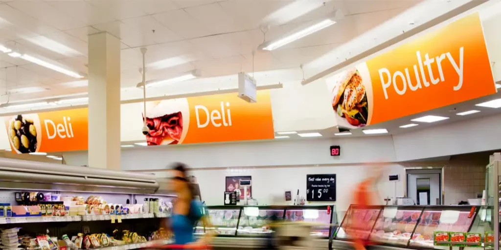
Colour is not just about being pretty – it is a robust branding tool. Let us consider how supermarkets utilise colour psychology to their advantage.
Red: The Attention-Grabber
Red is often used in supermarket logos (like Tesco) because it catches your eye and whets your appetite. It’s like saying “Hello there” visually!
Blue: The Trustworthy Choice
Trust and dependability are evoked by blue (seen in the Tesco and Asda logos). This brand won’t let you down; at least, that’s what its appearance suggests.
Green: The Fresh Option
Green is associated with freshness, healthiness and nature (Morrisons and Waitrose use it). It's like looking at an apple or some lettuce.
Orange: The Friendly Face
Warmth and energy come across from orange (Sainsbury’s use it). This is like a happy sign saying, “Come on in!”
The Role of Typography in Supermarket Logos
The font selection in a logo is not just limited to being legible; it also has to have personality. Typography has always been an essential factor in design as well as branding.
Serif vs Sans-Serif
There’s something about serif fonts (such as the M&S logo) that makes us associate them with tradition and reliability. On the other hand, sans-serif typefaces (like that used in the Asda logo) often come across as more modern or approachable — think of the difference between receiving a handwritten letter versus getting a text message.
Upper vs Lowercase
Using uppercase letters (e.g., ALDI) can make brands seem bold or self-assured, while lowercase ones (as seen on the Asda logo) tend to feel friendlier and more down-to-earth, like someone speaking softly instead of shouting at you.
Custom vs Standard Fonts
To establish themselves among competitors, many supermarkets opt for custom typefaces. This way, it's akin to having your voice amidst the noise.
The Impact of Logo Design on Consumer Behaviour
Think about it. How much can a logo affect me? Trust me, it can do wonders.
First Impressions Do Count
Usually, the customer gets to see the logo first. It could also be responsible for how they feel about the shopping process. It’s just like judging a book by its cover – we all do it even when we are unaware.
Recognition Of The Brand
In half a second, you can identify a good logo design. This immediate knowledge affects our purchase choices, especially when time is not on our side. It’s similar to seeing someone you know in a crowd – there’s comfort in familiarity.
Connecting On An Emotional Level
The thing about logos is that they make us feel some type of way. When we come across an emblem connected with positive memories, it automatically gives us satisfaction while shopping there. Think of your favourite meal scent – it brings back good times.
Conclusion: The Logo Lowdown
So there you have it – an in-depth exploration of supermarket logos. It’s incredible how much thought goes into such a simple design! Whether it’s the psychology behind colours, hidden messages, or even affecting consumer behaviour, these symbols are working their hardest to get noticed and earn trust.
Look up at those logos next time you’re pushing your trolley down the supermarket aisle. They’re more than just signs – they’re silent storytellers with a brand story. Who knows? You might start seeing your favourite grocery store in a whole new light.
After all, in retail, where everything has a price tag, pictures are worth thousands of dollars, sometimes too many zeros to count. So here’s to those humble little emblems that lead us through deals, good and bad, until we find ourselves standing before shelves full of great products, wondering how we got there.
FAQs
What is the reason behind the use of blue colour in most supermarket logos?
Supermarkets usually use blue in their logos to signify trust, reliability, and calmness – all qualities they want their customers to feel.
How frequently do supermarkets change their logos?
There is no fixed pattern; however, most do it every five to ten years. However, such changes are often minor transformations rather than complete makeovers.
Are there any legal concerns when designing a supermarket logo?
Yes, trademark infringement can be avoided by ensuring that logos are unique. Moreover, simplicity should also be considered since app icons require being easily identifiable even at small sizes.
Do supermarket logos differ across countries?
Occasionally – though many worldwide chains attempt to keep consistent brand identities everywhere, they might adjust their emblems to meet local cultural tastes or language demands.
How much does an average supermarket logo design cost?
The cost can range widely, from several thousand pounds for smaller chains within one area to hundreds or even millions during major rebranding campaigns by national supermarkets.
