The Best Buy Logo and the Perils of “Modern” Design
Let’s get one thing straight. Corporate logos aren’t art.
They aren’t sacred relics to be admired in a gallery. They are tools. Functional, hard-working assets designed to do a particular job: identify a business. Nothing more, nothing less.
Some do that job brilliantly. Others fail spectacularly.
The history of the Best Buy logo is a perfect, messy, multi-billion-dollar case study in this truth. We aren’t here to politely applaud its journey. We’re here to dissect it, to pull it apart and see how it works.
This story is more valuable than a dozen branding textbooks for any entrepreneur or business owner. It’s a real-world lesson in identity, equity, and the catastrophic allure of chasing trends.
We have to start with that famous yellow price tag. It’s the elephant in the room. But to understand its power and the folly of its demotion, we must return to the beginning.
- Corporate logos are functional tools designed to identify businesses, not artworks to admire.
- The evolution of Best Buy's logo highlights the dangers of chasing modern design trends at the expense of distinctiveness.
- Maintaining brand equity and recognition is crucial; rebranding can lead to losing established identity and customer associations.
It Started With Music, Not a Grand Design (1966-1983)
Before the blue and yellow big-box stores, there was a single shop. A hi-fi stereo shop. The brand wasn’t born in a high-rise agency with whiteboards and focus groups. It was born out of necessity.
The Sound of Music: A Logo of Pure Function
In 1966, Richard Schulze opened ‘The Sound of Music’.
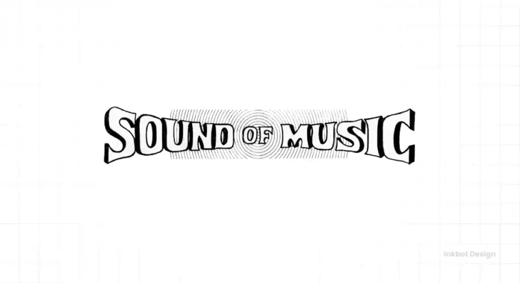
Here’s the first lesson, and it’s a crucial one. Your first logo doesn’t need to be a masterpiece. It doesn’t need to “tell your story” or “encapsulate your vision.” It needs to work for a business of one, a shop on a street. It simply needs to say who you are. The rest comes later.
The Tornado Sale: When Action Creates a Brand
The name ‘Best Buy’ wasn’t conceived. It was earned.
In 1981, a tornado hit one of Minnesota’s Sound of Music locations. It was the worst natural disaster in the area’s history. In the aftermath, Schulze did something innovative. He held a massive sale in the car park of the damaged store, advertising “best buys” on all the stock.
The event was a phenomenal success. People weren’t just coming for the deals; they were shouting about getting the “best buy.”
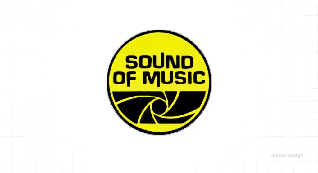
A designer didn’t create the brand’s core identity. It was forged in a car park during a disaster sale. It wasn’t a strategic pivot when the company officially rebranded as ‘Best Buy Co., Inc.’ in 1983. It was just management catching up to the reality that their customers had already created.
That Bizarre Tornado Logo: A Lesson in Literalism (1983-1989)
With a new name came a new logo. And it was… something else.
Deconstructing the Swirling Vortex
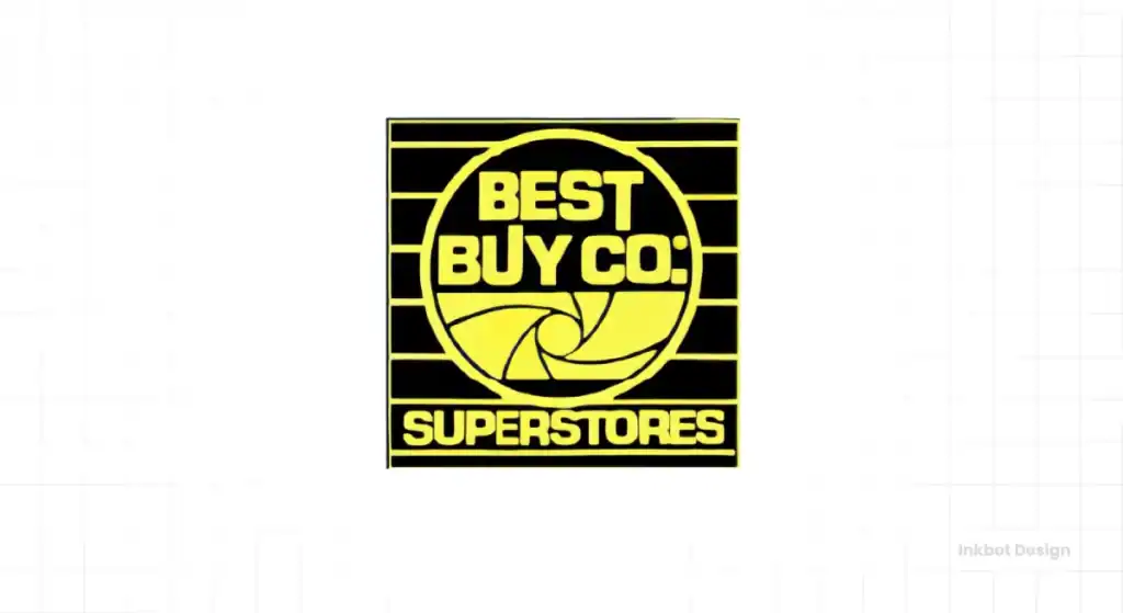
The official Best Buy logo was a busy, swirling vortex for about five years—a literal tornado.
Let’s be brutally honest. As a piece of graphic design, it’s a failure by almost any modern metric. It’s busy, the shapes are chaotic, it’s difficult to reproduce, and it wouldn’t survive for a second as a 16×16 pixel favicon.
But did it work then? Maybe. It was certainly distinctive. It had energy. It directly referenced the company’s foundational myth and deal-making, whirlwind-of-activity ethos. It stood out in an era before the internet demanded clean, scalable vectors.
Why You Don’t Put Your Origin Story in Your Logo
The tornado logo is the ultimate cautionary tale against literalism. Taking your “eureka moment” and turning it into a picture is almost always a mistake.
Why? It shackles you. It anchors your entire brand identity to a static moment. How do you evolve a company dedicated to modern technology when your logo is a cartoon weather event from the early 80s? You can’t. It’s a dead end.
Your origin story belongs on your ‘About Us’ page. It provides context and character. A logo has a different, more immediate job. It needs to identify you, simply and memorably, today. Not tell a long story about yesterday.
Enter the Price Tag: Forging an Icon (1989-2018)
By the late 80s, Best Buy knew it needed to grow up. The tornado had run its course. The company expanded rapidly and needed a serious, professional, powerful mark.
What they came up with was a stroke of absolute genius.
The Masterstroke: Simple, Direct, Unmistakable
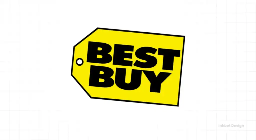
In 1989, the yellow price tag was born.
Let’s pull it apart. The typography was a bold, confident, no-nonsense sans-serif. The hero of the mark, however, was the container: a bright, graphic, unashamedly commercial yellow price tag.
It was brilliant for three simple reasons:
- It communicated the core promise instantly. Value. Deals. Price. You knew what Best Buy was about before you even finished reading the words.
- It was utterly distinctive. The price tag had guts in a corporate world of swooshes, globes, and sterile wordmarks. It was populist, not elitist.
- It was a functional workhorse. That tag shape worked everywhere on the massive facade of a big-box store, on the corner of a newspaper advert, on an employee’s polo shirt, on a tiny product label. It was a consistent, versatile vessel for the brand.
It was almost comically direct. There were no hidden metaphors. No clever visual puns. It just said: “We sell things. This is the tag. Come get a deal.”
The Blunt Psychology of Yellow and Blue
People love to get poetic about colour theory. The Best Buy colour scheme worked because it was simple and primal.
- Blue: The colour of corporate stability. It communicates trust, security, and reliability. Think IBM, Dell, HP.
- Yellow: The colour of a hazard sign. The colour of a Post-it note. The colour of a “SALE” sticker. It screams: “LOOK AT ME! THIS IS IMPORTANT! THIS IS A DEAL!”
The combination created the perfect message. A big, reliable, trustworthy company (blue) where you could get an unmissable deal (yellow). Simple. Powerful. Effective.
The Forgotten Power of “Good Enough” Design
Here’s a point that gets lost in design schools. The Best Buy price tag logo wasn’t “perfect.” A type purist could probably find a dozen things to critique about the font’s kerning or weight.
But who cares?
It had what mattered more than technical perfection: character. It had personality. For nearly three decades, it has built up billions of dollars in brand equity to become one of the most recognised retail symbols in the world.
The lesson for every entrepreneur is stark. Stop chasing some mythical, academic “perfection.” Start chasing recognition and function. A slightly quirky logo that everyone on the street remembers is infinitely more valuable than a “perfectly” balanced logo that everyone ignores.
A Quick Aside: The Genius of the Geek Squad Logo
During the price tag’s reign, Best Buy did something else brilliant. They created the Geek Squad sub-brand.
The black-and-orange, slightly retro, badge-like logo was a masterpiece of sub-branding. It had its own distinct, quirky personality. It felt different from the leading Best Buy brand, yet they were part of the same family. It showed that the Best Buy universe could contain multitudes, proving the brand could be about service and expertise, not just rock-bottom prices. It was a strategic masterclass.
The Great Flattening: Chasing the “Modern” Trap (2018-Present)
And then, in 2018, they threw most of it away.
After nearly 30 years of building an iconic identity, Best Buy needed a change. The decision-making process offers a chilling insight into the flawed logic of corporate branding.
The Corporate Logic Behind Changing a Winner
The context is essential. Amazon was eating the world. The “death of retail” was the headline of the day. Best Buy knew it couldn’t compete with Amazon regarding price and logistics alone.
So, they pivoted. The new strategy focused on human connection, expert service, and a consultative sales approach. The new tagline became “Let’s talk about what’s possible.
Suddenly, the old logo, which proudly and loudly shouted “PRICE! DEALS! VALUE!”, felt off-message. The internal brief to the branding agency was like: “Make us look more premium. More like a tech company. More… ‘modern’.”
Deconstructing the 2018 Logo
The result was predictable for anyone watching design trends.
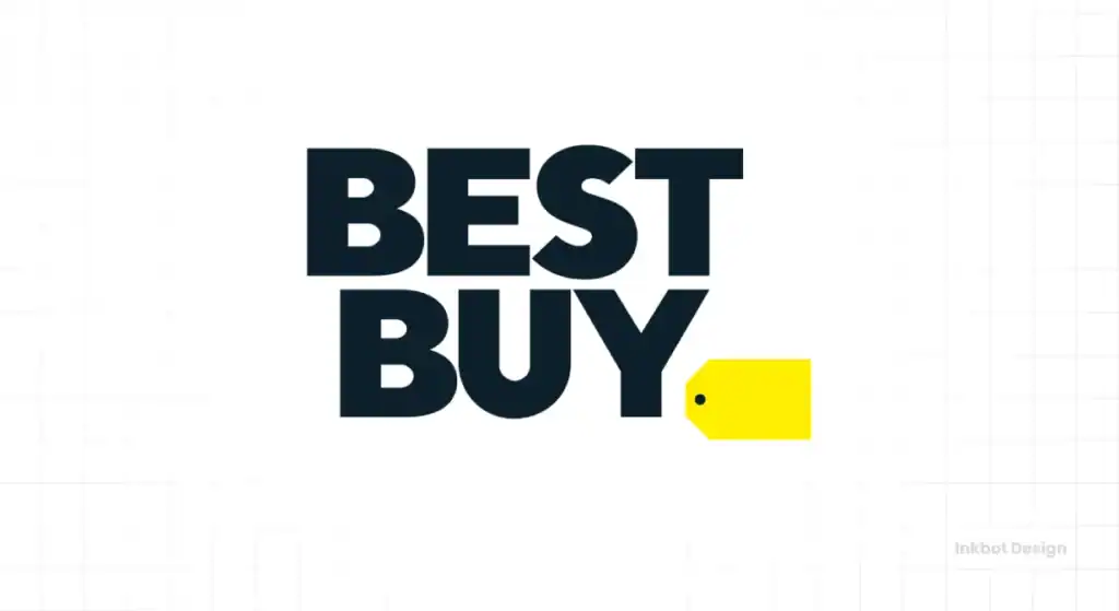
The bold “BEST BUY” wordmark was liberated from its tag. The font was updated to be even simpler and heavier. And the iconic price tag? It was shrunk, castrated, and demoted to a minor, decorative punctuation at the end of the line. A “nod,” they called it.
The new logo is undeniably “cleaner.” It’s more flexible for digital applications. It fits neatly into the little square of an app icon. In short, it looks like a lot of other logos.
A Brutal Assessment: What Was Gained vs. What Was Lost?
This is where the rubber meets the road. Let’s do a simple audit.
What was gained?
- Flexibility: The wordmark can be used more easily on its own. True, but hardly a game-changer.
- “Modernity” now fits in with the general aesthetic of contemporary tech-adjacent brands. It looks “current.”
- Subtlety: It whispers “value” with the tiny tag instead of shouting it.
What was lost?
- Identity. This is the unforgivable sin. The price tag was the identity. It was the single most distinctive visual asset the company owned. Removing it was like Nike removing the swoosh or McDonald’s ditching the golden arches. They surgically removed the soul of the mark.
- Recognition. The logo went from being instantly recognisable from a hundred yards away to being utterly generic. Swap “Best Buy” with “Tech Corp” or “Direct Ship” and the logo would work just as well, which is to say, not well at all.
- Courage. The redesign feels like a defensive crouch. It’s the visual equivalent of being afraid to own what made you successful. It’s a brand chasing trends, not confidently setting its path.
Best Buy Joins the “Blanding” Epidemic
This move wasn’t made in a vacuum. It was part of a sad, broader trend in the corporate world often called “blanding.”
From Burberry to Yves Saint Laurent to Google, we’ve seen dozens of major brands sand off all their interesting, characterful edges in favour of bland, geometric, sans-serif wordmarks. It’s the pursuit of inoffensive conformity. It’s safe. It’s boring. And it’s a plague on distinctiveness.
Best Buy traded a unique, powerful, and famous symbol for something that looks like everything else.
The initial public and design community reaction was overwhelmingly negative. This is always a bad sign. An anecdote I remember clearly is seeing the new logo on a storefront and genuinely believing it was a temporary sign used during construction. When a brand has to issue press releases and articles “explaining” the thoughtful strategy behind its new logo, the logo has already failed. A good logo explains itself.
Brutal Lessons for Business Owners from the Best Buy Saga
Enough observation. Let’s extract the practical advice. What can a small business owner learn from this multi-billion-dollar story?
Lesson 1: Your Logo Can’t Lie
The price tag logo worked because it perfectly reflected the truth of the business: a massive selection at great prices. The new logo reflects a “consultative service” business, but that experience is far more challenging to deliver consistently across thousands of stores.
A logo can only amplify the truth. It cannot invent it. If your service is rubbish, the most elegant logo in the world won’t save you. It will just make you look like a stylish liar. Fix the business reality first. The logo is the easy part.
Lesson 2: Beware the Siren Call of “Modern”
“Modern” is just another word for “trendy.” And today’s trend is tomorrow’s dated cliché.
Chasing a “modern” aesthetic can lead you to strip away the character and quirks that make your brand memorable and relatable. The goal isn’t to look like you belong in 2025. The goal is to be instantly recognisable.
Instead of asking your designer, “Can you make it look more modern?”, ask these questions:
- Is it distinctive?
- Is it memorable?
- Does it work across all the places I need it to?
Professional guidance is invaluable in getting this balance right. It’s why our logo design services exist—to steer businesses away from these traps.
Lesson 3: Equity is Hard-Won and Easily Lost
Best Buy invested 30 years and billions of marketing dollars into making a yellow tag mean something. It was a globally recognised asset. And they downgraded it to a complete stop.
Before you think about a rebrand, do an honest, unsentimental audit of your current identity. What parts work? What do your customers recognise? What do they connect with? Be ruthlessly objective. Don’t throw away your most powerful asset because you’re bored with it or a new marketing manager wants to make their mark.
Lesson 4: The Refresh vs. Rebrand Choice
Did Best Buy need a ground-up rebrand? I’d argue forcefully that they did not.
They needed a refresh.
They could have kept the iconic tag. They could have commissioned a world-class typographer to redraw the wordmark inside it. They could have refined the colours and simplified the tag’s shape for the digital age. They could have modernised the execution while preserving the core concept.
This is often the smarter, safer, and vastly more effective route for an established business with existing brand recognition. It shows evolution, not amputation.
If you’re facing this choice, weighing a simple refresh against a full-scale rebrand, a professional opinion can bring critical clarity. It’s a conversation worth having before you make an expensive mistake. You can request a quote to start that exact conversation with us.
Conclusion: The Ghost in the Big Box Store
The Best Buy logo saga is a journey from literalism (the tornado) to iconic function (the price tag) to generic conformity (the current wordmark).
But here’s the most telling part.
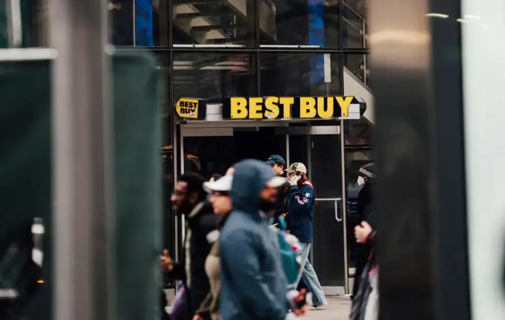
What do you see if you walk into a Best Buy store today? You see that yellow tag. It’s on the price signs. It’s on promotional displays. It’s on employee vests. The ghost of the old, powerful logo still haunts the entire brand experience, doing the heavy lifting that the new, “modern” logo can’t.
It’s a quiet admission that they know which identity truly had the power.
So, look at your logo. Look at it right now. Is it a functional tool with a clear job? Or is it just pretty decoration? Is it distinctively yours, or could it belong to anyone?
The history of the Best Buy logo is a billion-dollar lesson in knowing the difference.
Frequently Asked Questions (FAQs)
Why did Best Buy change its logo in 2018?
Best Buy changed its logo to align with a new business strategy focused on offering expert service and a human connection, rather than just low prices. They felt the old “price tag” logo over-emphasised deals and wanted a more “modern” and subtle look to reflect their consultative approach.
What was the Best Buy “Tornado” logo?
From roughly 1983 to 1989, Best Buy used a logo featuring a colourful, swirling tornado. This was a literal reference to the company’s origin story, which involved a famous “best buy” sale after a tornado damaged one of its original ‘Sound of Music’ stores.
What did the old yellow Best Buy price tag logo represent?
The yellow price tag logo, used from 1989 to 2018, was designed to be a direct and consequential symbol of value. The tag shape and bright yellow colour instantly communicated deals, price, and affordability, while the corporate blue font conveyed trust and reliability.
Is the new Best Buy logo effective?
Effectiveness is debatable. From a functional design perspective, it is “clean” and works well in digital formats like app icons. However, from a branding perspective, critics argue it sacrificed a unique, highly recognisable identity for a generic, forgettable look that blends in with other modern brands.
What is “blanding,” and is the Best Buy logo an example?
“Blanding” (a portmanteau of “bland” and “branding”) is a design trend where companies strip their logos of unique character in favour of simplistic, generic, sans-serif wordmarks. Many critics consider the 2018 Best Buy logo a prime example of this, as it traded its distinctive price tag for a much safer and less memorable design.
Who designed the new Best Buy logo?
Best Buy’s internal creative team reportedly led the design of the 2018 logo update.
Did the Geek Squad logo also change?
The iconic Geek Squad badge logo was largely untouched during the 2018 Best Buy rebrand. It remains a strong, distinct sub-brand that co-exists with the primary corporate identity.
What is the key lesson for small businesses from the Best Buy logo history?
A primary lesson is not to undervalue the brand equity of a distinctive logo. Best Buy spent decades building recognition into its price tag symbol, only to demote it. For small businesses, this teaches the importance of creating a memorable and functional mark, and being cautious about discarding that recognition in pursuit of a “modern” trend.
What is a brand “refresh” versus a “rebrand”?
A brand “refresh” involves modernising and updating an existing logo and visual identity while keeping its core concept intact (e.g., simplifying lines, updating typography). A “rebrand” is a more drastic change, often involving a completely new logo and strategic direction, as seen with Best Buy in 2018.
How does the current Best Buy logo incorporate the old one?
The current logo uses the wordmark “Best Buy” followed by a small yellow tag at the end, almost like a period. The company refers to this as a “nod” to its heritage, using the iconic shape as a small accent mark rather than the central feature of the logo.
What was Best Buy called before it was Best Buy?
Before being renamed Best Buy in 1983, the company was founded in 1966 as a small stereo shop called ‘Sound of Music’.
Why is brand equity in a logo so important?
Brand equity is the value and recognition built up in a brand element over time. A logo with high equity (like the old Best Buy tag) is instantly recognisable and triggers associations in a customer’s mind. This is an incredibly valuable business asset that is expensive to build and risky to discard.
We’ve just spent over 3,000 words observing how a massive corporation navigated its identity. The lessons are clear, practical, and often brutally simple. You’ll find more on our blog if these real-world observations resonate with you more than fluffy marketing talk.
If you’re looking at your logo and starting to ask some of these complex questions, that’s where we come in. Our job is to provide the direct, experienced guidance that prevents costly mistakes.
Explore our logo design services to see our approach, or if you’re ready to have a frank conversation about your brand’s identity, request a quote today.
