
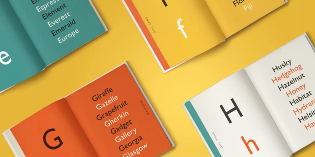
Top 10 Best Sans-Serif Fonts of All-Time
When it comes to design, your choices regarding typography can profoundly impact how your brand is perceived.
One of the most commonly used font categories in modern design is sans-serif.
But why have these fonts become the backbone of contemporary design?
- Sans-serif fonts enhance legibility and readability, crucial for effective digital communication.
- They convey modernity and simplicity, important for branding and consumer perception.
- Versatile fonts adapt well across various mediums, improving overall design cohesion.
- Font selection should align with audience demographics to enhance emotional engagement.
- Emerging trends focus on geometric shapes and sustainable typography in 2025 designs.
Why Sans-Serif Fonts Matter
Sans-serif fonts are more than just a visual preference; they significantly influence legibility and readability.
Whether setting up a blog post, designing a website, or crafting promotional material, your font choice can make or break your design. Studies have shown that sans-serif fonts are easier to read on screens, which is critical in our digital age.
Key Factors:
- Legibility: Can the letters be easily distinguished from one another?
- Readability: How easily can the words be read in continuous paragraphs?
Think about it: when did you last squint at an article because of a funky font choice? We've all been there, and it never leaves a good impression.
The Aesthetic Appeal of Sans-Serif Fonts
Many businesses have embraced sans-serif fonts not just for their performance but also for their aesthetic appeal. These fonts evoke feelings of modernity and straightforwardness.
This quality is essential in a world where consumers value transparency and simplicity. Take Futura, for instance. Its distinctive geometric shapes give a sleek, polished look that's hard to ignore.
Plus, it has the versatility to feel both progressive and vintage—like that timeless band you still enjoy, even if they're “old school”.
Common Applications
Where can you effectively use these fonts? Here are some typical applications:
- Web design: Perfect for headlines and body text.
- Branding: Creates a clean, professional identity for your brand.
- Digital advertising: Grabs attention while being easy to read.
Criteria for Evaluating Sans-Serif Fonts
Now that we've established why sans-serif fonts are such a vital part of modern design let's dive into the criteria that can make or break your choice of font.
Selecting the right sans-serif font isn't just about finding one you like; it's about ensuring that it meets specific standards for effectiveness.
Legibility and Readability
One of the foremost considerations when choosing a font is how legible and readable it is. Legibility refers to how easily individual letters are distinguished from one another.
Picture this: You're at a bustling airport, trying to read a sign using a fancy sans-serif font with oddly shaped letters. The frustration level goes up, right?
- Characteristics of Legibility:
- Letter shapes: Look for simple and distinct letterforms.
- Weight and thickness: Strong contrasts help define the letters better.
- Spacing: Adequate letter and line spacing can drastically improve legibility. Think of it as giving each letter its personal space.
On the other hand, readability measures how easily words and sentences can be absorbed. You might have a beautiful font that looks great on a poster but turns into a chore to read in a long article. Trust me, I've been there, and it's not pretty.
- Characteristics of Readability:
- Line length: Shorter lines are easier to read, especially on digital screens.
- Font size: Testing different sizes can make a world of difference in how your audience interacts with your content.
- Contrast: Ensure there's enough contrast between the font colour and background. Dark grey text on white? Yes. Light blue text on yellow? Not so much.
Versatility in Different Designs
Next up is versatility. This might be the secret sauce that helps you elevate your design game. A versatile font can adapt to different contexts, and that's a huge plus.
Let's talk about when I was designing marketing material for an upscale real estate agency. They needed something modern yet classy. Enter: Proxima Nova. This font worked perfectly across their website, brochures, and social media posts without any hiccups—it felt like a design superhero swooping in to save the day.
- Characteristics of Versatility:
- Multiple weights and styles: A font with a range of weights (light, regular, bold) provides flexibility for headlines, subheadings, and body text.
- Compatibility with other fonts: Some sans-serif fonts pair effortlessly with serifs, while others stand alone like a lone wolf. You don't want a font that causes drama in a design layout!
- Application across mediums: Whether it's print, web, or mobile, the font should perform well in every medium.
Examples of Versatile Fonts:
- Helvetica: A pure classic used in everything from logos to websites.
- Open Sans: Its friendly and approachable design works beautifully in various sizes.
- Gotham: This font feels very American, making it perfect for brands that want to exude confidence and strength.
Putting It All Together
When evaluating sans-serif fonts, think of legibility and readability as the foundation of a solid building. If the foundation isn't strong, your entire structure—your designs, brand identity, and even your message—can crumble under the pressures of consumer scrutiny.
Versatility, meanwhile, is the finishing touch that allows your designs to evolve and adapt. Imagine a font that meets all of these criteria. It's like finding that multi-tool in your drawer: you never know when you'll need it, but you're thrilled it's there when you do.
Top 10 Best Sans-Serif Fonts
With a solid understanding of evaluating sans-serif fonts, it's time to dive into the crème de la crème of the type design world. These fonts have stood the test of time and consistently deliver on legibility, versatility, and style.
Whether designing a sleek corporate brochure or a trendy blog, these ten sans-serif fonts are essential for any designer's toolkit.
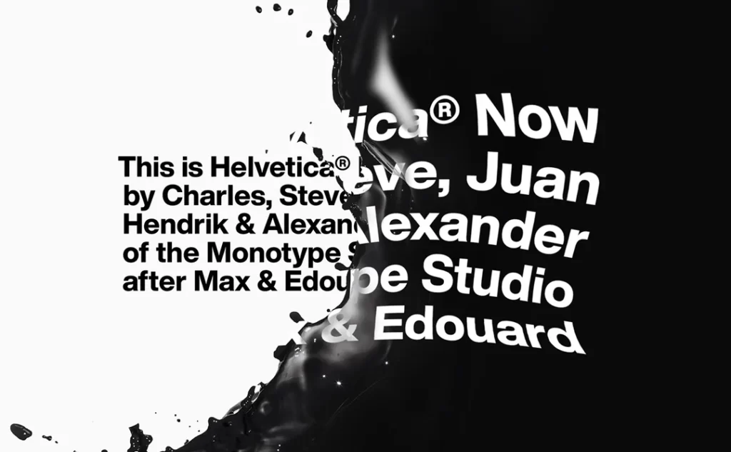
1 – Helvetica: The Design World's Swiss Army Knife
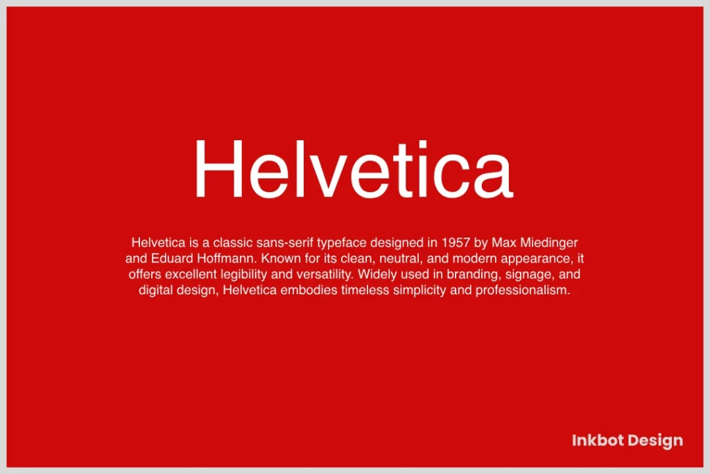
Ah, Helvetica—the font everyone loves to hate and simultaneously adores. It's like the ubiquitous jacket that somehow looks good on everyone.
- Versatile Applications: Helvetica does everything from brand logos to subway signage.
- Classic Appeal: Its clean lines and neutral tone suit various contexts.
I once worked with a branding client obsessed with minimalism. When we switched to Helvetica, their brand identity took on a timeless elegance that resonated with their audience.
2 – Futura: The Modernist's Dream
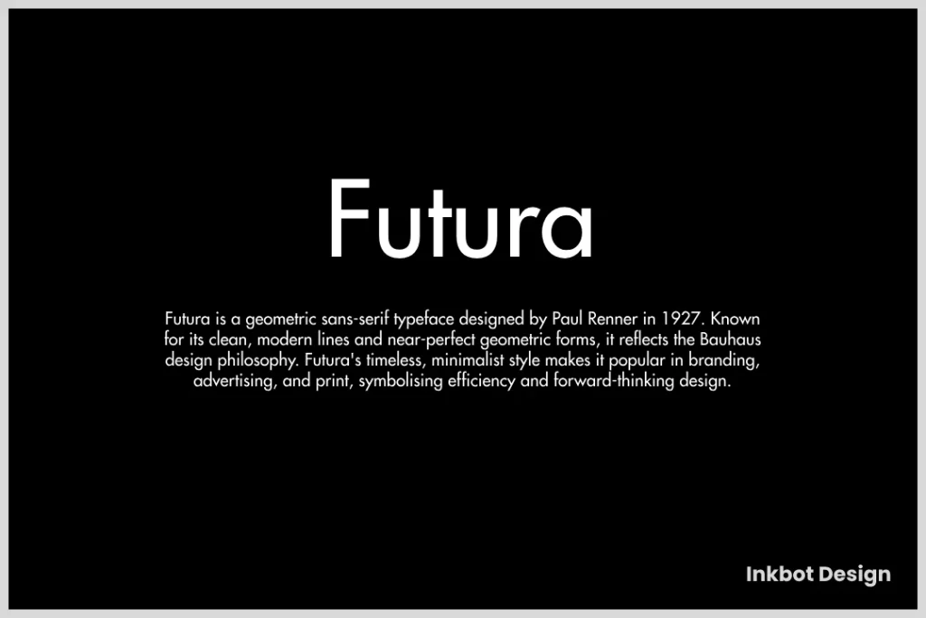
Futura represents everything that the modernist movement stands for. It's geometric, stylish, and oozes sophistication.
- Geometric Shapes: Each letter feels designed with mathematical precision.
- Perfect for Titles: It shines in headings rather than body text, forcing readers to pay attention.
In a project for a tech startup, Futura became the go-to choice for their slogan. The futuristic vibes perfectly encapsulated their innovative spirit.
3 – Roboto: Google's Typographic Masterpiece
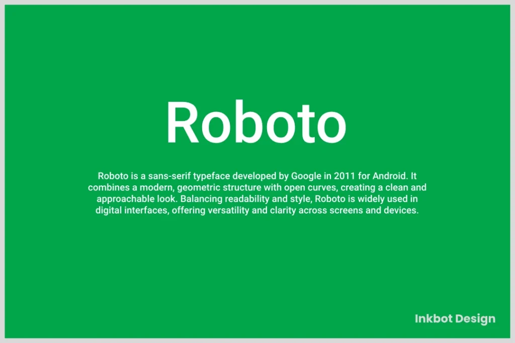
If you've ever browsed the web, chances are you've encountered Roboto. Designed by Google, this font is eye-catching and highly functional.
- Designed for Digital: Roboto maintains legibility across different device sizes.
- Friendly and Approachable: It balances modernity with warmth, making it perfect for user interfaces.
Using Roboto in an app I designed felt natural. Users responded positively because it was easy to read on any screen.
4 – Arial: The Controversial Workhorse

Let's get this out of the way: Arial has its fair share of critics. But whether you like it or not, it's a workhorse in the typography field.
- Widespread Availability: Almost everyone can access Arial, making it a safe choice.
- Functional for Everyone: This font is here to get the job done, even if it doesn't wow you.
During my early design days, I used Arial often out of necessity. It's reliable, even if others groan about it being overused.
5 – Open Sans: The People's Champion

Open Sans has become a favourite among web designers. It's clean, simple, and extremely easy to read.
- Humanist Style: Despite its sans-serif nature, it has a friendly vibe.
- Ideal for Websites: Open Sans performs well in large and small text sizes.
I can't count how often I've used Open Sans for website projects. Clients love it, and I appreciate its humbleness in letting content shine.
6 – Proxima Nova: The Chameleon Font
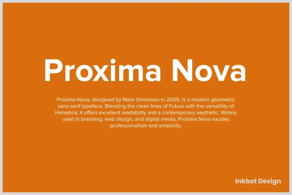
If Versatility had a name, it would be Proxima Nova. This font can adapt to any brand identity and design style.
- Different Weights: Available in many weights, it equally suits headlines and body text.
- Modern Yet Timeless: It embodies a modern aesthetic yet feels familiar.
For a recent campaign, I used Proxima Nova to blend different elements into a cohesive design. The results were effortlessly stylish.
7 – Montserrat: The Hipster's Delight

Montserrat has a distinct urban flair—think trendy coffee shops and boutique fashion.
- Unique Character Shapes: A few quirks set it apart from other fonts.
- Perfect for Creative Projects: It excels in setting a contemporary tone.
When designing for a local clothing brand, Montserrat offered a fresh appeal that attracted a youthful demographic.
8 – Avenir: A Blend of Modern and Classic
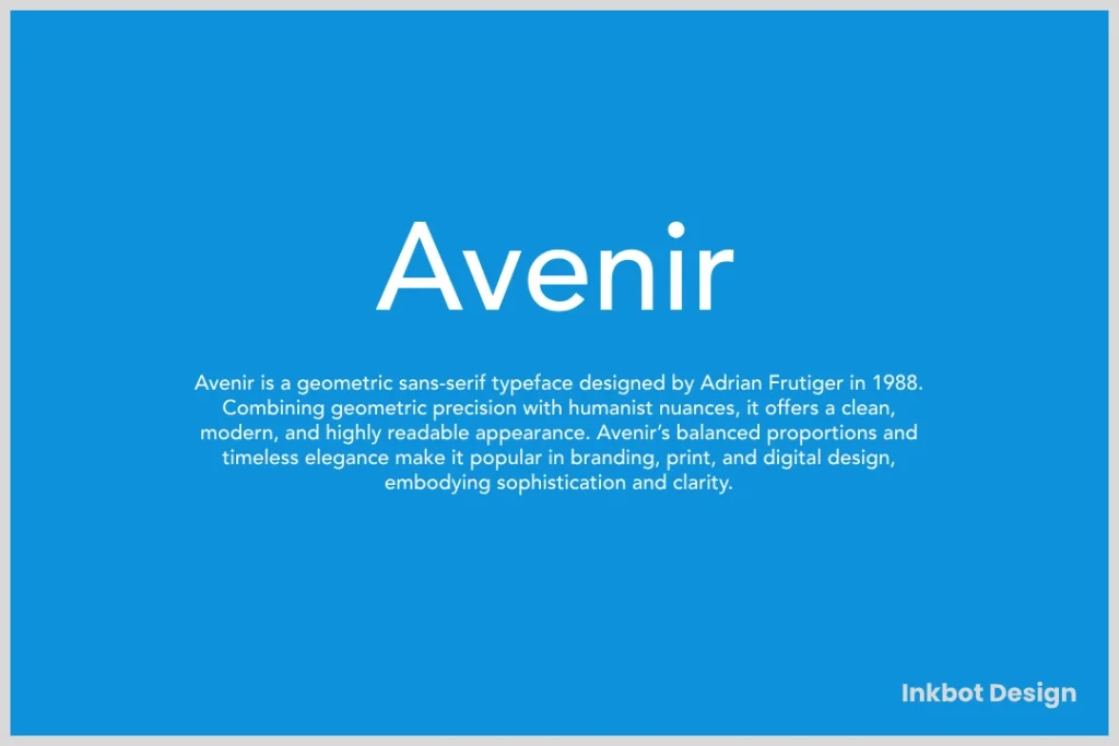
Avenir strikes the perfect balance between modernity and tradition. It's like visiting an art gallery where classical meets contemporary.
- Sophisticated Look: Its smooth curves offer elegance and charm.
- Versatile Usage: Avenir adapts well across various mediums.
In a project for a high-end event, using Avenir elevated the design, making it feel instantly luxurious.
9 – Poppins: Geometric and Bold

If you want a font that stands out, go for Poppins. Its geometric shapes give a bold personality that draws the eye.
- Playful Look: Great for brands that want to feel fun and friendly.
- Multiple Weights Available: It allows flexibility in design.
When launching a children's educational app, Poppins was a no-brainer. It infused a sense of joy and excitement into the design.
10 – Gotham: The American Dream Font

Finally, we have Gotham, often seen as the quintessential American font. It's strong and authoritative, making it popular in diverse settings.
- Bold and Impactful: Perfect for everything from posters to websites.
- John McCain's Choice: Used in various political campaigns, it has a sense of credibility.
Using Gotham for a non-profit campaign, we increased engagement because it conveyed a strong message while remaining accessible.
There you have it—the top ten best sans-serif fonts that every designer should know about. Each has unique qualities that enhance your brand's identity and improve communication.
As you explore these options, consider your specific needs and audience. Choose wisely, and watch your designs soar! Ready to delve into the practical usage of these fonts? Let's go!
How to Use Sans-Serif Fonts Effectively
Now that you're familiar with top sans-serif fonts, you must understand how to use them effectively. Great typography doesn't just happen; it's carefully crafted.
Let's explore two crucial strategies that can elevate your design game: pairing sans-serif fonts with serif fonts and ensuring consistency in branding.
Pairing with Serif Fonts
One of the most intriguing aspects of typography is how different fonts can come together to create a harmonious design. Mixing sans-serif and serif fonts can create a striking visual balance; it's like having the best of both worlds.
Why Pairing Works:
- Contrast in Styles: Sans-serif fonts have a modern feel, while serif fonts carry a sense of tradition and elegance.
- Guides the Reader's Eye: A well-considered pairing can help guide your audience through content, distinguishing headings from body text.
Tips for Successful Pairing:
- Choose Complementary Fonts: Select fonts that enhance each other. For instance, you might use Helvetica for your headings paired with Georgia for your body text. This combination creates a sophisticated look.
- Maintain Size Hierarchy:
- Headings in sans-serif fonts should generally be more prominent and bolder.
- Use serifs for body text to improve readability in longer passages.
- Stick to Two Fonts: Resist the urge to mix more than two fonts, which can create visual chaos. Less is more when it comes to typography.
I remember when I redesigned the website for a local bakery.
We paired the vibrant, playful Montserrat for headings with the classic Merriweather for the body text. The result? It was a visually appealing site that perfectly matched the bakery's blend of traditional recipes and modern flair.
Ensuring Consistency in Branding

Consistency is key in branding, and your choice of fonts plays a significant role. Using sans-serif fonts effectively means choosing the right ones and applying them consistently across all platforms.
How to Achieve Consistency:
- Establish a Font System: Choose your primary sans-serif font for headings, a secondary font for body text, and a possible accent font for unique elements. This system keeps your designs cohesive.
- Example:
- Primary: Futura for headings
- Secondary: Open Sans for body text
- Accent: Poppins for callouts or highlights
- Example:
- Create a Style Guide: Document how and where to use your chosen fonts within your brand materials. This ensures it follows the same guidelines whenever you or your team creates anything—print materials, social media graphics, or web content.
- Apply Across All Platforms: Whether it's your website, packaging, or promotional materials, ensure that your chosen fonts appear everywhere. Consistent typography fosters brand recognition.
In my experience with Inkbot Design, creating a detailed style guide has been invaluable. I once worked with a tech client with various teams, developing content for different platforms.
Despite numerous contributors, we maintained a uniform brand identity by outlining font usage, spacing, and colour palettes.
A Quick Reference Table for Font Pairing
| Element | Sans-Serif Font | Serif Font |
|---|---|---|
| Headings | Helvetica | Georgia |
| Body Text | Open Sans | Times New Roman |
| Captions | Montserrat | Baskerville |
Using sans-serif fonts effectively is all about strategy and consistency. By mastering font pairing, you can create visually stunning designs that guide your audience while maintaining a cohesive brand identity.
Remember, typography isn't just a visual element; it's an integral part of your brand's voice.
Dive into these techniques as you experiment with your designs, and see how proper typography can elevate your overall aesthetic. Ready to create dazzling designs that resonate with your audience? Let's get started!
Tips for Font Selection
Now that we've covered how to use sans-serif fonts effectively let's tackle another critical aspect of typography: font selection. The right font can elevate your design, while the wrong choice might leave your audience confused or disinterested. So, how do you choose wisely? Let's dig into two vital considerations: audience and purpose and testing font compatibility.
Considering Audience and Purpose
Every design serves a specific audience and purpose. Knowing who your audience is—and what you intend to communicate—will dramatically influence your font selection.
Key Factors to Consider:
- Demographic Characteristics:
- Age: Younger audiences prefer modern, trendy fonts, while older audiences might resonate more with classic styles.
- Profession: Fonts can convey a vibe. A tech startup may lean towards sleek and contemporary fonts like Roboto, while a law firm might choose a more traditional look with fonts like Garamond.
- Emotional Impact:
- Fonts carry emotional weight. For example, a rounded sans-serif like Poppins can project friendliness and approachability, while a bold serif like Times New Roman exudes seriousness and authority.
- Consider what you want your audience to feel when they interact with your content. Is your goal to inform, entertain, or persuade?
I once worked on a campaign for an educational program for high school students. We chose Open Sans for its friendly nature, coupled with vibrant colours. The result was engaging and relatable, ideally aligned with our target demographic.
- Cultural Context:
- Understand cultural implications in typography. Specific fonts may resonate differently based on cultural backgrounds. For example, using an overly ornate font might be seen as elegant in some cultures but excessive in others.
- Brand Identity:
- Your font choice should reflect your brand. It should align with your brand's values and mission. If your brand is about innovation and creativity, contemporary sans serifs like Futura or Montserrat could work wonders.
Testing Font Compatibility
Once you've considered your audience and purpose, it's time to ensure the chosen font works across various formats and platforms. Testing for font compatibility plays a massive role in maintaining a consistent and professional look.
How to Effectively Test Compatibility:
- View in Different Contexts:
- Create mock-ups for various mediums (web, print, mobile) to see how the font performs. What looks good on a screen might translate poorly to print and vice versa.
- Test readability at different sizes. A sleek font in large headlines may become a chore to read in body text.
- Mix and Match:
- Try pairing your selected font with other fonts to see how they interact.
- For example:
- Futura (heading) with Merriweather (body)
- Helvetica (heading) with Georgia (body)
- Solicit Feedback:
- Getting external opinions can make a difference. Share prototypes with peers or potential users and gather their thoughts.
- Ask simple questions:
- Is the text legible?
- Does it evoke the intended emotion?
- Do the fonts work well together?
- Use Font Performance Tools:
- Consider using typography tools or websites that help assess font performance and compatibility. Tools like Google Fonts allow testing different fonts side-by-side.
2025 Trends in Sans-Serif Fonts
As we look ahead, it's crucial to keep an eye on emerging trends in the world of typography. Sans-serif fonts continuously evolve and will play a significant role in shaping design aesthetics in 2025.
Now, this isn't just about picking a trendy font; it's about understanding the direction typography is heading and how you can leverage these trends to captivate your audience. Let's dive into what to expect!
Embracing Geometric Shapes
One of the most noticeable trends is a shift towards geometric sans-serif fonts. These fonts are characterised by their clean lines and circular forms, which convey a sense of modernity and simplicity.
Why Geometric?
- Minimalism Reigns: With the rise of minimalistic design, geometric fonts such as Futura are back in vogue. They embody simplicity and sophistication, making them versatile for various applications.
- Youthful Appeal: These fonts often resonate with younger audiences who prefer bold, straightforward design elements.
I remember attending a design conference last year where the speaker declared that “simplicity is the new sophistication.” When I first experimented with geometric fonts for a branding project, I decided to use Circular Std for my client's app, which resulted in a clean and contemporary feel that appealed to younger users.
New Variants of Classic Fonts
As we enter 2025, expect to see revamped classic sans-serif fonts on the rise. Designers will be more open to revisiting traditional fonts like Helvetica and redesigning them to fit the contemporary landscape.
What to Watch For:
- Customisations: Many brands will lean towards unique typographic variations of well-known classics to set themselves apart.
- Hybrid Fonts: Fonts that blend serif and sans-serif elements will become more prevalent. This trend gives a nod to tradition while embracing modern aesthetics.
For instance, during a project for a film festival, I experimented with a modified version of Helvetica that incorporated softer edges and more organic shapes. The final design felt approachable and modern, ideally aligned with the festival's youthful, fresh vibe.
Expressive Typography
In 2025, expect to see expressive typography making waves. Designers are increasingly using fonts that possess personality beyond mere functionality. This trend revolves around individuality, creativity, and storytelling.
Important Features:
- Bold statements: Fonts will be used to convey emotions and messages. Expect to see oversized and unconventional typefaces.
- Interactive Design: Typography will take centre stage in interactive designs, such as websites that allow text animations and transformations for user engagement.
During a campaign for a local art director, we chose a playful sans-serif font that conveyed joy and curiosity. Not only did it help express the brand personality, but it also invited users to explore the site further. Everyone loves to see creativity!
Sustainable Typography
A profound trend gaining traction in 2025 is the emphasis on sustainable design. Brands will increasingly showcase their commitment to sustainability through their design choices, including font selection.
- Earthy Aesthetics: Fonts that embody organic curves and softer edges will reflect a commitment to sustainability.
- Environmentally-conscious Brands: Expect to see brands choosing fonts that resonate with eco-friendly ideals, using softer, rounded styles instead of harsh, rigid lines.
For example, when working with an eco-friendly clothing brand, we opted for a soft sans-serif that mirrored the brand's values. This decision laid the groundwork for compelling visual storytelling, showcasing their commitment to a sustainable lifestyle.
Conclusion
As we wrap up our journey through the world of sans-serif fonts, it's essential to reflect on the key takeaways that can help you elevate your designs and branding in impactful ways. We've explored the effectiveness of sans-serif fonts, how to use them well, emerging trends, and, importantly, the considerations behind selecting the right typography for your projects.
Embrace the Power of Typography
Typography isn't just about choosing a pretty font; it plays a central role in your design's narrative. Sans-serif fonts, with their clean lines and modern aesthetics, offer a range of possibilities:
- Legibility: Their straightforward, simple lines make sans-serif fonts incredibly easy to read, regardless of the medium.
- Versatility: From websites to printed materials, these fonts adapt seamlessly to various contexts, making them a designer's best friend.
- Emotional Connection: Your font can influence how your audience perceives your brand. Don't underestimate its power!
For example, transitioning to Open Sans for a client's e-commerce site made a difference. The fresh look increased engagement and overall trust in the brand.
The Importance of Selection Criteria
Choosing the right font isn't a decision to be taken lightly. The criteria we discussed—such as legibility, versatility, and compatibility—are what you should focus on when selecting types.
- Audience Awareness: Always consider who your audience is. Tailoring your font choices to their preferences and sensibilities can set your design apart.
- Testing: Feel free to test out different fonts in various settings. A font that looks great on paper might perform poorly on a digital platform and vice versa. Test, adjust, and refine!
One of my favourite projects was for a local sports brand. I didn't rush the font selection; I surveyed potential customers' preferences. This user feedback shaped our final decision, creating a brand identity everyone loved.
Stay Ahead with Trends
Trends come and go, but you must stay ahead of the curve as a designer, especially for 2025. Some key trends gathered here include:
- Geometric Fonts: Utilising clean and minimal fonts will create an air of elegance and simplicity.
- Expressive Typography: Be bolder and make statements—your fonts can speak louder than words, creating a dialogue with your audience.
- Sustainable Typographic Choices: Reflecting eco-friendly values in your font selection aligns business practices with customer expectations.
These trends are not mere fads; they represent a shift in how we approach design. Consider these trends, but remember to infuse your unique brand identity into every piece you create. Your designs should tell a story that resonates on a personal level.
Final Thoughts
As we conclude our exploration into sans-serif fonts, remember that typography is an art form and a science, combining aesthetics with functionality.
Embrace the versatility and accessibility of sans-serif fonts, and let them amplify your design narratives. Your choice of typography can either enhance or undermine your message, so tread carefully but creatively.
Whether you're designing for a corporate giant or a local coffee shop, harness the power of these fonts to unlock new levels of communication and engagement. Keep experimenting, keep learning, and keep pushing the boundaries of design. Your creative journey doesn't end here—it's just the beginning.
So, make bold choices, and let your typography inspire the world! Let the insights you've gathered guide you, whether it's your next design project or a new client pitch.
Are you ready to transform your designs with the impactful power of sans-serif fonts? Let's dive in and make it happen!

