History of the Olympics Logo Design & Symbols
The five interlocking circles of the Olympics logo represent much more than just five interlocking rings. They are a promise and a narrative; they have stood the test of time as a brand.
In 1912, when Baron Pierre de Coubertin drew those rings, he was not merely doodling – he was coming up with symbols for unity, continuity and excellence that would last for millennia.
But here's what you need to know about great design: It changes. It grows. It tells new stories while respecting old ones.
Global appeal meets local flavour in the Olympic logo odyssey — it's a master class on balancing tradition against innovation. These symbols must be able to say more than words can express and reach beyond language or culture.
Every design is a time capsule, from those modest rings to recent dynamic logos used during past games; each one captures an Olympic spirit and reflects some sense of the age which birthed them.
So, let us unpack this visual journey because we will discover much more than just beautiful images within these badges and signs; here lies the potential for design to bring people together, motivate them, and imprint their everyday experiences into our memories.
The Founding of the Modern Olympics
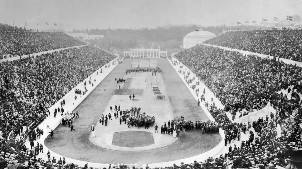
The Modern Olympics arose in 1896 due to a cultural revival and a desire for global unity that resulted from the convergence of these two events. What Pierre de Coubertin aimed for when he founded the Games was nothing less than this – to see nations come together in competition.
The Role of Pierre de Coubertin
Pierre de Coubertin was crucial in resurrecting this ancient gathering, hoping to bring back its original spirit.
He wanted sportsmanship to become more internationalised because he believed it could promote education worldwide and foster closer ties between countries through healthy rivalry among their youth.
However, there is another important thing we should mention regarding his contributions – the Olympic motto “Citius, Altius, Fortius” (“Faster, Higher, Stronger”). This phrase represents striving for perfection or reaching one's potential at any cost and serves as a guiding principle for athletes and everyone involved in these Games.
This year marked such an enormous commitment by him that never before had so many countries participated nor so many different events been held during what turned out to be an incredibly vibrant return to international sportsmanship since antiquity (competitors from thirteen nations contested 43 events)
The First Modern Olympics in 1896
During these Games, modern perceptions about Olympiads began to take shape; here, too, were sown seeds of excitement that would eventually sprout into worldwide interest. 1896 saw an event centred on athletic achievement with determination as its core value system – rewards came through hard work alone.
But they weren't just games either; they signified more than anything else hope and renaissance for humanity across borders.
People still talk about moments from those days, like when Marathon winner Spyridon Louis brought down heaven's thunderbolt upon earth or how diverse cultures competed side by side in friendly rivalry, thus giving birth to what we now call the Olympic spirit.
Early Olympic Symbols and Logos
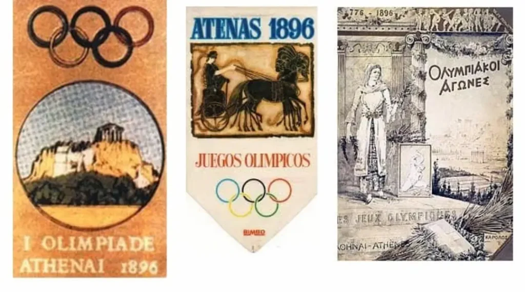
Some symbols can characterise an era, while others represent a profound vision. The 1896 Olympics logo was among the earliest efforts to establish a common identity for the newly revived Olympic Games.
This initial logo, conceived by Pierre de Coubertin, the founder of the modern Olympics, represented hope, unity and international rivalry.
The First 1896 Olympics Logo
Logos are not just visual marks; they embody the spirit of an event. The original logo of the 1896 Olympic Games featured an image of an ancient Greek amphora – symbolising both the historical roots of the games and celebrating athletic excellence throughout history. This design reflects a rebirth for these Games after centuries of inactivity.
Elements of Design and Symbolism
Logo design is about finding that sweet spot between aesthetics, meaning and emotional connection. It links modernity and tradition by combining a laurel wreath (symbolising victory) with the Olympic flame, representing enlightenment or ambition.
Such an approach asks you to remember how great ancient competitions were while leading towards contemporary pursuits for excellence.
Cultural & Historical Context
The late 19th century marked a turning point in culture as it witnessed the birth of the modern Olympics. More than merely another sporting spectacle, the 1896 Games held in Athens, Greece, were designed to bring people together around shared global values during a time when many felt disconnected from one another. With this in mind, it became necessary that any emblem adopted should resonate with ideals such as unity and peace.
The early versions of the Olympic logos served as reminders about the importance of international cooperation against the backdrop of growing nationalism coupled with increasing divisions among different nations across the globe.
There was a deliberate choice made regarding historical symbols used, which sought to re-establish linkages with ancient Greek times; at the same time, simplicity embraced within its design allowed for universal appeal – thus reflecting the true nature of these games, i.e., bringing people together from all walks of life transcending challenges posed by an ever-changing environment.
Evolution and Adoption of the Olympic Rings
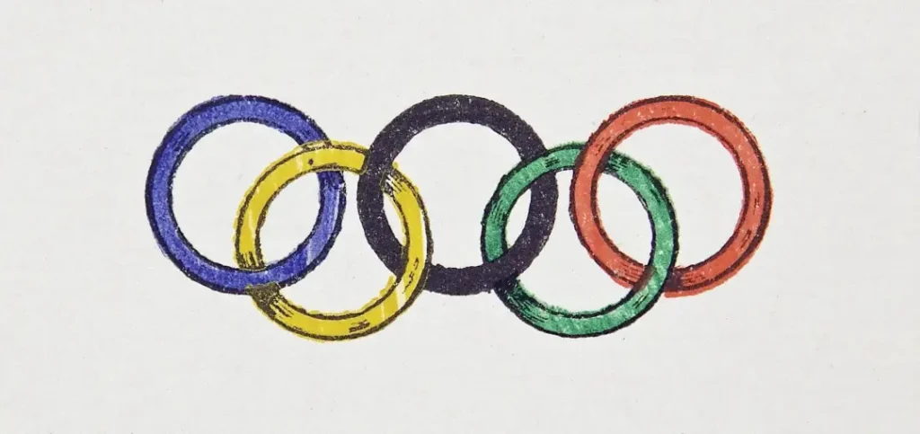
So, let us see how the famous Olympic rings transformed from a vision into an official emblem of the Games and unite athletes and countries worldwide.
The official symbol of the Rings' establishment
In 1913, Pierre de Coubertin made a historic decision to adopt circles as part of Olympic branding. The idea was that they should represent unity and friendship among nations; thus, their introduction reflected Coubertin's hope for global peace through sports where people compete with each other regardless of nationalities or any other differences.
Early Applications & Modifications Made on Them
Since they became part of Olympic culture, these symbols have served as visual shorthand for everything related to the Olympics.
Still, they were later used widely across many marketing materials, such as posters, which were supposed to inspire excellence among athletes by reminding them about striving together towards one goal worldwide, as represented by those rings.
The circles were also adapted in different forms, including printed matter like brochures, pamphlets, or even merchandise; early versions showed more than just what each ring stood for – hope and unity amid chaos caused by events like World Wars.
Recognition worldwide is primarily due to their status not being recognised anywhere else but implying something more profound. Acknowledging this fact, they became universal symbols representing peace within oneself while striving against others.
Changes in the Olympic Logo Over the Years
Over the years, the Olympic logo has changed a lot. It reflects changes in culture and design. Each version is a visual identity and a story about the Games themselves.
The 1924 Paris Olympics Logo
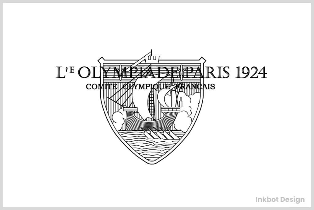
With the 1924 Paris Olympics, logo redesigns made a giant leap. It was the first time the Olympics were used prominently as part of an emblem, uniting them all into one symbol for these Games. This signpost marked when they were officially linked to an event and set up what would be done with them later on down the line.
Post-War Changes (1940s-1950s)
Paris represented broader post-war transitions within Olympic branding around WW2; after such destruction, people needed something positive to bring them together again; hence, logos also required altering. There was always continuity between designs, but certain elements were softened during this period to represent hopefulness and worldwide cooperation.
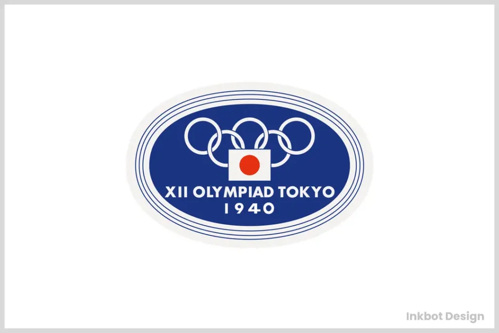
Modifications at that time mirrored those happening globally; having just come out from under its shadow, there was a need for an image which could resonate with an audience needing optimism.
The changes to the Olympic logo during this era were subtle yet significant; it took on softer lines while adopting more inclusive design language, reflecting broader shifts towards peace and collaboration within society – laying the foundations for newer ways of thinking about messaging through sports events like these.
Modernisations (1960s-Present)
In recent years, we have seen some very traditional yet innovative approaches by designers when creating current Olympic logos. Modern aesthetic trends favour minimalism and simplicity, often achieved through new technologies, allowing adaptability across different media platforms and increasing visibility in today's digital age.
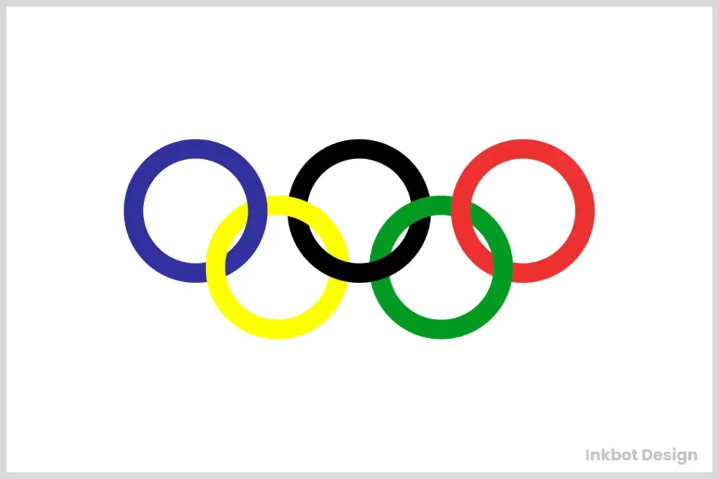
Over time, there has been an increasing focus on inclusivity and embracing host city cultures throughout various editions. The games have become more global over time; therefore, it is essential that they are visually appealing and can also tell powerful stories that resonate with different people worldwide.
This is an opportunity for you to understand how design can be a brand, cultural, and community spirit all in one, thus making the Olympics relevant for generations.
Olympic Symbols Beyond the Rings
The Games are filled with iconic symbols such as the Olympic rings. They have a deep-rooted culture and identity manifested in various symbolic elements like mascots, medals, and torches.
Designing and Developing Olympic Mascots
Designing principles for Olympic mascots have notably changed over time. From the first-ever mascot named Waldi, which was a dachshund at the Munich 1972 games, they invested in them as characters of the Olympics representing different cultures, values, and dreams amongst others, each time being made to relate emotionally with people, hence fostering more enjoyable moments during these events.

Medals: Their Designs and Historical Importance
After years of hard work and sacrifice, winning a medal is an athlete's ultimate dream. Host countries' artistic styles have significantly influenced the design of Olympic medals over different historical periods.
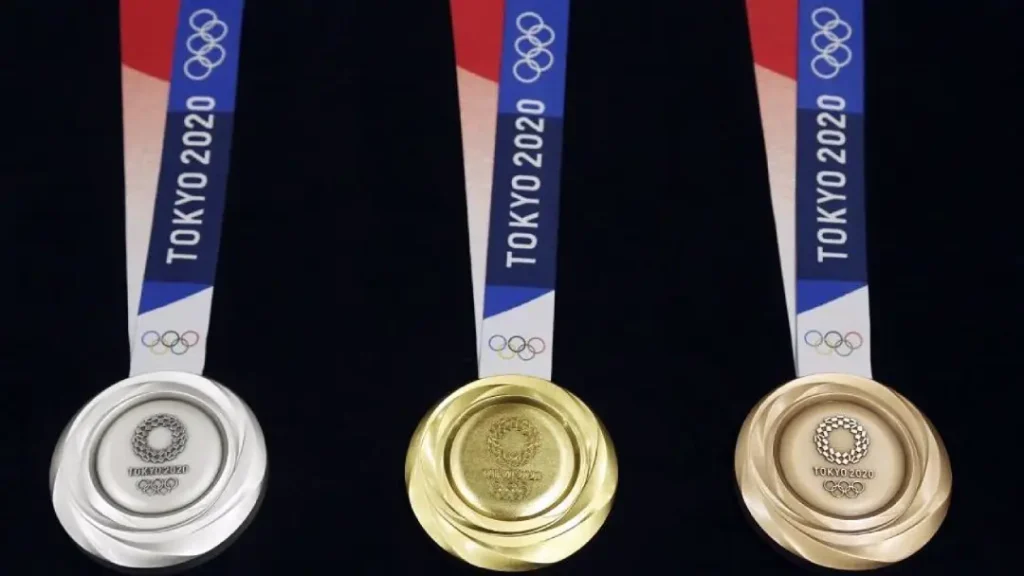
This year's ones were also crafted to reflect Japan's natural beauty through intricate patterns around five rings symbolising continents. Today's showcase modern manufacturing techniques while still having rich historical meaning as they represent winning at sports and sharing a part in broader Olympic history.
For example, the 2021 Tokyo Olympics medals were uniquely designed, featuring five interlocking circles representing continents surrounded by complex shapes.
Torch Designs And What They Mean
In designs of Olympic torches, rings made out of flames represent peace through competition. The torch relay that carries the flame from Olympia to the host city is a powerful example of how ancient traditions and sports can bring people together.
Olympic torches are symbols of hope for humanity's quest towards excellence, and they change their design at every edition. For example, the 2012 London Games torch had 8000 holes, each meant to be carried by one person so as not only to give it an eye-catching look but also to represent participants' values profoundly.
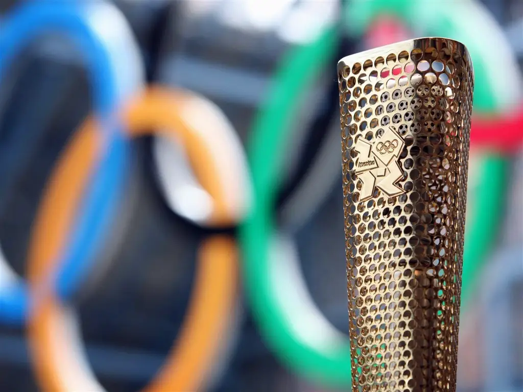
Through creativity in design and thoughtful symbolism, these flames remain alive throughout the Olympics, and the spirit of competition is felt among all those participating in or watching them.
The Role of National Identity in Olympic Branding
Despite taking place worldwide, national identity is critical to Olympic branding. It's not just about sports; The Games are a chance for each country to show itself off and foster pride among its people. Olympic logos and symbols represent where sport and national culture meet, leaving a lasting impact on global audiences by generating recognition.
National Colours Enacted
Typically, Olympic branding uses the colours associated with each nation to represent them better. Every country brings its own unique set of hues to the event, which can resonate emotionally with athletes or viewers right away. These colours may be shown through flags or uniforms, instilling deep-seated patriotism as we recognise our place in international athletics.
Host Nation's Influence Over Logo Design
A significant element in designing an Olympic logo is how much it reflects the personality traits of the countries hosting them. When given this opportunity, nations visually express themselves through various aspects of their identity related to these games' brands. Often, specific patterns or colour palettes will be used to represent local cultures, histories, and values such logos embody.
While creating the brand for the Olympics, decisions are often made that include parts inspired by traditional practices and cultural symbols from around where it takes place.
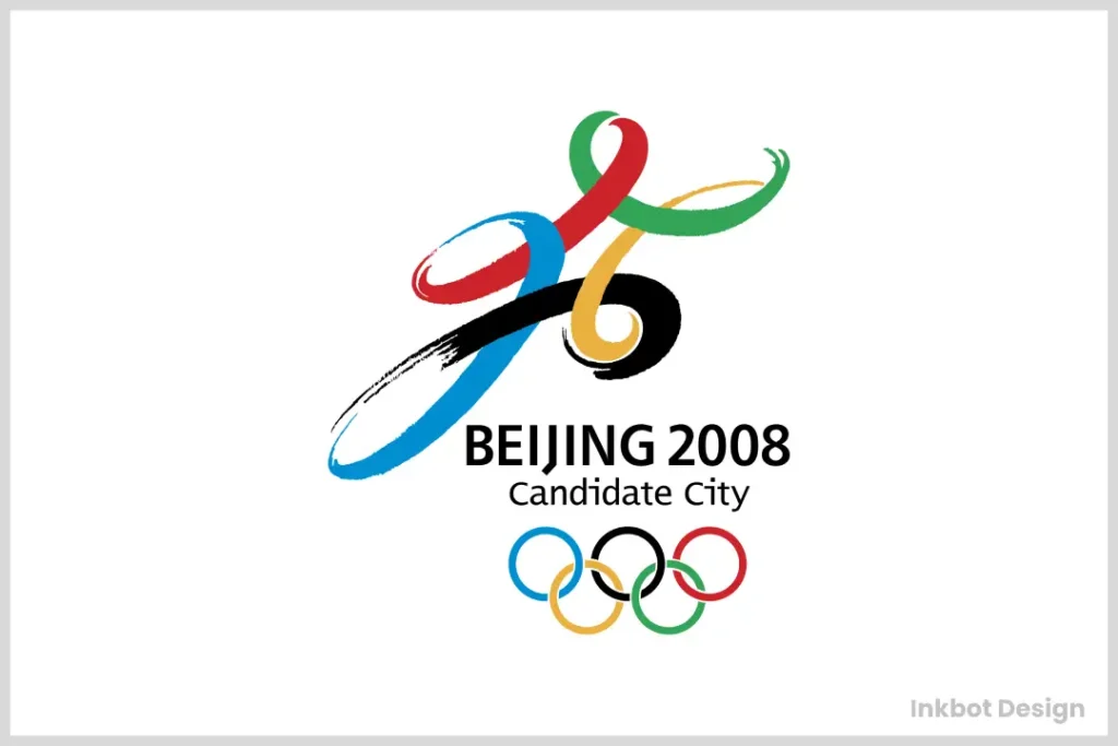
For example, Beijing's 2008 emblem design drew heavily upon calligraphic elements found within ancient Chinese art forms while merging them with more contemporary-looking visuals, also seen throughout this logo creation period. This type of blending not only serves pride at home but also connects internationally through a window into the rich heritage shown by host countries.
Symbols Reflecting Cultural Heritage
No matter what any Olympic symbol stands for, it has the potential to reflect specific cultural attributes held dear within nations involved – thus making them reflective pieces too deeply loved locally.
Designs often tell stories rooted in past events or artefacts still celebrated today, embodying shared experiences amongst individuals who live near one another during those particular periods around such places where these competitions take part.
More than just a contest between different countries, this combination of art and physical activity marks humanity's joint route through history.
Using symbols that are important to a culture can unite people who might otherwise not understand each other well. For example, the Sydney 2000 Olympic Games incorporated Aboriginal elements into their logo design to recognise Australia's Indigenous heritage.
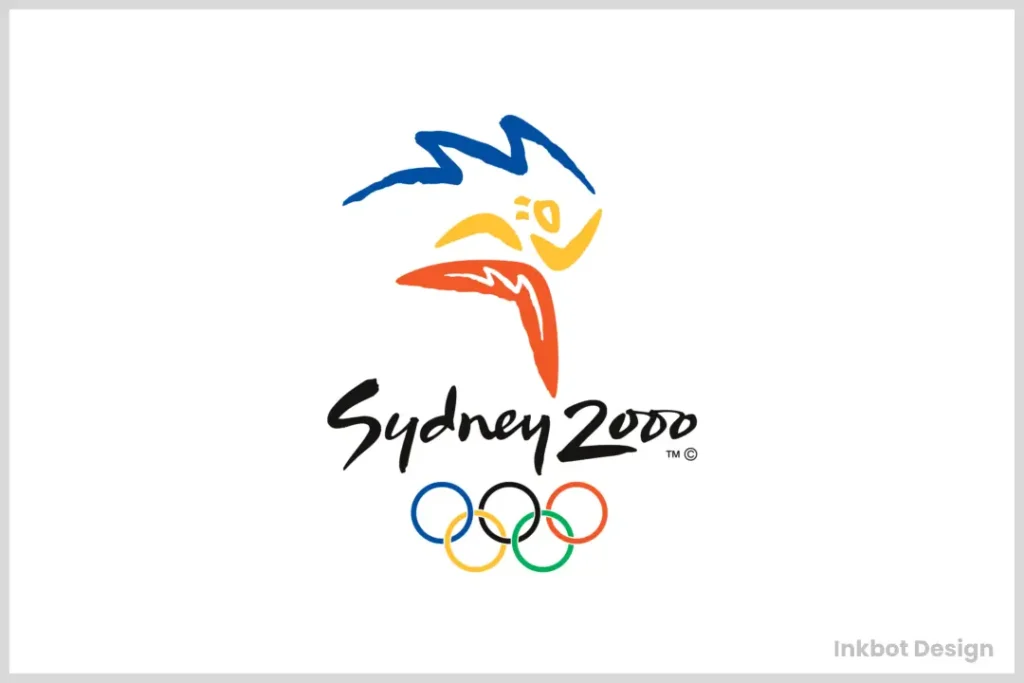
In doing so, they were able to pay respect to long-standing traditions while also sparking conversations about what it means for us all now living within an age defined by globalised connections but still shaped profoundly by local identities, especially in relation towards modern Olympism.
Marketing and Commercialisation of the Olympics
Once more, the Olympics have changed. They are no longer merely sports events; they have become worldwide advertising giants. Branding strategies and partnership integration have changed how people see and experience the Games worldwide.
Sponsorship Strategies and Partnerships
Strategic alliances play a significant role in shaping Olympic brand identity. By partnering with global corporations and local organisations, the branding of the Olympic Games has gone to unprecedented levels, and emotional connections and financial support characterise it. The sponsors enjoy increased visibility while at the same time providing critical resources to run the games.
Logo Design Impact and Overall Identity
Partnerships demand different logos that resonate with diverse audiences, thus significantly impacting logo design. A need for a potent emblem that can be recognised from far off also enhances the overall identity of these international competitions, thereby positioning them as symbols for unity through fair competition.
Looking at this evolution process, I see how visual identities should reflect current concerns, cultural contexts, and worldwide scope, marking out territories geared towards the following levels of branding success.
Over the decades, various strategies have been implemented to make designs look modern and align them closely with corporate objectives. This mutual relationship between logos calls for aesthetic appeal while conveying inclusiveness and fun.
Each redesign acknowledges past achievements while embracing new ideas, thus showing that a logo carries common hopes. In doing so, it remains clear what the Olympics stand for among shifting cultural environments.
The Role Played by Sponsors in Olympic Symbolism
Sponsorship is critical not only because it funds events but also due to its impact on their symbolic meanings. Brands become representative of excellence, friendship, and respect – values associated with the Olympics – thereby creating multi-layered stories about their association with specific events.
Visibility vs Values: A Delicate Balance within Olympic Sponsorships
Olympics sponsorship involves managing how much exposure should be given to what image this project is about one's organisation or company. Businesses align themselves towards the ideals of these games to elevate their status.
Official emblems often come with corporate-sponsored logos, thus attaching extra significance to public perception. Every partnership emphasises shared dedication performance; hence, brands are encouraged to live out Olympic values. Ultimately, such joint ventures tell global tales of accomplishment and commitment, reinforcing worldwide understanding of the Olympics.
The Globalisation of the Olympic Brand

Remember that the Olympics have transcended borders, emerging as a powerful global brand that unites nations through sport and shared values.
The Olympic Games symbolise athletic excellence and celebrate peace and international cooperation. As a spectator or participant, you're invited to be part of this universal narrative that has grown more vibrant and complex with every game.
The Olympics as a Global Brand
Global awareness of the Olympic brand has skyrocketed since its inception, transforming it into an emblem of unity, excellence, and human potential. Today, the Olympic brand resonates with billions, evoking emotions that transcend cultural boundaries. As you watch the games, you're not just a fan but engaging with a worldwide legacy that inspires hope and ambition.
Iconic Logos and Transnational Appeal
An enduring aspect of the Olympic identity is its iconic logos, each designed to resonate across diverse cultures. Olympic logos can evoke pride and connection among millions, regardless of nationality. They serve as visual anchors, reminding you that while athletes may represent their countries, the spirit of competition is universal.
Olympic logos have evolved, but the critical purpose remains strikingly consistent: to foster a sense of belonging and identity on a global stage. From the first use of the Olympic Rings to today's modern interpretations, these logos encapsulate the essence of competition and camaraderie.
Each redesign reflects the cultural zeitgeist of its time and speaks to the transnational appeal that feeds our collective aspirations as global citizens.
Cultural Sensitivity in Logo Design
One cannot underestimate the importance of cultural sensitivity in the design of Olympic logos. As the Games attract a global audience, missteps can lead to significant backlash or misinterpretation. Therefore, carefully crafting logos must reflect diverse perspectives and values, which is crucial to maintaining harmony and inclusivity.
Transnational design stakeholders must know cultural nuances and sensitivities when creating logos. By applying an informed approach, they can distil the essence of various cultures into their designs, nurturing respect while minimising the risk of cultural appropriation.
This thoughtful engagement enhances the brand's credibility. It allows the Olympic spirit to resonate with everyone, creating a tapestry of connection across different societies. Ultimately, the goal is to unify—not divide—this global family through meaningful and respectful symbols.
Aesthetic Evolution of Olympic Logos
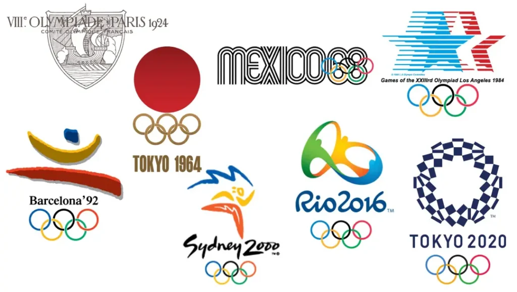
Your interpretation of Olympic logos' aesthetic journey speaks to a lot more than design. As the Games have advanced, so have their logos. Each represented its time's artistic feeling and identity and acted as a potent symbol of worldwide unity.
Style Trends Throughout The Years
One thing that makes the development of the Olympic logo fascinating is how different design trends go hand in hand with contemporary movements. From being more ornate in the late 19th century to minimalist aesthetics during the 21st century, these logos consistently changed according to what was happening around them, often using vibrant typography and simple graphics.
Artistic Influences on Olympic Logo Design
The design of Olympic logos draws heavily from artistic influences that resonate with cultural sentiments through various schools or styles. The early ones showed off classicism's glory. In contrast, recent ones reflect modern expressions of art inspired by vibrant host nations' dynamic cultures.
Besides representing the games, Olympic symbols also bear much significance regarding the values and the spirit in which they are located. Every emblem has a tale behind it, influenced by local artists, historical movements, and even the hosting country's national identity, thus creating a multi-layered visual narrative that is globally felt.
Branding At The Intersection Of Art And Sport
Olympics branding creatively blends arts with sports to become cultural touchstones rather than symbols. This unique partnership allows games to foster inclusivity among people from diverse backgrounds who come together to celebrate athletic achievements.
To brand the Olympics requires finding a middle ground between artistic integrity & commercial appeal so that created visuals can communicate effectively among different audiences. With every evolution, these marks represent athleticism and evoke emotional connections, thereby sparking pride and unity across borders while still adapting to the digital era.
Impact of the Olympics on Graphic Design
All professional graphic designers know how much the Olympics has affected the design world. These games have always been where people can display their athleticism and ideas for new designs.
Different symbols and logos associated with each prompt a change in visual identity that encourages companies and artists to think outside of their usual ways when telling stories through graphics.
The Olympics as a Stimulant of Design Creativity
Only a few things have inspired creativity in graphic design, as the Olympic games have done. Every time they come around, designers face the challenge of capturing the essence of host cities while paying homage to an age-old event.
As technology evolves and cultural shifts occur, so does inspiration, which, at its core, is nothing more than continuously rethinking what branding visually means.
Designers whom Olympic Branding inspired
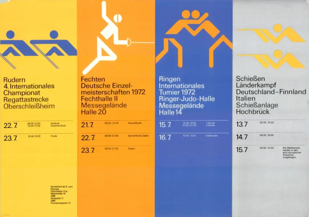
Many famous designers were influenced by various aspects or periods within brand histories rooted in these international competitions celebrating human sporting achievements; such as Otl Aicher's work on Munich '72 or Wim Crouwel's experimental typography during this time frame alone should be enough evidence.
Still, it doesn't stop there–each new edition provides another chance for someone somewhere specialising primarily (or even solely) within logo creation fields alone to take notice too (and potentially forever cement themselves among peers)!
In addition, certain milestones were set by individuals like Otl Aicher, who created a visual language system for Munich 72′.
This became one of the most successful applications in terms of not only being part of all-time greats when coming up with logos that look good but also impacting how we approach other areas within graphic design – something which has continued throughout generations following his lead.
Olympics Within Global Graphic Design Trends
When nations gather together at one place every four years under such circumstances, representing different parts of our planet 🌍 with diverse cultures exhibiting various creative expressions, it becomes easier to understand why certain things happen worldwide.
This is where we need only look closely enough…or somewhat just beyond those surface levels… and voila! The games become an all-knowing mirror reflecting current trends within creative fields around the globe.
For example, Suppose you were paying attention back when minimalism started gaining momentum during the 2000s. In that case, chances are high that at some point soon after, this same style would show up somewhere associated with either Beijing '08 or London '12 (if not both).
These most recent Olympics saw sleeker logos than ever – shedding much of their former years' decorative patterns for more superficial lines and bolder colours.
Every time another Olympics rolls around, people everywhere should pay close attention not only because such events draw millions upon millions but also because they reflect so many changes happening in society today, thus urging us to rethink where our limits lie creatively.
FAQ: History of the Olympics Logo Design & Symbols
Why are the Olympic Rings considered such an iconic symbol of the Games?
The Olympic Rings were created by Coubertin himself in 1913 to represent the five inhabited continents of the world – Africa, Americas, Asia, Europe and Oceania. These five interlocking circles signify unity between different countries through competition and camaraderie. Each colour (blue, yellow, black, green and red) was chosen because it appeared on at least one flag from every nation participating at that time, emphasising inclusivity even more.
What is the meaning behind each colour used in the Olympic Rings?
The colours of the Olympic Rings (blue, yellow, black, green and red) were selected because they are found on flags worldwide. This choice reflects diversity and unity; during the Olympics, people from different countries come together to play games united by one goal – sport! The palette also shows how vital every nation is, according to Coubertin, who believed in peace among them.
How has the host city's culture affected changes in design for past Olympic logos?
Over the years, various host cities have changed their cultural context and contemporary art trends, thus significantly transforming the visual representation known as “the logo” for each edition of this event. For instance, the Paris Olympics introduced the idea of formally incorporating rings into a logo. At the same time, later editions included place names, cultural motifs, or even abstract elements inspired by respective locales' histories, thereby creating unique identities for themselves based upon where these games were held.
Why do mascots play an essential role in the Olympic branding strategy?
Since 1968, Grenoble Games mascots have formed part and parcel of the Olympic brand. They personify the Olympics by presenting it as fun-filled and accessible, promoting values like unity through diversity and teamwork. Most often, these characters draw inspiration from local traditions, legends, or wildlife, thereby acting as a link between athletes competing before crowds while also contributing towards a broader narrative surrounding these events.
How has technology influenced the way we see Olympic logos today?
Digital technology has revolutionised our perception of not just Olympic logos but everything else, too! In particular, social media platforms provide opportunities for more dynamic presentations where brands can be adapted to fit different mediums without losing their essence or disrupting consistency across various channels. This includes being flexible with usage during promotions, live broadcasts, interactive apps, etc., all aimed at heightening engagement levels among wider audiences who may otherwise have been unreachable due to a lack of technological savviness or sheer numbers.
What will happen to Olympic logo design and branding strategy in the coming years?
Concerns about sustainability and worldwide digital interconnectivity could shape the future of Olympic logo design. More adaptive designs may emerge, which mirror the character of host cities or address social concerns of different eras. Moreover, augmented reality (AR) and virtual reality (VR) technologies might revolutionise audience engagement with the Olympics, necessitating constantly updated branding approaches that keep pace with a rapidly changing global context.


 Pinterest
 LinkedIn
