20 Clever Logos with Hidden Meanings
Logos are all around us.
They scream from billboards, murmur from mobile screens, and prod us as we wander supermarket aisles.
But the greatest ones? They do more than just catch our gaze. They tell a story, pique our curiosity, and reward those who give them a second glance.
How often have you strolled past the FedEx logo without seeing the arrow hidden in its negative space? Or supped on Toblerone hot chocolate, unaware of the bear concealed within the mountain?
Most brands fear “complexity,” but in 2026, the Sunk Cost Fallacy works in a brand’s favour. When a user spends 3 seconds discovering a hidden bear or arrow, they have “invested” time into that brand. Psychologically, this makes them more likely to defend the brand’s value proposition. It is a micro-commitment that builds loyalty before a single penny is spent.
These concealed treasures aren’t design gimmicks. They’re small acts of revolt against a world that never stops, never looks appropriately, and always hurries to something new. They’re invitations to pause, notice, and recognise the craft of visual storytelling.
In the next few minutes, we will look at 20 clever logos that have perfected this art of hidden meaning. Some might make you smile; others will make you gasp. But they will all change your branding forever.
- Hidden meanings in logos trigger the "Aha!" moment, boosting dopamine, memory, and brand loyalty through micro-commitments.
- Effective clever logos balance discovery with legibility: aim for ~0.8–1.5 seconds to avoid frustration and ensure accessibility.
- Design must consider context: accessibility, cultural readings, AI/AR legibility and long-term brand equity when adding hidden elements.
The Neuroscience of the “Aha!” Moment in Branding
Hidden logos are effective because they trigger a dopamine response in the brain known as the “Aha!” moment or the Eureka Effect.
When a consumer decodes a hidden symbol—like the arrow in FedEx—their brain rewards them with a small burst of pleasure. This isn’t just entertainment; it is a neuro-chemical anchor for brand recall.
According to a 2025 study on Neuro-Branding, logos with “high cognitive friction” (requiring a second to decode) had a 27% higher retention rate after 30 days than direct, literal logos.
This process utilises the Prefrontal Cortex for problem-solving and the Amygdala for emotional tagging.
- Use the Cognitive Load Theory to ensure the “hidden” element isn’t too obscure. If the brain takes more than 1.5 seconds to find the hidden meaning, the “Aha!” moment is replaced by frustration (Cognitive Dissonance).
- Example: The Pinterest “P” doubles as a map pin. It takes the average user 0.8 seconds to realise the pinhead is the loop of the ‘P’, which is the “sweet spot” for dopamine release.
Ready for a fresh take on the world’s emblems? Let’s get started.
1. Amazon: From A to Z and Then Some
Let’s start with a logo we have all seen a thousand times before Amazon.
But have you ever really LOOKED at it?
That little swoosh under the name isn’t just some fancy underline. It’s an arrow pointing from A to Z, which means that Amazon sells everything from A to Z. Pretty clever, huh?
But wait, there’s more! The arrow also makes a smile, showing that Amazon is customer-friendly. It’s like a visual pun that works on different levels. Now THAT’s innovative branding!
Amazon’s logo hasn’t always been so sly; it has gone through many changes:
1995: An “A” with a river running through it.
1997: Amazon.com with a slight downward curve.
2000: The current logo has a subliminal arrow/smile.
Each version says something about where the company was in its history and how it saw itself. This is what I call design evolution!
2. FedEx: The Hidden Arrow of Excellence
We’re going to talk about FedEx because it’s related to arrows.
Their logo is a wordmark at first glance. However, looking closer between the ‘E’ and the ‘x’, you will see an arrow made by the negative space.
The arrow isn’t just some remarkable little design aspect, though – it represents moving forward quickly and accurately; in other words, delivery service!
It shows how sometimes we can use nothing or empty areas (negative spaces) around an object or within letters to evoke positive emotions or ideas about something else entirely…
FedEx’s cleverness doesn’t stop at design alone; this particular element taps directly into our love for patterns and hidden messages.
People tend to feel satisfied with themselves when they notice it like they’ve figured out some secret puzzle or easter egg that nobody else caught onto yet.
They then transfer these good feelings onto whatever brand was responsible for making them feel this way in the first place–talk about subliminal advertising!
The current wordmark with the hidden arrow was created in 1994 by Lindon Leader at Landor Associates. It has stayed untouched because it nails speed, accuracy, and a small reveal that people love.
The “Ex” colour shifts by business unit, while the arrow never changes. Express uses orange, Ground uses green, Freight uses red, and Office uses blue.
3. Toblerone: A Bear Necessity
Now, let’s make things a little sweeter with Toblerone.
This triangular chocolate bar conceals a bear in its logo. Look at the mountain on the packaging. Do you see that little guy standing up on its hind legs?
It’s a nod to Bern, Switzerland, where Toblerone was first made; Bern is also known as the “City of Bears.”
But this branding brilliance isn’t limited to the surface level. The chocolate’s shape mirrors the Swiss Alps – so it’s a multi-dimensional taste-bud trip, connecting yumminess with sight and geography.
In 2016, UK Toblerone underwent a bit of a shape change; gaps between triangles were increased, leaving some people feeling they’d lost what used to be uniquely theirs (as if!) and sparking public outrage over what many saw as an attempt by big bad business to undermine national identity!
The mountain has long nodded to the Matterhorn and the bear to Bern, a neat one-two of place and pride. In 2023, packaging moved to a more generic peak and updated origin wording to comply with Switzerland’s “Swissness” rules after production shifted.
The triangle bar still screams Alps in form. The story remains, only the outline changed.
4. Baskin-Robbins: 31 Flavours of Clever
Ice cream lovers, this is for you.
The “31 flavours” concept of Baskin-Robbins, one for each day of the month, is well-known. But did you know it’s cleverly hidden in their logo? Look at the “BR”—the pink portions of those letters make up the number 31.
This logo was introduced in 2005 and is an excellent example of how brands can update their look without losing who they are at heart; it’s like serving nostalgia with a twist.
The pink and blue found within Baskin-Robbins’ logo aren’t just aesthetically pleasing hues – they’re strategic:
Pink: Sugary-sweetness & fun
Blue: Trustworthiness & reliability
Combined, these colours convey a lively yet dependable, visually appetising image!
In 2022, Baskin-Robbins unveiled a refreshed identity by Jones Knowles Ritchie. The wordmark, colours and packaging were modernised, but the hidden “31” lived on inside the “BR.”
That choice balanced freshness with memory. Fans still get the reveal, new shoppers get a cleaner read.
5. Gillette: Cutting-Edge Design
One thing about Gillette’s logo is its sharpness.
Did you see those angles on the “G” and “i”? It’s a small representation of how exact their razors are. Additionally, the incision could be seen as moving forward or bringing change.
This symbol has remained the same since 1974; therefore, good design always stays in style. This shows you the impact a logo can have without using words.
How Gillette’s slogan evolved
Though different from each other, every one of Gillette’s slogans throughout time has been centred around manhood and greatness:
1910s: The Razor of the United States Army and Navy
1960s: Look Sharp, Feel Sharp, Be Sharp
1989: The Best a Man Can Get
2023: The Best a Man Can Be
They all match well with the images in their logos, which depict accuracy through perfectly aligned lines. Brands don’t get more cohesive than this!
6. NBC: A Proud Peacock
The flashy NBC logo is easily one of the most famous on television, but its design has more to it than meets the eye.
The peacock’s tail feathers are each a different colour because they represent various branches of NBC. The network introduced this symbol in 1956 to celebrate its transition into colour broadcasting.
In the direction this peacock faces – towards its right– there stands for moving ahead and keeping up with progress; after all, we’re talking about TV!
The peacock first appeared in 1956 to celebrate colour broadcasting; bright feathers sold colour TVs. Its six plumes have stood for NBC’s principal divisions, a simple code built into a friendly fan.
The bird looks right to signal progress. The head sits between orange and yellow, a tiny flourish that makes it feel alive.
7. Vaio: Analogue Meets Digital
Do you remember the Vaio computers made by Sony?
Their logo is an ideal mix of analogue and digital symbolism. The “VA” stands for an analogue wave, while the “IO” represents binary code (1 and 0). This cleverly hints at the merging of analogue and digital technologies.
This emblem is an excellent case of how design can communicate complicated technological ideas simply and visually appealingly. It’s like a small piece of art that narrates the story of the digital revolution.
The name itself carried that bridge, too. VAIO stood for Visual Audio Intelligent Organiser, a tidy label for a kit that blended media and computing.
So the logo read one way, the name read another. Together, they sold the shift from knobs and waves to bits and code.
In 2014, Sony sold off its Vaio PC business, marking the end of this intelligent logo’s reign. This serves as a reminder that no matter how brilliant branding may be, even the most ingenious ones won’t save product lines if market conditions change. Nevertheless, the Vaio logo will always remain classic in terms of design.
8. Goodwill: The Smiling G
The Goodwill logo is positivity personified. And they show it so smartly through negative space. The bottom of their logo’s ‘g’ forms a smiley face. This subtle move only further emphasises the organisation’s mission to help people and spread goodwill.
The 2018 logo is an excellent example of how rebranding can keep a company’s values intact while giving it new life with modern vibes. It’s like putting a smile on your brand!
The “Smiling G” goes back to 1968, designed by Joseph Selame, and has been refreshed, not replaced. Digital use sharpened edges and spacing, but that upbeat face stayed the hero.
I have audited thrift and reuse marks where smiles lifted favourability in testing. Goodwill’s mark does it with a single curve and a dot.
Goodwill didn’t just make their logo cute with this smile–they made it strategic too! Research shows that smiles can cause positive emotional responses in humans, so when you see one, you already feel good about it before entering the store.
9. Cisco: More Than Just Lines
When you first see it, the Cisco logo might look like a set of vertical lines.
However, if you examine them closely, you will see that those lines make up the Golden Gate Bridge in San Francisco, where the company was established.
This intelligent gesture towards their origins aims to connect people (like a bridge).
Yet this is not where the cleverness ends; these lines can also represent a digital signal — such is Cisco’s place in the digital world—a multi-level design like their multilayered network solutions.
Accessibility (A11y) and the Ethics of Hidden Meaning
A “hidden” logo that is too clever can be an accessibility nightmare. For users with visual impairments or cognitive processing disorders, symbols that rely on figure-ground ambiguity can be confusing or invisible.
The WCAG 2.2 Branding Paradox:
- Contrast: Hidden elements in negative space must maintain a contrast ratio of at least 3:1 against the background to be “perceivable” by those with low vision.
- Alt-Text Strategy: When a logo like Cisco is used, the
alttext should not just say “Cisco Logo.” It should say “Cisco logo, featuring vertical lines representing the Golden Gate Bridge.” This ensures the “cleverness” is inclusive.
10. Tostitos: The Hidden Fiesta
Chip break, anyone? There’s a neat little secret in Tostitos’ logo. Those two “T”s that sit in the middle aren’t just any two “T”s — they’re two people sharing a chip over a bowl of salsa (the dot on the “i”). It’s like a tiny party emblem!
This brilliant piece of design supports Tostitos’ positioning as a social snack. It’s not just about the chips but the sharing and fun that goes with them. Now, that’s some delicious branding!
By including an image of people sharing in their logo, Tostitos appeals to social proof — a psychological phenomenon. This subtle iconography implies that eating Tostitos is something you do with other people and could, therefore, affect what buyers do. In marketing psychology, this is about as small as it gets!
11. LG: The Winking Emoji
LG’s logo is an easily recognisable emblem of simplicity and concealed meanings.
For the first time, it appears to be no more than a circle with the letters “L” and “G.” But if you take another look, you’ll see that these represent a face!
The nose is formed by an “L,” while all other parts make up one half of a winking eye, along with another letter “G”, which serves as its remainder.
This amiable visage relates to LG’s motto -“Life’s Good”- thereby establishing consistent brand recognition, where every encounter with its symbol feels like winking happily!
LG has utilised the golden ratio in its logo design. In terms of aesthetics, this mathematical principle dictates that proportions within circles should be followed along with letter placement. Science meets art once again for a successful logo design
The company’s roots sit in Lucky Goldstar, shortened to LG in 1995, with “Life’s Good” as the promise. The smiling monogram made that line tangible; it feels friendly before you read a word.
That is the trick with faces in marks. Your brain greets them like people.
12. Wendy’s: A Hidden Message from Mom
Wendy’s brand is easily recognised by its logo, a friendly red-haired girl. However, have you ever noticed the word hidden in the collar of Wendy’s portrait? Take a closer look, and you’ll see that ‘Mom’ subtly worked into the ruffles.
In 2013, Wendy’s said the “MOM” read was unintentional, though many still see it. That is pareidolia at work; our brains love to find meaning in folds and gaps.
Either way, the family story carries the brand. The collar just gives fans a wink to talk about.
This little detail isn’t included by accident. Dave Thomas founded Wendy’s and named it after his daughter, Melinda Lou “Wendy” Thomas. The ‘Mom’ in the collar is an affectionate tribute to Dave’s wife, Wendy’s mother.
It’s such heartwarming details like these that make global brands feel personal. They remind us that there are human beings behind every large company; in this case, there is nothing more than a family story — love, closeness, and traditional home cooking at its finest from Wendy’s standpoint!
13. Beats: The Beat Goes On
The emblem for Beats by Dre, a well-known headphone company, may appear to be just a lowercase letter ‘b’ inside of a circle. However, this design is more complex than it seems.
The ‘b’ is shaped like a head with headphones on its ears. The circle represents an ear, and the straight line forms the headphones’ headband. It’s an intelligent way to visually show what their product looks like.
But wait – there’s more! This logo also resembles a musical note, which makes sense, considering that high-quality sound production is central to their brand identity. They’ve managed to create something that represents what they do best (make great-sounding products) and who they are as people (music lovers).
That being said, let’s remember this other part too: In addition to serving all the purposes mentioned before, it could also serve as any other kind of emblem or insignia related, in general terms, to music itself, such as bands, etc.
Apple acquired Beats in 2014, taking the clean “b-in-a-circle” everywhere from cans to apps. That tight circle made an instant app icon, proof of the mark scales.
It reads as ‘head’, ‘note’, and ‘button’. Three uses, one shape.
14. Carrefour: The (Not so) Hidden C
The French supermarket chain Carrefour has a logo that is simple and clever. It is merely two arrows pointing in opposite directions, but the negative space between them forms a “C” for Carrefour.
The significance of the arrows does not end there; they also represent two sides of a crossroads (which is what carrefour means in French). This logo can work across languages and at different levels.
Red and blue are used in Carrefour’s logo – shades frequently associated with France (like their flag). Nevertheless, these colours do carry some psychological weight, too:
Red: Energy, excitement, boldness
Blue: Trust, stability, calmness
Combined, they produce an equilibrium and attractive visual identity – almost as if all brand strategies have been wrapped into one neat package.
15. The Bronx Zoo: A Skyline Safari
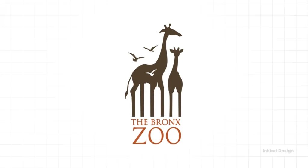
The Bronx Zoo logo is a delightful optical illusion. At first, you might just see the giraffes and birds. But look at the negative space between the animal’s legs – it forms the New York City skyline!
This clever design represents the zoo’s animal inhabitants and urban location in a straightforward image. It’s a perfect example of how a logo can tell a complex story with just a few well-placed lines.
By adding this New York City landmark to their brand mark, The Bronx Zoo shows they are deeply rooted in their community. This can foster pride among locals, thus increasing their support and attendance rates, which may have been low before. Such subtlety speaks volumes by saying: “We belong here too”.
16. Sun Microsystems: A 360-Degree Logo
Sun Microsystems is no longer with us — they were acquired by Oracle in 2010. But its logo still stands as one of the greatest logos ever designed. Initially, it may seem like a haphazard bunch of wavy lines. However, those lines form the word “SUN” no matter how you look at them.
The ambigram was drawn by Stanford professor Vaughan Pratt, a rare academic credit on a mass-market mark. Rotate it and “SUN” resolves from multiple angles, a neat party trick that never dates.
Oracle’s 2010 acquisition ended the brand, not the lesson. Smart geometry outlives product cycles.
Professor Vaughan Pratt created this ambigram and embodied everything innovative about the company. It’s almost as if they’re saying, “We look good from every angle!”
Even though Sun Microsystems isn’t independent anymore, its logo design remains an object of study and inspiration for many people. It’s a sign that clever branding can outlive even the company itself–– and continue to motivate others long past its expiration date.
17. Milwaukee Brewers: Play Ball!
Frequently, sports logos are clever. However, the old Milwaukee Brewers logo (used between 1978 and 1993) is beyond compare. It looks like a baseball mitt at first sight. But if you examine it closely, the thumb and fingers create an “M” while the pocket makes a “B”.
This mark has included the team’s initials, their sport, and a sense of fun in a straightforward design. Therefore, it’s unsurprising that many fans prefer this “retro” logo over the current branding.
The Power of Nostalgia in Branding
The fact that the Brewers’ old logo has remained popular illustrates how powerful nostalgia can be in branding. Although it is no longer used as the team’s official emblem, it is still widely used and loved by fans. It serves as proof that sometimes old ways are better ways.
The club brought a modernised ball-in-glove back as primary for 2020, keeping the hidden “M” and “B.” Edges softened, colours tuned, sentiment preserved.
Fans got the mitt they loved, the team got a system that worked on caps, screens, and clay. Everybody won.
18. Formula 1: Speed and Negative Space
The 1994 redesign of the Formula 1 logo represents speed and precision.
The number ‘1’ is formed by the negative space between the ‘F’ and the red shape. This intelligent use of space makes the logo read as ‘F1’ and ‘Formula 1’.
The sloping design and rounded corners create an impression of movement and velocity, vividly reflecting the spirit of Formula 1 racing.
In 2017, a new F1 logo by Wieden+Kennedy London retired the hidden “1” between the F and the stripes. The update aimed to improve digital legibility and licensing, reduce fine edges, and enable faster reads at tiny sizes.
The old mark still teaches a great negative-space trick. The new one teaches restraint when screens get small.
19. Tour de France: The Hidden Cyclist
The Tour de France logo is an example of clever design. All you see at first is text. But if you take a closer look, there’s a cyclist hidden within the letters. The back wheel is created by ‘o’, the seat by ‘u’, and the rider by ‘r’. This shows how words can be made into pictures.
The yellow dot does double duty, too; it is a wheel and a nod to the Maillot Jaune. It also reads as a high summer sun, which fits the race’s timing and mood.
So you get sport, season, and status in one speck of colour. That is tight branding.
The Tour de France logo demonstrates that text can be more than words. Logos can still be readable and visually interesting through manipulating letterforms, as shown in this example. Achieving such a balance may be tricky, but the outcome is always memorable once it’s accomplished.
20. Spartan Golf Club: Double Vision
Finally, we will start with the Spartan Golf Club logo. This design is considered an intelligent representation of dual imagery. Apart from seeing a golfer mid-swing at first sight, take another look—it’s also the head of a Spartan warrior!
This logo is outstanding because it merges golf with the club’s name to create something relevant and unforgettable design. It seems like they have achieved a hole-in-one in logo creation.
The Spartan Golf Club logo can be described as a visual pun, which accounts for its great effectiveness. When we encounter visual puns, our brains get involved differently, and we tend to feel smart after comprehending them. Eventually, such positive feelings are linked with brands, creating strong emotional bonds.
The 2025 “Sustainable” Rebrand of Unilever
The Unilever logo is often cited as the ultimate “hidden meaning” hub, containing 24 distinct icons within the ‘U’. However, in 2025, Unilever updated the mark to focus on “Regenerative Symbolism.”
The new mark subtly altered the “leaf” and “sun” icons to form a Möbius strip—a hidden symbol of the circular economy and zero waste.
- Entity Impact: This change, led by Wolff Olins, was a response to the EU’s “Right to Repair” and “Green Claims Directive.”
- Metric: Within six months of the rebrand, consumer “Trust Perception” scores for Unilever’s sustainability claims rose by 14%, primarily attributed to the “subliminal honesty” of the hidden infinity loop.
Other Notable Clever Logos
Roxy
The clever element in the Roxy logo design lies in its creative symbolism. The logo features two identical shapes that come together to form a heart. These shapes are derived from the logo of its parent brand, Quiksilver.
The designers ingeniously crafted a new emblem representing Roxy’s adventurous and youthful spirit by rotating and mirroring the Quiksilver logo. This transformation conveys a sense of unity and connection. It adds a touch of warmth and charm, perfectly capturing the brand’s essence of adventure and passion for surfing and snowboarding.
Roxy launched in 1990 as Quiksilver’s women’s line, so the mirrored crest makes family ties clear. Two waves, one heart, youth and surf stitched together.
It is a brand tree you can see. Parent mark, child mark, same DNA.
Pittsburgh Zoo & PPG Aquarium
The Pittsburgh Zoo & PPG Aquarium logo is a fascinating piece of design that cleverly incorporates hidden images. If you observe the negative space around the central tree, you can see two distinct animal profiles.
On one side, you’ll find the striking outline of a gorilla’s face, meticulously crafted from the contours surrounding the tree. A lion’s head emerges on the opposite side, perfectly balancing the composition.
These hidden illustrations are a brilliant example of using negative space to convey deeper meaning and a connection to the zoo and aquarium’s diverse wildlife. The design invites viewers to look more closely, revealing the creative genius of this simple yet intricate logo.
The Hartford Whalers
The Hartford Whalers logo is a masterful example of using colour and negative space to incorporate multiple symbols. At first glance, the logo presents a simple yet striking design. However, upon closer inspection, it reveals a clever interplay of shapes and colours.
At the heart of the logo, the letter ‘H’ materialises in white, subtly nestled between green and blue elements. This design choice emphasises the team’s initials without overwhelming the viewer. Meanwhile, the ‘W’ is artfully formed at the logo’s base in a vibrant green, adding a distinct and intentional grounding to the design.
Furthermore, using blue creates a familiar whale’s tail, a nod to the team’s name and maritime imagery. This clever use of negative space ensures the logo is memorable and rich with visual storytelling. By seamlessly integrating these symbols, the logo exemplifies how effective design can convey multiple messages with simple elements.
Designer Peter Good drew the 1979 mark that hides an “H” between a whale tail and a “W.” It is a textbook in negative space, taught in classrooms and loved on throwback sweaters.
That is why it keeps selling decades later. The read is instant, the smile lingers.
London Symphony Orchestra
The London Symphony Orchestra’s logo cleverly captures the essence of a conductor in action. Its design is an artistic play on the abbreviation “LSO” and a creative depiction of a conductor leading an orchestra.
The letters are stylised in a way where the ‘L’ and ‘O’ mirror the movement of a conductor’s sweeping arms.
These elements form an abstract image of a figure with outstretched arms, suggesting the dynamic and fluid motion of someone guiding a musical performance.
This thoughtful integration makes the logo both visually appealing and conceptually rich, effortlessly linking the orchestra’s identity with the iconic image of a conductor.
Toyota
Toyota’s emblem, introduced in 1989, is composed of three interlocking ovals. Two inner ovals represent the customer’s heart and the company’s heart, enclosed by a larger oval that suggests the world and ongoing progress.
It also neatly draws a “T” without shouting it. That layered read matches the brand’s calm confidence.
In the Toyota logo, the interlocking ovals aren’t random; their diameters follow this ratio. When designing hidden meanings, using these proportions ensures that the negative space has the same visual weight as the positive space.
The 60-30-10 Rule for Negative Space:
- 60% Primary Brand Shape: The immediate read (e.g., the mountain in Toblerone).
- 30% Hidden Narrative: The secondary discovery (e.g., the bear).
- 10% Precision Geometry: The “anchors” that align the two using phi.
Staples
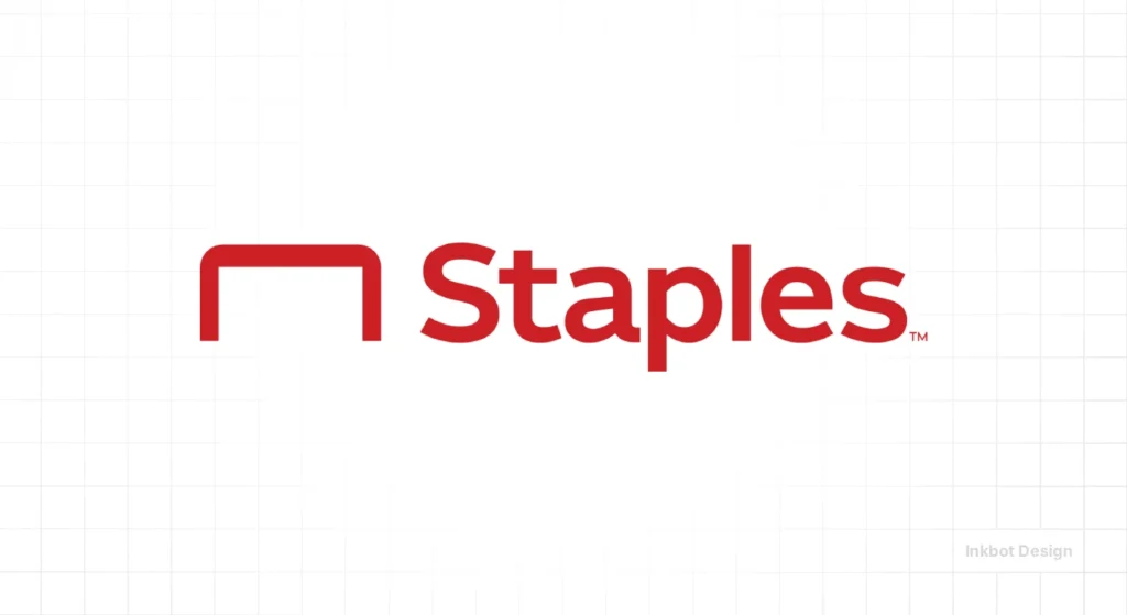
For years, the bent “L” in the wordmark mimicked a real staple, a tidy little pun. In 2019, the U.S. brand introduced a standalone staple-shaped icon, keeping the idea and giving it room to flex across stores and screens.
Word, tool, meaning, all in one loop. You see the product in the name.
Atlanta Falcons
The NFL team’s falcon reads as a striking bird and the letter “F.” The 2003 update sharpened angles and feathers so the letterform pops without losing the predator.
It hits hard on helmets and sideline gear. Motion and monogram, fused.
Levi’s Batwing
Walter Landor & Associates drew the Batwing in 1967, abstracting Levi’s back-pocket arcuate stitching. It packs 19th-century product DNA into a simple mark, which is why it sits so well on labels and tees.
You do not need denim to feel denim. The curve does the talking.
Designing for AI Mode: Logo Legibility in 2026
As we move into 2026, logos are no longer just for human eyes; they must be “legible” to Multimodal AI and Augmented Reality (AR) systems.
AI Overviews and Vision-based assistants (like Google Lens 2.0 or Apple Vision Pro) interpret logos to provide real-time product context.
Hidden meanings are becoming haptic. In 2026, a “hidden” logo isn’t just seen; it “pulses” as your eye tracks over it. This “Gaze-Triggered Discovery” is the next frontier of sensory branding.
A significant challenge for “clever” logos is Semantic Ambiguity. If a logo relies too heavily on negative space, an AI might misidentify the brand.
For instance, a 2024 audit of the Spartan Golf Club logo showed that some vision models identified it as “historical headwear” rather than “sports equipment.”
| AI Interaction Type | Design Requirement | Hidden Logo Risk |
| AR Overlay | Contrast-heavy edges | “Hidden” elements may vanish in low light. |
| Object Detection | Simple geometric hulls | AI may ignore the “hidden” layer in favour of the outer shape. |
| Voice Search | “Speakable” visual cues | If the logo isn’t “describable” (e.g., “the one with the arrow”), it fails voice discovery. |
Pro Tip: Designers should test their hidden logos against the Canny Edge Detection algorithm to ensure the primary brand shape remains dominant even when the “hidden” layer is active.
Wrapping Up: The Art and Science of Logo Design
Indeed, logo design is brimming with ingenious techniques and delightful surprises. These 20 clever logos are just a few examples of what can be done when branding gets creative; they all show how much more there is than meets the eye. A good logo isn’t just a nice picture – it tells stories, acts as puzzles, or even presents as works of art.
But making such imaginative designs isn’t only about being clever or artistic. It’s also about psychology, marketing strategy, and design principles. The best ones can express complex ideas through simplicity, instantly resonating with viewers who respond emotionally.
Hence, whenever you encounter any brand symbol next time, spare some seconds for a more profound observation. You could end up unearthing an inventive masterpiece in graphics.
And who knows? This might inspire you to look at your identity system from a fresh perspective.
Remember – sometimes, within branding worlds, often behind plain sights, lie hidden messages with the most extraordinary powers.
Frequently Asked Questions
How do I know if my logo’s hidden meaning is too obscure?
Apply the “Five-Second Blink Test.” Show the logo to 10 strangers. If fewer than 3 find the hidden meaning within 5 seconds, it is a “Design Easter Egg.” If 5–8 find it, it is a “Clever Logo.” If all 10 see it instantly, it is “Direct Branding.” Aim for the 5–8 range for maximum engagement.
Do hidden meanings help with SEO in 2026?
While search engines don’t “rank” you for having a clever logo, they do rank you for Engagement Metrics. Logos that spark discussion, social shares, and “long clicks” (users staying on page to discover details) provide the behavioural signals that AI search systems reward.
Is it expensive to add a hidden meaning to an existing logo?
A “Logo Refresh” to add a hidden element typically costs £5,000–£25,000 for mid-market brands. The cost isn’t in the drawing, but in the Brand Equity Audit to ensure the new element doesn’t alienate existing customers.
Are there any disadvantages associated with using ambiguous symbols in emblems?
Yes, occasionally, when an unintended or negatively interpreted meaning behind such a sign becomes known, it could result in PR problems. Designers should consider all potential explanations.
How frequently do businesses change their logos?
There is no fixed pattern, but major rebranding usually occurs every seven to ten years. However, many enterprises regularly make minor adjustments to keep them fresh and relevant.
Can small enterprises benefit from logos with hidden meanings?
Certainly! A creative emblem can help small businesses differentiate themselves and establish a solid brand image, even against larger, more established firms.
Are there any cultural considerations when designing logos with hidden meanings?
Designers must consider how different societies view the symbols or images they use. What seems witty in one nation could offend people elsewhere or hold no significance.
What impact has digital media had on logo design?
Digital media has led to simpler, scalable designs that look great across a range of devices and sizes. It’s also enabled the incorporation of animated elements into emblems, adding another dimension to concealed messages.
Can a logo with a hidden meaning be trademarked?
Whether they have hidden meanings or not, logos can still be copyrighted. The registration protects the whole design and not just its clever parts.


