How to Choose the Best Font for Logo Design
Choosing the best font is very important for your logo design. A good font should be legible, easy to read and convey your company's message.
Fonts are one of the most critical design elements of a logo. Not only does the font choice affect the look and feel of your brand, but it also impacts how your potential customers see and interpret the logo.
This article will examine the different fonts and what to consider when choosing the best typeface for your next project.
Do you have an idea for a logo? Do you need a logo? Have you tried to do it yourself? There are many ways to go about designing your logo. Some are better than others.
However, one of the most important aspects of a logo is that it has to be legible. It has to be easy to read and understand. That means that it has to have a good font.
Why Does Choosing the Best Font Matter?
Your logo is an essential part of your business identity. It's the first thing people see, and the impression that it creates in mind is often the first one they have of your company. So, it makes sense to choose a suitable typeface for your logo.
Choosing a suitable typeface for your logo can be tricky. The wrong font may make your logo look amateurish or cheap, or the right font may cost you thousands of dollars.
In addition to choosing a typeface, you should consider other factors such as:
- Colour – The right colour can add value to your logo.
- Character – The right character can make your logo distinctive and memorable.
- Size – Smaller fonts are more challenging to read on computer screens, and larger fonts are more difficult to read on paper.
Logo Typefaces
There are hundreds of typefaces to choose from. Most companies use two or three typefaces to create a brand identity. The most commonly used typefaces include:
- Serif – These fonts are designed with little tails or flourishes that help to connect letters.
- Sans Serif – These fonts are free of the little tails of serif typefaces. Sans Serif is often used in headlines or logos where legibility is the primary goal.
- Script – These fonts are used primarily in books and magazines.
- Display – These fonts, including Google fonts, are the most commonly used for websites.
When choosing the best font for your logo, it's essential to consider how you'll be using it. You might want to stick with a particular typeface if it's the best option for your website or if you plan to print your logo on business cards.
When choosing a logo typeface, consult a professional designer for expert advice. If you're looking to choose a typeface, here are some things to consider when selecting a good font for your logo:
- Look for a typeface that's easy to read and easily enlarged.
- Make sure the letters aren't too crowded. Crowded letters will be harder to read.
- Use a bold or italicised font if you're unsure about the readability of the letters.
- If you plan to use the same typeface for your logo on business cards, ensure it's also used on the website.
- Check the commercial usage licence of any font you're considering before purchasing it.
You don't need to spend much money on a typeface. You can get great results with a program like Adobe Illustrator. Just ensure that you've got enough space to include the logo in the design of your business cards and stationery.
It's a good idea to make the logo as easy to reproduce as possible, so be sure to use a clear, well-designed typeface that will print nicely on business cards.
What Are the Different Font Formats?

While many types of fonts are available, you will encounter only three categories of fonts in most computer text documents: TrueType, PostScript, and Open Type.
TrueType font is a “native” font. That means it was designed for the computer screen and is very easy to read. It is also generally the cheapest type of font available.
Postscript fonts are bitmapped and can be very large. They must be rasterised (i.e., turned into a bitmap image) before being printed on paper. Because of this, they are usually much more expensive than true-type fonts.
Open Type fonts, sometimes called “generic” fonts, are usually bitmapped. They do not contain outlines, so you cannot scale them without distorting the typeface. They are generally costly to buy.
Most fonts today come in one of the above three types. TrueType fonts are the most commonly used because they are so versatile. However, since TrueType is a proprietary format, it is incompatible with other applications, including Adobe Illustrator.
Fonts come in a variety of weights or styles. The weight of a font determines the thickness of the letters, and the size of the font is the size of the letters.
There are also a variety of options to consider when using fonts. The size of the space between the lines is known as tracking. A larger space between the lines means you can type more characters per line. Tracking also affects the appearance of the text on your screen. For example, a large tracking setting creates a blocky look and is not recommended.
Here is a list of the most common font types, along with a few tips for selecting the right font for your document:
TrueType Fonts
TrueType fonts are very flexible and easy to use. They are the most popular font type and compatible with other applications. However, TrueType fonts cannot be scaled without distorting the font. You can scale them by changing the size of the typeface, but you will have to change the font settings in your application.
When using TrueType fonts, ensure the tracking is set to a minimum, and the size is adjusted to your preference. You will find that fonts too big or too small are difficult to read.
Postscript Fonts
PostScript fonts are bitmapped and, therefore, very large. You can scale them to fit any document size, including paper. This makes PostScript fonts very useful for print documents.
If your printer can print in PostScript, you should use PostScript fonts. Otherwise, you should select the TrueType version of the font. If you print on paper too small for a PostScript font, your text will be minimal and illegible.
For large documents, you may consider creating a separate file for the text and an additional file for the graphics. That way, you can send the graphics separately, and the text is easily accessible for printing.
Open Type Fonts
Open Type fonts are often referred to as “generic” fonts. They are compatible with most programs. Open Type fonts can be scaled to fit the size of the document.
Open Type fonts look different from TrueType fonts, making them more challenging to read. Open Type fonts usually have more features than TrueType fonts, such as ligatures (letters that are joined together) and kerning (the spacing between letters).
Test all the fonts in your document to see which one you prefer. Remember that your preferred fonts may not look great on your computer or printer.
How Do I Decide What Font Style to Use?
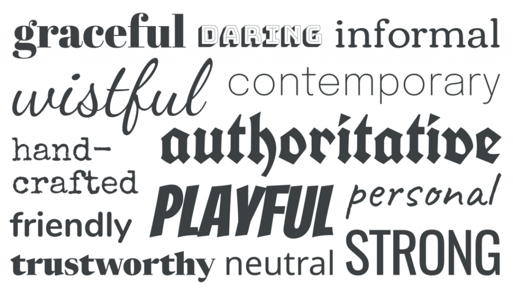
Fonts are the designs you see in print media like newspapers and books. They can be created digitally or physically through a typeface. Digital fonts are similar to digital images and can be used for print or digital media.
While digital fonts are convenient and easy to use, they lack the quality of physical fonts. Physical fonts are made with a type (or metal) used to create physical objects, such as magazines and signage.
How Do I Choose The Best Font for Logo Design?
You would want to use physical fonts for many reasons, such as printing a wedding invitation, creating a poster, or adding a handwritten touch to a greeting card. However, a physical font is also necessary when publishing a newspaper article or creating an ad.
Before you choose a font, it's essential to consider how you will use it. Some fonts work better for large text, while others work better for smaller pieces of text.
Typeface Styles
A typeface can be described as an alphabet or series of letters used to create text, often associated with different design styles.
The most common font style is sans serif; sans serif means no serif. Serifs are small decorative details that help to give the lettering character, making it look more natural. Sans serif fonts look alike, so the name stands for nothing.
If you're looking for a classic, timeless font, wear a traditional sans serif. These fonts are simple, straightforward, clean and look good in a wide range of print and digital applications. Famous examples of sans serif fonts are Arial and Helvetica.
The next step is to try out a script font in two styles: straight and italic. A script font is generally used to create handwritten text. It's a more formal typeface that looks great in various applications. Examples of script fonts are Edwardian and Kunstler Scripts.
You'll love calligraphy if you want a more informal yet professional look. This typeface is used for invitations, signs, and logos and has a distinct appearance.
In addition to the font mentioned above, abstract and fancy styles are less commonly used but still have their place in specific applications. Examples of fancy fonts include Garamond, Gill Sans, and Optima.
Fancy fonts tend to look more ornate, with extra flourishes that are commonly found in book illustrations. While these fonts are often used for signage, you can also use them for writing.
Geometric fonts are also a great choice. They can be found in various sizes and styles and are best suited for logos and other graphics-based products.
The final type of font is a hybrid, which combines the characteristics of the first three styles. For example, the geometric and script fonts often use the same letters, slightly changing how they're formed. This gives the font a unique appearance.
Tips for Choosing a Typeface
Selecting the right typeface can be a daunting task. It requires extensive knowledge of typography, as well as an understanding of the needs of your brand. In short, you must know how to choose the appropriate typeface for your brand.
Let's look at a few ways to choose a suitable typeface.
1 – Consider Your Brand
Before selecting a font, it's crucial to think about your brand and target audience. Is it a simple corporate logo, or do you need a custom typeface with many visual effects? Does it include many bold graphics, or should it be clean and simple?
2 – Understand the Font Family
Fonts come in two primary varieties—serif and sans serif. Serif fonts have a small cross on the end of each letter, adding an extra character to each letter. On the other hand, sans-serif fonts have no cross, creating a more straightforward and cleaner appearance.
3 – Look at the Font Options
Once you've determined the typeface, you'll want to examine the options available. This is called the font family, which usually includes a variety of styles or weights. These weights determine the space between letters and extra weight or thickness on a letter.
For example, let's say you choose a bolded, italicised version of a classic font. Now, you'll want to consider the different styles and weights of the font. If you want your logo to be exquisite and refined, you may opt for a light style and a thin weight. On the other hand, if you want your brand to be fun and bold, you may opt for a heavy, blocky font with bold features.
4 – Check the Glyphs
The last consideration is the glyphs or characters. Glyphs are essentially the individual letters that make up the font, so they include the “@” and the “!” and the “%” and the “&”, for example. In addition to the letter shapes, you'll want to consider the font's punctuation marks and numbers.
5 – Choose a Suitable Color
Finally, you'll want to ensure the font matches your brand colours. You may often want to use a single colour in a logo, but matching the overall appearance is important.
If you're looking to hire a graphic designer, consider working with someone specialising in your industry. Most designers know how to create the best logo design for your company, so ensure they have the experience you need.
Discovering Tools and Resources for Typographic Logo Design
The graphic and web design world is bustling with resources that can elevate your typographic logo design game. If you’re on the hunt for tools and inspiration, here’s where to start:
- Font Libraries: Access a wide range of free, open-source fonts through online libraries. These platforms offer abundant font choices and provide insights into trending styles across the web. This can be invaluable when aiming to stay ahead of your competitors.
- Creative Communities: Websites such as designer-centered platforms are treasure troves for inspiration. Designers frequently share their portfolios and projects, allowing you to glean innovative ideas and see firsthand how various fonts are utilised in logo design.
- Design Inspiration Hubs: Exploring design galleries or showcases can spark creativity. These platforms often feature curated collections of standout designs, helping you envision new possibilities and harmonise typography with visual identity.
By tapping into these resources, you can enhance your typographic logo design process with fresh ideas and current trends, ensuring your designs stand out in a crowded landscape.
Which are the most popular fonts for logos?
According to a recent survey by NewlySwissed, Helvetica is the most popular font for logos today. That makes sense because Helvetica is still one of the most widely used fonts in the world, and it's great for logo design.
Fonts are one of the critical elements of a logo. Using a font that fits your brand and creates a good impression is essential.
Mixing up fonts in a logotype is common, even if they are all the same style. That's a mistake.
Make sure that your choice of font is appropriate. If you're designing a logo for a business, choose a typeface that reflects your brand. If you're designing a logo for a personal project, choose a typeface representing your personality.
You don't need to limit your options to one or two fonts. Choose three or four, and make sure that they're all distinct. It doesn't have to be Helvetica for the whole thing, and it doesn't have to be Comic Sans for the entire thing. Pick something that suits your needs.
According to a recent survey, here are some of the most popular fonts for logos.
- Courier New – This typeface is simple and legible. It's also trendy, so it's a good choice if you want to make a substantial impact.
- Helvetica – This classic typeface is highly legible and versatile. It's a popular choice for corporate logos, but you can use it for all projects.
- Times New Roman – This typeface is a traditional and clean option. It's one of the most commonly used fonts and is often associated with formal documents.
- Calibri – This typeface looks good on any screen, from a smartphone to a big TV. It's modern and clean, and it's also popular.
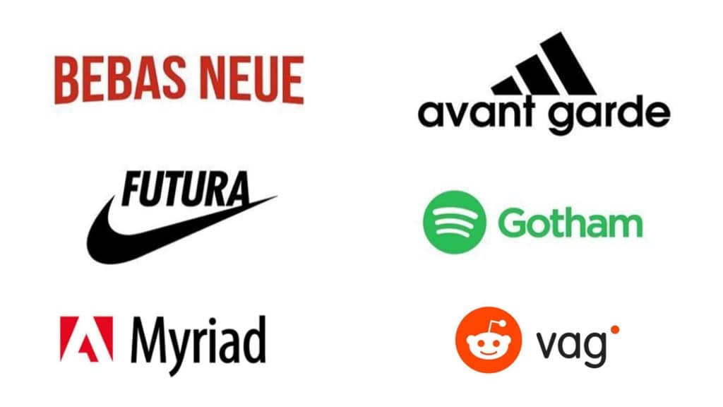
- Gotham – A typeface inspired by the look of old English letters, this font is available in both serif and sans serif versions. It's a beautiful typeface with a classic look.
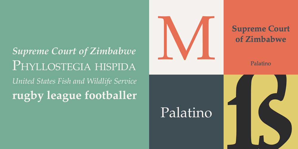
- Palatino Linotype – A serif font that's been around for over 100 years, Palatino Linotype, is known for its elegant, refined appearance. It's a classic typeface that works well on all kinds of projects.
Why is Font Uniqueness Important in Logo Design?
Font uniqueness is a crucial element in logo design as it directly contributes to the distinctiveness and memorability of a brand. When a logo uses a font that stands out as original and tailored, it immediately reinforces brand identity and helps establish a strong visual connection with its audience.
Opting for a unique font ensures that your logo does not inadvertently mimic or resemble those of competitors. This differentiation is vital because:
- Avoiding Confusion: In a crowded market, a similar font can create confusion. Consumers might associate your brand with another, diluting your brand message.
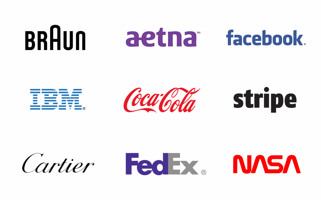
- Enhancing Brand Recall: A unique font can leave a lasting impression. Think of iconic brands like Coca-Cola or Disney; their typography is unmistakably associated with their brand stories.
- Building Trust and Authenticity: A well-chosen, unique font underlines your brand's commitment to originality and authenticity. This can foster trust among consumers, who appreciate creativity and attention to detail.
- Conveying the Right Brand Attributes: Different fonts convey different emotions and characteristics. A unique font tailored to your brand's personality can help communicate specific values and ethos effectively, from elegance to playfulness, seriousness to modernity.
Choosing a distinctive typeface for your logo is not just an artistic choice; it's a strategic decision that sets your brand apart while resonating with your target audience.
Tips for Combining Typefaces in Branding
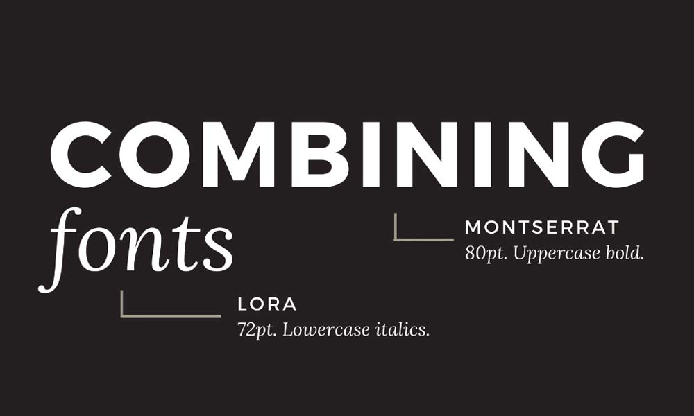
When creating a logo or branding design, it's a great idea to use complementary typefaces to draw attention. This way, no matter what size of text is used, you'll always have a crisp, readable design.
How to Find Complementary Typefaces:
The process of finding complementary typefaces can be a fun exercise. It allows you to get creative and see what works best.
Here are three simple steps to help you create a winning logo:
- Start with the colours and shapes in the logo design, and then choose a typeface. For example, you might choose a bold, dark font for the colour and a light font for the shape.
- Incorporate the chosen typefaces into your branding design. Keep in mind that the typefaces you select should complement each other. Choose a font slightly larger than the type size used for the design.
- Ensure the letters are balanced and the typefaces don't look too alike. A well-balanced logo design will have equal amounts of black and white in the background, and it's good to have a mix of uppercase and lowercase letters.
Counting the number of uppercase and lowercase letters is a good test for balancing the letters. If it's roughly even, you're good to go!
Once you've found complementary typefaces, it's crucial to think about the design for the entire branding campaign. Considering how you will use the typefaces throughout the design is a good idea.
- Do they work well together, or are they too similar or contrasting?
- Is the typeface easy to read, or do the letters look busy?
- Can you incorporate complementary typefaces in the logo or branding design?
You should include complementary typefaces in any branding design. They're an essential part of how the design looks and can help set your brand apart from the crowd.
Conclusion
Fonts are one of the most critical elements of a logo. Choosing a font can be as important as choosing a colour palette.
Once you've chosen a colour scheme, it's time to start thinking about the font. Here are my top tips to ensure you select a font that will make a great first impression.
You must pick a font that matches your brand's style and vibe. While there's nothing wrong with a bold, edgy font, it's not always the best choice.
Another critical consideration is readability. If you're using a small font, it's easy to miss some details. I recommend keeping the average reading size around 16px (font size).
Lastly, you want to select a font that's easy to read and understand. This is where a little bit of research goes a long way.
Want to learn more about the best font for logo design and branding? Subscribe to the newsletter below.

