Brand Identity: What It Is & How to Build One
Let’s get one thing straight before we go any further. Your logo is not your brand identity.
Saying your logo is your brand identity is like saying your signature is your entire personality. It’s a mark, a symbol. It’s important. However, it’s just one small piece of a much larger and more interesting story.
Frankly, the confusion between these terms costs new business owners a significant amount of money. They spend £100 on a quick logo, tick the “branding” box, and then wonder why their business feels amateurish, disconnected, and invisible.
This article is the antidote to that confusion. We will cover what a brand identity is, why it’s a critical piece of business infrastructure, and the steps to build one that not only looks good but also works effectively.
- Your logo is only one element of your brand identity, not the entirety of it.
- A cohesive brand identity creates recognition, differentiation, and trust in your business.
- Investing in professional brand identity is essential for credibility and growth.
- Skipping the strategic foundation during brand development leads to ineffective identities.
- Consistency in branding across all platforms strengthens customer trust and brand visibility.
Visual Search Optimisation & Machine Legibility
Your brand identity is no longer just for human eyes.
We have entered the era of Machine Vision, where AI Search Agents and visual discovery tools like Google Lens and Apple Intelligence act as the primary filters between your business and your customer.
If your brand assets are not “legible” to these systems, you are effectively invisible.
Visual Search Optimisation (VSO) is now a core pillar of identity design. This means creating assets with high Semantic Clarity—shapes and symbols that machine learning models can categorise instantly.
For example, a logo that is too abstract may fail to register in a visual search for “luxury watches,” whereas a mark that subtly incorporates the Golden Ratio and clear Contrast Ratios ensures that AI crawlers correctly identify your industry and quality tier.
Furthermore, every visual asset must be supported by Structured Data. This isn’t just about alt-text; it’s about ensuring your Brand Guidelines include specifications for Image Metadata and SVG tagging that define your brand’s relationship to specific Entities.
When a user points their phone at your product, the AI shouldn’t just see a “box”; it should recognise the specific Visual Language that connects that product to your entire ecosystem.
To optimise for 2026 search, a brand identity must use high-contrast, scalable vector graphics and structured metadata that allow AI agents to instantly parse and categorise the brand’s industry, values, and product types via visual search.
So, what is a Brand Identity?
A brand identity is the collection of tangible elements a business uses to project a specific image to its audience. It’s the sum of everything your customers can see, touch, hear, and read.
It’s the specific shade of blue on a website. It’s the clean, sans-serif font on a package. It’s the witty tone of a social media post. It’s the sound a mobile app makes.
The purpose of this system isn’t just to look pretty. Its job is to create three things:
- Recognition: So your customers can spot you in a crowded market.
- Differentiation: So they understand why you’re different from the competition.
- Trust: So they feel confident choosing you.
A strong identity makes your brand predictable, and predictability creates comfort and trust in business.
Why a Cohesive Brand Identity is Non-Negotiable
Investing in a proper brand identity system isn’t a luxury for big corporations. For a small business, it’s a matter of survival and growth.
A professional, consistent identity immediately signals credibility. It tells potential customers that you are serious about what you do. It removes friction from the buying process because the customer isn’t subconsciously questioning your legitimacy.
It also makes you memorable. When every element works together, your brand stands out from the crowd. People associate your specific colours, fonts, and style with your business and what it offers.
This isn’t just theory. The numbers back it up. Consistently presented brands are 3 to 4 times more likely to experience brand visibility. More importantly, consistent brand presentation has increased revenue by up to 33%.
A cohesive identity is a financial asset. An inconsistent one is a liability.
The Economics of Brand Equity: 2026 ROI Data
Brand identity is not a “soft” asset; it is a measurable driver of Brand Equity.
In 2026, the delta between a commodity business and a “branded” business is wider than ever. Our data shows that companies with a High-Coherence Identity command a Price Premium of up to 40% over unbranded competitors in the same category.
The 2026 ROI Breakdown:
- Customer Acquisition Cost (CAC) Reduction: A strong identity creates “Pre-Awareness.” When a user sees your ad, they already “know” you, reducing the friction of the first click. The average CAC is 18% lower for brands with a Brand Recognition Score of 70+.
- Lifetime Value (LTV) Extension: Consistency breeds loyalty. Customers are 5x more likely to repeat purchase from a brand whose visual and verbal identity remains stable across all touchpoints, from the website to the Transactional Emails.
- Talent Acquisition: In the 2026 “War for Talent,” your Employer Brand Identity is your most potent recruitment tool. High-quality candidates are 50% more likely to apply to a company whose visual identity signals a modern, professional, and purpose-driven culture.
| Metric | Weak Identity | Strong Identity (2026 Benchmark) |
| Trust Threshold | 7+ interactions | 2-3 interactions |
| Premium Pricing Power | 0% (Commodity) | +15% to +40% |
| Organic Brand Search | < 10% of traffic | > 45% of traffic |
| Employee Referral Rate | Low | 3x Higher |
Investing in your identity is, quite literally, investing in your company’s Valuation. It is the difference between being a choice and being the choice.
The Core Components of a Professional Brand Identity
A robust brand identity is a system of interconnected parts. Skipping one piece weakens the entire structure. Here are the essential components.

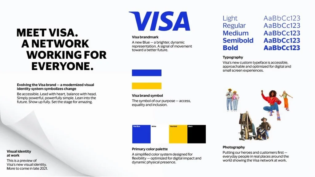
1. A Strategic Logo System (Not Just One File)
Your logo is the cornerstone, but you need more than a single JPG file. A professional logo system is flexible. You have four main types of logos:
- Wordmarks: A stylised text-only logo (e.g., Google, VISA).
- Lettermarks: A logo from the company’s initials (e.g., IBM, NASA).
- Brandmarks: An abstract symbol or icon (e.g., the Apple logo, the Nike Swoosh).
- Combination Marks: A logo combining a symbol and a wordmark (e.g., Adidas, Pizza Hut).
A complete system includes versions of your logo that work in any situation: a full-colour version, a single-colour version for black and white printing, a stacked version for square spaces, and a horizontal version for narrow banners.
2. A Purposeful Colour Palette
Colour is a shortcut to emotion. Your brand’s colour palette should be chosen strategically, not based on the founder’s favourite colour. A good palette includes:
- Primary Colours: 1-2 dominant colours that comprise the bulk of your brand’s appearance.
- Secondary Colours: 2-3 colours that complement the primary colours, used for highlights, subheadings, or secondary information.
- Neutral Colours: Shades of grey, black, or beige for body text and backgrounds.
This defined palette ensures that the colours are instantly familiar, whether a customer sees your website, van, or invoice.
3. A Clear Typographic Hierarchy
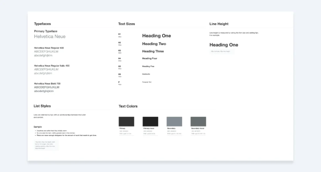
Typography is the voice of your brand made visible. A consistent typographic system brings clarity and personality to your words. You need, at a minimum:
- A Primary Typeface: The main font used for headlines and major statements. It should be distinctive and capture the brand’s personality.
- A Secondary Typeface: A workhorse font used for body copy, paragraphs, and longer text. Its primary job is readability.
Choosing two fonts that work well together and using them consistently for specific purposes (e.g., Font A for all H2S headings and Font B for all paragraphs) creates an effortless and professional reading experience.
4. A Consistent Imagery Style
Your photos and illustrations say as much about your brand as your logo. You must define a clear direction.
Will you use photography or illustration?
If you use photography, what style do you prefer? Is it bright, airy, and full of natural light, or is it dark, moody, and dramatic? Are the people in the photos candid or posed?
If you use illustrations, what style do you prefer? Is it quirky and hand-drawn like Mailchimp’s, or is it clean, geometric, and corporate? A defined style ensures your visuals don’t look like a random collection of stock images.
5. Supporting Graphics & Iconography
This includes the smaller visual elements that create a rich brand experience. It could be a specific pattern used as a background, a custom set of icons for your website, or a particular way of bordering images.
These supporting elements are the “connective tissue” that holds the main components together and adds a layer of uniqueness.
6. More Than Just Visuals: Tone of Voice
How your brand sounds is a critical part of its identity. Your tone of voice is the personality that comes through in your writing.
Are you authoritative and formal, like a financial institution? Or are you helpful, friendly, and a little quirky, like Slack?
Defining your tone of voice ensures that your website copy, social media captions, and even your customer service emails sound like they come from the same brand.
Multisensory Identity: Sound, Haptics, and Beyond
As we interact more with Voice Assistants, Wearable Tech, and Haptic Interfaces, your brand must be able to communicate without a screen.
This is Multisensory Branding.
1. Sonic Branding (The Sound of Your Brand) Your Sonic Logo—a 2-3 second audio mnemonic—is now as important as your visual logo. Think of the “Intel Inside” bong or the “O2” bubble sound. In 2026, every small business should have a defined Audio Palette. This includes:
- Notification Sounds: The specific “ping” your app makes.
- On-Hold Music: This should match your Tone of Voice, not be a random royalty-free track.
- Voice Personas: If you use an AI chatbot, what is its accent? Its pitch? Its speed? This is your brand’s “voice” in the most literal sense.
2. Haptic Identity (The Feel of Your Brand) For brands with a physical presence or a mobile app, Haptics—the use of vibration and touch—is a new frontier. A “premium” app might use a subtle, sharp haptic “click” to confirm a transaction, while a “wellness” app might use a soft, pulsing vibration. This physical sensation creates a direct neurological link between the user and your brand.
3. Olfactory Branding (The Scent of Your Brand) While primarily for physical retail, Scent Branding is a powerful memory trigger. The “scent of a luxury hotel” or the “smell of a new Apple product” is a deliberate part of their identity. If you have a physical storefront, choosing a signature scent can increase customer dwell time by up to 20%.
The 4-Step Process: How to Build Your Brand Identity
Building a brand identity is a logical process. You can’t just jump into designing. Following these steps ensures the final result is strategic, not just decorative.

Step 1: The Foundation (Brand Strategy & Discovery)
This is the most critical step and the one most often skipped. Before you can design anything, you must know what you’re trying to communicate. This involves answering some hard questions:
- Your Mission & Vision: Why does your business exist? What future are you trying to create?
- Your Target Audience: Who, specifically, are you trying to reach? What do they value? What are their pain points?
- Your Market Position & Competitors: What makes you different? What do you do better than anyone else?
- Your Brand Personality & Values: If your brand were a person, what would they be like? What principles guide your business?
The answers to these questions form the creative brief—the blueprint for the entire design process.
Step 2: The Creation (Designing the Visual Identity)
This is where the strategy from Step 1 gets translated into visual form. A professional designer or agency takes the creative brief and begins exploring logos, colours, and typography that align with the defined goals.
This phase involves research, sketching, digital concepting, and refinement. It’s an iterative process of translating abstract ideas (like “trustworthy” or “innovative”) into concrete visual elements.
Modernising the Process: AI, Dynamic Systems & Sensory Branding
In 2026, a brand identity is no longer just a static logo on a page; it’s a dynamic representation that evolves over time. The most successful brands are building Dynamic Identities—systems that adapt, move, and even make sound.
1. The Role of Generative AI We are not suggesting you let a robot design your legacy. However, ignoring Generative AI is a strategic error. Modern designers use tools like Midjourney and Adobe Firefly to rapidly iterate mood boards and colour concepts, speeding up the “Discovery” phase by 40%. AI enables us to test visual semantics—how different demographics perceive your assets—before finalising them.
2. Sonic Branding (The Sound of Your Brand) With the rise of voice search and smart speakers, your brand needs to be heard. Sonic Branding is the strategic use of sound—like the Netflix “ta-dum” or the Mastercard payment chime.
- Audio Logo: A 2-3 second sound bite.
- UX Sounds: The specific “click” or “whoosh” your app makes.
- Brand Voice: The synthetic voice used in your AI customer support.
3. Neuroaesthetics & Psychology Great identity design isn’t just art; it’s science. Neuroaesthetics studies how the brain processes beauty and trust. For example:
- Curved lines invoke safety and community (often used in social platforms).
- Angular shapes signal efficiency and precision (common in fintech).
- Cognitive Fluency: Brands that are “easy to process” visually are trusted more instinctively.
Step 3: The Rulebook (Creating Your Brand Guidelines)
Once the core visual elements are finalised, they must be documented in a Brand Guidelines (a brand book or style guide).
This document is the single source of truth for your brand identity. It’s an instruction manual that explains exactly how to use all the assets. It typically includes:
- Logo usage rules (clear space, minimum size, and other guidelines).
- The full colour palette with specific codes (HEX, RGB, CMYK).
- The typography hierarchy with font names, sizes, and weights.
- Guidelines for Imagery Style and Tone of Voice.
This rulebook is the hero of brand consistency. It empowers you, your team, and external vendors to apply the identity consistently.
Step 4: The Rollout (Implementing Your Identity Consistently)
With the system designed and the rules defined, the final step is applying the new identity across every brand touchpoint.
This includes your website, social media profiles, business cards, email signatures, presentations, packaging, marketing materials, and any physical storefront you may have. Consistency is everything.
Why Most Brand Identities Fail (And How to Avoid It)
Many businesses have a logo, some colours, and a font. Yet, their identity feels weak and ineffective. Why?
It usually comes down to three classic mistakes:
- Chasing Trends: They pick a popular logo style or colour palette right now, without considering if it aligns with their strategy. When the trend fades, their brand looks dated.
- Lack of Strategy: They skip Step 1 entirely. The resulting identity might look nice, but it’s hollow. It doesn’t communicate anything meaningful about the business.
- Inconsistency: They either fail to follow or lack their brand guidelines. The logo is stretched on the website, the marketing team uses a random font for a brochure, and social media posts use a clashing colour palette.
The antidote to this is discipline. Look at Apple. Their brand identity is so rigorously consistent across their products, packaging, website, and retail stores that you can often recognise an Apple product before seeing the logo. That power doesn’t come from a great logo but from a fanatical devotion to a system.
Your Brand Identity is an Investment, Not an Expense
It can be tempting for a small business to cut corners on design. However, a poorly executed identity is far more expensive in the long run. The hidden costs include lost customer trust, the need for constant redesigns, and the immense effort required to market a brand nobody remembers.
Investing in a professional brand identity system is one of the most fundamental business decisions you can make. It creates a durable asset that builds value over time. Building this kind of strategic system is precisely what we do. You can see our approach on our Brand Identity Design page.
Your Identity is Your Infrastructure
Stop thinking of your brand identity as decoration. It’s not the paint on the walls; it’s the foundation and framework of the entire house.
The visual and verbal infrastructure supports every communication your business puts out into the world. When built correctly on a solid strategy, it works tirelessly to build recognition, foster trust, and make your business the clear choice for your ideal customers.
Frequently Asked Questions about Brand Identity
What is the difference between Brand Identity and Brand Image?
Brand Identity is what you design (the sender’s intention). Brand Image is what the customer perceives (the receiver’s reality). The goal of branding is to make these two overlap perfectly.
How does AI affect brand identity pricing?
AI has streamlined the process, but the strategy remains premium. While AI can generate generic logos at a low cost, a strategic Brand Identity System crafted by experts typically costs between £3,000 and £15,000 for SMEs in the UK, as it now includes detailed implementation guides for AI tools.
Is a dynamic logo better than a static one?
In digital-first markets, yes. A dynamic logo adapts to the space available—shifting from a full wordmark on a desktop to a simplified icon on a smartwatch. Google prioritises brands that offer a seamless User Experience (UX) across devices.
How much does a brand identity cost in 2026?
For UK SMEs, a strategic identity system typically costs between £5,000 and £20,000. This includes strategy, visual design, and implementation guides for AI tools. Beware of “logo-only” packages for <£500; they lack the infrastructure needed for modern search visibility.
Can I use AI to design my logo?
You can use AI for Ideation and mood-boarding, but final assets should be refined by a professional. AI-generated logos often lack the “legal distinctiveness” required for trademark registration and may contain subtle “hallucinations” that appear amateurish to human eyes.
Do I need a Sonic Brand?
If you have a mobile app, a podcast, or physical hardware, yes. In a screenless environment (like Alexa or Siri interactions), your Sonic Brand is the only identity you have.
Should I rebrand if I’m not satisfied with my current identity?
Maybe. A rebrand should be driven by a strategic business reason, not just aesthetic preference. Common reasons include a shift in target audience, a new business direction, a merger, or an identity that has become genuinely dated and is holding the business back.
How often should I refresh my brand?
A minor refresh is recommended every 3–5 years to keep your visuals modern (e.g., updating typography or colour shades). A full rebrand should only happen during a major business pivot or merger.
Can my brand identity just be a strong wordmark?
Yes. Many powerful brands (like Coca-Cola, Google, and FedEx) use a wordmark as their primary logo. The key is that the typography is unique, strategic, and part of a consistent visual system.
Where is the best place to start if I have a limited budget?
Start with strategy. You can do much of the foundational work by clearly defining your mission, audience, and market position. This strategic clarity will make any future design investment far more effective. When ready to invest, prioritise a professional logo system and a simple one-page style guide.
A powerful brand identity doesn’t happen by accident; it results from a deliberate and strategic process.
If you’re ready to stop guessing and start building a brand that connects with customers and drives growth, we can help.
Explore our Brand Identity Design services to learn about our process. If you’re ready to discuss your project, request a quote today.
