Bad Graphic Design Isn’t Just Ugly — It’s Expensive
That logo your mate’s cousin designed for fifty quid? It’s costing you a lot more than you think.
Bad graphic design isn’t merely an aesthetic problem — it’s a business liability that silently drains your resources, undermines customer trust, and sabotages your brand faster than you can say “Comic Sans.
Whether you’re wincing at your marketing materials or wondering why your conversion rates are poor, understanding the cost of poor design could be the wake-up call your business desperately needs.
- Bad graphic design undermines customer trust and can significantly harm your business's bottom line.
- Inconsistent branding reduces brand recall, potentially costing revenue and customer loyalty.
- Poor design choices, like typography and colour, directly impact usability and conversion rates.
- Amateur designs lead to negative perceptions of professionalism, affecting customer acquisition costs.
- Investing in quality design yields substantial returns, enhancing brand image and financial performance.
The Hidden Price Tag of Amateur Design
We’ve all been there. Budget constraints, tight deadlines, or simply not knowing better lead us down the DIY design rabbit hole. But while that homemade logo or hastily assembled brochure might save pennies today, it’s likely costing pounds tomorrow.
Research from the DMI shows that companies that invest in good design outperform their competitors by nearly 200%. That’s not a typo — design-led businesses have consistently demonstrated superior financial performance across virtually every industry.
When you skimp on design, you’re not being economical and potentially leaving serious money on the table.
Think about it this way: your visual identity is often the first thing potential customers encounter. That pixelated logo or cluttered website? They’re judging your professionalism, reliability, and attention to detail before they’ve read a single word about your services.
Studies show users take about 50 milliseconds — 0.05 seconds — to form an opinion about your website. If that opinion is negative, you’ve likely lost them forever.
Common Design Disasters: More Than Just Eyesores
Let’s examine the most common design mistakes that aren’t just visually painful but commercially damaging.
Inconsistent Branding: The Identity Crisis
Ever notice how some businesses seem to have different personalities on every platform? Their Facebook page feels corporate, their website looks like they’re selling children’s toys, and their business cards suggest they’re a funeral parlour. That’s inconsistent branding, and it’s confusing your customers.
Inconsistent branding creates a perception gap between what you promise and deliver. When your visual elements don’t align, customers struggle to form a clear mental image of your business. This confusion reduces brand recall and makes it less likely they’ll choose you when purchasing.
Some studies suggest that consistent presentation of a brand can increase revenue by up to 23%. That’s because consistency builds recognition, and recognition builds trust. When your branding elements work harmoniously, they reinforce each other, creating a stronger overall impression.
To avoid this costly mistake, develop a comprehensive brand style guide that governs your logo, colours, typography, imagery, and tone of voice across all touchpoints. Then stick to it religiously. Your bank account will thank you.
Poor Typography Choices: When Readability Suffers
Typography isn’t just about making text look pretty — it’s about communication. You’re putting barriers between your message and your audience when you choose illegible fonts, inappropriate typefaces, or poor font pairings.
Think about the last time you encountered a website with tiny text, poor contrast, or a font that looked like it belonged on a ransom note. Did you stick around to decipher it? Probably not. Studies in user experience design show that poor typography is one of the top reasons visitors abandon websites.
The financial impact is substantial. For e-commerce sites, poor typography can directly affect conversion rates. For service businesses, it can increase bounce rates and reduce enquiries. For all businesses, it diminishes the effectiveness of your marketing communications.
Clashing Colour Palettes: The Visual Headache
Colour psychology is powerful. The colour scheme can strengthen your brand identity, evoke specific emotions, and guide user behaviour. The wrong colour scheme can repel customers faster than a bad smell.
Colours that clash create visual noise that’s fatiguing to look at. They make information more complicated and can even trigger negative physiological responses. Beyond the immediate discomfort, inappropriate colour choices can send the wrong message about your brand’s personality and values.
Consider a financial advisor whose website uses bright neon colours. Does that inspire confidence in their conservative investment strategies? Or a children’s toy company using grayscale minimalism.
Does that suggest fun and playfulness? Colour misalignment with your brand values creates cognitive dissonance that erodes trust.
Overused Stock Images: The Credibility Killer
We’ve all seen them — the unnaturally happy office workers, the impossibly perfect handshake, the woman laughing alone with salad. Generic stock images are the fast food of visual content: convenient but ultimately unsatisfying and potentially harmful.
Ah, the stock photo — simultaneously everywhere and nowhere. Visitors encountering these overused images on your site trigger pattern recognition. They’ve seen these same images on countless other websites, which immediately signals “template” and “cookie-cutter.” Not precisely the unique value proposition you’re hoping to convey.
The generic imagery suggests you couldn’t be bothered to create custom visuals representing your business. This perceived lack of effort or investment translates to assumptions about your products or services. Where else might you be taking shortcuts if you cut corners on your visual presentation?
Design Layout Mistakes: When Form Fights Function
Good design isn’t just about aesthetics — it’s about functionality. Crowded layouts, poor alignment, and confusing navigation don’t just look amateur; they actively prevent users from accomplishing their goals.
Consider these common layout disasters:
- Overcrowded pages with no visual hierarchy
- Misaligned elements create a sense of disorder
- Lack of whitespace makes content difficult to parse
- Inconsistent spacing creates rhythm disruption
- Poor contrast makes essential elements invisible
Each mistake increases cognitive load — the mental effort required to use your website or interpret your marketing materials. The higher the cognitive load, the less likely users are to complete desired actions, whether making a purchase, filling out a form, or simply remembering their message.
The Brand Trust Erosion: How Bad Design Damages Perception
Let’s talk about trust — that precious, hard-won commodity determining whether customers choose you over competitors. Bad design erodes trust in subtle but powerful ways.
When potential customers encounter amateur design, they make unconscious connections:
- If the business doesn’t care about its presentation, does it care about its products?
- If attention to detail is lacking in design, is it lacking in service too?
- If they can’t invest in professional branding, are they financially stable?
These perceptions might seem unfair, but they’re reality. The aesthetic usability paradox demonstrates that users perceive visually appealing designs as more functional and trustworthy, even before using them. Conversely, poor design creates an uphill battle where you must work harder to prove your competence.
The Business Impact: Converting Design Failures to Financial Losses
Let’s get concrete about how design failures translate to financial impact:
Customer Acquisition Costs
Bad design increases your cost per acquisition. When your marketing materials fail to convert effectively, you need more leads to achieve the same number of customers. This means spending more on advertising, content creation, and other acquisition channels.
Conversion Rate Depression
Poor user interface design directly impacts conversion rates. Studies show that improving user experience design can lift conversion rates by up to 400%. Conversely, confusing navigation, illegible text, and unclear calls-to-action can decimate your conversion potential.
Pricing Pressure
When your brand looks amateur, you lose pricing power. Customers expect discounts from businesses that appear less professional. This perception forces you to compete on price rather than value, squeezing your margins and reducing profitability.
Employee Morale and Recruitment
Often overlooked is how bad design affects internal stakeholders. Employees feel less pride in representing a brand with a subpar visual identity. This impacts morale and can make recruiting top talent more difficult and expensive.
Opportunity Cost
Perhaps the most significant financial impact is the opportunity cost — the business you never win because your visual presentation turns prospects off before considering your offering.
Real-World Examples: The Cost of Design Failures
Let’s examine some notorious design fails and their impacts:
The 2012 London Olympics Logo
The 2012 Olympics logo cost a reported £400,000 and was widely panned as one of the worst Olympic logos ever created. Beyond the initial investment, the negative press and public ridicule created a PR challenge requiring additional resources. While the Games were successful, the logo remains a cautionary tale of high-cost, low-value design.
Tropicana’s Packaging Redesign Disaster
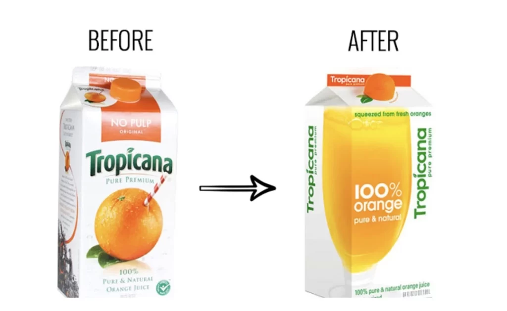
In 2009, Tropicana spent $35 million on a packaging redesign that abandoned its iconic orange-with-straw imagery. Sales plummeted by 20% in just two months, representing a loss of approximately $30 million. Tropicana quickly reverted to the original design, but not before significant damage was done.
Small Business Consequences
While these examples involve large corporations, the percentage impact on small businesses can be even more severe. A local restaurant with menu designs that make dishes difficult to find or read might lose 5-10% in potential orders, a margin that could determine survival in the competitive hospitality industry.
The False Economy of DIY Design Software Misuse
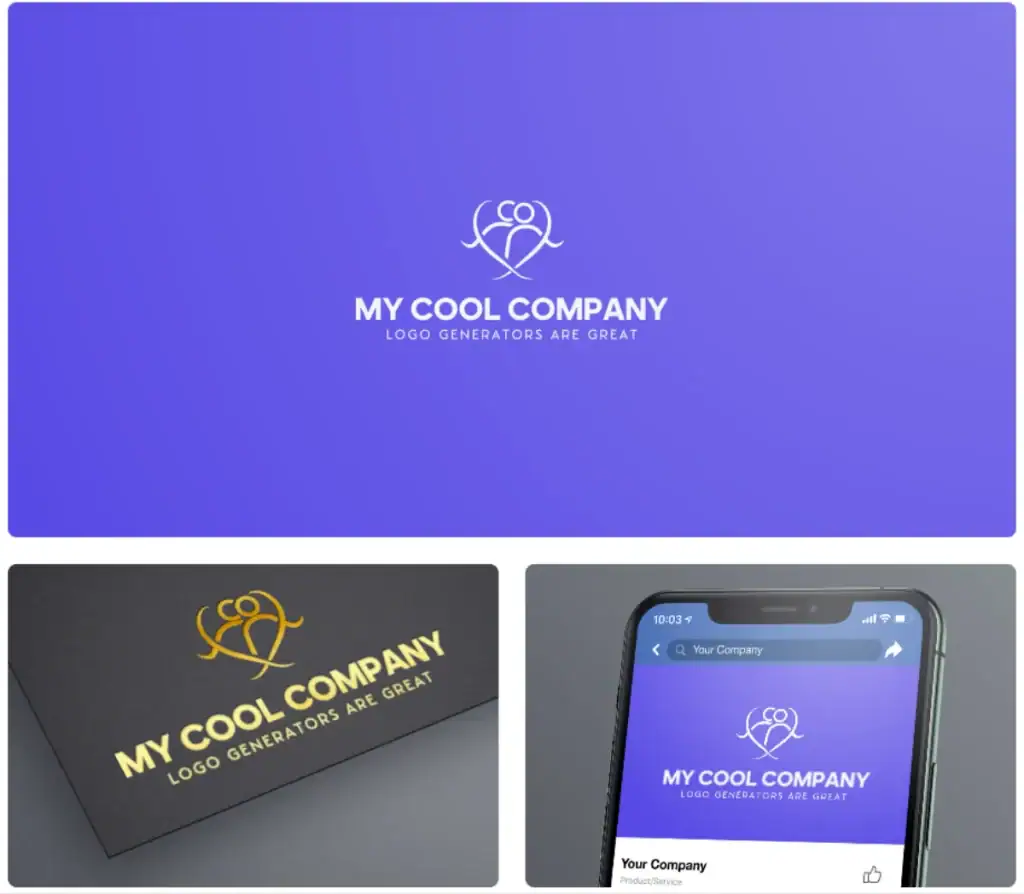
With tools like Canva and Adobe Express making design accessible to non-designers, it’s tempting to believe professional design is obsolete. These platforms can produce decent results in skilled hands, but they’ve also enabled design mistakes.
The problem isn’t the software — it’s using powerful tools without understanding fundamental design principles. It’s like giving someone a professional camera without teaching them about composition, lighting, or focus. You might get lucky occasionally, but consistent quality remains elusive.
The real cost comes when businesses repeatedly create and distribute poorly quality visuals that damage their brand equity incrementally. Each individual might seem harmless, but collectively, they construct a perception of amateurism that’s difficult to reverse.
How to Fix Bad Design Without Breaking the Bank
If you’re wincing at your current design materials but working with budget constraints, here are pragmatic steps to improve:
Prioritise Your Visual Touchpoints
Not all design elements have equal impact. Focus first on high-visibility items that shape first impressions:
- Your logo and core brand identity
- Your website homepage and key landing pages
- Social media profile images and templates
- Proposal documents for potential clients
- Business cards and essential print materials
Invest in Design Education
If budget constraints make hiring professionals challenging, invest time in understanding basic design principles. Resources like Inkbot Design’s blog offer valuable insights without the heavy theory.
Use Templates Wisely
Pre-designed templates can provide a solid foundation, but customisation is essential. Change default fonts, adapt colour schemes to match your brand, and replace generic stock images with authentic photography whenever possible.
Consider Phased Professional Help
Instead of an all-or-nothing approach to professional design, consider targeted assistance:
- Hire a professional for your core brand identity, then apply those principles yourself to secondary materials
- Invest in a professional website theme or template, then manage content updates internally
- Commission a designer to create templates you can modify for ongoing social media needs
The Professional Advantage: When to Call in the Experts
While DIY approaches can be stopgaps, specific scenarios warrant professional design intervention:
- Rebranding or initial brand development
- Website redesigns or significant updates
- High-stakes marketing campaigns
- Materials for major clients or proposals
- Anything produced in large quantities or with extended lifespans
The investment in these scenarios typically delivers substantial returns through improved conversion rates, stronger brand perception, and enhanced customer loyalty.
Visual Hierarchy Issues: Why Your Message Gets Lost
Poor visual hierarchy is one of the most common design mistakes with profound business implications. When everything shouts for attention, nothing gets heard.
Visual hierarchy is the arrangement and presentation of elements in order of importance. Without a clear hierarchy, users struggle to identify what’s most important, where to focus, and what actions to take. This directly impacts how effectively your communication achieves its goals.
Common hierarchy mistakes include:
- Equal visual weight is given to all elements
- Important information is buried in dense text blocks
- Critical calls-to-action that blend into backgrounds
- Too many competing focal points
- Lack of contrast between primary and secondary content
The business cost? Customers leave when they can’t quickly find what they’re looking for or identify your desired action. For e-commerce sites, studies suggest that a clear visual hierarchy can improve conversion rates by up to 20%.
Non-Responsive Design: The Mobile Customer Exodus
In 2023, mobile traffic accounted for approximately 55% of all web traffic globally. Yet many businesses still maintain websites that provide suboptimal experiences on smartphones and tablets.
Non-responsive design isn’t just inconvenient for mobile users — it actively drives them away. Google research shows that 61% of users are unlikely to return to a mobile site they had trouble accessing, and 40% visit a competitor’s site instead.
The financial implications are staggering:
- Lost traffic from mobile search (Google prioritises mobile-friendly sites)
- Abandoned transactions when checkout processes fail on mobile
- Reduced engagement with content and offerings
- Damaged brand perception among mobile-first audiences
This isn’t merely about aesthetics — it’s about functionality that directly impacts revenue.
The Accessibility Oversight: Design That Excludes Customers
Beyond the moral imperative, accessible design makes business sense. When your website or marketing materials aren’t accessible to people with disabilities, you’re excluding approximately 15% of the global population — a massive potential market.
Common accessibility failures include:
- Poor colour contrast makes the text unreadable
- Missing alt text for images prevents screen reader users from understanding content
- Complicated navigation that can’t be used with keyboard controls
- Tiny tap targets that are difficult to activate on touchscreens
- Animated elements that trigger vestibular disorders
The business costs extend beyond lost customers. In many jurisdictions, inaccessible websites face increasing legal risks, with web accessibility lawsuits growing by over 300% in recent years.
The Professional Alternative: What Good Design Investment Looks Like

Professional design isn’t about pretty pictures — it’s about strategic visual communication that achieves business objectives. When you invest appropriately, here’s what you should expect:
Research-Based Approach
Professional designers begin by understanding your business, audience, and competitors. This research informs visual choices that align with strategic goals rather than subjective preferences.
Consistent System, Not Just Individual Pieces
Rather than creating isolated designs, professionals develop comprehensive systems that work cohesively across all touchpoints, ensuring consistency that builds recognition and trust.
Measurable Results
Good design creates measurable improvements in key metrics:
- Increased time on site
- Improved conversion rates
- Higher average order values
- Better email open and click-through rates
- Enhanced social engagement
- Stronger brand recall
Long-Term Value
Professional design delivers value long after the initial investment. A well-designed logo, website, or brand system continues working for years, often requiring only minor updates to stay current.
Finding the Right Design Partner
Choosing the right partner is crucial when you’re ready to invest in professional design. Request a quote from designers who demonstrate:
- Understanding of business objectives beyond aesthetics
- Portfolio work relevant to your industry
- Transparent process for incorporating your input
- Ability to explain design decisions in business terms
- Track record of measurable results for clients
The right partnership transforms design from a cost centre to a revenue generator that delivers ongoing returns.
FAQS About Bad Graphic Design
How can I tell if my current design is hurting my business?
Look for symptoms like high bounce rates, low conversion rates, negative customer feedback about usability, or comments about your business looking “unprofessional.” Compare your visual identity to respected competitors — if yours seems notably less polished, that’s a red flag.
What’s the minimum I should invest in professional design?
At a minimum, invest in a professional logo, consistent colour palette, typography system, and website homepage. These core elements establish your visual foundation and affect most customer interactions.
Can I improve my DIY designs without hiring a professional?
Yes! Start by simplifying — remove unnecessary elements, create more whitespace, limit your colour palette, and use no more than two font families. Also, get objective feedback from people outside your business.
How long does professional design typically take?
A comprehensive brand identity takes 4-8 weeks from start to finish. Website design can range from 6-12 weeks, depending on complexity. Smaller projects like business cards take 1-2 weeks.
What’s the ROI of good design?
While specific returns vary by industry, the Design Council reports that every £1 invested in design typically yields over £20 in increased revenues. Design-led companies have consistently outperformed the S&P 500 by over 200%.
How often should I update my design materials?
Major rebrands typically occur every 7-10 years, but more minor refreshes might happen every 2-3 years. Websites often benefit from updates every 2-4 years as technology and user expectations evolve.
What’s the difference between a designer and a design agency?
Freelance designers typically specialise in specific areas like logo design or web design. Agencies offer broader expertise across multiple disciplines, but often at a higher cost. Your needs and budget should determine which is right for you.
Can bad graphic design harm my SEO efforts?
Absolutely. Poor user experience signals like high bounce rates and low time-on-site negatively impact search rankings. Non-responsive design also directly affects mobile search visibility.
What if I like a design but my customers don’t?
This highlights the difference between personal preference and strategic design. Effective design isn’t about what you like — it’s about what resonates with your target audience and achieves business objectives.
Should I follow design trends?
Selectively. Some trends enhance user experience and keep your brand current, while others are flashy but impractical. Professional designers help distinguish between meaningful innovations and fads.
When Bad Design Costs More Than Money
We’ve focused primarily on financial impacts, but bad design carries other significant costs:
- Time wasted managing design-related problems
- Opportunities are missed when poor presentation undermines pitches
- Talent is lost when top candidates choose employers with stronger brands
- Partnerships foregone when potential collaborators question your professionalism
Most importantly, bad design costs you peace of mind. The nagging feeling that your visual identity doesn’t reflect your true capabilities or the quality of your offerings creates a persistent cognitive dissonance that distracts from your core business.
Good design isn’t an indulgence — it’s an investment that pays dividends across every aspect of your business. From attracting customers to retaining employees, from commanding premium prices to building lasting brand equity, thoughtful visual communication is fundamental to sustainable success.
Remember, in a world where first impressions happen in milliseconds, you can’t afford design that makes you look cheap. Because when your graphics go bad, your bottom line follows suit.


