The 10 Logo Design Best Practices That Actually Matter
Most articles about logo design best practices are filled with useless fluff. They talk about “capturing your brand’s essence” and other romantic notions that don’t help you make a practical decision.
This isn’t that.
These aren’t gentle suggestions. These are the 10 essential constraints. They are the rules that force good, functional design. A logo isn’t a piece of fine art to be admired in a gallery; it’s a functional business tool with a job.
If it can’t do its job, it’s worthless.
Here are the practices that separate professional, hard-working brand marks from expensive, amateur mistakes.
- Simplicity is crucial for logos; it ensures recognition and memorability while avoiding cognitive overload.
- A logo’s effectiveness is determined by its scalability and versatility across various media and sizes.
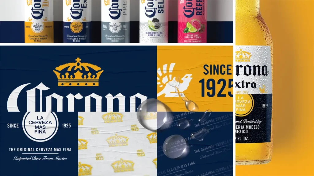
- Choosing appropriate colours strategically enhances brand perception and recognition, making it essential in logo design.
1. Start with Simplicity: The Foundation of Recognition
The single most important characteristic of a great logo is simplicity. Why? Because our brains are wired to recognise and recall simple shapes far more easily than complex ones. A complicated logo is a cognitive burden. A simple one is a mental shortcut.
This is where we must address the most pervasive myth in branding: the “storytelling” logo. There’s a popular idea that a logo must tell your company’s history, mission, and vision in one clever mark.
That’s nonsense.
Your logo isn’t a novel; it’s the title on the cover. Its primary job is to identify. The story is built by your brand’s actions, products, and reputation over time, imbuing the simple mark with meaning.
Good Example: Look at the Nike Swoosh. When it was created, it meant nothing. It was just a simple, fluid checkmark. Decades of world-class marketing, athlete endorsements, and product innovation turned that simple shape into a global symbol for victory and determination. They didn’t cram a story into it; they built a story around it.
Bad Example: Think of any local business with a logo that tries to show everything they do. A contractor with a hammer, saw, house, and sun crammed into a shield. It’s an unreadable mess that communicates only one thing: amateurism.
Actionable Tip: Use the 5-Second Memory Test. Show the logo design to someone for five seconds, then hide it. Ask them to sketch what they saw. Your logo is too complicated if they can’t draw a reasonable facsimile of its basic form.
2. Aim for Memorability: Does It Stick in the Brain?
Memorability is the direct result of simplicity and distinctiveness. If a logo’s purpose is to identify, it fails if it cannot be remembered. A memorable logo lodges itself in the viewer’s mind, accelerating brand equity growth. A forgettable one is just money down the drain.
This is less about being loud and more about being clear. A unique shape is far more memorable than a blast of colour or a trendy effect.
Good Example: The Apple logo. It’s a universally understood object—an apple—with one simple, distinct feature: a bite taken out of it. That modification makes it unique, easy to describe, and impossible to forget. It’s recognisable even when tiny or presented without the company name.
Bad Example: The endless sea of generic corporate logos. Think of the hundreds of consultancies, tech firms, and logistics companies that use an abstract globe, a generic swoosh, or three converging lines. They are so interchangeable that they are effectively invisible. They blend in when the entire point is to stand out.
Actionable Tip: Place your logo concept next to the logos of your top three competitors. Be brutally honest. Does it get lost? Does it look like it belongs to the same family? If you could swap it with a competitor’s and no one would notice, you don’t have a logo—you have a placeholder.
3. Design for Timelessness: Resisting the Seduction of Trends
A well-designed logo is a long-term asset. It should feel relevant in 10 or 20 years as it does today. Chasing design trends is the fastest way to guarantee your logo will look dated and require an expensive, brand-damaging redesign in just a few years.
Trends are temporary. Good design is permanent. Things like 3D bevels from the 2000s, recent obsessions with pastel gradients, or ultra-thin “air-like” fonts are stylistic tics that will instantly timestamp your brand to a specific era.
Good Example: The Coca-Cola script. While subtly refined over the decades, the fundamental Spencerian script has been used for over a century. It has transcended trends and become an untouchable piece of brand equity. It looks classic, not old.
Bad Example: The infamous 2010 Gap redesign. They traded their iconic, serif wordmark—a mark with decades of customer recognition—for a generic Helvetica with a little blue square. The public backlash was so swift and severe that they reverted to the old logo in less than a week. More recently, the rebranding of Twitter to ‘X’ serves as a stark case study in discarding globally recognised visual equity for something generic.
Actionable Tip: When reviewing a logo design, ask yourself: “Would this have looked good 20 years ago?” If yes, it has a better chance of looking good 20 years from now. Focus on classic typography, simple geometric forms, and a solid structure.
4. Ensure Scalability: From a Billboard to a Browser Favicon
Your logo will not live in a pristine presentation deck. It will be put to work in the real world, in countless sizes and applications. It must remain legible and maintain its integrity, whether printed on the side of a building or shrunk to a 16×16 pixel favicon in a browser tab.
This is the ultimate technical test of a logo’s viability. A beautiful, detailed illustration might look fantastic in a designer’s portfolio, but it has failed if it turns into an unreadable smudge when scaled down. This is not a “nice-to-have”; it’s a fundamental requirement.
Details get lost at small sizes. Fine lines disappear. Intricate text becomes illegible. A strong, scalable logo relies on a bold, unmistakable silhouette.
Good Example: The McDonald’s Golden Arches. The ‘M’ is so simple and powerful that it’s instantly recognisable at almost any size. You can see it from a moving car on a highway sign or spot it as a tiny app icon on your phone. Its form is bulletproof.
Bad Example: Any logo that relies on small, secondary text as part of its central lockup (e.g., “Est. 2021” tucked underneath). That text is the first thing to become a blurry mess. Similarly, logos with delicate, thin-line illustrations fall apart when you try to shrink them.
Actionable Tip: Before you approve any design, demand to see it mocked up at its smallest intended size. Don’t just look at it on a big screen. Test it as a social media profile picture. Test it as a favicon. If it’s not clear, it needs to be revised. This is a non-negotiable step in any professional logo design process.
5. Prioritise Versatility: The Mark of a True Workhorse
Beyond scaling up and down, a logo must be versatile enough to work across various media and contexts. It needs to be a flexible tool that can be applied anywhere without losing its impact. This requires thinking beyond the full-colour digital version from day one.
There are two critical tests for versatility.
Rule 5a: It Must Work in One Colour.
If your logo needs colour, gradients, or shadows to be recognisable, it’s a broken logo. Simple as that. It must have a strong enough foundational form to work in a single, solid colour—typically black. This is essential for applications like embroidery on uniforms, laser etching on products, embossing on stationery, or single-colour newspaper ads. A dependency on colour is a rookie mistake.
Rule 5b: It Must Work on Light and Dark Backgrounds.
You don’t always control the background on which your logo will appear. It might be placed over a photograph, on a partner’s website with a dark theme, or on a coloured trade show banner. A professional logo package always includes versions that work on light backgrounds (the standard version) and a “reversed-out” all-white version that works on dark or busy backgrounds.
Actionable Tip: Before finalising a design, insist on seeing it in three formats: the full-colour version, a solid black-only version, and a solid white-only version on a black background. It is not versatile enough if the logo loses its character or legibility in these tests.
6. Strive for Uniqueness: Stand Out, Don’t Blend In
A logo’s entire reason is to differentiate your business from your competitors. Therefore, a generic logo or one similar to another brand’s is a catastrophic failure. The goal is not to fit into your industry’s visual language, but to create your own.
This means actively avoiding the visual clichés that plague every industry. If you’re a dentist, avoid using a tooth. Avoid a house or a roofline if you’re a real estate agent. Avoid a globe or an abstract swoosh if you’re a tech company. These are lazy shortcuts that make you look like everyone else.
Good Example: The NBC peacock. In the early days of television, most network logos were simple typographic abbreviations (CBS, ABC). NBC introduced a colourful, abstract peacock. It was unique, memorable, and strategically tied to the innovation of colour television. It gave them a visual asset no one else had.
Bad Example: The tidal wave of nearly identical, minimalist, lowercase sans-serif wordmarks used by startups over the last decade (think brands like away, hims, quip). While clean, they are so stylistically similar that they create a bland, forgettable monoculture.
Actionable Tip: Before you even start sketching, thoroughly audit your competitors’ logos. Pin them all up on a board. Your primary design goal should be to create something that looks nothing like them.
7. Be Appropriate: Align with Your Industry and Audience
While a logo must be unique, it must feel appropriate for its intended audience and market. The design’s personality—conveyed through typography, shape, and style—must align with the brand’s positioning.
This is not about being literal. A bank doesn’t need to show money in its logo. It’s about conveying the right feeling. A bank’s logo should feel stable, trustworthy, and professional. A toy company’s logo should feel fun, playful, and energetic.
A significant stylistic disconnect can destroy credibility before a customer engages with you.
Good Example: Disney. The whimsical, looping, script-based logo perfectly captures the feeling of magic, fantasy, and family fun. It would be inappropriate for a company like a central investment bank, but it’s perfect for them. It aligns perfectly with their brand’s core emotion.
Bad Example: Imagine a high-end, bespoke tailor using a font like Comic Sans for their logo. The mismatch between the service (premium, craftsmanship) and the visual identity (childish, unserious) would be jarring. It creates a credibility gap that is nearly impossible to overcome.
Actionable Tip: Before the design process begins, write down 3-5 keywords that describe your brand’s personality (e.g., “Rugged,” “Premium,” “Friendly,” “Innovative”). Use this list as a filter for every design decision. Does this font feel “Rugged”? Does this shape feel “Innovative”?
8. Use Colour Strategically: It’s More Than Decoration
Colour is one of the most potent tools in branding. It can evoke emotion, influence perception, and dramatically improve brand recognition. However, it must be used strategically, not as a decorative afterthought applied at the end of the process.
While colour psychology (blue = trust, red = energy, etc.) is a good starting point, context is everything. The most important thing is choosing a colour palette appropriate for your brand (see point 7) and unique in your market (see point 6).
Good Example: Tiffany & Co. Their specific shade of robin’s egg blue (Pantone 1837) is so iconic that the colour is trademarked. That colour is not just in their branding; it is their branding. Seeing that little blue box evokes feelings of luxury, quality, and desire before you even read the name.
Bad Example: Using too many colours. A logo that looks like a rainbow is visually chaotic. It’s harder to remember, reproduce accurately, and often looks unprofessional. Unless you are a brand specifically about colour (like NBC or Google), a limited palette of 1-3 colours is almost always more effective.
Actionable Tip: Start designing the logo in black and white to ensure the form is solid. Then, introduce colour strategically. Choose a primary brand colour that feels appropriate and stands out from your competition. Select one or two secondary accent colours if needed, and then stop.
9. Avoid the “Cleverness” Trap: Prioritise Clarity Over Puns
There’s a dangerous obsession in the design world with being “clever.” Designers and clients fall in love with logos with a hidden meaning, a visual pun, or some secret “aha!” moment.
Here’s the hard truth: 99% of the time, this cleverness comes at the expense of clarity. And clarity always wins. If your logo requires an explanation for people to “get it,” it has failed. Its job is to be understood in an instant.
Good Example: The FedEx logo. For one reason, it is the gold standard of “clever” design: the cleverness is a bonus, not the main feature. The white arrow between the ‘E’ and ‘x’ in the negative space is a brilliant nod to speed and direction. But crucially, if you never see the arrow, the logo still works perfectly. It’s a bold, clear, legible wordmark for a logistics company. The arrow is an elegant discovery, not a prerequisite for understanding.
Bad Example: Any logo that is so abstract or conceptual that it leaves the viewer confused. A logo for a company called “Lighthouse” that is an abstract series of dots and lines meant to represent a beam of light is a failure. Just show a clear, simple lighthouse. Don’t make your audience solve a puzzle.
Actionable Tip: If you have a clever concept, apply the “FedEx Test.” Does the logo function perfectly as a simple, appropriate, and clear identifier even if nobody notices the clever element? If the answer is no, you are sacrificing clarity for a gimmick. Simplify it.
10. Demand Vector Format: The Technical Non-Negotiable
This is the least glamorous but most critical best practice. It is a hard, technical rule that separates professional design from amateur hour. Your final logo must be created and delivered in a vector format.
There are two main types of image files: raster and vector.
- Raster files (.JPG, .PNG, .GIF) are made of pixels. They have a fixed resolution. When you try to enlarge them, they become blurry and pixelated.
- Vector files (.AI, .EPS, .SVG) are made of mathematical paths and points. They have no resolution. They can be scaled infinitely—from the size of a postage stamp to the size of a skyscraper—with absolutely no loss of quality.
A logo created in a raster program like Photoshop or Canva is a ticking time bomb. It will cause endless problems when you need a high-resolution version for a printer or a large sign.
Good Example: Any logo delivered by a professional designer or agency. The standard final package from a firm like Inkbot Design will always include the source vector files as the master files.
Bad Example: A business owner who receives only a .JPG file from their designer. That file is practically useless for anything other than small-scale web use. They have not received a real logo but a picture of one.
Actionable Tip: This is simple. Never sign off on a logo project or pay the final invoice until you have the final source vector files (.ai or .eps) in your possession. They are not professionals if a designer tells you they aren’t necessary or can’t provide them. If you’re ready to start a project the right way, you can request a quote to ensure you get the proper, professional-grade files you need.
Conclusion: A Logo is a Tool, Not a Masterpiece
A great logo is not a matter of subjective taste or artistic expression. It results from a strategic process guided by unforgiving, practical constraints.
It’s a functional, hard-working business tool.
By focusing on these ten core principles—simplicity, memorability, timelessness, scalability, versatility, uniqueness, appropriateness, strategic colour, clarity, and technical soundness—you move the conversation from “Do I like it?” to “Does it work?”
Stop looking for a masterpiece. Start demanding a tool that gets the job done.
Logo Design Best Practices (FAQs)
What is the most critical logo design best practice?
Simplicity. It is the foundation upon which almost all other best practices—like memorability, timelessness, and scalability—are built. A simple logo is easier to recognise, remember, and reproduce.
How many colours should a logo have?
Ideally, between one and three. A limited colour palette is more memorable, versatile, and cost-effective to reproduce. Your logo must be able to work in a single colour (black or white) to be truly effective.
What is the difference between a vector and a raster logo?
A vector logo (.AI, .EPS, .SVG) is made from mathematical paths and can be scaled to any size without losing quality. A raster logo (.JPG, .PNG) is made of pixels and will become blurry and unusable when enlarged. Always insist on receiving the final vector files.
How do I know if my logo is timeless?
Ask yourself if it relies on current design trends (e.g., specific gradient styles, ultra-thin fonts, 3D effects). A timeless logo uses classic typography and simple, robust forms that would not have looked out of place 20 years ago.
Should my logo literally show what my company does?
Generally, no. This is a common mistake that leads to overly complex and cliché logos. Apple’s logo isn’t a computer. Nike’s logo isn’t a shoe. The logo should identify your brand, not describe it.
What is the biggest mistake people make when designing a logo?
Making it too complicated. They try to cram too many ideas or “stories” into the mark, undermining its primary function: to be an instantly recognisable symbol.
Can I design my own logo using an online maker?
While you can, it’s generally not recommended for a serious business. These tools often use generic templates and icons, making it challenging to create something unique. They also may not provide the proper vector files required for professional use.
How much should a professional logo design cost?
Costs vary widely based on the designer’s experience and the project’s scope. It can range from a few hundred pounds for a freelancer to tens of thousands for a major agency. The investment should be viewed relative to the value of a strong, lasting brand identity.
What files should I get from my logo designer?
At a minimum, you should receive:
Source vector files (.AI and/or .EPS)
Print-ready vector file (.PDF)
Web-ready raster files (.PNG with transparent backgrounds, .JPG)
A scalable vector graphic for web use (.SVG)
What is a “responsive logo”?
A responsive logo is a set of variations designed to work optimally at different screen sizes. A complex primary logo might simplify to a symbol or icon for a small mobile view or favicon, ensuring legibility at all scales.
Your logo is the face of your business. Following these fundamental best practices isn’t about limiting creativity; it’s about making a wise, long-term investment in your brand’s future. If you’re ready to build a brand mark that works as hard as you do, look at our professional logo design services to see how the process should be done.

