Leica Logo Design: Crafting an Iconic Brand Identity
Have you ever stared at a logo and felt… something? That's precisely what happened to me when I first saw the Leica logo. It was like looking at a perfectly composed photograph—every element in its proper place, nothing superfluous.
I remember thinking, “How the hell did they make something so simple look so damn good?”
That question led me down a rabbit hole of design history, brand strategy, and more than a few sleepless nights redesigning logos for my clients at Inkbot Design.
What I discovered was eye-opening. And potentially game-changing for your brand.
But first, let's get one thing straight:
Creating an iconic logo isn't about following trends or throwing money at the problem.
It's about understanding the core principles that make great design work.
And Leica? They've got it down to a science.
So buckle up because we're about to dissect one of the most recognisable logos in the world. And trust me, by the end of this, you'll see logos in a whole new light.
🔰 TL;DR: Leica's logo is a masterclass in minimalist design that's stood the test of time. This post dives deep into its history, evolution, and the lessons you can apply to your brand identity—without needing a Swiss bank account or a degree from a fancy design school.
| Detail | Information |
|---|---|
| Company Name | Leica Camera AG |
| Founded | 1849 |
| Founder | Ernst Leitz I |
| Headquarters | Wetzlar, Hesse, Germany |
| Estimated Value | Not publicly disclosed |
| Industry | Cameras and sports optics |
| Key Products | Digital and analog cameras, lenses, binoculars, spotting scopes |
| Parent Company | Part of the Leica brand, which includes Leica Microsystems and Leica Geosystems |
| Website | Leica Camera |
- Leica's logo exemplifies minimalist design, showcasing how simplicity can elevate brand identity and recognition.
- Consistency in brand presentation is crucial; it enhances Leica's market perception and drives customer loyalty.
- A strong logo is an investment in your brand's future, building brand equity over time.
- The Birth of an Icon: Leica's Logo Evolution
- The Anatomy of Perfection: Dissecting Leica's Logo Design
- The Power of Consistency: Leica's Brand Identity Beyond the Logo
- Lessons from Leica: Applying Their Design Principles to Your Brand
- The ROI of Good Design: Why Investing in Your Logo Pays Off
- DIY vs Professional: When to Call in the Big Guns
- The Future of Logo Design: Trends and Predictions
- Conclusion: Your Logo, Your Legacy
- FAQs
The Birth of an Icon: Leica's Logo Evolution

From Wordmark to Symbol: A Journey Through Time
Let's kick things off with a little history lesson. Don't worry; I promise it won't be as dull as your high school textbooks.
Leica's logo didn't just appear out of thin air. It evolved. Like a fine wine or that cheese you forgot in the back of your fridge (okay, maybe not that last one).
The original Leica logo was… drumroll, please… Just use the word “Leica” in a fancy font. Shocking, I know. But here's where it gets interesting:
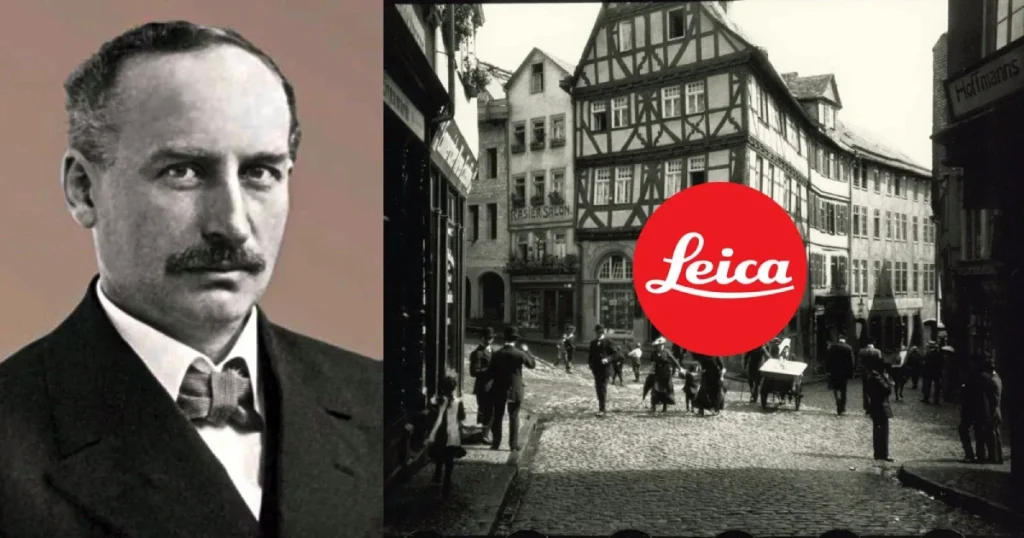
1913: Ernst Leitz introduces the first Leica camera with a simple wordmark logo.
1968: The dot appears. It's small, red, and about to become legendary.
The 1990s: The wordmark shrinks, the dot grows. It's like watching a visual representation of my waistline over the holidays.
The Dotting of the ‘i': More Than Just a Punctuation Mark
Now, let's talk about that dot. It's not just a dot. It's THE dot.
In design circles, we call this a “reductive” approach. You take something complex and boil it down to its essence. It's like making a delicious pasta sauce or explaining cryptocurrency to your grandma.
The red dot became synonymous with Leica. It's simple, memorable, and instantly recognisable. It's like that friend who always wears the same hat to every party.
But here's the kicker: that simplicity? It's deceptively difficult to achieve.
The Anatomy of Perfection: Dissecting Leica's Logo Design

Minimalism That Speaks Volumes
Let's get our scalpels out and dissect this bad boy. (Metaphorically speaking, of course. Please don't cut up any Leica cameras.)
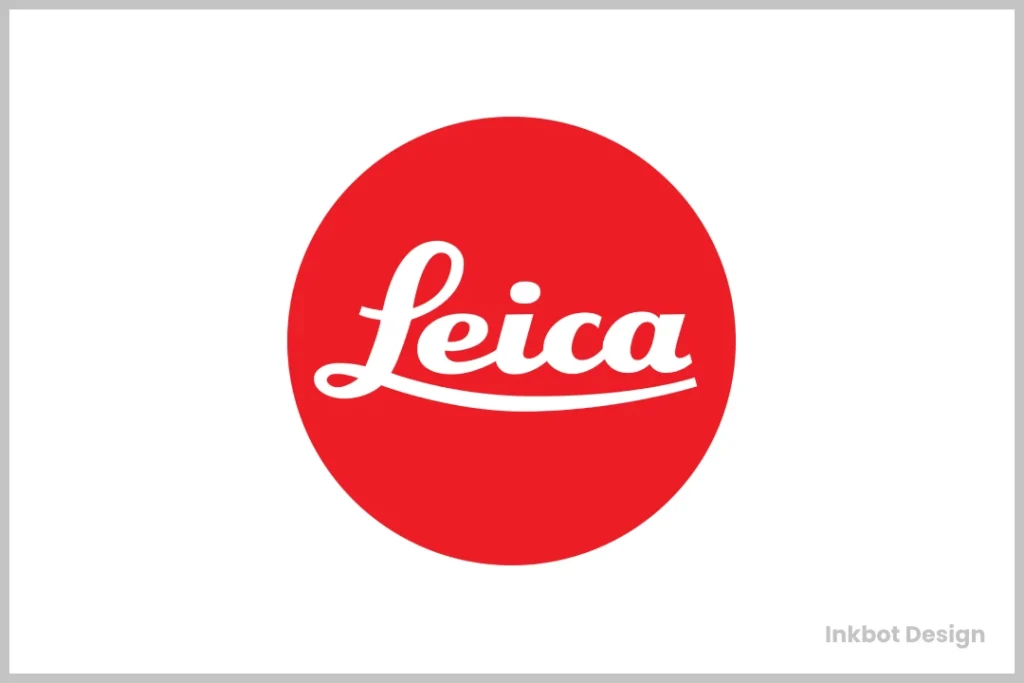
The Leica logo is a masterclass in minimalism. But what exactly makes it tick?
- The Shape: A Perfect Circle. No frills, no fuss. It's just pure geometric perfection.
- The Colour: That vibrant red. It's bold, passionate, and stands out like a sore thumb (in a good way).
- The Negative Space: The white background isn't just space. It's integral to the design, creating contrast and letting the logo breathe.
Colour Psychology: Why Red Rules the Roost
Now, let's talk about that red for a second. It's not just any red. It's Leica red.
Red is:
- Passionate
- Energetic
- Attention-grabbing
Sound familiar? Yeah, that's the essence of photography right there.
But here's a little insider tip: the exact shade of red Leica uses is Pantone 1795 C. You're welcome, design nerds.
Typography: The Unsung Hero
While we're all gawking at that red dot, let's remember the unsung hero of this logo: the typography.
The Leica wordmark uses a custom sans-serif font. It's clean, it's modern, and it perfectly complements the simplicity of the dot.
Pro tip: When in doubt, keep your typography simple. It's like wearing a classic white T-shirt. It always stays in style.
The Power of Consistency: Leica's Brand Identity Beyond the Logo

A Logo Is Not a Brand (But It's a Damn Good Start)
Here's where many businesses trip up. They think a logo is a brand. Newsflash: It's not.
A brand is the total of how people perceive your business. It's like your business's personality.
Leica gets this. Their logo isn't just slapped onto products willy-nilly. It's part of a cohesive brand identity that extends to every touchpoint.
Product Design: When Form Meets Function
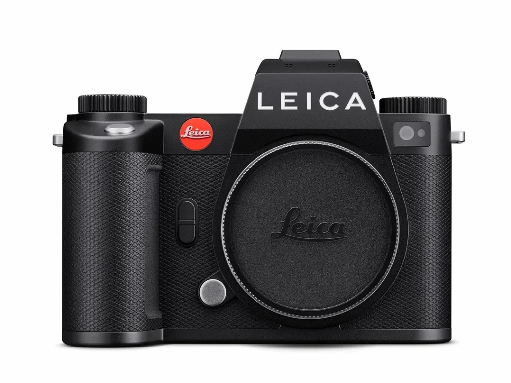
Have you ever picked up a Leica camera? It's like holding a piece of art. But here's the kicker: It's functional art.
Leica's product design philosophy mirrors their logo:
- Minimalist
- Functional
- Timeless
It's no coincidence that their cameras are as recognisable as their logo. It's all part of the brand package, baby.
Marketing Materials: Consistency Is Key
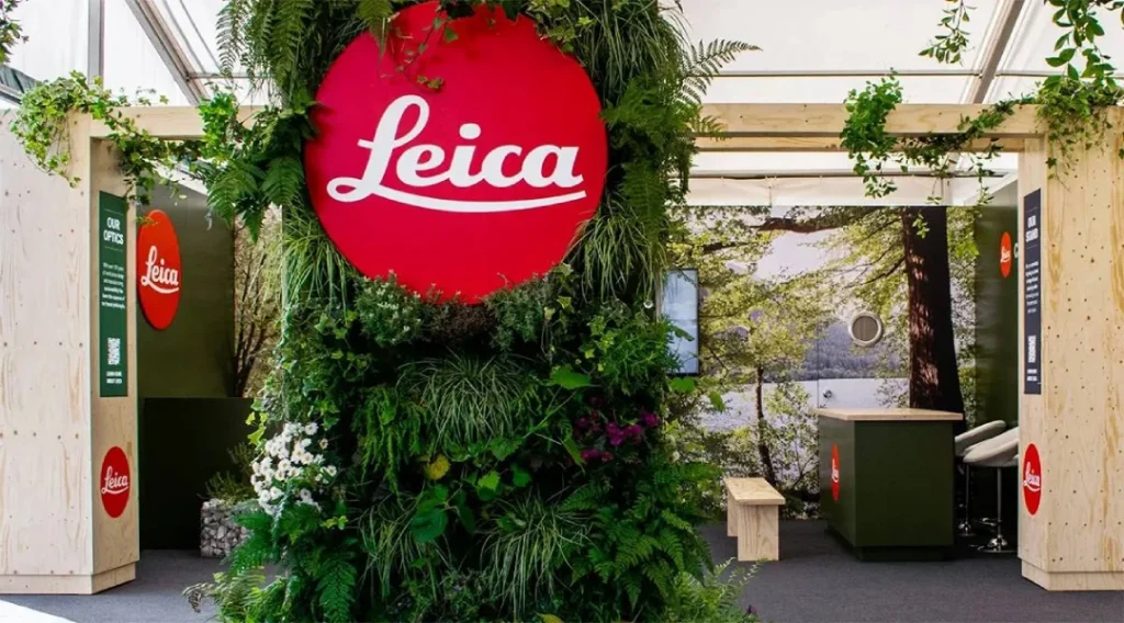
From its website to its product packaging, Leica maintains a consistent visual language. It's like they're speaking in design morse code, and once you crack it, you see it everywhere.
Key elements:
- Generous use of white space
- High-contrast imagery
- That iconic red dot, strategically placed
Lessons from Leica: Applying Their Design Principles to Your Brand

Simplicity Is the Ultimate Sophistication
Remember when I said that creating a simple logo is hard? Well, it is. But it's worth it.
Here's why:
- Simple logos are more memorable
- They're easier to reproduce across different mediums
- They stand the test of time
Think about it. The Nike swoosh, the Apple apple, and yes, the Leica dot. All simple. All iconic.
Know Your Brand's Core Values
Leica's logo is more than just pretty. It embodies their core values:
- Precision
- Quality
- Innovation
Before you even think about designing a logo, nail down your brand's values. It's like building a house. You need a solid foundation before you start picking out curtains.
Consistency Is Your Best Friend
I can't stress this enough. Consistency in your brand identity is crucial.
It's like dating. If you show up as a different person every time, people will get confused and probably stop calling you back.
The ROI of Good Design: Why Investing in Your Logo Pays Off

First Impressions Matter (A Lot)
Your logo is often the first thing people see. It's like the handshake of your brand.
A study by the Missouri University of Science and Technology found that it takes less than two-tenths of a second for an online visitor to form a first opinion of your brand once they've perused your company's website.
That's faster than you can say “Leica”.
Brand Recognition: The Holy Grail of Marketing
Here's a fun fact: According to a 2019 study by Lucidpress, consistent brand presentation across all platforms can increase revenue by up to 23%.
That's not chump change, folks.
And what's at the centre of that consistent brand presentation? Yep, your logo.
The Long Game: Building Brand Equity
Think of your logo as an investment. Sure, it might cost a bit upfront. But over time, it builds brand equity.
Brand equity is like the street cred of the business world. It makes people choose your product over a competitor's, even if yours is pricier.
Just ask Leica. Their cameras are costly, but people buy them because of what the brand represents.
DIY vs Professional: When to Call in the Big Guns
The Pros and Cons of DIY Logo Design
Look, I get it. When you're starting, every penny counts. And there are some great DIY logo design tools out there.
Pros of DIY:
- It's cheap (or free)
- You have complete creative control
- It's a great learning experience
Cons of DIY:
- It's time-consuming
- You might miss essential design principles
- The result might look… well, DIY
When to Hire a Professional
Here's my two cents: If you're serious about your business, invest in professional design.
At Inkbot Design, we've seen countless businesses transform their brand perception with a well-designed logo. It's like watching an ugly duckling turn into a swan but with more RGB colours.
Consider hiring a pro if:
- You're rebranding
- You're entering a new market
- Your current logo feels outdated
Remember, a good designer doesn't just create a pretty picture. They make a visual strategy for your brand.
The Future of Logo Design: Trends and Predictions

Minimalism Is Here to Stay (Sorry, Maximalists)
If Leica's evolution teaches us anything, it's that simplicity endures.
Simple logos cut through the clutter in a world of constant noise and information overload. They're like a breath of fresh air in a smog-filled city.
Adaptability Is Key
With the rise of digital platforms, logos must be more adaptable than ever.
Think about it. Your logo needs to look good on:
- A billboard
- A smartphone screen
- A tiny favicon in a browser tab
That's where simple, scalable designs like Leica's shine.
The Rise of Dynamic Logos
Static logos are so last century. The future is dynamic.
We're seeing more brands use logos that change based on context. It's like your logo plays dress-up but in a sophisticated way.
Conclusion: Your Logo, Your Legacy
So there you have it. The Leica logo was dissected, analysed, and served up with a side of practical advice.
Remember:
- Simplicity is powerful
- Consistency is key
- Your logo is an investment in your brand's future
Whether starting from scratch or looking to refresh your brand, take a page out of Leica's book. Keep it simple, make it meaningful, and for the love of all things holy, please don't use Comic Sans.
Ready to level up your brand identity? At Inkbot Design, we're passionate about creating logos that stand the test of time. Let's chat about how we can bring your brand vision to life.
After all, your logo isn't just a pretty picture. It's the face of your brand. Make it count.
FAQs
How much did Leica spend on their logo design?
While the exact figure isn't public, high-end logo designs cost anywhere from £10,000 to £100,000+. The value lies in strategic thinking and long-term brand equity.
Can I use red in my logo if I'm not Leica?
Absolutely! Just ensure it aligns with your brand values and industry. Red isn't trademarked, but using a red dot in photography might raise eyebrows.
How often should I update my logo?
Major rebrands typically occur every 7-10 years, but subtle refinements can happen more frequently. Always ensure changes align with your brand evolution.
Is it okay to design my own logo?
While possible, professional designers bring expertise in strategy, typography, and brand consistency. It's an investment in your brand's future.
How important is colour psychology in logo design?
Very. Colours evoke emotions and associations. Choose wisely to align with your brand personality and industry expectations.
Can a good logo make up for a mediocre product?
No. A logo enhances a good product/service but can't compensate for poor quality. Focus on both product excellence and strong branding.
How do I know if my logo is “good enough”?
A good logo is simple, memorable, versatile, and reflects your brand values. Test it in various sizes and contexts to ensure it holds up.
Should my logo look like those of my competitors?
While industry trends matter, your logo should differentiate you. Stand out while still being appropriate for your sector.
How many concepts should a designer provide?
Typically, 3-5 vital concepts allow for variety without overwhelming. Quality over quantity is key in logo design.
Is a logo or a wordmark better for my brand?
It depends on your brand recognition and long-term goals. Many brands, like Leica, use both a symbol and a wordmark for flexibility.
How do I protect my logo from being copied?
Trademark your logo. This gives you legal protection and exclusive rights to use the design in your industry.
Can I use my logo on merchandise?
Absolutely! This is a great way to increase brand visibility. Ensure your logo looks good on various materials and products first.
