Effective Logo Design Is a Science, Not an Art: Here's the Formula
The biggest mistake entrepreneurs make is treating their logo like a painting to be hung in a gallery.
They fret over whether they like it. They ask their family if it’s pretty. They want it to be a complex masterpiece telling their life story.
This is fundamentally wrong.
Your logo isn't a piece of art. It's a functional tool. It’s a surgical instrument for your business. Its job isn’t to be beautiful; its job is to identify. Quickly, clearly, and memorably.
We aren't here to talk about aesthetics. We're here to talk about what works.
- Your logo is a functional tool, not a piece of art, intended for quick and clear identification of your business.
- Follow the 5 unbreakable rules of logo design: simplicity, memorability, timelessness, versatility, and appropriateness to create impact.
- A structured process for logo creation, such as Inkbot Design's, ensures a strategic business asset rather than just an appealing image.
Your Logo Shouldn't Tell Your Entire Story
Here’s a pet peeve of mine: “My logo needs to tell the whole story of my business.”
No, it doesn't. Your brand tells the story. Your customer service tells the story. Your product tells the story.
The logo is the full stop at the end of the sentence, not the entire novel.
Its primary job is identification. It's a simple, visual trigger connecting customers to every experience they've had with your company.
Think about the Apple logo. It’s a bitten apple. It says nothing about user-friendly computers, sleek design, or premium technology.
Decades of consistent branding, marketing, and product experience have poured meaning into that simple shape. The logo didn't create the meaning; it just soaks it all up.
Your logo has one job: to be an empty vessel that your business can fill with value. Don't weigh it down with unnecessary baggage from day one.
The 5 Unbreakable Rules for a Logo That Actually Works
If you want to move past subjective arguments about whether a logo “looks good,” you need a framework. These aren't suggestions or friendly tips.
These five objective principles separate an effective logo from a decorative failure.
Rule 1: Simplicity
This is the foundation. A logo must be simple.
Simple designs are easier for the human brain to process, recognise, and, most importantly, recall—the simplest forms cut through the most effectively in a world saturated with visual noise.
Here’s a practical test: Look at a logo for five seconds and then try to draw it accurately from memory.
Could you draw the Nike swoosh? The McDonald's golden arches? The Target bullseye? Almost certainly. They are brutally, beautifully simple.
Now try to draw the Starbucks siren or the crest of your local city council. It’s a mess of details you can’t possibly remember.
Complexity is the enemy of memory. Simplicity is its greatest ally.
Rule 2: Memorability
Memorability grows directly from simplicity, but with an added requirement: it must be distinctive.
A simple logo is good. A simple and unique logo is effective. This is where you have to fight the urge to use clichés. Your business is not a globe, a generic swoosh, or a series of interconnected dots representing “synergy.”
Thousands of logos feature a leaf to signify “natural” or a rooftop to signify “property.” They are simple, yes, but they are utterly forgettable. They blend into a sea of sameness.
A great example of a memorable mark was the old Twitter bird. It was simple, unique, and instantly recognisable. The rebrand to a generic “X” threw away over 15 years of global brand equity for a symbol that lacks any distinction.

An effective logo sticks in your mind because it's slightly different from everything else.
Rule 3: Timelessness
Good design is not the same as fashionable design. An effective logo should stand against the winds of trends, not bend to them.
Chasing the latest design trend—gradients, drop shadows, or minimalist geometric animals—will make your logo look dated in three to five years. And a redesign costs time, money, and brand equity.
Look at the Coca-Cola script. It was designed in the 1880s and has remained fundamentally unchanged. It is a masterclass in timeless design. It doesn't scream “19th century” or “21st century.” It just is.
When evaluating a design, ask yourself: “Will this still look good in 10 years? 20 years? 50 years?” If the answer is anything but a confident “yes,” you're looking at a fashion statement, not a lasting brand asset.
Rule 4: Versatility
Versatility is the most practical and unforgiving rule. A logo is useless if it doesn't work everywhere it needs to.
An effective logo must be functional across a vast range of applications. This means:
- It must work in one colour. If your logo relies on colour to be understood, it will fail when faxed, photocopied, or printed on a single-colour promotional item.
- It must be scalable. It must be clear and legible when shrunk to the size of a favicon on a browser tab and still look sharp when blown up on a billboard.
- It must work on light and dark backgrounds. It needs a variant that provides enough contrast to be seen clearly anywhere.
- It must be medium-agnostic. It should also work when embroidered on a shirt, as on a website or a mobile app.
This is why complex, illustrative logos with fine details and subtle gradients often fail. They break down into small sizes and are used in single-colour applications.
A truly versatile logo is built on a solid, simple foundation. This is also why a professional designer always provides your logo in a vector format, such as SVG, AI, or EPS. Vector files can be scaled to any size without losing quality.
Rule 5: Appropriateness
Your logo's design language must match your brand's industry, audience, and positioning.
This doesn't mean being literal. A dentist's logo doesn't need to show a tooth. A car company doesn't need to show a car. It's about the feeling, tone, and message that the typography and shapes convey.
A law firm that uses a bubbly, cartoonish font is sending the wrong message. It feels unprofessional and childish. A toy company using a rigid, industrial typeface feels cold and uninviting.
The classic IBM logo, designed by Paul Rand, is a perfect example. Its solid, structured, technological feel is appropriate for a pioneering tech corporation. The playful, rounded script of the Disney logo is equally suitable for a global entertainment brand focused on families.
Your logo should feel right for your business.
The Anatomy of a Logo: Choosing Your Weapon
Not all logos are built the same. The type of logo you choose is a strategic decision that depends on your company's name, industry, and goals.
Wordmarks (or Logotypes)
A wordmark is a logo built entirely from the custom-styled name of the company. The typography is the star.
- Examples: Google, Coca-Cola, FedEx, Visa.
- When to use it: This is an excellent choice for new businesses. It directly builds name recognition because the name is the logo. It’s also suitable for companies with catchy, unique names.
Lettermarks (or Monograms)
A lettermark is a logo created from the initials of a company. It's a typographic symbol.
- Examples: IBM (International Business Machines), NASA (National Aeronautics and Space Administration), HBO (Home Box Office).
- When to use it: This is ideal for businesses with long, complex, or difficult-to-pronounce names. It simplifies a mouthful into a memorable and punchy mark.
Brandmarks (or Pictorial Marks/Logo Symbols)
A brandmark is a symbolic image or icon representing the company. There are no words.
- Examples: The Apple apple, the Nike swoosh, the Target bullseye.
- When to use it: This is the most challenging path for a new business. It requires a significant marketing budget and years of repetition to connect the abstract symbol with the company name in the public's mind. It's incredibly powerful once established, but a high-risk strategy.
Combination Marks
A combination mark pairs a wordmark with a brandmark. The two elements are locked up together but can also be used separately.
- Examples: Adidas, Burger King, Lacoste, and Doritos.
- When to use it: This is the most popular and versatile option for a reason. It gives you the best of both worlds: a symbol for versatile application and the company name for clear identification. For most small businesses, this is the safest and most effective choice.
The Process is Everything: How an Effective Logo is Actually Made

A great logo doesn't appear in a flash of divine inspiration. It's the result of a structured, strategic process. Anyone who tells you otherwise is selling you clip art.
The professional process looks something like this:
- The Brief & Discovery: This starts with profound questions about the business, not “What colours do you like?” It covers the target audience, competitors, brand values, and business goals.
- Research & Mood Boarding: Analysing the competitive landscape to find opportunities for differentiation and gathering visual inspiration to define the right tone.
- Sketching & Conceptualisation: This is where the real work happens. It’s about exploring hundreds of ideas with a pencil and paper, discarding the 99% that don't work to find the 1% that does.
- Digital Execution & Refinement: The strongest concepts are brought into vector software. This stage is about meticulous refinement of curves, spacing, and balance.
- Presentation & Feedback: The top 1-3 concepts are presented to the client, not just on a blank white page, but in real-world mockups—on a website, a business card, a sign. This shows how the logo functions in context.
- Finalisation & Delivery: Once a final design is chosen, the designer prepares a comprehensive package of files for every conceivable use (JPG, PNG, EPS, SVG) and often includes a basic brand guideline sheet.
This is the structured process a professional firm like Inkbot Design follows. It’s a system designed to produce a strategic tool, not just a pretty picture. It removes guesswork and subjectivity.
The Red Flags: Two Massive Mistakes That Guarantee a Bad Logo
You can follow all the rules, but if you fall into these two traps, you'll still have an ineffective logo.
Mistake 1: Designing by Committee
This is the single fastest way to kill a great design concept.
When you ask for feedback from everyone—your partner, employees, clients, parents—you invite a flood of conflicting, subjective, and often uninformed opinions. The designer must sand off a strong idea's interesting edges to please everyone.
The result? A camel—a horse designed by a committee. It's a safe, beige, watered-down compromise that inspires no one and is forgotten instantly.
The solution is simple: trust the expert you hired. Limit the feedback loop to one or two key decision-makers.
A perfect case study in this failure is the infamous 2010 Gap rebrand. They abandoned their iconic, 20-year-old logo for a soulless, corporate design that looked like it came from a PowerPoint slide.
The public backlash was so immediate and intense that they reverted to the old logo in less than a week. It was a textbook example of a committee trying to “modernise” and instead destroying decades of brand equity.
Mistake 2: Chasing the “Hidden Arrow”
My second pet peeve is the obsession with forced cleverness. Yes, the arrow hidden in the FedEx logo's negative space is brilliant. It was also a happy accident discovered during the design process, not the starting goal.
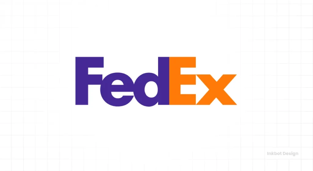
Clients constantly ask for a “clever” gimmick to be shoehorned into their logo. “Can you make the ‘A' look like a house and our company mascot?”
Pursuing a hidden meaning almost always comes at the expense of clarity. It results in logos that are complex, confusing, and illegible. The viewers are so busy trying to solve the visual puzzle that they forget the company name entirely.
Remember the first rule: Simplicity. Clarity beats cleverness. Every. Single. Time.
Your Logo is a Tool, Not a Trophy
Let's bring it back to the core idea. Your logo is not about your personal taste. It’s not a trophy to show off your creativity. It is a strategic business asset designed for a single purpose: identification.
When you evaluate your next logo design, don't ask “Do I like it?
Instead, ask the right questions:
- Is it Simple?
- Is it Memorable?
- Is it Timeless?
- Is it Versatile?
- Is it Appropriate?
You don't just have a logo if you can confidently answer “yes” to all five. You have a tool that will work for your business for years.
Frequently Asked Questions about Effective Logo Design
What is the most essential principle of effective logo design?
Simplicity is the most important principle. A simple logo is easier to recognise, remember, and apply across various media, making it more functional as a business tool.
How much should a professional logo design cost?
The cost varies wildly based on the designer's experience and the project's scope. It can range from a few hundred pounds for a junior freelancer to tens of thousands for a whole agency process. You are paying for the strategic process, not just the final image.
What's the difference between a logo and a brand identity?
A logo is a single visual mark that identifies a company. A brand identity is the entire visual system, which includes the logo, colour palette, typography, photography style, and other graphical elements that create a consistent look and feel.
Can I design my own logo using an online logo maker?
You can, but it's generally not recommended for a serious business. Logo makers often use generic templates and stock icons, resulting in a logo that is not unique, memorable, or legally protectable as a trademark.
What file formats do I need for my logo?
You need your logo in vector formats (AI, EPS, SVG) for scalability and raster formats (JPG, PNG) for web and general office use. A professional designer will provide a complete package.
How many colours should my logo have?
Fewer is better. Most timeless logos use only one or two colours. An effective logo must always work in a single colour (black or white) first and foremost.
What is a “responsive logo”?
A responsive logo is a logo that has several variations designed to work optimally at different sizes. For example, a complex combination mark might simplify to just its brandmark icon when used as a small social media profile picture.
Why is sketching important in the logo design process?
Sketching allows for rapid exploration of dozens or hundreds of ideas without the constraints of digital tools. It's the most efficient way to work through bad ideas and find the few good concepts worth refining digitally.
Should my logo literally represent what my company does?
No, it doesn't have to. Some of the world's most effective logos are abstract (Nike) or unrelated to the product (Apple). The job of the logo is to identify, not to describe.
How do I know when to redesign my company's logo?
Consider redesigning if your logo looks dated, is difficult to use in digital applications, no longer reflects your company's values, or if your business has fundamentally changed direction. Don't redesign it just for its sake.
Judging a logo objectively isn't easy, but it's essential. If you're building a brand and want to ensure its cornerstone is solid, focus on the principles, not just your preferences.
A strategic, professional process is the only way forward when you're ready to create a logo that functions as a powerful business tool. If you'd like to see what that looks like, you can explore the logo design services at Inkbot Design or request a quote to discuss your project.


