Mobile Visitors Are Taking Over the Web — Are You Ready?
While you've been optimising your website's desktop experience, your customers have moved to mobile. And they're not necessarily coming back.
I spent a lot of last year driving traffic to websites. You know what I discovered? The businesses making real money didn't have the prettiest desktop sites. They were the ones who understood that mobile isn't just “another channel” – it's becoming THE channel.
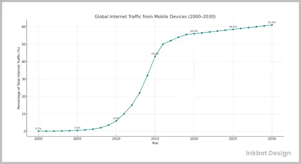
Look at the numbers: 60% of web traffic now comes from smartphones. Yet most businesses still treat mobile as an afterthought – designing for desktop first, then “adapting” to mobile. That's not how it should be.
This isn't just about having a “responsive” site anymore. This is about wholly rethinking how you engage with prospects when they're holding a small screen in their palm, standing in line at Starbucks, with eight seconds of attention to spare.
The companies that get this right are dominating. The ones that don't? They're being left behind, wondering why their conversion rates keep dropping while their competitors do well.
Let me show you exactly what's happening and how to position yourself on the right side of this massive shift…
- Mobile now accounts for over 60% of global web traffic; optimising for mobile is imperative for business success.
- Google's mobile-first indexing prioritises mobile site versions, making mobile optimisation crucial for search visibility.
- Fast load times are vital; sites taking over three seconds to load risk losing visitors and lowering engagement.
- Responsive design and user-friendly navigation increase mobile user satisfaction and significantly enhance conversion rates.
- Why Mobile Visitors Matter More Than Ever
- Optimising for Mobile-First Indexing
- The Importance of Fast Mobile Load Times
- Designing an Exceptional Mobile Experience
- Mobile Navigation Best Practices
- Critical Technical Considerations for Mobile
- The Role of Accelerated Mobile Pages (AMP)
- Final Thoughts on Tapping into Mobile’s Potential
- Examples of Successful Mobile-First Strategies
- FAQs
Why Mobile Visitors Matter More Than Ever
Embracing the “Mobile Mind Shift”
The way people access information has fundamentally shifted in recent years. This is what some call the “mobile mind shift.”
Just think about it: How often are you within arm’s reach of your phone? Chances are that your mobile device is the first thing you look at when trying to find something out or kill time while waiting for something else.
It is officially our primary digital behaviour. Innovative businesses have noticed this by ramping up their mobile web strategies.
Staggering Mobile Usage Stats
Still not convinced that you should prioritise making your website easily accessible on a smartphone or tablet? Then these stats might change your mind:
- 58% of web traffic now comes from mobile devices globally (Statista, 2024)
- The average person spends 4.5 hours per day on their phone (WJAR, 2024)
- 60% of Google searches happen on the phone (Google, 2024)
- Mobile internet usage surpassed desktop back in 2016 (TechCrunch)
With these numbers so high, delivering an exceptional mobile experience isn’t just nice—it is necessary if you want anyone to revisit your website.
Optimising for Mobile-First Indexing

What is Mobile-First Indexing?
In March 2018, Google began rolling out its mobile-first indexing approach. What does that mean exactly?
Previously, Google used the desktop version of your website to determine search rankings. However, because so many people are using their mobile phones to browse the internet, they changed it so that their algorithms primarily crawl and index the mobile version instead.
Why? Google says:
“Mobile-first indexing means that we will use the mobile version of the website for indexing and ranking to help our mobile users better find what they are looking for.”
So, by prioritising the mobile experience, Google aims to make more phones appear in search results.
Does Mobile-First Indexing Impact SEO?
Unfortunately, for people who do not like change, yes! With Google emphasising pages that are friendly for phone browsing, not optimising your site for smartphones and tablets will damage your visibility in search results.
If your pages are difficult to read on a smaller screen or take forever to load, Google will not care about how great you are at formatting them on a computer. So be sure to structure and optimise everything with mobile users in mind.
Now, let us dive into optimising your user experience and technical approach for visitors who can only access their phones or tablets.
The Importance of Fast Mobile Load Times
When a mobile site takes too long to load, people leave it quickly. Google research shows that if a page takes over three seconds to load, users tend to abandon it.
This impacts not just user satisfaction but also your search rankings. Optimising load times can reduce bounce rates and improve engagement in a world where speed matters.
Tools like Google's PageSpeed Insights offer actionable insights into speeding up your site. Emphasising compact images, efficient coding, and caching is a good start.
Designing an Exceptional Mobile Experience
Your site shouldn’t only be easy to read on a phone — it should be enjoyable. People will not stick around if your site is inaccessible or hard to consume content on when made smaller.
These UX tips and best practices will help craft a mobile-friendly site users adore:
Make It Responsive
Previously, companies often made their mobile websites using subdomains such as m.yoursite.com. However, responsive web design is now the standard approach.
Responsive web designs use fluid layouts that adapt and optimise themselves to any device or screen size. This means no more maintaining separate desktop and mobile codebases – making your work much more manageable.
Optimising the Viewport for “Thumb-Friendly” Navigation
Trying to click on tiny links or buttons can be frustrating. Here are the best practices you should apply for touch targets:
- Minimum target size of 48px
- Links and buttons should have enough space between them
- Style tap targets with clear affordance signals (colour, shadow, etc.)
This way, users can enjoy a smooth experience that will not make them want to yeet their phone to oblivion.
Keep Menus Short and Swipe-able
Long menus are just a usability nightmare on mobile. Instead of long menus, use hamburger menus that neatly tuck navigation under a nice ☰ icon. Alternatively, if daring, try swipeable carousels to display options horizontally.
The goal is to keep your menu neat and condensed so users can quickly scan it without doing too much work.
Prioritise Legible Typography
Reading tiny text from afar is hard enough when someone sends it to you via screenshot. It worsens when you read paragraph after paragraph on your phone screen. Always ensure body fonts stay sized between 16-19px for optimal legibility on mobile screens.
Also, leave some breathing room between lines and paragraphs so that content is not crammed into one big block – white space works wonders!
Reduce Excess Content on Mobile
Large pictures look impressive on desktop but could spell disaster for mobile users. For better user experience, remove or simplify visual embellishments when viewed on mobile devices. Providing core content quickly is the main goal – sometimes less is more.
Enable Tap-to-Call Functionality
If your business receives many phone inquiries, consider adding “click-to-call” links. This way, mobile users can just tap and call you immediately without copying your number first. Sounds like a win if you ask me.
Make Forms Mobile-Friendly
Typing on a phone is no fun. So, keep mobile forms as straightforward as possible while using auto-formatting and input masks where applicable.
This may mean reducing or splitting form fields into smaller steps. Anything that will make it quicker and easier for users to complete the form without inducing typos!
Disable Annoying Pop-Ups on Mobile
Pop-ups are an excellent way of getting email signups on desktops, but they are usually just annoying obstacles on mobile. It would be better if you only allow pop-ups for desktop users so you do not drive away visitors with mobile devices.
Test Everything Rigorously
Above all else, test everything about your mobile UX before going live—a slick site results from meticulous tweaking and quality assurance.
Mobile Navigation Best Practices
Good mobile navigation is intuitive and makes it easy for users to find what they need. Popular techniques involve using icons for compact navigation, such as universally recognised hamburger menus.
Implementing breadcrumbs helps users keep track of their path through the site.
Keeping dropdown menus to a minimum and ensuring all clickable areas are easily tappable with a thumb are must-haves.
Sticky headers that stay at the top of the screen while scrolling improve accessibility, as there’s no need to go back to the top to switch sections.
Consider utilising swipe gestures for navigation, a feature increasingly common in mobile design. It provides a more intuitive user interaction by simply allowing users to swipe between pages or sections.
Integrating context-sensitive help or guidance, such as tooltips or pop-ups explaining new features, can further benefit users who may not be familiar with certain gestures or navigation styles.
This approach ensures users can navigate your site effortlessly, reducing the need to search for instructions or support elsewhere.
Critical Technical Considerations for Mobile
Mobile devices often connect to public Wi-Fi or cellular networks, so security is essential. Ensure HTTPS is enabled and you follow data encryption best practices.
You should also verify that any payment portals, forms, or areas handling sensitive information are thoroughly secured for mobile transmission.
Mobile SEO and Metadata
It has been mentioned a few times now: optimisation for mobile indexing is crucial if you want search visibility nowadays. To ensure that your website can be crawled and indexed by Google on mobile, do the following:
- Design responsive pages instead of separate URLs for mobile.
- Keep quality/keyword-optimised content consistent throughout
- Avoid lazy-loading critical content.
- Put titles and descriptions in place to assist with mobile metadata.
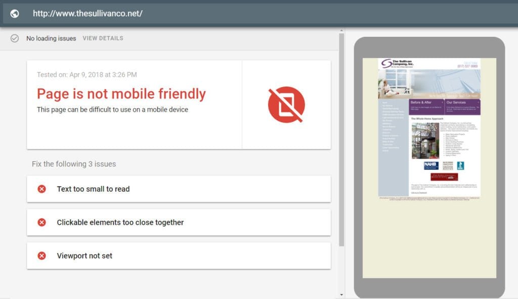
Google’s Mobile-Friendly Test and Mobile Usability Report in Search Console are beautiful tools that help discover and solve mobile SEO issues.
Analytics and Mobile Metrics
There is no point in optimising experiences on mobile devices if you do not have a proper way to measure performance and engagement.
Audit your web analytics setup so that you can accurately track statistics for mobile traffic sources, behaviour flows, conversions, etc. Creating particular segments specifically for your data drilling needs may be helpful.
Furthermore, do not forget to configure your system to track native app experiences if you offer them.
Optimise All User Touchpoints
Just like any other digital touchpoint in this day and age, social media channels, transactional emails, push notifications — anything digital — need to follow best practices across all possible customer touchpoints:
- Social media channels
- Transactional emails
- Push notifications
- In-app experiences
- Online ads
While a website bookmark works fine, PWAs take it further. They allow users to instantly install an app-like icon onto their mobile home screen.
This simple shortcut eliminates any unneeded steps and navigational hurdles. Users can tap once and start using the intended experience.
Being “installed” locally means quicker load times. Service workers pre-cache static assets and data, music to the ears of people who care how fast their mobile devices are!
Lower Cost Compared to Native Apps
Businesses love PWAs because they are much cheaper than developing, deploying and maintaining native apps, especially for those businesses that need to reach multiple platforms and app stores.
PWAs work across all devices and operating systems using standard web technologies like HTML, CSS, and JavaScript. No fancy programming languages are required!
This translates into significant savings in engineering costs. Moreover, unlike with app stores, you have complete control over the hosting experience with PWAs.
So, while native apps are still worth it for the mega tech companies of the world, budget-conscious organisations can deliver exceptional mobile experiences through low-cost PWAs.
The Role of Accelerated Mobile Pages (AMP)
Accelerated Mobile Pages, or AMP, is a Google-backed project designed to create super-fast mobile web pages. AMP reduces page load time significantly by simplifying HTML and keeping only key content.
These pages load almost instantly, keeping users happy and likely to stick around. They're also given a unique indication in search engine results pages, which can lead to higher click-through rates.
Adopting AMP can be beneficial, especially for content-heavy sites like news platforms.
Businesses that rely on organic search traffic can see tangible benefits from AMP, as these pages often achieve better positions on search engine results pages.
Implementing AMP is about improving load times and enhancing the overall mobile browsing experience.
With the flexibility to integrate interactive elements like images and videos, AMP ensures an engaging yet fast-loading page that retains user interest.
Final Thoughts on Tapping into Mobile’s Potential
And there you have it — a complete look at how to welcome your mobile visitors by 2025 or earlier.
With any luck, you found many compelling reasons and tremendous tactical tips on optimising your mobile experiences to make them more fun and addictive.
Nevertheless, as global mobile usage and connectivity continue growing every year, providing seamless mobile journeys will be one of the most essential things for any website or digital product out there.
Aside from diagnostics, you must thoroughly test your site on mobile devices. You should look for sluggish performance, difficult navigation, or poor UX. Performance indicators such as load times, bounce rates, and conversion rates among mobile visitors are also good tools.
But no pressure! The success or failure of your business might depend on how well you embrace this new way of thinking about your online presence.
So get started, friend! Start iterating, start testing… However, above all else, put your mobile visitors first in everything you do online.
Examples of Successful Mobile-First Strategies
Adopting a mobile-first strategy has propelled many companies to success. A well-known example is Facebook, which prioritised mobile development early on and reaped immense gains in user engagement.
Another good example is Airbnb, whose mobile-first approach improved booking experiences by simplifying the process for users on the go. Their app was designed to be fast and intuitive, reducing booking friction and increasing customer satisfaction.
These cases highlight the importance of considering mobile users in every business decision as their numbers continue to climb steadily.
FAQs
What is the deal with mobile web usage?
Over the past few years, mobile web usage has skyrocketed, surpassing desktop use in many parts of the world. According to recent studies, mobile devices account for more than 60% of global web traffic.
So, why is it growing so fast?
There are simply way more smartphones and tablets out there than ever before. Couple that with better connectivity and a user base that prefers on-the-go information and services, and you have a recipe for growth that seems like it will continue for a while.
If businesses do not optimise their sites for mobile, what happens?
To put it simply, nasty stuff. A poor user experience can lead to increased bounce rates, lower conversion rates, and other problems resulting in lost customers and revenue. With over half of all web traffic coming from mobile devices nowadays, having a website that doesn’t work on phones isn’t just bad business – it’s not even an option any more.
How do you make sure your website is optimised for mobile?
It’s simple: follow best practices! Ensure your site design responds well to different screen sizes and devices (A.K.A., make it “responsive”), prioritise content that users with fat fingers can easily navigate, minimise loading times by optimising images and media, etc.
Why should I bother?
You’d be surprised how much a minor tweak or two can affect your bottom line. For example, making your site easier could increase engagement rates, meaning more conversions (and dollar bills). Additionally, search engines love websites that are easy to view on phones, so having one may boost your visibility online.
Should I build a separate app or website altogether?
Not unless you’re offering something complex or interactive! Responsive web design has eliminated the need for separate sites explicitly focused on phone users, but some companies still benefit from developing apps that improve the user experience.
How do I monitor my mobile web traffic?
You’ve got many tools at your disposal: Google Analytics, SEMrush, and so on. These programs can tell you how many people visit your site from their phone or tablet and give you information like critical data points about their device type, operating system and screen resolution.
What should I avoid when making my site mobile-friendly?
To keep things short, anything that annoys the user! Things to avoid include intrusive pop-ups and interstitial ads, images, media that take forever to load (or don't load at all), headlines and buttons that are hard to tap on with your thumb… Essentially, prioritise speed and ease of use above all else.
How often should I update my mobile optimisation plan?
It depends on various factors, but one thing is for sure: You should always make improvements as technology changes. Aim to run bi-annual audits to spot issues in your current strategy and make constant minor improvements along the way.

